


Giuliano Rusciano, from russs.design, created the brand identity, packaging and photography for Sangiacomo, a family-owned brand of tomato preserves from Italy. All their tomatoes come from biological farming and they only produce in small batches, following the traditional process with artisanal techniques handed down from generation to generation.
Preparing tomato preserves is an important ritual for the Italian families, especially in the south. Every summer the oldest and youngest members of the family gather to harvest tomatoes and produce delicious sauces and preserves to be used in winter months.
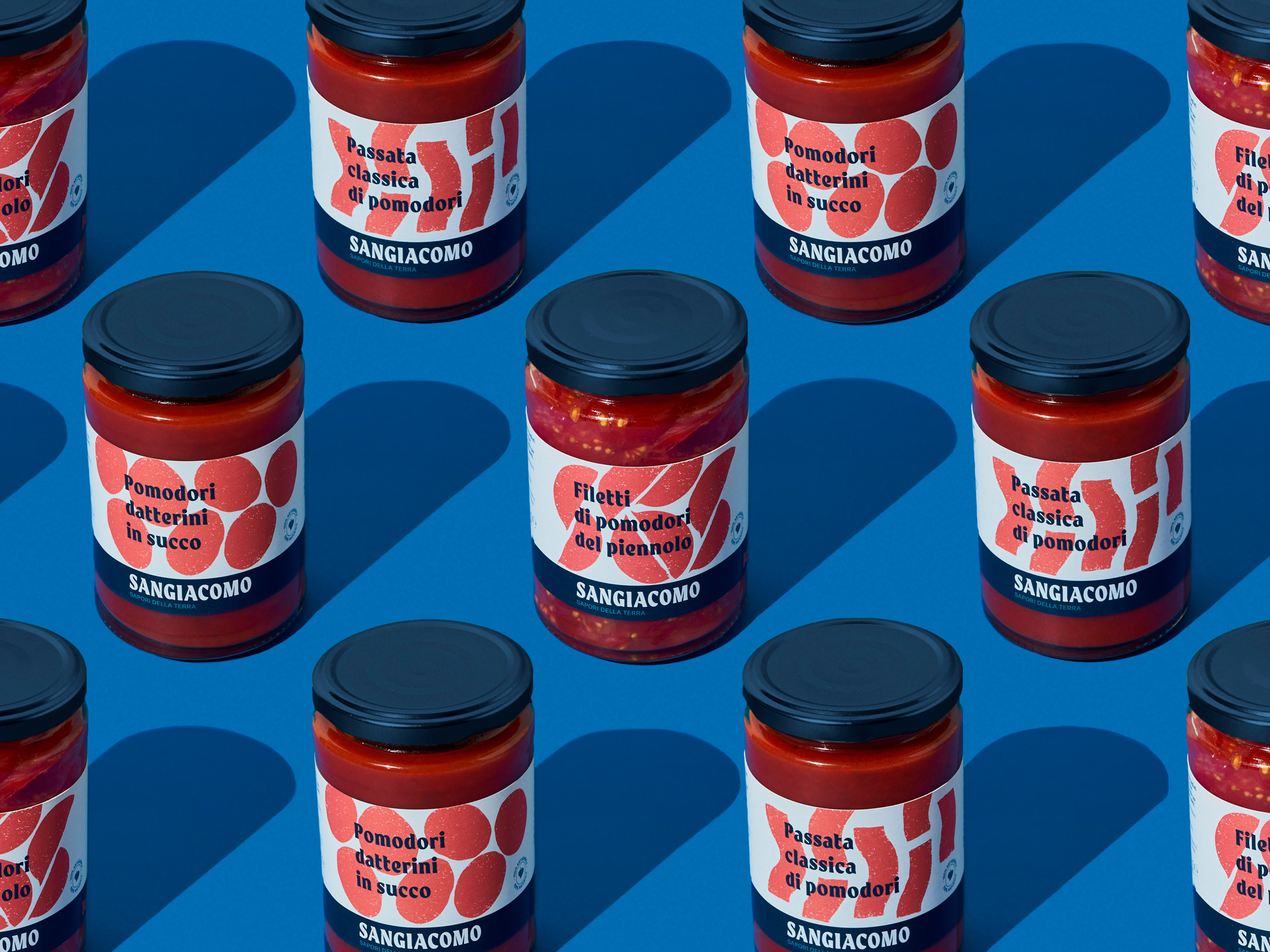
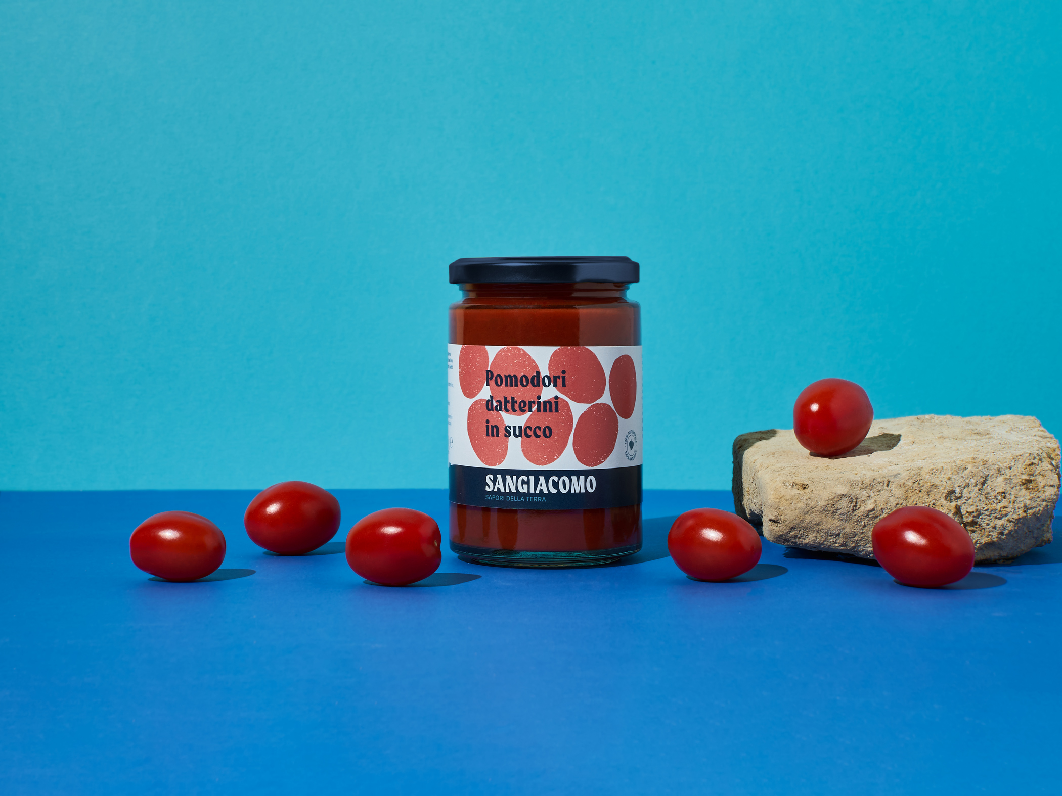
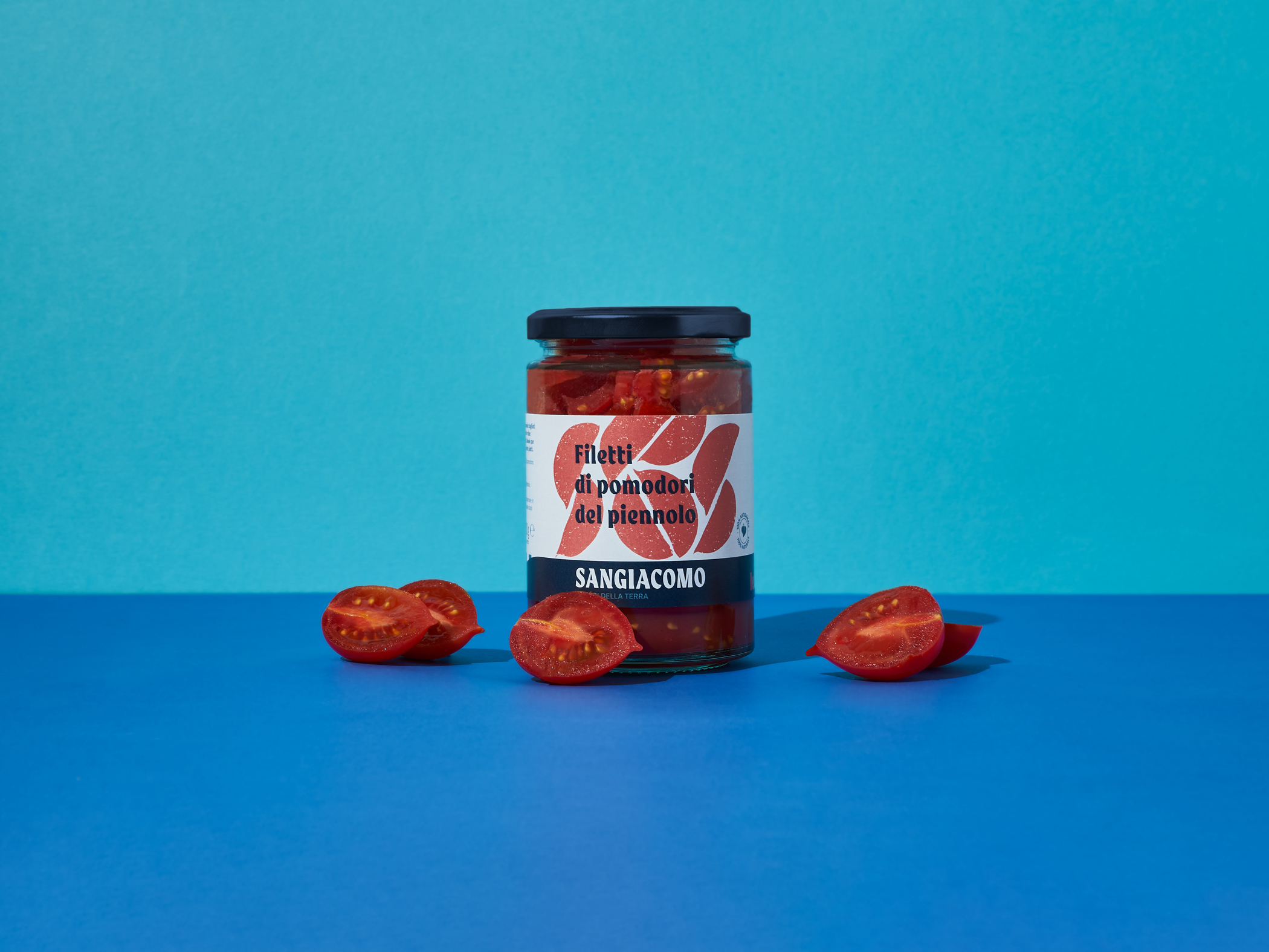
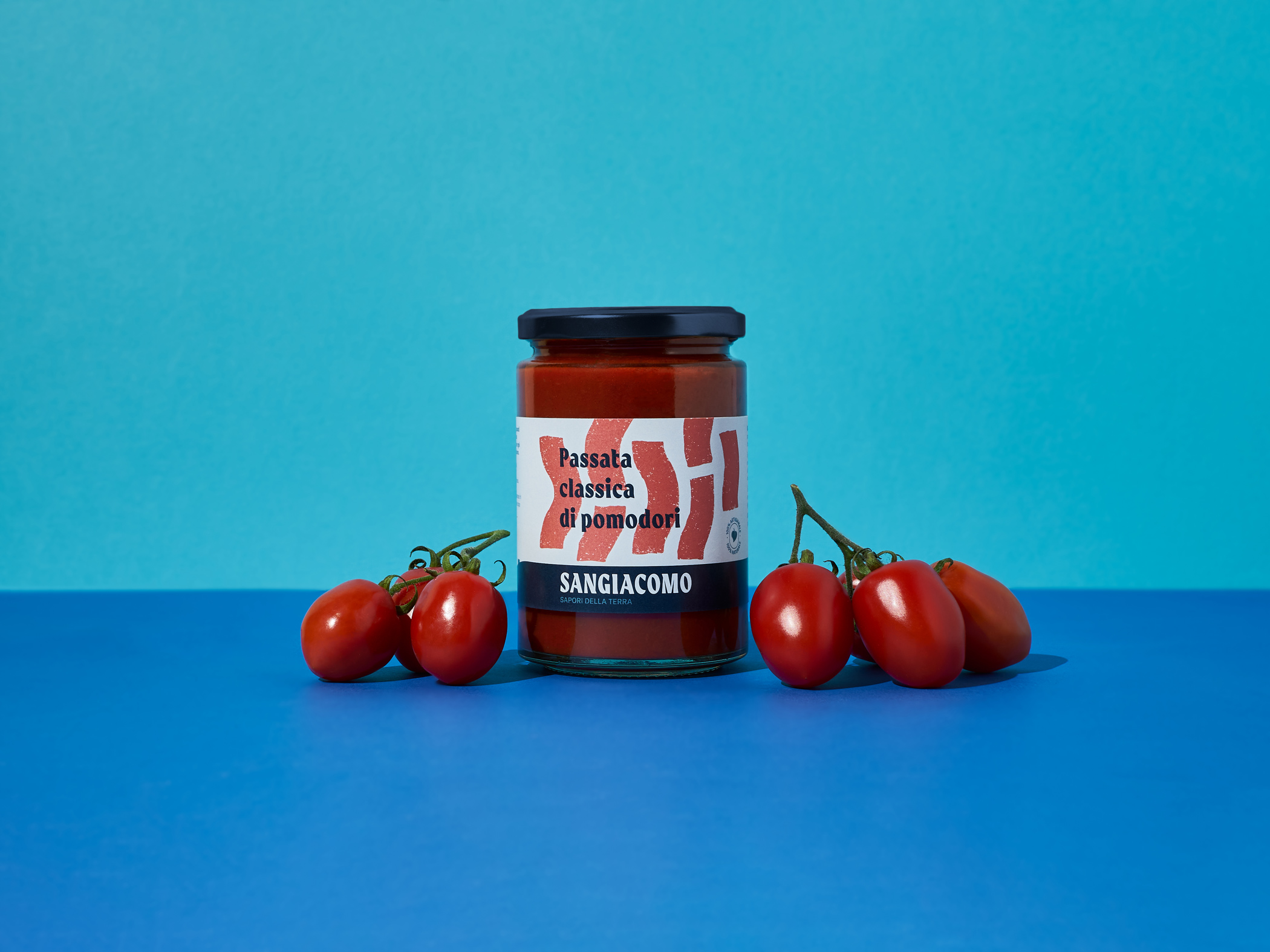
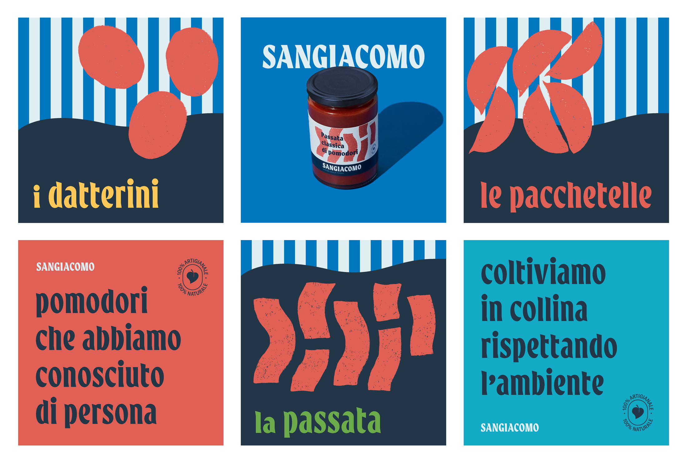
The label designs are strongly focused on typography and colored shapes to create a high-impact, contemporary look. The goal was to break the mold in the tomato preserve industry and to avoid classic Italian appearance in order to help the brand to stand out and differentiate from competitors. Sangiacomo’s products are addressed to the gourmet market, selling mainly to an audience of young people (less than 45 years) who look for quality products and pay special attention to brands with a modern and fresh aesthetic.
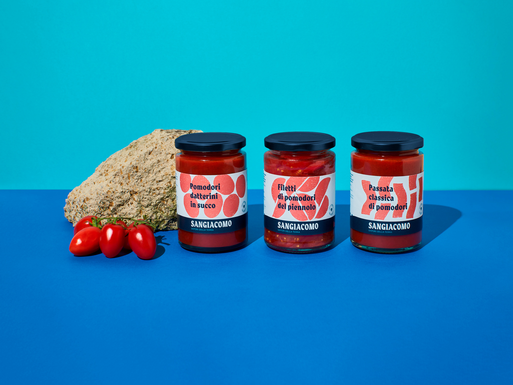
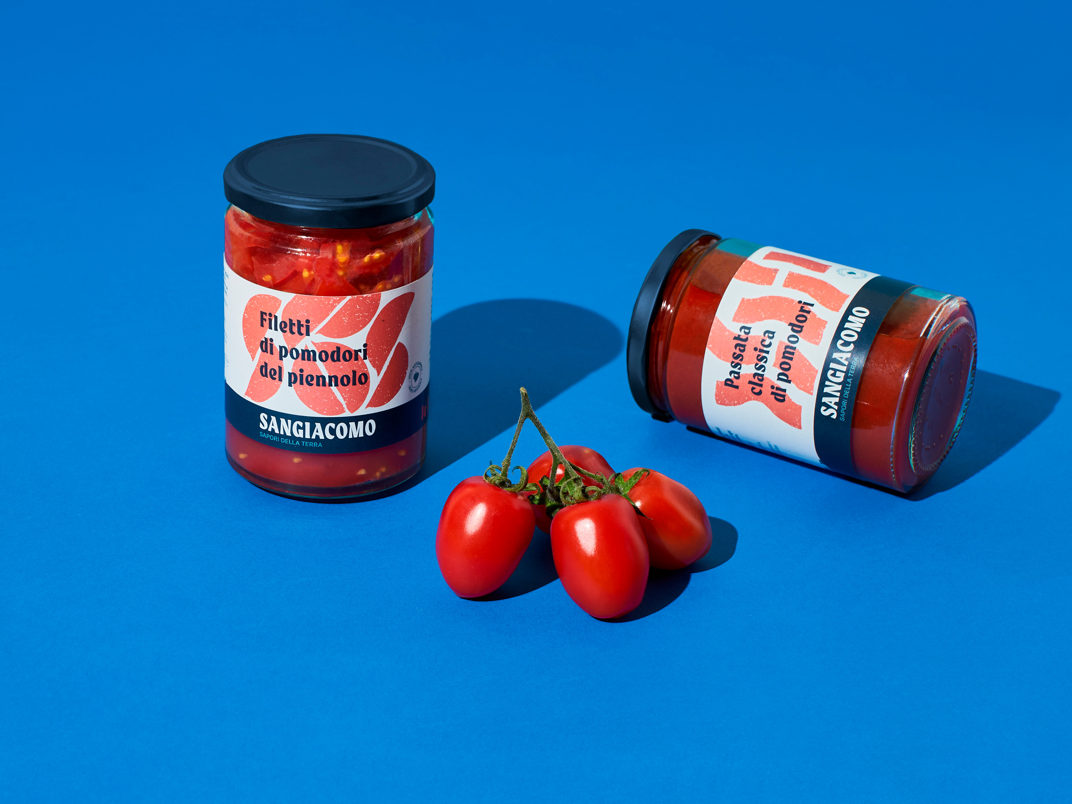
The range of the products includes 3 different tomato preserves: passata, datterini and pacchetella. In every product type, there are different illustrated shapes according to the tomato variety or recipe.
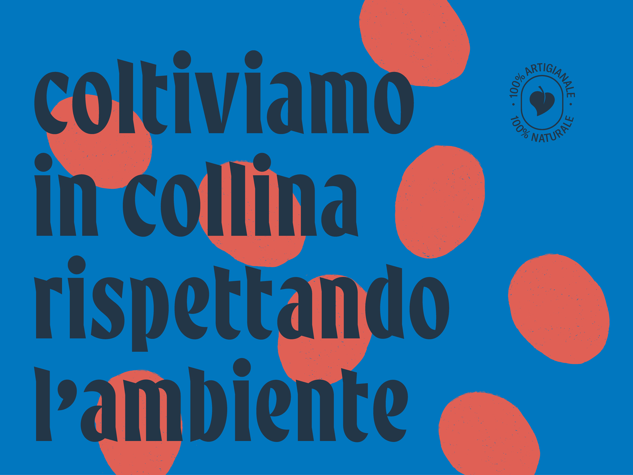
“We only eat tomatoes we meet in person”. This is one of the brand mottos, to communicate the authenticity and craftiness in the production process.
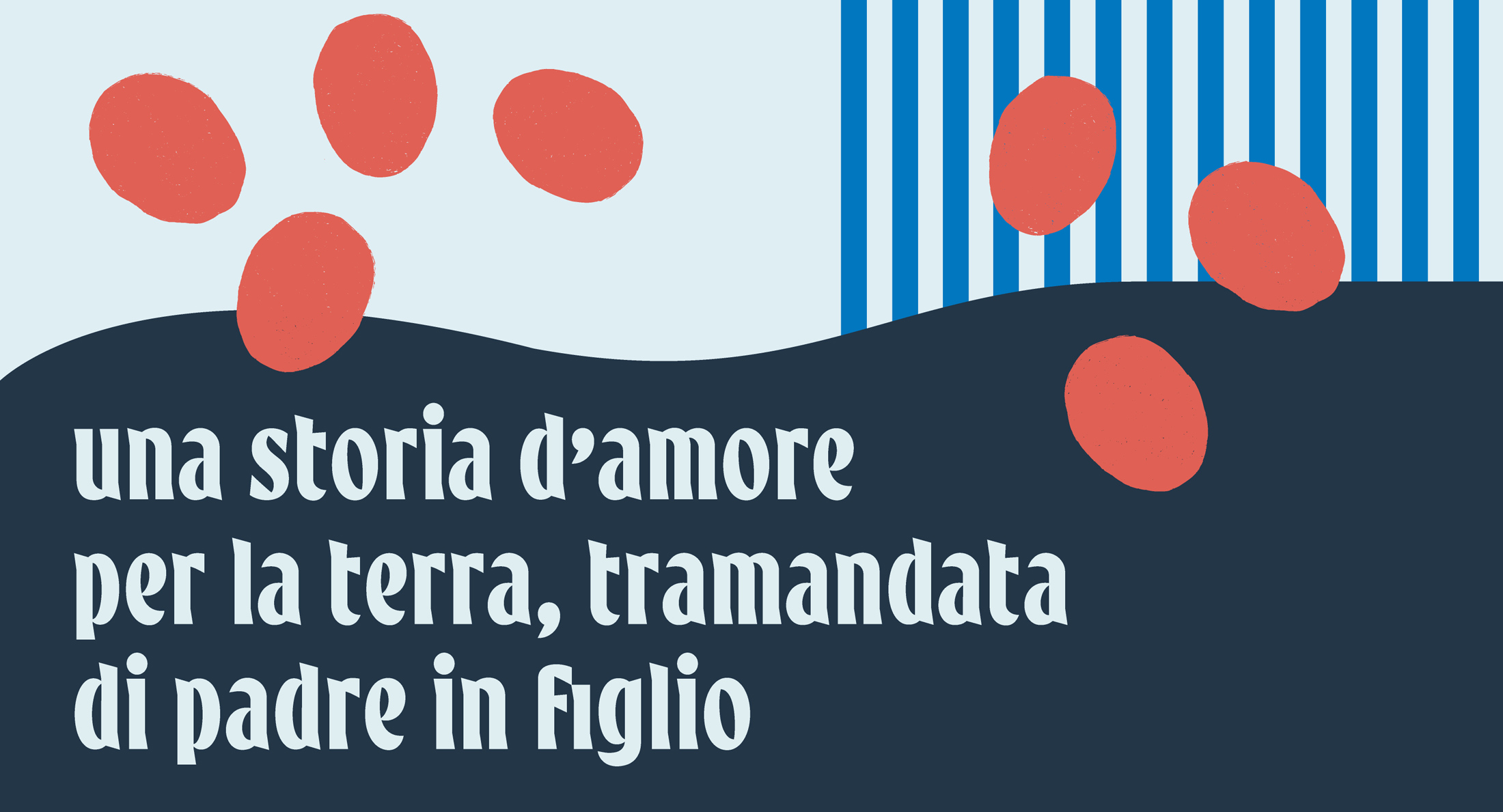
The overall look of brand identity is inspired by the story and unique geographical characteristics of Sangiacomo’s lands. The area in which they are located was mostly rural until the ’80s and nowadays is almost completely urbanized in its surroundings. For this reason, Sangiacomo shows the contrasts between city and countryside, through straight lines (city buildings and streets) and organic curves (nature and country) that are merged together into a fresh aesthetic. It evokes memories of summer, the harvest season for tomatoes.

CREDIT
- Agency/Creative: Giuliano Rusciano - russs.design
- Article Title: Branding and Packaging for Tomato Preserves Sangiacomo by Giuliano Rusciano
- Organisation/Entity: Freelance, Published Commercial Design
- Project Type: Packaging
- Project Status: Published
- Agency/Creative Country: Spain
- Market Region: Europe
- Project Deliverables: Brand Creation, Brand Digital Design, Brand Guidelines, Brand Identity, Brand Naming, Brand Strategy, Branding, Graphic Design, Identity System, Illustration, Packaging Design, Photography, Product Architecture, Product Naming, Research / Insight, Tone of Voice
- Format: Jar
- Substrate: Glass Jar


