


Marka Network – The Supreme Roastering Co.
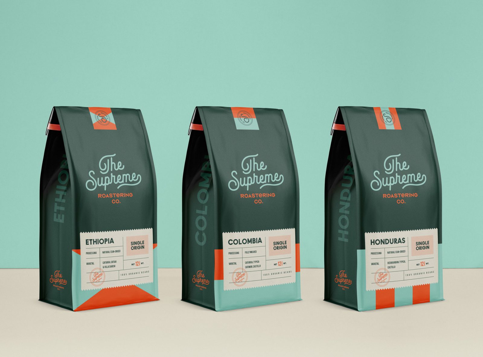
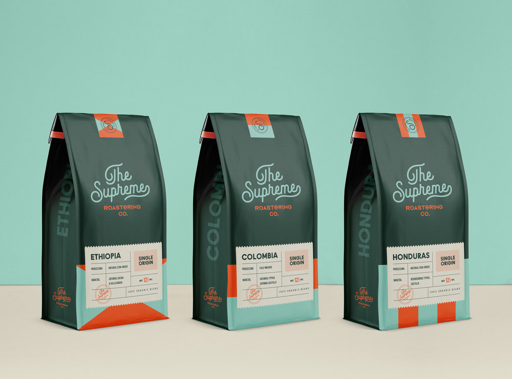
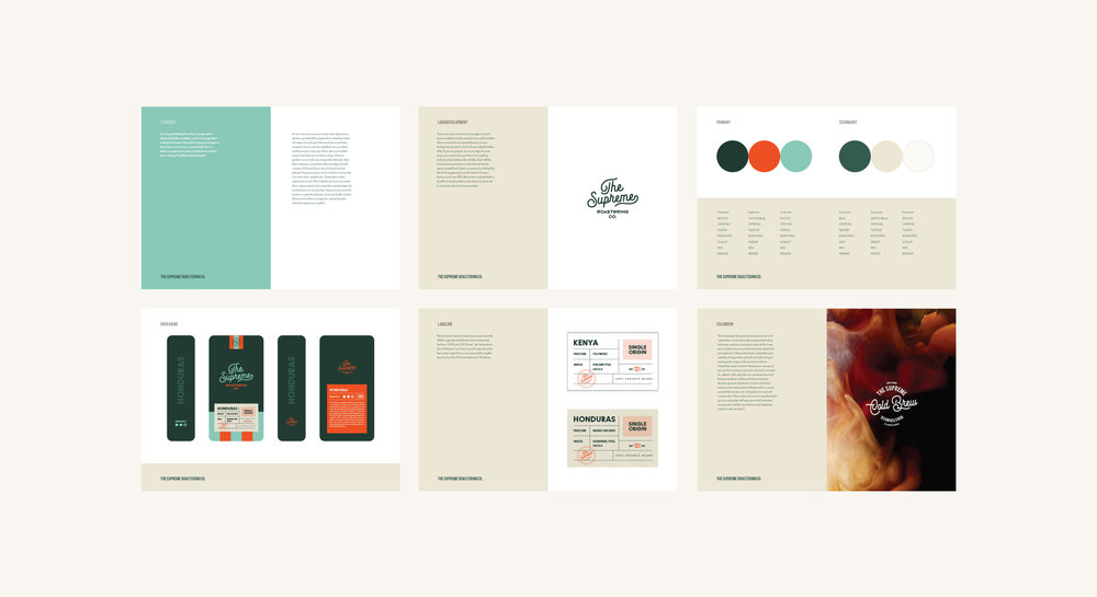
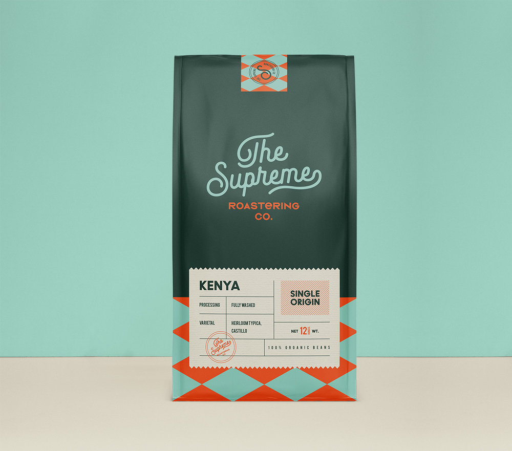
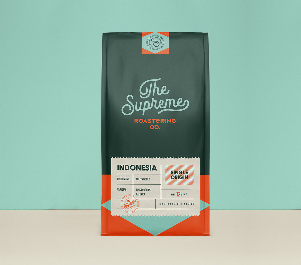
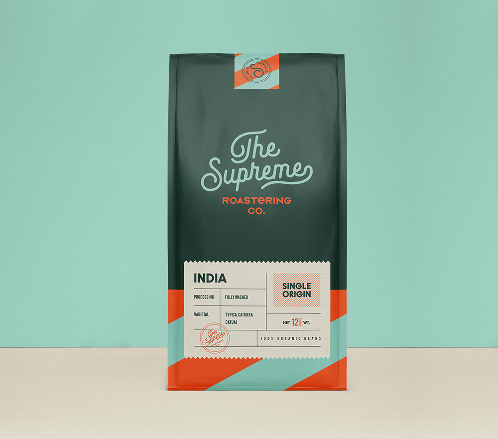
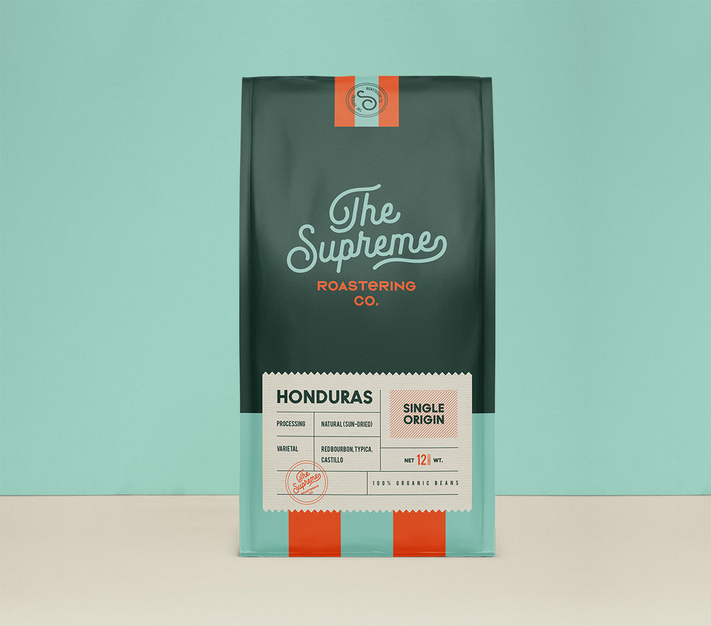
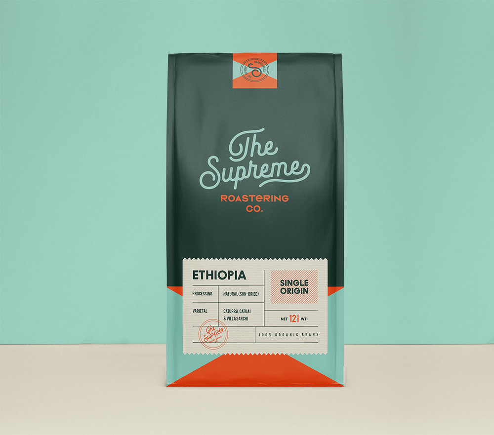
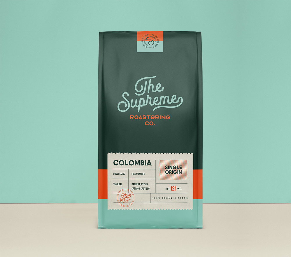
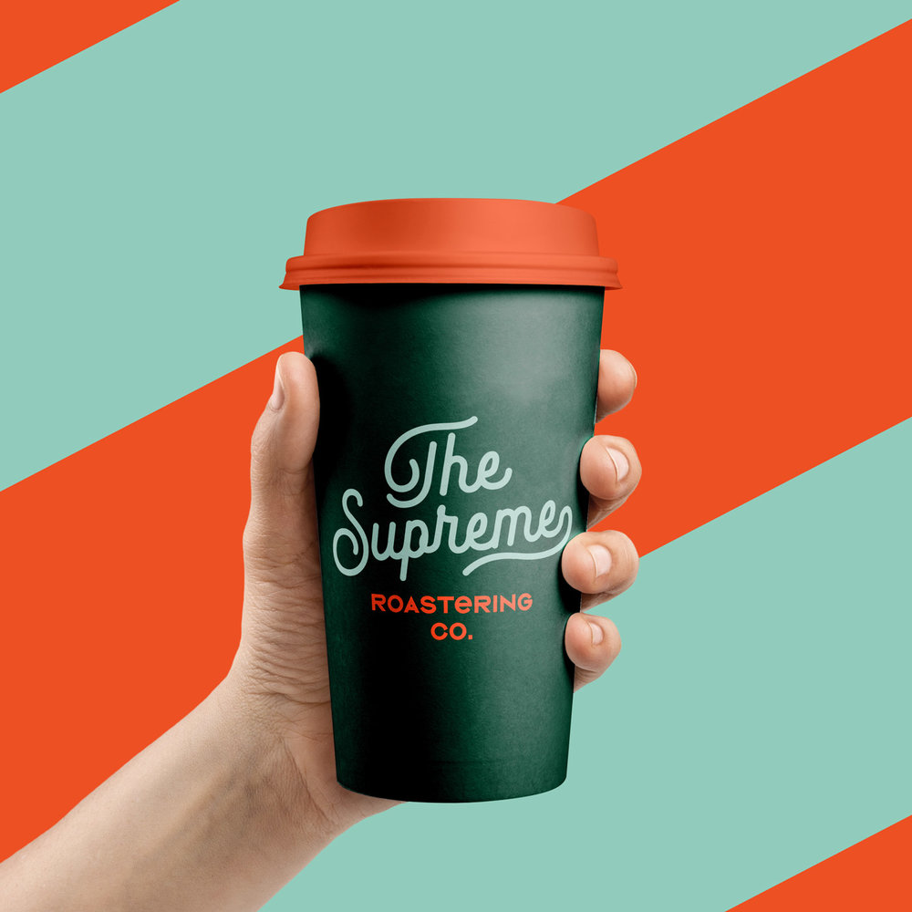
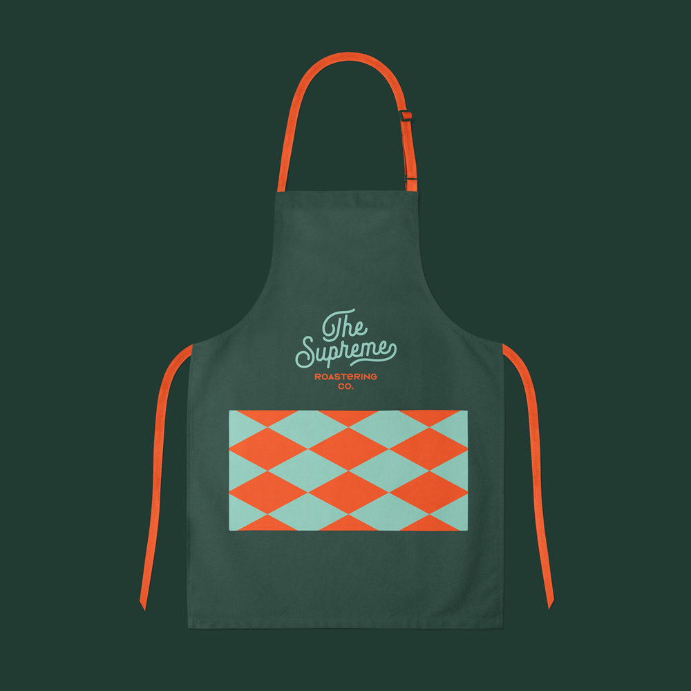
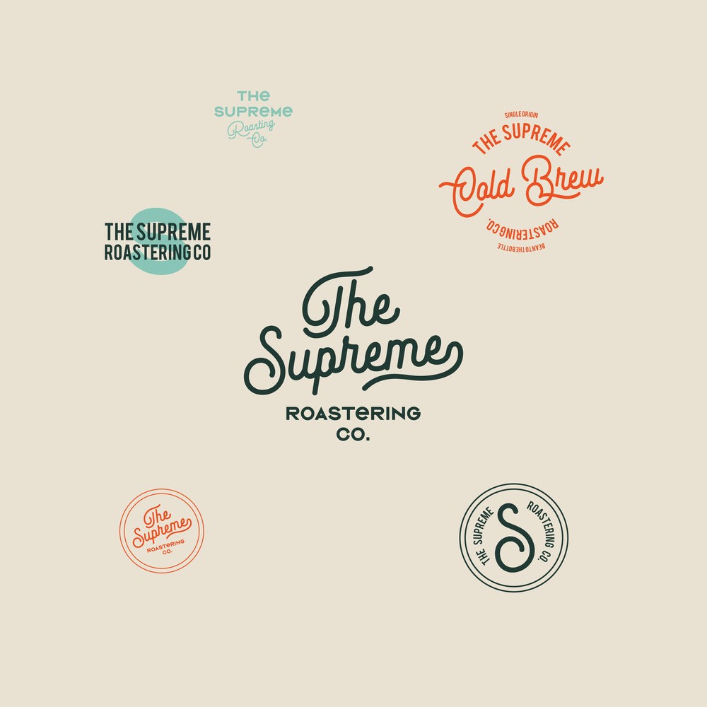
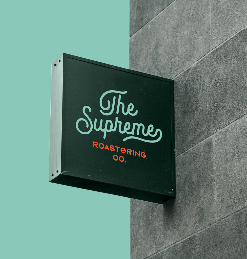
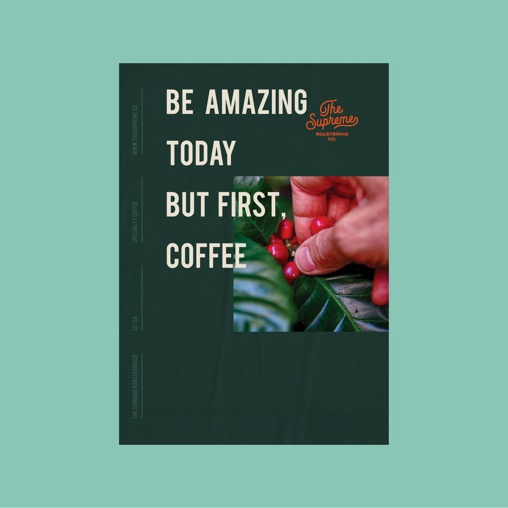
We created a brand identity with a vintage and minimal approach for The Supreme Roastering Co.
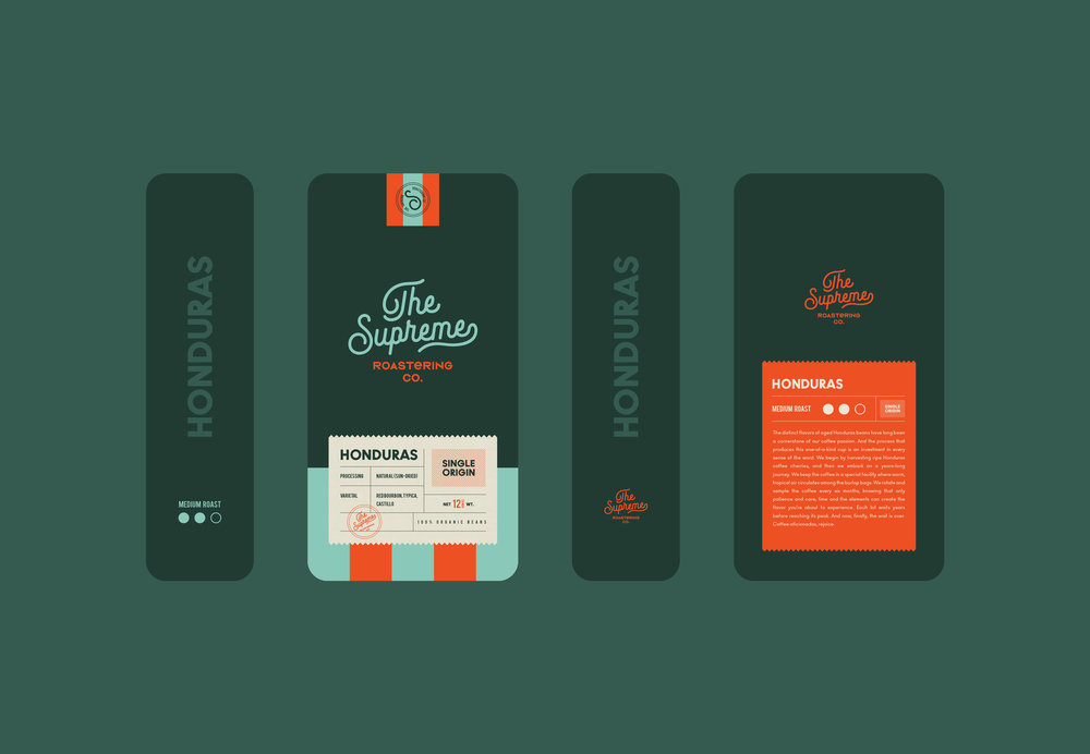
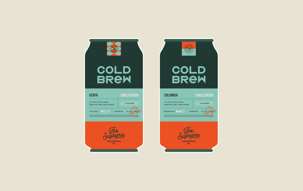
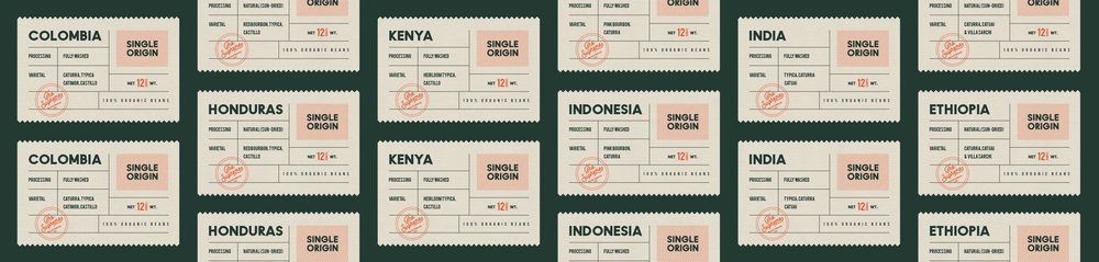
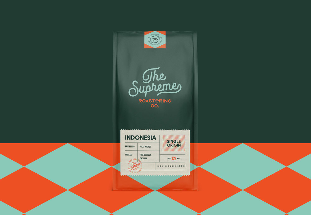
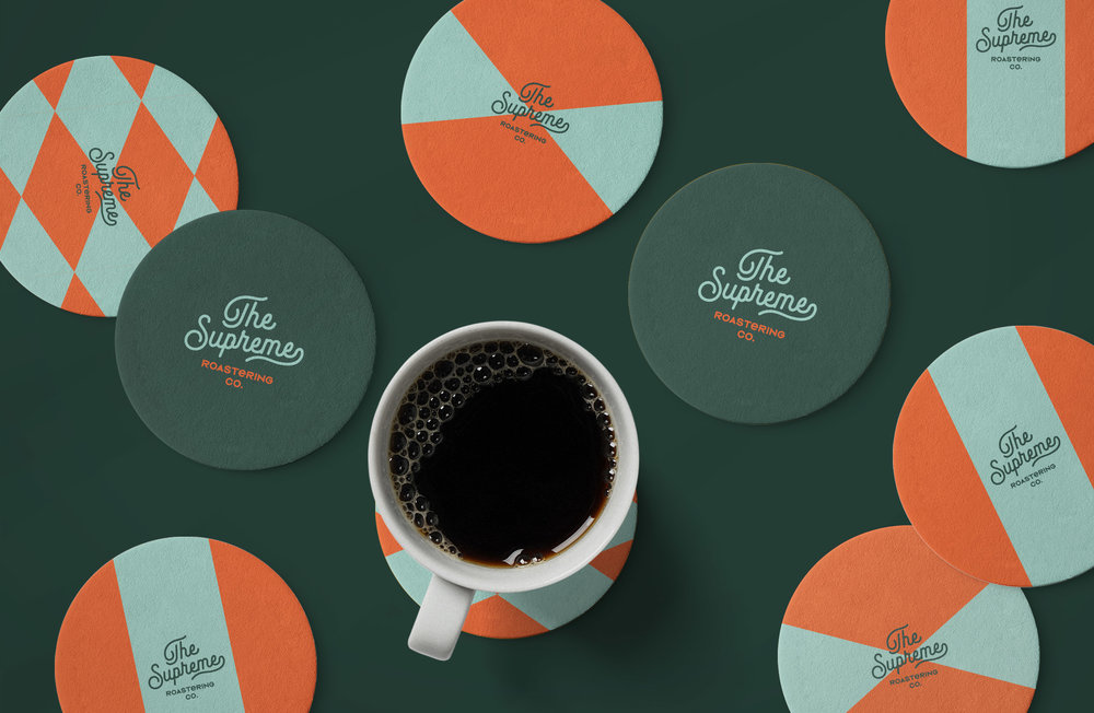
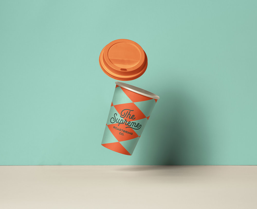
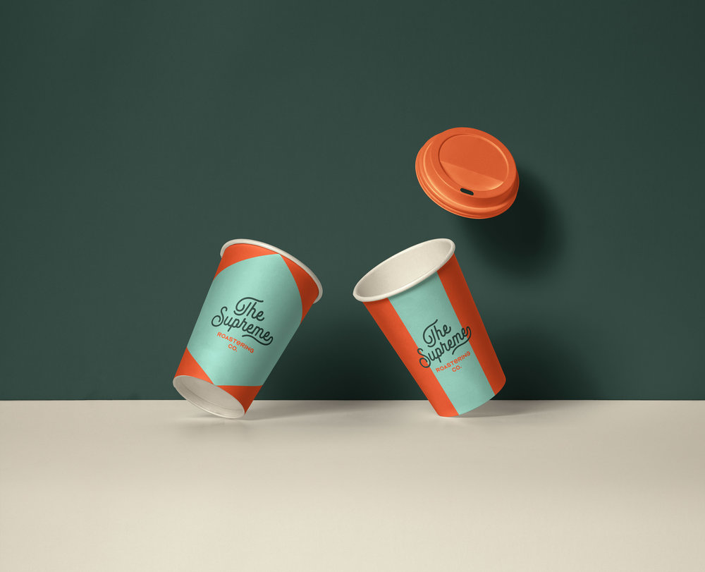
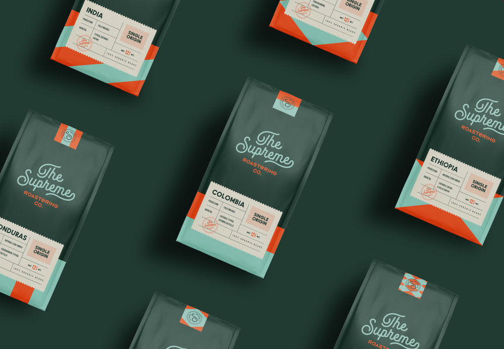
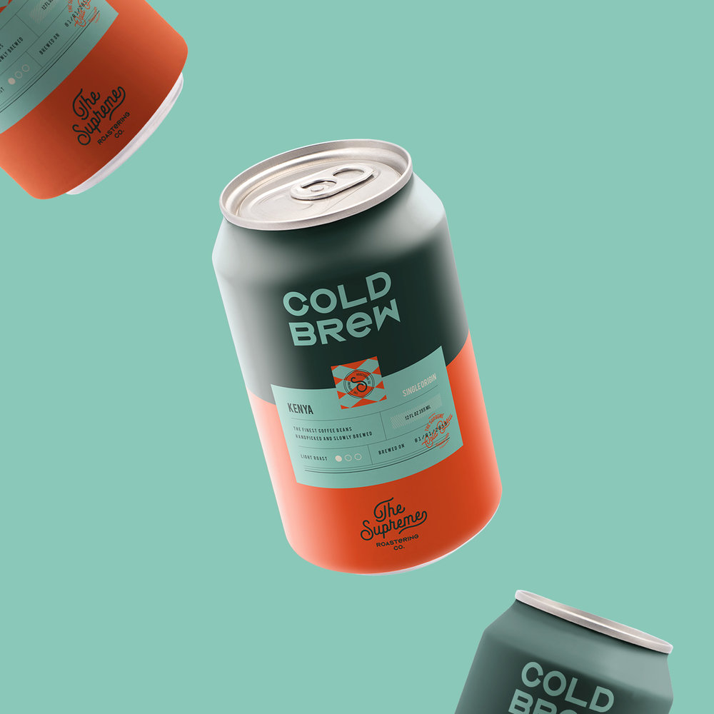
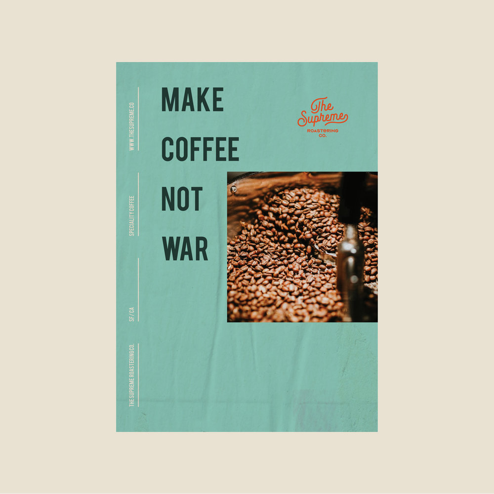
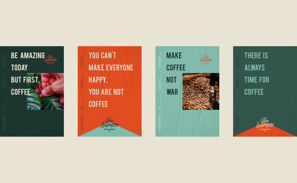
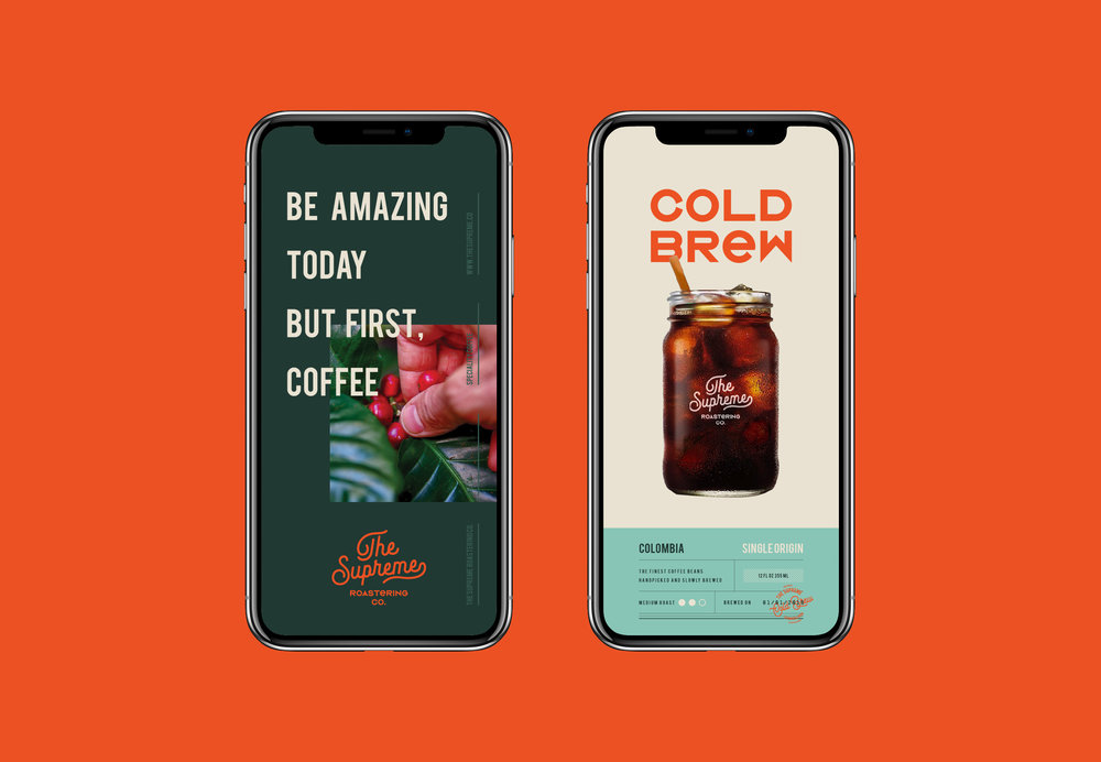
The inspiration for the colors of The Supreme comes from coffee beans. At the same time it was supported by orange tone in order to create contrast.
We also used cream tone and soft colors alternatively.
It is a vintage, simple and minimal branding / packaging project. We hope that you like it!
CREDIT
- Agency/Creative: Marka Network
- Article Title: Branding and Packaging for The Supreme Roastering Co.
- Organisation/Entity: Agency Commercial, Published
- Project Type: Packaging
- Agency/Creative Country: Turkey
- Market Region: Multiple Regions
- Format: Bag, Box, Can, Cup
- Substrate: Plastic, Pulp Carton, Pulp Paper
FEEDBACK
Relevance: Solution/idea in relation to brand, product or service
Implementation: Attention, detailing and finishing of final solution
Presentation: Text, visualisation and quality of the presentation


