Junu is a shop that produces and sells natural fruit juices in Hanoi – Vietnam. With a fun, friendly and energetic style, JUNU offers customers pure fruit juice products along with great experiences when using products from the store.
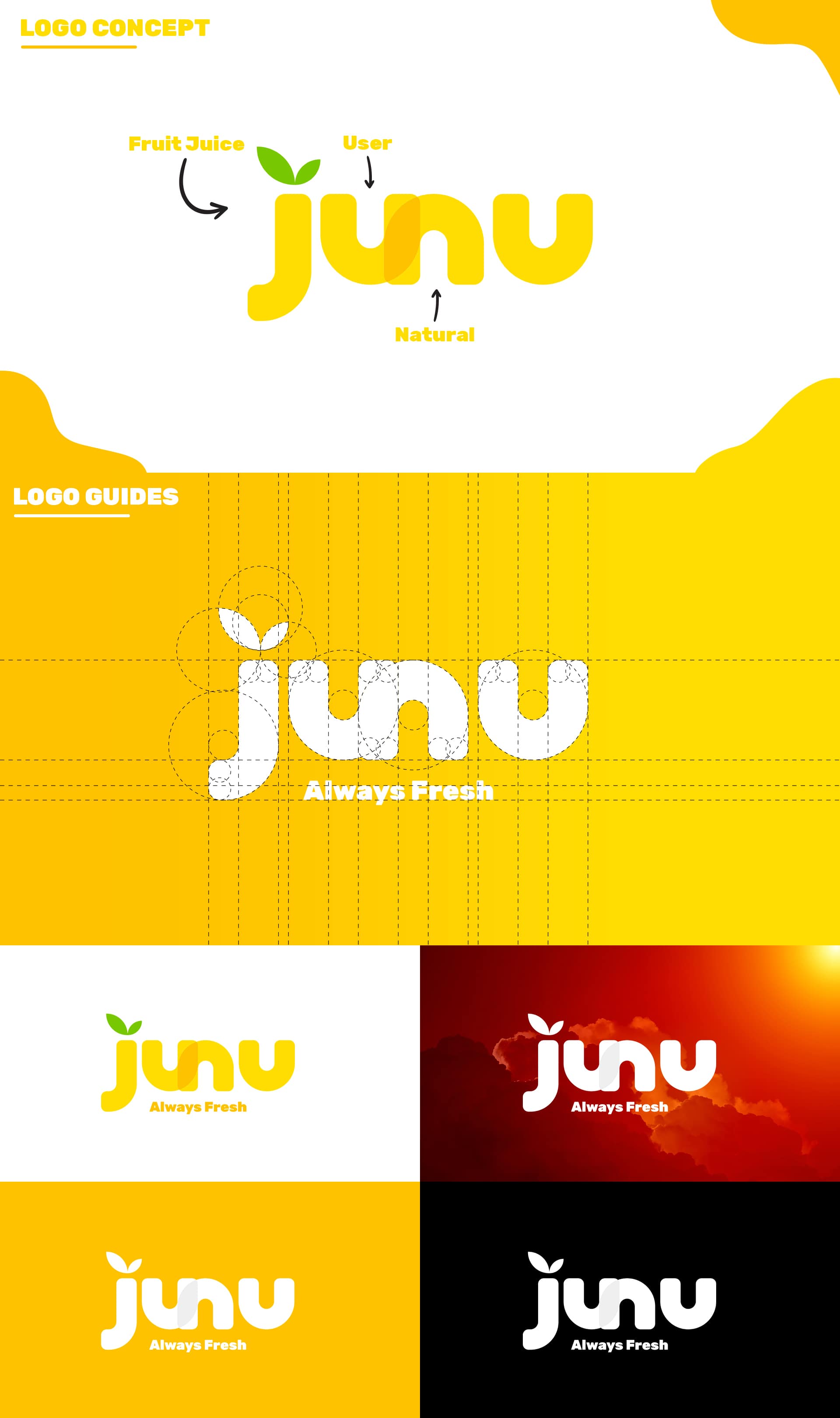
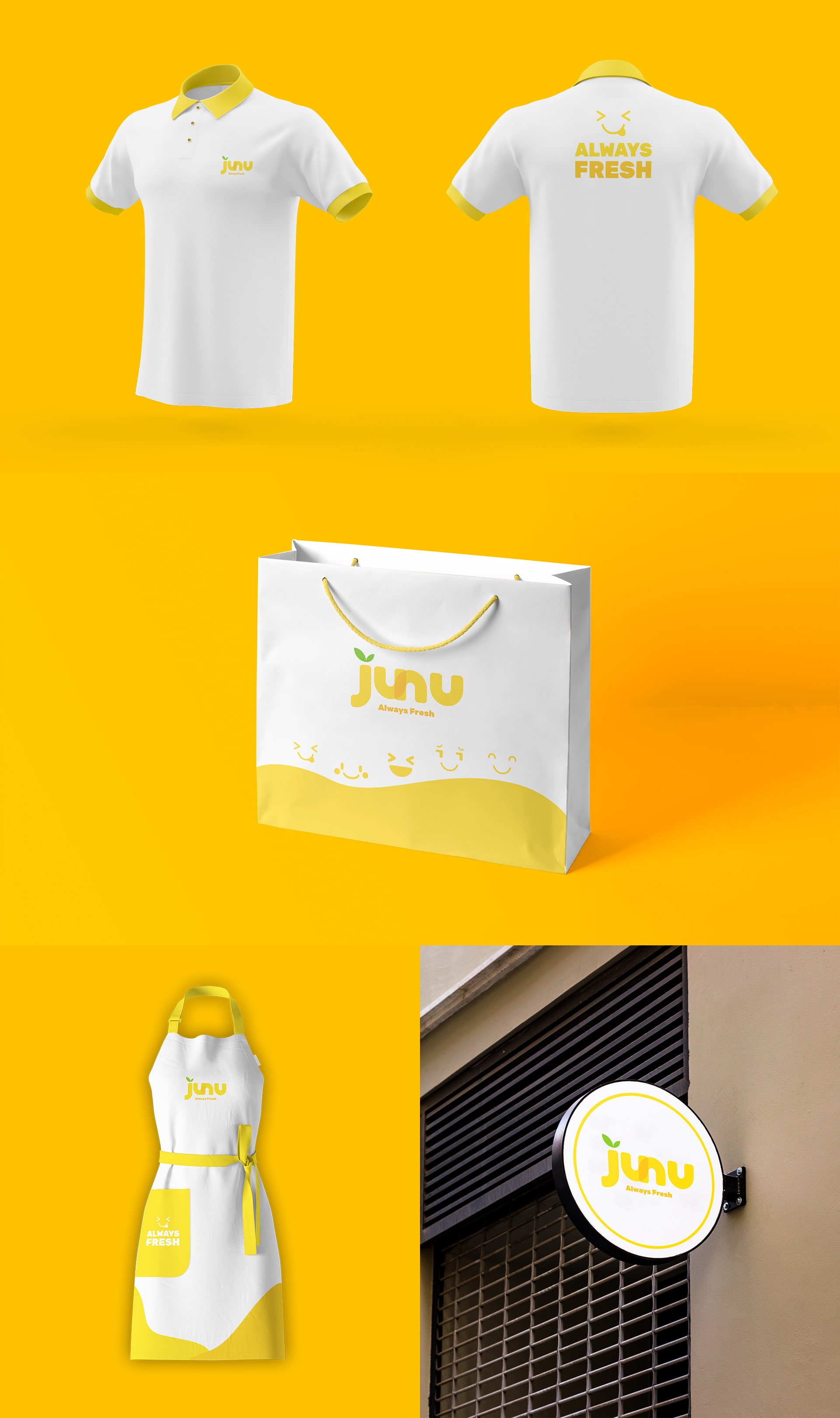
Junu wishes to bring customers healthy natural fruit juice products to improve everyone’s life. Understanding the core values of my brand, I created a logo that is somewhat playful and lovely but also created strength by giving logo bold strokes. The letter “J” was first created to represent the field of the brand, the letters “N” and “U” are connected together to show the connection of the two words “Natural” and “User” to expressing the brand’s desire that natural products will be present in people’s daily lives.
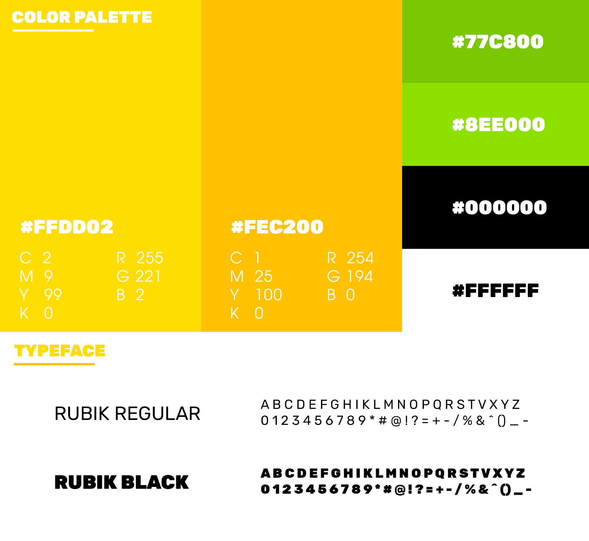
I use yellow and orange as the main colours for the brand to show the dynamism of the brand, yellow is also the colour of the sun, making viewers feel energetic when interacting with the brand identity. brand of Junu. The leaf symbol in the letter “J” has the only green color in the logo to remind viewers of the fruit, which is also the main product of the brand.
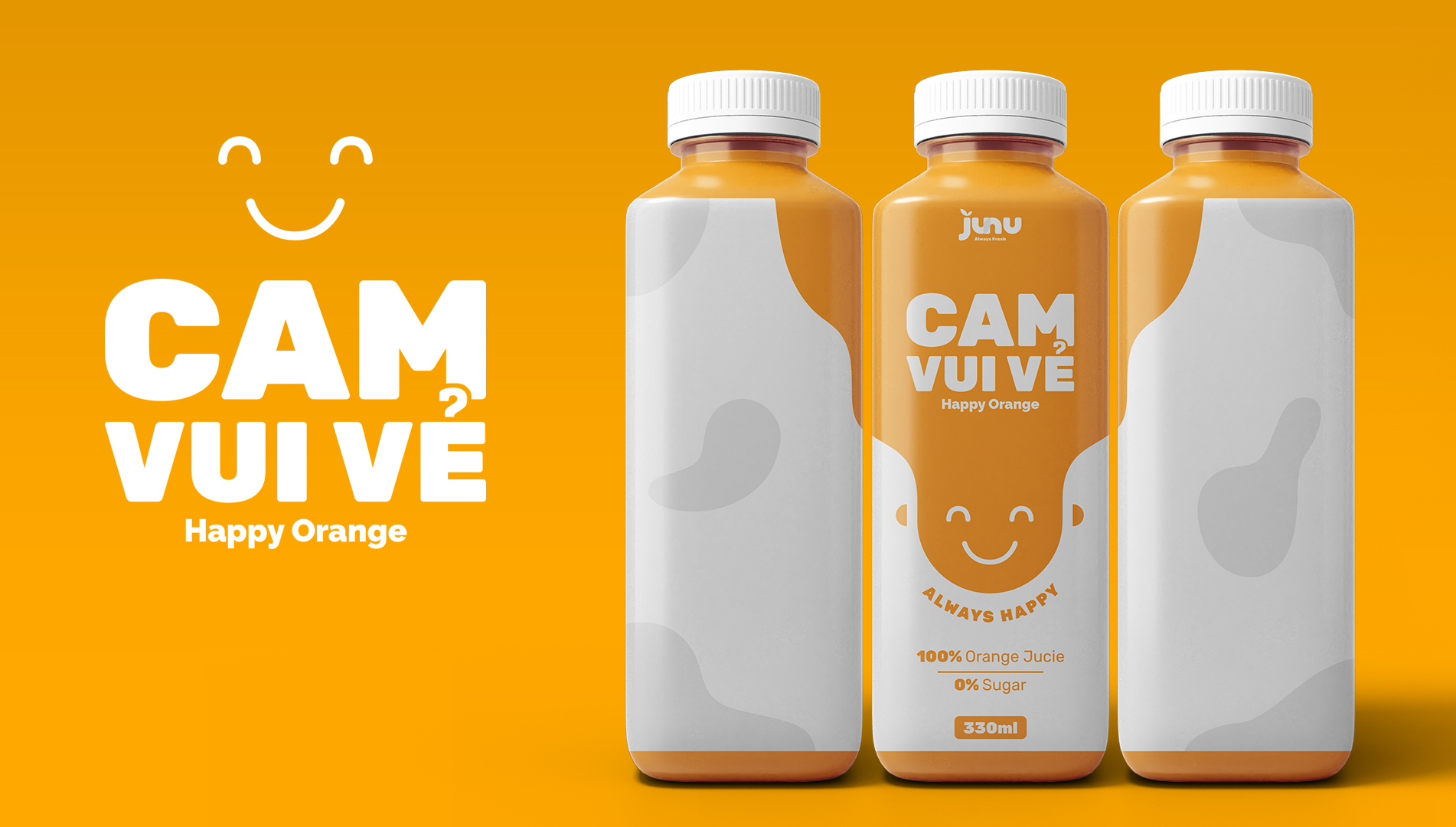
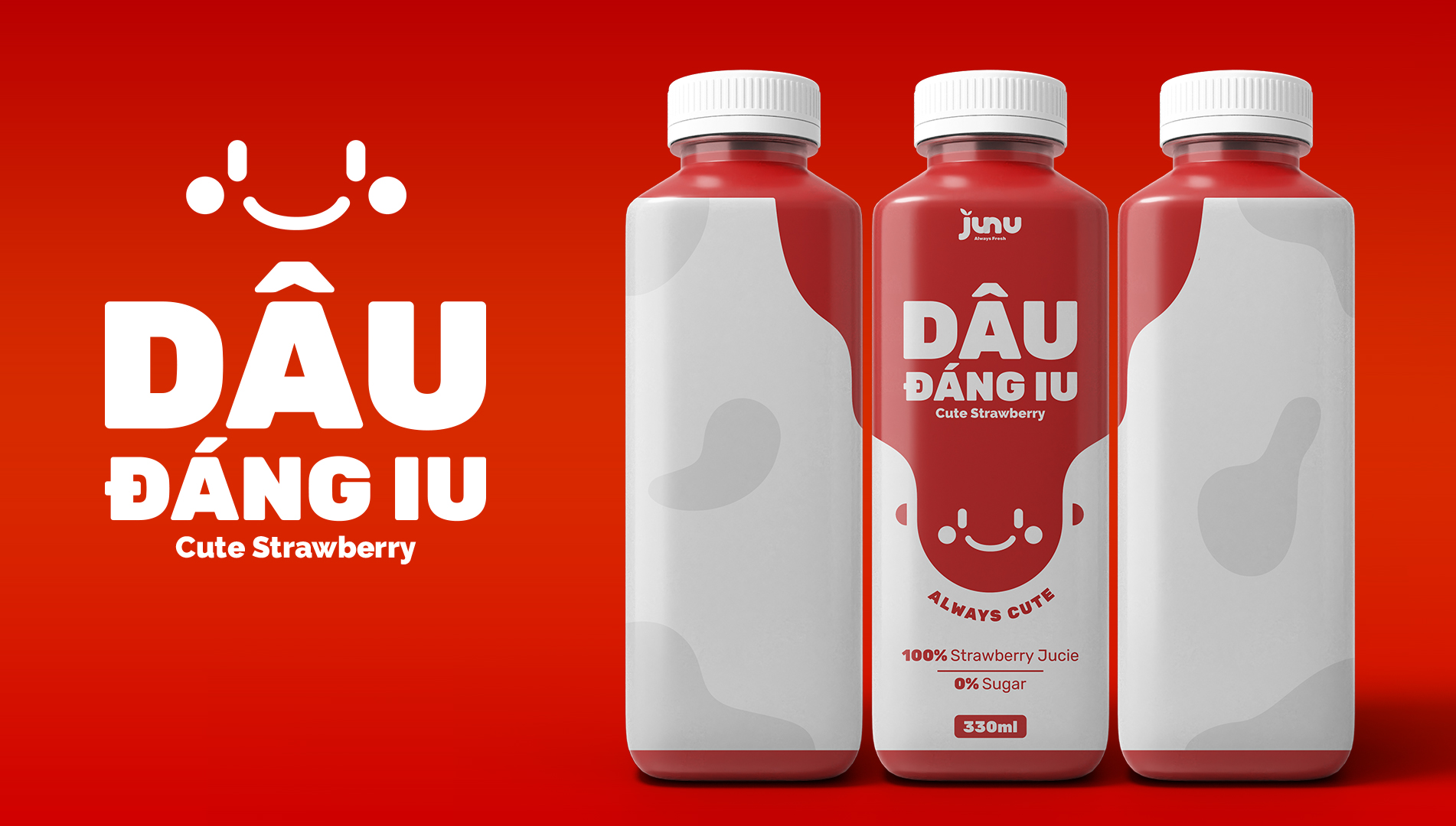
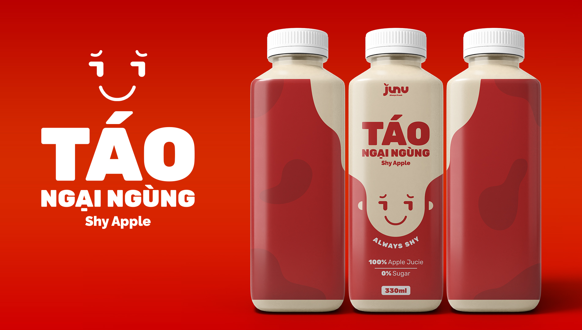
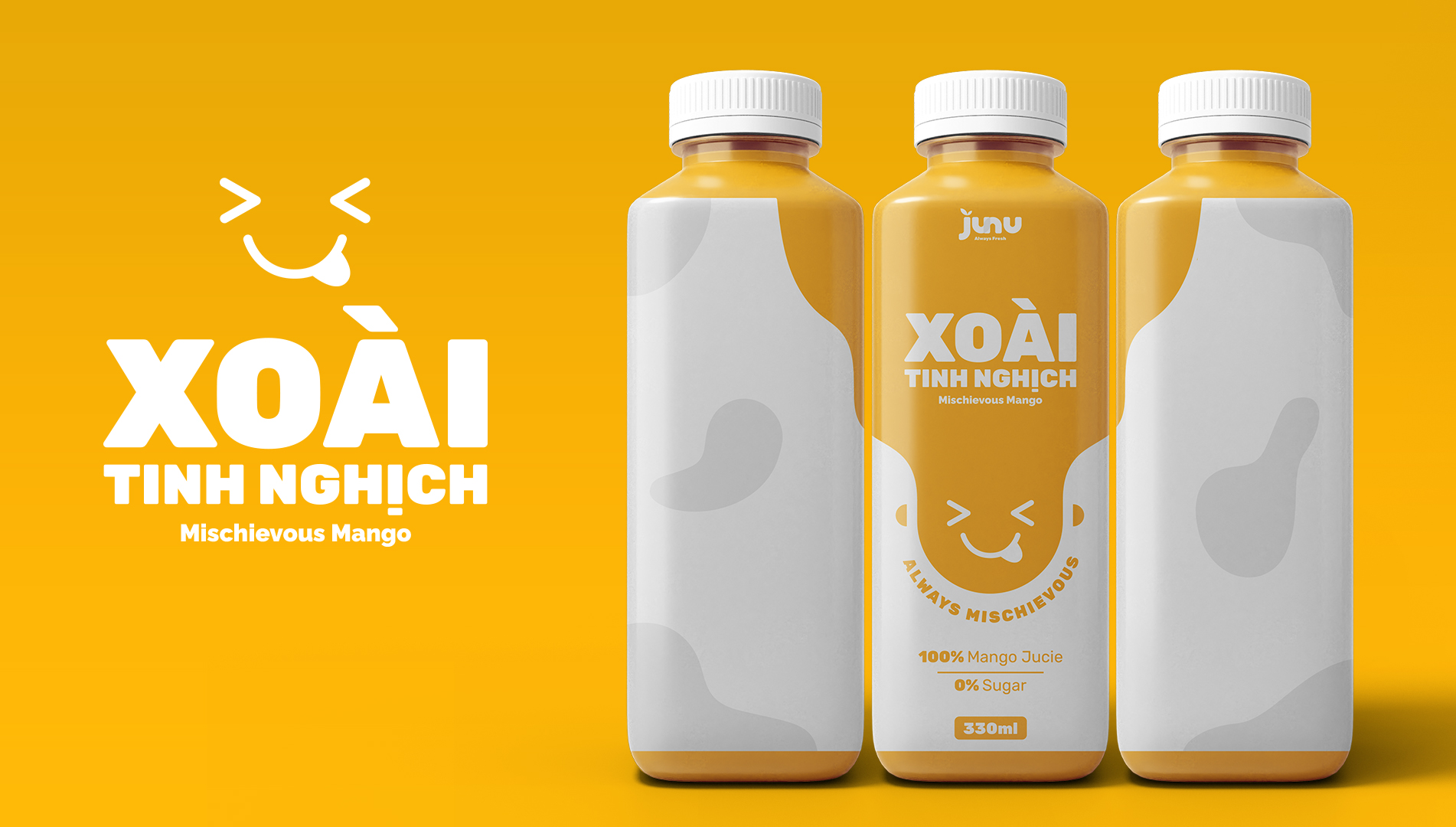
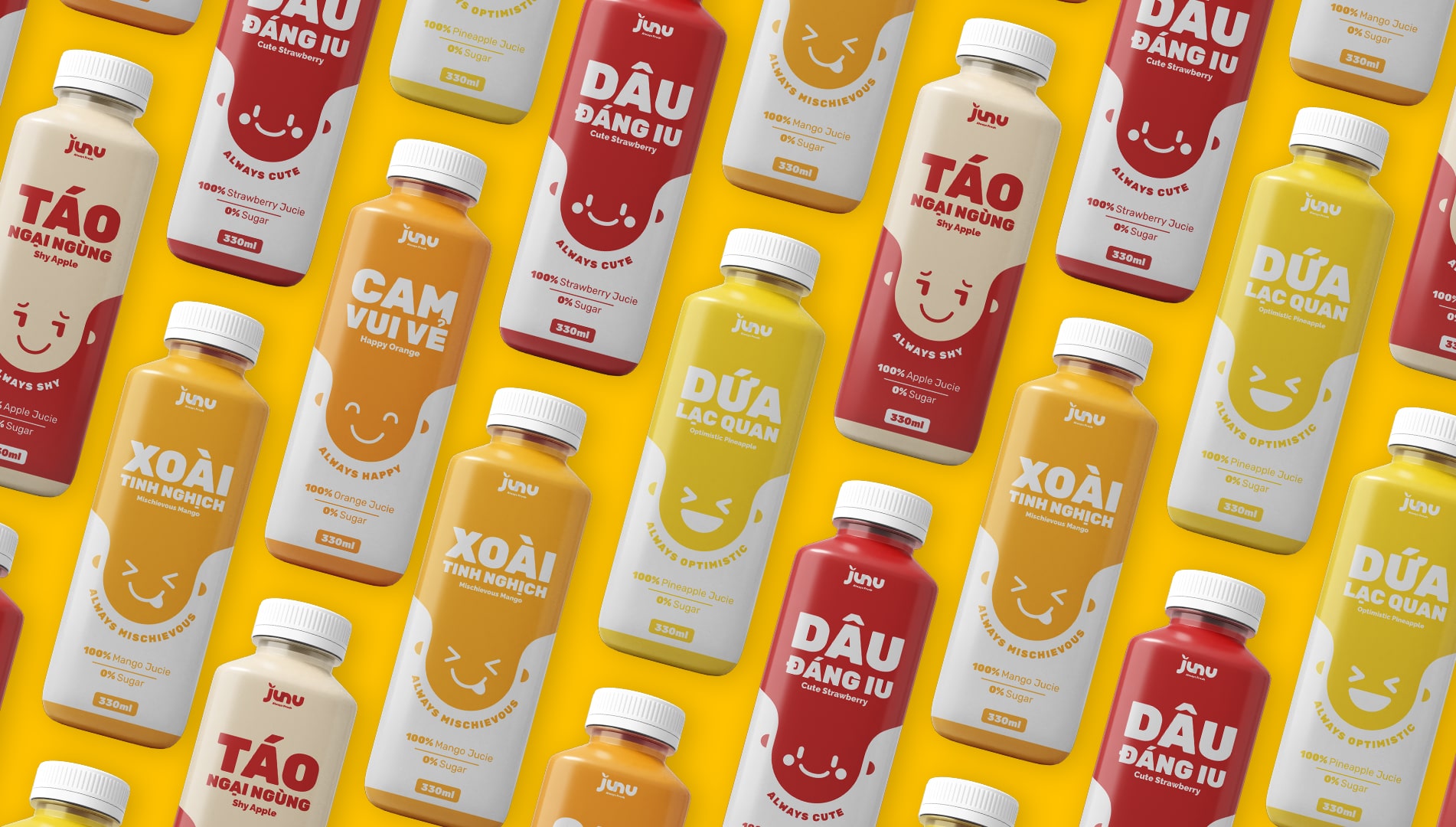
The fruit juice bottles with emotions will help customers feel like interacting with the water bottles. Junu’s packaging is inspired by everyday human emotions to highlight the brand’s personality, using cute patterns to describe emotionsaccompanied by minimalist colors that help users have better access to JUNU’s fruit juice products. There’s nothing better than interacting with what we use, right?
CREDIT
- Agency/Creative: Khac Duc
- Article Title: Branding and Packaging For June by Khac Duc
- Organisation/Entity: Freelance
- Project Type: Packaging
- Project Status: Published
- Agency/Creative Country: Vietnam
- Agency/Creative City: Hanoi
- Market Region: Asia
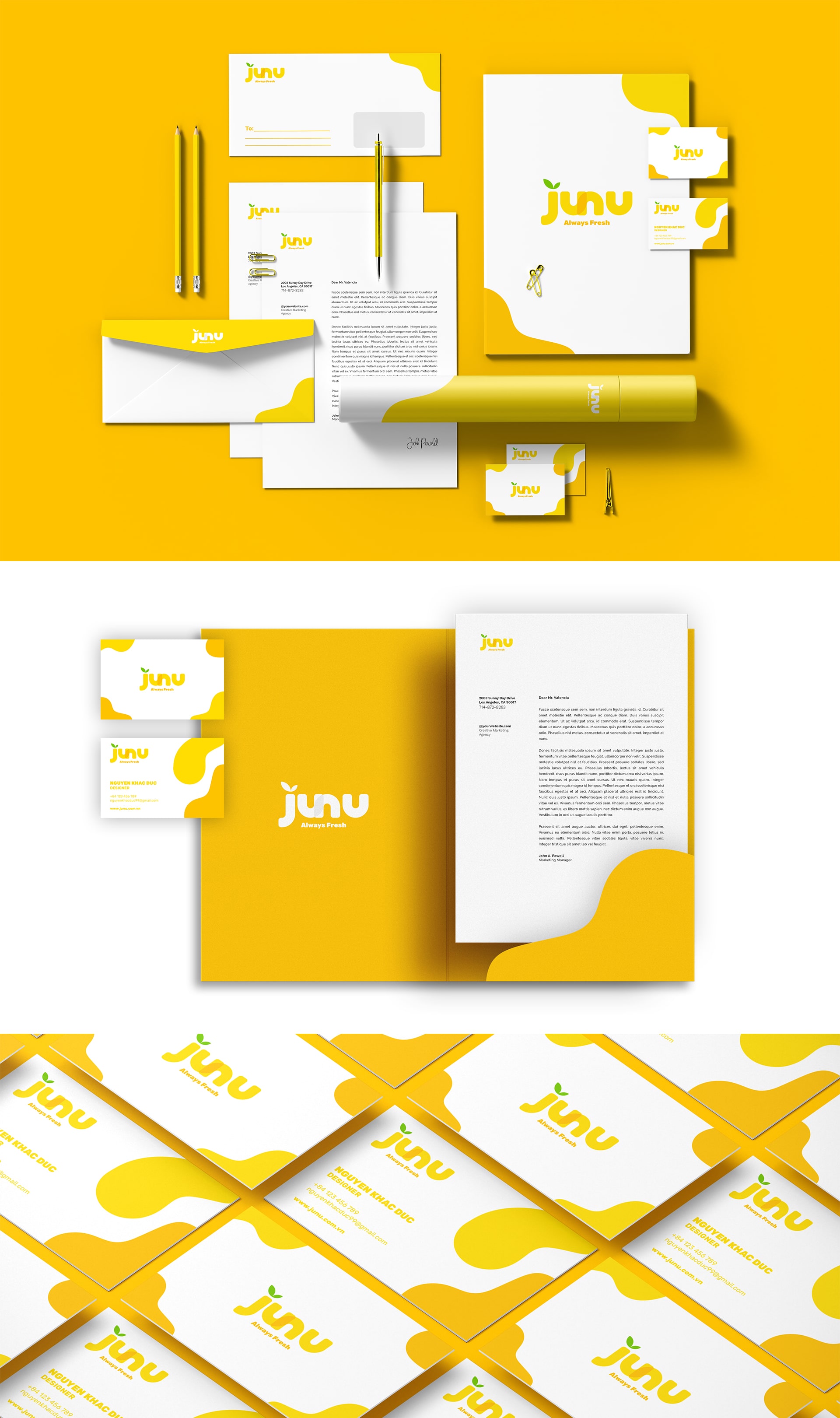
- Project Deliverables: Brand Design, Brand Identity, Packaging Design
- Format: Bottle
- Substrate: Plastic
- Industry: Food/Beverage
- Keywords: JUNU
-
Credits:
Designer: Khac Duc


