In a world where health and vitality are paramount, Core stands out as a pioneering force in the realm of medical supplements. Dedicated to transforming the way we approach well-being, Core has set its sights on a unique mission – catering to the dynamic needs of the young generation.
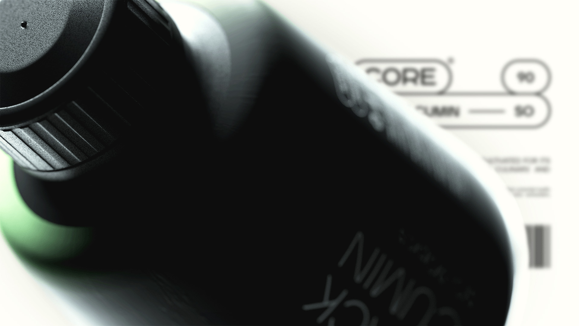
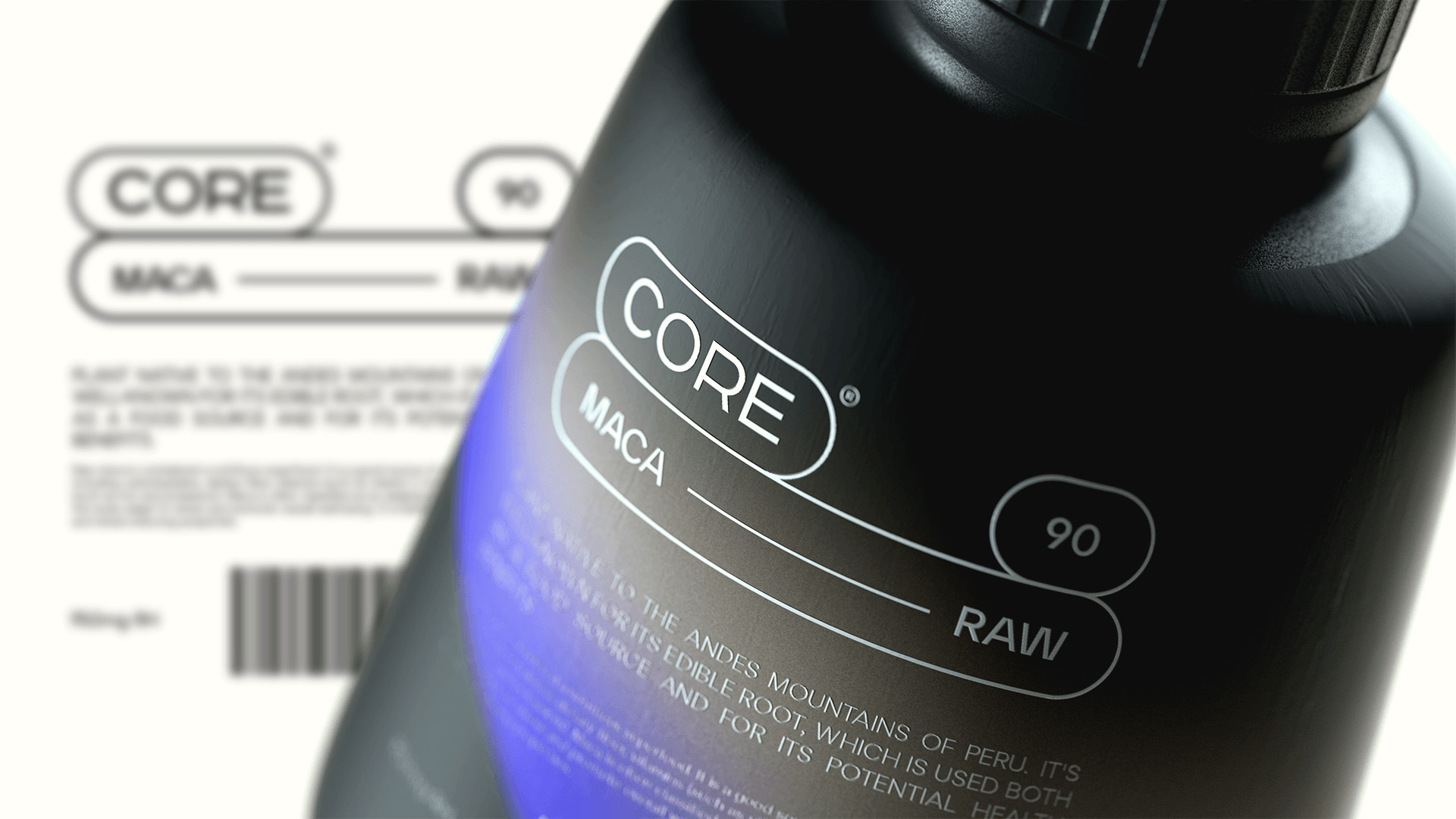
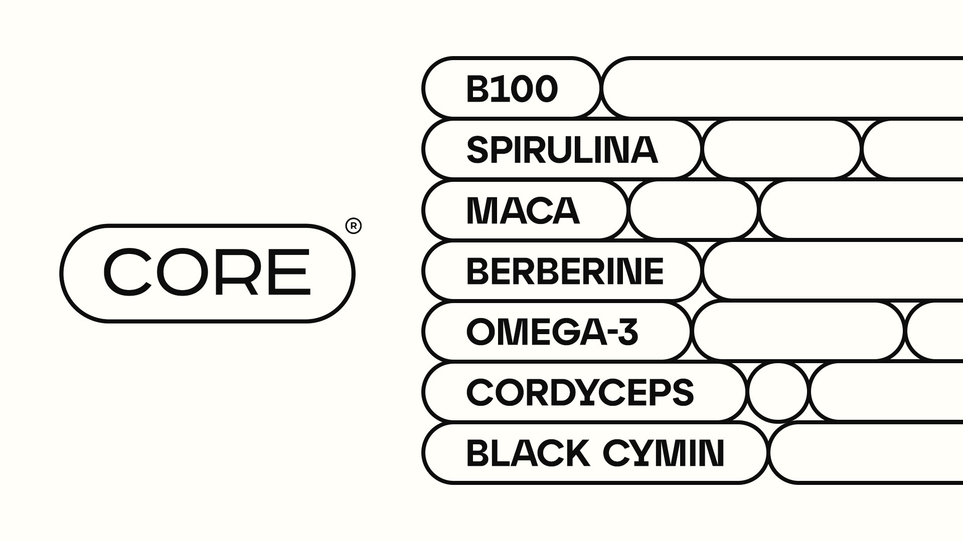
At the heart of Core ‘s philosophy is a commitment to creating medical supplements that resonate with the vibrancy and energy of youth. In a market saturated with conventional and clinical designs, Core boldly steps into the limelight with atypical packaging solutions that redefine the visual language of wellness products.
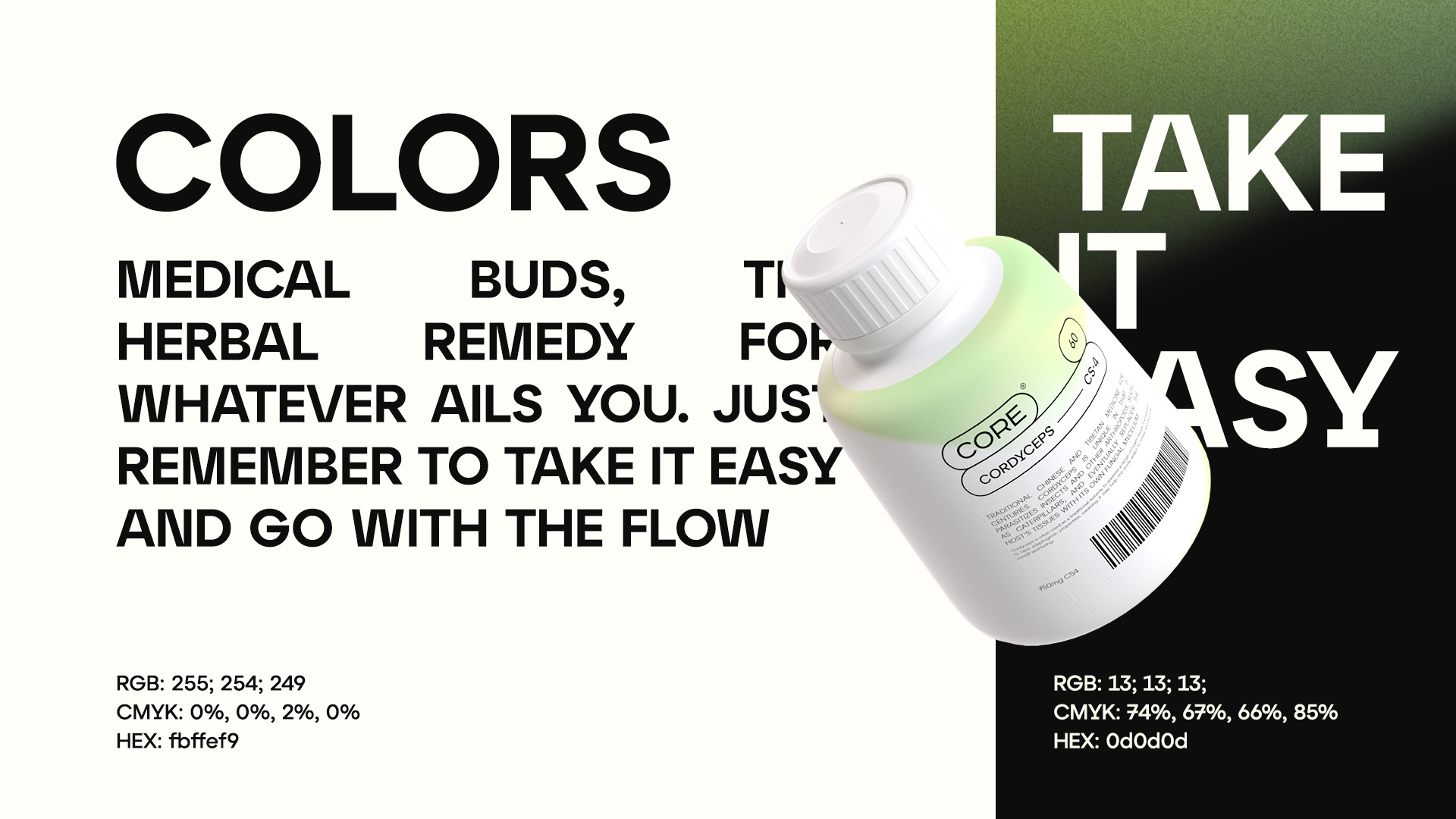
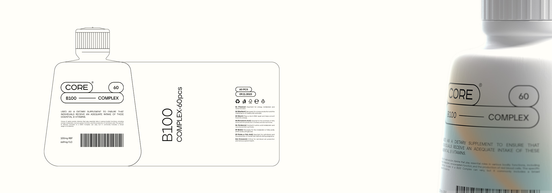
Core’s packaging design is a visual feast, carefully curated to capture the attention of the young, dynamic audience it targets. The company embraces a distinctive approach with a two-color palette that serves as the foundation for its product packaging. The chosen colors reflect the brand’s identity, embodying energy, positivity, and a forward-thinking attitude.
The primary colors, often vibrant and bold, create a striking contrast that immediately draws the eye. This deliberate choice not only ensures visibility on the shelves but also establishes a strong brand presence. The duality of the color scheme represents the balance Core seeks to achieve between science-backed formulations and the vitality of youth.
However, what truly sets Core ‘s packaging apart is the ingenious use of gradients. Each product line features a variety of gradients that seamlessly blend the two main colors, creating a spectrum of hues that mirrors the diversity of the products within. These gradients not only add a dynamic visual element but also convey a sense of fluidity, suggesting adaptability and innovation.
The gradients on the packaging are purposefully chosen to align with the nature of the specific supplement. For instance, a product promoting energy and focus might feature gradients that transition from invigorating yellows to deep, focused blues. On the other hand, a relaxation or sleep aid product could showcase gradients that shift from calming greens to soothing purples.

CREDIT
- Agency/Creative: Yernaz Ramazanov
- Article Title: Branding and Packaging for Core Supplement Brand Designed by Yernaz Ramazanov
- Organisation/Entity: Freelance
- Project Type: Packaging
- Project Status: Non Published
- Agency/Creative Country: Kazakhstan
- Agency/Creative City: Almaty
- Market Region: Europe, Middle East
- Project Deliverables: 3D Art, Art Direction, Brand Identity, Brand Naming, Graphic Design, Packaging Design
- Format: Bottle, Jar
- Industry: Health Care
- Keywords: branding, supplement, health, care, bottle, packaging, madicine, gradient
-
Credits:
Art Director/Brand Designer: Yernaz Ramazanov


