


When Poetry Inspires Design or How to Create a Label Which is Different Every Time, and Affects Every Person Differently
Our clients came to us with a request to brand their new product, a craft gin, wanting something completely different: something to remain instilled in the people’s memory and something that will make the user look at the label every time even though he held it in his hands already. We all like clients with impossible requests – because at the verge of impossible and possible creativity is born and imagination lives.
Out task was to elaborate a brand story – from the beginning to the label. After multiple years spent at the capital, our clients decided to open a distillery in Vrgorac, their small home town which had given Croatia one of its most popular and powerful poets – Tin Ujević – known for his constant battle with traditional poetry and bringing something completely new. For this reason we chose him as an ideal inspiration for this project.
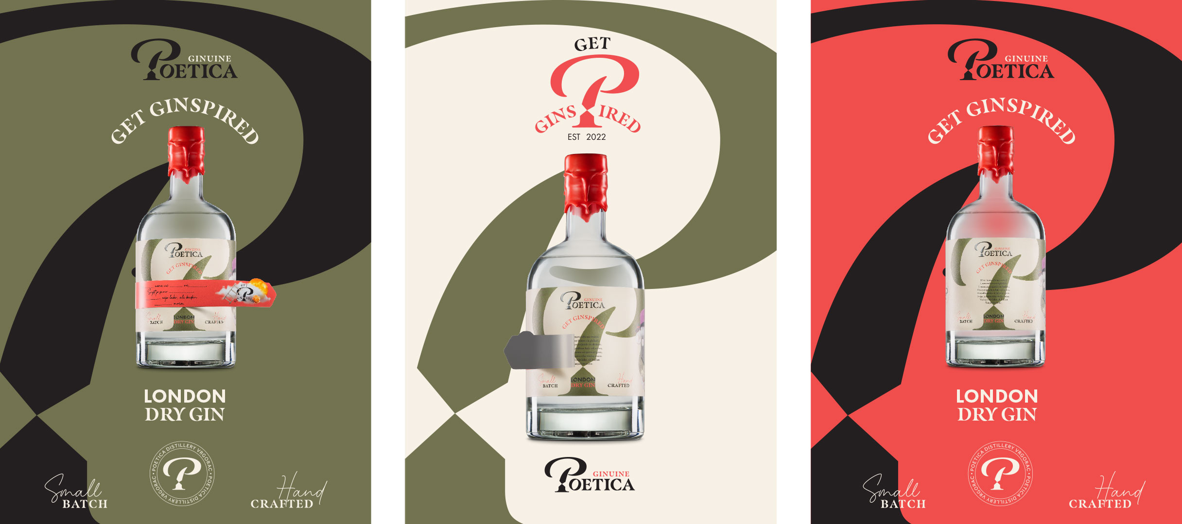
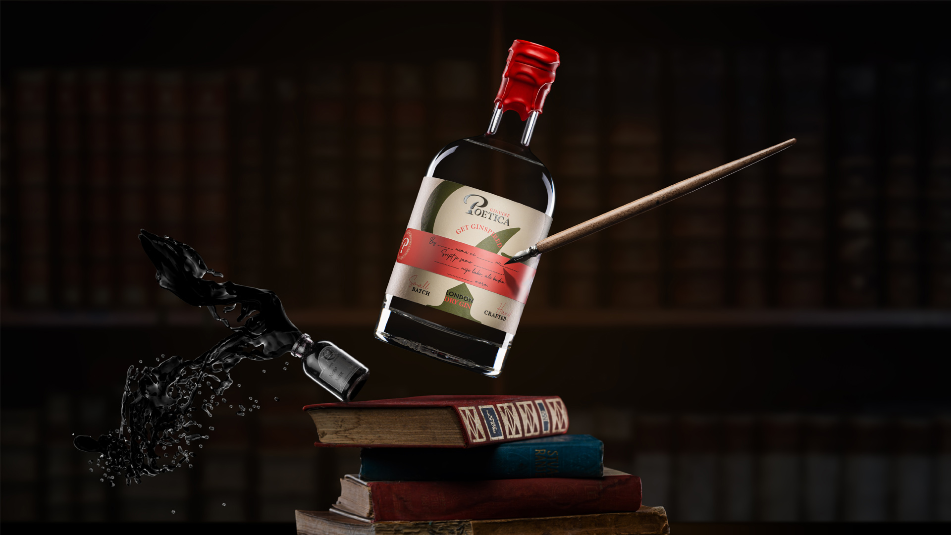
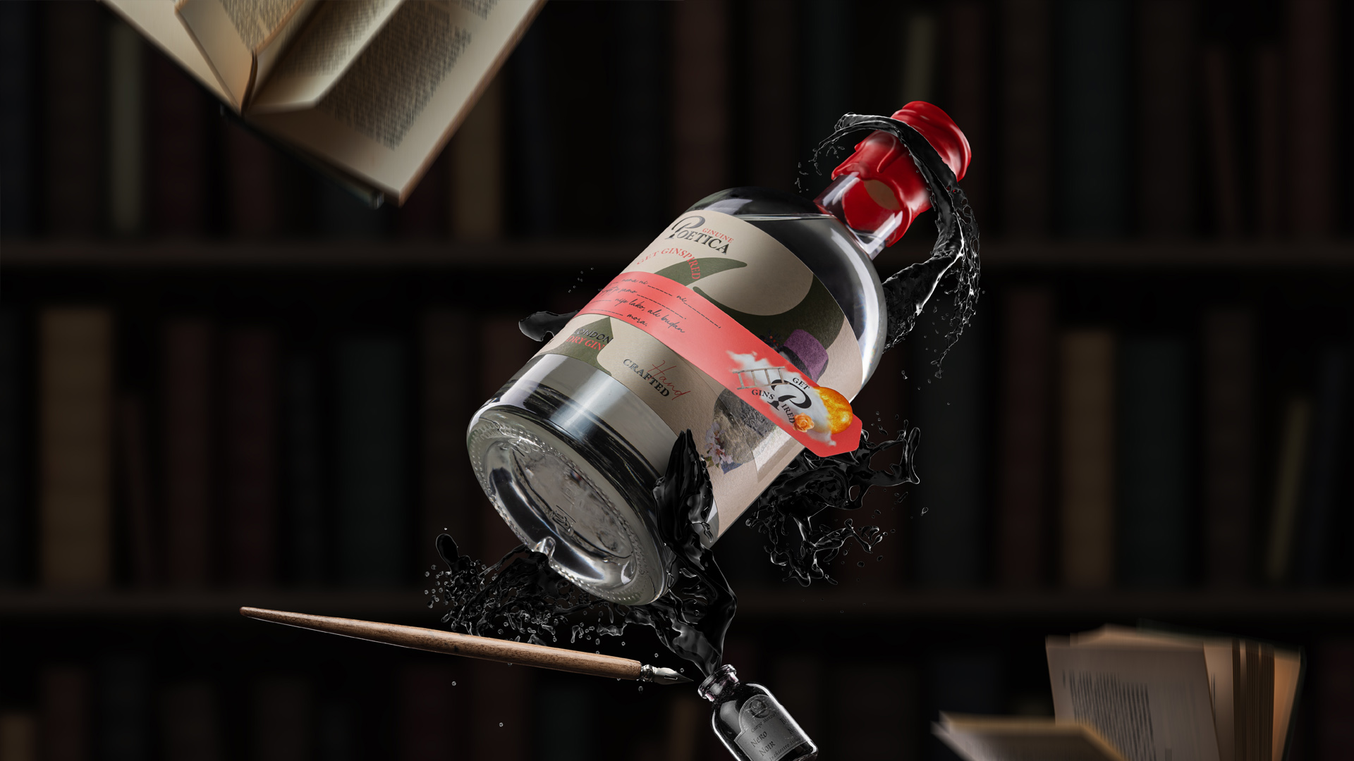
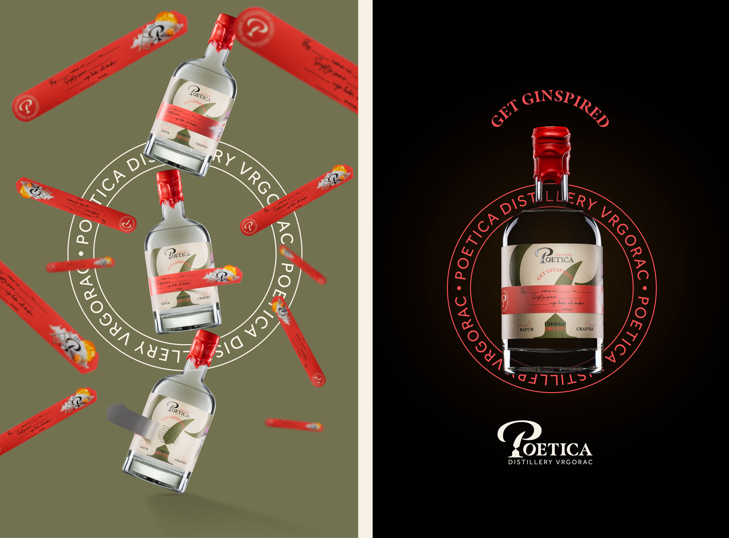
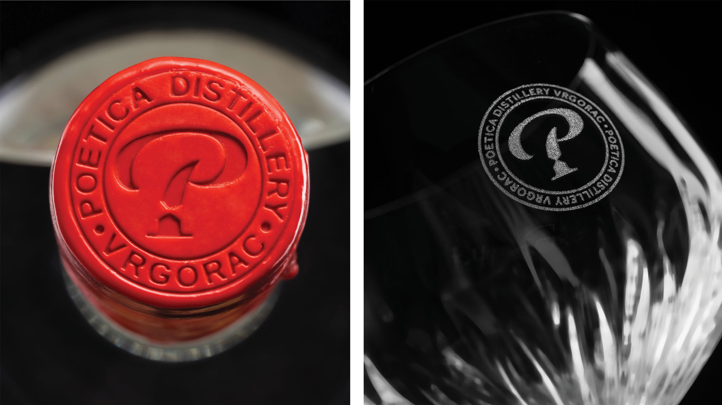
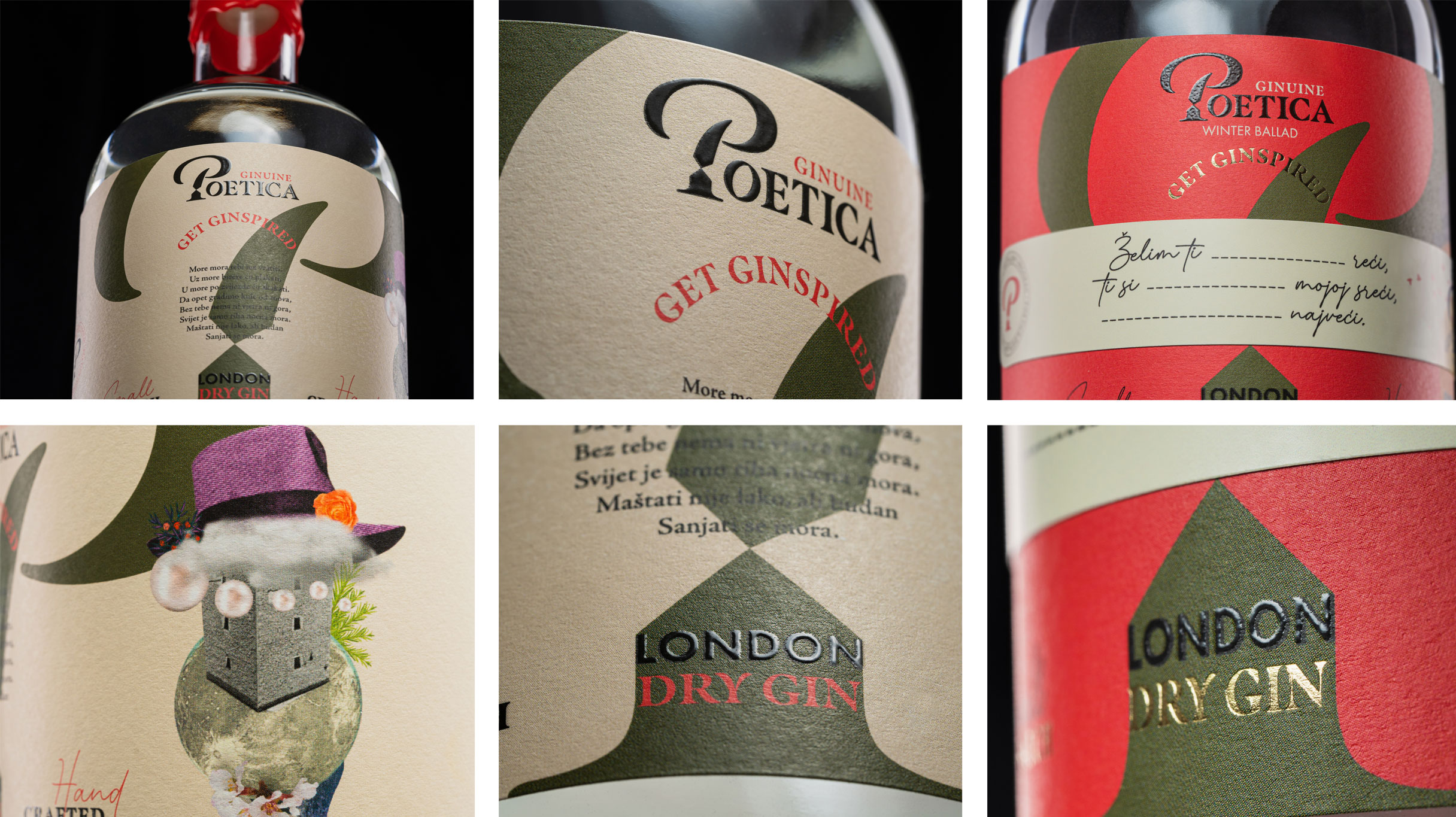
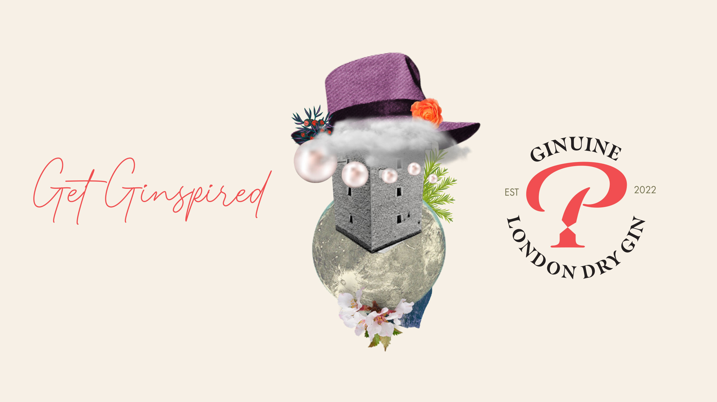
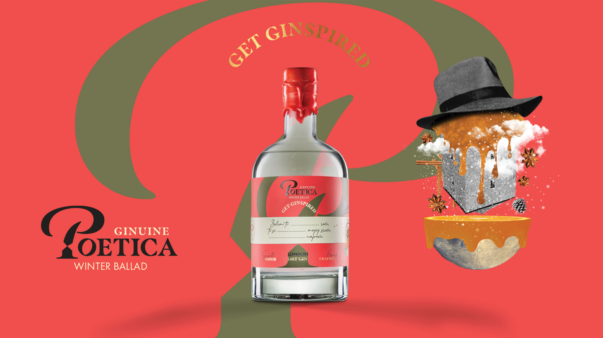
We named the brand Poetica standing for the art of poetry, just as craft stands for the art of gin production. Visual identity was enriched with the symbol of writing – the ink which itself was created from the symbol – the tower where Tin was born.
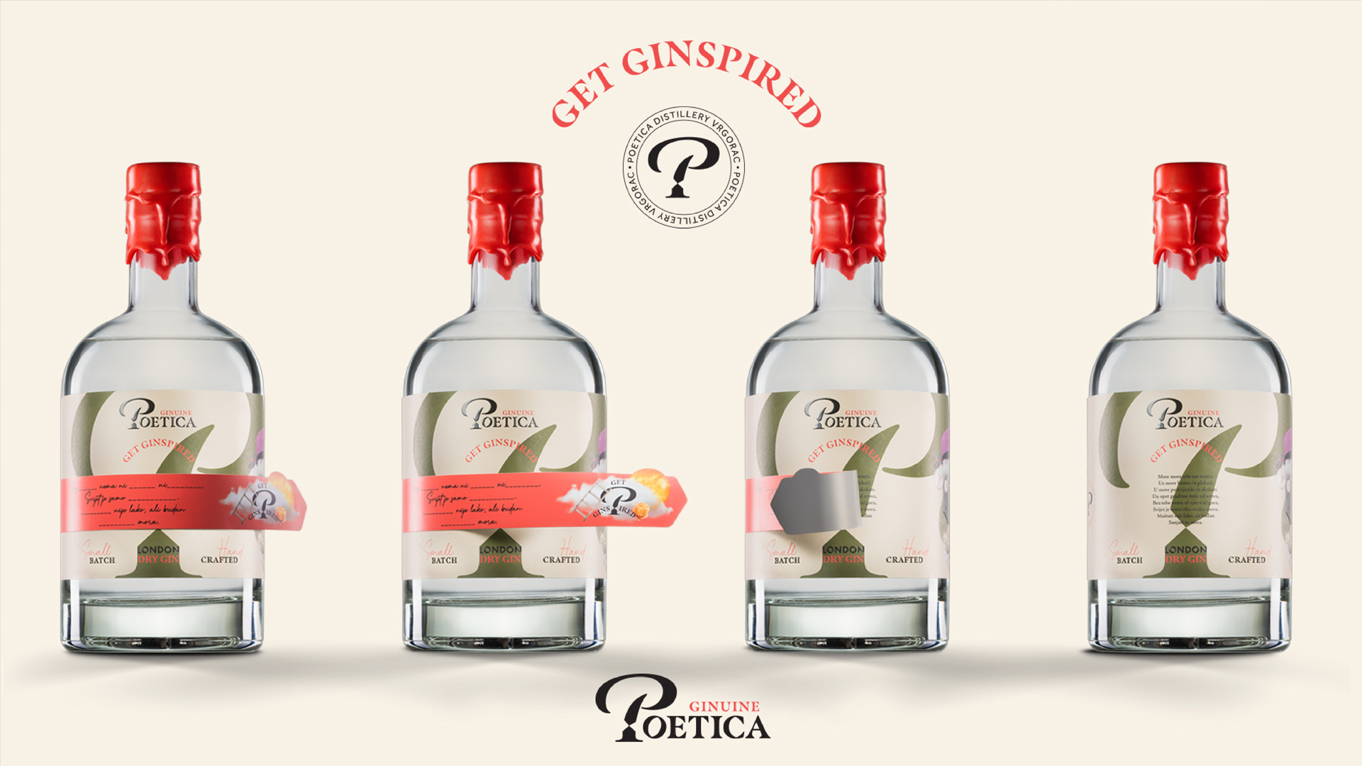
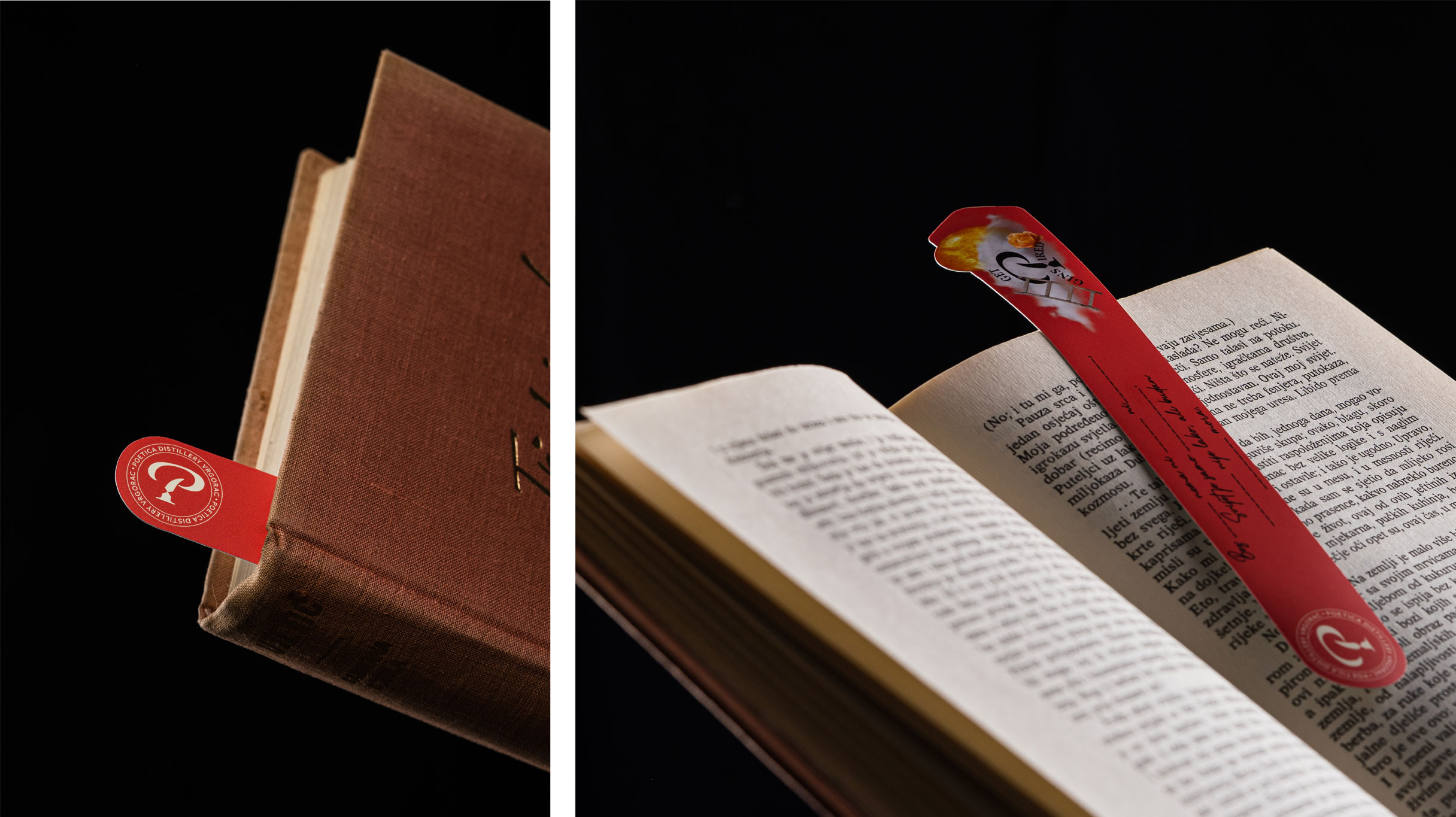
To remain long instilled in the memory of the user was our first task. To resolve it successfully we added to the label an unavoidable tool for every reader – a bookmark. This way it became sustainable; you peel off the bookmark and Poetica is suddenly between the pages of your favorite book. Our second task was to connect the users with the brand making them the creators of their own poetry. Verses were added to the label, and blank fields to the bookmark creating an opportunity for the users to add their own words and create a personal poetry for a person they hold dear. This way we achieved an important goal – every label is different and whenever you pick up a bottle of Poetica gin – you will read the label too.
Every edition of gin brings new lyrics. So the promotion of gin is also a promotion of poetry – and if you need ginspiration, you can always take a sip of this premium craft gin first.
CREDIT
- Agency/Creative: Fabula Design & Marketing Agency
- Article Title: Branding and Packaging Design for Vrgorac
- Organisation/Entity: Agency
- Project Type: Packaging
- Project Status: Published
- Agency/Creative Country: Croatia
- Agency/Creative City: Fabula Design & Marketing Agency
- Market Region: Europe
- Project Deliverables: Art Direction, Brand Design, Brand Identity, Brand Naming, Creative Direction, Graphic Design, Packaging Design, Pattern Design, Photography
- Format: Bottle
- Substrate: Glass Bottle
- Industry: Food/Beverage
- Keywords: gin, label design, bookmark, poetry
-
Credits:
Creative director / Designer: Marko Perožić
Copywriter / Creative strategist: Tena Ružić
Photographer: Filip Gržinčić


