Our client had their own fantasy: democratize orgasms and happiness by creating a universal sexual products brand for everyone and all groups. A brand capable of causing smiles and not just orgasms, contributing to normalizing and positively portraying the use of these types of erotic toys, freeing itself from its negative image, and endowing itself with vital and inspiring values.
So, getting rid of the embarrassment, guilt and putting on a good dose of naturality in its place was our goal. After all, humans masturbate more often than they fill up their gas tanks.
After conducting a market and trend analysis, we realized that being “sex-positive” is now in fashion, everyone has and talks about sexual toys because, you can buy them wherever you please, sex is health, masturbation is self-love, and more so in a country like Spain, which according to surveys seems to give much more attention to the topic than others. All of this left us with extremely fertile ground for the development of our brand. Now all we had to do was create the naming, its verbal universe, and the brand identity, and later on a corner of our own for the leading perfumery chain in Spain: Perfumerías Primor.
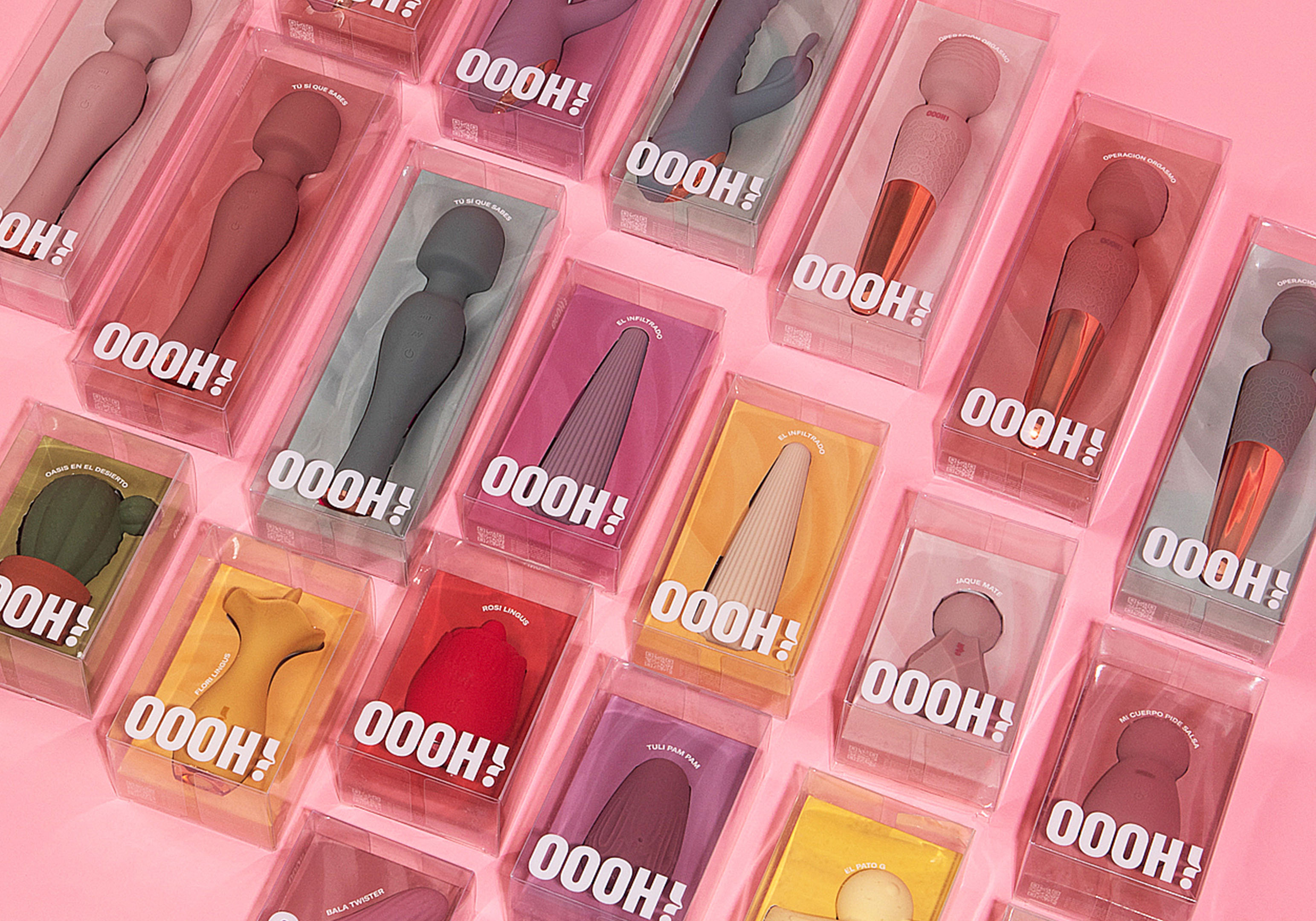
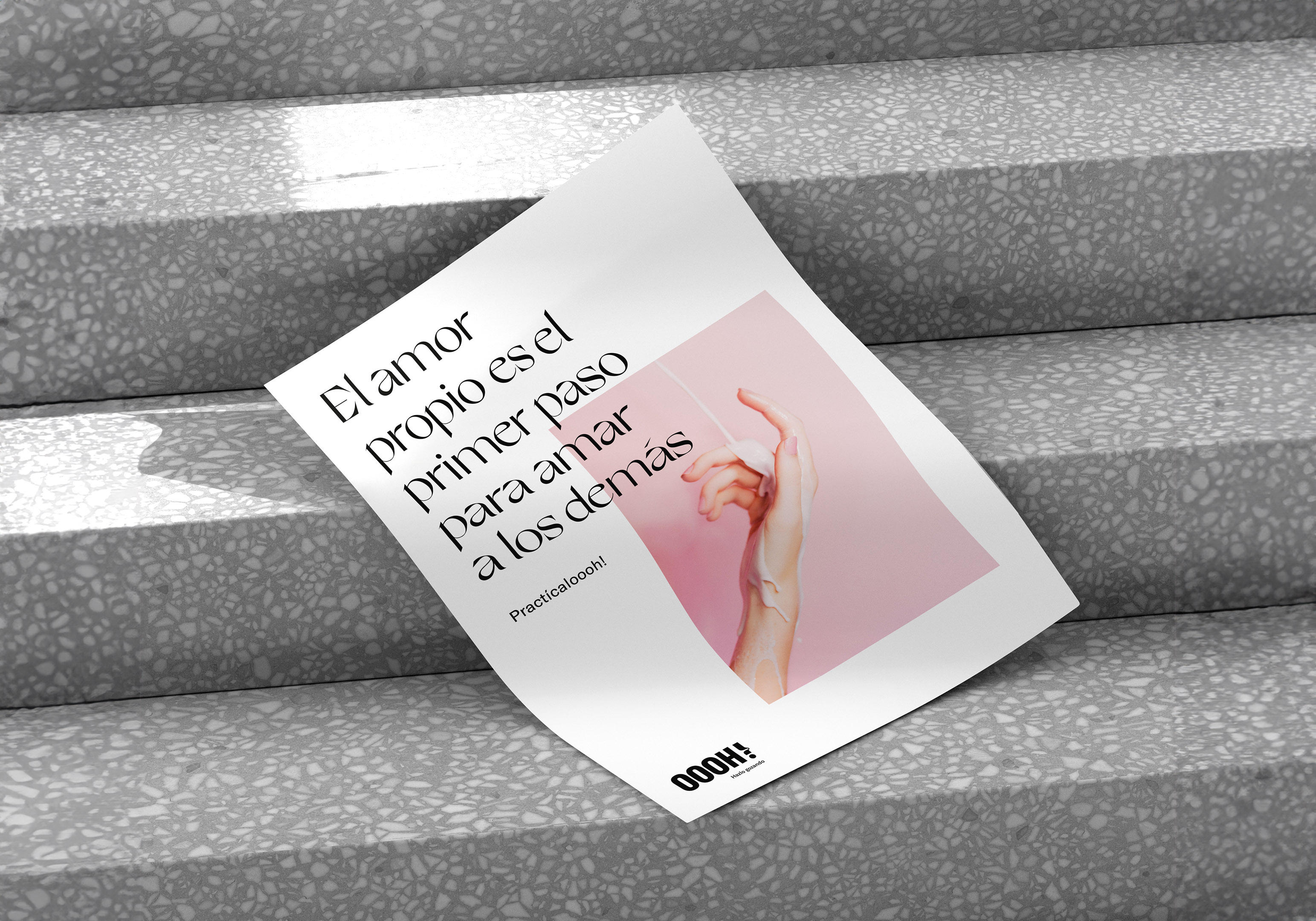
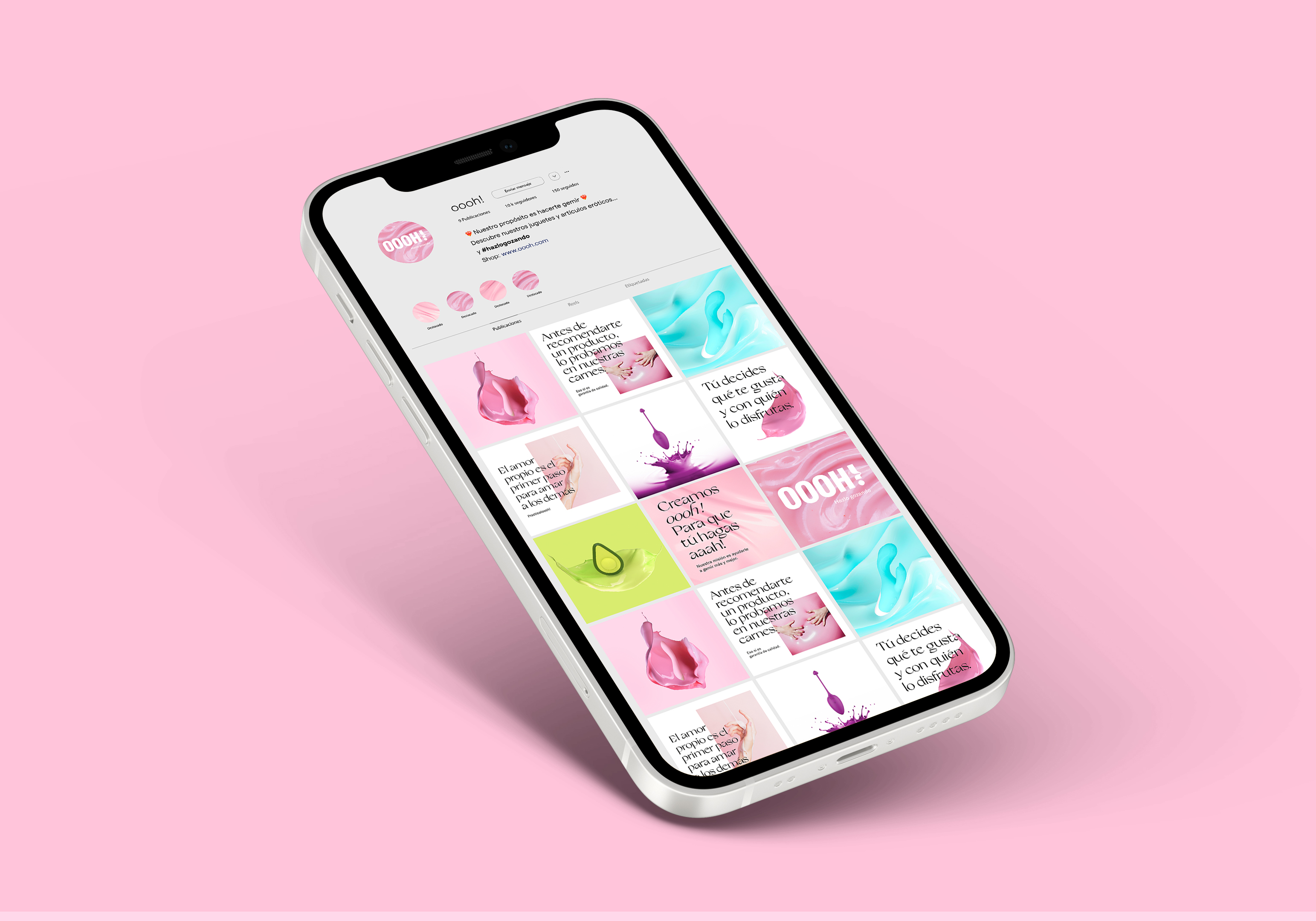
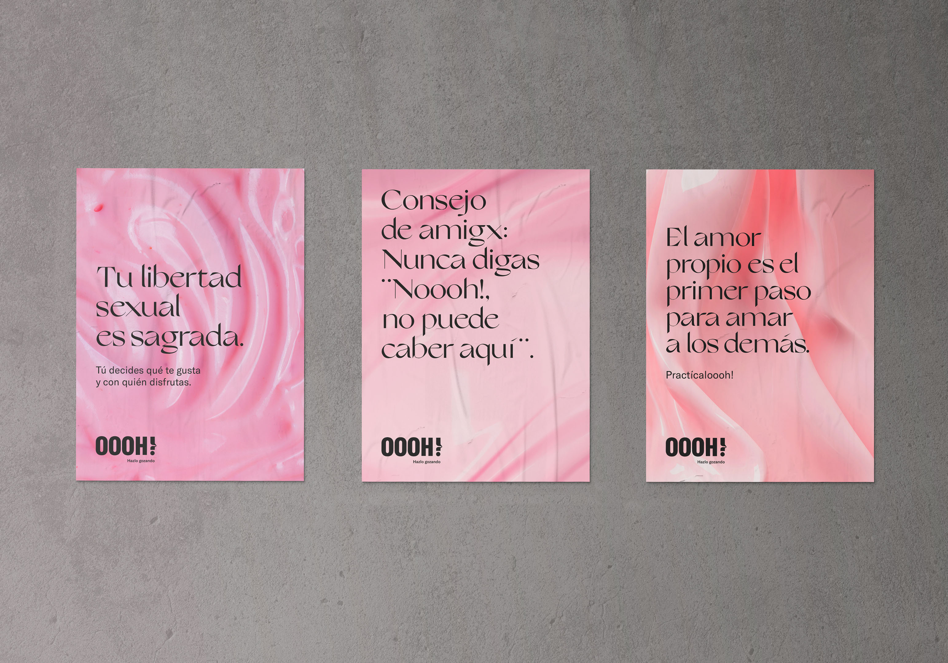
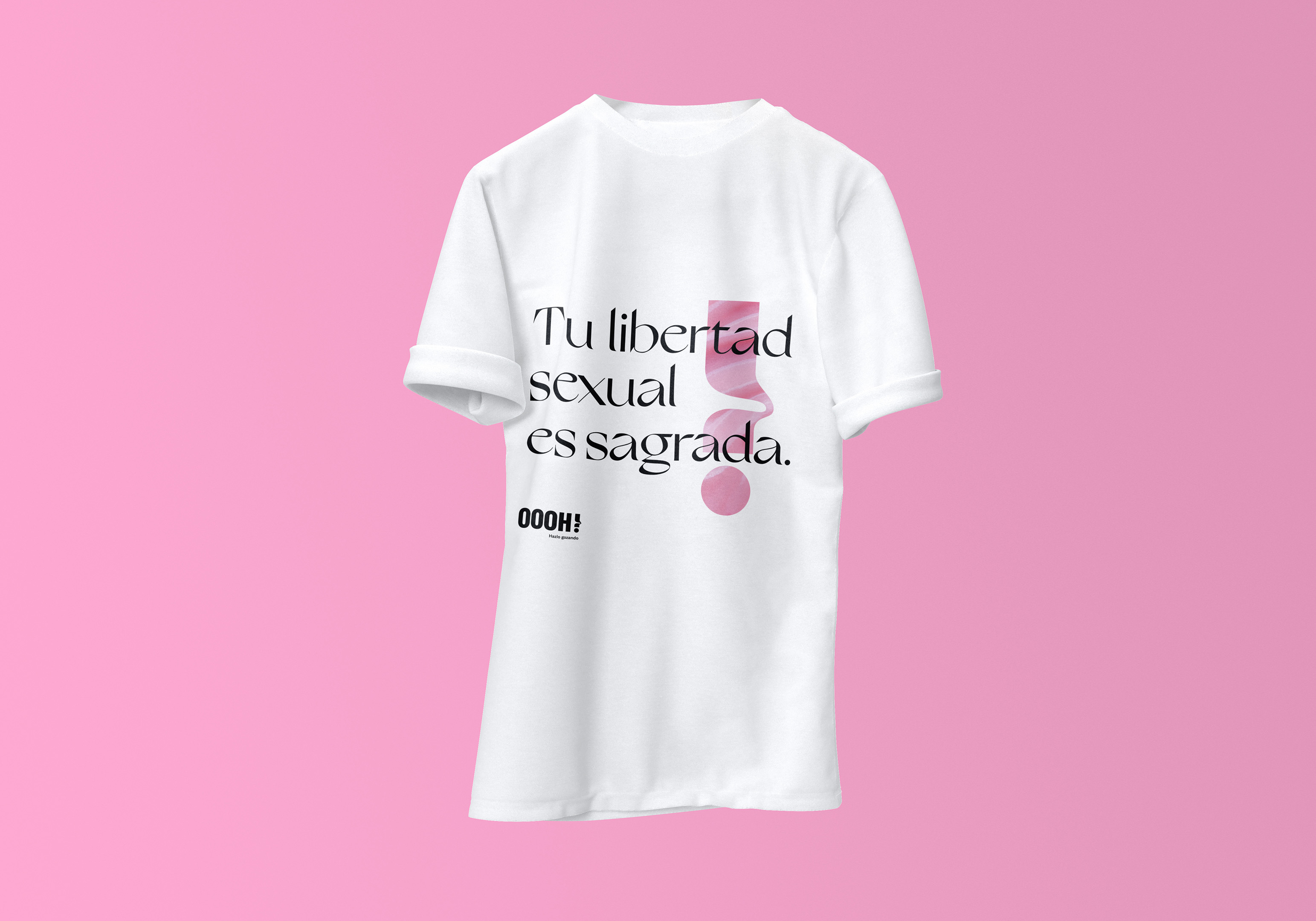
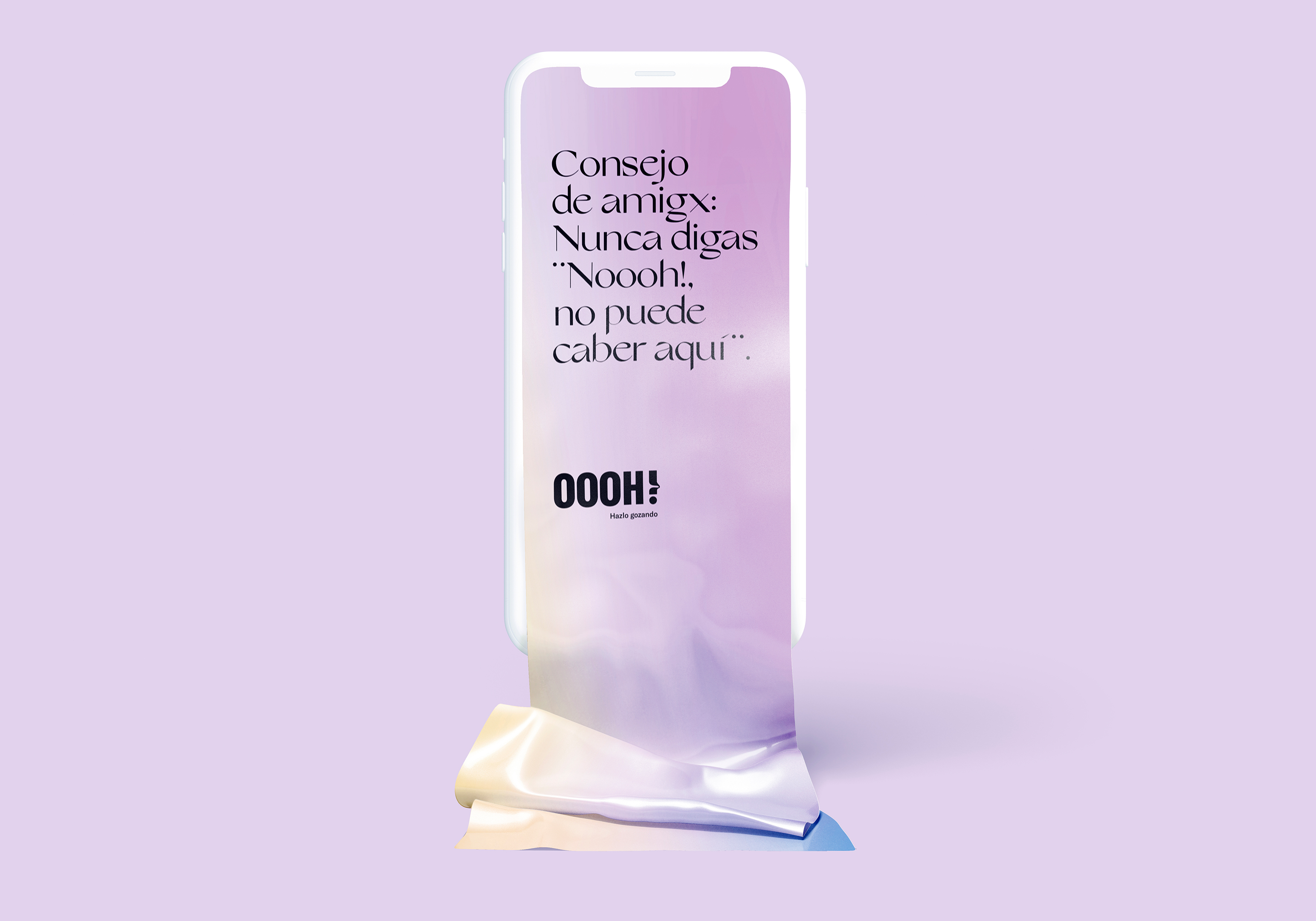
The important thing was to differentiate ourselves from the competition, so we wanted to create a fun, friendly, beautiful, and especially “enjoyable” universe, with a more “chic” touch than the stores focused on sales, and as vibrant as to invite our audience to enjoy it.
There are orgasms from touching and arriving, the conventional ones that ensure climax in 10-15 minutes, the tantric ones can give you productive hours of pleasure, but there are others, the ones that seem to come, but then go away, the ones that stay there, resisting and promising you heaven, those are the ones that make you explode when they arrive, with those you really stay well satisfied!
That was our branding process for this brand, an incredible naming resolution but it cost us a lot of stimulation and creativity to get there. But when we arrived, it was an “Oooh!”
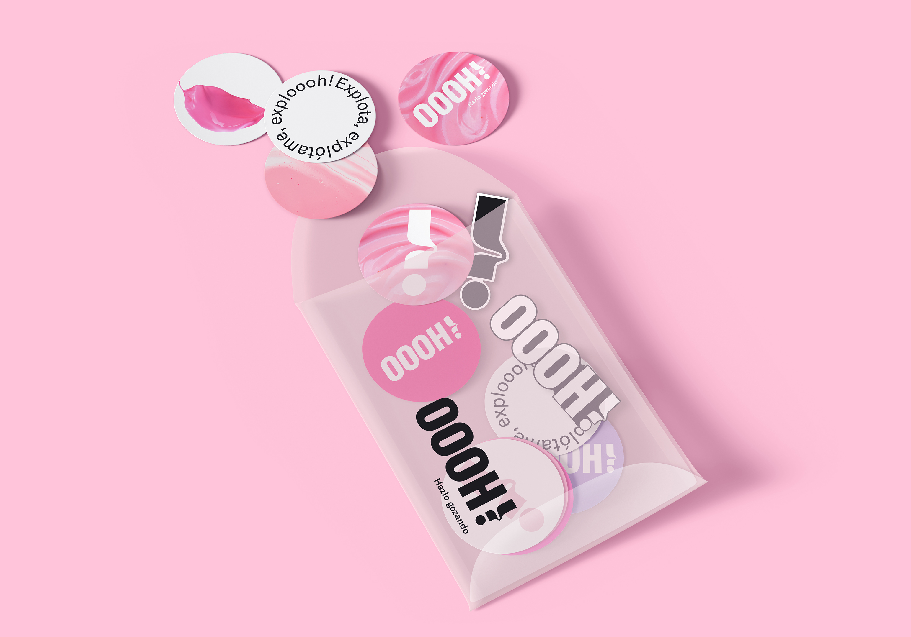
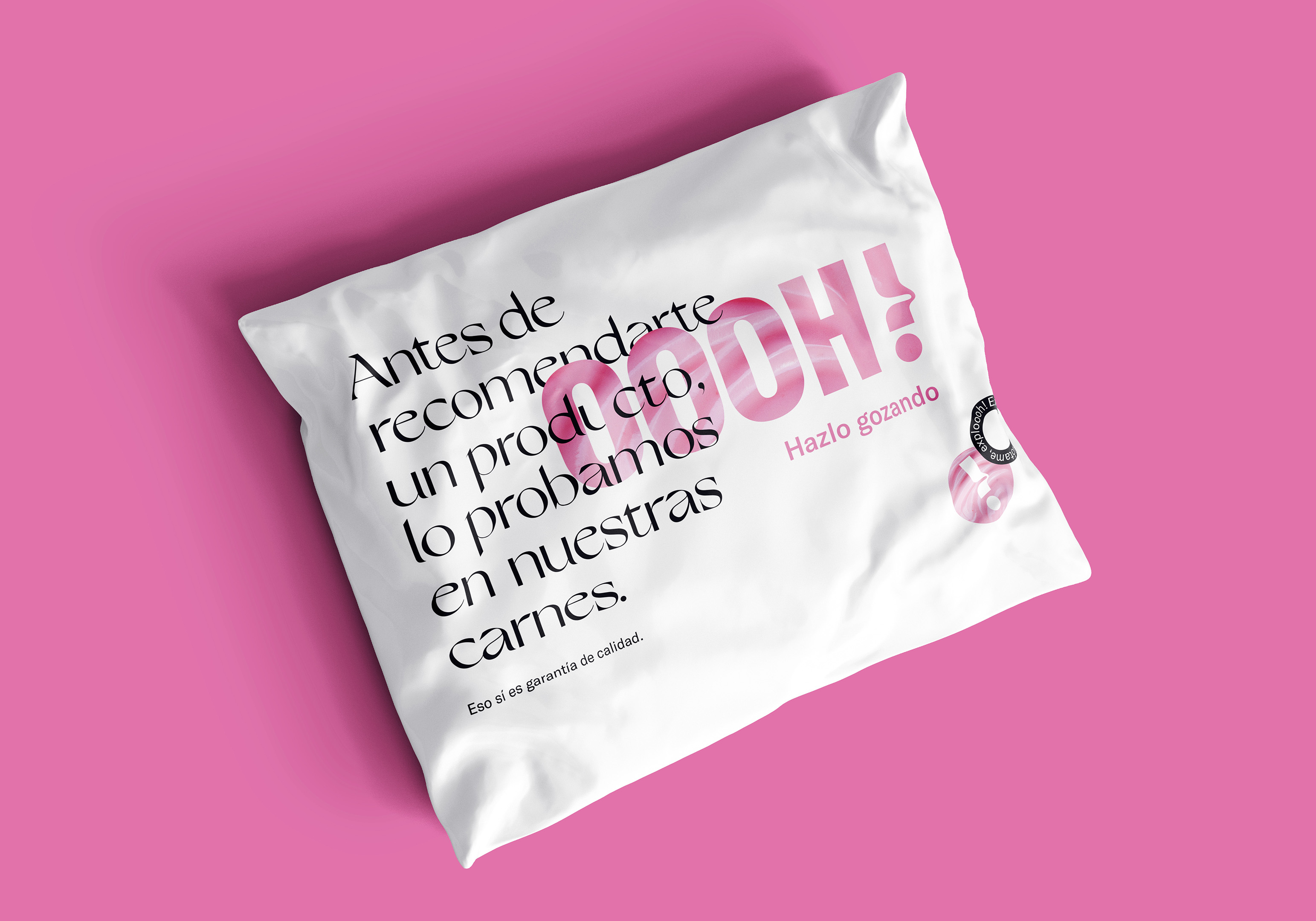
For its simplicity and ability to universally speak with a simple onomatopoeia. Because it says everything without saying anything, because it calls for pleasure just by naming it, and because it allowed us to build a whole verbal universe very close to our audience. The result? A very recognizable and personal, fun, intergenerational, and very positive branding.
In addition to being sold online, “Oooh!” has its own space in the Primor stores, both nationally and internationally.
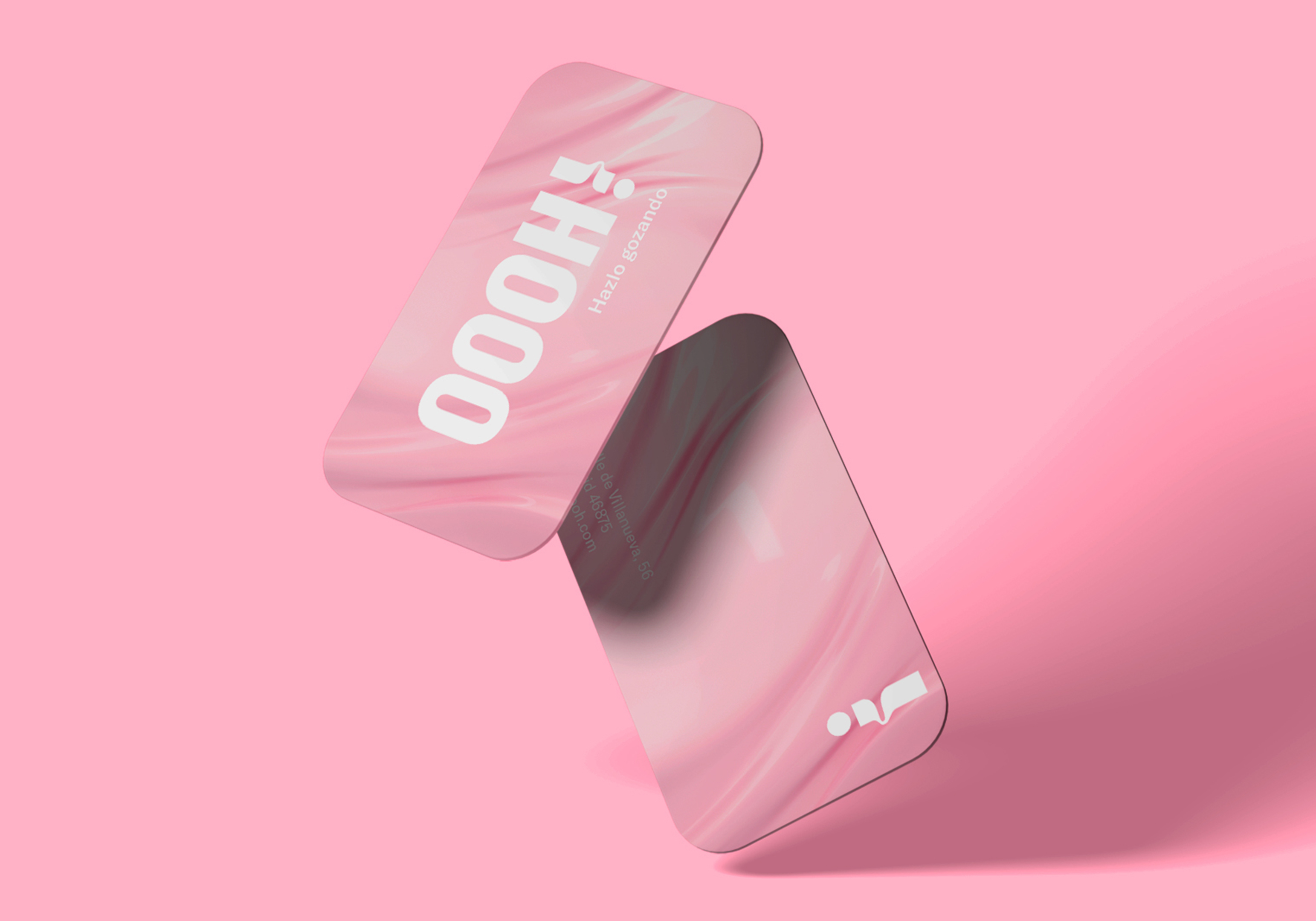
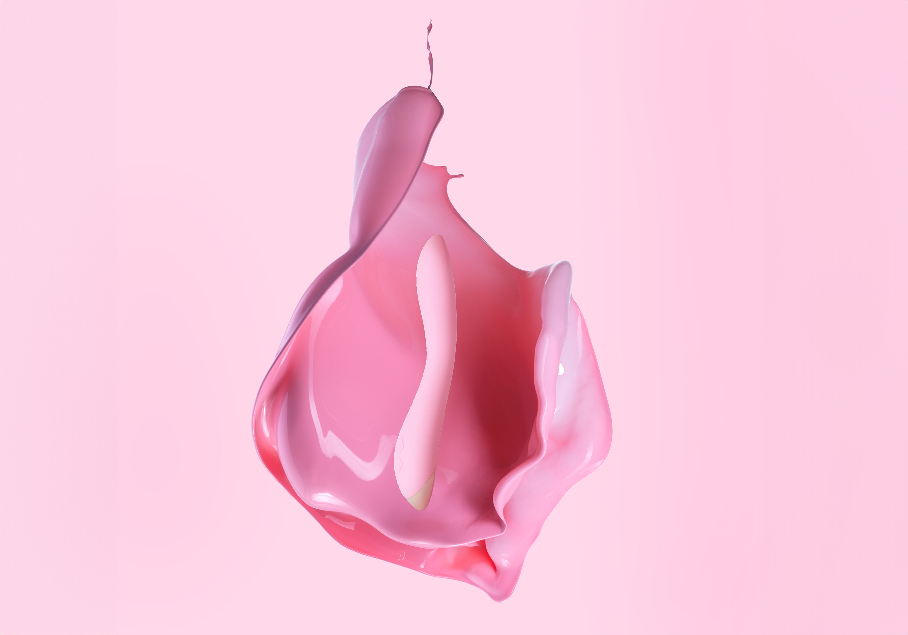
The corner we have created for this is a three-dimensional embodiment of its visual universe, with an organic and fluid design of sensual and suggestive colors that confer conceptual coherence to the entire brand imagery.
CREDIT
- Agency/Creative: Wanna
- Article Title: Branding and Packaging Design for OOOH!
- Organisation/Entity: Agency
- Project Type: Identity
- Project Status: Published
- Agency/Creative Country: Spain
- Agency/Creative City: Madrid
- Market Region: Europe
- Project Deliverables: Brand Creation, Brand Design, Brand Experience, Brand Guidelines, Brand Identity, Brand Mark, Brand Naming, Brand Strategy, Brand Tone of Voice, Design, Graphic Design, Interior Design, Logo Design, Packaging Design, Retail Design
- Industry: Health Care
- Keywords: erotic market, sexual toys, happiness, self-love, health, sex-positive, health care
-
Credits:
Brand creators: WANNA
Client: You are the Princess


