


Naming
“Morojenka” — new brand of natural ice cream in Kyrgyzstan. The naming is a play on the words for “ice cream” in Central Asian languages, which has an “affectionate” accent. “Morojenka” literally means “ice cream”, but in a simple colloquial distorted form. The Latin spelling of the colloquial word created a new name for the brand.
Graphic Design
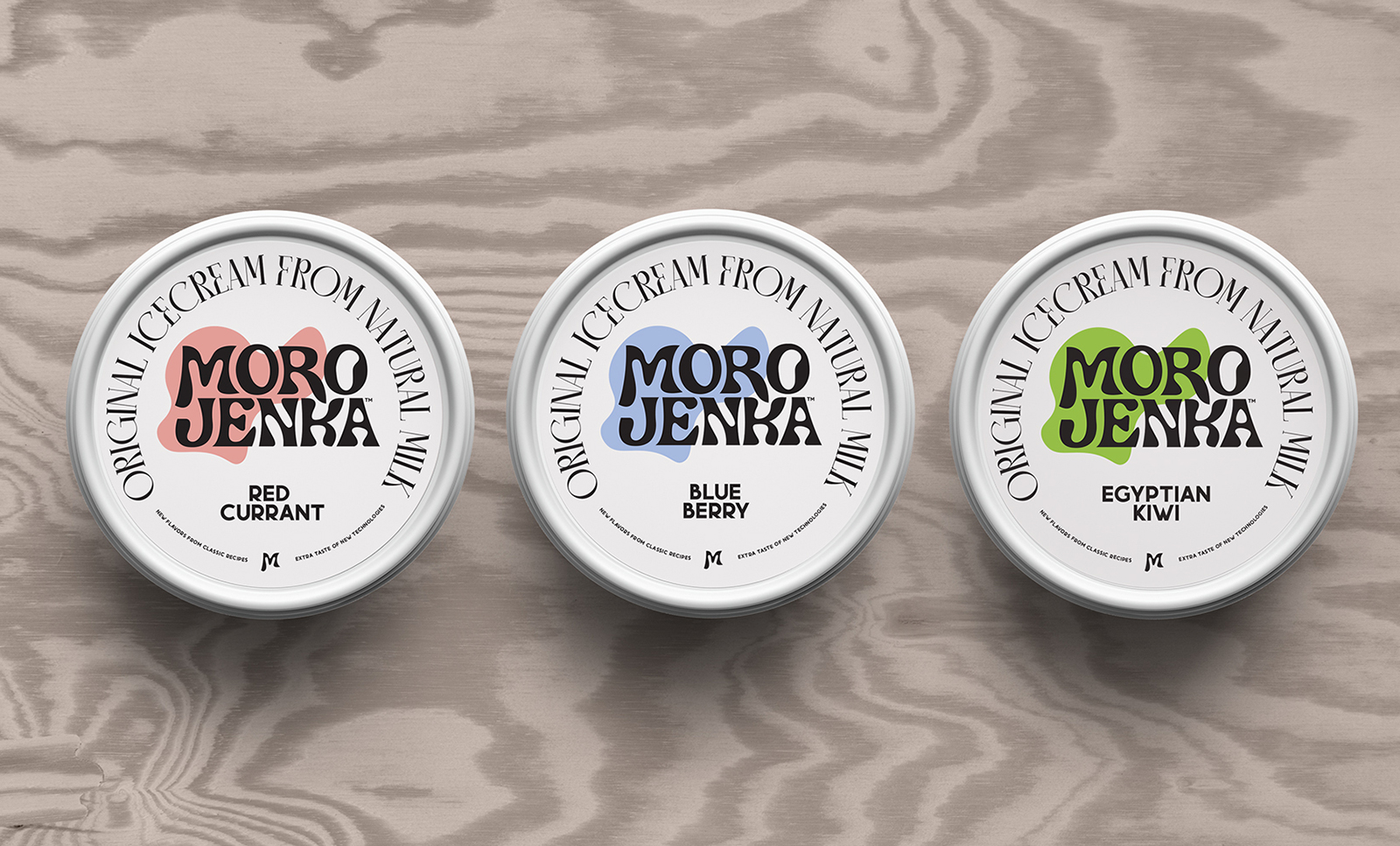
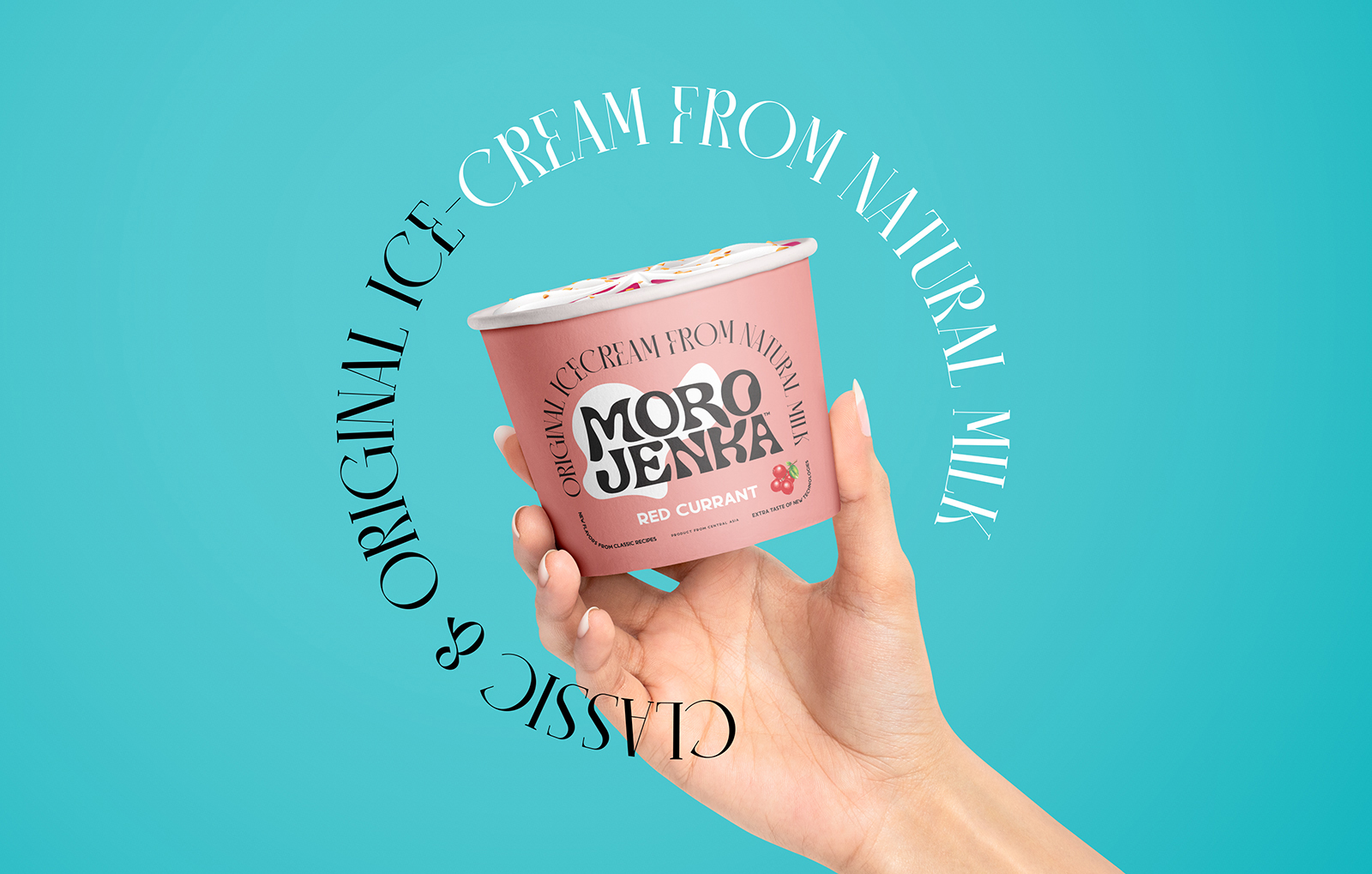
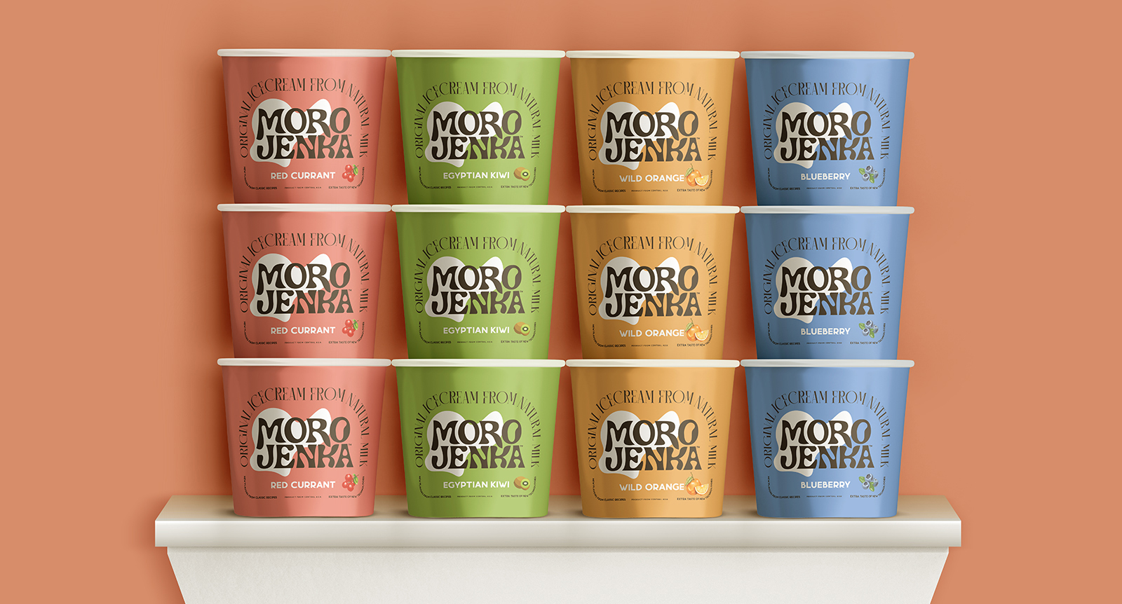
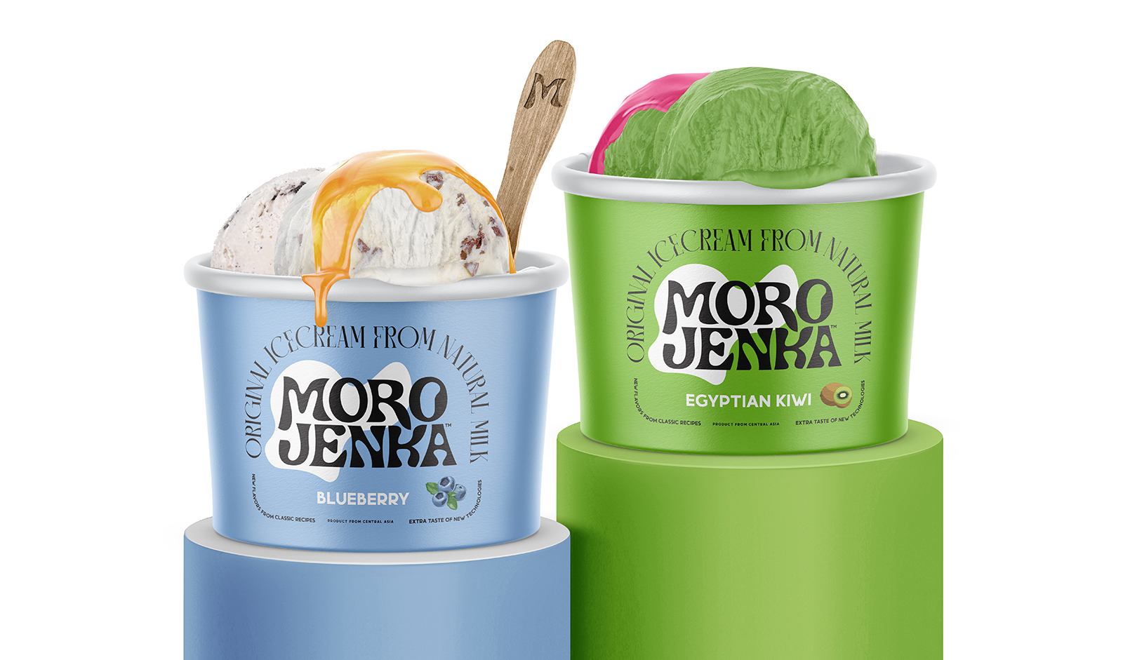
The design is inspired by Art Nouveau (Modern). Sleek shapes and classic fonts are great for classic ice cream recipes and its real forms: streamlined, flexible and tasty. The design of “Morojenka” is certainly not an imitation or a reconstruction 19th century labels. “Morojenka” is just inspiration from the past but created using modern graphic design language. The main form in the design is a streamlined white spot in the logo. This is Ice Cream itself – milky, always white (according to the design), always combined with contrasting black.
Branding
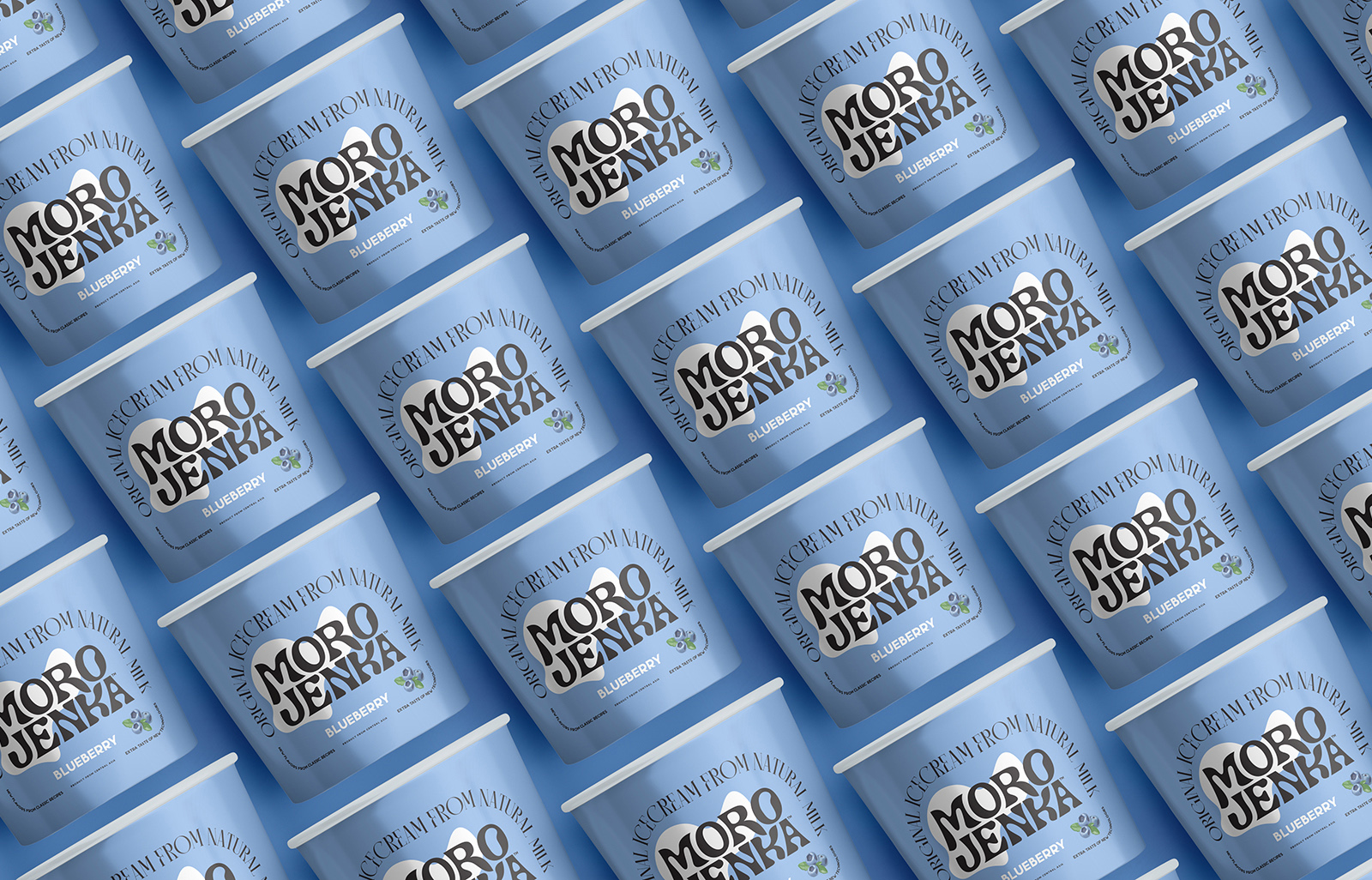
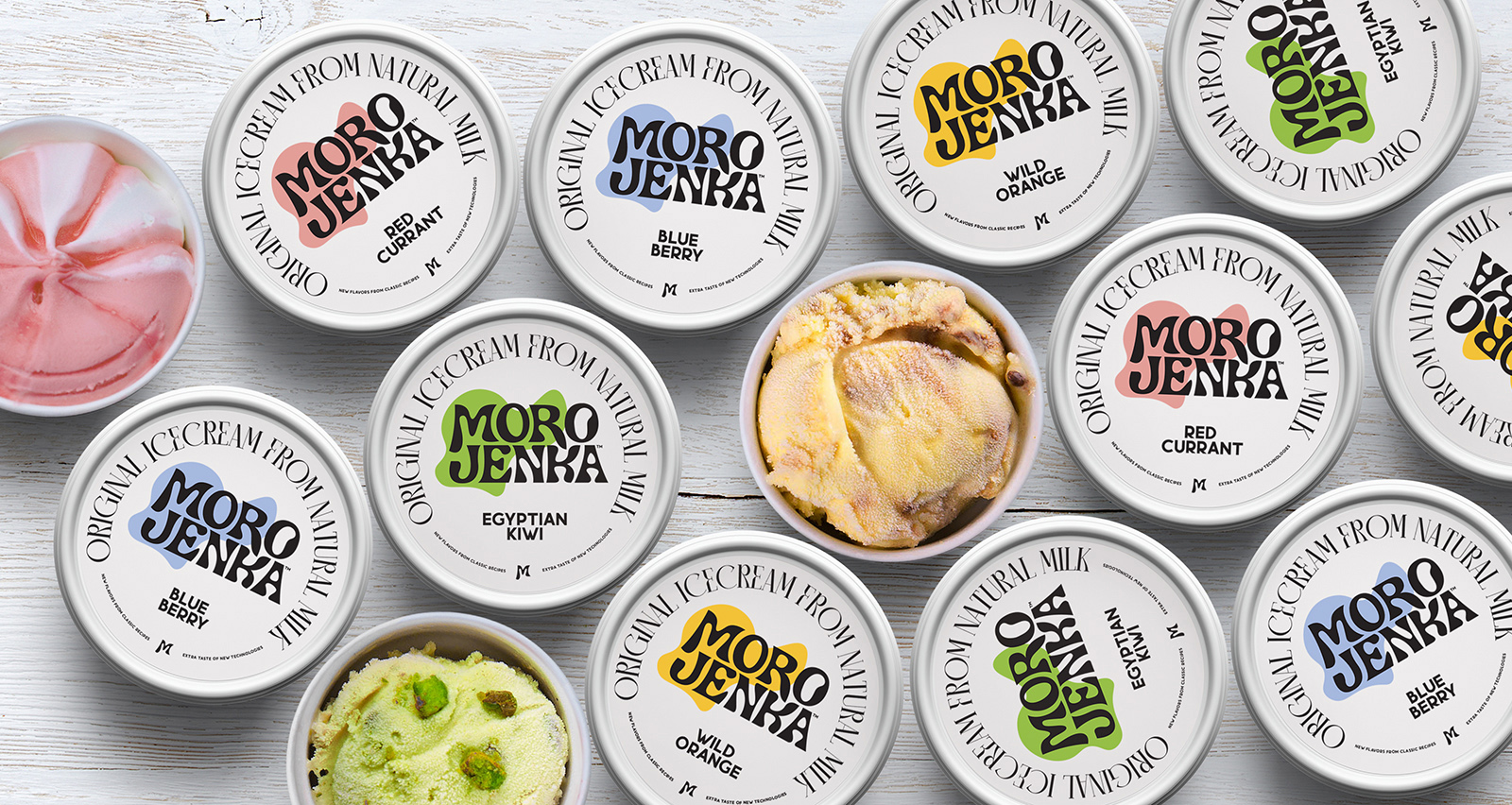
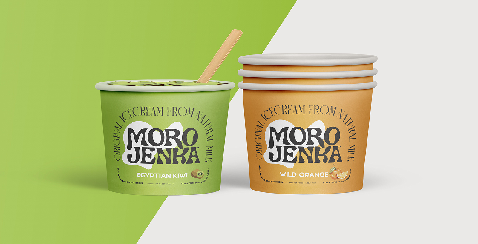
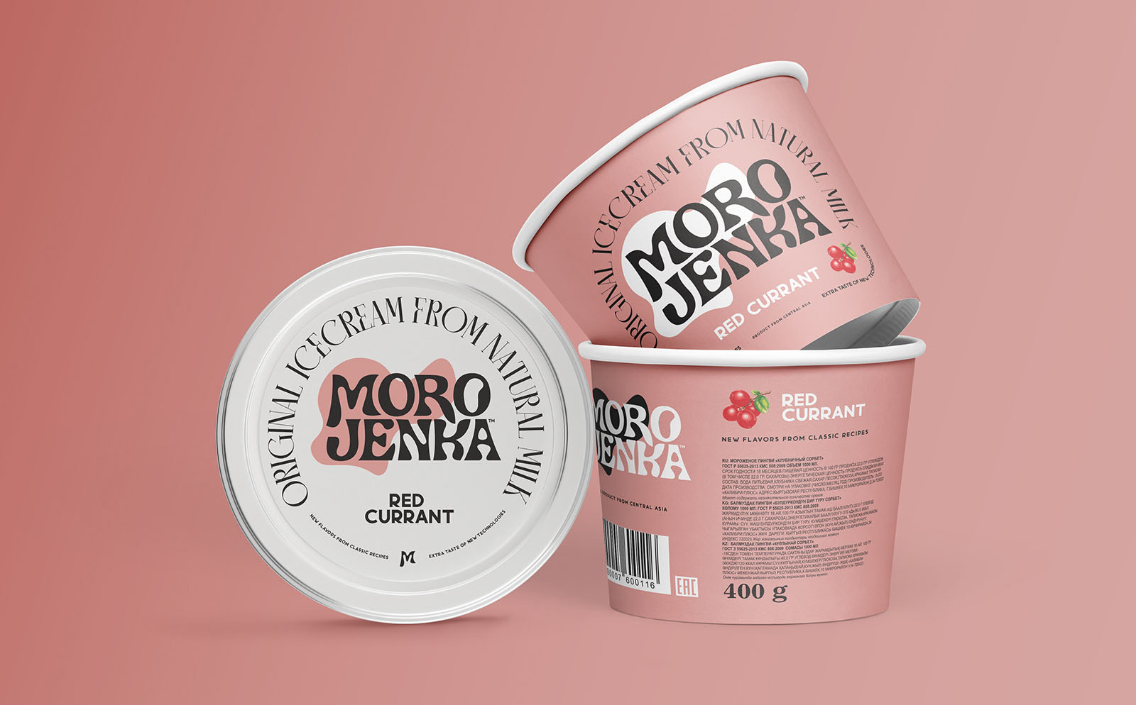
At launch, four flavors were created, with a simple color coding. The color of the flavor and the color of the product inside cup. With a simple construction where the brand’s logo remains a predominantly black and white identifier, new flavors in the brand’s lineup will easily emerge in the future. The design can be easily inserted into any other media: bags, posters, brand advertising. By simply changing the color background, a branding system was developed for different advertising media.
Memorability
The design is built on a contrasting logo, which makes it easy to remember, even with a multi-colored background of cups. The bright display of colored products also favorably emphasizes the design of the brand logo and its quick memorization.
CREDIT
- Agency/Creative: Alexey Lysogorov
- Article Title: Branding and Packaging Design for Morojenka Ice Cream
- Organisation/Entity: Freelance
- Project Type: Packaging
- Project Status: Published
- Agency/Creative Country: Kyrgyzstan
- Agency/Creative City: Bishkek
- Market Region: Asia
- Project Deliverables: Brand Mark, Brand Naming, Branding, Graphic Design, Lettering, Packaging Design
- Format: Cup
- Substrate: Pulp Carton, Pulp Paper
- Industry: Food/Beverage
- Keywords: Kyrgyzstan, kyrgyz republic, ice-cream, ice cream
-
Credits:
Art-director, graphic designer: Alexey Lysogorov


