


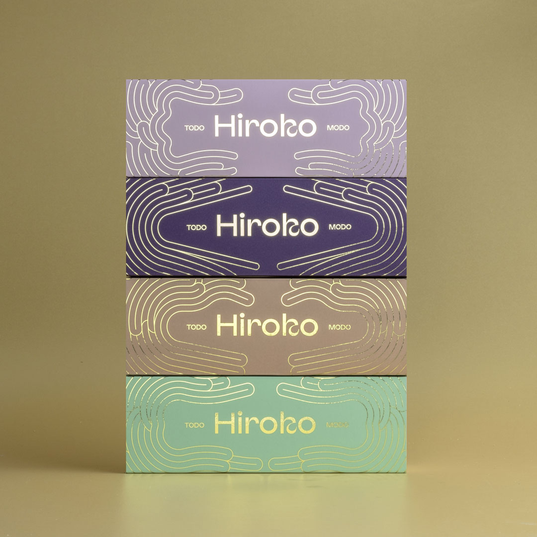
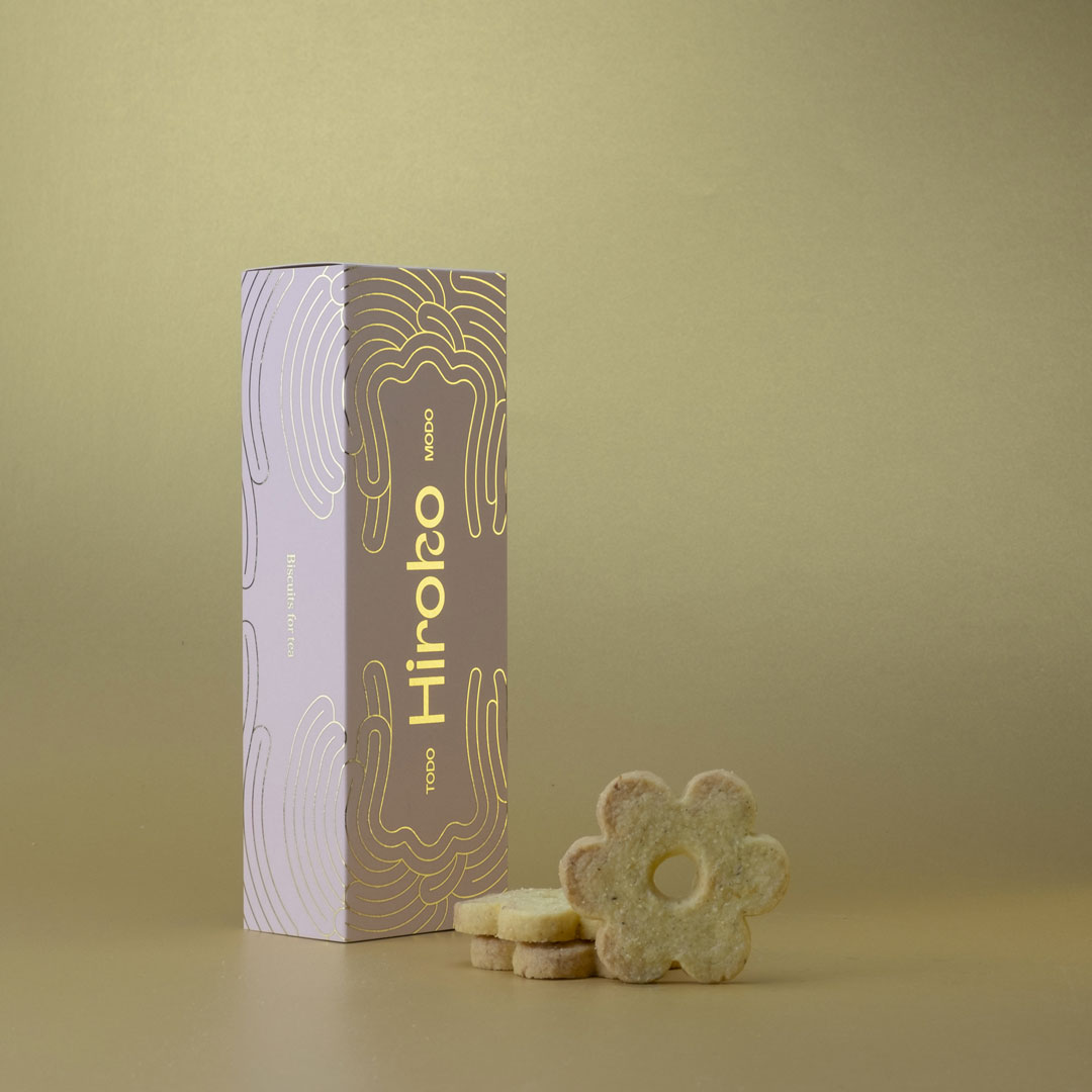
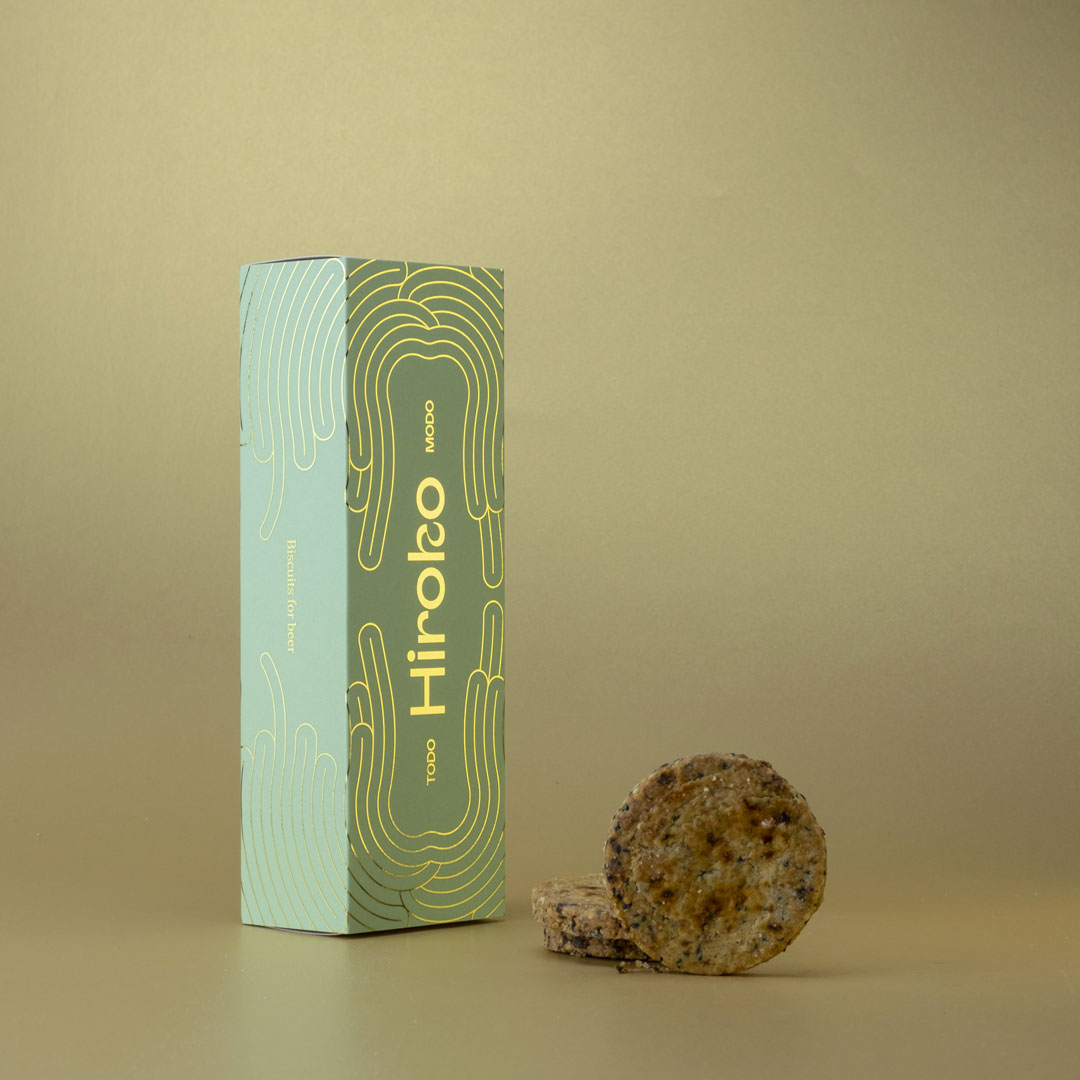
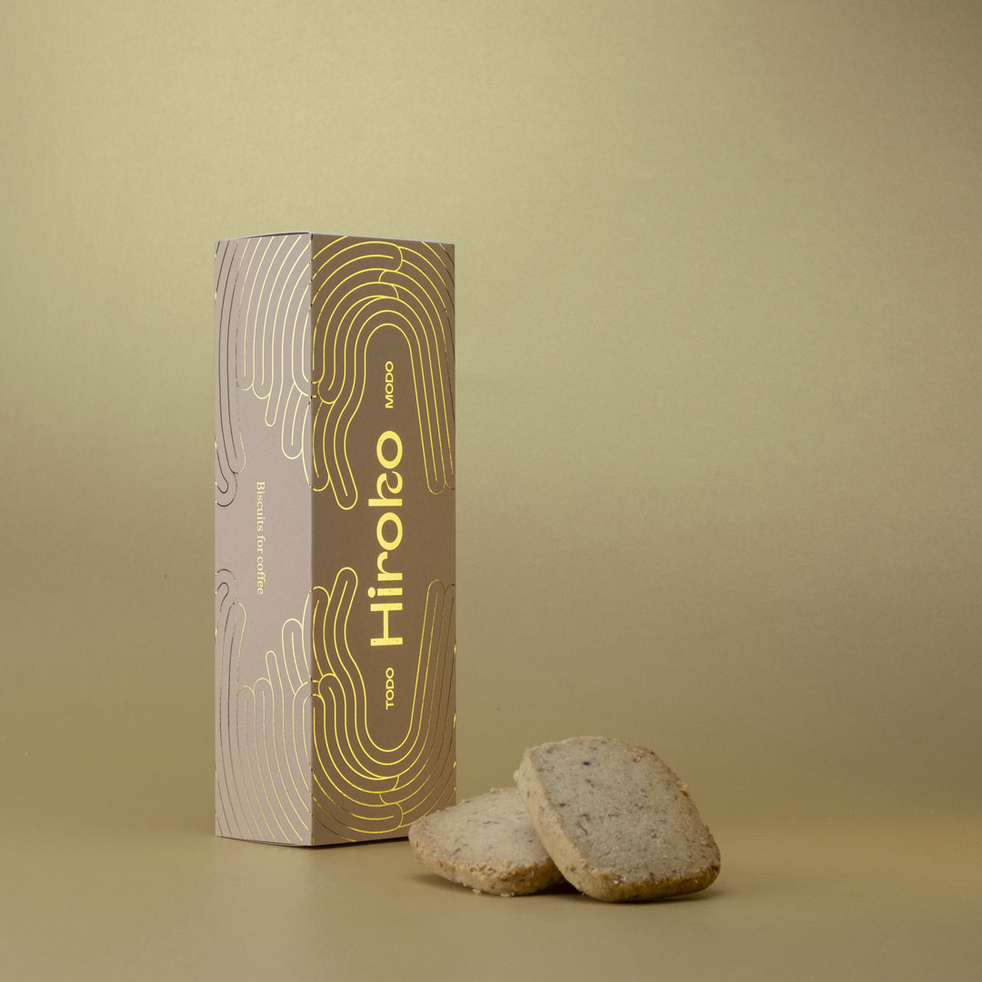
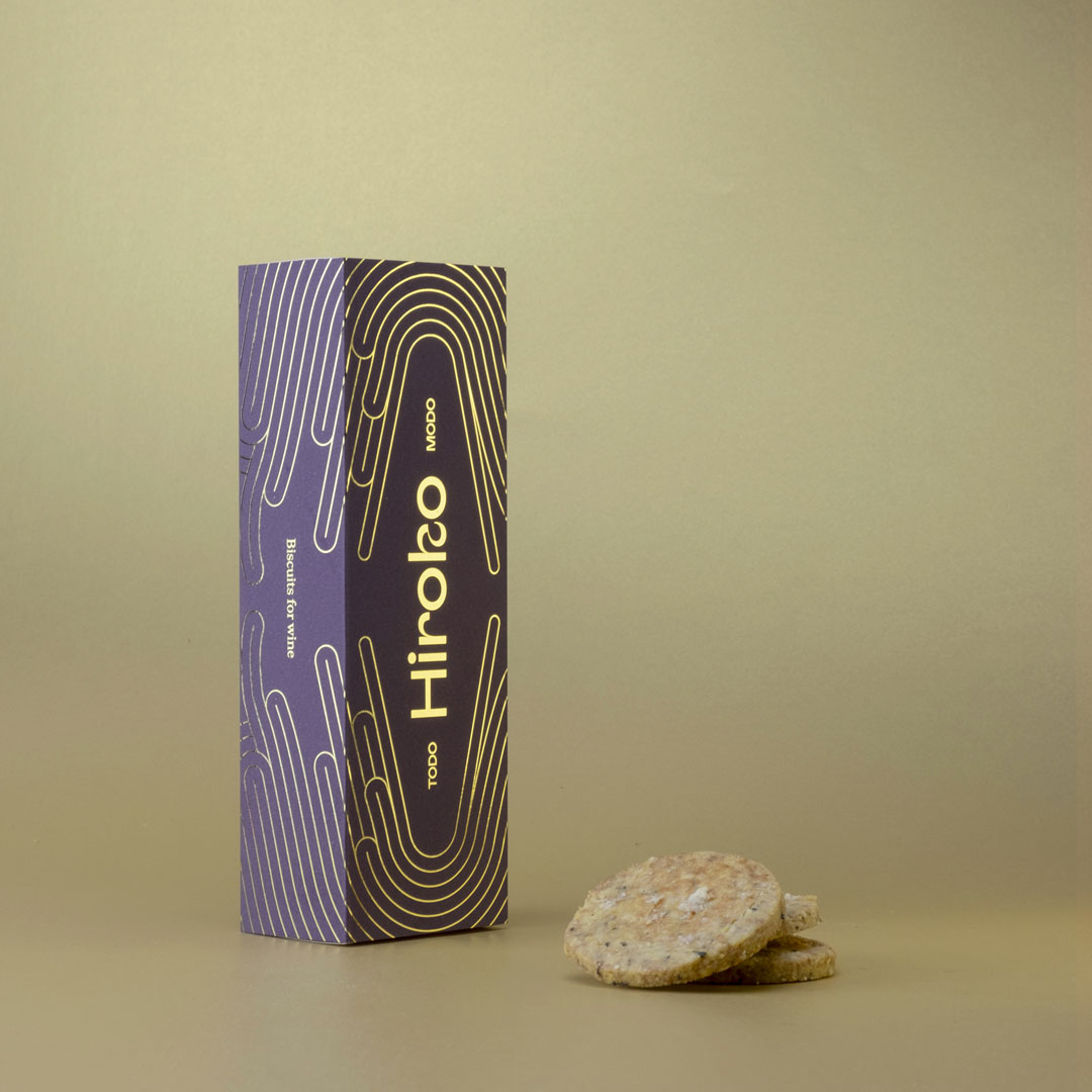
Hiroko’s biscuits are biscuits born from the idea of the Japanese cook who works at the independent Florentine bookshop “Todo Modo” in Florence. Hiroko had always had the dream of producing her own cookies and finally the owners of the bookshop decided at the end of 2020 – during the pandemic – to carry on this dream by financing and sponsoring the project. The Todo Modo bookshop is a beautiful independent Florentine bookshop where thousands of customers pass by every day to buy books, drink a glass of wine, eat a specialty prepared by Hiroko or simply to say hello to the owners Pietro and Maddalena. When we were contacted as a studio to design the logo and the packaging of the biscuits, Hiroko expressed only two wishes: that there was a reference to Art Noveau / Decò and that gold was present as an element, flanked by pastel colours.
So we first designed the new logotype, using the Afronaut font designed by Mateusz Machalski, which has a letter design that seems to us to recall Hiroko’s Japan in some way. We then decided to add to the logotype some abstract illustrations that recalled the world of Art Noveau a little but at the same time that were our contemporary interpretation: all different but at the same time all the same in order to be recognisable as belonging to the same family. From a production point of view (initially only 100 per type) we were forced to compromise: golden foil on pastel paper and a box specially designed to contain the precise number of cookies that Hiroko wanted to insert inside them. Sweet/savory biscuits prepared with ghee, a clarified butter according to the Ayurvedic method, with always different ingredients designed specifically to match the liquids to which they will be accompanied: wine biscuits, beer biscuits, tea biscuits, coffee biscuits. Four boxes of different colors. Gold is always there. From today, every customer of the bookshop will be able to read a book inside the restaurant while tasting a drink and eating a pack of Hiroko biscuits.
CREDIT
- Agency/Creative: Muttnik
- Article Title: Branding and Packaging Design for Hiroko Biscuits Created by Todo Modo
- Organisation/Entity: In-house, Published Self Promotional Design
- Project Type: Packaging
- Agency/Creative Country: Italy
- Market Region: Europe
- Project Deliverables: Brand Identity, Branding, Identity System, Packaging Design, Research
- Format: Box
- Substrate: Pulp Paper


