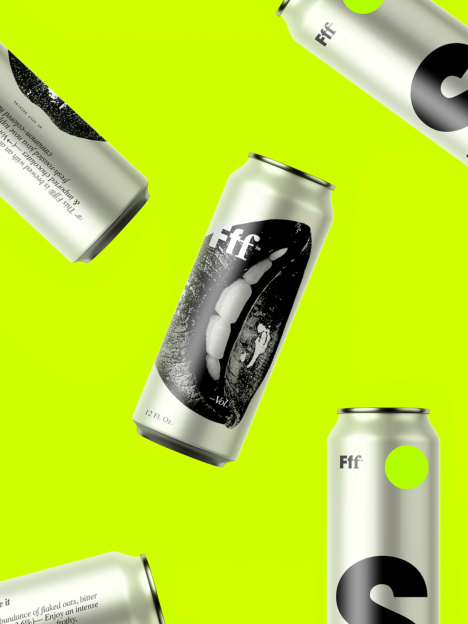
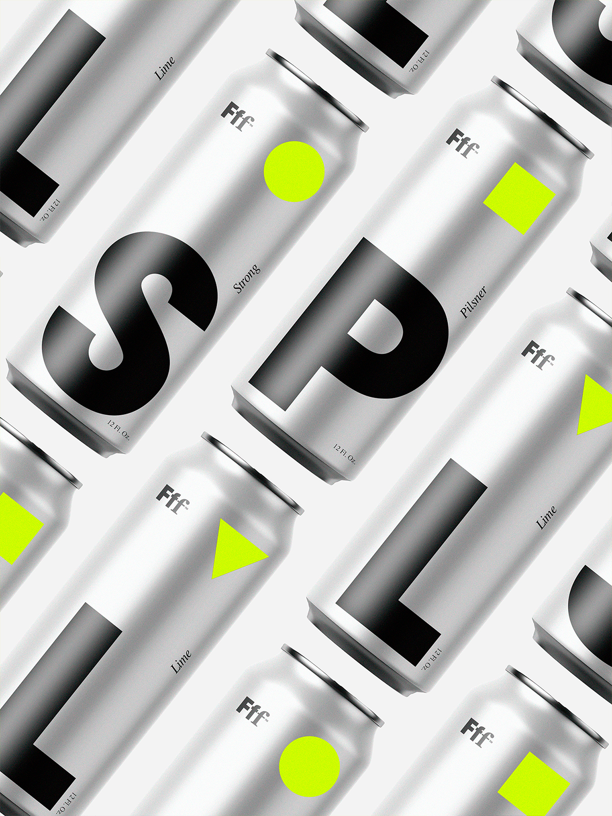
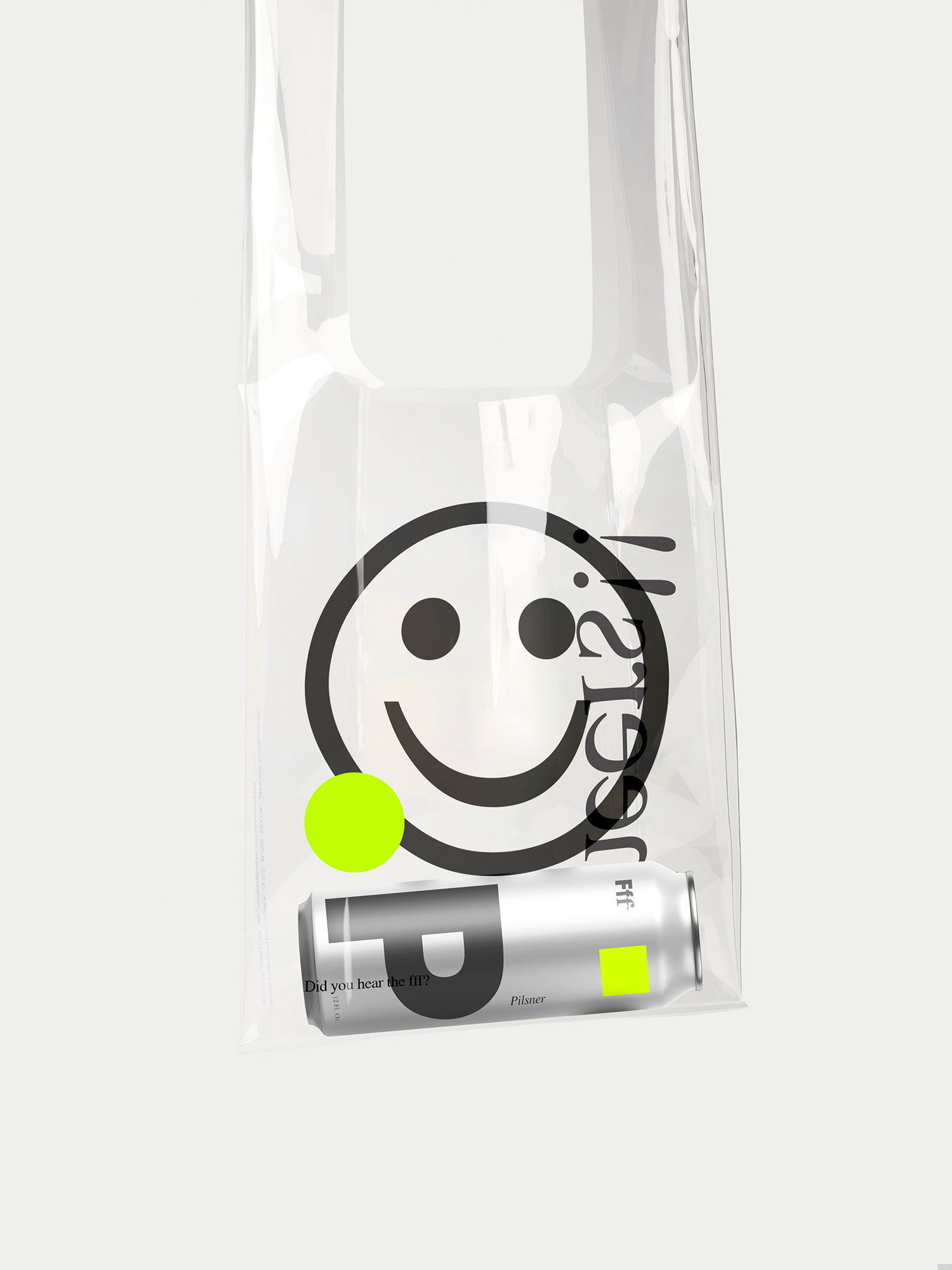
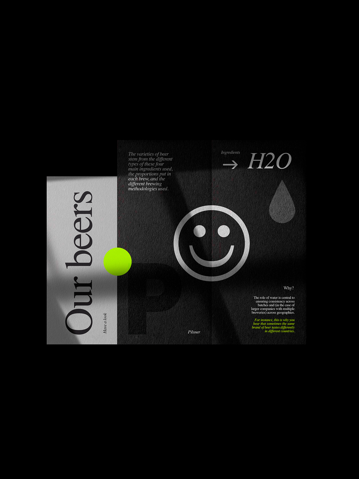
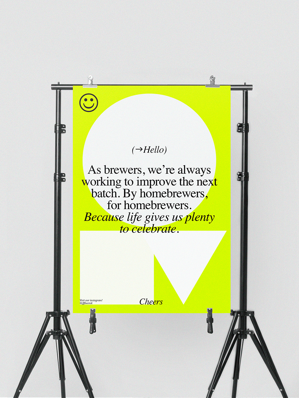
Branding and packaging design for Fff™ a San Francisco based brewing company. They asked us to create a packaging for their beer, that could really stand out in the busy brewing market. The brief was quite open, except for the technical limitations of package. Based on the client’s budget, we needed to be smart with how it was all put together. We had to find a way to make the can eye-catching in order to properly reflect the company’s culture. With a majority of women in their team, we decided to provide both visual metaphor and representation of a woman in the design. The palette features a stunning yellow, bright in contrast when placed on the aluminium of the can and on printed materials.

CREDIT
- Agency/Creative: empatía
- Article Title: Branding and Packaging Design for Fff
- Organisation/Entity: Agency, Published Commercial Design
- Project Type: Packaging
- Agency/Creative Country: Argentina
- Market Region: North America
- Project Deliverables: Brand Creation, Brand Guidelines, Brand Identity, Brand Strategy, Brand World, Branding, Graphic Design, Identity System, Packaging Design, Photography, Research, Tone of Voice
- Format: Can
- Substrate: Metal
FEEDBACK
Relevance: Solution/idea in relation to brand, product or service
Implementation: Attention, detailing and finishing of final solution
Presentation: Text, visualisation and quality of the presentation


