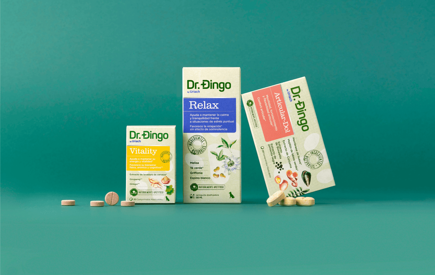
Uriach, a company aimed at the development of health and well-being products, and Dingonatura, a company specialised in pet nutrition, are joining forces to create Dr. Dingo. As it is possible to take care of your pet’s health in a natural way because if your pet is happy, you’re happy. With the firm belief that it is possible to take care of your pet in a completely natural way, this launch is an innovation in the animal health category.
The challenge was to develop a branding and packing design that conveys the effectiveness of its products, by positioning itself clearly as a natural product. Ensure product decoding without necessarily showing any pets, with the aim of moving away from the most classic designs in this category.
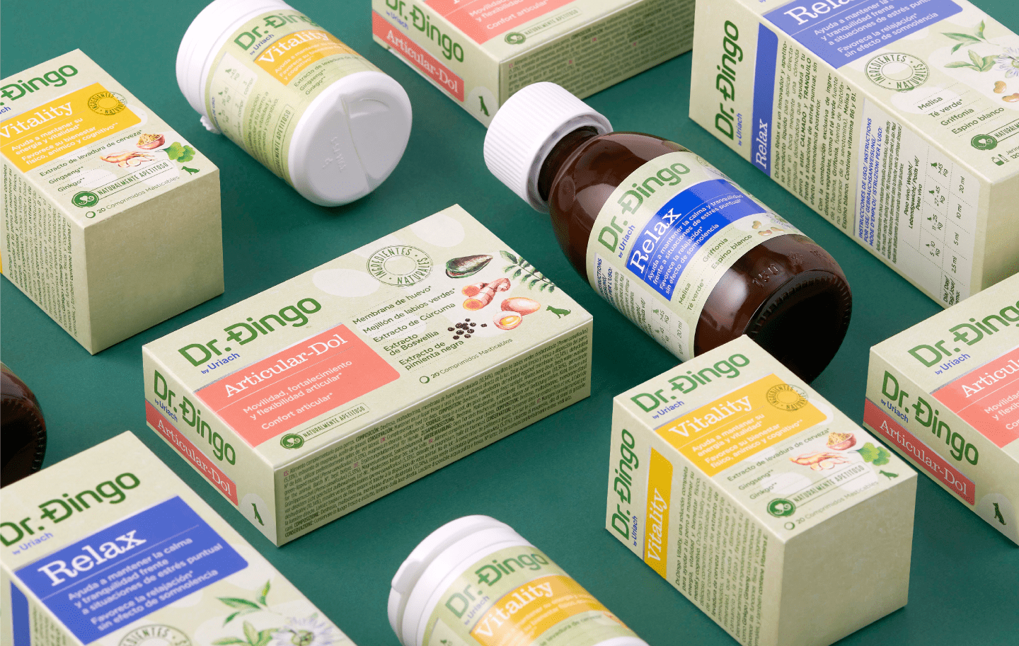
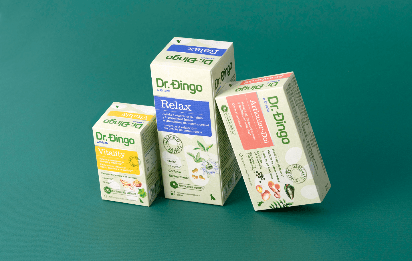
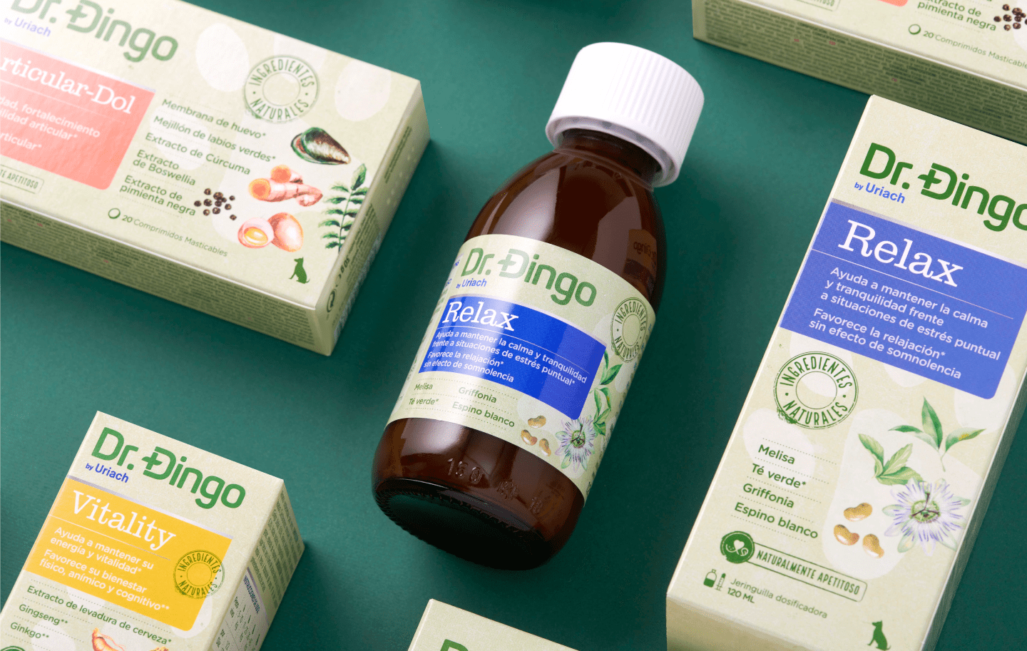
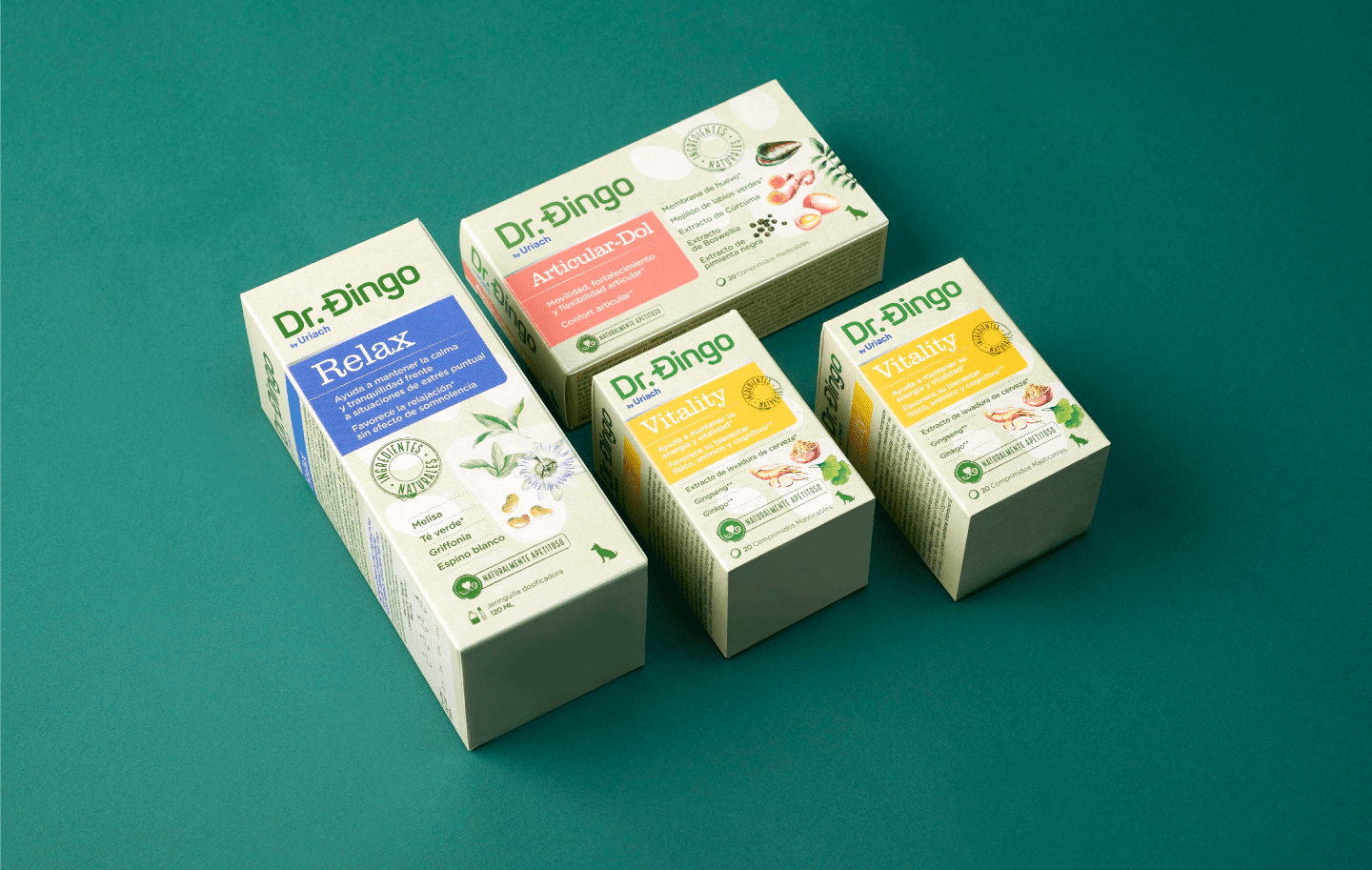
On the one hand, a clear and clean brandbook is essential in such a distinct launch in this category. As for the packaging, the design is structured in a block that presents the naming and product benefits clearly and which demonstrates the 3 SKUs of the range using soft colours. Silver details help convey the product’s effectiveness. The design consists of a still life of ingredients illustrated in watercolour which, as well as reinforcing the naturalness, provide a large part of the design’s own aesthetics. A very soft green kraft background stands out, which allows both the product block and the ingredients to stand out very well. Providing continuity to the range and transmitting naturalness.
On the other hand, a kraft paper style background is a very soft green, which allows the product block and the ingredients to be highlighted. It brings continuity to the range and communicates its concept of natural products. Typography with serifs, which is more traditional, scientific, and “rigorous”, has been used for product naming. The rest of the front-end information is expressed using typography that doesn’t use serifs, with rounded strokes that are more friendly, clear, and familiar.
The result was a distinctive and attractive design, primarily focused on communicating the concept of natural ingredients. A packaging that brings a new way of communicating to the category and is also self-explanatory, enhancing the product’s effectiveness.
CREDIT
- Agency/Creative: Littlebuddhagroup
- Article Title: Branding and Packaging Design for Dr. Dingo Animal Health Products
- Organisation/Entity: Agency, Published Commercial Design
- Project Type: Packaging
- Project Status: Published
- Agency/Creative Country: Spain
- Market Region: Europe
- Project Deliverables: Brand Identity, Brand Redesign, Graphic Design, Packaging Design, Product Architecture
- Format: Bottle, Box
- Substrate: Glass Bottle, Plastic


