Plau Design – Moccato
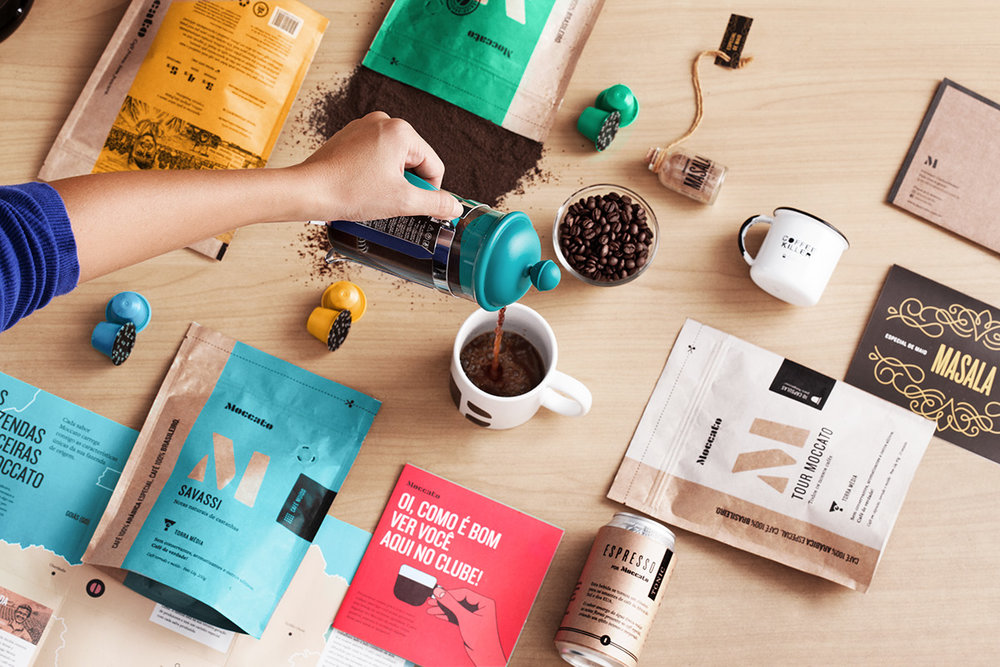
“Starting up as a fully digital specialty coffee pods subscription company, Moccato quickly established its reputation with its customers and among bigger players.
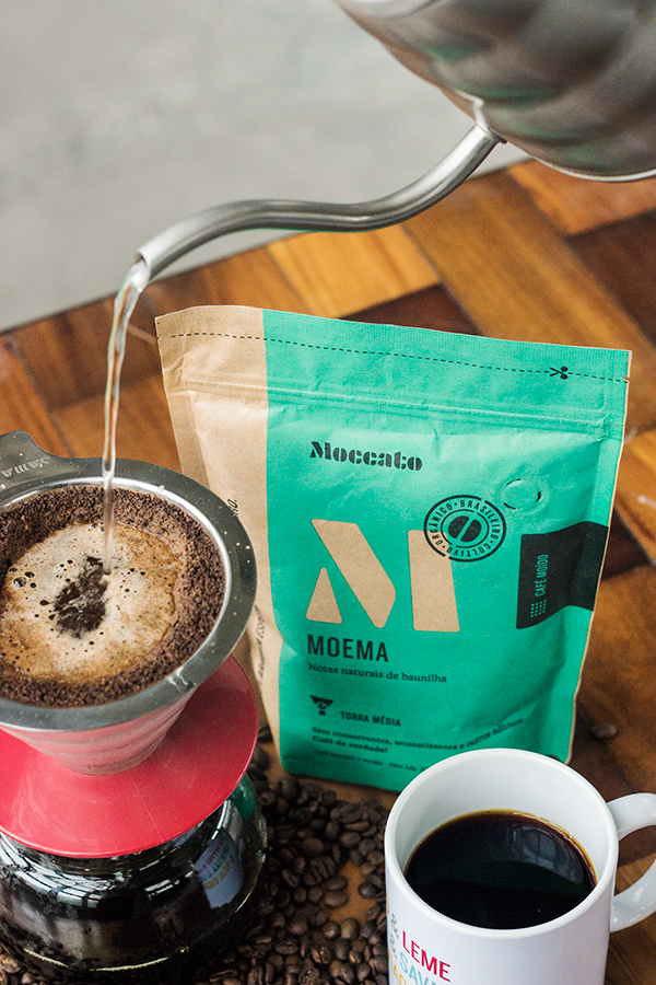
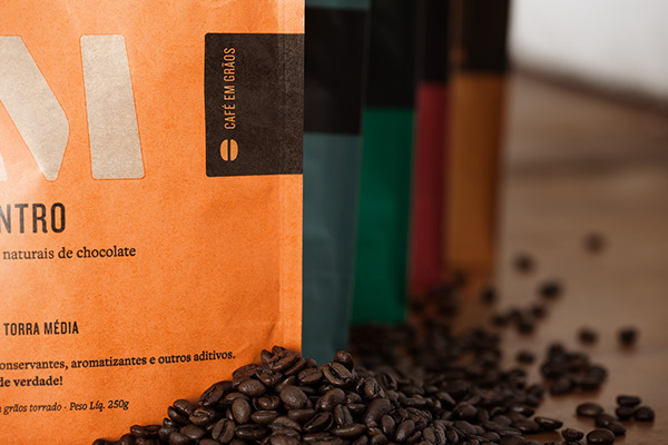
The next step was to get into the retail scene and provide coffee in different forms, namely whole and ground coffee beans.
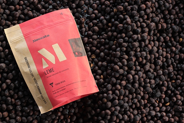
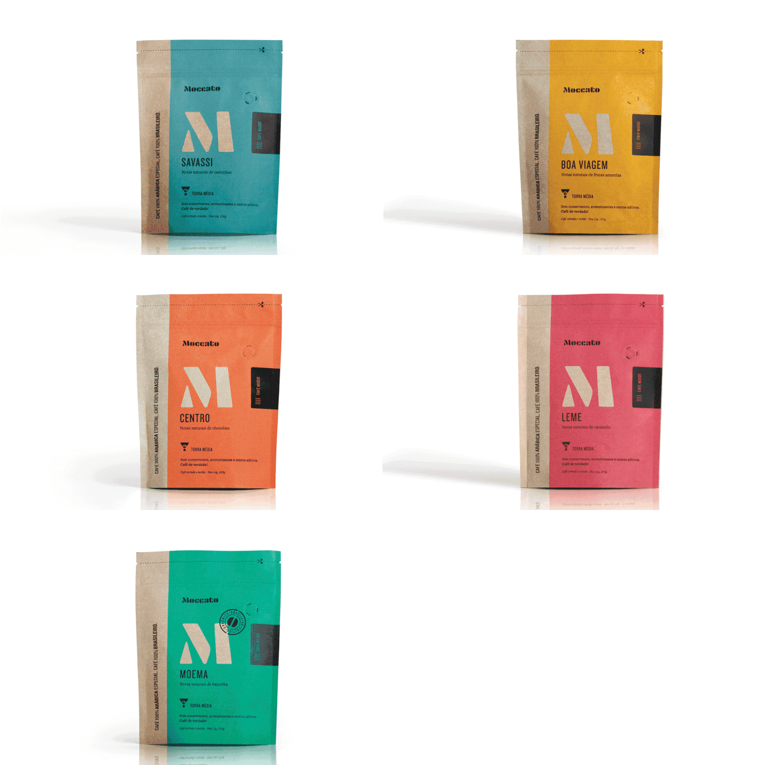
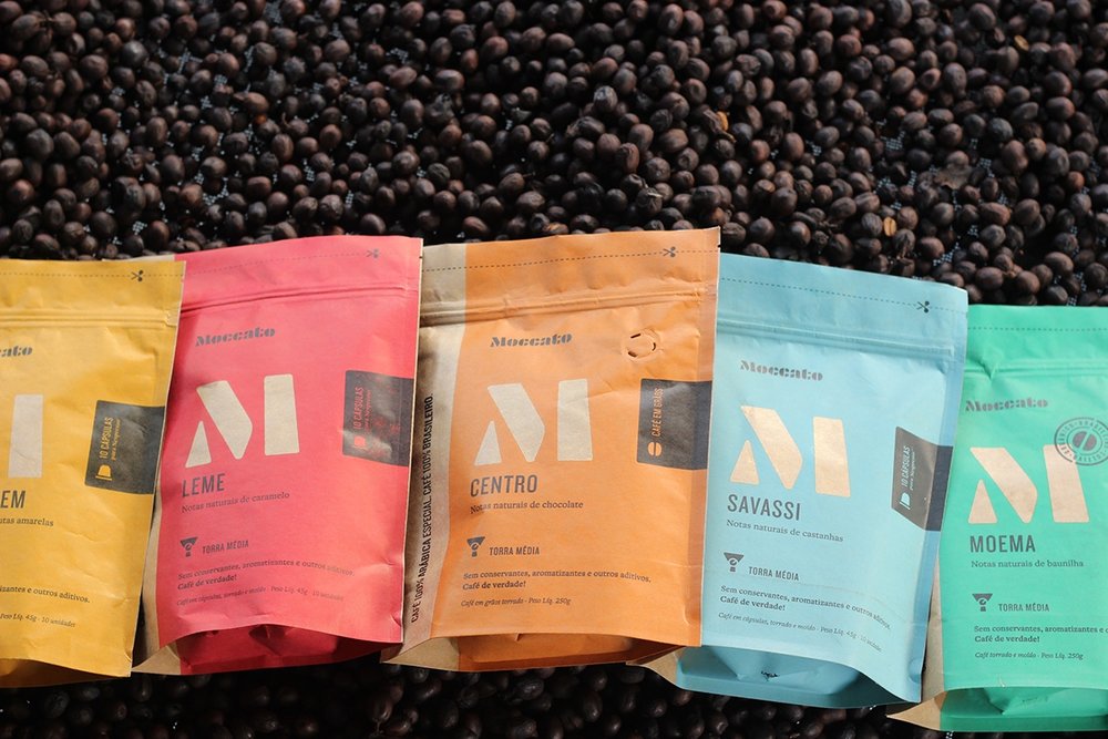
Our first packaging was something special and even got us awards – like the “excellence in typography” by the TDC in New York, but it had its liabilities when it came to shelves in specialty stores. It took some back and forth with the team at Moccato to change it into a pouch.
With more canvas available and with the responsibility to make it work harder to grab the customers’ attention in a crowded market place, we wanted the signature minimalism that made the first packaging stand out to be carried through in retail.
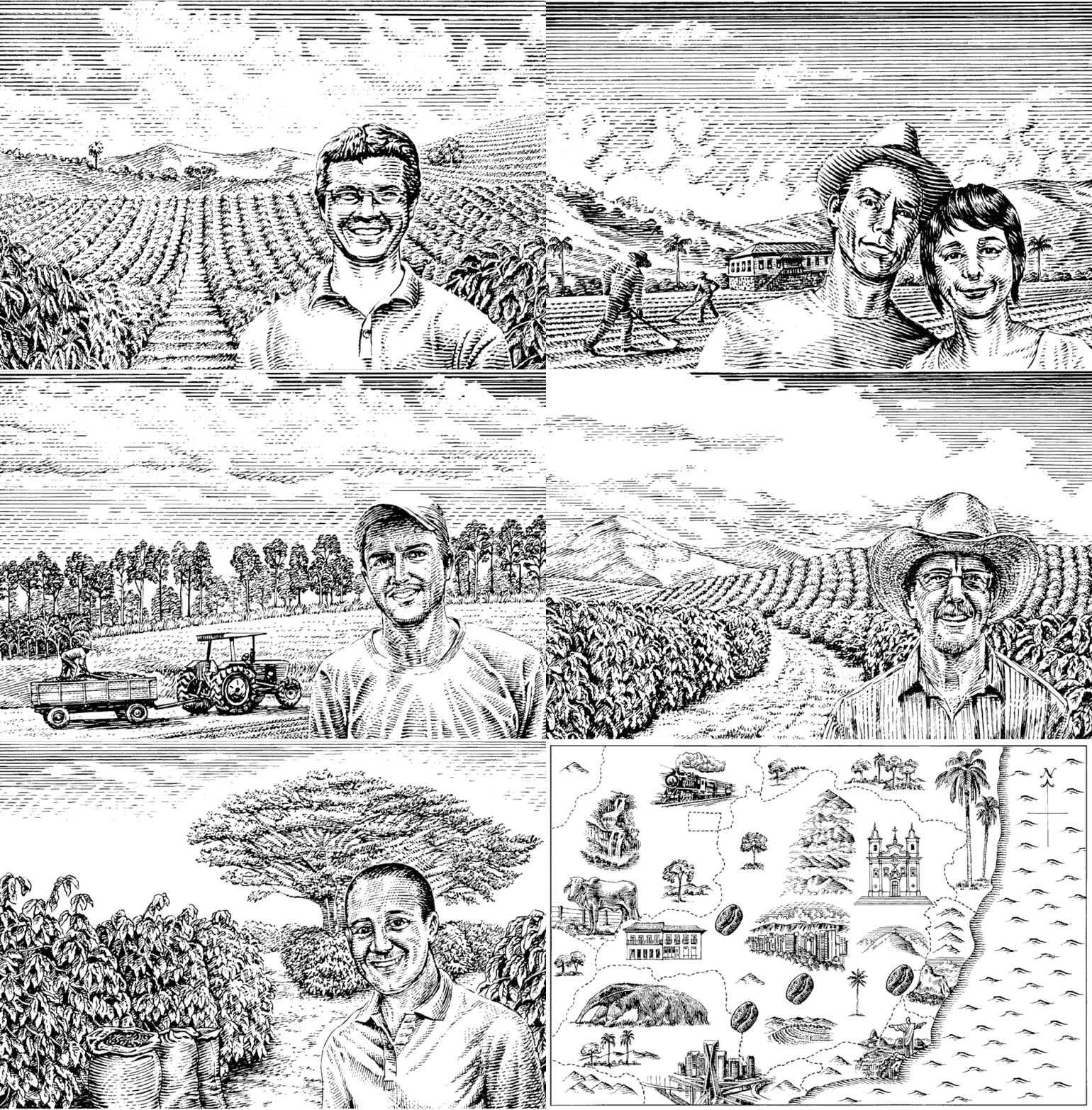
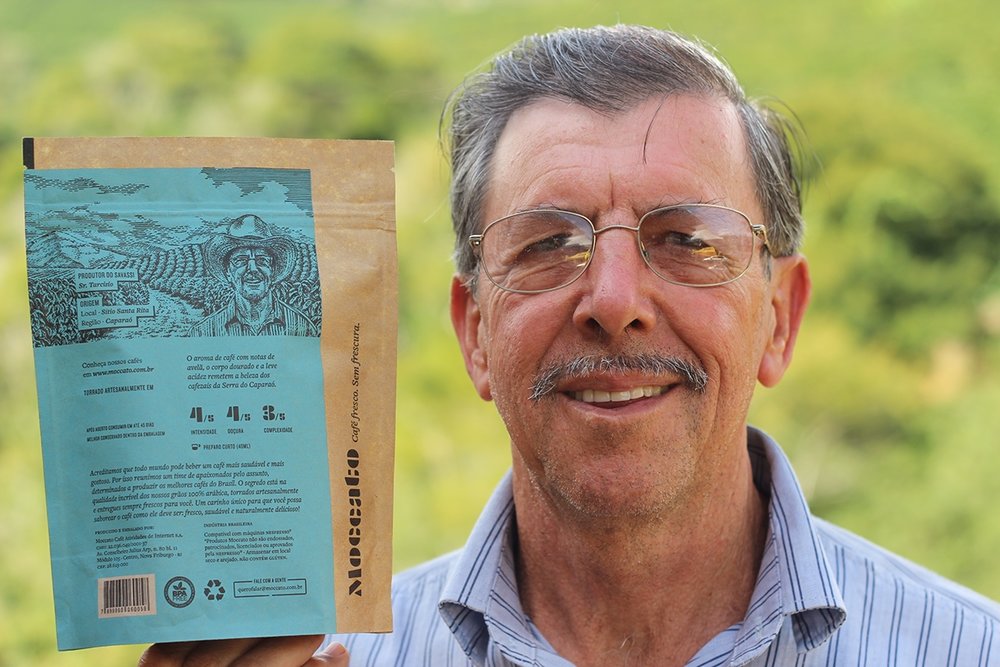
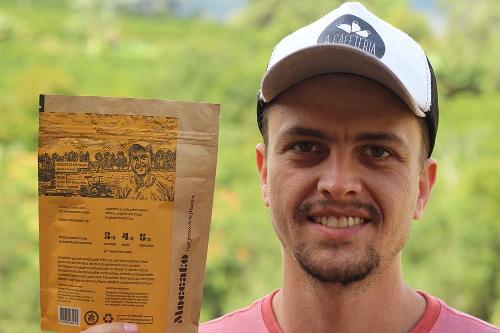
With a big area on the back to play with, we decided to pay tribute to the coffee producers by illustrating their portrait in their coffee plantations. In came William Webb, who illustrated these important people in a fine scratchboard style.
Moccato is a darn good coffee, and a client who spared no efforts to carry their vision even in the hardest moments of the project.”
CREDIT
- Agency/Creative: Plau Design
- Article Title: Branding and Packaging Design for Digital Specialty Coffee Pods Subscription Company
- Project Type: Packaging
- Format: Bag
- Substrate: Pulp Paper


