


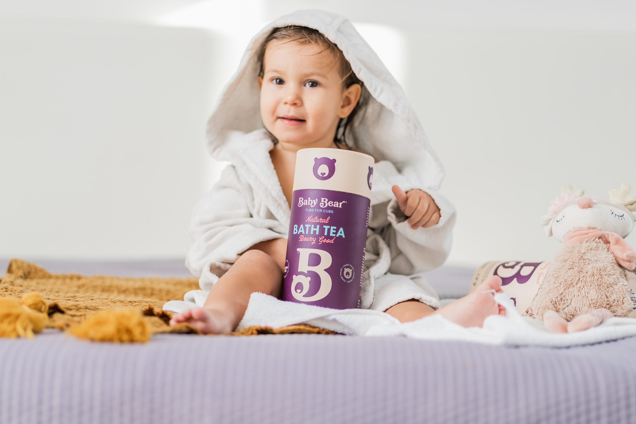
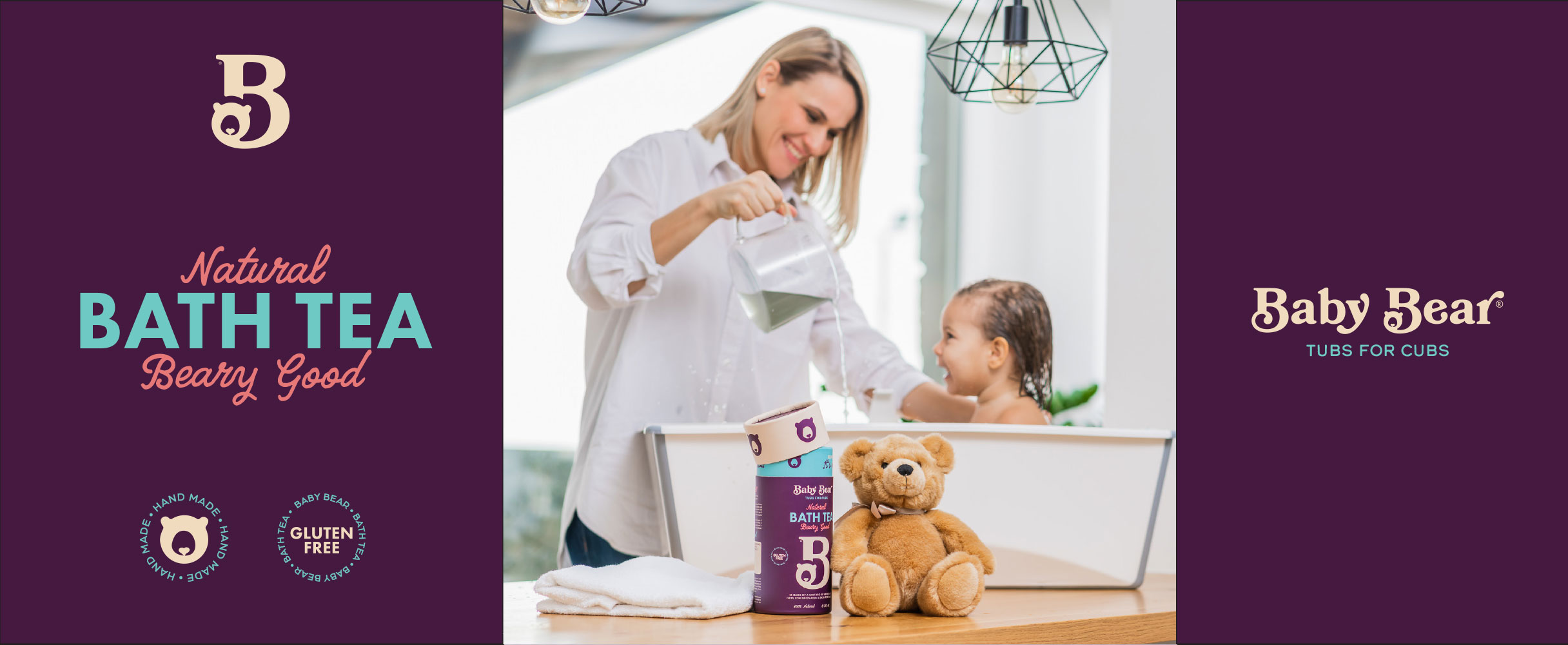
Baby Bear is a herbal bath for babies with a protective, soothing and nurturing effect, which was created after many years of dedicated work and cooperation with experts in the fields of pediatrics, dermatology and phytotherapy. It is made according to a unique recipe: a completely natural mixture of six flowers, one leaf and one fruit.
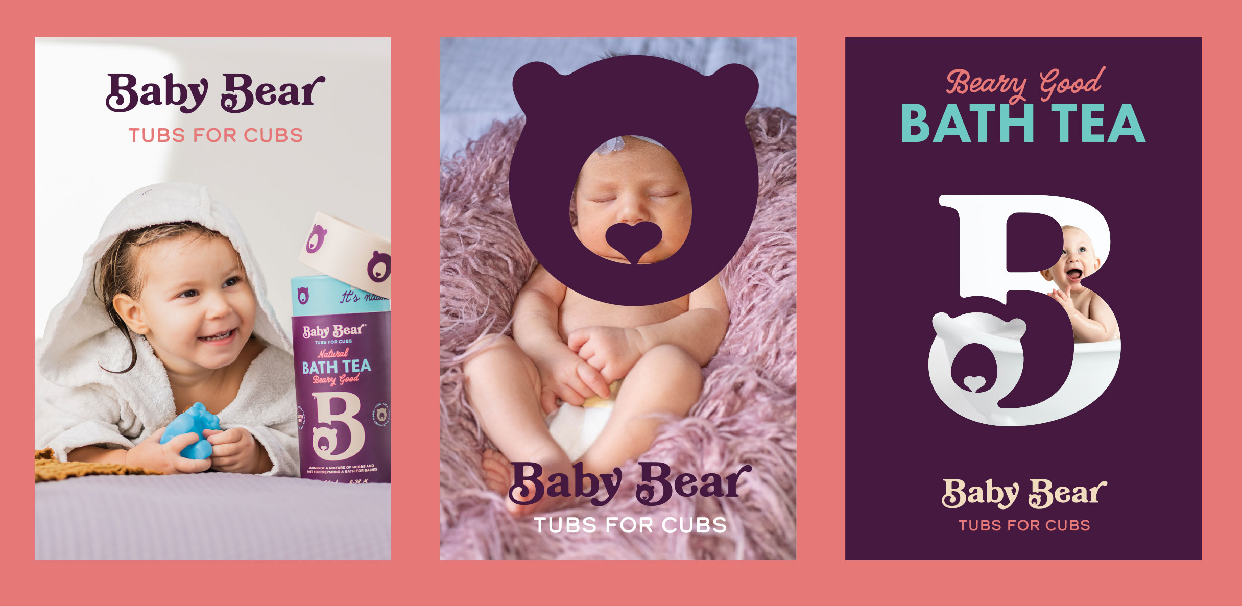
In order to emphasise the naturalness of the product, instead of plants, an animal was placed in the name – sweet and cuddly that grows under the watchful eye of the mother, who will do everything best for her cub. We found the inspiration for the brand name in the symbol of everyone’s childhood – a teddy bear. He is every child’s first friend and the association of a gentle hug, softness, comfort, safety and love.
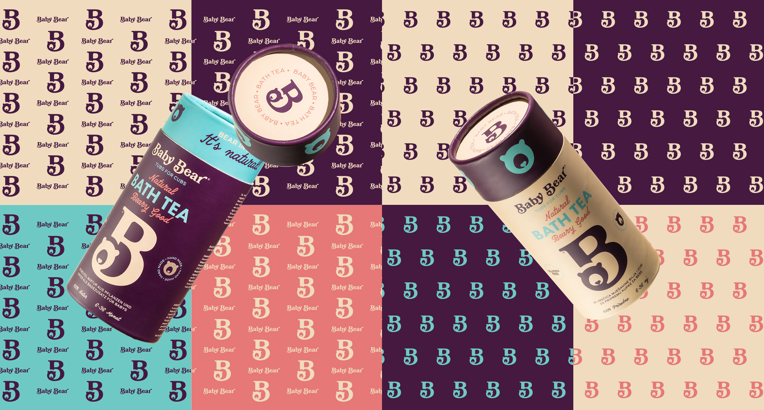
We put ‘Natural Bath Tea’ in the signature of the brand – different enough to interest us to read further what kind of product it is and precise enough to guide users to a specific method of application.
Baby Bear is a playful suggestion of a name that immediately indicates that it is a product for children. In addition to the educational part, its goal is to bring the product closer to customers in a fun way. The name and signature are accompanied by modern communication through word games that convey brand messages in a memorable way: Tubs for cubs; Bear in mind: It’s natural!
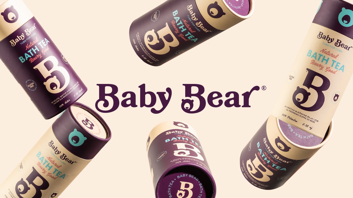
The brand sign consists of the letter “B” – the beginning of both words of the name Baby Bear. Inside the letters, there is a teddy bear that has a small heart instead of a muzzle – a symbol of the love with which the product was created and the mother’s love for the child, which also functions as a separate illustration.
The chosen colours communicate the naturalness of the product: the soothing cream colour of oats, the soothing purple colour of lavender and black marshmallow, and the blue colour that symbolises water, i.e. a bath. A carefully selected combination of typography gives a playful tone to the visual identity.


CREDIT
- Agency/Creative: Fabula
- Article Title: Branding and Packaging Design for Baby Bear Natural Bath Tea
- Organisation/Entity: Agency
- Project Type: Identity
- Project Status: Published
- Agency/Creative Country: Croatia
- Agency/Creative City: Rijeka
- Market Region: Europe
- Project Deliverables: Art Direction, Brand Creation, Brand Identity, Brand Mark, Brand Naming, Branding, Packaging Design
- Industry: Food/Beverage
- Keywords: Natural bath tea
-
Credits:
Creative director: Marko Perou017eiu0107
Tena Ruu017eiu0107: Copywriter and creative strategist


