


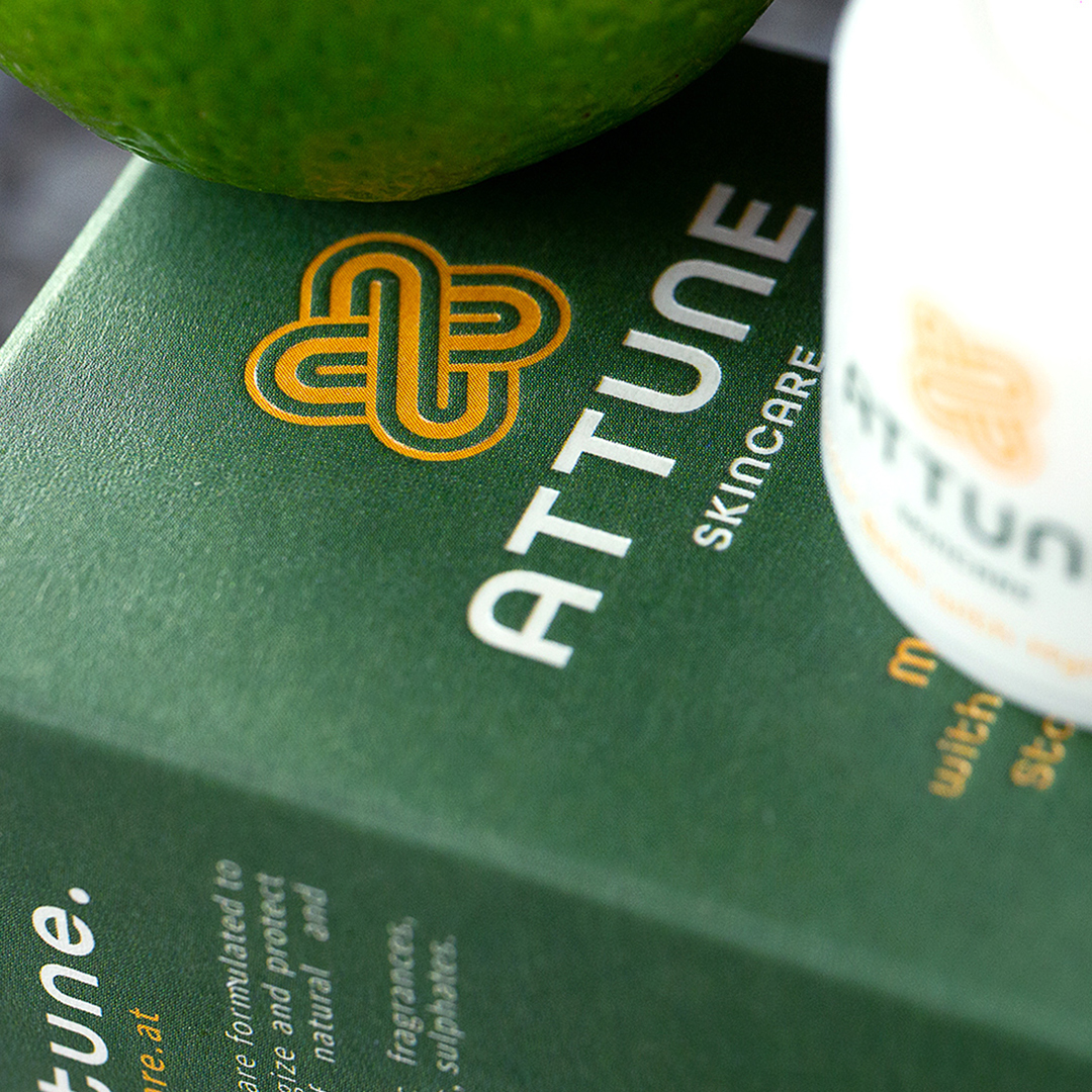
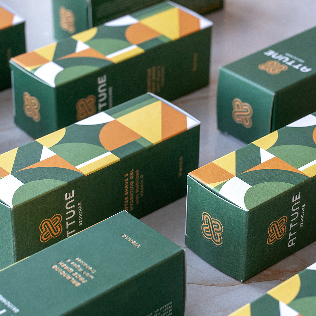
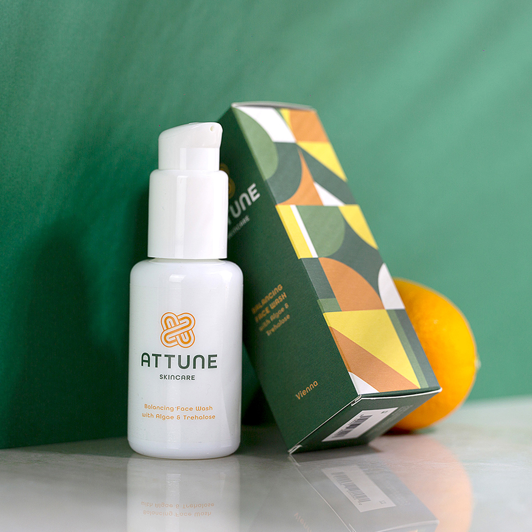
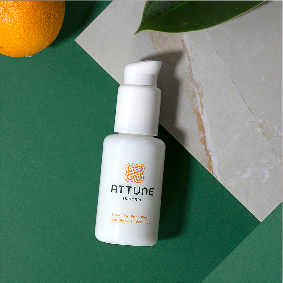
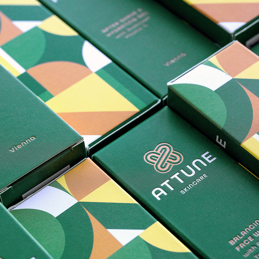
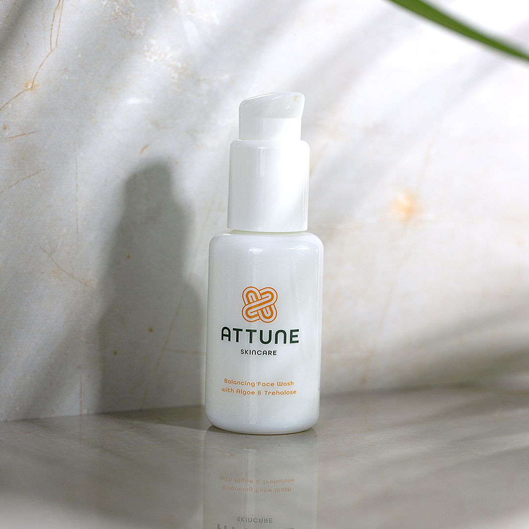
Attune is a brand of easy-to-use, hassle-free, high-tech products that actually deliver the desired effects, granting male customers access to quality natural skincare specifically designed for the needs of male skin. Attune skincare products are formulated to rebalance male skin, energize, and protect with the combination of natural and high-tech ingredients. Our mission was to differentiate Attune from any other brand of cosmetics dedicated to men, while visually illustrating their mantra: be in tune! We built the brand’s identity taking into account the fact that they want to constantly explore and create new products to offer effective solutions, tailored to men’s skin. In terms of colors, we created a mix of green, the color of nature, symbolizing growth, harmony, freshness, fertility, and orange, which represents enthusiasm, happiness, determination. Our pattern is made of basic geometric shapes, in the idea that “form follows function” following our inspiration from the Bauhaus movement, which is represented in all our visuals.
CREDIT
- Agency/Creative: MRZ Design
- Article Title: Branding and Packaging design for Attune Skincare
- Organisation/Entity: Agency, Published Commercial Design
- Project Type: Identity
- Agency/Creative Country: Romania
- Market Region: Europe
- Project Deliverables: Brand Guidelines, Brand Identity, Branding, Graphic Design, Packaging Design, Photography, Research
- Industry: Health Care
- Keywords: Skincare packaging and branding


