


Kombucha, also known as “mushroom from tea”, is a fermented drink that is made on the basis of sweet tea and a symbiotic culture of bacteria and yeast. This drink has been around for thousands of years and is traditional in some cultures, where it is revered for its many beneficial properties.
The concept of the “Clear Mind” brand:
In today’s world, where information overload, stress and a sedentary lifestyle have become the norm, we all need something that will help keep our minds clear and improve our physical well-being. People strive for harmony in life, for a state where they can successfully manage their responsibilities while simultaneously enjoying moments of rest and relaxation. That’s why I decided to create a kombucha, which is not only useful, but also aimed at cleansing and restoring the body. “Clear mind” helps to free the mind from unnecessary worries and restore harmony to the body.
Idea:
It’s just colorful mushrooms!
The brand’s mission statement:
The brand’s mission is to support each person on their way to harmony between work and leisure by offering a natural and refreshing drink that promotes mental clarity and inner peace. I believe that a combination of health care and pleasure can help people achieve a state of “life-balance”, which ultimately leads to a happier and more productive life. The brand strives for a world where taking care of mental and physical health becomes a natural part of everyday life. “Clear Mind” is a kombucha brand that supports people on this path, helping them maintain mental clarity and inner balance.
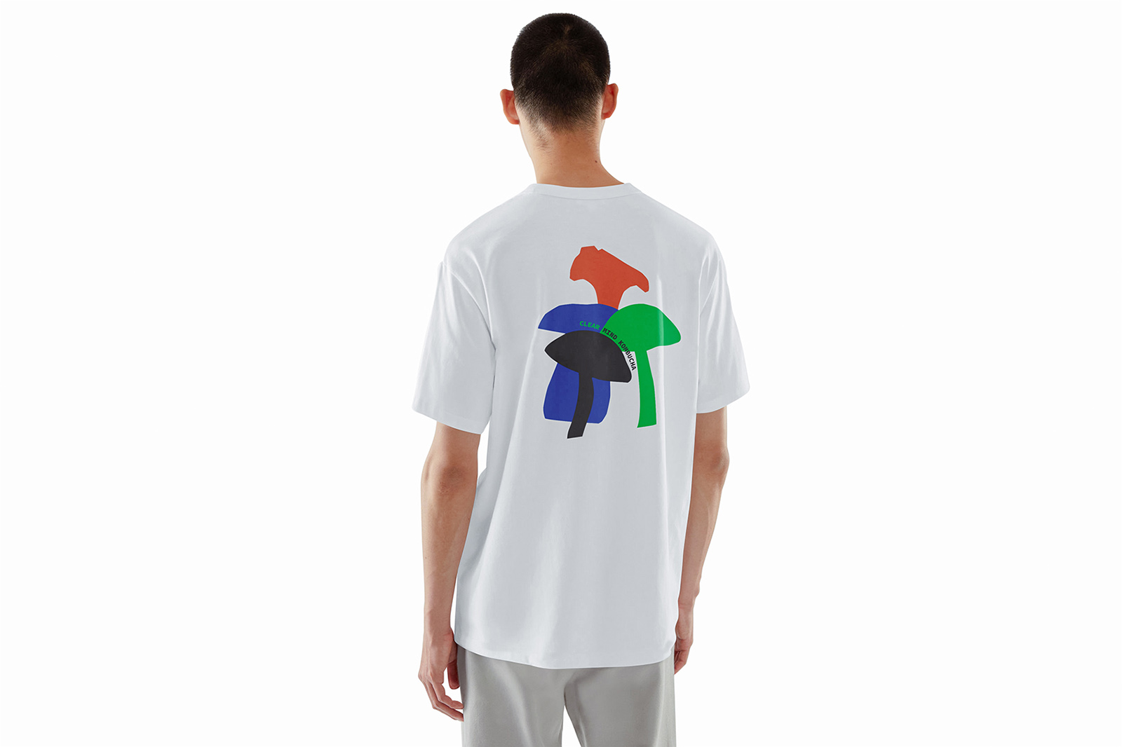
Packaging and visual identity:
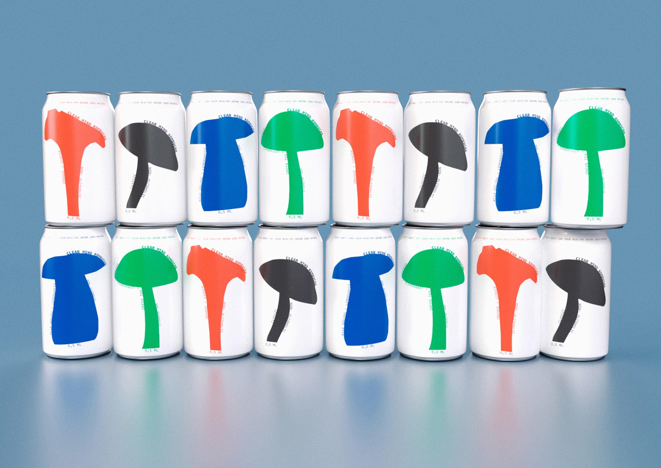
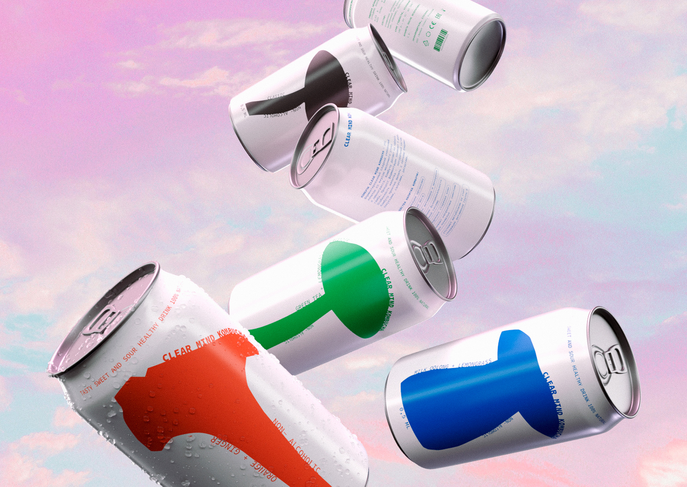
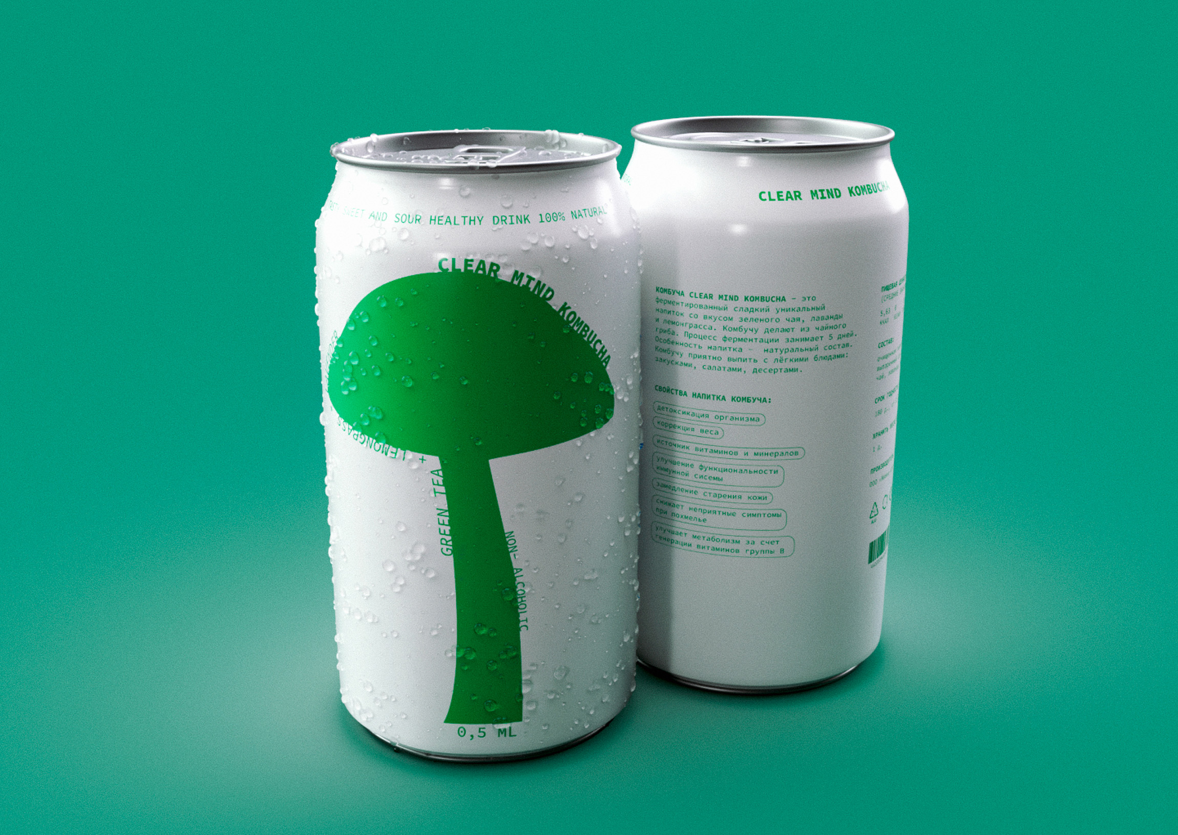
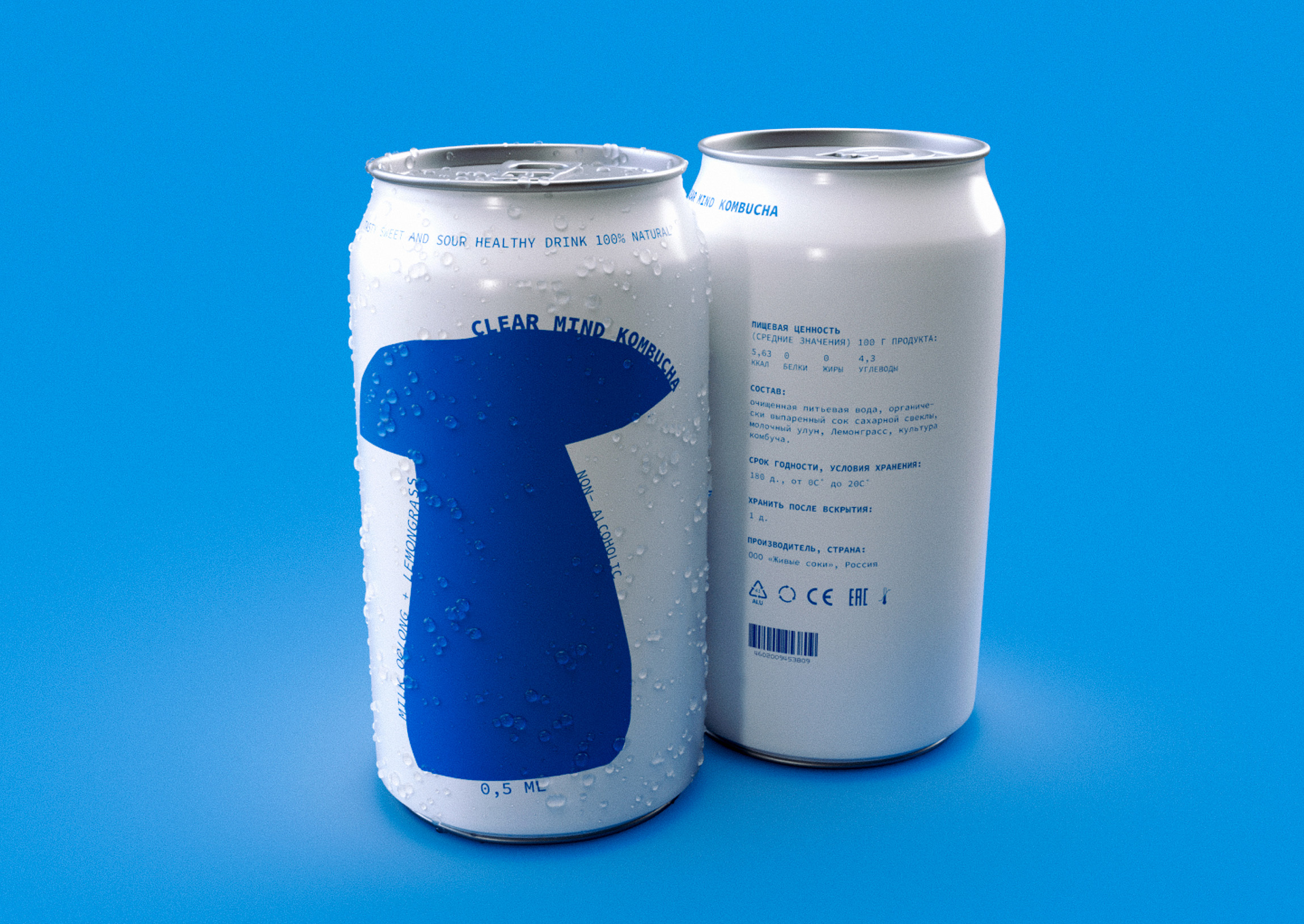
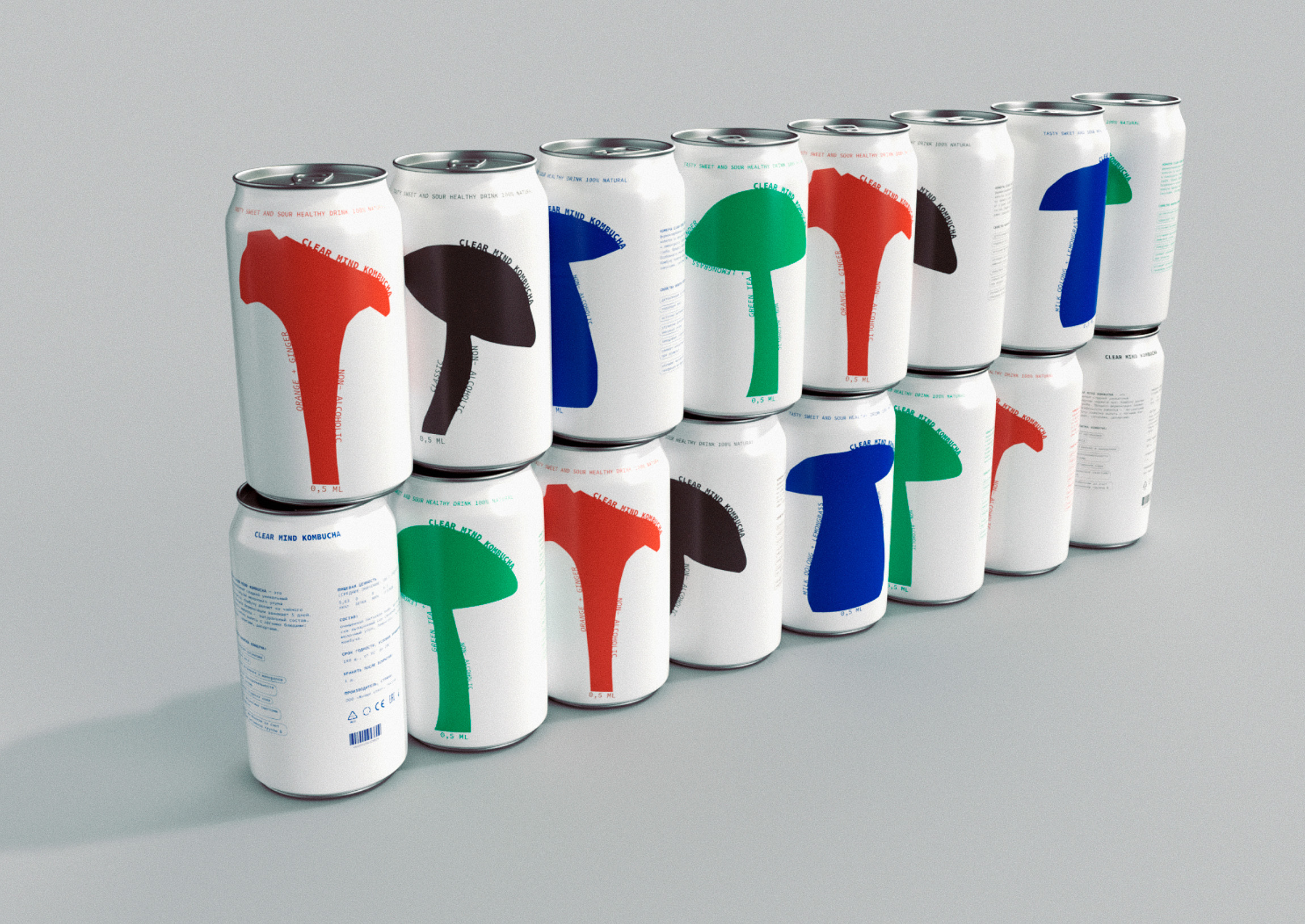
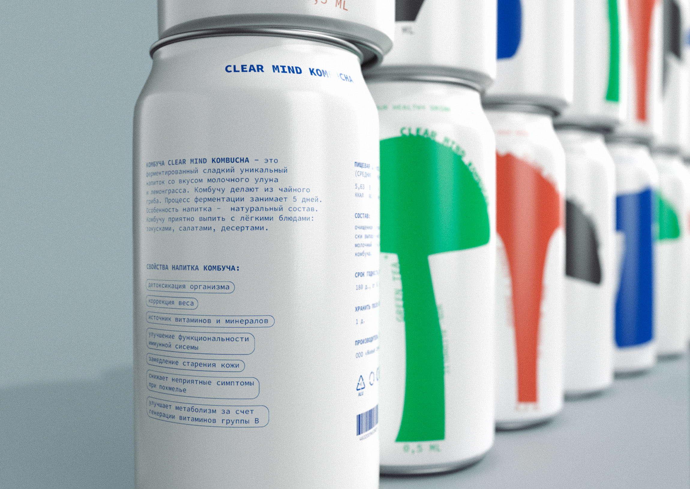
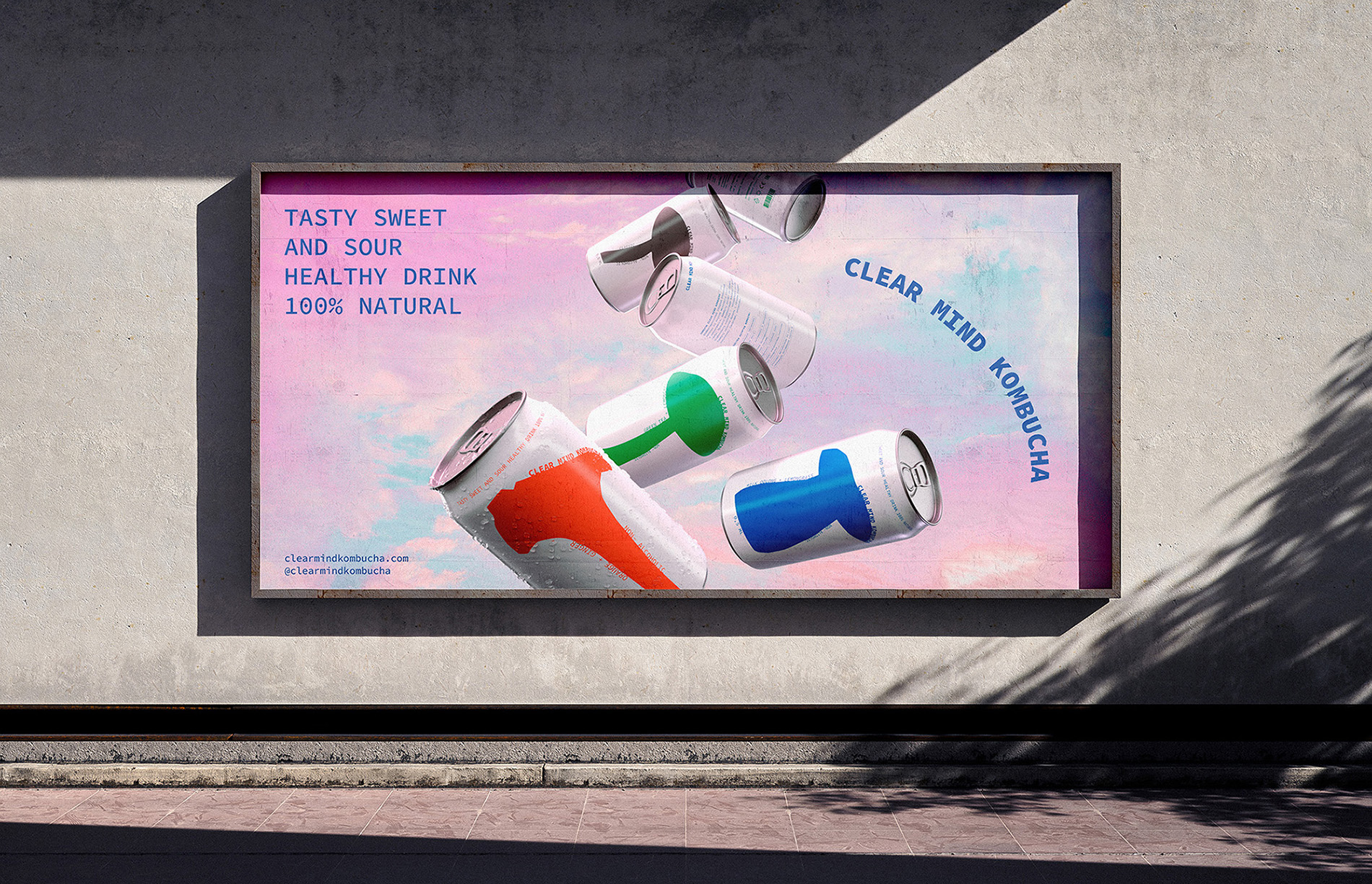
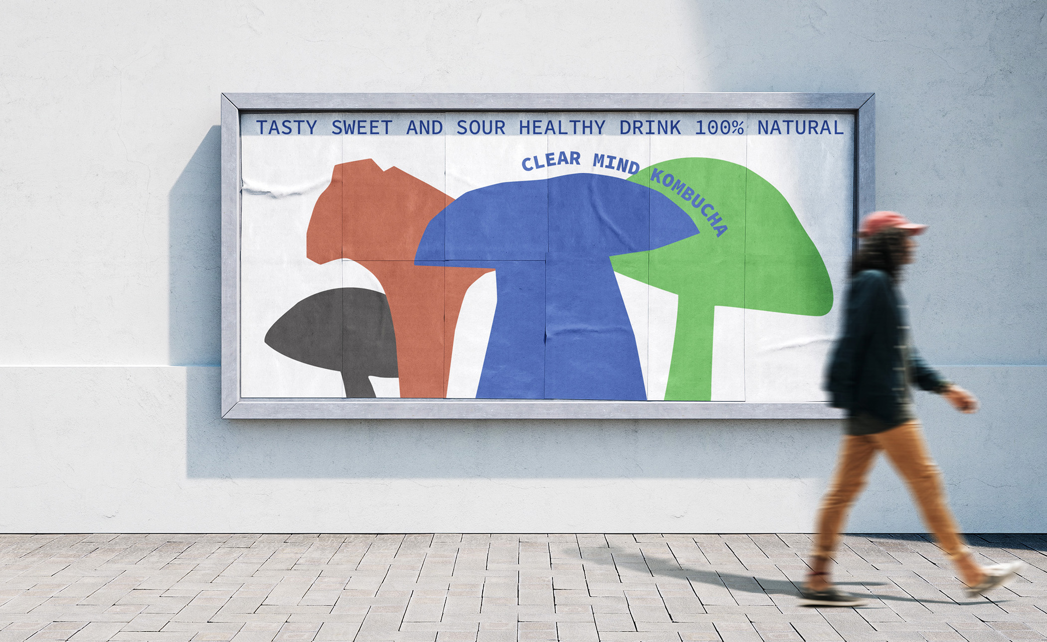
The “Clear Mind” packaging is a continuation of the “life-balance” philosophy. It is bright, but not overloaded with details, easy to perceive, but with elements of fun. “Clear Mind” differs from other brands in its simplicity and lightness, reflected in the packaging design and in the product itself. Such a kombucha is not only useful, but also visually understandable for everyone. Each aluminum jar has a minimalistic illustration of different types of mushrooms. What could be simpler and clearer? This is a reflection of the lightness, simplicity and joy that I want to bring to the lives of the brand’s customers. The color scheme of the packaging corresponds to the philosophy of each taste: each jar has only one main color, nothing superfluous. If you put a ruler in a row, you will get a “mushroom forest” – this is a reference to the development of a community where everyone can get help, support and motivation.
CREDIT
- Agency/Creative: Sofya Grazhevich
- Article Title: Branding and Packaging Design for Сlear Mind Kombucha by Student Sofya Grazhevich
- Organisation/Entity: Student
- Project Type: Packaging
- Project Status: Published
- Agency/Creative Country: Russia
- Agency/Creative City: Moscow
- Market Region: Europe, Global
- Project Deliverables: 3D Design, Brand Creation, Brand Design, Brand Identity, Graphic Design, Illustration, Packaging Design
- Format: Can
- Industry: Food/Beverage
- Keywords: Kombucha, Packaging, Fun, Mindfulness, Health, Beverage, Soft drinks, Branding
-
Credits:
Designer: Sofya Grazhevich
Curator: Evgeny Razumov
Curator: Leonid Slavin


