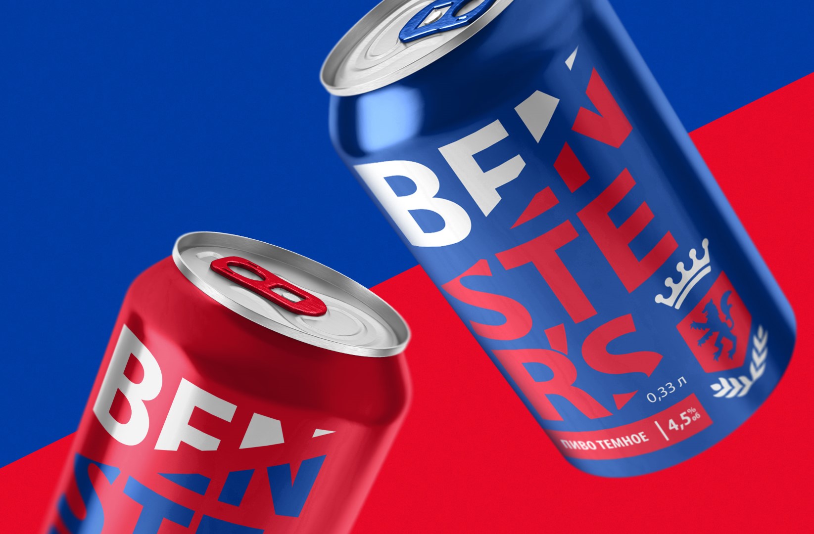
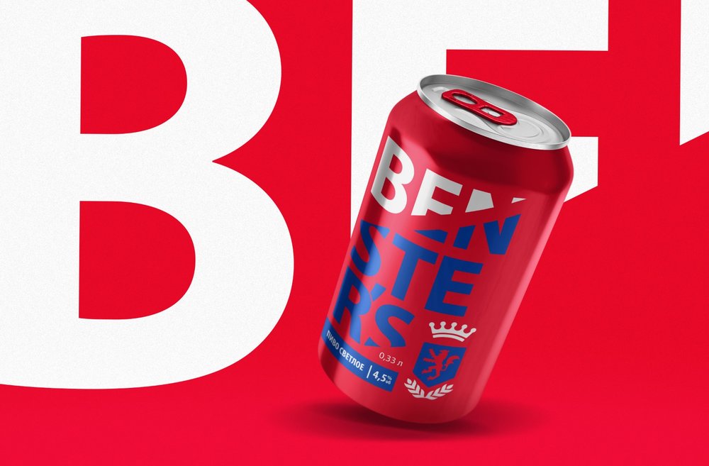
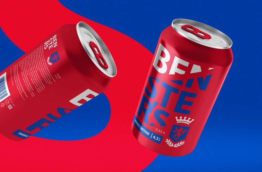
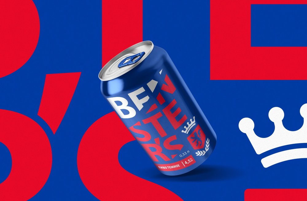
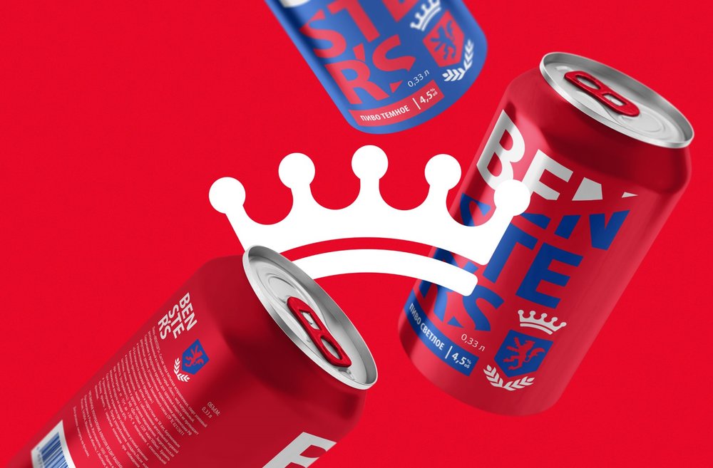
” We refused the template of the british classics, but took the best – national flag, his geometry and colors. In the package you can see bright rebellious Britain, that gave the world The Beatles, Depeche mode and The Rolling stones, raised the first generation of punks and adorned the youth of millions people with electronic mixes by Prodigy and Chemical Brothers.
Benster’s packaging is a modern minimalist. The British flag provided a basis of the design, but not used directly. Diagonal lines divide the writing Benster’s and bright color spots repeat stylistics of the flag. Heraldic symbols play a minor role –to emphasize the stated nature of Britain. Large typography draws attention and stay in perfect harmony with general design.”
CREDIT
- Agency/Creative: Branding agency DDC.Lab
- Article Title: Branding agency DDC.Lab – Benster’s beer
- Project Type: Packaging
- Format: Can
- Substrate: Metal
FEEDBACK
Relevance: Solution/idea in relation to brand, product or service
Implementation: Attention, detailing and finishing of final solution
Presentation: Text, visualisation and quality of the presentation


