


Introduction: The Evolution of the Digital Architect In the rapidly evolving landscape of the Information Technology sector, the term “software house” has often been relegated to a purely functional role—a black box where requirements enter and code emerges. For Walor Software Studio, the ambition was far greater. As the technological foundation of the Inbreathe group, the studio needed to move beyond the anonymous narrative of outsourced coding. The goal was to establish a brand that functions as a Venture Studio partner: a collaborative, design-aware, and business-centric entity.
Created and directed by Damian Jaszczyk (General Partner at Brand You Studio), the new identity for Walor Software Studio is conceived like a clean line of code: structured, modular, and intentionally minimal. It is a visual manifesto that proves technology should not fight aesthetics but rather be elevated by it.
The Challenge: Breaking the Binary Stereotype The primary challenge was to break the stereotypical image of a programming agency. Most competitors in the IT space rely on generic tech-blue palettes, complex abstract shapes, or impersonal stock imagery of “the cloud.” Walor needed to communicate a “Developer as a Service” model, where the value lies in precision, partnership, and engineering excellence.
The task was to translate abstract lines of code into a tangible, premium brand experience. The project required a move from being a mere provider of labor to being seen as a strategic architect of digital products. This necessitated a visual language that could speak to both the technical rigor of developers and the high-level business goals of founders and CEOs.
The Strategic Foundation: Naming and the Concept of Value Everything began with the name: Walor. In the Polish language, “Walor” denotes value, a positive trait, or a precious asset. It is a short, punchy declaration of quality. By choosing this name, Brand You Studio positioned the brand as a value-add partner from the very first interaction.
The strategy was built on the “Logic of Clean Code.” Just as a well-written script follows a strict hierarchy and avoids unnecessary complexity, the branding was designed to be “system-led.” The philosophy was simple: if an element doesn’t serve a specific purpose, it is noise. And in a world of digital clutter, clarity is the ultimate luxury.
Visual Strategy: The Architecture of Swiss Precision Drawing deep inspiration from the roots of Swiss Graphic Design and the International Typographic Style, the visual system relies on a strong typographic rhythm and a clear, mathematical grid. This choice was not merely stylistic; it was a metaphor for the engineering precision inherent in Walor’s work.
The grid acts as the “source code” of the brand. It dictates the placement of every element, ensuring that whether the brand is seen on a business card, a mobile app, or a large-scale presentation, the structural integrity remains uncompromised. This modularity allows the brand to adapt easily across formats without losing its core identity—mirroring the scalability of the software Walor builds for its clients.
Typography: Rhythm, Structure, and Voice Typography is the protagonist of the Walor identity. In the absence of distracting illustrations or decorative flourishes, the choice of typefaces becomes the primary vehicle for the brand’s personality. The studio selected fonts that balance technical modernity with timeless readability.
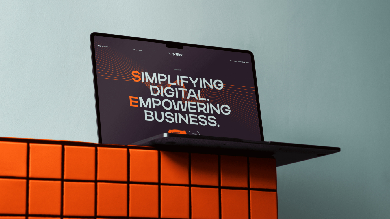
The typographic system is built on a hierarchy that mirrors code indentation. Large, bold headings command attention and establish authority, while smaller, meticulously spaced secondary text provides the technical detail. This “rhythmic typography” ensures that information is digested effortlessly, reinforcing the brand’s promise of “simplifying digital.”
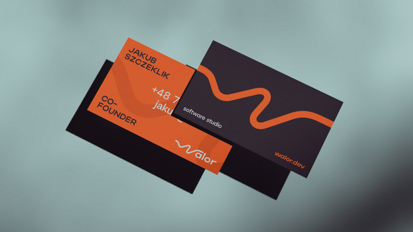
The Palette: High Contrast, High Focus Color in the Walor universe is used functionally rather than decoratively. The high-contrast palette—dominated by deep blacks, crisp whites, and strategic accents—reinforces hierarchy without distraction. This monochromatic core is a nod to the “dark mode” environments where developers spend their time, creating an immediate sense of familiarity and professional “insider” knowledge.
By stripping away a rainbow of colors, the brand focuses the viewer’s eye on what truly matters: the content, the logic, and the results. It is a palette that “works harder” by using contrast to guide the user’s journey through digital interfaces and physical touchpoints.
The Modular Design System: Building for Scale One of the standout features of this case study is the modular design system. Brand You Studio created a toolkit of components that can be rearranged and scaled as the company grows. This “Design System” approach ensures that every new piece of communication—be it a social media post, a technical documentation header, or a website update—stays consistent with the original vision.
The logo itself is a testament to this construction. It is built on a geometric framework that reflects both the “W” of Walor and the symbols often found in code syntax. It is a mark that feels both solid and dynamic, representing a technological foundation that is ready to support the brand’s logic and communication.
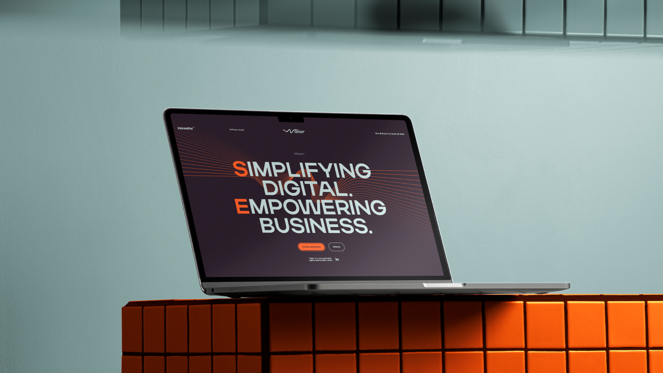
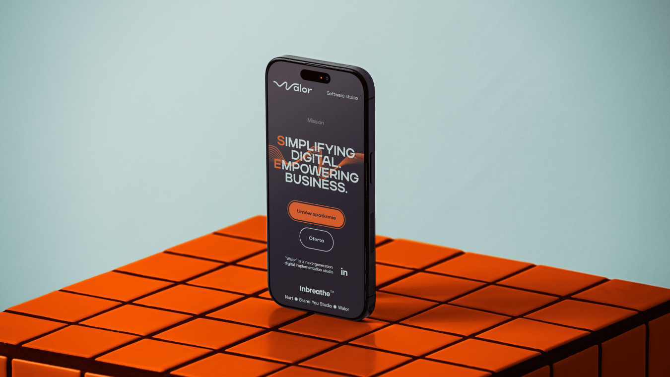
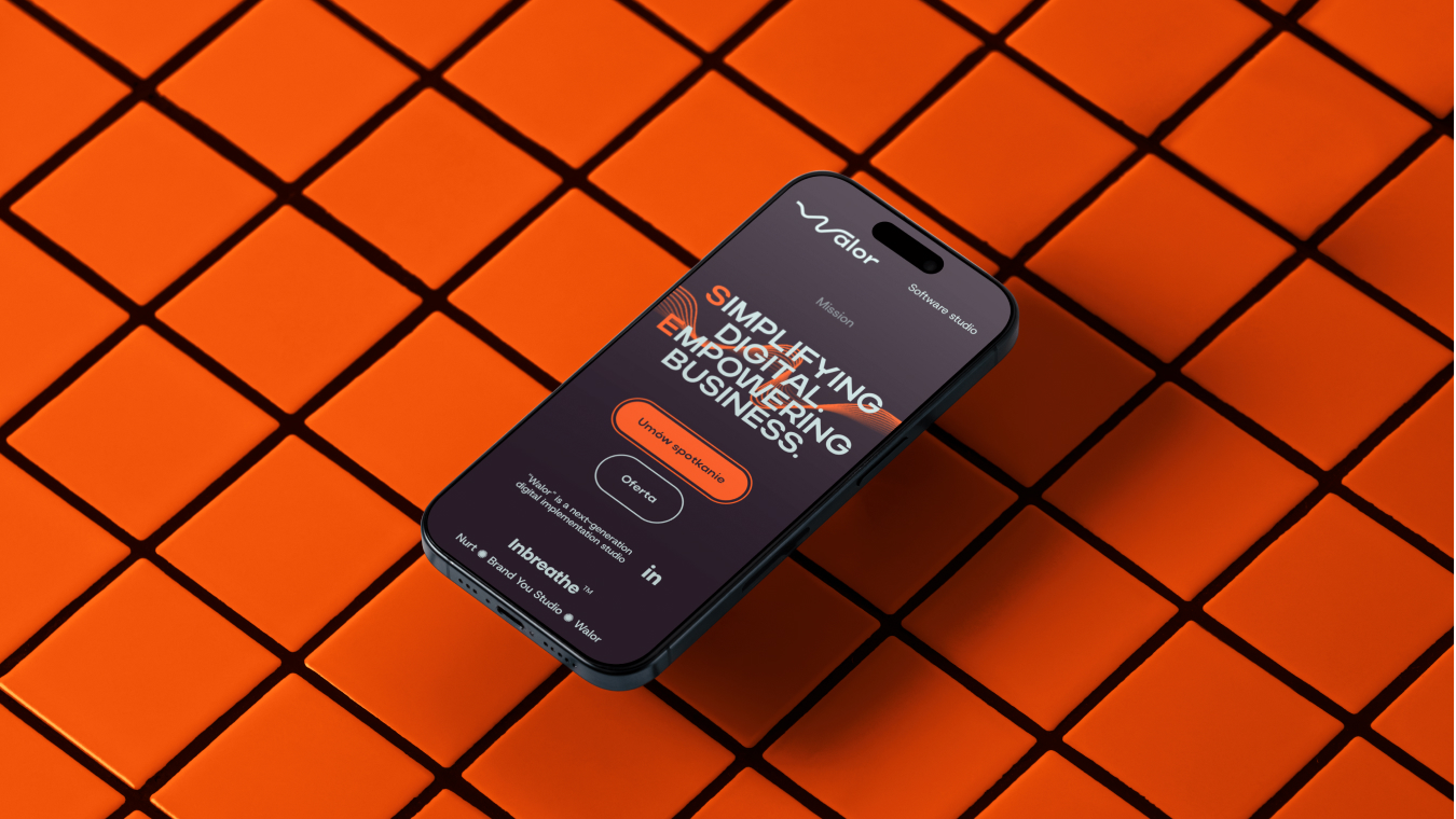
Digital Implementation: Bridging the Gap As a software studio, Walor’s most important touchpoint is its digital presence. The website design & development was treated with the same “no noise” philosophy. Every interaction is purposeful. The transition from desktop to mobile is seamless, thanks to the modular layout mentioned earlier.
The website acts as a live demo of the brand’s capabilities. It is fast, efficient, and aesthetically uncompromising. By implementing the brand’s visual identity through art direction that prioritizes “Czysty Kod” (Clean Code), the site positions Walor as a premium player in the tech space, attracting clients who understand that code is, in itself, a form of design.
Conclusion: Branding That Works Harder The final result is more than just a new logo; it is a complete ecosystem that breeds trust from the first encounter. Walor is no longer seen as a generic contractor but as a premium technological partner.
Through the work of Damian Jaszczyk and Brand You Studio, Walor Software Studio now possesses a brand that supports its scale, logic, and long-term vision. It is an identity that doesn’t just look good—it is a functional tool that drives business value, proving that in the world of high-end software development, the most powerful statement is one of structured simplicity.
CREDIT
- Agency/Creative: Brand You Studio
- Article Title: Brand You Drives Industry Authority with Walor Software Studio’s High-Contrast Functional Design
- Organisation/Entity: Agency
- Project Type: Graphic
- Project Status: Published
- Agency/Creative Country: Poland
- Agency/Creative City: Cracow
- Market Region: Europe
- Project Deliverables: Brand Design, Brand Guidelines, Brand Identity, Brand Strategy, Branding
- Industry: Technology
- Keywords: Software House, Technology, Design System, Modular Design, Visual Identity, High Contrast, B2B Branding, Minimalist, Corporate Identity, IT Sector, Modern Branding, Brand Strategy
-
Credits:
Growth strategist: Fabian Lic
Art director: Damian Jaszczyk


