


Rebranding Magic embraces the universe of digital learning. A universe where you can learn and grow through joyful experiences EdTech that embraces humanistic learning.
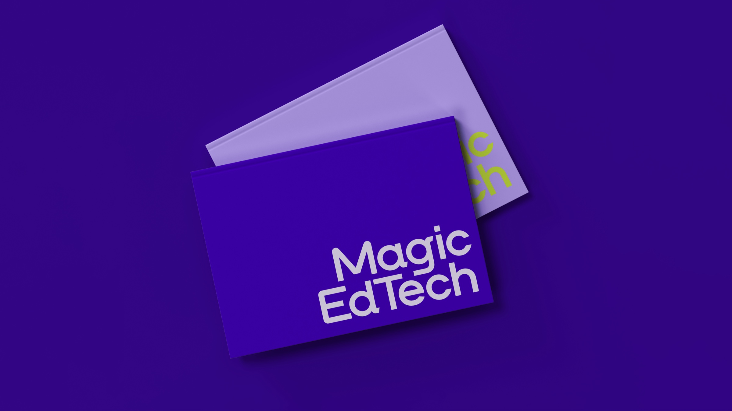
We created a stimulating digital presence for Magic Edtech with a brand new logotype combined with a sparkling visual motif, making the educational technology brand stand out with verve.
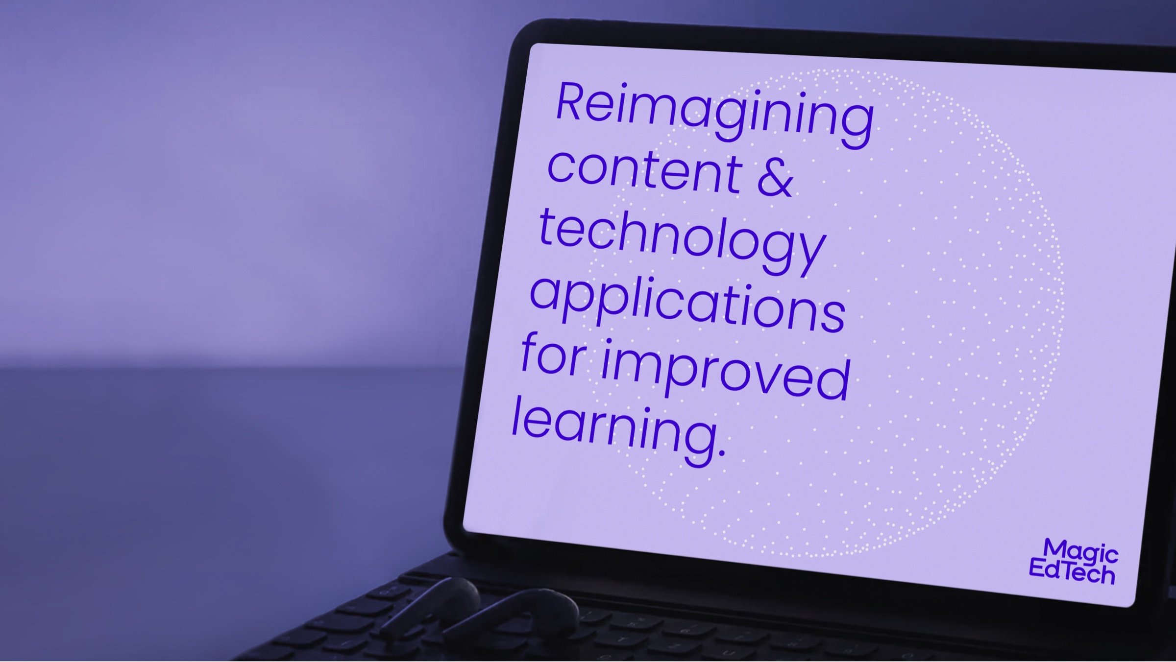
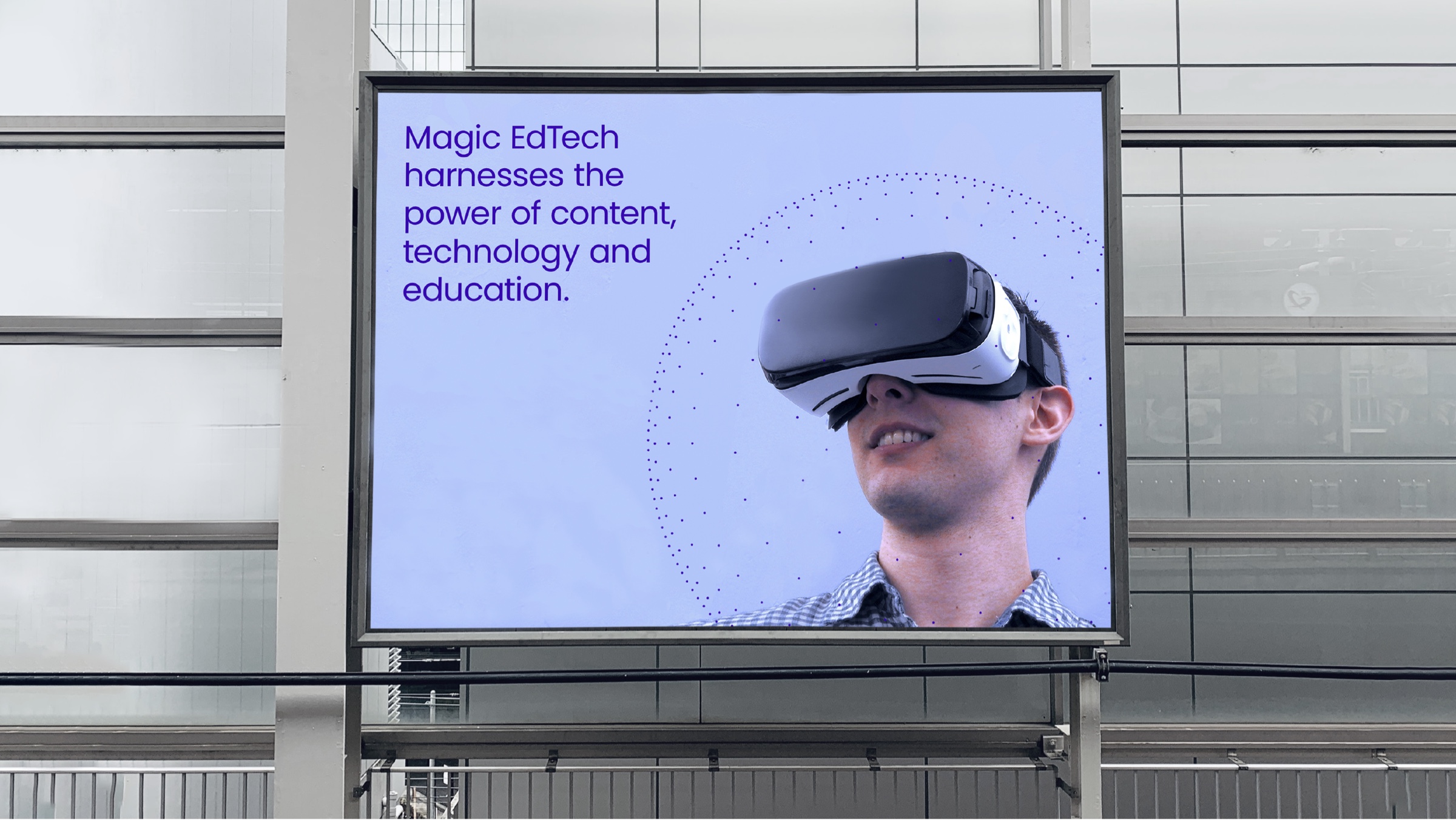
Magic Edtech had evolved over the years, with an early entry in digital education thereby establishing a firm foothold in the Edtech sector. Magic prides itself on having a holistic understanding as educational technology experts who provide a unique blend of content, technology, and education.
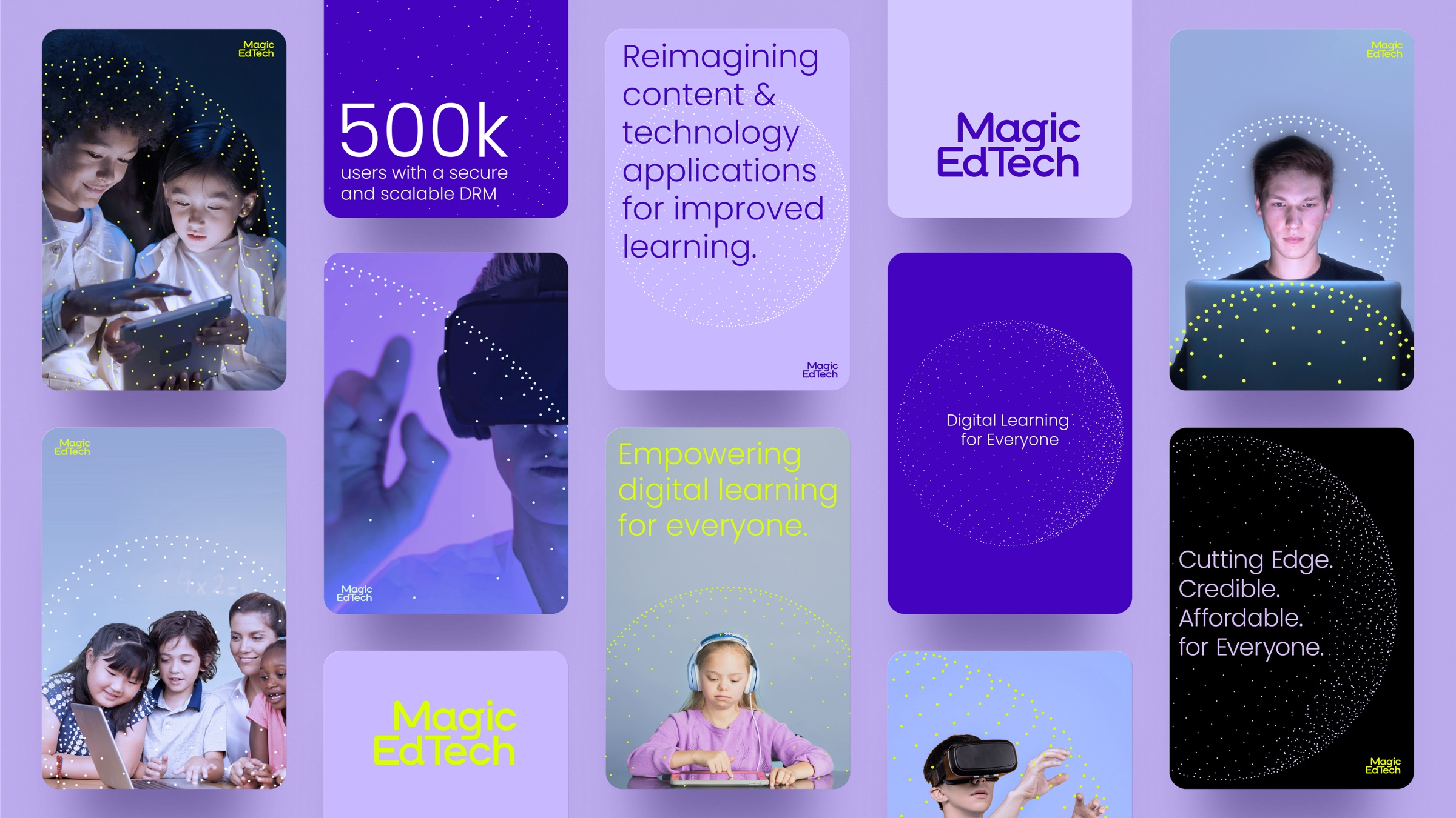
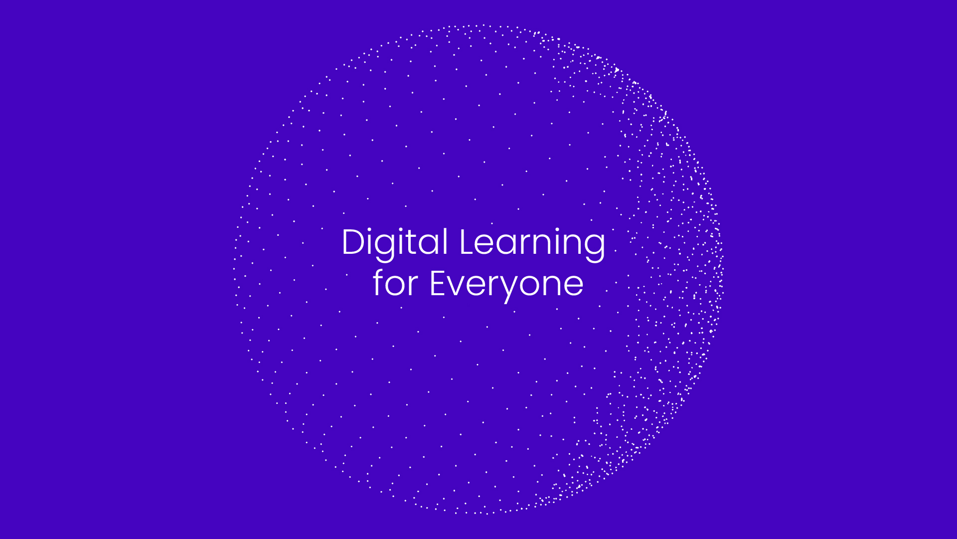
We positioned them as Edtech experts who enabled learning for all kinds of people, creating their stance as ‘Digital Learning for Everyone’.
The clean, simple, and emphatic logotype act as a signature for the brand, giving assurance of quality and standards. The logotype forms were derived by constructing curved humanistic contours with sharp edgy forms.The logotype is a compact typographic form that reflects the efficient and humanistic nature of the brand. The highly-crafted yet engineered appearance establishes the two-sided character of Magic, which is both human and technological.
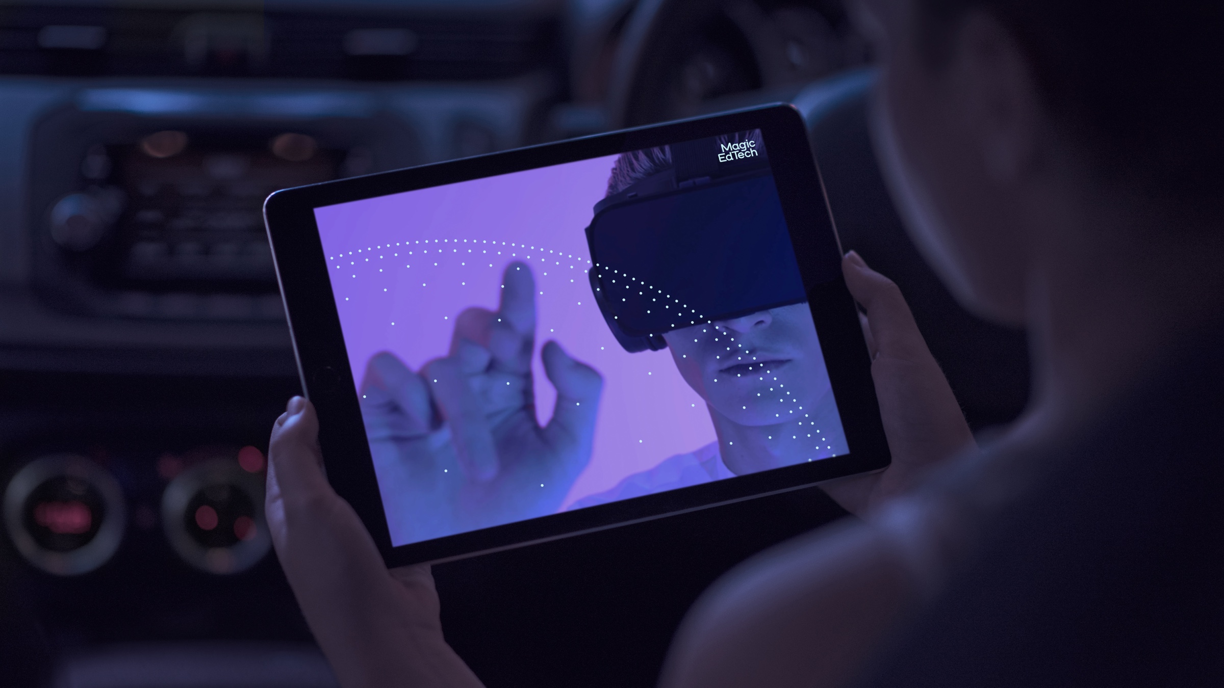
The visual system was derived using circular forms consisting of ‘digital particles’. The aim was to portray a digital space that encapsulated the magical experience of technology. In essence, the circular configuration of dots complements the simple identity adding visual meaning and substance by relating to varied subject matter. Depending on how it is placed over a photograph or text, the visual dot motif works in tandem, giving emphasis to the subject of the image, text or visual system.
We created manifestations of the dots system: an animation that grows and bursts into sparkles or a ring that encircles people or text.
The color palette of purple and green tones sets Magic Edtech apart in the landscape.
All together the visual system portrays the space for Magic Edtech, combining learning, technology, and joyful experiences.


CREDIT
- Agency/Creative: Lopez Design Pvt. Ltd.
- Article Title: Brand Visual System for Magic EdTech
- Organisation/Entity: Agency
- Project Type: Identity
- Project Status: Published
- Agency/Creative Country: India
- Agency/Creative City: Gurgaon
- Market Region: North America
- Project Deliverables: Branding, Design, Graphic Design, Logo Design, Motion Graphics, Rebranding, User Experience, User Interaction, Web Design
- Industry: Education
- Keywords: branding, motion graphics, User Interaction, User Experience, Ed-tech, Education technology, graphic design, brand identity
-
Credits:
Principal Designer: Anthony Lopez


