The project for the Letterz School in Kyiv is a comprehensive work on rebranding, which lasted almost three months. During this time, our agency has developed a strategy, naming, branding, website, and communication strategy.
After analyzing the audience and business, we decided to focus on schoolchildren 6-16 years old, because this audience is the most loyal.
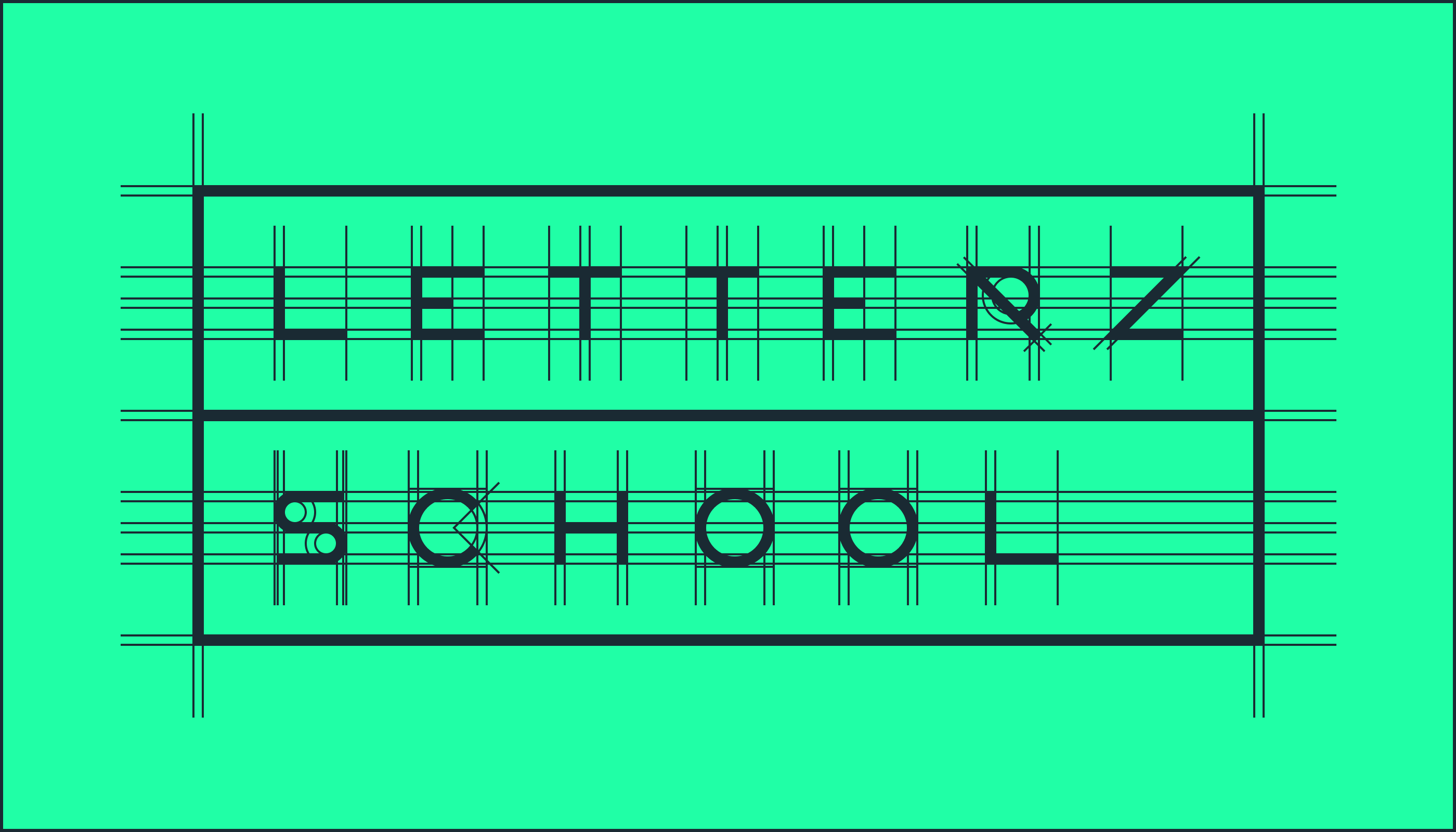
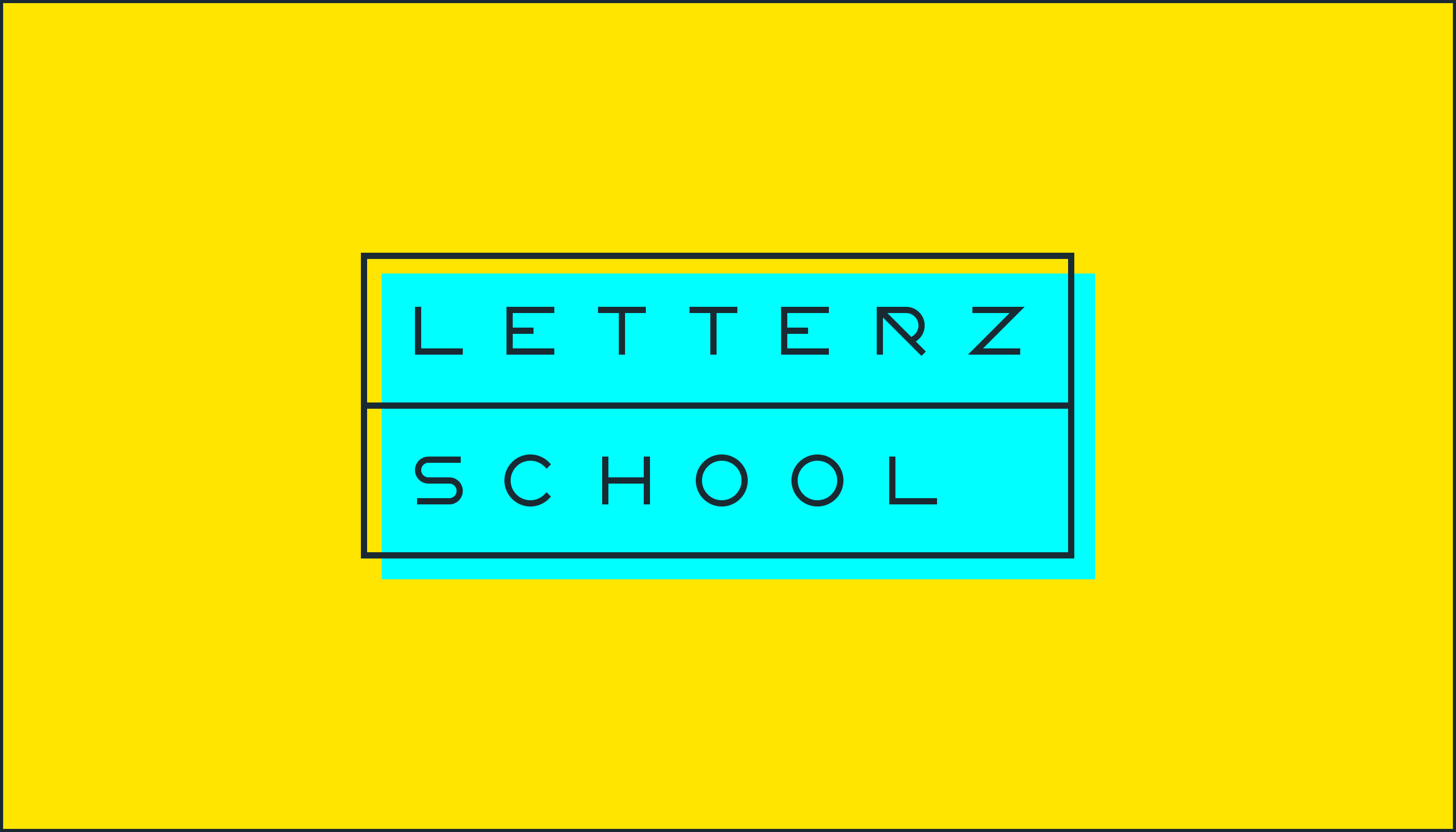
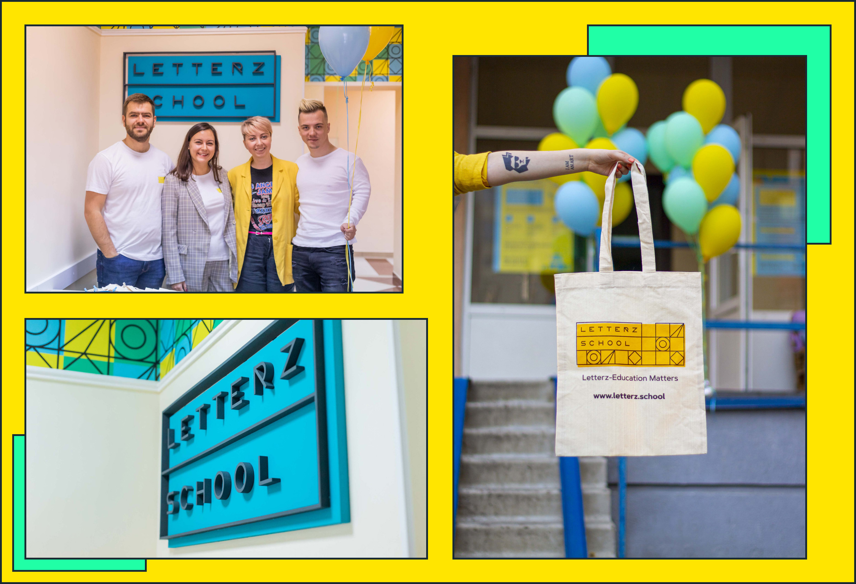
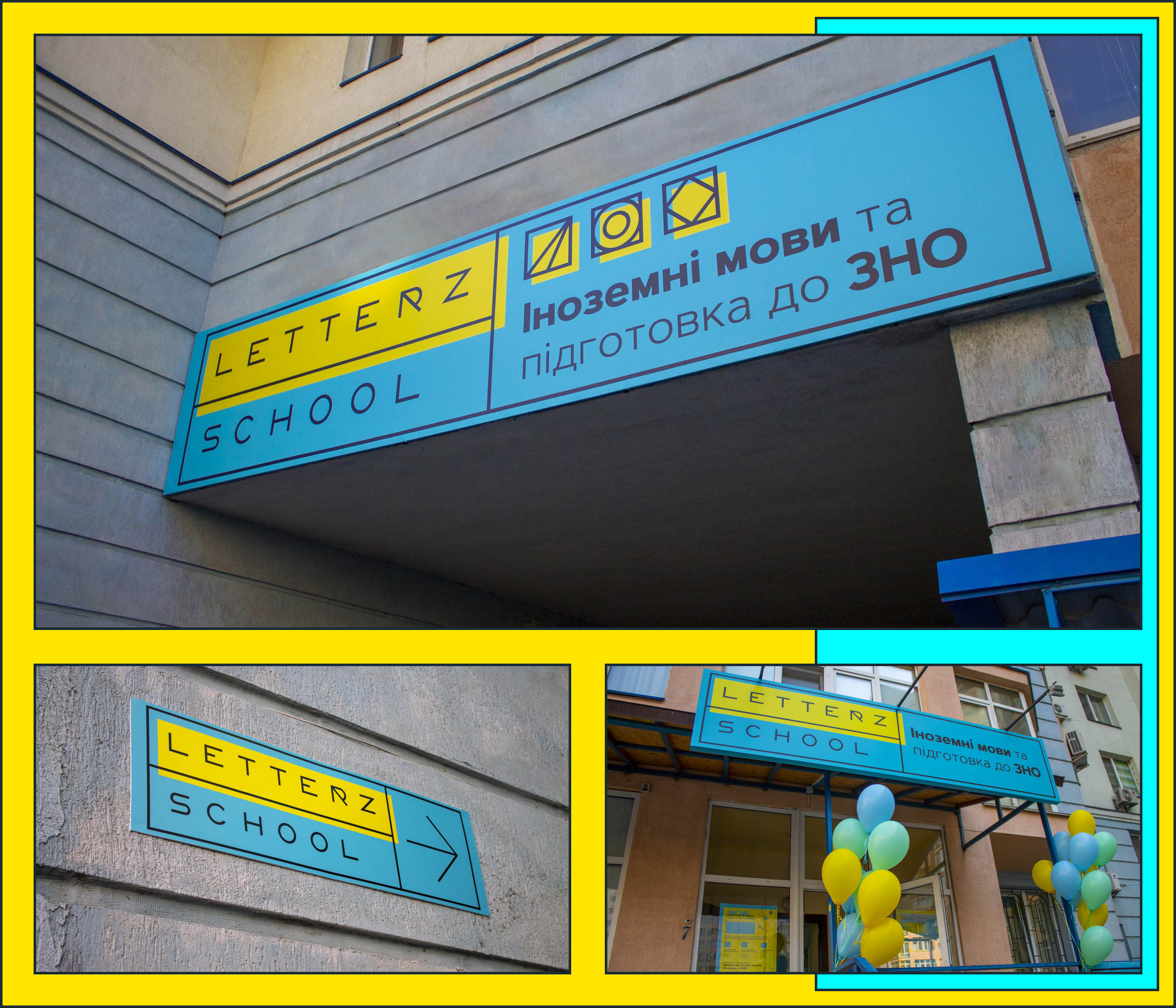
We created the name Letterz School, as the most reflecting an emphasis on linguistics, general mood, and tone. In the word “Letterz”, the last letter “S” is intentionally replaced by “Z”. So the name looks more interesting and modern. Naming indirectly hints at the Z generation.
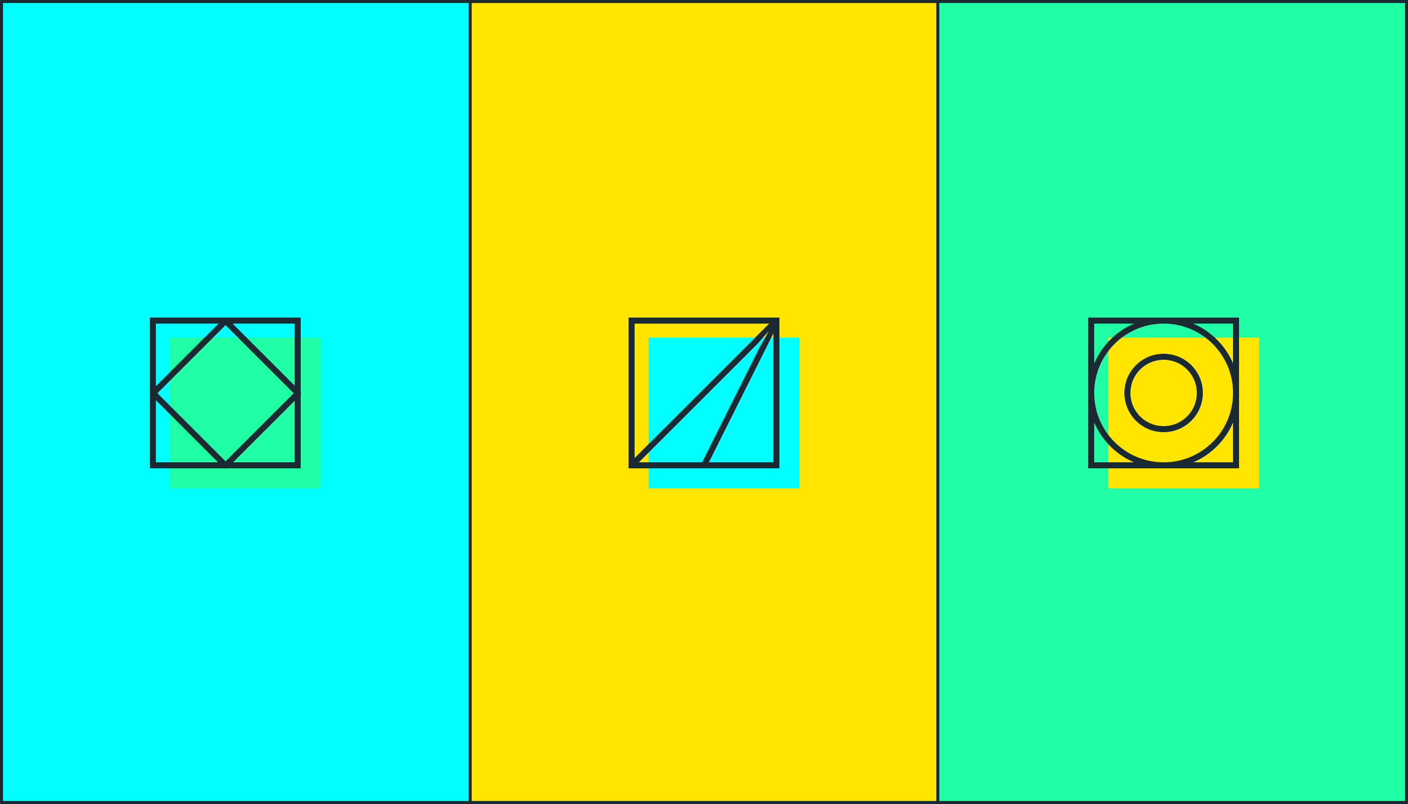
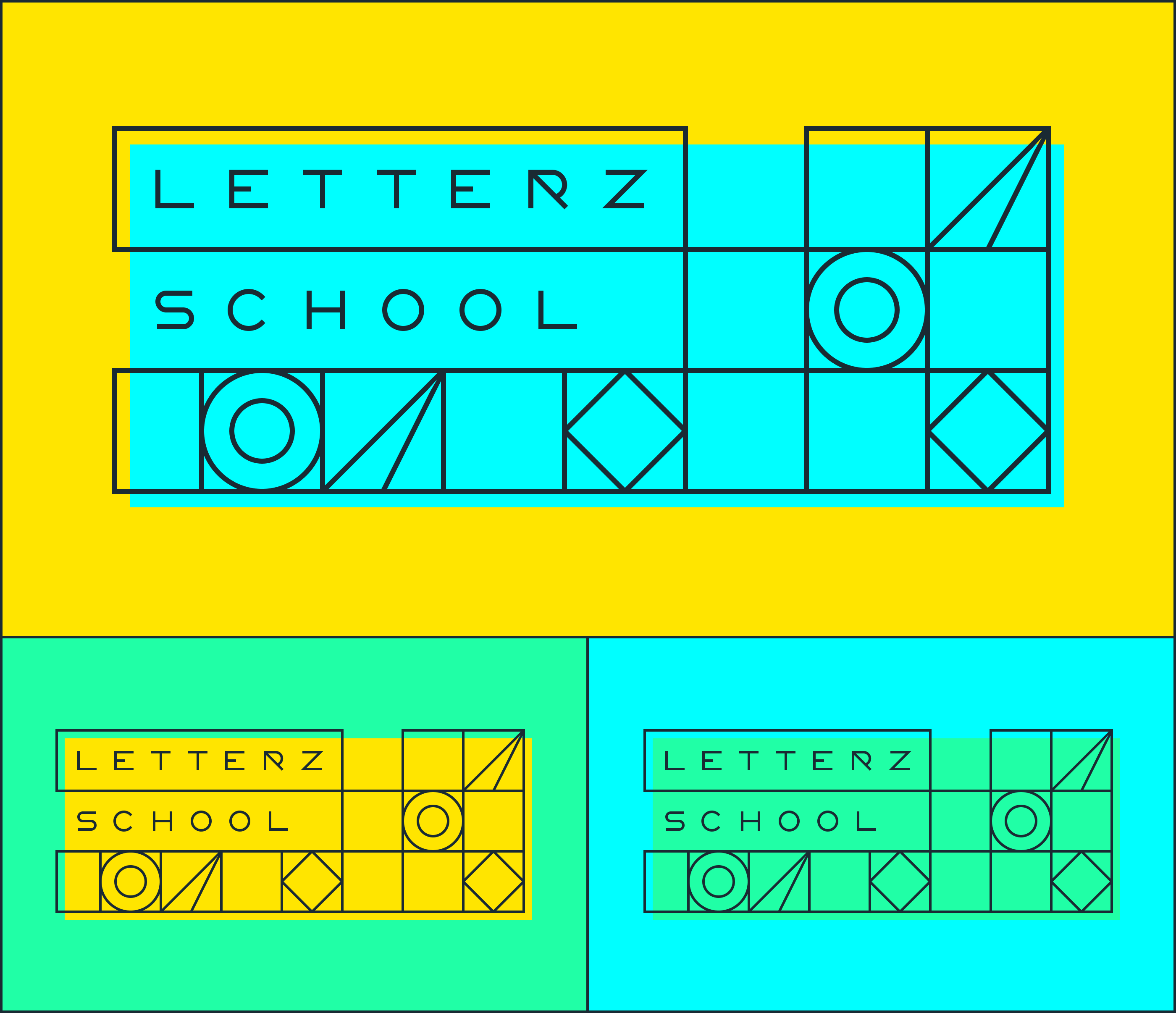
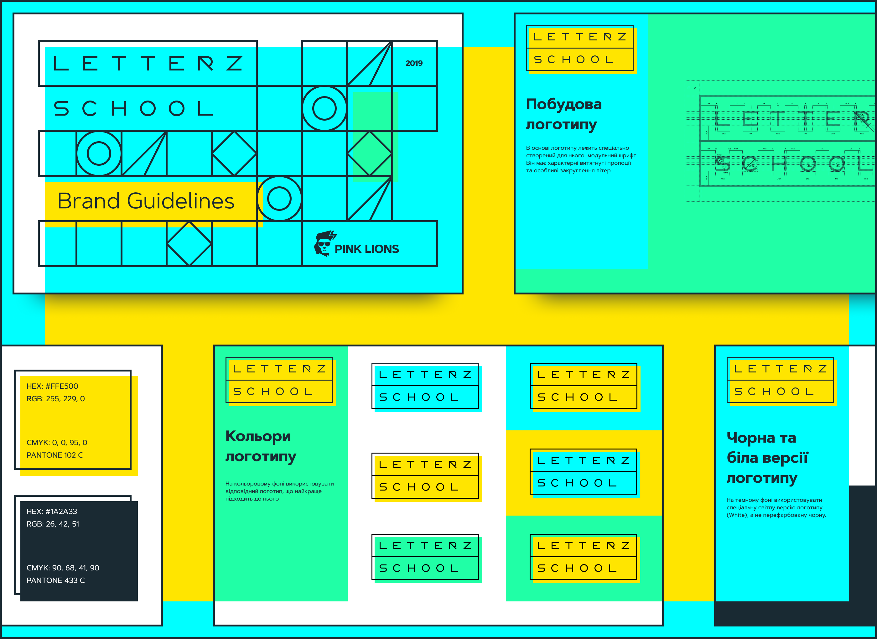
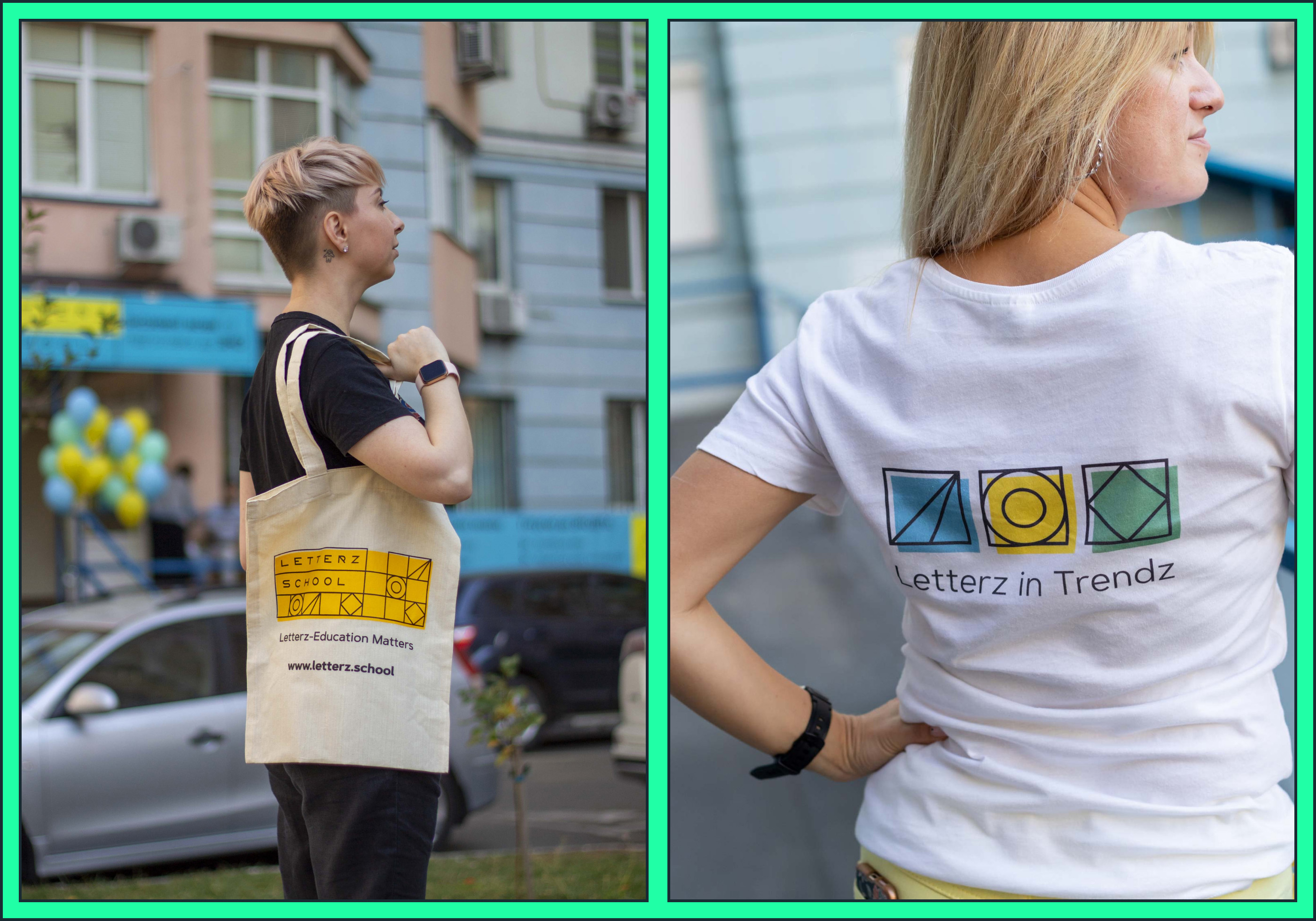
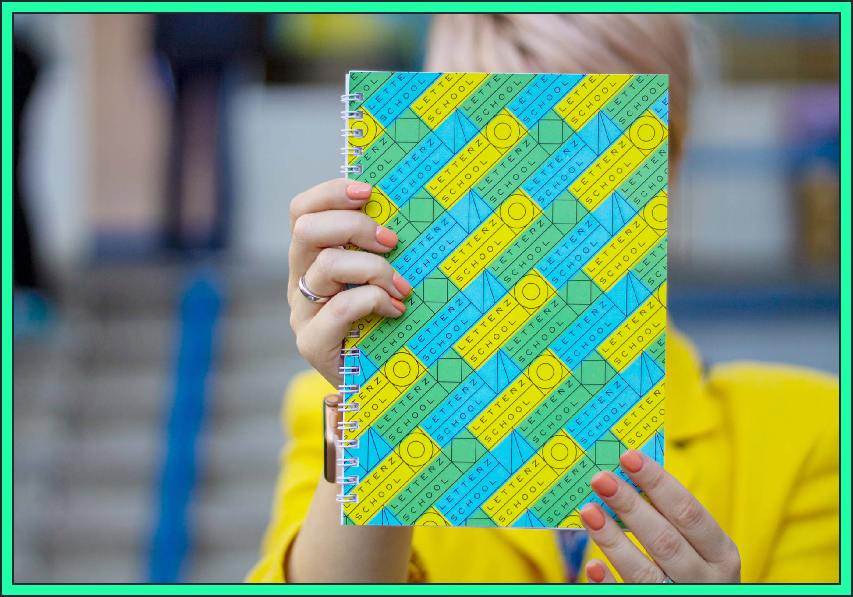
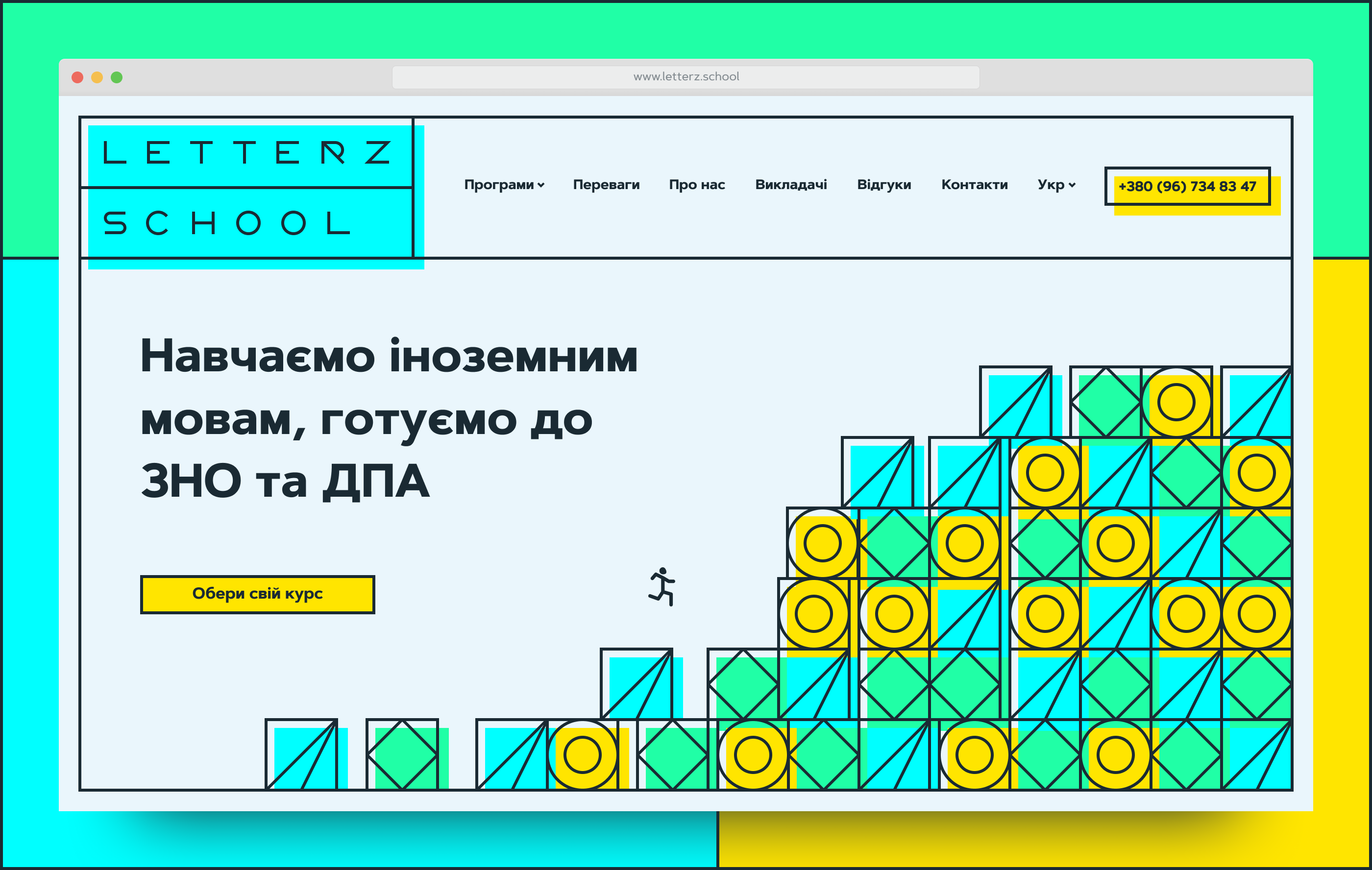
The graphic is built based on educational directions – indicated by sign and color. The rhombus is the comprehensive development and expansion of the worldview for adults, the triangle is the aspiration up and growth for children, the circle is a symbol of the goal for all graduates.
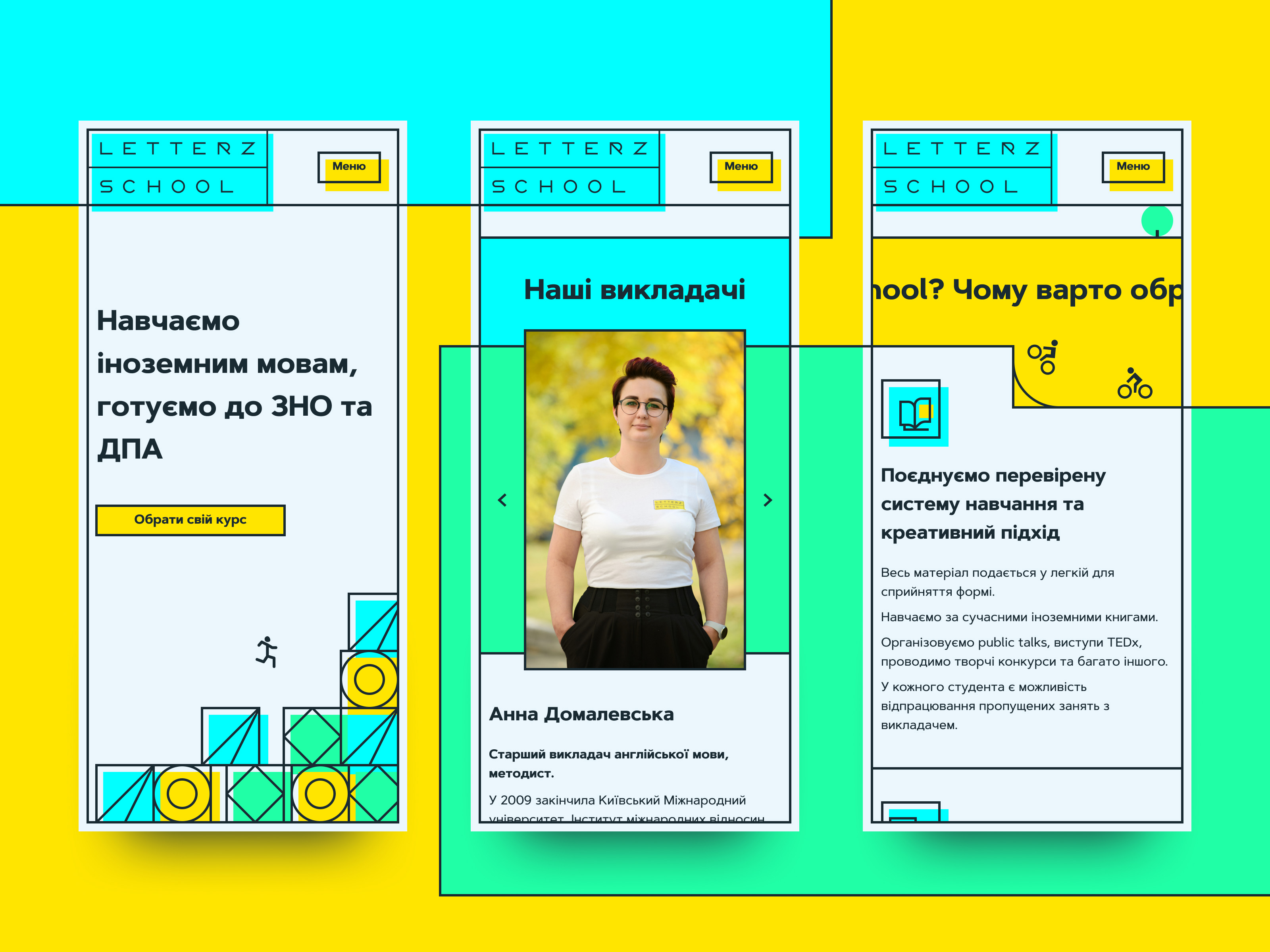
Icons are created specifically for the project, in the same style. They are used in social networks, internal navigation, and communication.
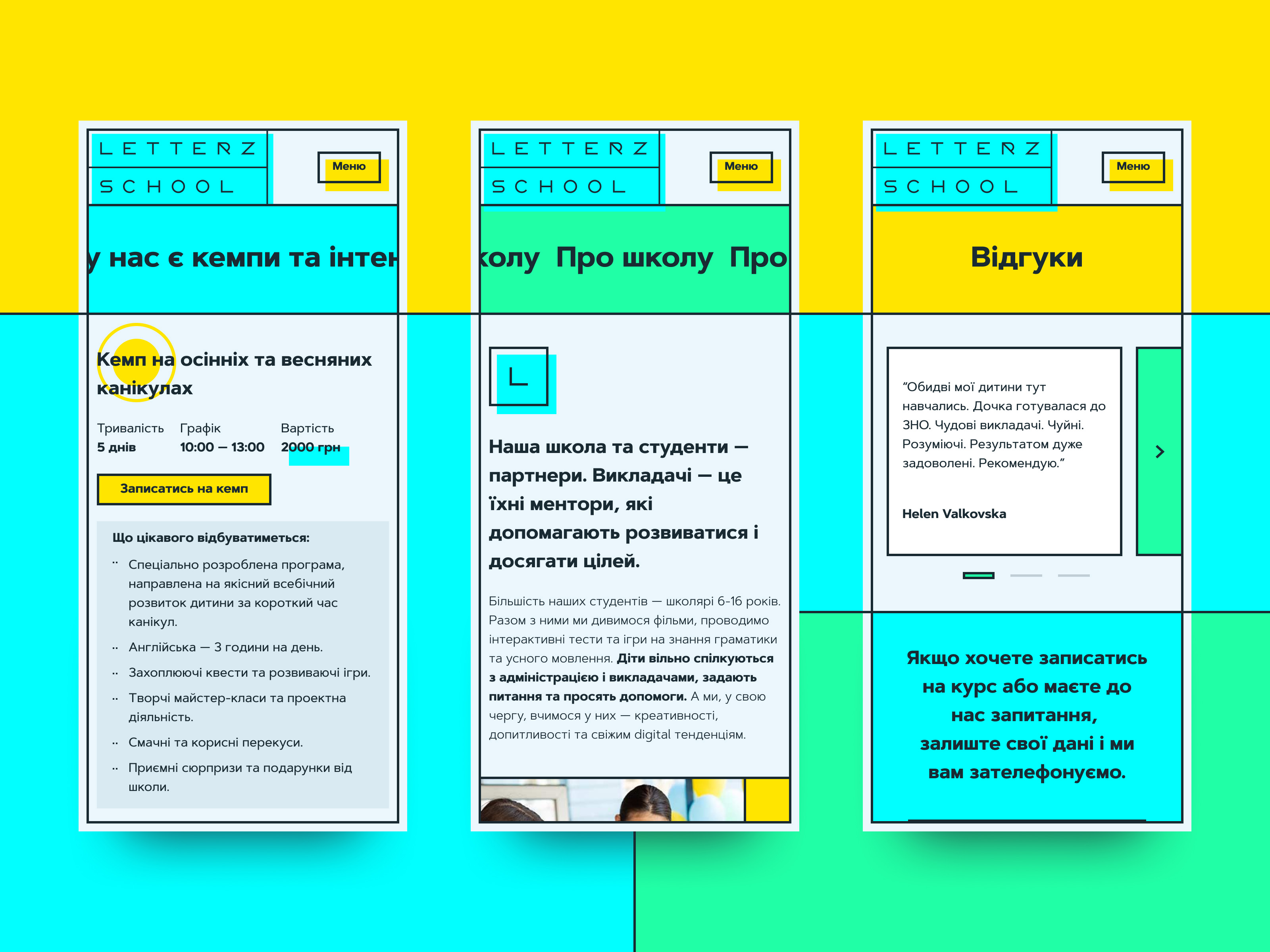
Animation adds liveliness to the site and engages the user. After the release, we received many positive reviews from the target audience – schoolchildren and their parents. They noted an interesting and original design, a difference from competitors and easy contact with the school.



CREDIT
- Agency/Creative: Pink Lions
- Article Title: Brand Strategy, Naming, Identity and Website for the Letterz School
- Organisation/Entity: Agency, Published Commercial Design
- Project Type: Identity
- Agency/Creative Country: Ukraine
- Market Region: Europe
- Project Deliverables: Brand Creation, Brand Design, Brand Guidelines, Brand Identity, Brand Naming, Brand Strategy, Brand World, Branding, Graphic Design, Identity System, Rebranding, Research, Tone of Voice
- Industry: Education
- Keywords: School, Branding, Name, English, Web, Mobile, Icons, Colors, Education, Study, Kyiv, Ukraine, Kids, Children


