


Task: build a strong brand, develop a brand strategy and corporate identity
Brand Strategy
The work started with researches, because the quality of brand strategy directly depends on understanding the interests and fears of the target audience, how to attract exactly those people who will later become customers. As the business is focused on the b2b sphere, the target audience appreciates the quality and speed of work, a clear understanding of the list of services and their prices, the ability to set tasks and get results without constant reminders.
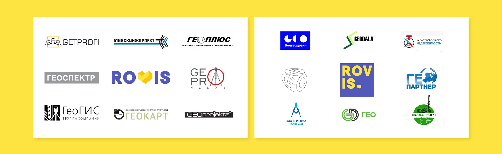
Analysis of competitors showed that many surveying companies are similar to each other: almost identical services, the same type of names, which always include GEO, low-key logos in shades of gray and green.
Therefore, it is possible to stand out with maximum involvement in each project and bright details. The idea of the strategy is to show that a job well done does not need to be controlled at every stage and to make all processes absolutely transparent. To become not just a contractor, but an inspiring partner with whom it is comfortable to work and who can be trusted.
Naming
It was decided not to use direct references to geodesy in order to preserve the ability to expand the business to other areas without changing the name. The naming is based on innovation, trust and ease. The name is abstract, but easy to pronounce and well perceived in both Cyrillic and Latin. It is a sonorous, memorable name, which fully corresponds to the idea.
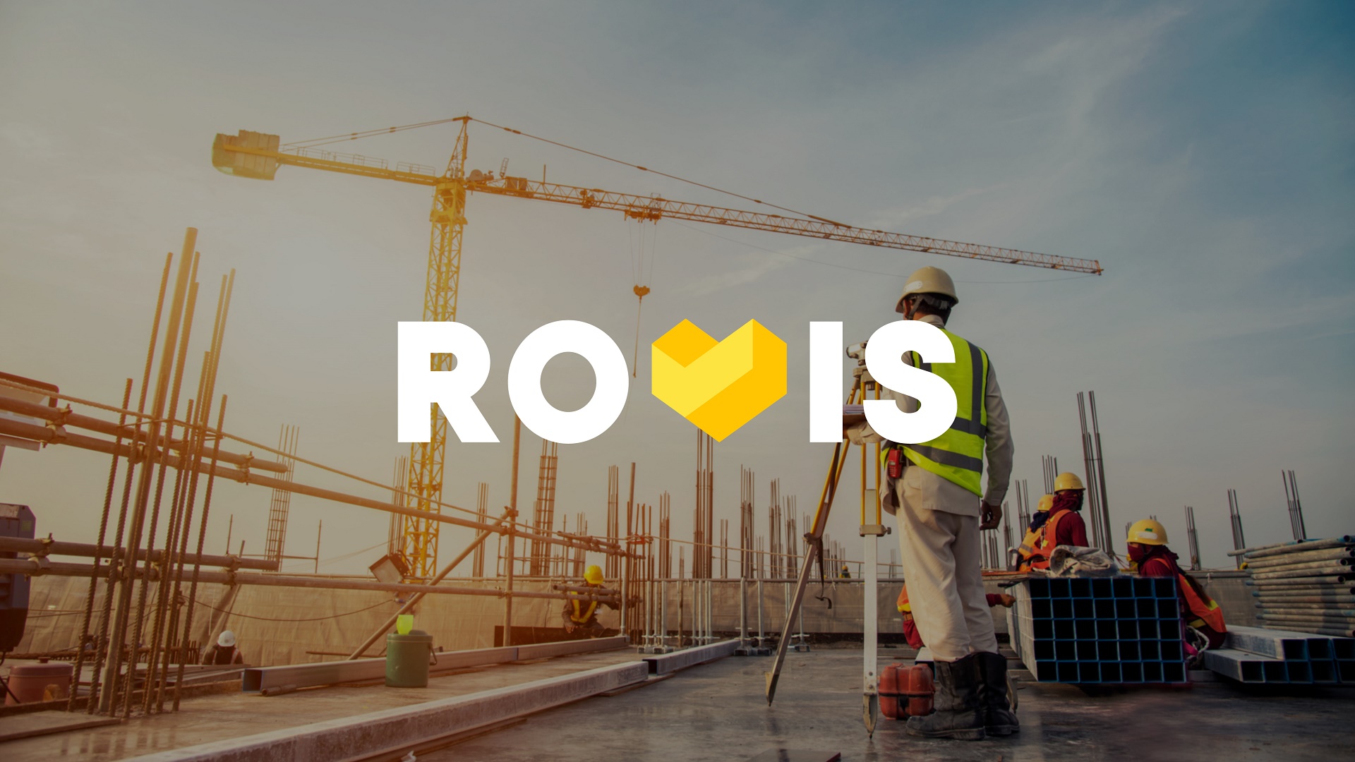
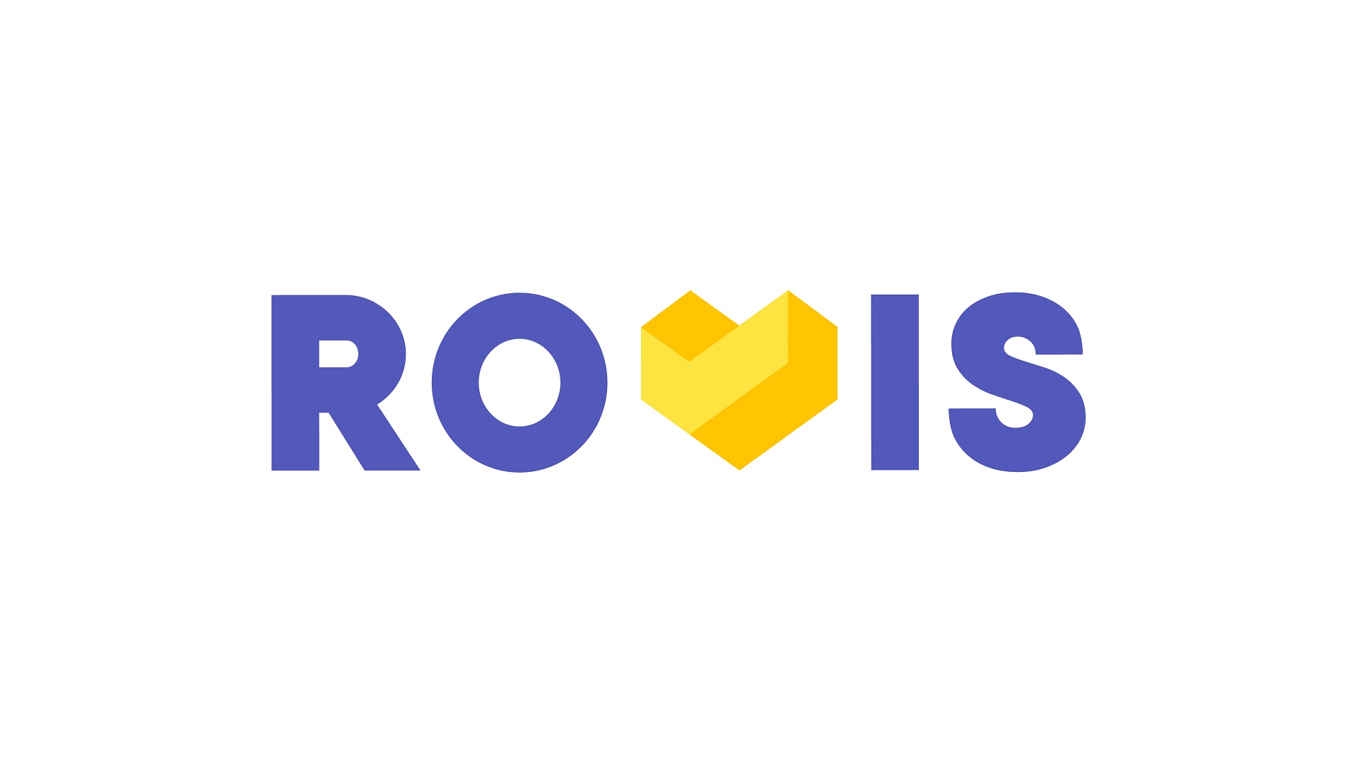
Logo
The logo was developed using evidence-based design to stand out from the competitors as much as possible. The design session with the clients gave us the basic guidelines and starting points, and then we started the design research.
We explored the logos and corporate identities of competitors in Belarus, the CIS and Europe. We realized that cool shades and fonts with right angles dominate, but friendly, warm colors and scalable design systems are almost non-existent.
But even in such a serious field as geodesy, there is a place for customer focus and humanity. Therefore, yellow and purple were chosen as the main colors.
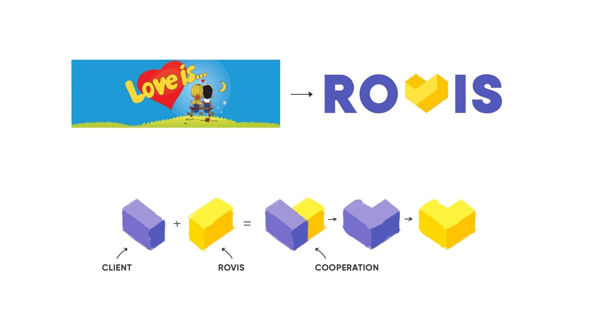
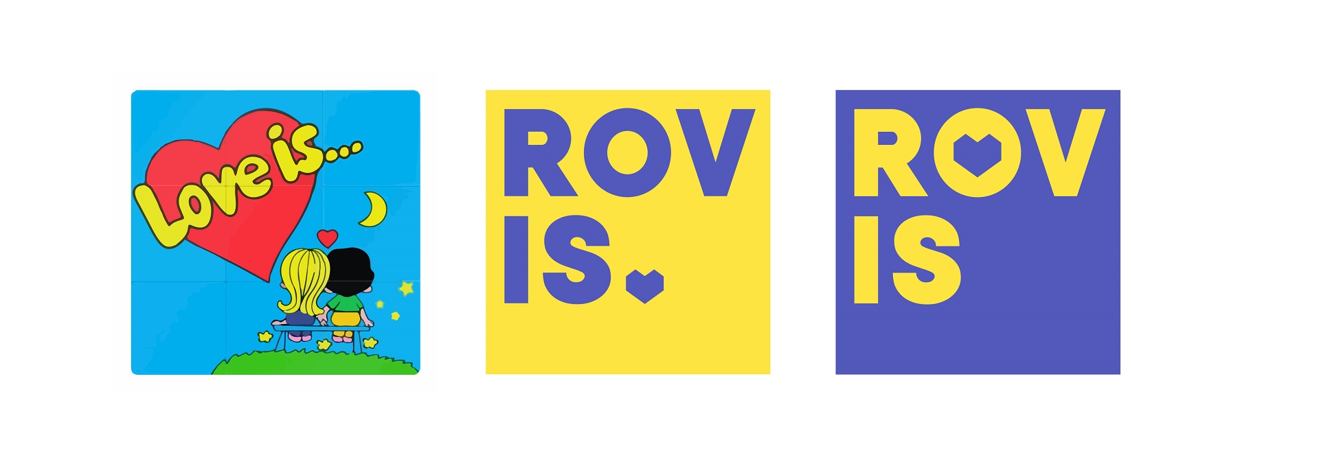
The concept refers back to LOVE IS chewing gum. Just as 2 flavors come together in gum, so 2 blocks in the ROVIS logo unite the client and the company, forming a heart.
The alternative version of the logo is placed in a square plate, which is associated with the shape of the chewing gum. This allowed the logo to be more flexible and adaptable, as well as to show an additional meaning – ROV IS (Rovis is…). After all, ROVIS means something different for everyone, because every client is individual and unique for the company.
Corporate Identity
The corporate identity conveys the main message – ROVIS loves your business. It creates a visual integrity of communication to convey all the meanings inherent in the strategy and logo.
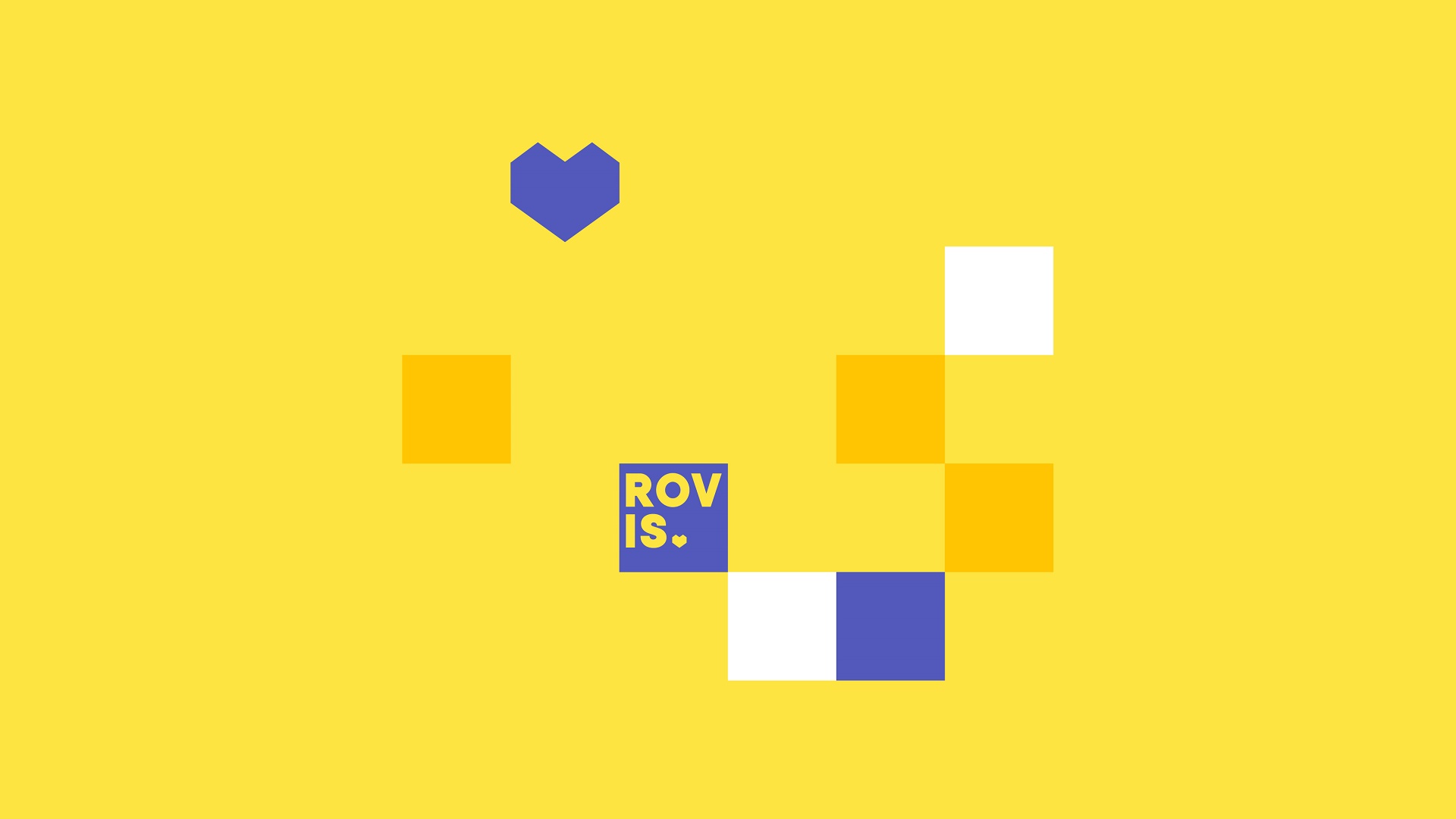
The corporate pattern consists of adapting an alternative version of the logo – squares of corporate colors. The square version of the logo is integrated into it, as well as the trademark – the heart.
The pattern is easily scalable for different carries and interacts with any branded background or photographic materials. For example, it is used on company letterhead. This technique allows standing out among other corporate documents, as well as once again reminds that the client’s business is important for ROVIS.
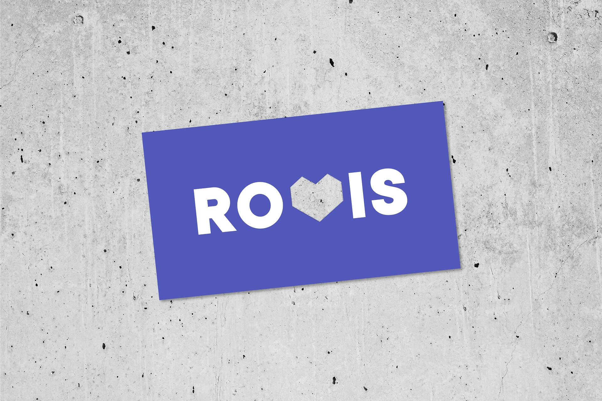
The business cards are also unusual: with the cutting of the corporate element – the heart, which interacts with any surface and shows that ROVIS is ready to adapt and give all the best for each unique business.
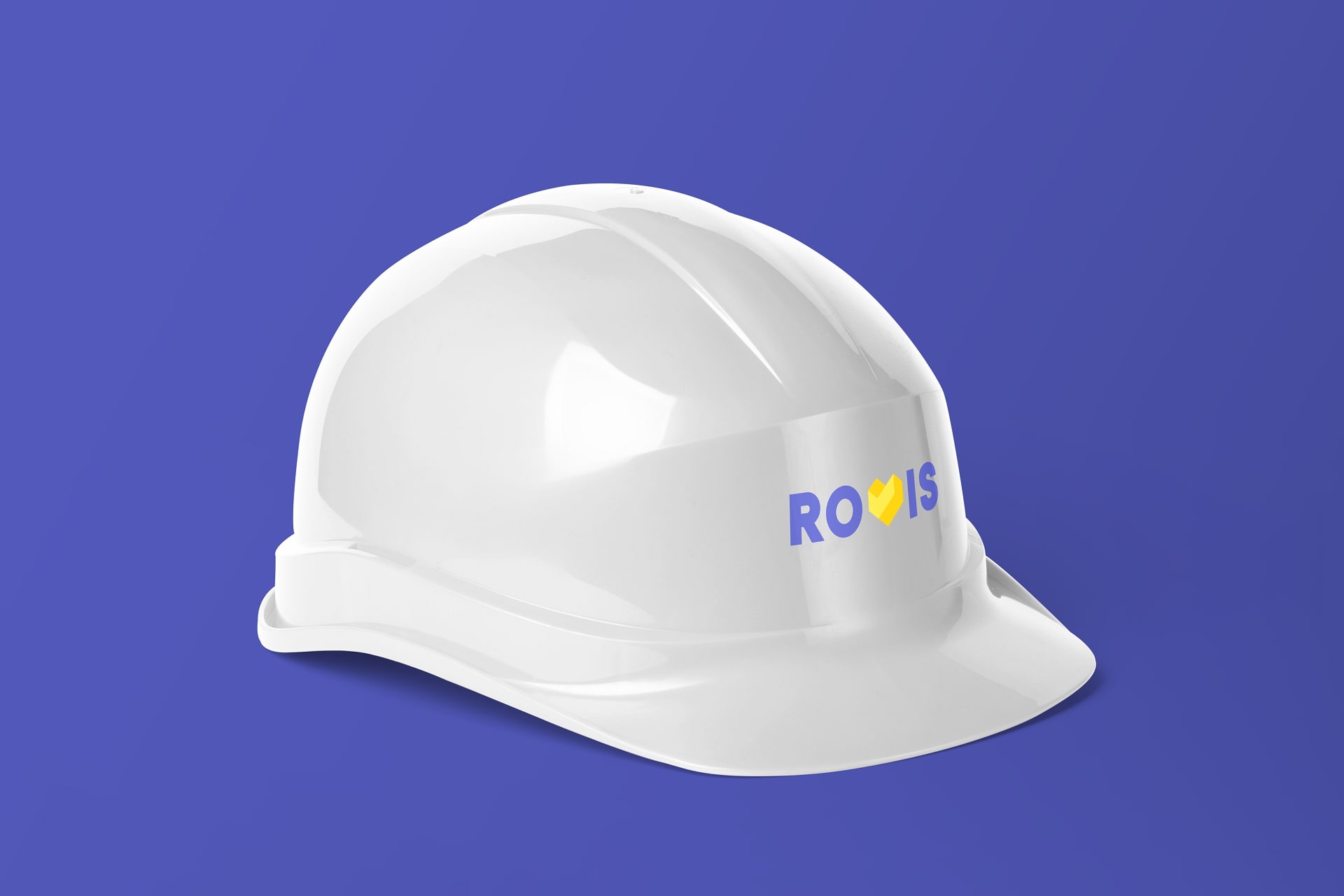
The new ROVIS corporate identity is perfectly suited for use in the digital space; the corporate element allows diversifying banners and the website with graphics and other bright details.
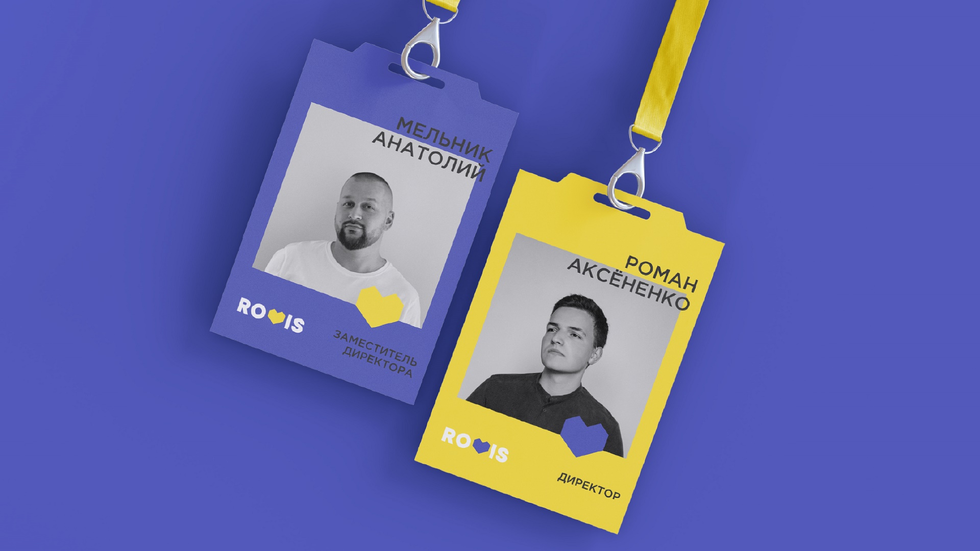
For the client-focused company, attention to all elements of the corporate identity is important, there are no too small details. Even employee badges include the corporate element, and this heart is located just in the area of the heart of each employee.
Thus, we managed to create a brand strategy that is not typical for a surveying company – friendly, bright, but at the same time demonstrating professionalism and openness. All elements of corporate identity complement each other and tell about the brand even before interacting with it.

CREDIT
- Agency/Creative: Moloko Creative agency
- Article Title: Brand Strategy and Corporate Identity for a Surveying Company by Moloko Creative
- Organisation/Entity: Agency
- Project Type: Identity
- Project Status: Published
- Agency/Creative Country: United States
- Agency/Creative City: St. Petersburg
- Market Region: Europe
- Project Deliverables: Brand Identity, Brand Strategy, Branding, Design, Graphic Design, Identity System, Logo Design, Product Naming, Research
- Industry: Construction
- Keywords: brand identity, brand strategy, branding, logo design, corporate identity
-
Credits:
Creative Director: Denis Misyulya
Creator-strategist: Dina Vasilevich
Creator-strategist: Vitalina Dubitskaya
Digital marketer: Ekaterina Bochkova
Art Director: Olga Lobanok
Designer: Ilya Pilinoga
Project Manager: Anastasia Bondarchik


