


Morning Fresh came to us with a clear challenge: strengthen its leadership in manual dishwashing while modernising how that leadership shows up on shelf.
For decades, Morning Fresh has been the number one dishwashing liquid in Australia. Its reputation has always been built on performance. In blind testing, the product consistently outperforms competitors. But as global brands continue to enter the category and shoppers become increasingly price sensitive, the brand needed to work harder to communicate exactly why it is worth paying for.
Our task was not to reinvent the brand, but to sharpen its point of view. How could Morning Fresh more clearly express its core advantage: superior grease-cutting efficacy?
Through extensive research into category language, claims, and consumer pain points, one insight stood above the rest. When it comes to dishwashing, nothing matters more than cutting through grease. That single performance cue sits at the top of the consumer decision ladder.
The opportunity was to ensure Morning Fresh owned that space more confidently than ever.
We worked closely with the team to develop a clearer verbal and visual system that substantiated Morning Fresh’s performance credentials in language consumers immediately understand. From exploring the power of “one squirt is enough” messaging to refining claims architecture and pack communication, every element was designed to reinforce the brand’s leadership position.
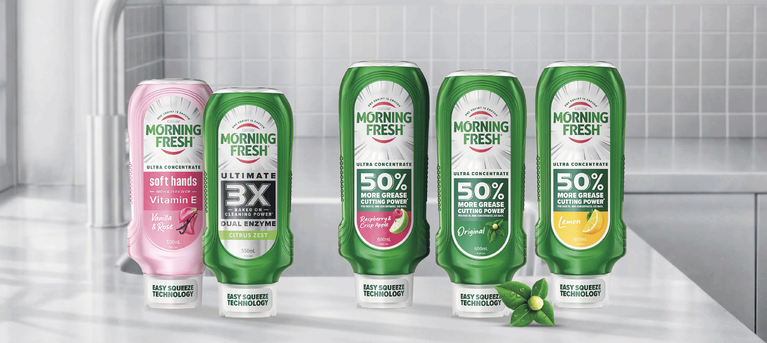
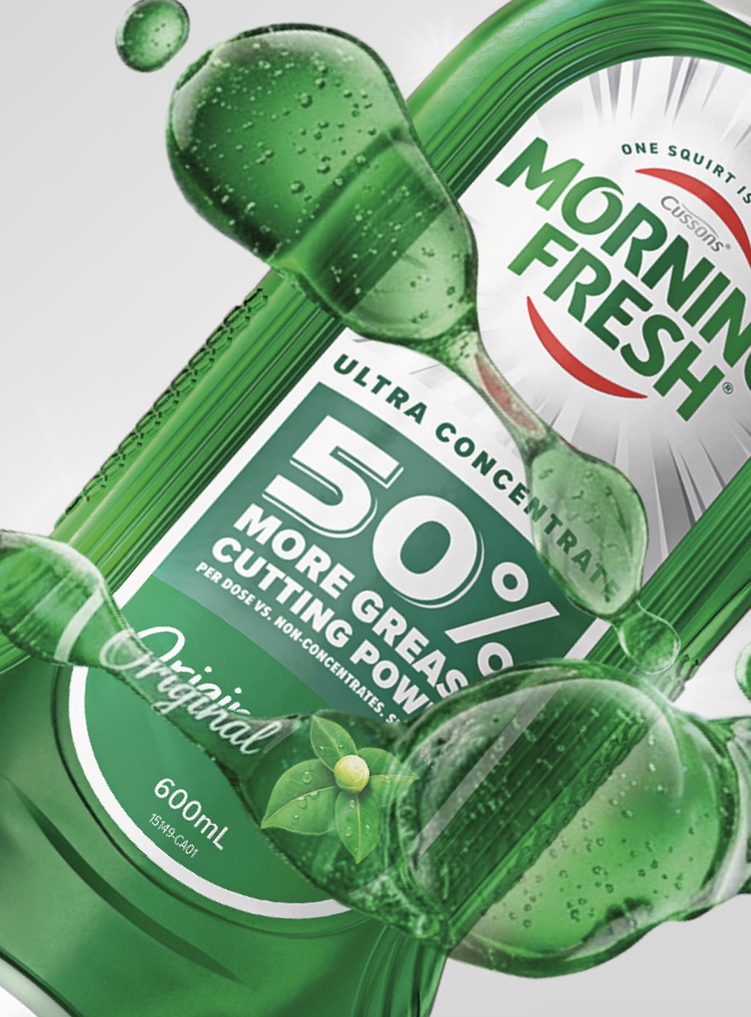
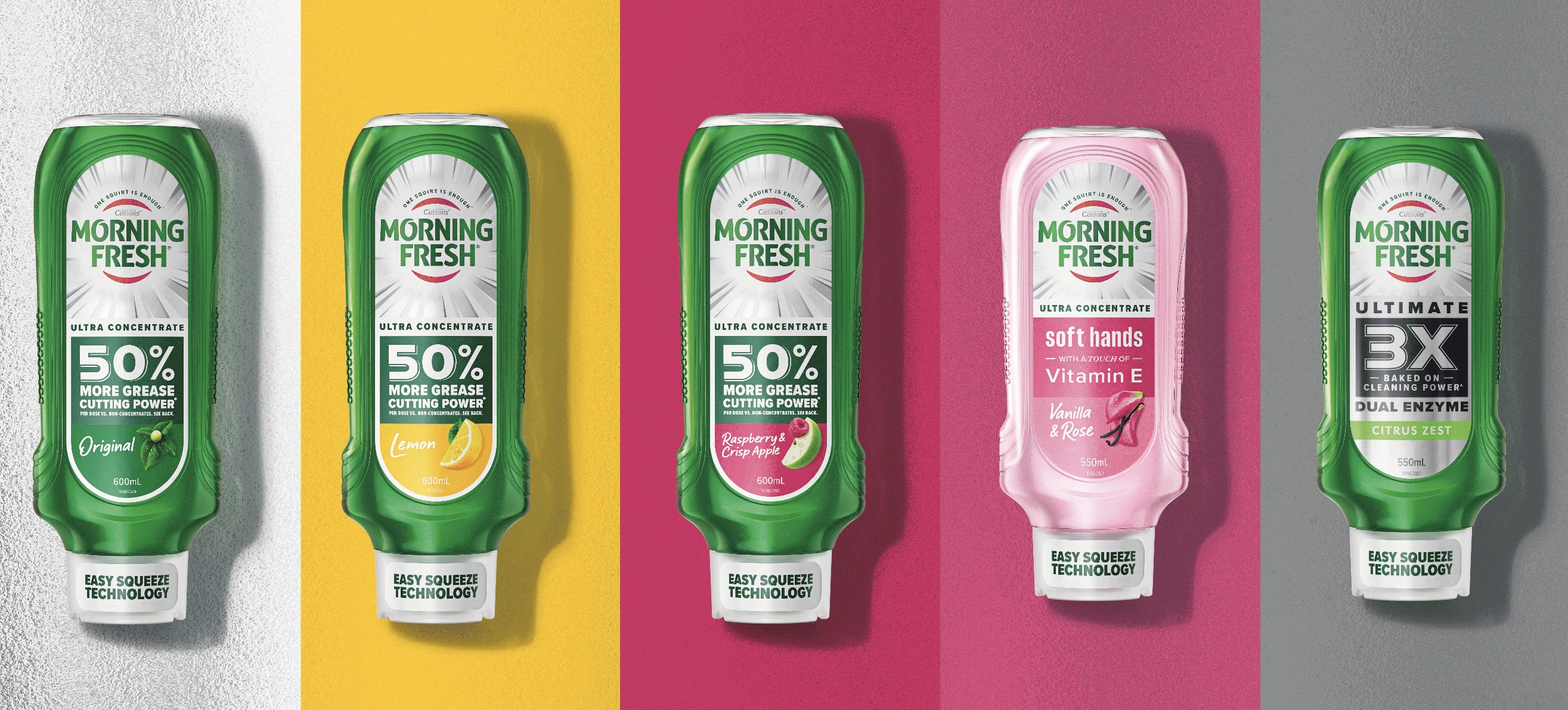
At the same time, we refreshed the visual identity to modernise the brand while protecting its most recognisable equities. A refined typographic wordmark, an optimised Morning Fresh burst, and the introduction of silver and metallic cues help signal strength, performance, and premium efficacy on shelf.
The result is a brand that remains instantly recognisable, but now communicates its advantage with greater clarity and confidence. Morning Fresh continues to lead the category not simply by being effective, but by making that effectiveness unmistakable.
Extending the System: The Easy Squeeze Launch
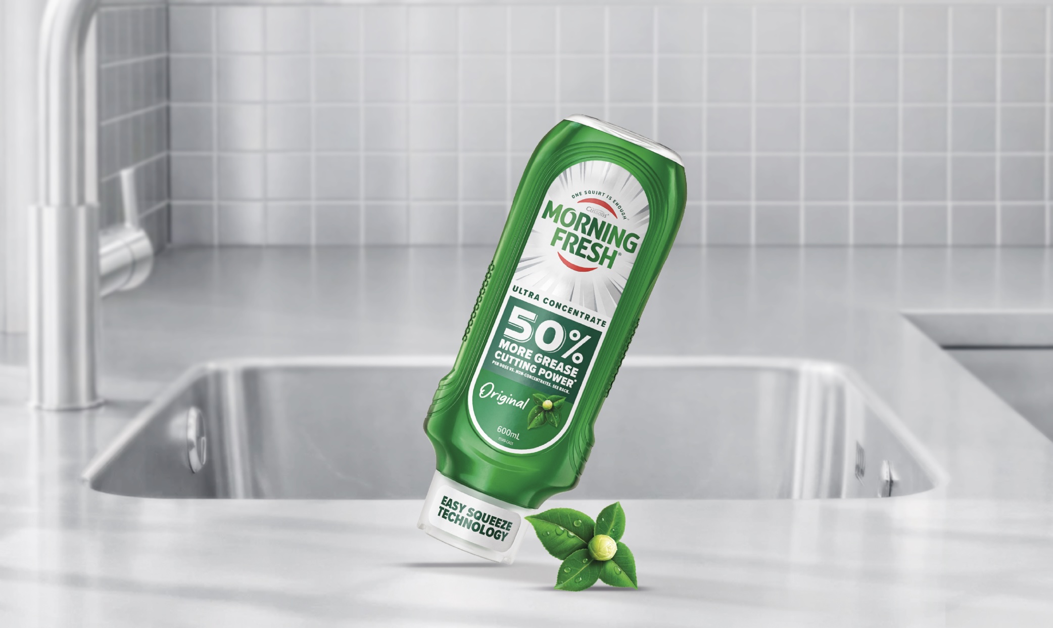
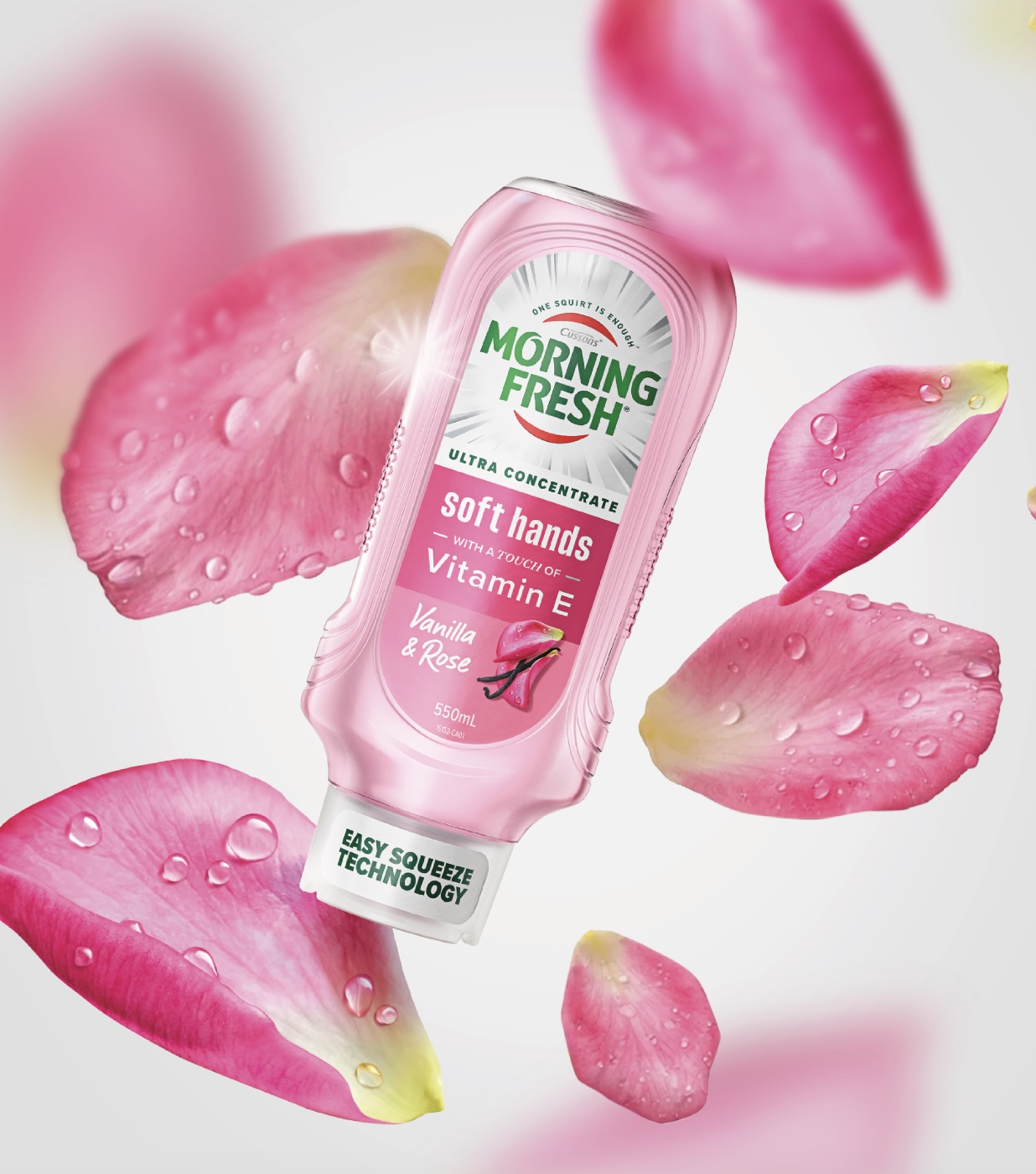
As part of the transformation, Morning Fresh also introduced a new packaging format designed to address a long-standing consumer frustration: waste.
Research revealed that many shoppers struggle to get the last of the liquid out of traditional bottles. The new inverted “Easy Squeeze” format solves this problem, allowing the product to be dispensed more easily while improving everyday convenience at the sink.
However, the new format also introduced a design challenge. Morning Fresh has historically relied on its distinctive white bottle as a strong visual asset, but sustainability requirements meant the new tottle had to be produced in clear plastic.
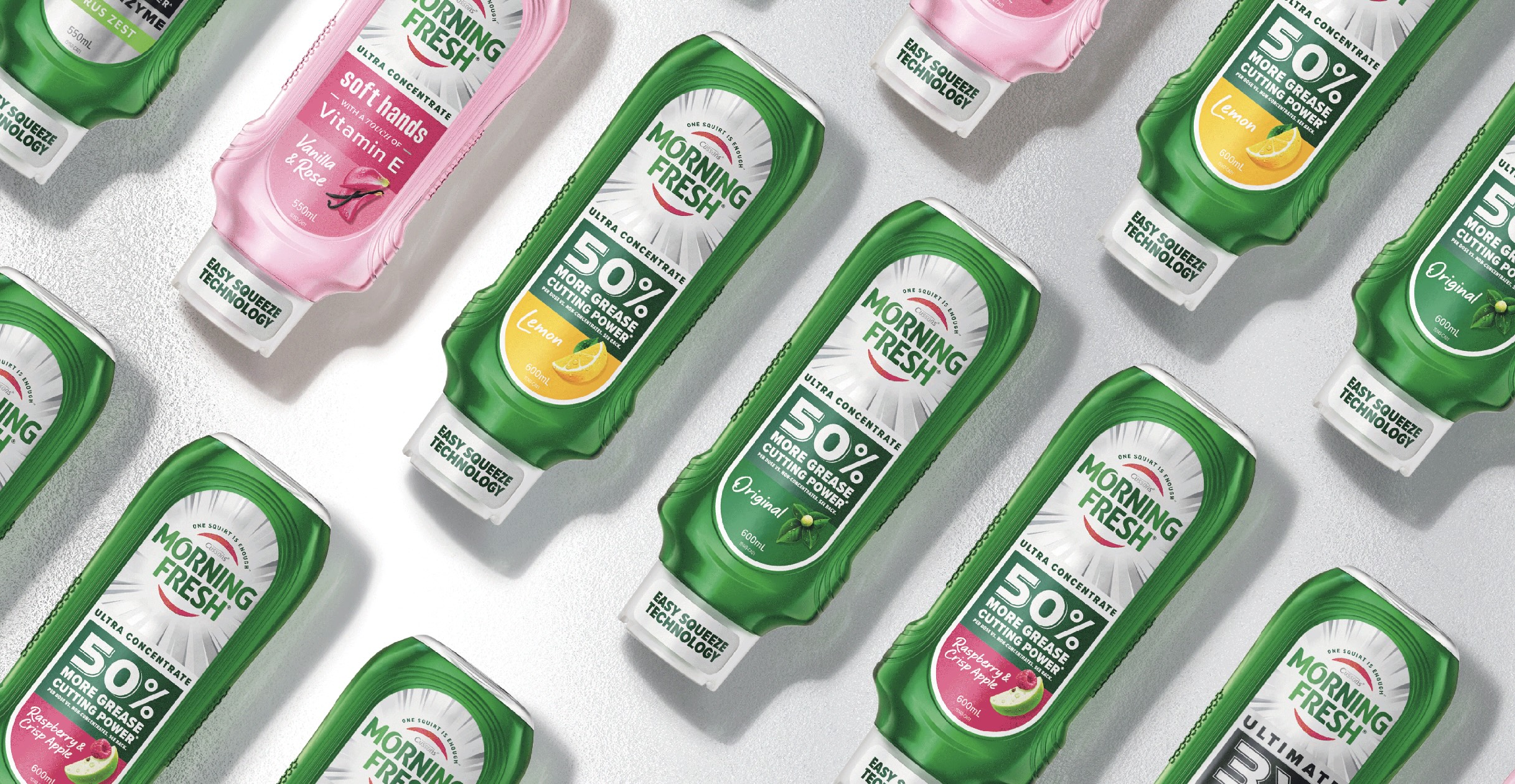
Our role was to translate the refreshed masterbrand into this new structure without losing the recognisable signals shoppers rely on. Key heritage cues were carefully retained and reinterpreted, including the signature ribbed grip designed to prevent the bottle slipping in wet hands. At the same time, the new visual system allowed the range architecture to expand clearly across variants.
The Easy Squeeze also became the first format to launch with Morning Fresh’s new formula and visual identity, introducing a tiered range that includes the classic formula, the botanically infused Soft Hands variant, and a premium black-pack edition featuring the brand’s most powerful grease-cutting formula.
Together, the refreshed masterbrand and the Easy Squeeze innovation demonstrate how Morning Fresh continues to evolve the category it leads.
By combining proven efficacy with smarter design and clearer communication, the brand reinforces its position as the most powerful solution in the sink.
CREDIT
- Agency/Creative: Brand Society
- Article Title: Brand Society Sharpens Morning Fresh with a Stronger Packaging Identity for Dishwashing Performance
- Organisation/Entity: Agency
- Project Type: Packaging
- Project Status: Published
- Agency/Creative Country: Australia
- Agency/Creative City: Melbourne
- Market Region: Oceania
- Project Deliverables: 3D Modelling, Brand Redesign, Brand Strategy, Logo Design, Packaging Design, Structural Design
- Format: Bottle
- Industry: Beauty/Cosmetics
- Keywords: brand strategy, packaging design, structural design, FMCG
-
Credits:
Design Team: Brand Society


