Hansells is a long-established New Zealand, family-friendly pantry brand. Stretching across a number of retail categories, the brand offers great quality products for Kiwis to make delicious food and drink with. Over time, the brand has fallen into standard mass retail on-pack messaging, thereby losing connections to its traditional foodies roots.
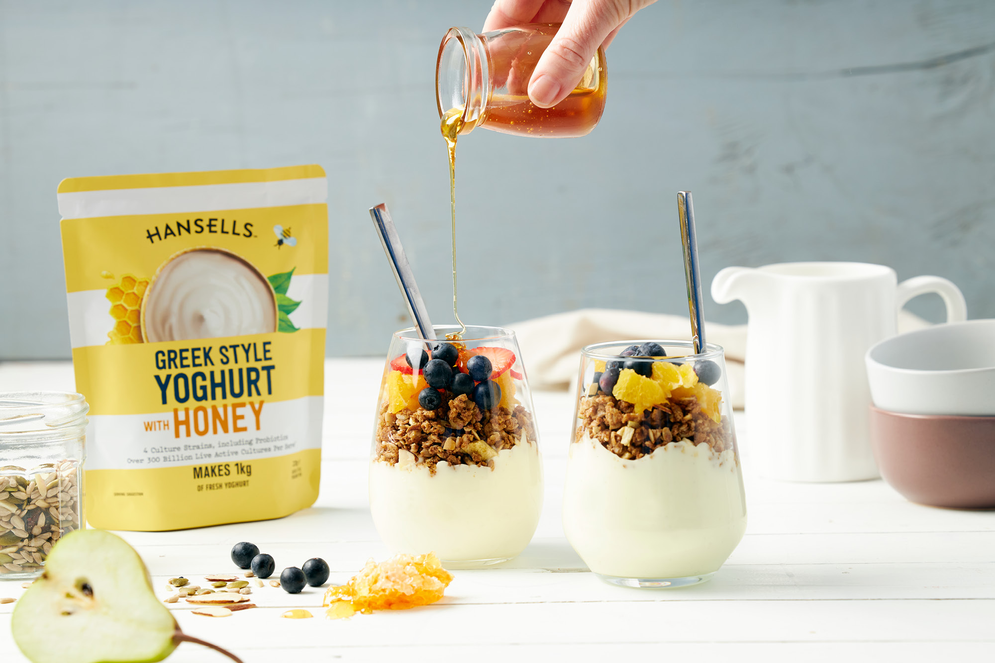
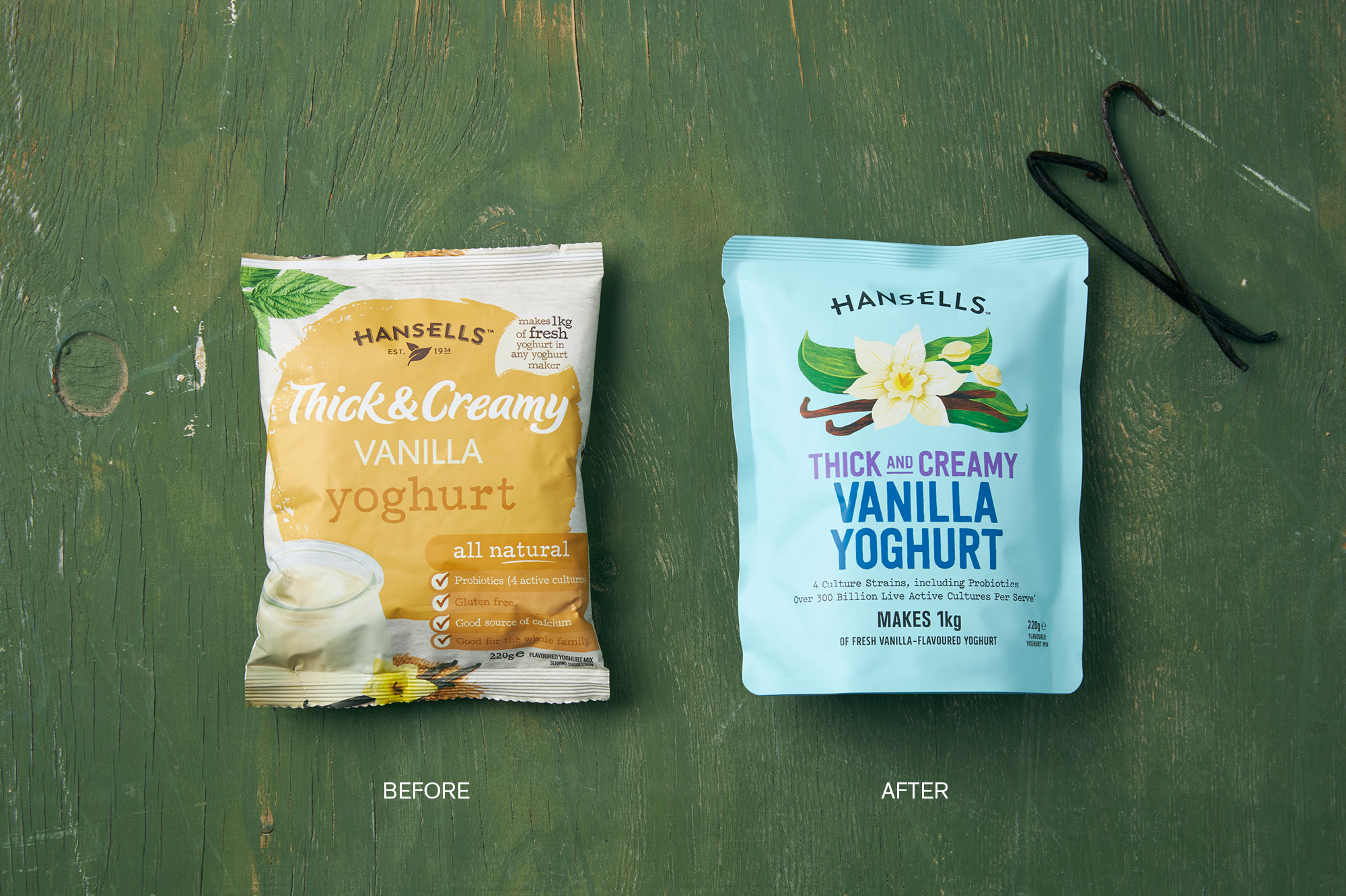
Their much-loved make-at-home dry yoghurt range is a perfect example of this. The previous iteration became loaded with various brand and product messages in various fonts which confused on-shelf (especially with a large product offering – shopability became difficult) and lacked stand out. The revitalisation allows for the brand to reconnect with its natural food-based roots. Ironically in a category dominated by two brands, its competitor also followed the same cluttered design language.
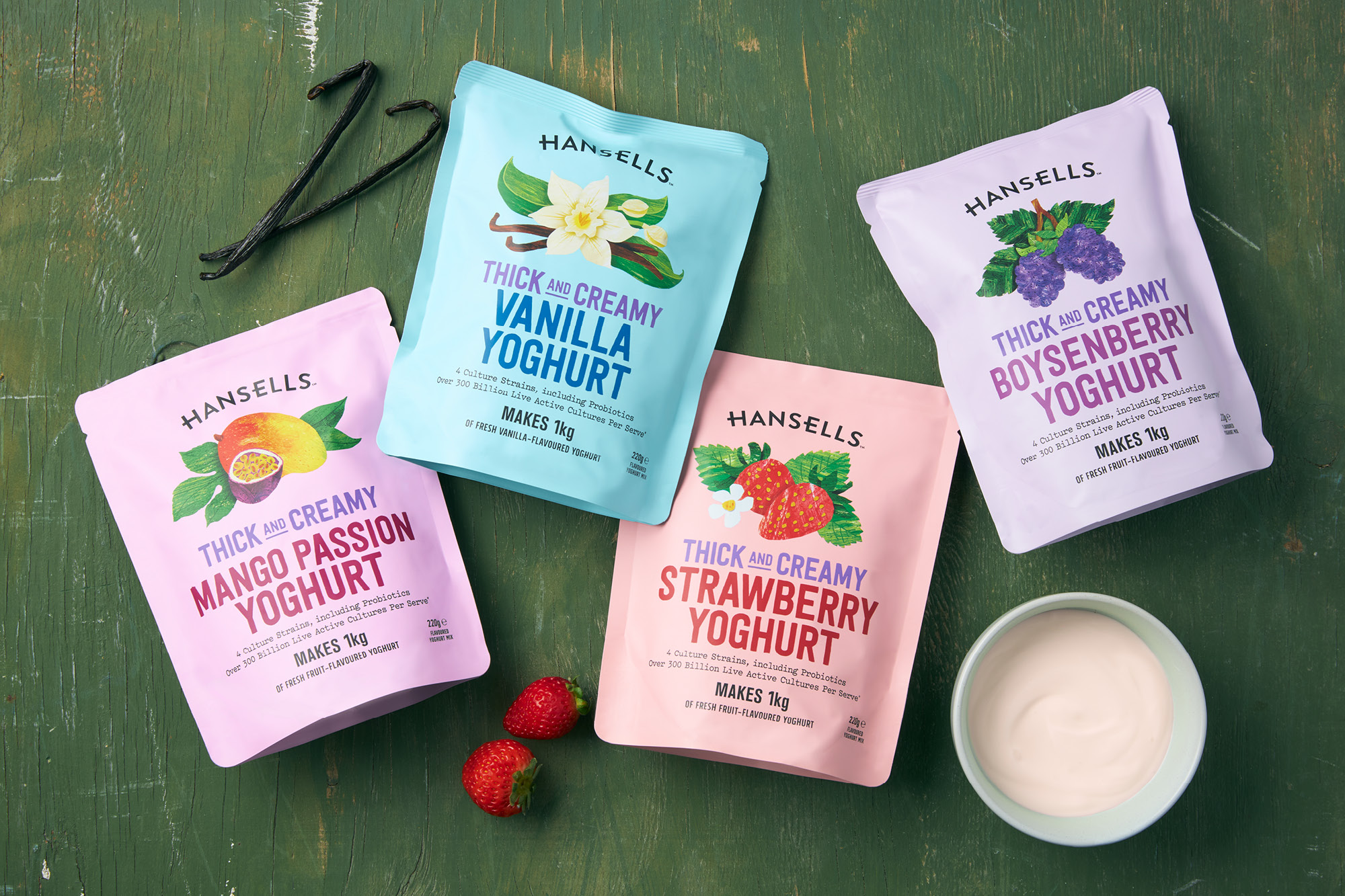
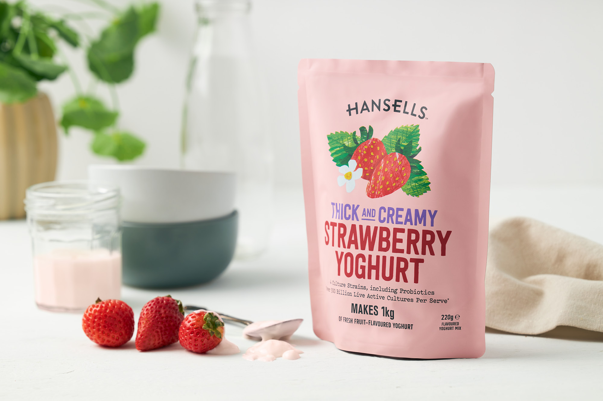
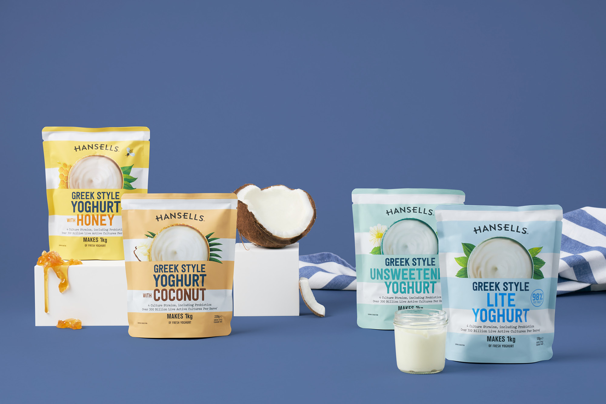
Flexibility was given to declutter the brand logo of superfluous embellishments. A design language was developed which concentrated on shopability and highlighting the core flavour – Simplified, bold typography was used across the range for ease of readability and give a family connection across multiple products. Secondary messaging was edited to key product and brand-specific purchasing drivers.
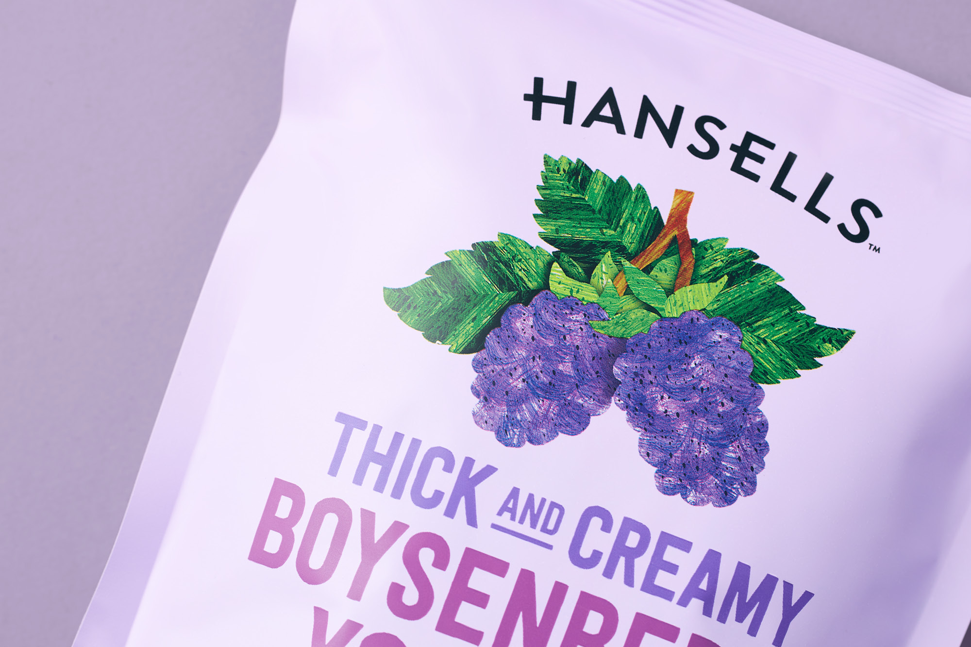
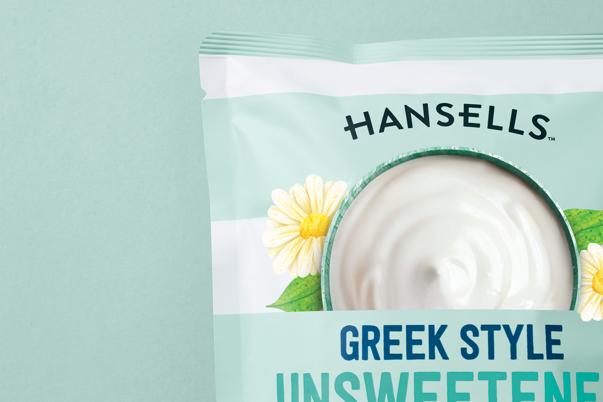
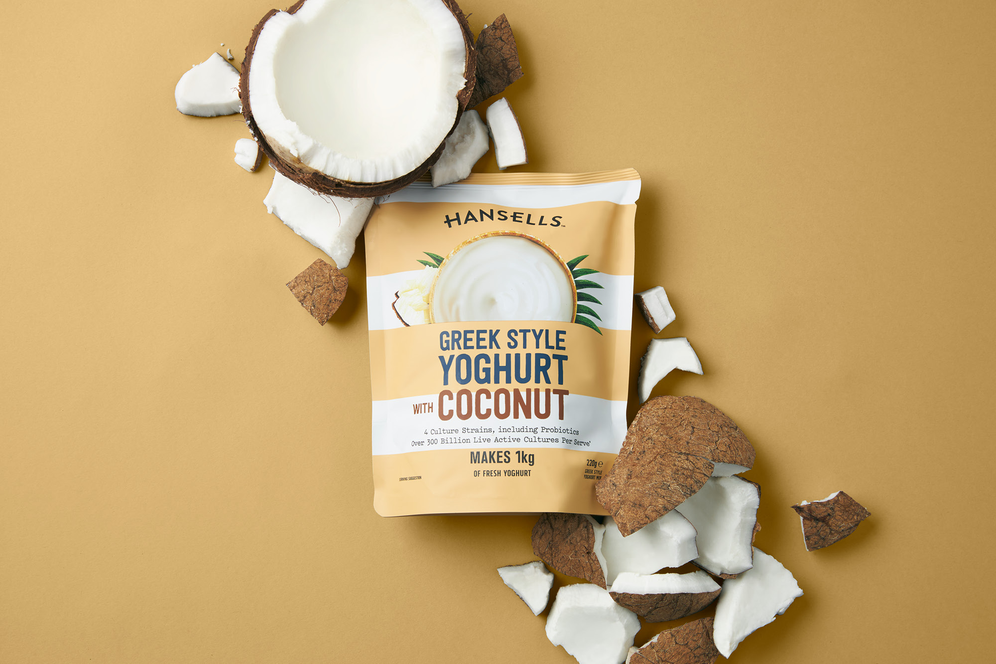
A highly textured, layered illustration style was developed for the hero ingredient visual. Across the core range of flavours, flat pastel colours allow these illustrations to stand out on shelf while also creating a soft, modern-retro theme unifying the brand offering.
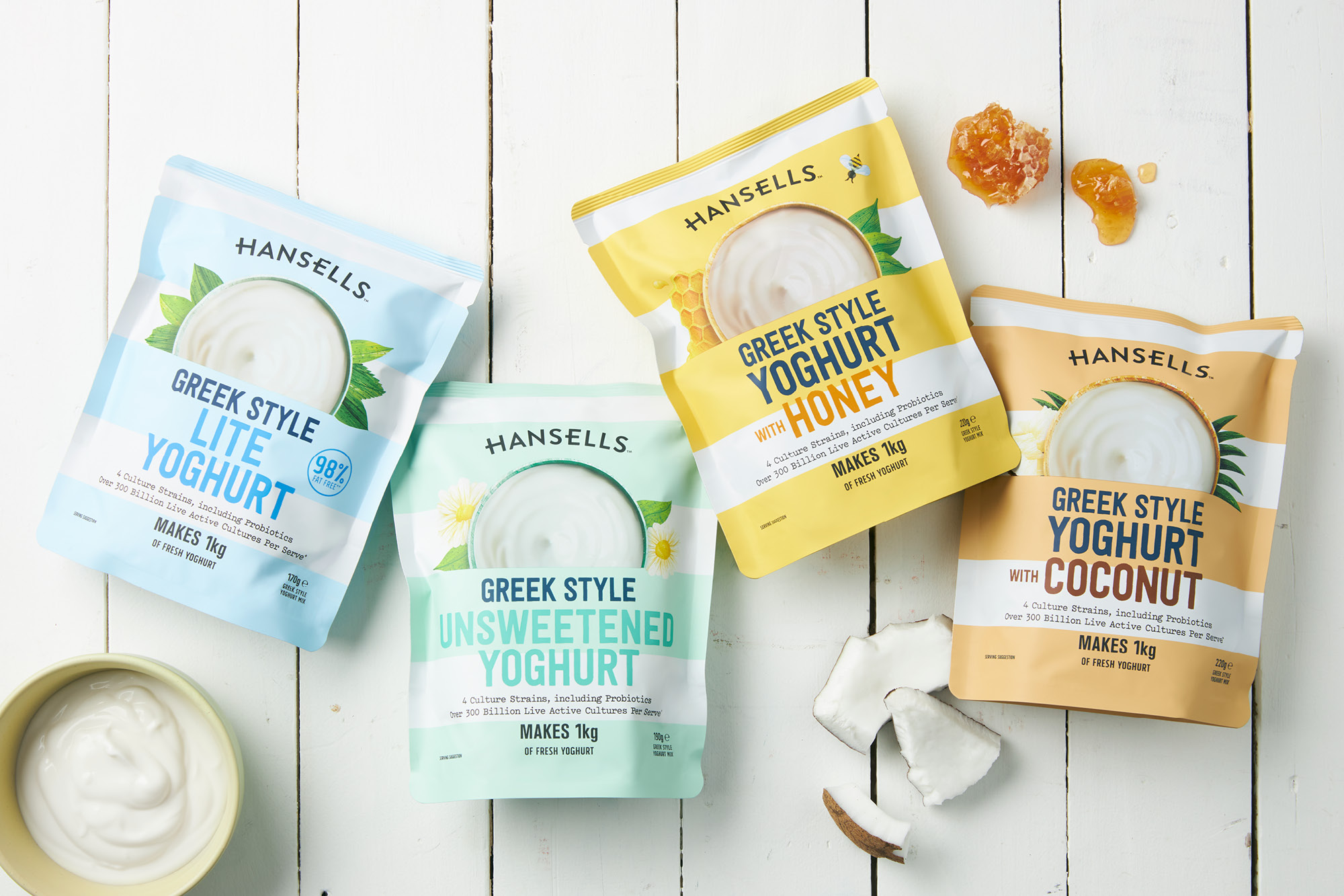
Greek yoghurts were all part of the overall range. Previously lost in the overall family, the brand refresh created an opportunity to create a point of distinction. Taking inspiration from the stripes of the Greek flag, bold colour stripes denoted flavours. Further differentiation was added by combining illustrations with yoghurt photography to help communicate the creaminess of the product.
CREDIT
- Agency/Creative: Onfire Design
- Article Title: Brand Refresh for New Zealander’s DIY Yoghurt Making Enthusiasts Designed by Onfire Design
- Organisation/Entity: Agency, Published Commercial Design
- Project Type: Packaging
- Project Status: Published
- Agency/Creative Country: New Zealand
- Market Region: Oceania
- Project Deliverables: Brand Architecture, Brand Redesign, Brand Refinement, Brand Rejuvenation, Brand Strategy, Graphic Design, Illustration, Packaging Design, Rebranding, Tone of Voice
- Format: Pouch
- Substrate: Plastic
- Keywords: WBDS Agency Design Awards 2020/21


