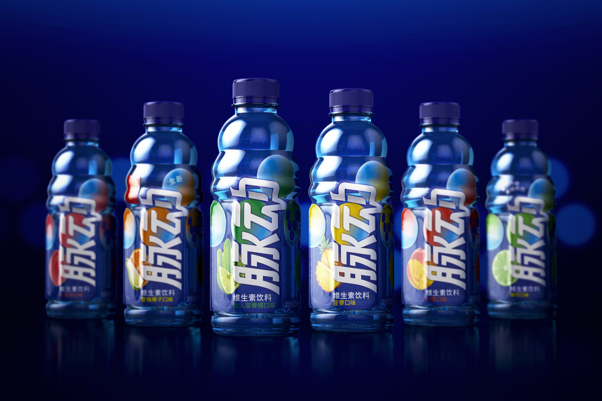
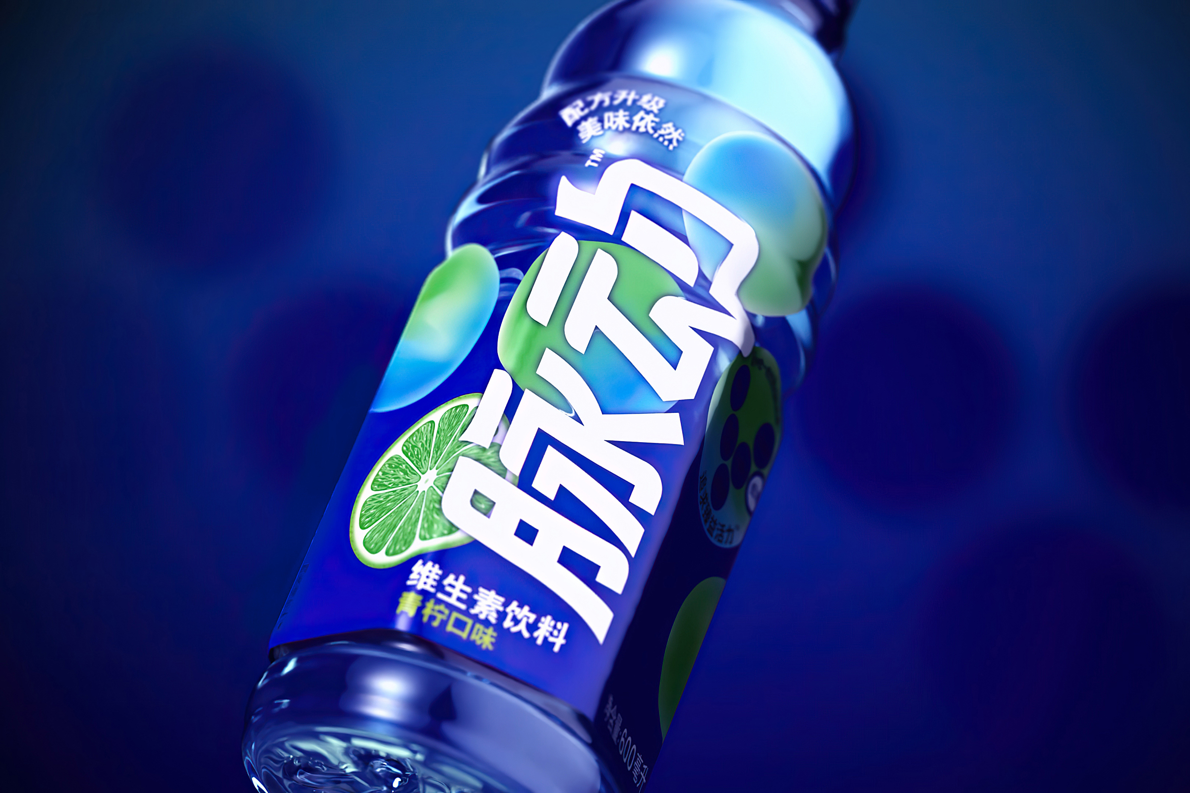
The 1.4 billion Chinese market is undergoing massive changes these years. The so-called ‘Post 95’ generation has made the Chinese consumer more brand-aware than ever before. To remain relevant, Mizone looked to rediscover its core values and catapult the brand into the new decade.
Now Mizone, China’s fifth-largest non-alcoholic beverage brand and owned by Danone, is ready with a rejuvenated brand experience that speaks directly to the China of tomorrow. With help from Danish design agency Everland, the brand has been repositioned and redesigned to reflect a new product formulation and the bold, brave and independent spirit of the Post 95’ers.
“Mizone translates “my pulse” in Chinese. The idea of individuality and a pulsating flow became a central concept when working on relaunching one of China’s largest brands. The pulse became the visual common thread, symbolising the thriving city and human drive,” explains Calle Larsson, Creative Director & Partner at Everland.
In close collaboration with Danone China, Everland developed the visual identity for the entire product line, and are currently working on new innovations, which will further help strengthen Mizone’s new position in the Chinese market.
The new design also reinforces Mizone as leader of the functional beverages category. A niche the brand defined when it launched in 2003.

CREDIT
- Agency/Creative: Everland
- Article Title: Brand Redesign of Mizone a Non-Alcoholic Beverage by Everland
- Organisation/Entity: Agency, Published Commercial Design
- Project Type: Packaging
- Agency/Creative Country: Denmark
- Market Region: Asia
- Project Deliverables: Brand Redesign, Research
- Format: Bottle
- Substrate: Plastic


