Institutional Logo:
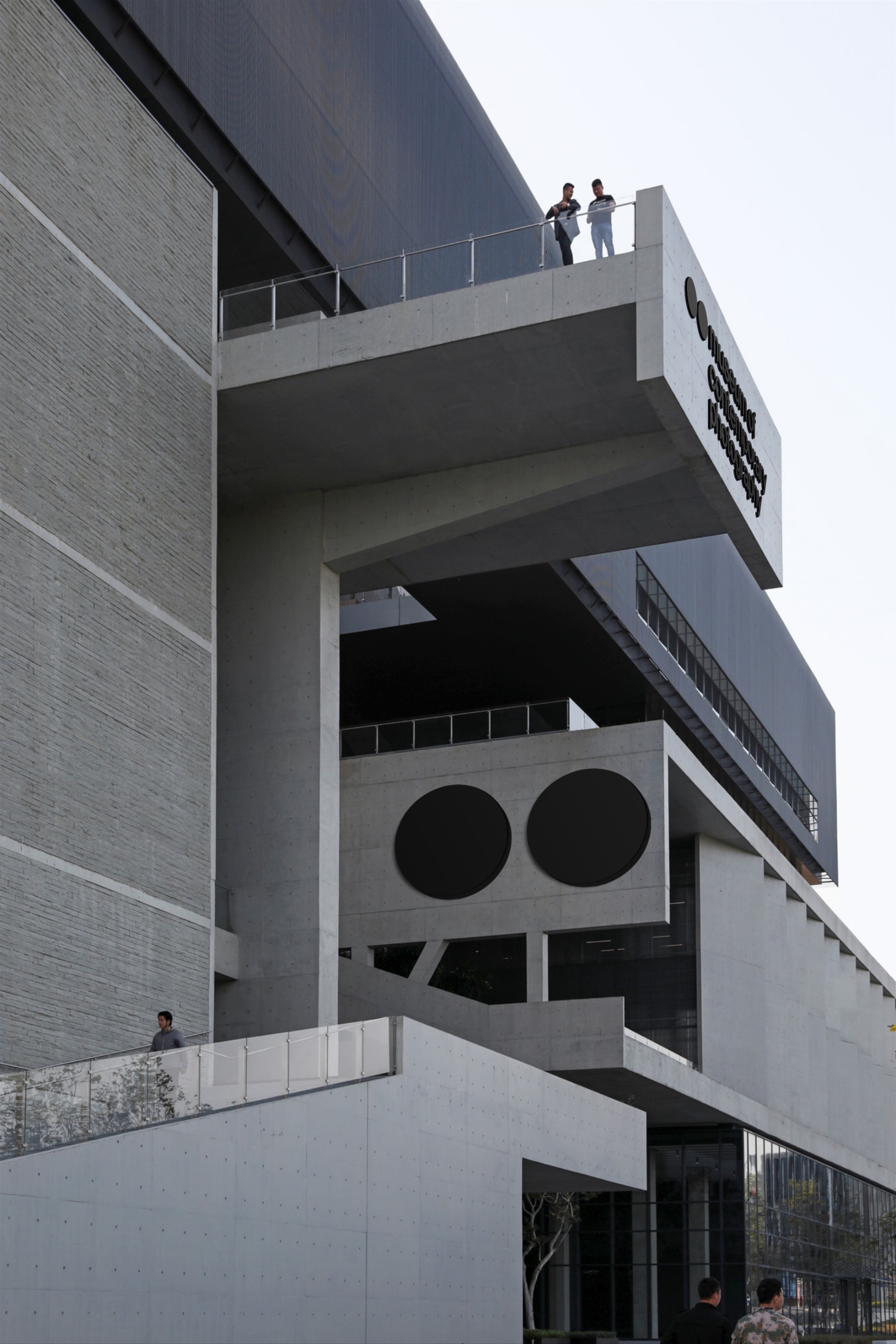
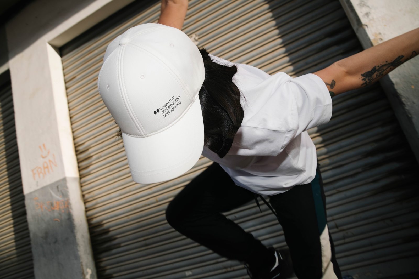
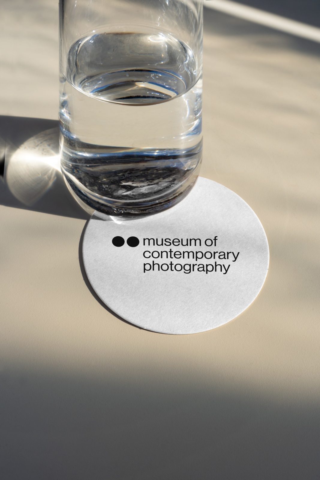
A bold and strong logo accompanies the identity system. The form is derived from combining the ellipse shape of our eye with the circular shape of the camera lens, which ultimately represents the camera we carry every day, our eyes—hence the motto “the act of looking.” The logo is designed to be legible from a distance or up close in any context and has a visual presence, whether it is the main focus or a secondary element in any design.
Department (Sub-branding) Logo:
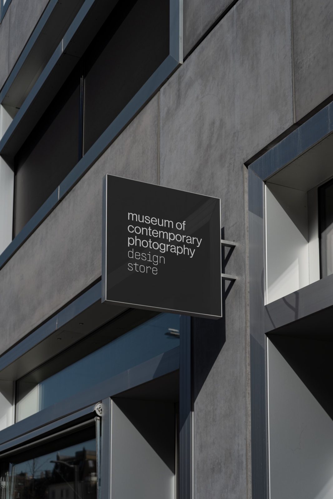
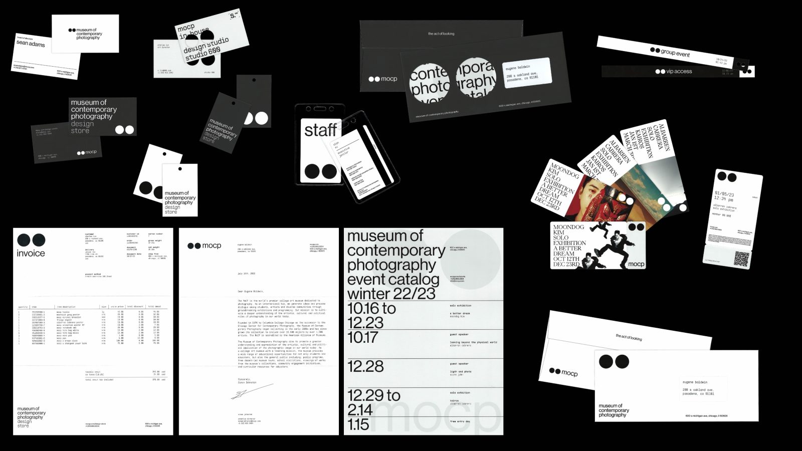
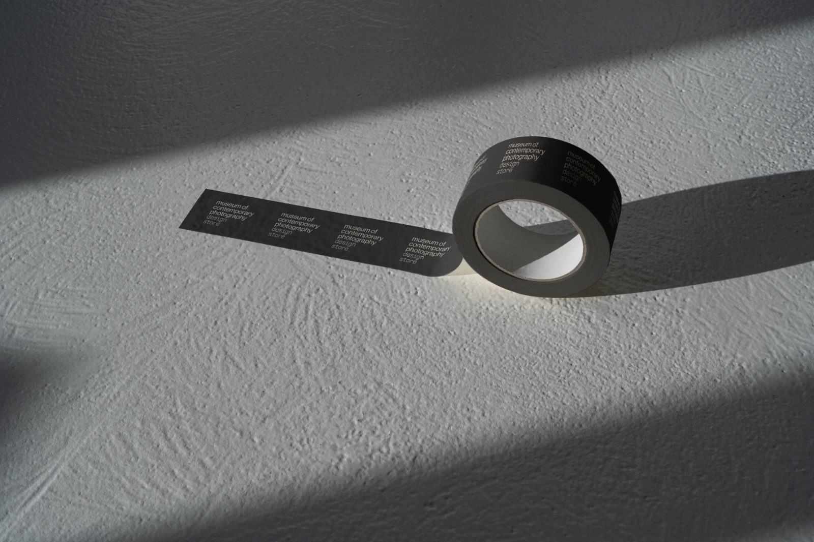
The institution also houses two departments. The first one is the design store, which provides contemporary-design goods. The second department is the independent in-house design studio, studio-600 (name inspired by the street the institution is located: 600 South Michigan Avenue), which handles all promotional, campaign, and installations of the institution.
Institutional Typography:
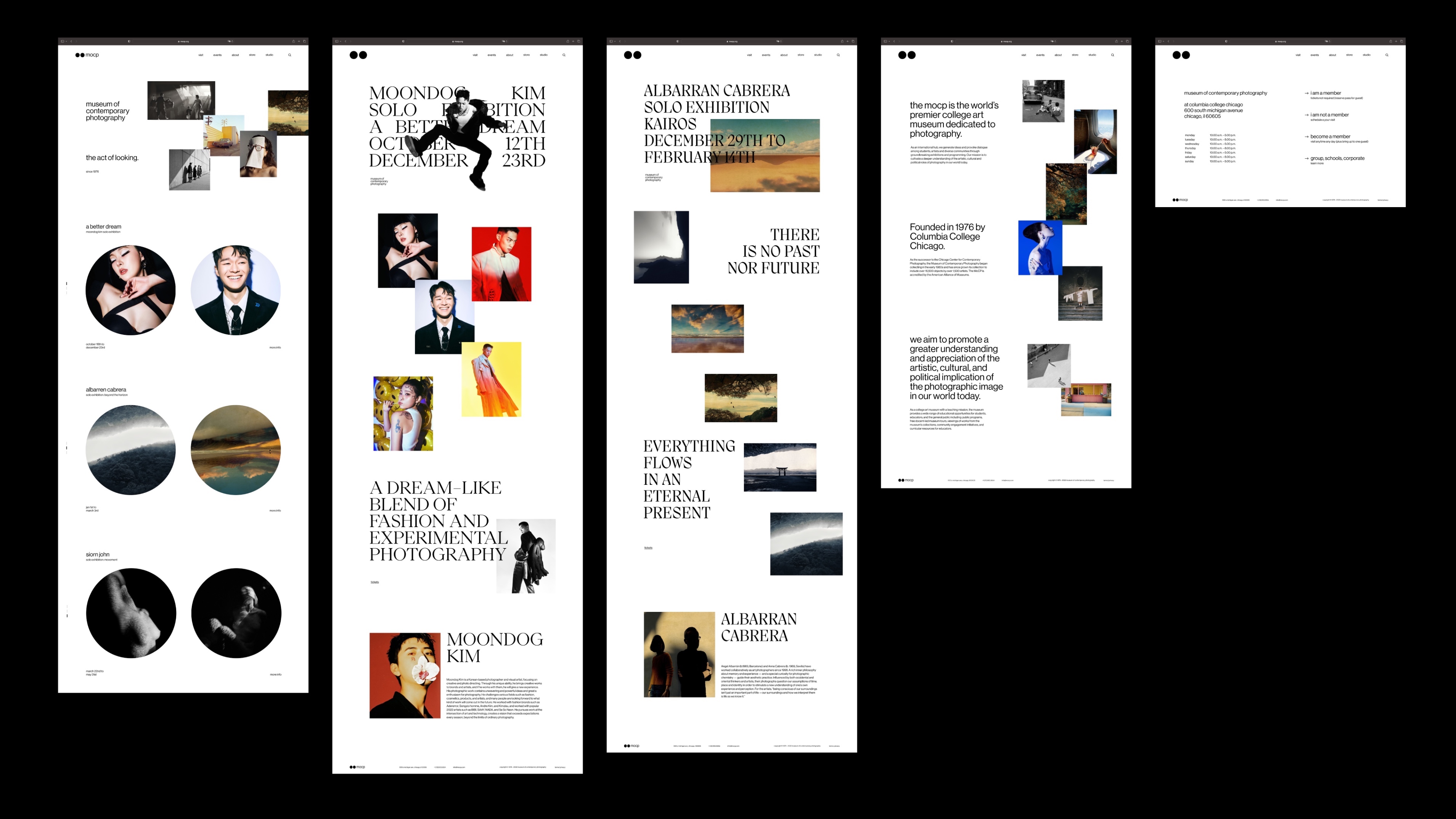
The institution typographic system comes with two typefaces with their respective weights: a primary san serif typeface, Neue Haas Grotesk Roman (display and text variation), for a clean and minimalistic look and a secondary monospace typeface, Supply Mono Ultralight, to create contrast.
All institutional typography, excluding body text, are typeset in lowercase. This design decision further pushes informational hierarchy while maintaining readability.
Campaign Typographic System:
This one-of-a-kind typographic system is designed conceptually to encourage creative freedom and design diversity, and it is designed visually to create impact and boldness. The campaign typographic system is Divided into four quadrants:
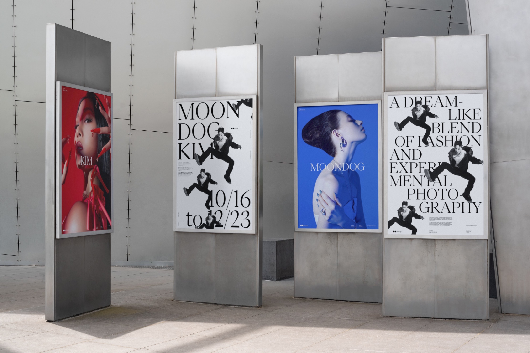
Top left categorizes exhibitions featuring works containing traditional photographing methods that focus on subjects matter—works categorized in this quadrant utilize the typeface Migra Regular, a sharp and modern humanist serif.
Bottom left categorizes exhibitions featuring works containing traditional photographing methods that is story invoking—works categorized in this quadrant utilize the typeface Eiko regular, an elegant and expressive serif.
Top right categorizes exhibitions featuring works containing experimental photographing methods that focus on subjects matter—works categorized in this quadrant utilize the typeface Neue Haas Grotesk Display Roman, a clean and modern geometric san serif
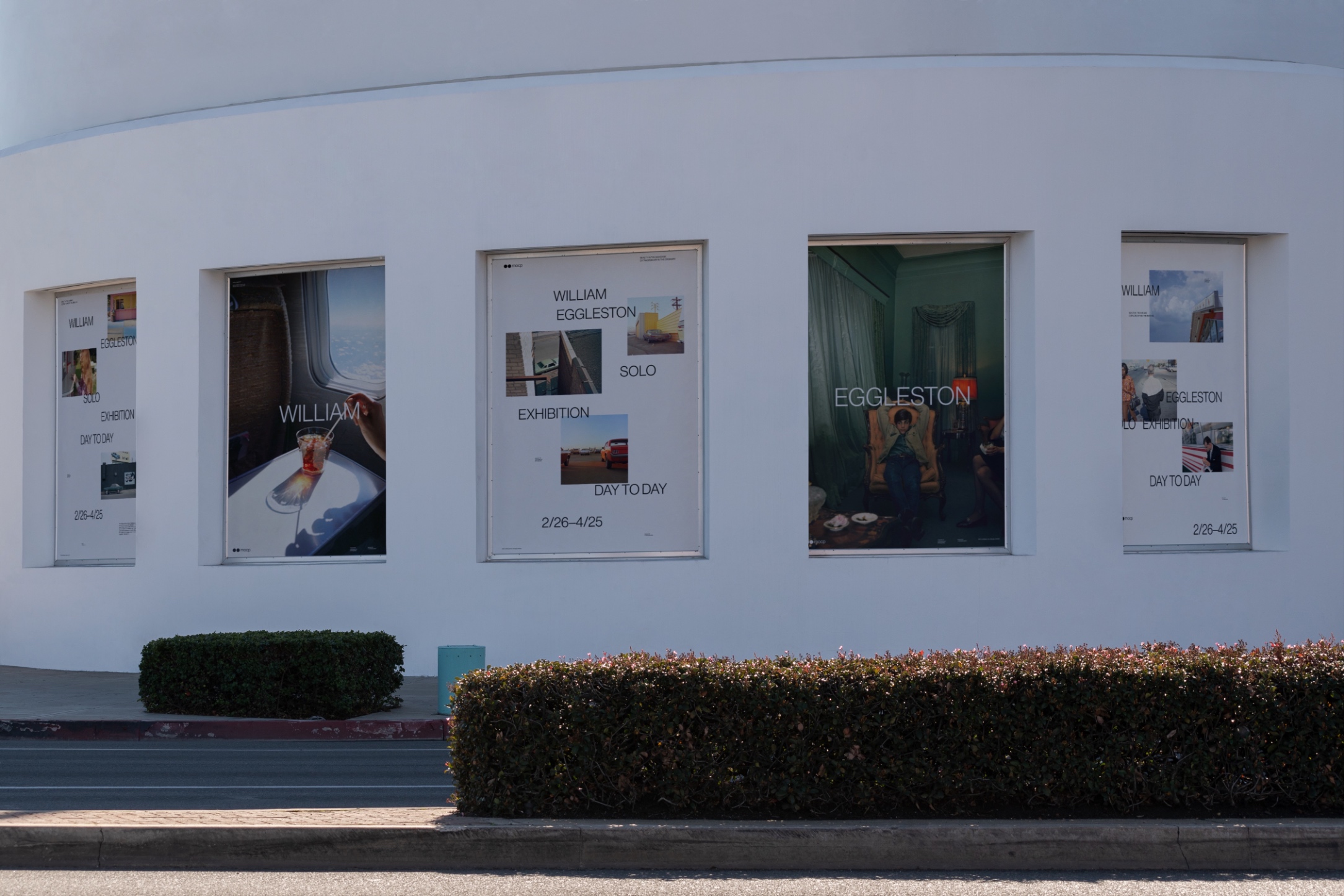
Bottom right categorizes exhibitions featuring works containing experimental photographing methods that story invoking—works categorized in this quadrant utilize the typeface Supply Mono Ultralight—An industrial and systematic monospace
Contrary to the institutional typography, the campaign typographic system is typeset to all caps, pushing informational hierarchy to its highest optimal limit.
Color:
The institution’s branding employs a limited color palette of black, white, light gray, and dark gray to convey sophistication, elegance, and neutrality. This minimalist approach allows visual elements to speak for themselves without being overshadowed by bold colors. The color palette is derived from the concept of light and shadows, with light and dark gray symbolizing shadows, and black and white symbolizing light and the absence of light. This creative approach adds depth and texture to the design, creating a memorable and visually engaging identity.
Animation:
mocp’s signature blur-in animation is a visual representation of how our eyes and cameras move in and out of focus. The secondary animations draw inspiration from both digital and film cameras, incorporating elements such as film processing, light reflection, and camera mechanisms to add depth and visual interest.
Institutional Poster:
The institutional poster design places emphasis on the logo and institution’s name, using straightforward positioning to create a bold visual impact that reinforces the brand identity. A set template is employed to provide a consistent and recognizable style across all materials. In contrast to a campaign poster system, the institutional posters prioritize functionality above all else, delivering clear and concise messaging.
Campaign Poster System:
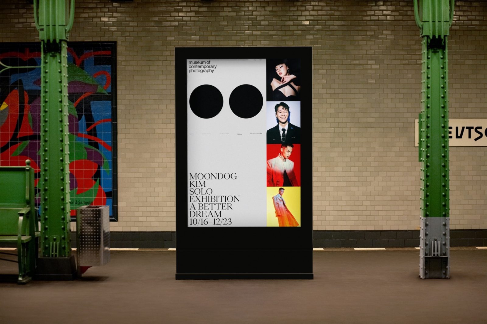
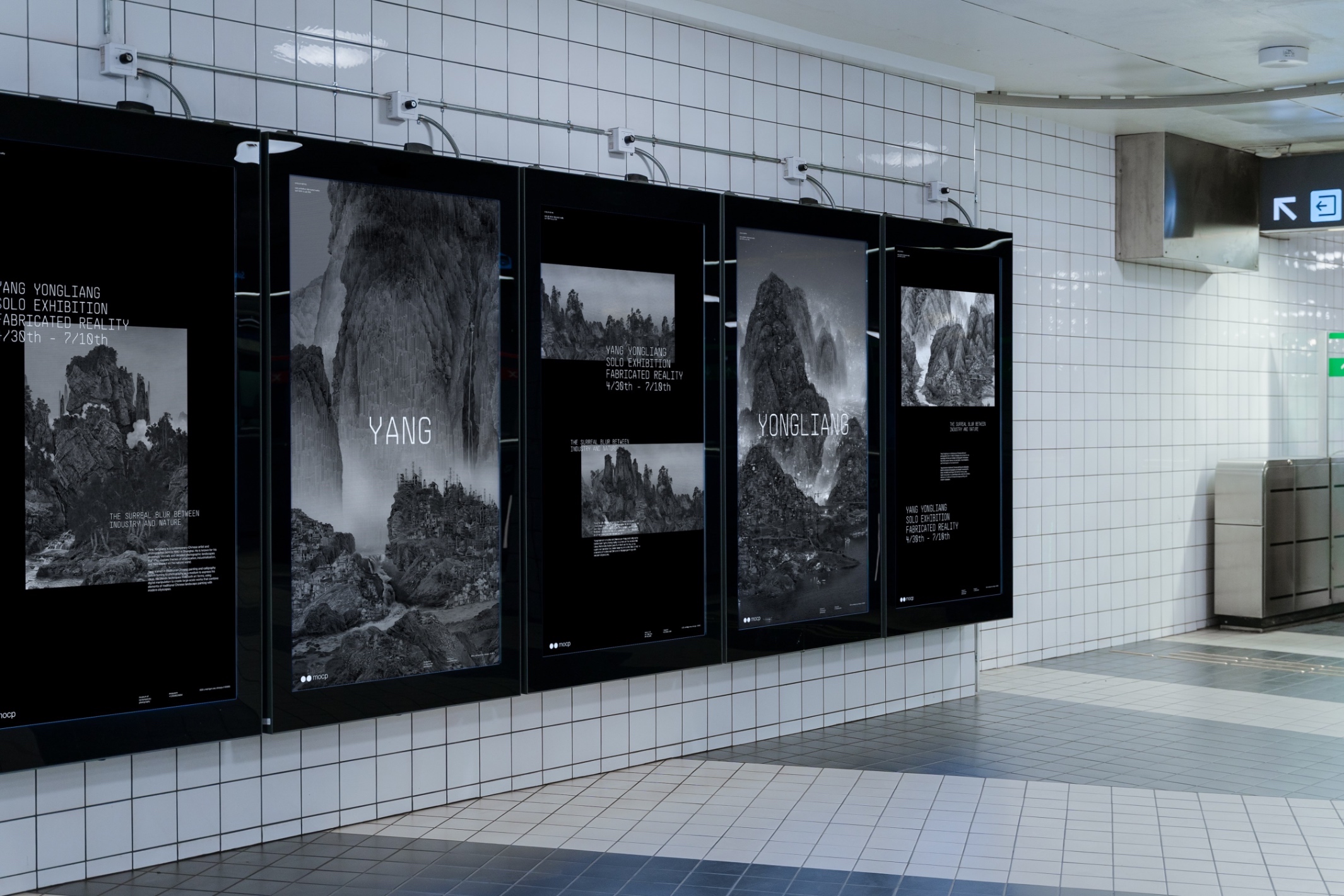
The Campaign poster system contains two type of posters: the art directed posters and the full bleed posters. Both work in tandem to create a visually appealing and. Informative poster series.
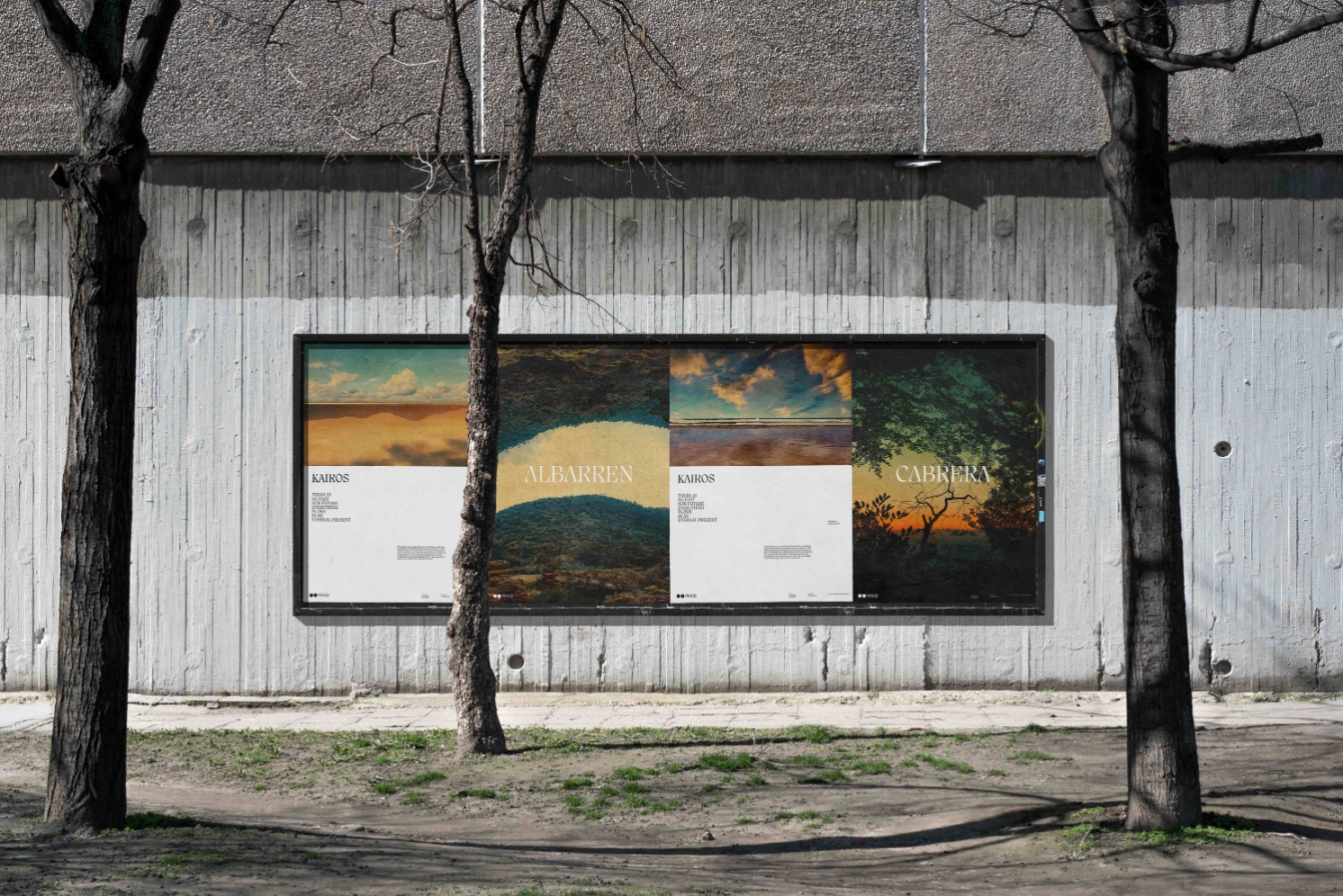
The design of art directed posters taking inspiration from photographic composition. Just like having a foreground, mid ground, and background, the art directed poster take that approach in the way it display typography, visuals, and information.
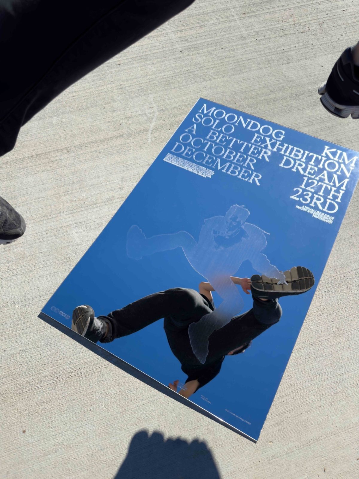
The full bleed posters have two intended purpose. The simplicity act as a breather between each art directed poster, and the consistent design helps every poster series feel cohesive to the institution.
Installation:
The institutional installation offer an attractive means of engaging with audiences. The front of the installation is designed to captivate attention with a dynamic and vibrant motion visuals that showcases the current exhibit in an eye-catching manner. The back of the installation is informative, providing a detailed and organized overview of upcoming events, exhibition, and time. Together, the installation creates an immersive and engaging experience for visitors.
Impact:
This new identity system for the museum of contemporary photography is intentionally crafted to deliver dynamic visuals that adapt to various contexts, while also embodying a timeless quality that transcends fleeting trends or fads.
CREDIT
- Agency/Creative: Alan Xu
- Article Title: Brand Redesign for the Museum of Contemporary Photography
- Organisation/Entity: Student
- Project Type: Identity
- Project Status: Non Published
- Agency/Creative Country: United States
- Agency/Creative City: Union City
- Market Region: North America
- Project Deliverables: Brand Redesign
- Industry: Education
- Keywords: WBDS Student Design Awards 2023/24
- Keywords: Identity: Brand Redesign
-
Credits:
Educational Institution: ArtCenter College of Design
Educator's Name: Simon Johnston


