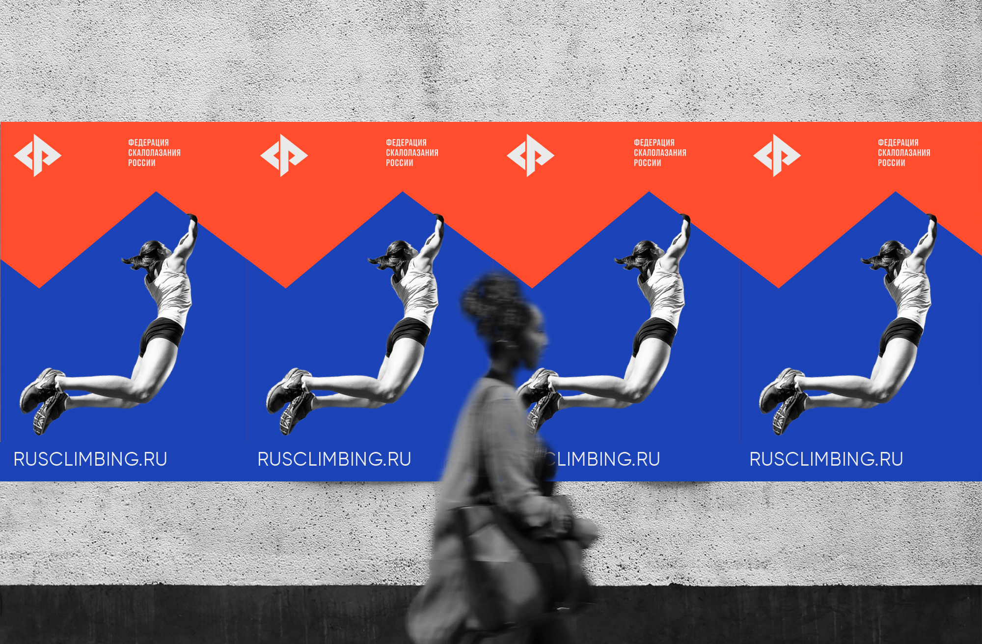
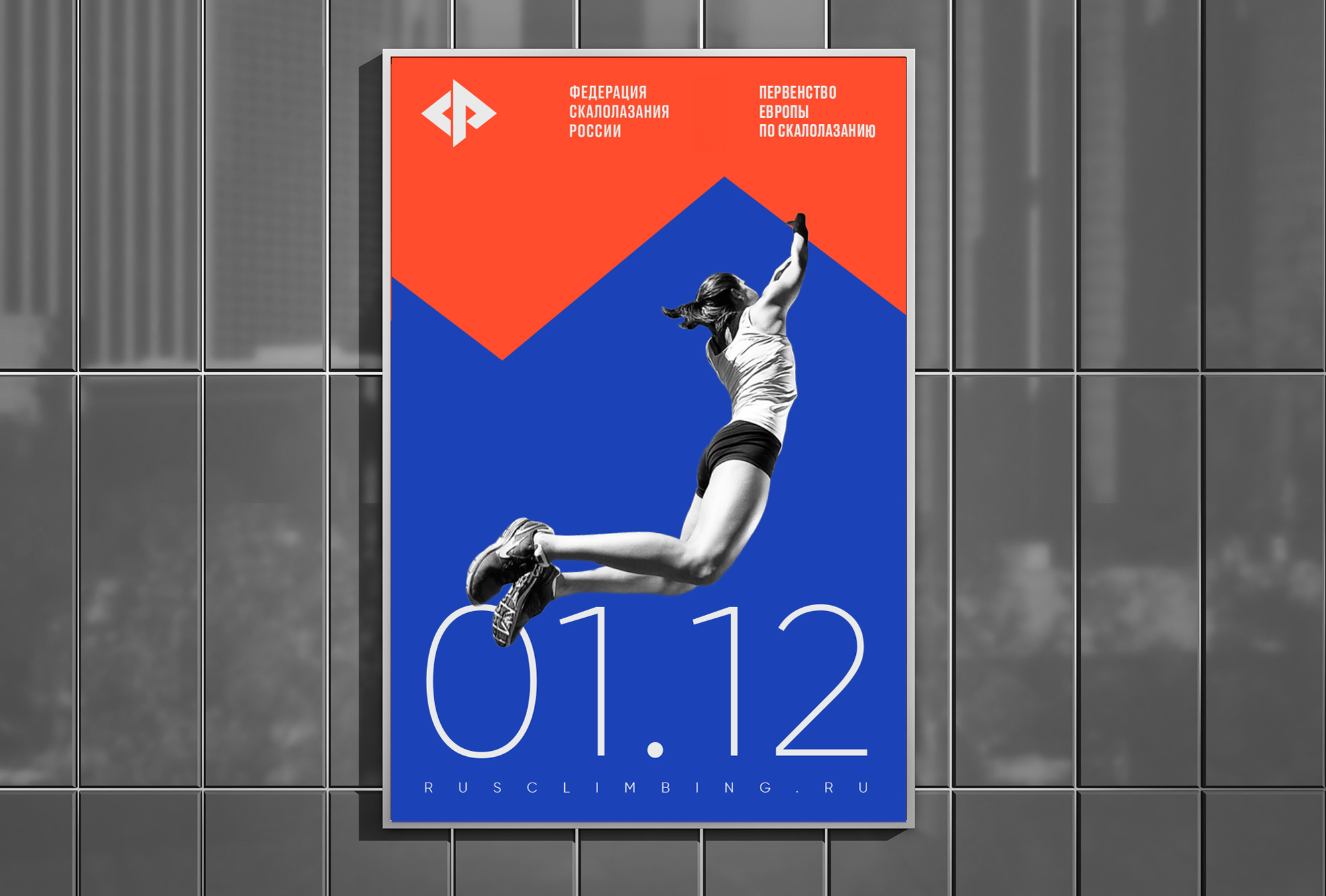
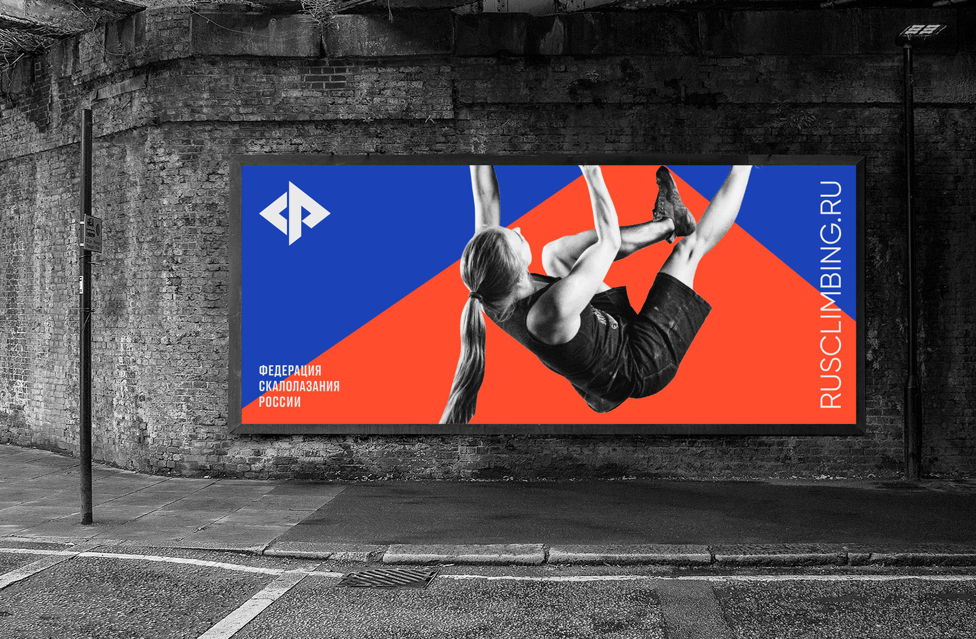
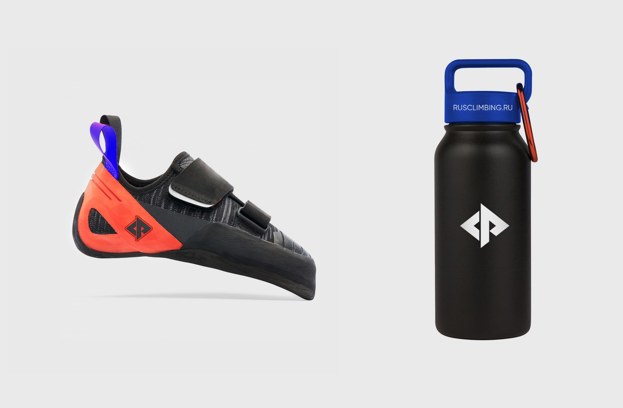
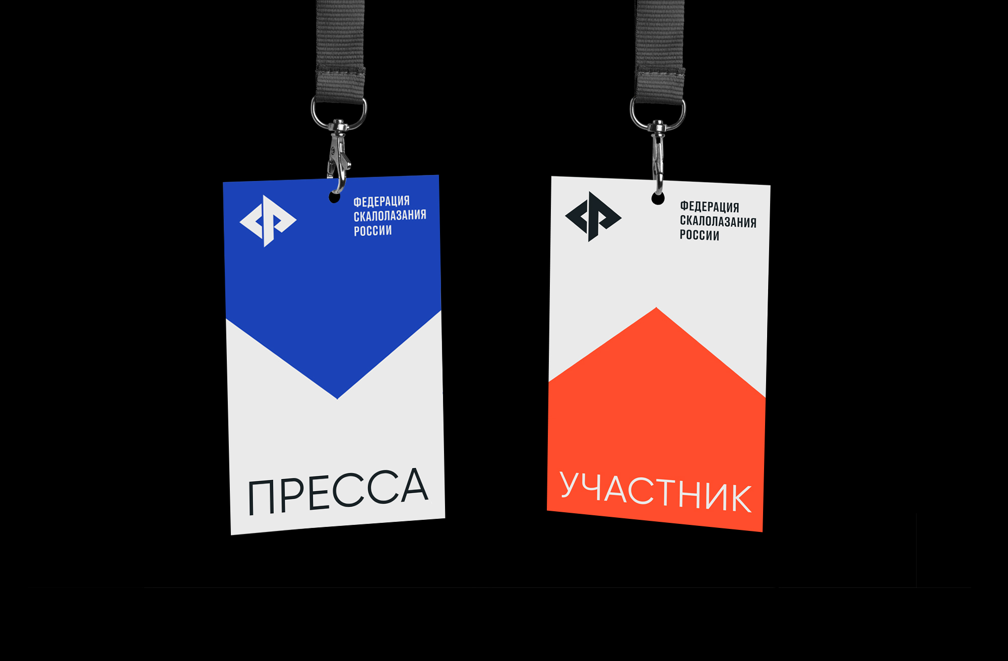
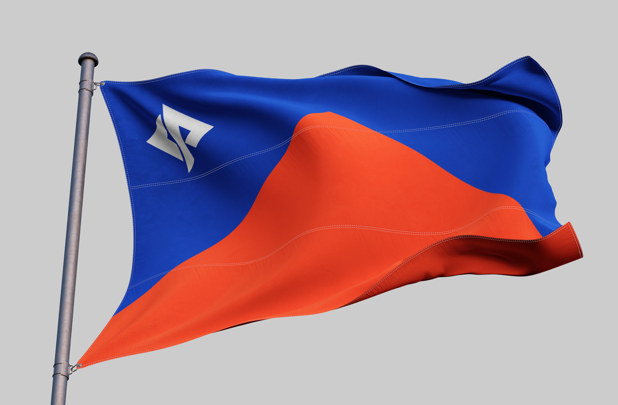
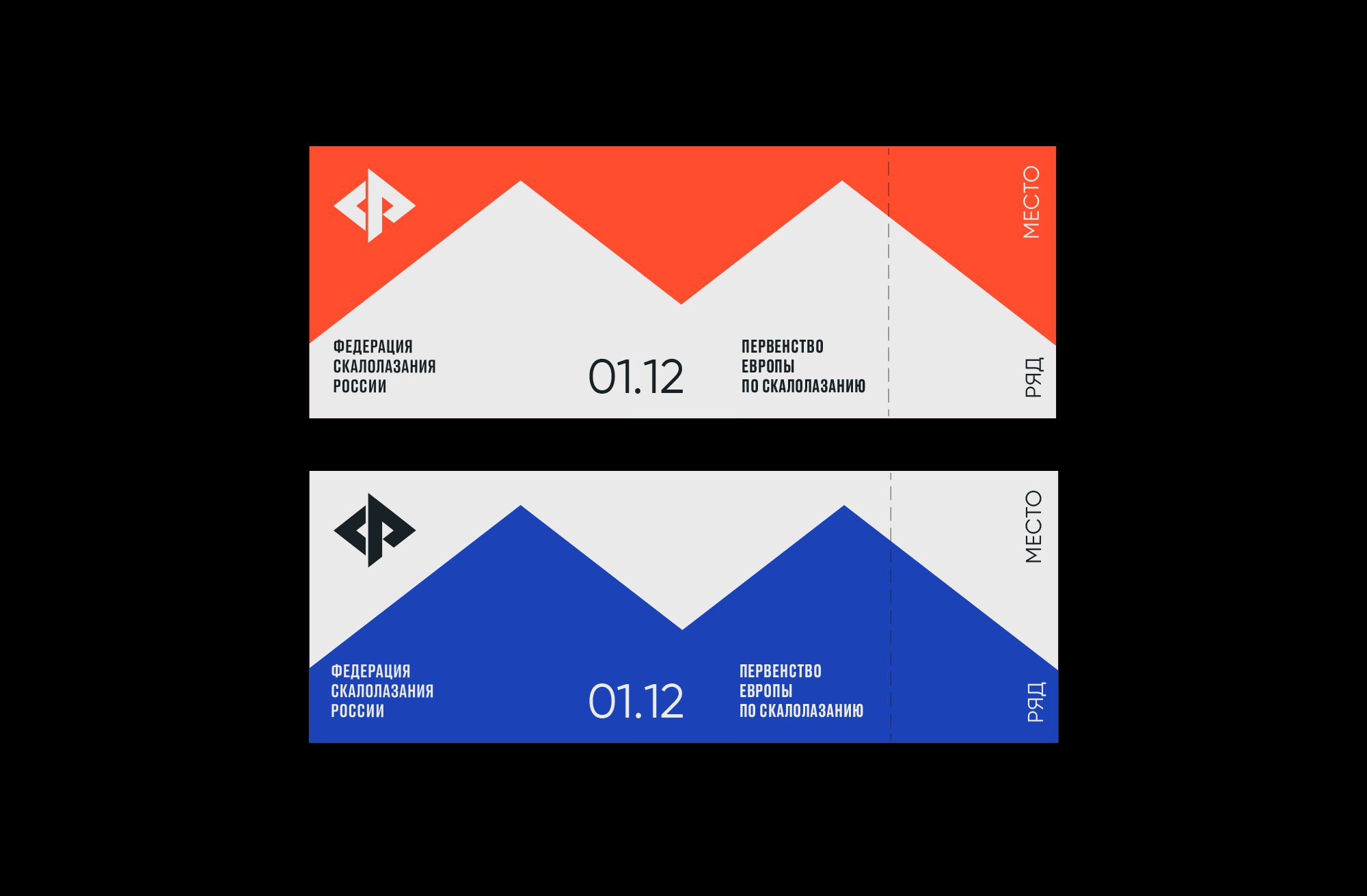
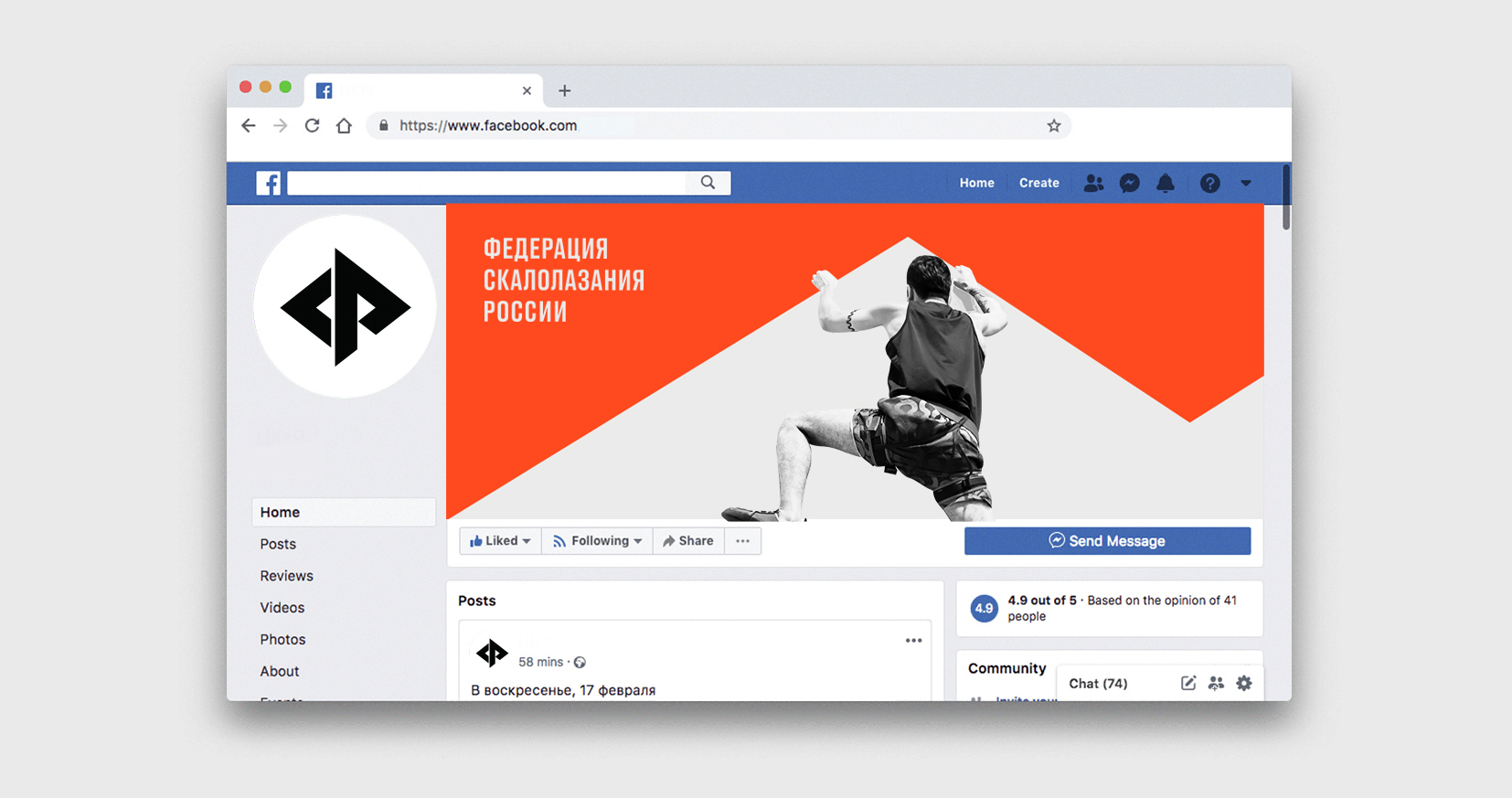
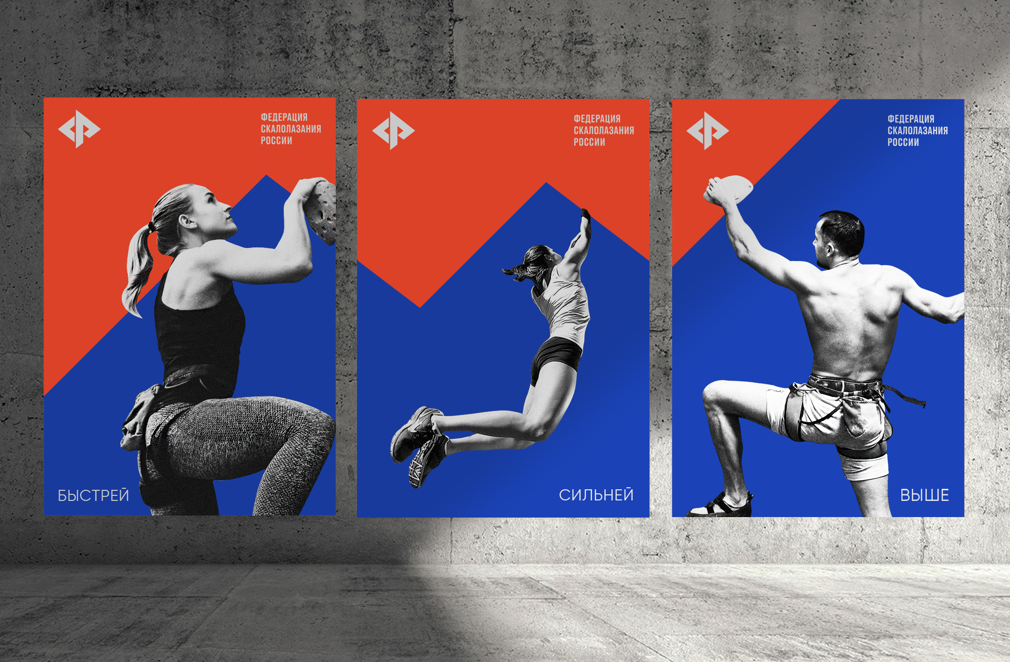
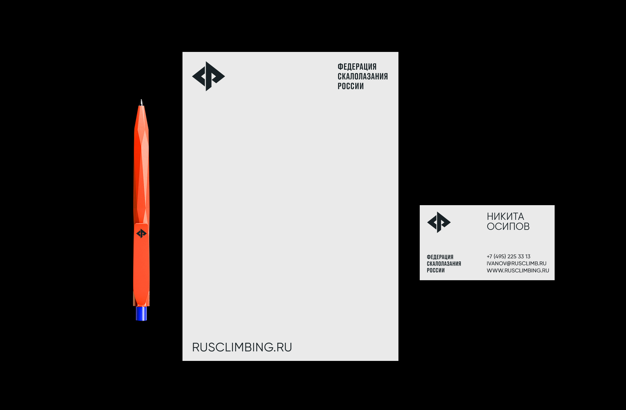
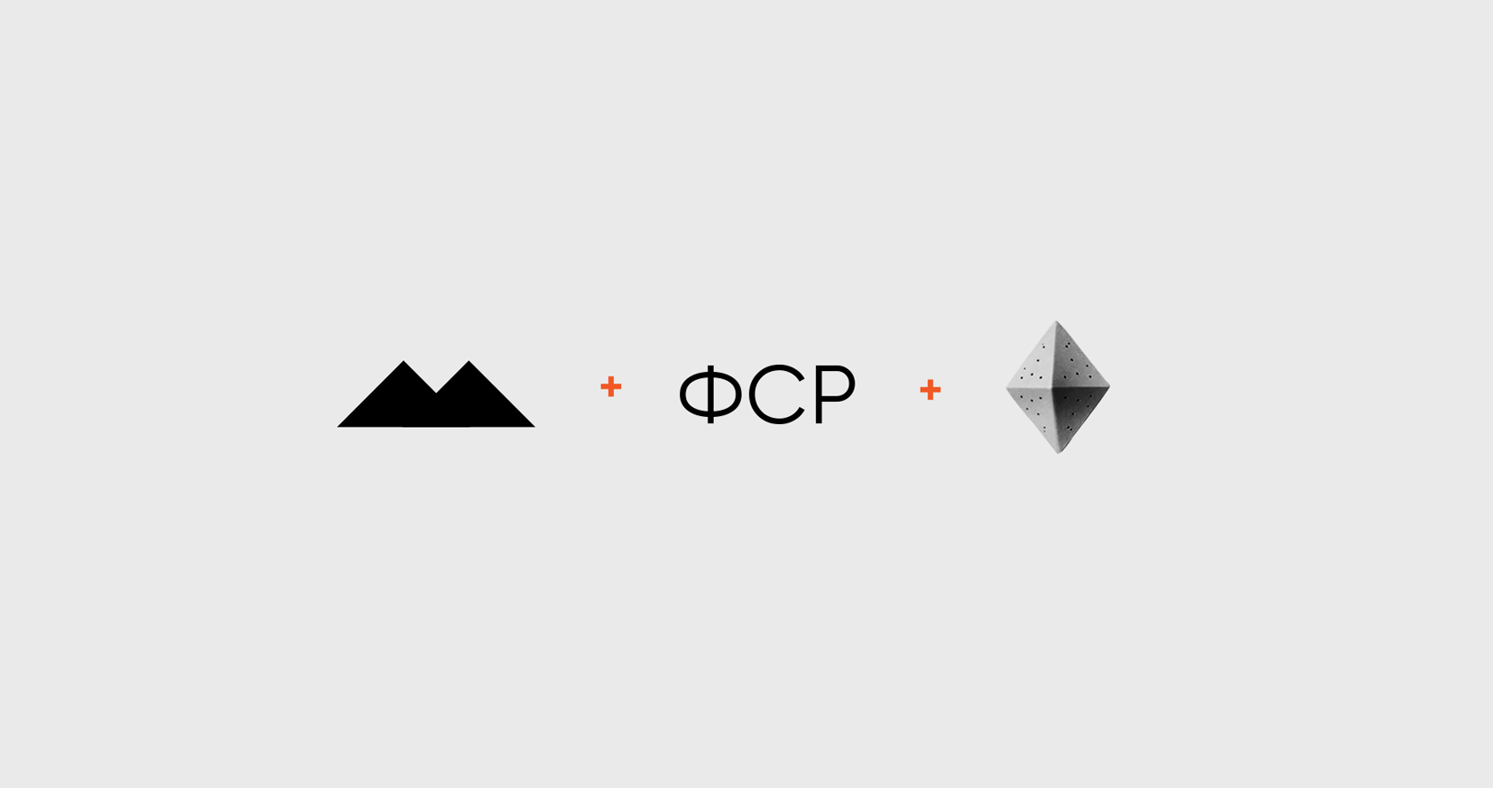
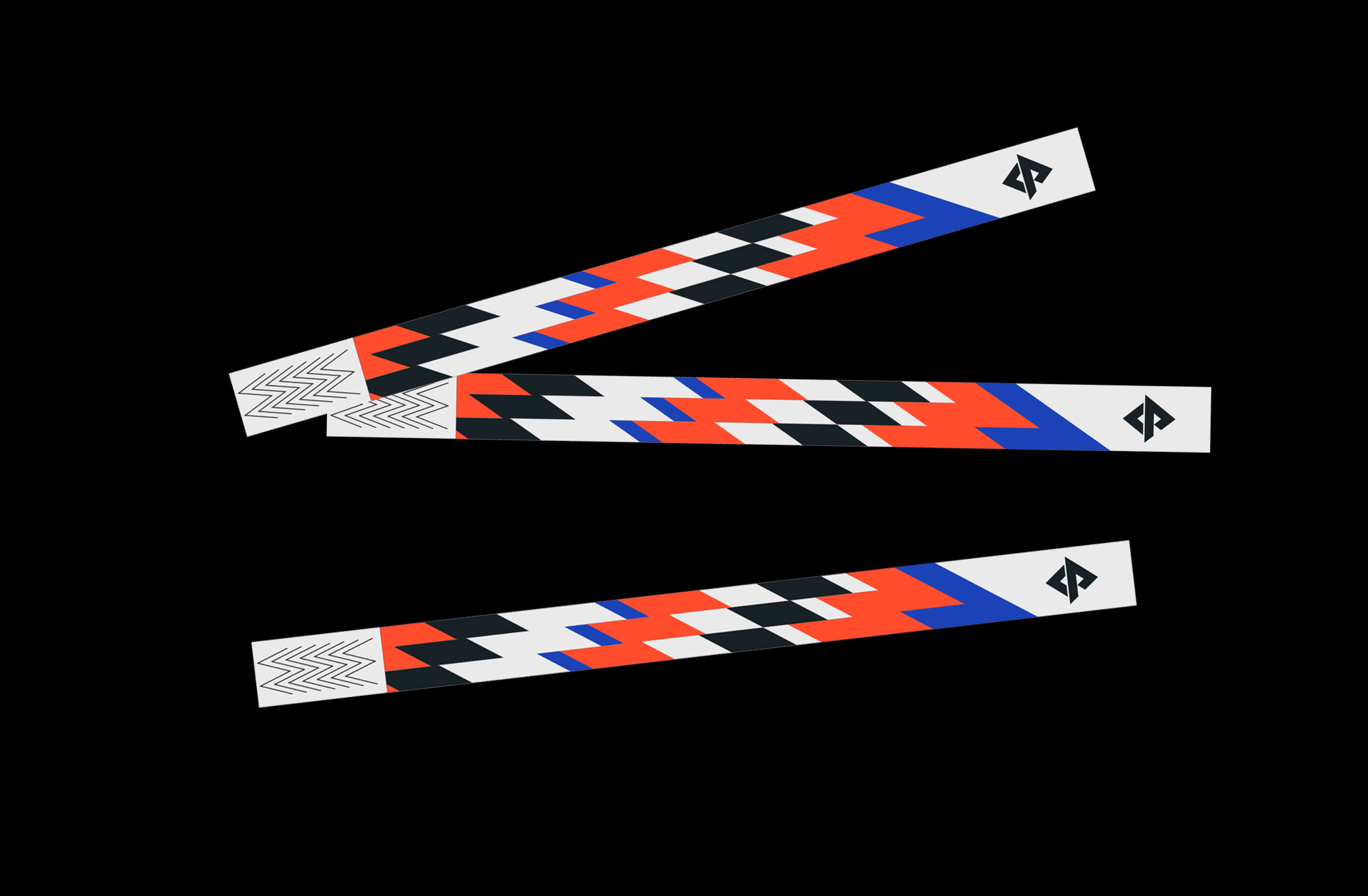
Redesign for the Climbing Federation of Russia. The client asked for a modern look, with the underlying goal of popularizing the discipline of mountain and rock climbing and making it more attractive to young people. The logo design is based on the first three letters of the Federation’s name. The letters are merged into a recognizable symbol that reflects mountains, climbing wall holds and climbing human figures. This geometric logo stands for the main theme of identity design. I used Russian national colors but applied more active and energetic tones. Dynamic and minimalistic graphics combined with monochromatic climbers photos round off the project.

CREDIT
- Agency/Creative: Veronika Levitskaya
- Article Title: Brand Redesign for the Climbing Federation of Russia by Veronika Levitskaya
- Organisation/Entity: Freelance, Published Commercial Design
- Project Type: Identity
- Agency/Creative Country: Russia
- Market Region: Europe
- Project Deliverables: Brand Identity, Branding, Graphic Design, Research
- Industry: Public Utility
- Keywords: climbing, sport, mountain, logo design
FEEDBACK
Relevance: Solution/idea in relation to brand, product or service
Implementation: Attention, detailing and finishing of final solution
Presentation: Text, visualisation and quality of the presentation


