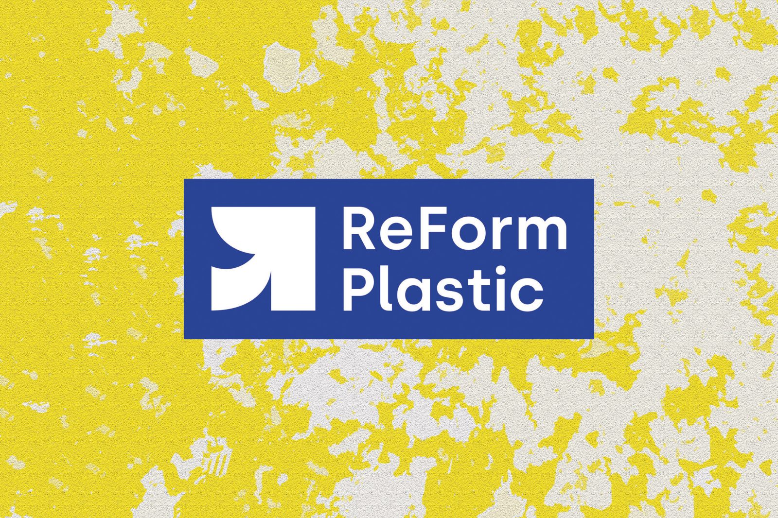
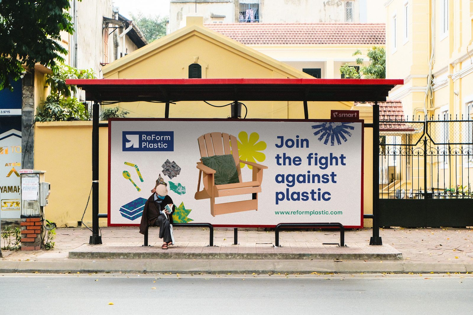
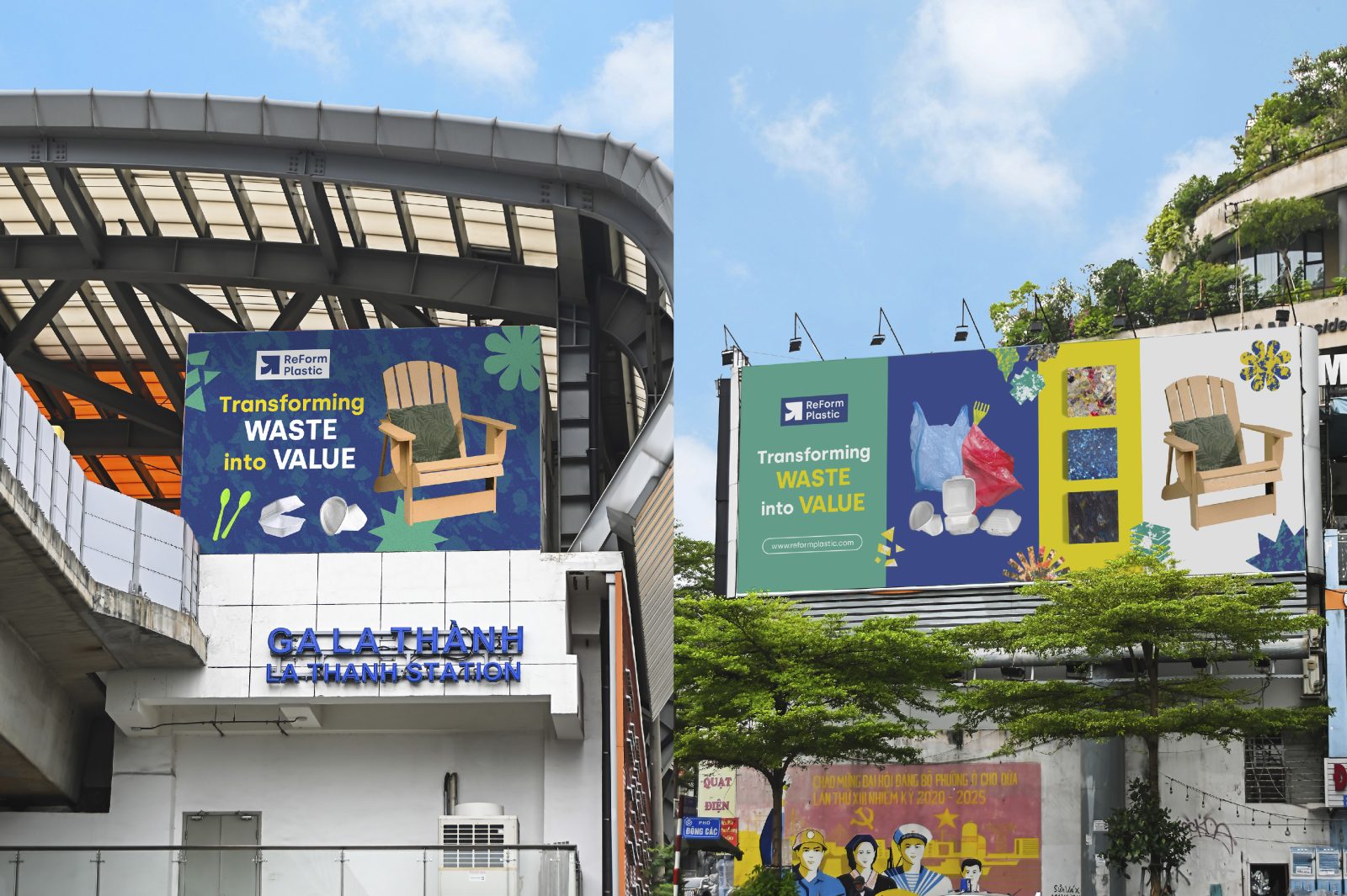
ReForm Plastic is a Da Nang-based social enterprise dedicated to solving the plastic waste problem and improving the livelihood of local informal waste workers. With a vision towards a better world, ReForm Plastic promotes circular economy by transforming plastic waste into beautiful, yet fully functional products through proven research and design.
Unlike other brands who only use high-value plastic wastes in production,ReForm Plastic also uses low-value plastic as materials for all of its products, which brings about significant and measurable benefits to the environment. Starting out with just one small pilot facility in Da Nang in 2020, ReForm Plastic has expanded to seven full-sized factories across 5 countries in Southeast Asia and Africa after 2 years of operation.
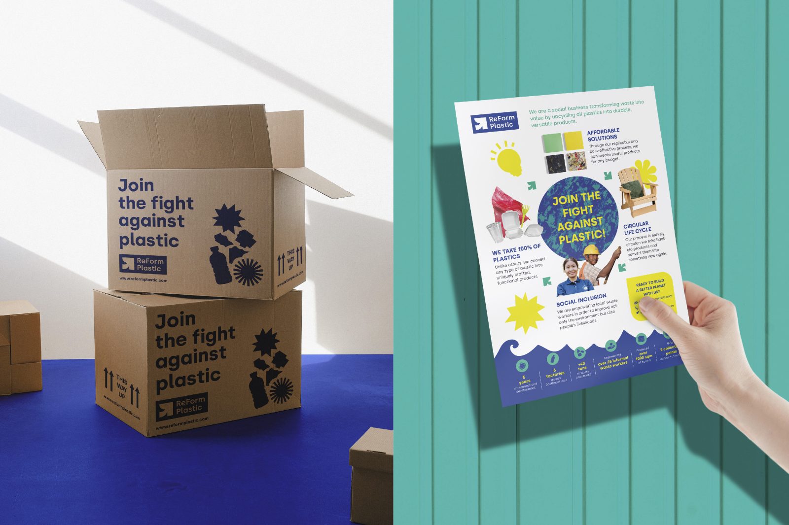
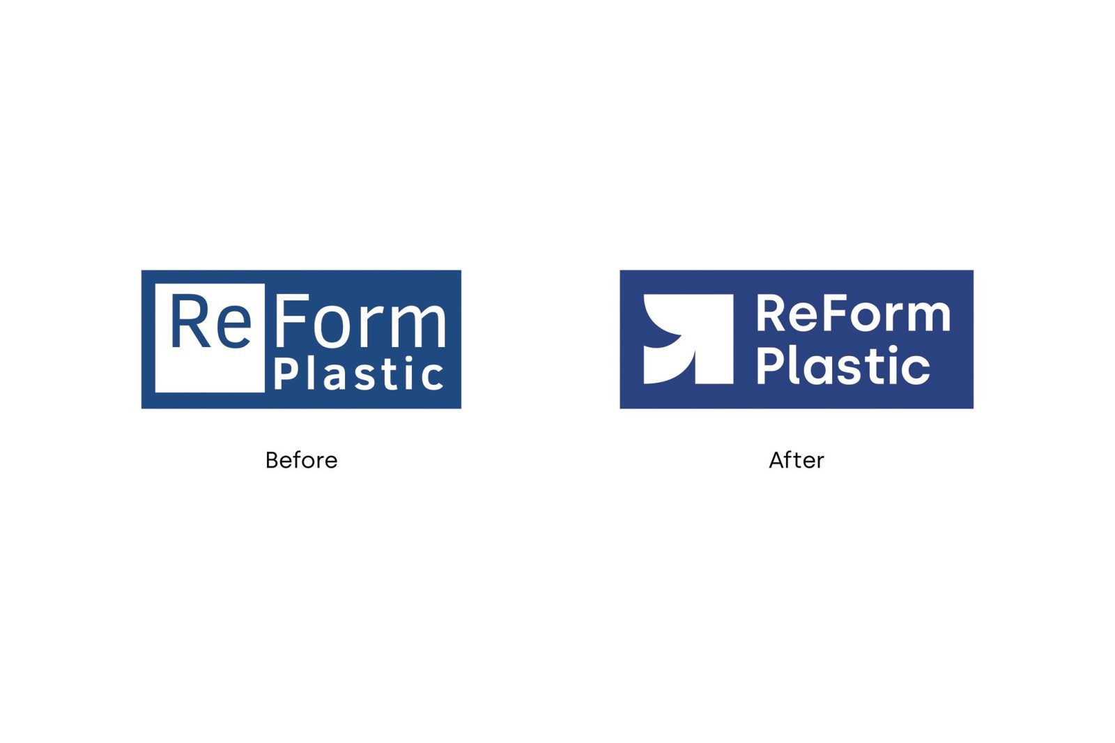
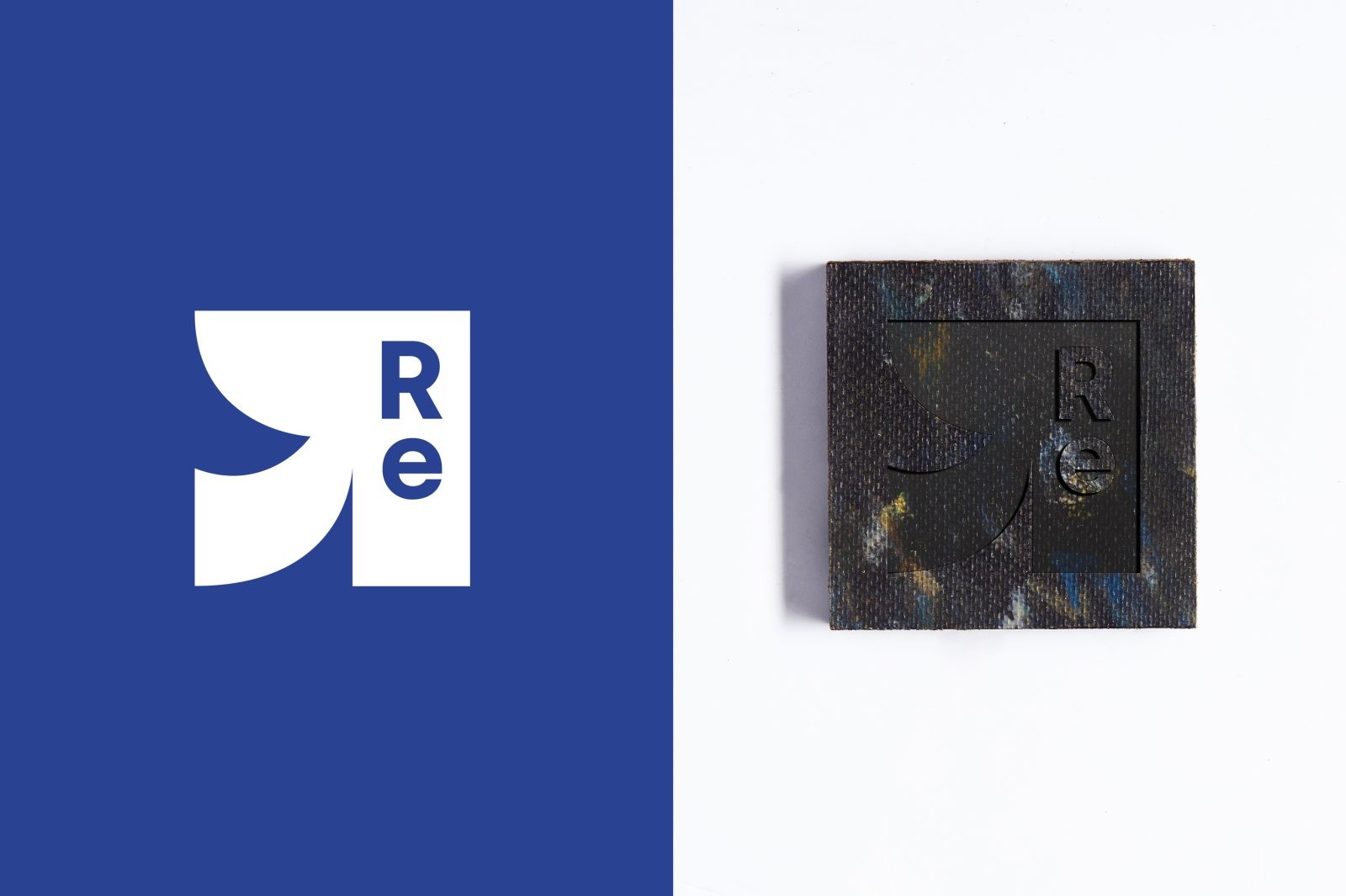
Due to this scaling up, ReForm Plastic needed to create a new visual identity that not only aligns with their current brand mission and business strategy but also maintains consistency across all communication channels. The new logo of ReForm Plastic is developed based on the footprint of the old logo, changing the old white square on the left into an arrow symbol – which connects with and reflects the current brand narrative. The arrow shape stands for the letter “R” in “ReForm”, representing innovation, development, transformation, plus adding a sense of movement to the logo.
In honor of the old ReForm Plastic logo which has a white square on the left with the word “Re” inside, we use the same square shape and the same text position, combined with the new arrow symbol to create a responsive logo version.
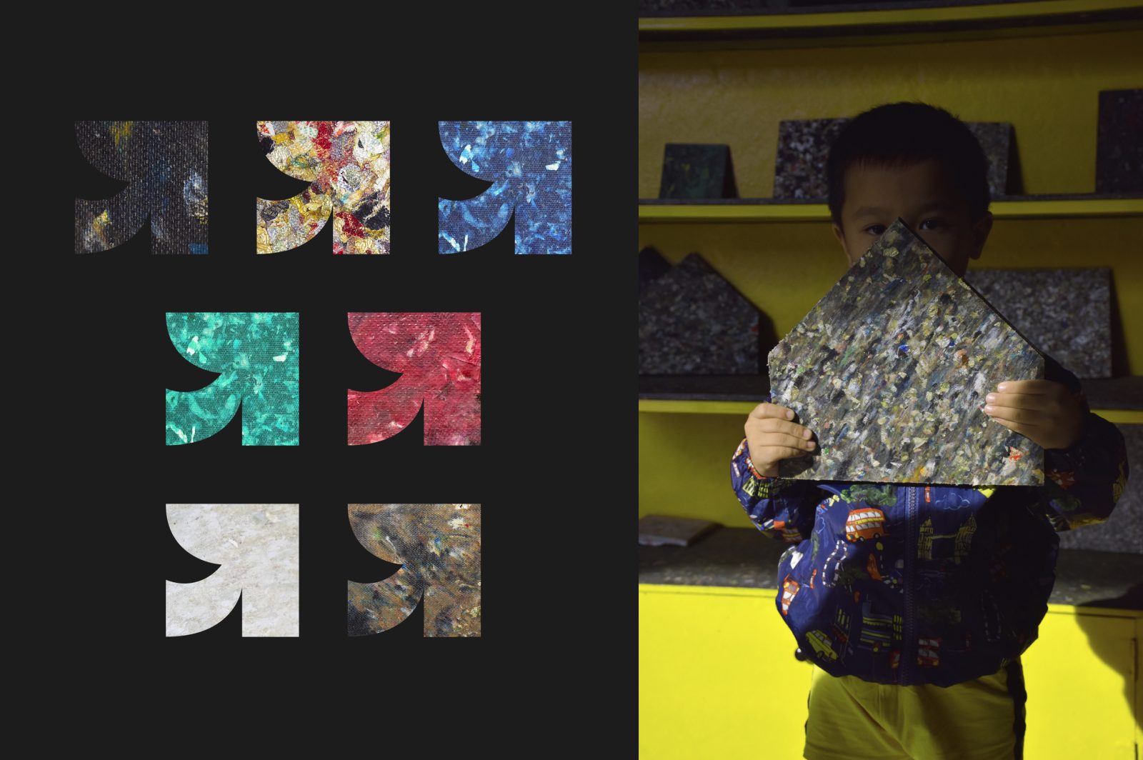
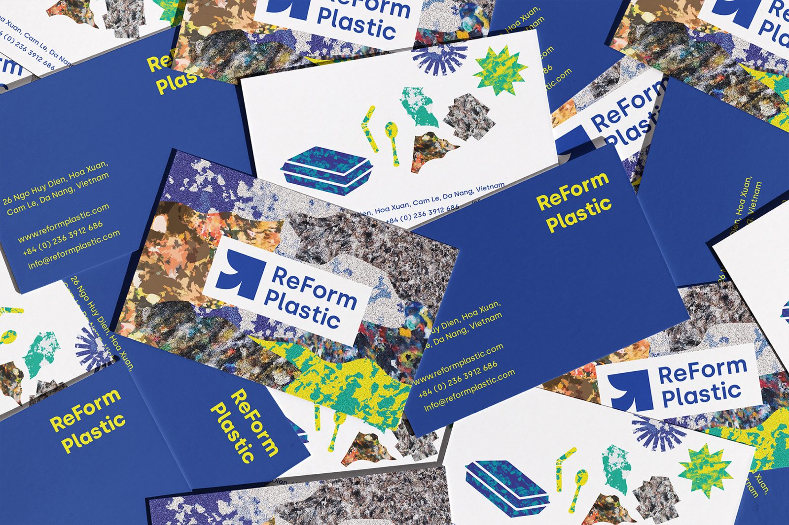
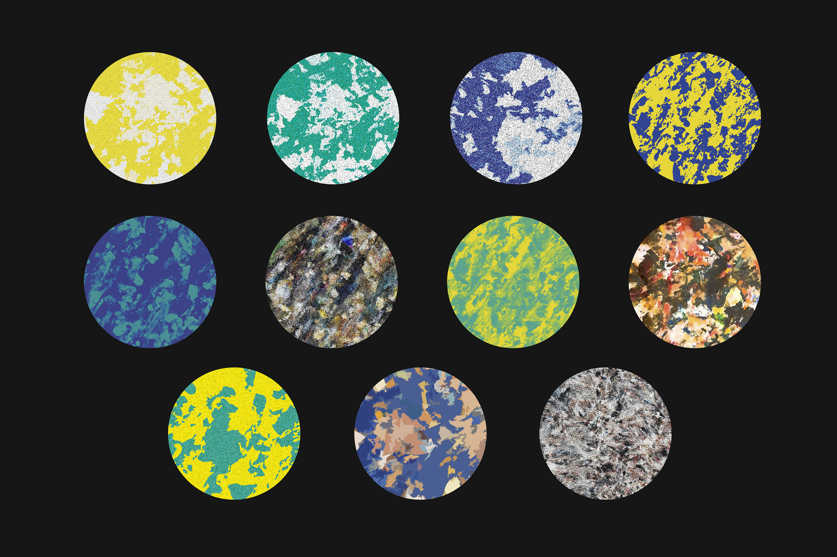
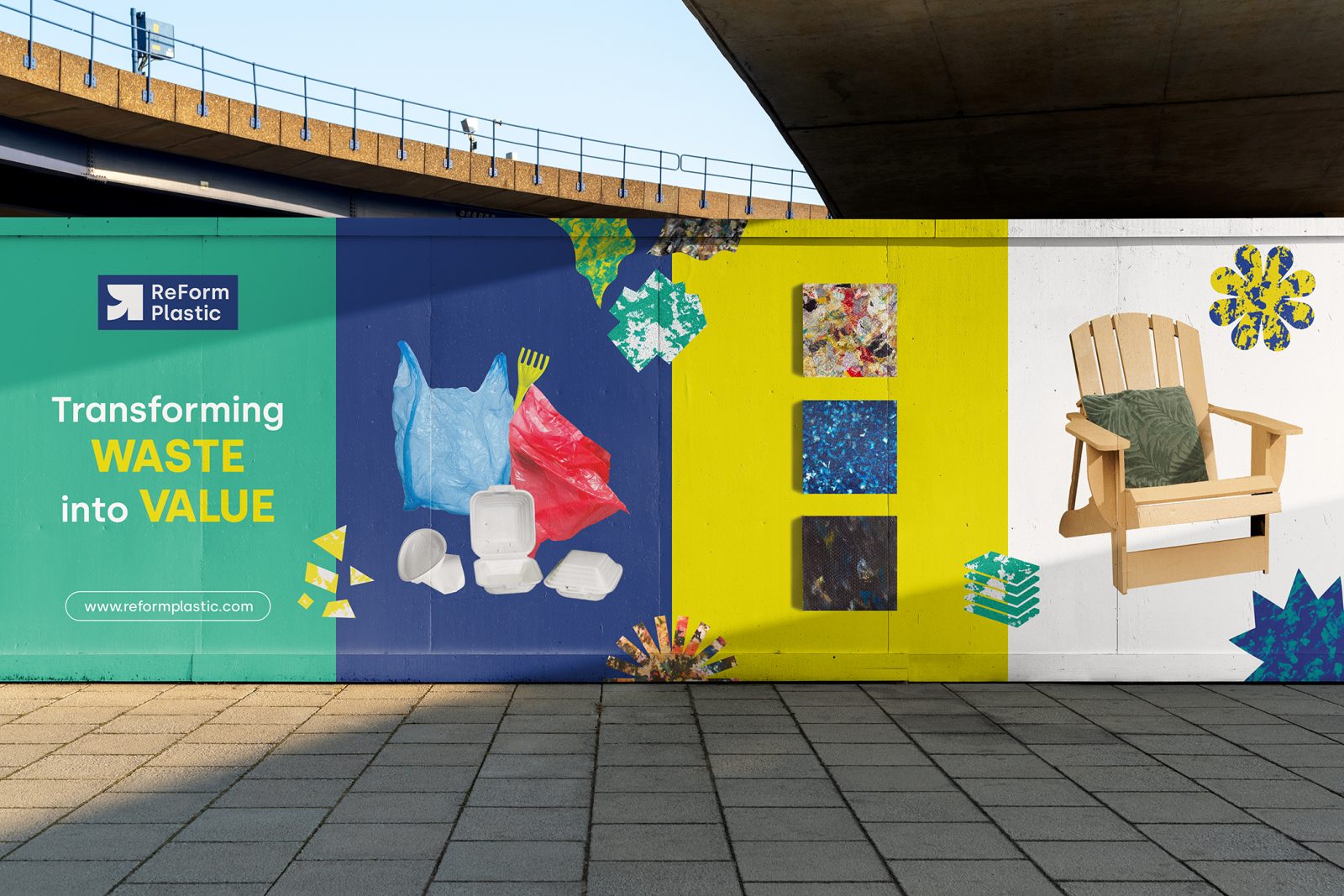
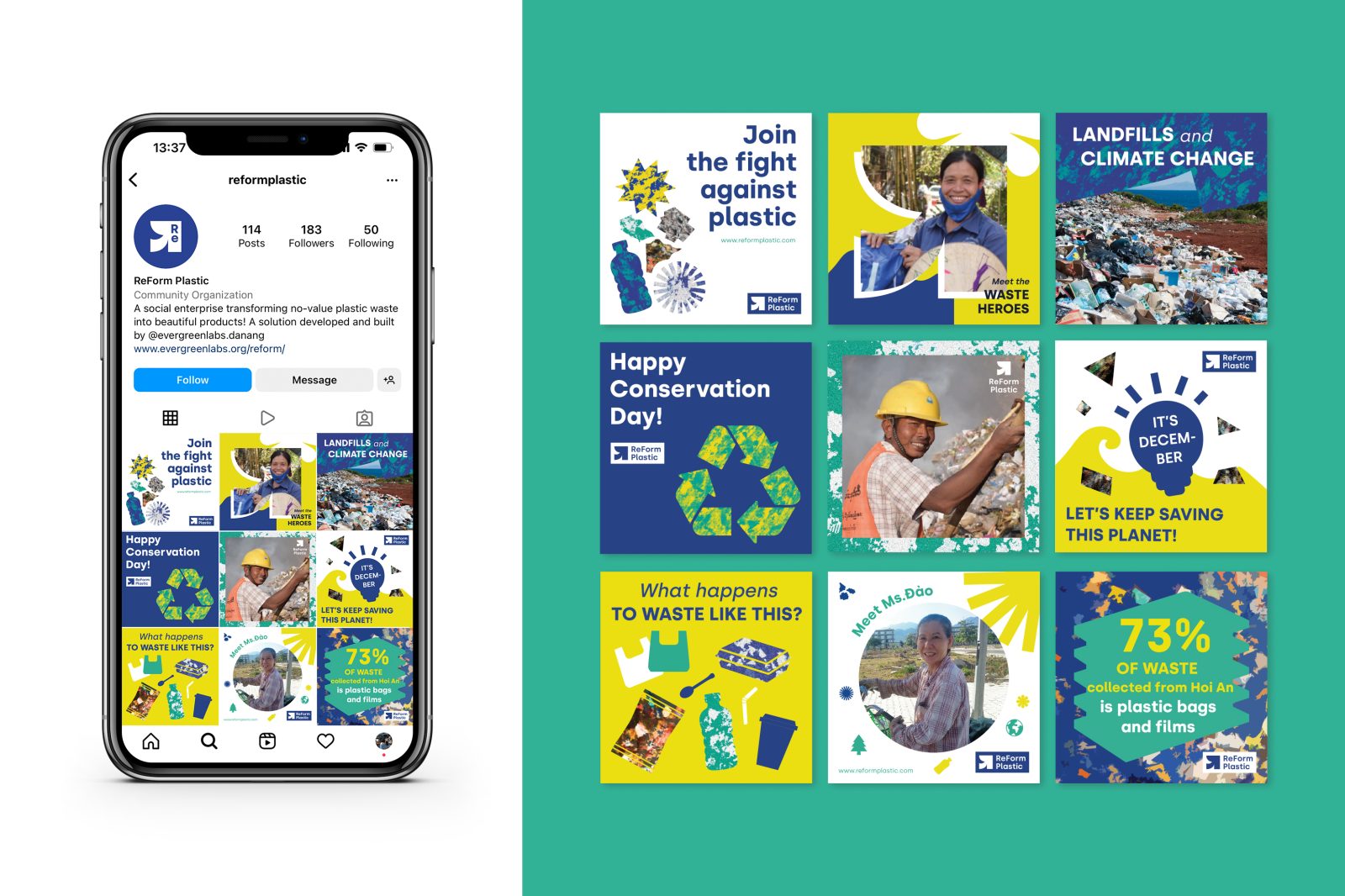
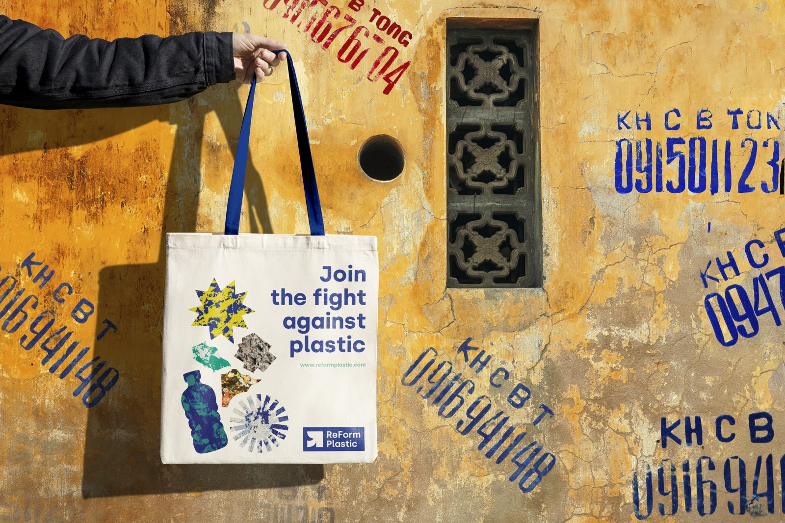
Impactful actions call for powerful visuals. The photographic patterns for ReForm Plastic are derived from the recycled plastic boards themself: a series of close-up photographs of board surfaces were taken, edited and manipulated in Photoshop. Since the wastes are different each time they are collected, each board is a unique representation of craft and design and no board is exactly the same. This pattern library will keep expanding as long as new boards are made, creating somewhat of a “generative” library of design materials to play with. This design framework allows room for experimenting and creativity, while keeping everything consistent by utilizing the brand’s color palette and working within a certain set of criterias.
The way we experiment with the pattern creation process is a visual parallel of the way plastic waste is treated, and then combined to form new products. With this design approach, we have a future-proof solution which guarantees both cohesion and flexibility to the brand’s visual identity.
CREDIT
- Agency/Creative: Giang Nguyen
- Article Title: Brand Redesign for ReForm Plastic Vietnam
- Organisation/Entity: Creative , Freelance
- Project Type: Identity
- Project Status: Published
- Agency/Creative Country: Viet Nam
- Agency/Creative City: Hanoi
- Industry: Chemical
- Keywords: WBDS Creative Design Awards 2022/23


