


VOLTA Brand Shaping Studio – Ferreira Porto wine Classic range
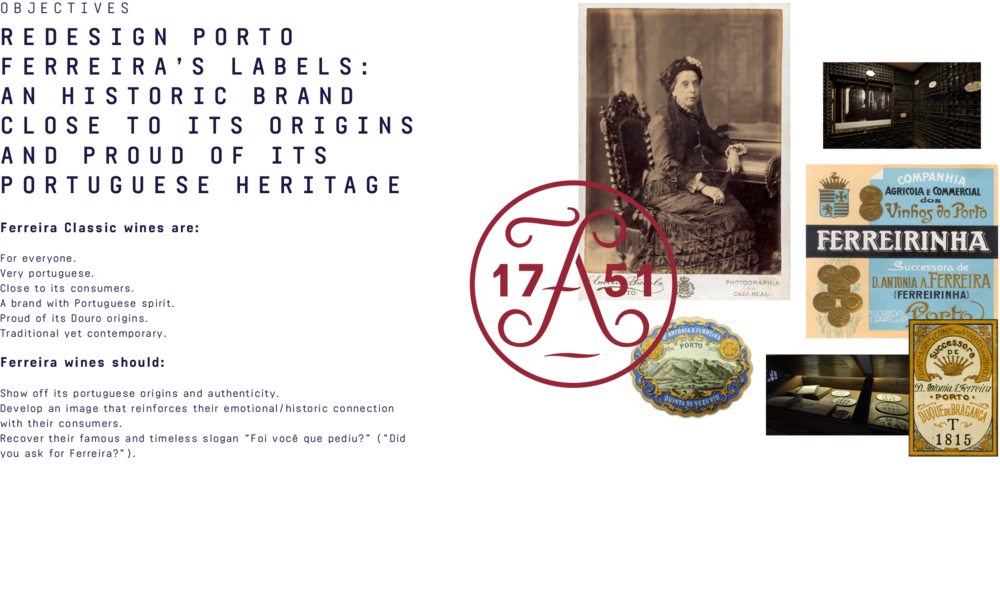
“ Ferreira is one of the oldest & most charismatic Porto wine brands. With its more than 250 years of history, it honours and continues the legacy left by Dona Antonia Ferreira, the iconic woman that in the 19th century helped transform the company into one of the biggest and best wine producers in the Douro. Her entrepreneurial and dynamic mindset is still present today, so the brand is always evolving.
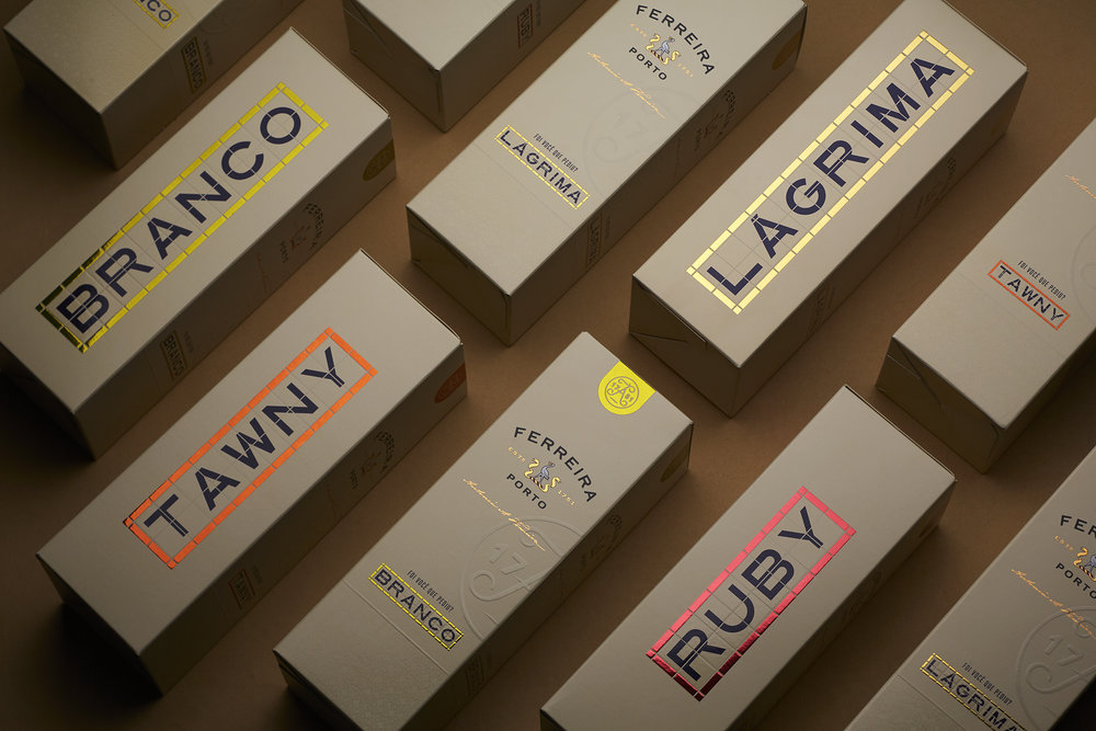
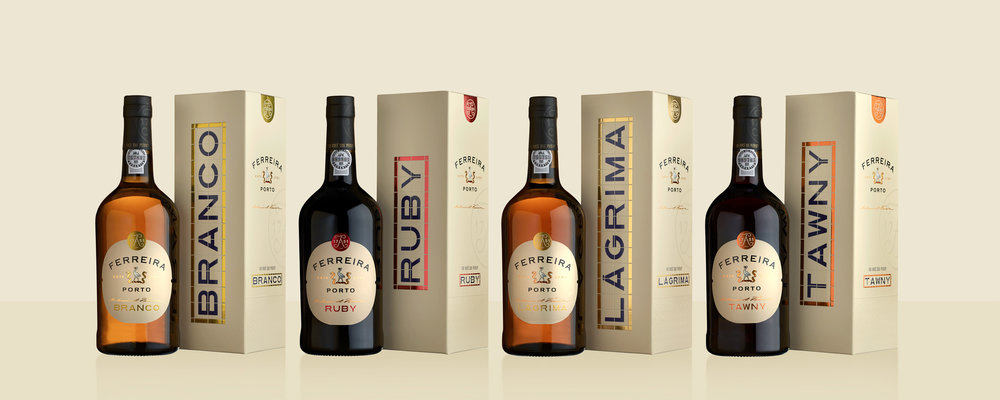
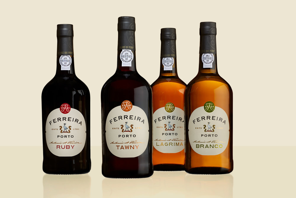
They approached VOLTA to reinvent and redesign their classic range wines image: Tawny, Ruby, White and Lágrima. These wines have a fierce shelf competition, so the redesign had to totally differentiate the brand from its competitors, without alienating its long time consumers.
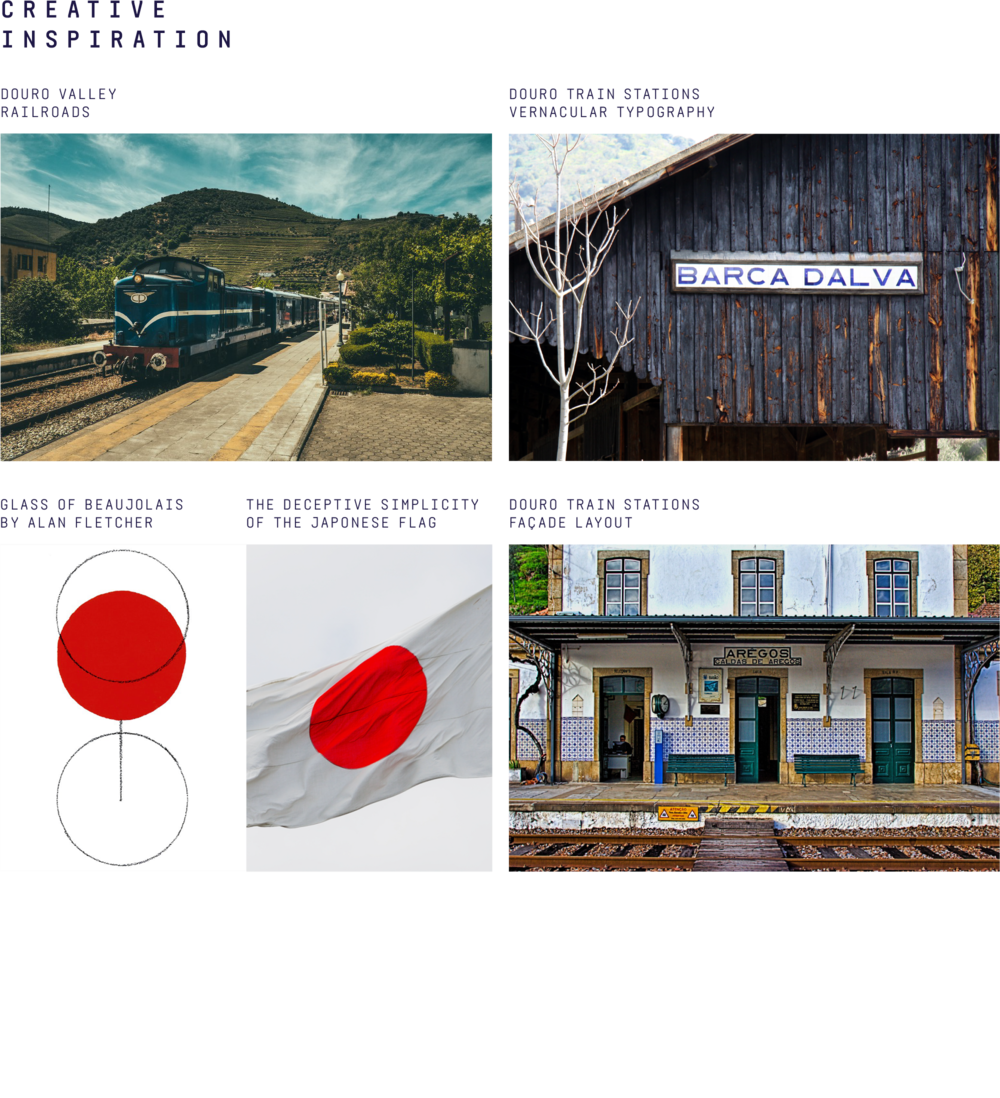
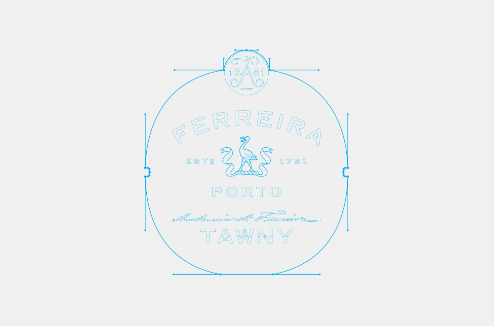
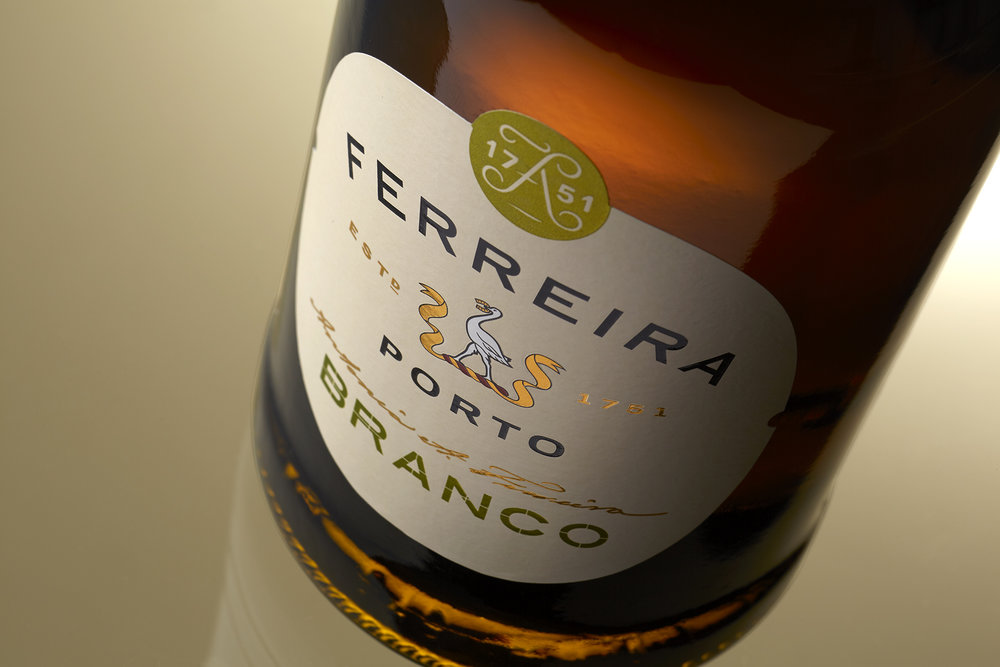
Our first approach was to dive deep in Ferreira’s history, researching their archives with thousands of old labels: a rich heritage of beautiful and varied shapes, colors and typographical styles. Secondly, a thorough analysis of the competitors labels shapes and colors made us understand a new shape should be considered. Bruno Munaris analysis of the Japanese Flag and the “less is best” Glass of Beaujolais by Alan Fletcher were both considered, helping us to define a rounded shape that “forces” the consumer to focus on the label content.
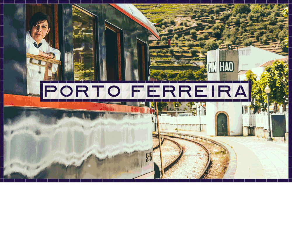
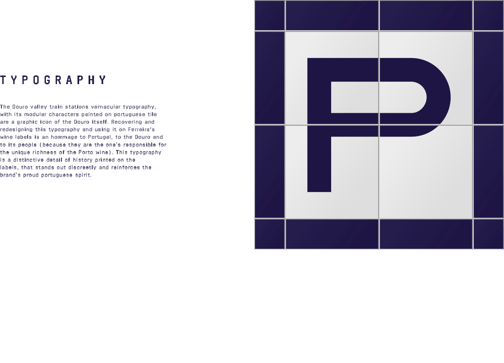
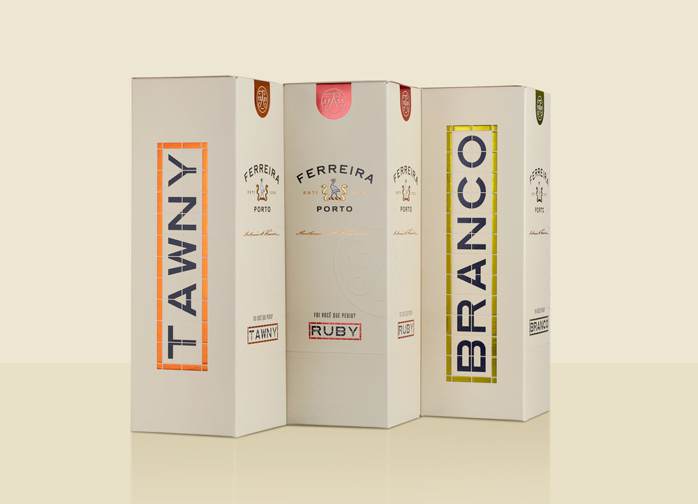
And finally, we drew inspiration from the Douro railroad line: Dona Antonia invested a lot of money in this railroad because she believed it would help develop and stimulate the business, the region and specially its community. Miles of new track and new stations were built, revitalising the region and the Porto wine trade. The typical layout of these stations (with rows of stone, portuguese tile and white concrete) and its distinctive vernacular modular type, framed and painted in tile, were the basis for our graphic layout, giving Ferreira’s new image a punchy (yet classic) and truly meaningful look & feel.”

CREDIT
- Agency/Creative: VOLTA Brand Shaping Studio
- Article Title: Brand Redesign and Rejuvenation of One of the Oldest and Most Charismatic Porto Wine Brands
- Organisation/Entity: Agency Commercial / Published
- Project Type: Packaging
- Agency/Creative Country: Portugal
- Market Region: Global
- Format: Bottle, Box
- Substrate: Glass, Pulp Board, Pulp Paper


