


Brand design and innovation agency Echo has continued its long-standing relationship with Rexona by launching a packaging refresh for the anti-perspirant and deodorant leader for both the UK and US markets.
Having first worked on the Rexona brand in 2006, and again in 2013, Echo’s mission for its latest partnership was to help re-assert Rexona’s superior performance credentials and to reflect this in a refreshed packaging design. The new look and feel would be part of the overall strategy to celebrate the brand’s role in empowering customers to live active lives, whilst managing the complexities of creating a consistent yet flexible global brand across diverse markets.
Denise White, Account Director at Echo, commented: “Rexona is one of the most recognisable deodorant brands worldwide, but the brand needed refreshing to unlock a sense of superior efficacy, maximise impact and stand out from the competition. We worked on the idea of ‘No Limits’ as a creative platform which helped us to devise ideas about empowering users to feel confident when active in all capacities – whether that’s running a marathon or for the bus. This emphasises the brand’s ‘it won’t let you down’ strapline to hero Rexona’s performance credentials and therefore its core point of differentiation.”
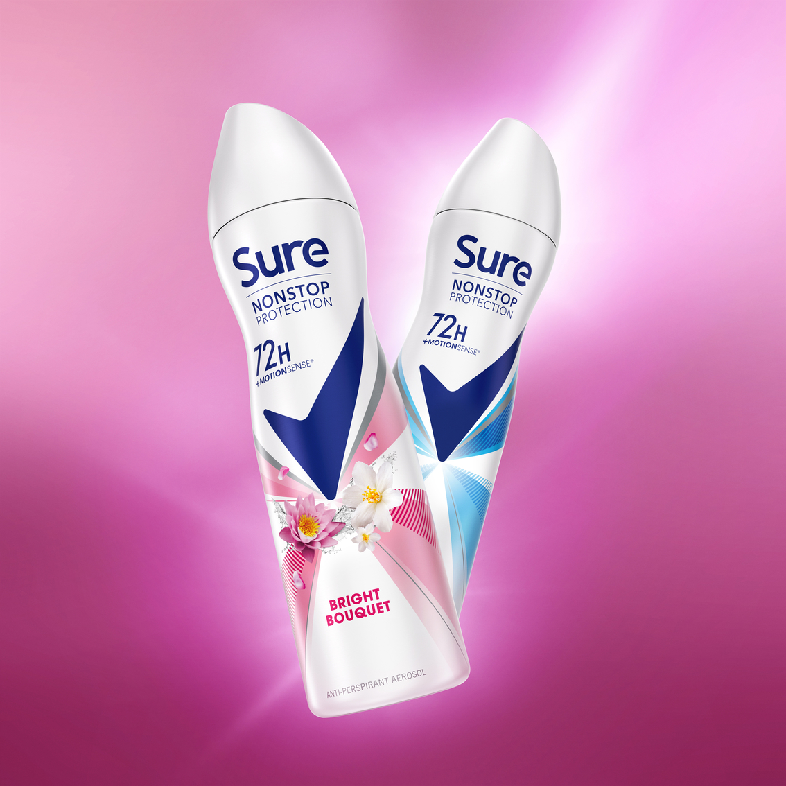
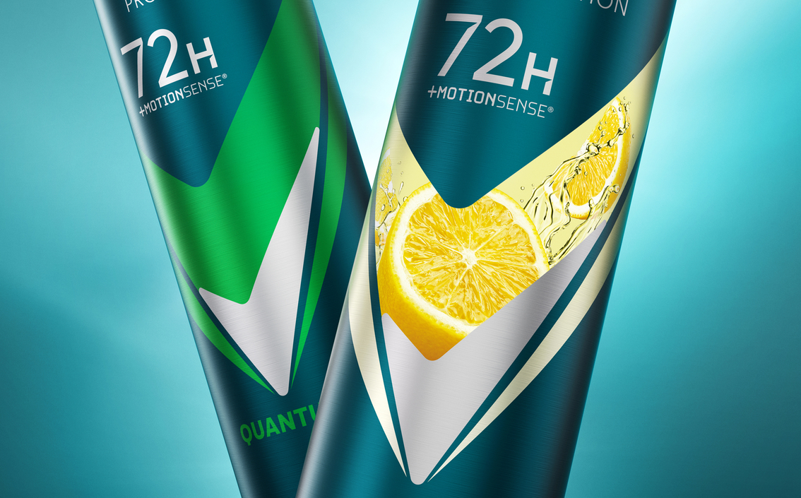
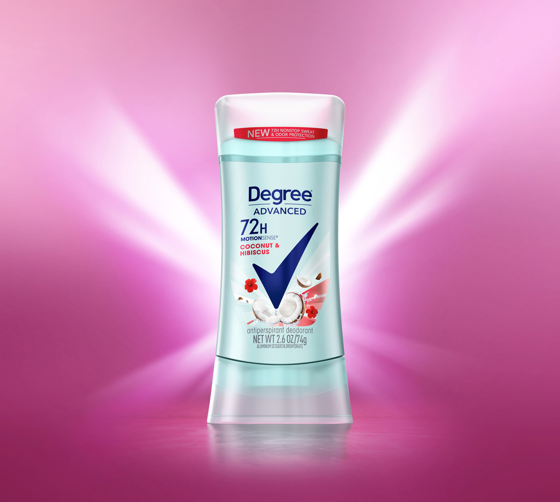
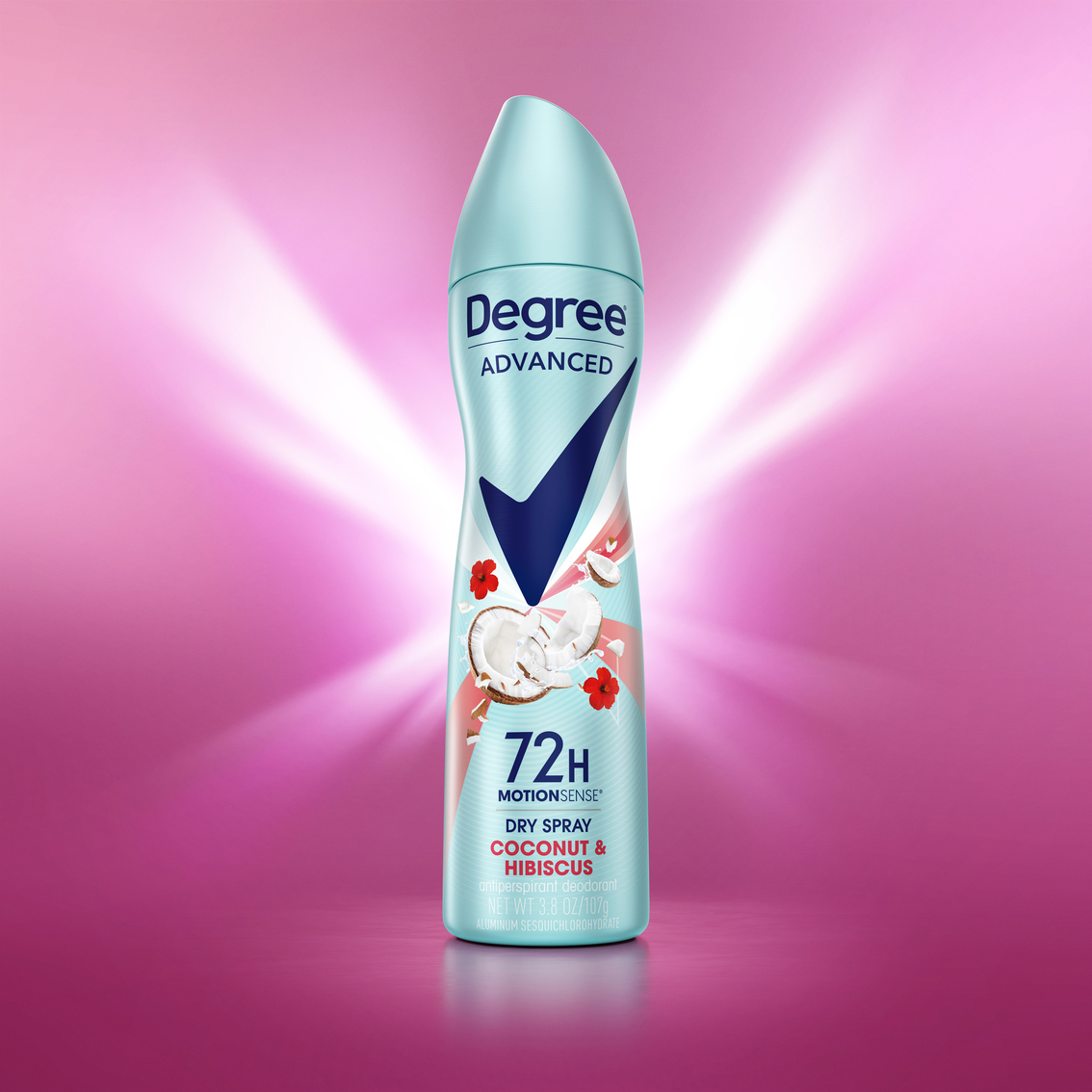
Archetypes were used to help understand how the brand’s expression of superior efficacy should be communicated and the ‘Hero’ was identified as being the most potent and relevant to the brand’s values. The Rexona Tick has always been one of the brand’s most distinctive assets and, as a potent symbol of efficacy, this gave Echo the opportunity to position this iconic equity at the very heart of the brand. The result is a design that immediately feels dynamic, confident, bold and heroic.
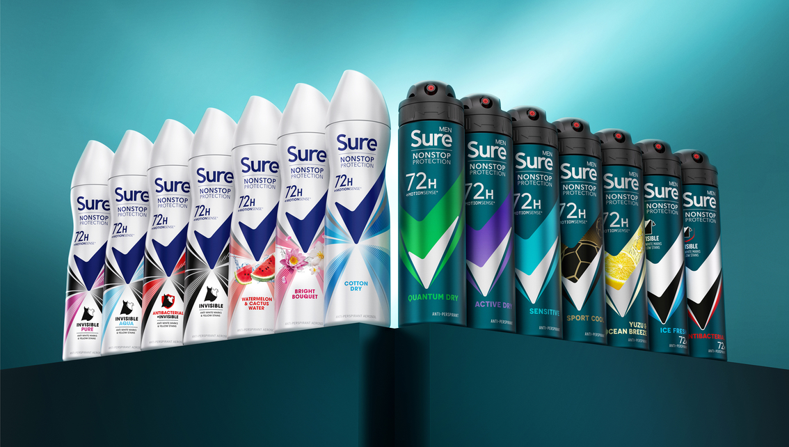
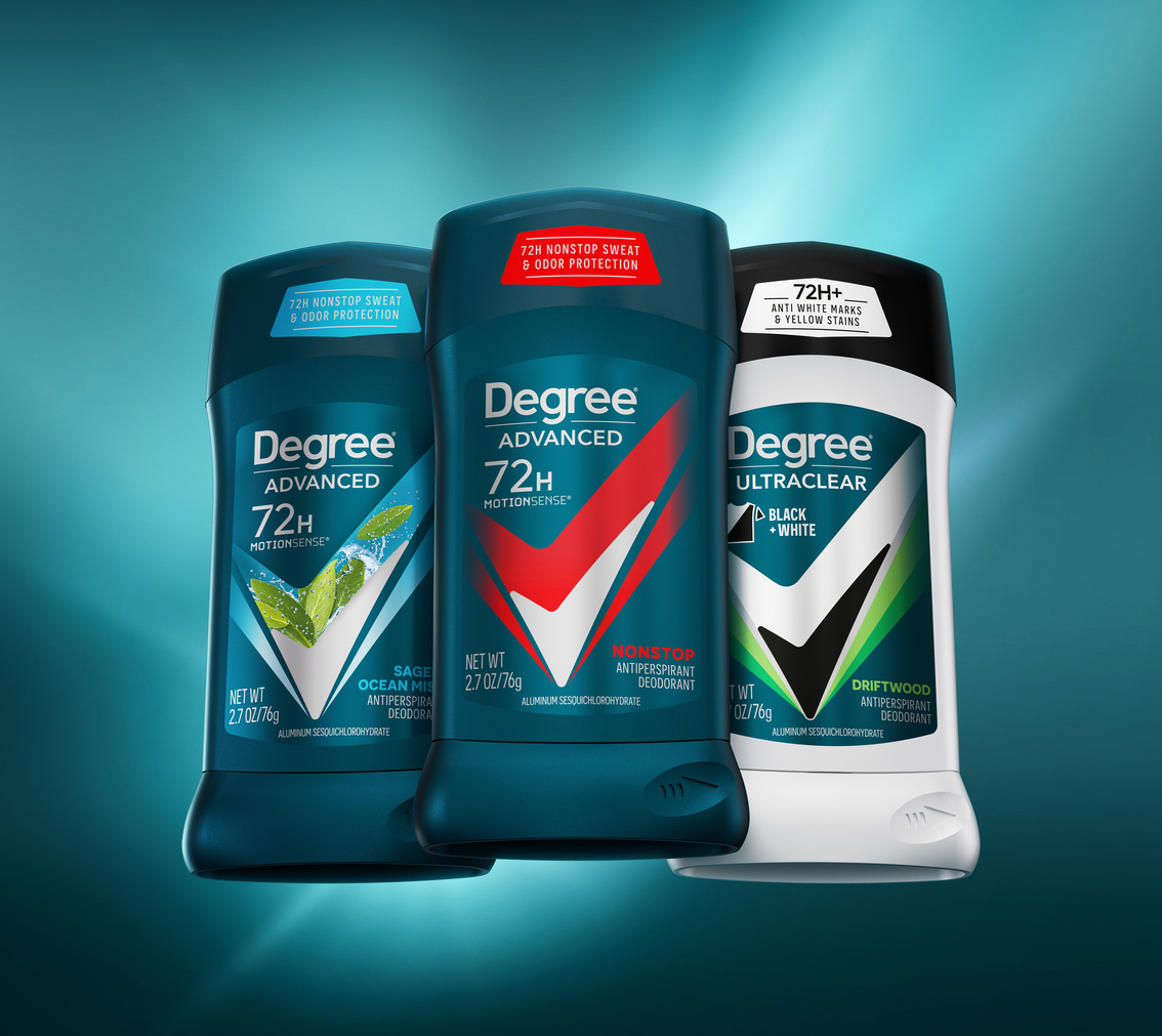
Known as ‘Sure’ in the UK and ‘Degree’ in the US, Echo simplified the brand’s previous packaging design to concentrate on its most distinctive brand asset. Echo also reworked the communication hierarchy to emphasise the brand’s efficacy benefits.
As well as communicating the brand’s superior performance, the Tick’s iconic status and boldness at the centre of the design delivers a strong unifying presence thus allowing for all important local market adaptation via colour and variant graphics. For instance, in order for the brand to remain familiar and recognisable, the colour teal was retained for Degree in the US whilst white was retained for the women’s range in the UK.
Nigel Ritchie, Creative Director at Echo, continued: “Redesigning a global brand on this scale is hugely challenging. We had to ensure the brand was not only strategically re-purposed but underpinned by a set of overarching design principles deeply rooted in the brand’s DNA. With a strong set of principles established, a firm understanding of existing and relevant brand equity and an inspiring brand idea we were able to deliver a powerful global look that flexes appropriately across different markets, product formats and price tiers.”
Echo developed the brand’s core, which includes the Performance, Sensorial and Added Benefit ranges, ensuring the design solution delivered clear range and variant differentiation whilst retaining a consistent overall brand look and feel.
Across the range the Tick acts as a bold and dynamic activation point that supercharges the designs with energy and movement.
The Performance Range utilises striking, contrasting colour rays to communicate superior efficacy, whilst the Sensorial Range design features dynamic, explosive ingredients and bursts of light to create a sense of sensorial freshness and amplified stimulation and invigoration.
Added Benefit variants also follow the main design system but lead with the core benefit claim and supporting icon to ensure clarity of communication.
CREDIT
- Agency/Creative: Echo
- Article Title: Brand Innovation Agency Echo Refreshes Deodorant Giant Rexona Across Uk and Us Markets
- Organisation/Entity: Agency
- Project Type: Packaging
- Project Status: Published
- Agency/Creative Country: United Kingdom
- Agency/Creative City: London
- Market Region: Europe, North America
- Project Deliverables: Brand Design, Packaging Design
- Format: Can
- Substrate: Metal
- Industry: Health Care
- Keywords: Brand, brand design, packaging design, brand assets
-
Credits:
Brand design agency: Echo


