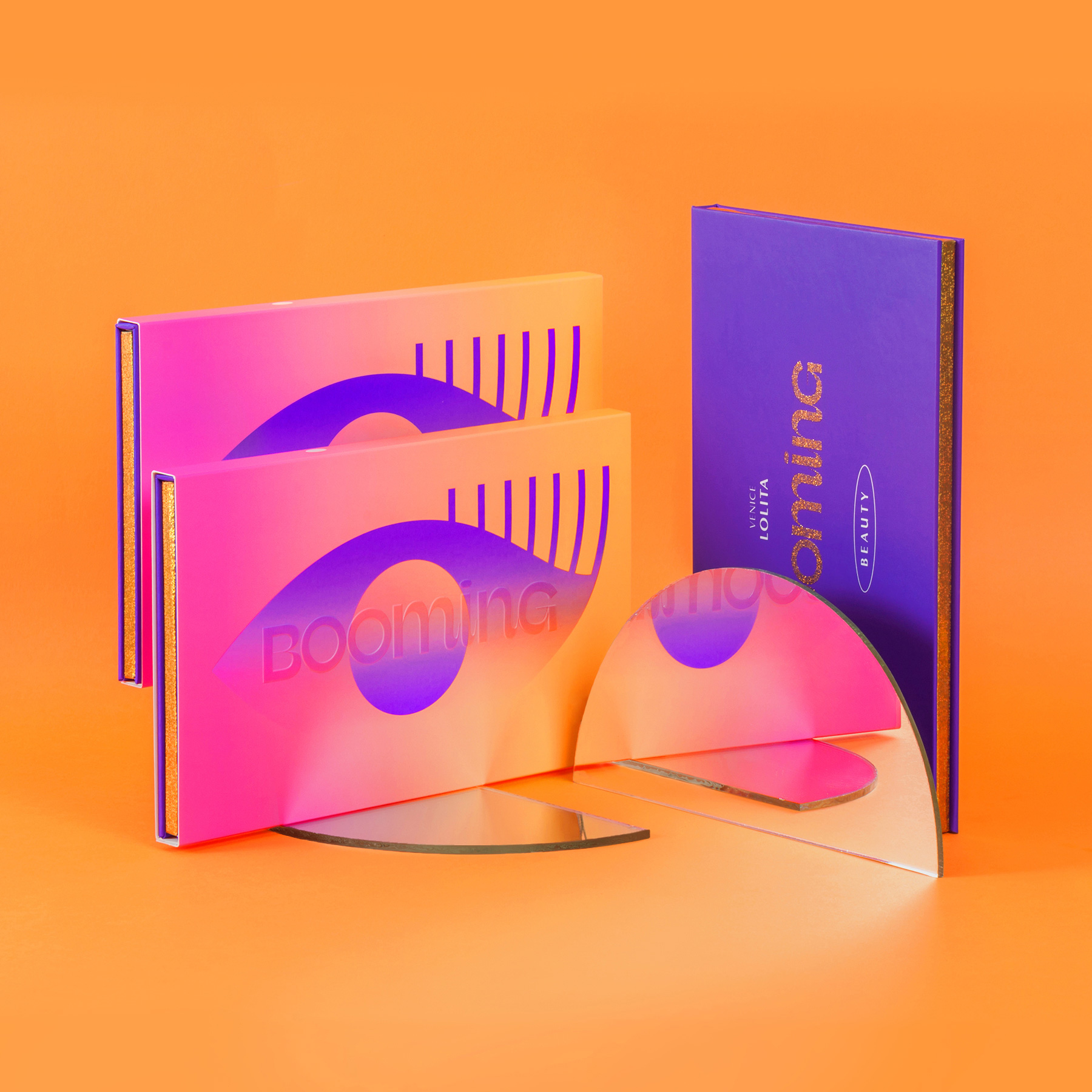
Brief: Booming is more than just makeup. It is a concept of beauty that goes beyond stereotypes and gender, using color to bring the best out of each one.
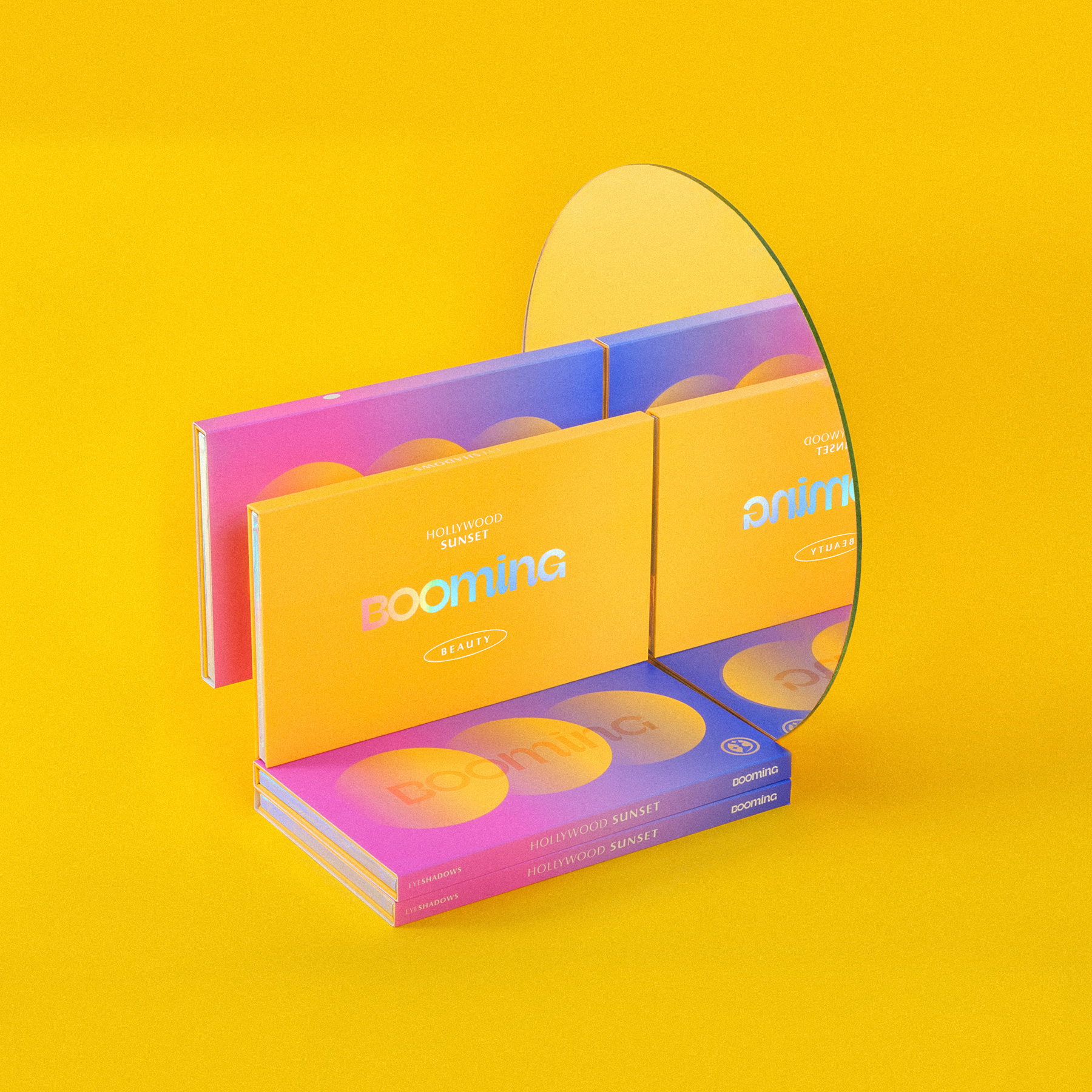
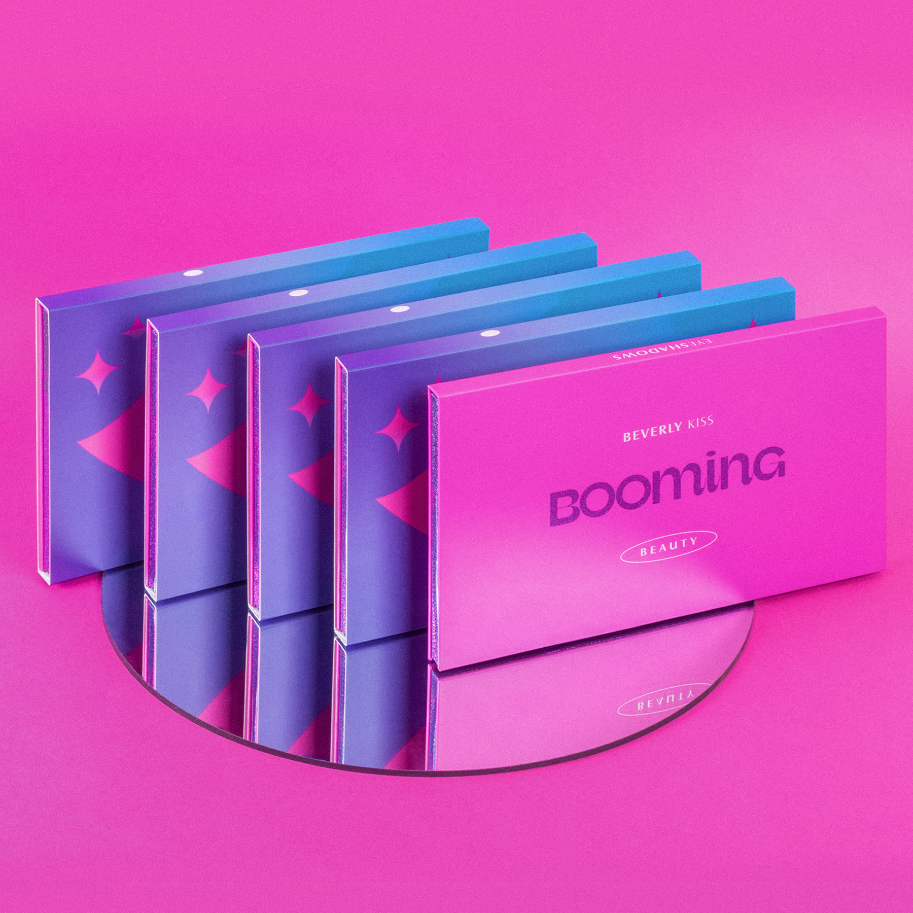
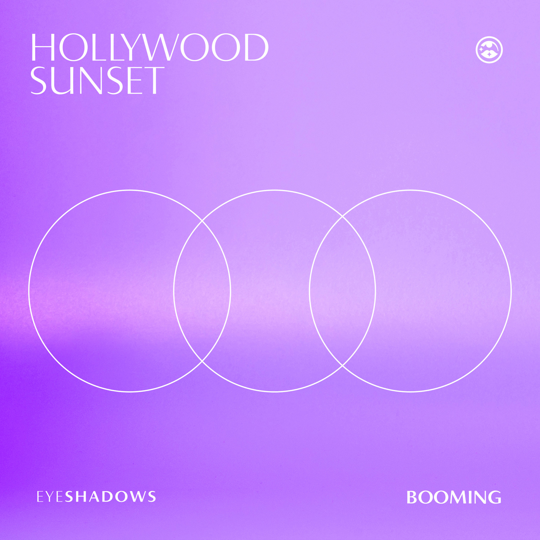
Taking inspiration from Los Angeles “the place where dreams come true” and its sunsets, Booming translates all this idea into bright, matte and bright color makeup palettes.
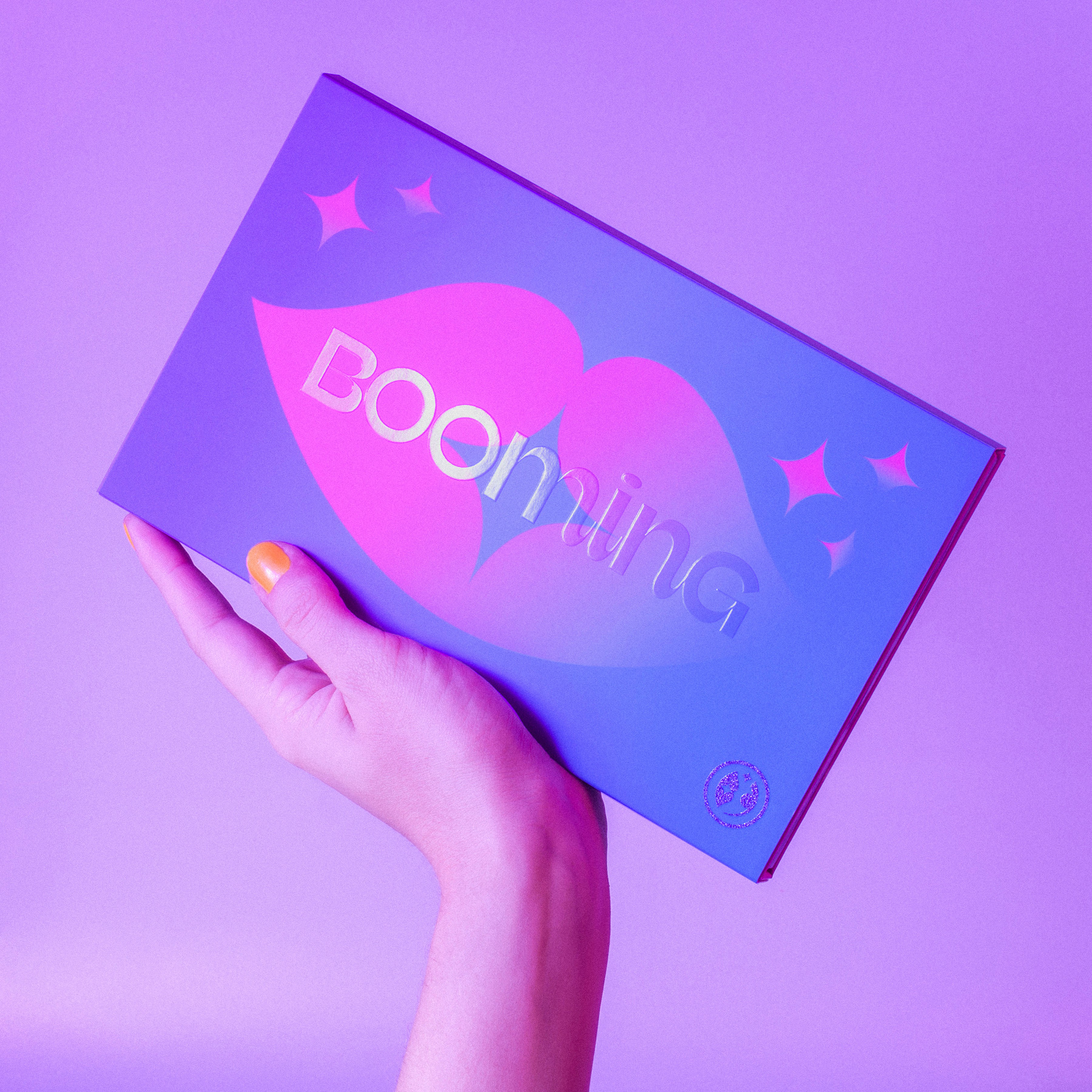
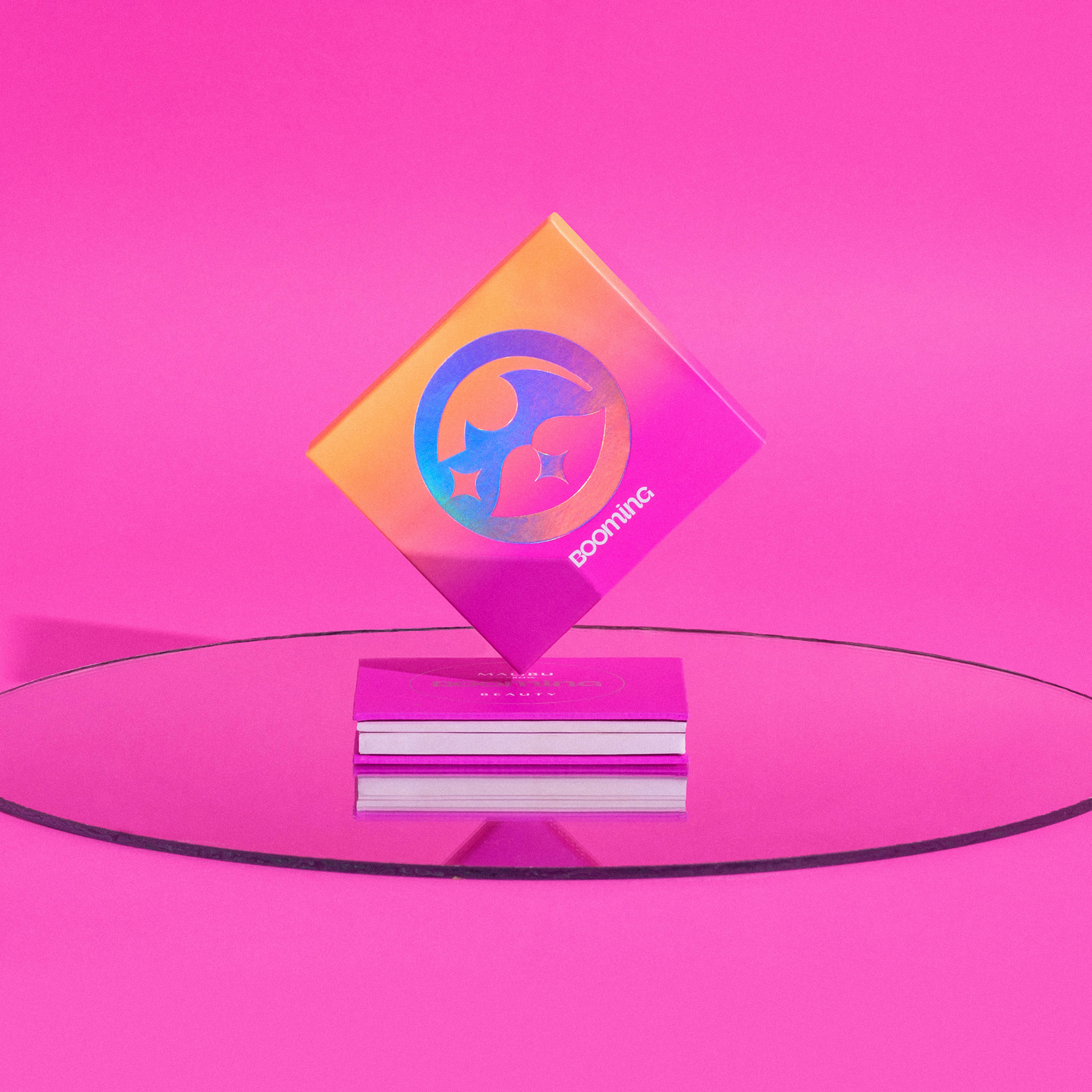
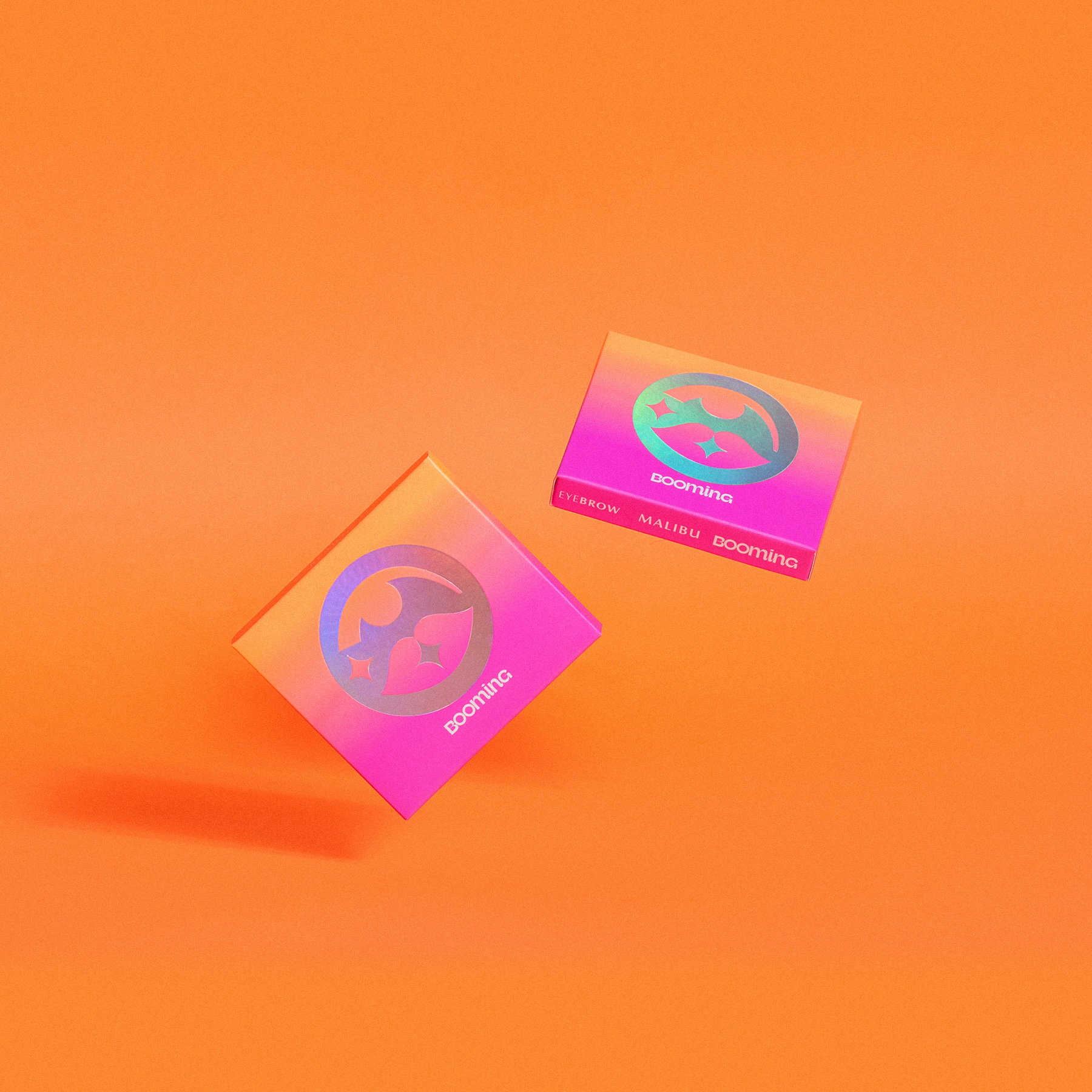
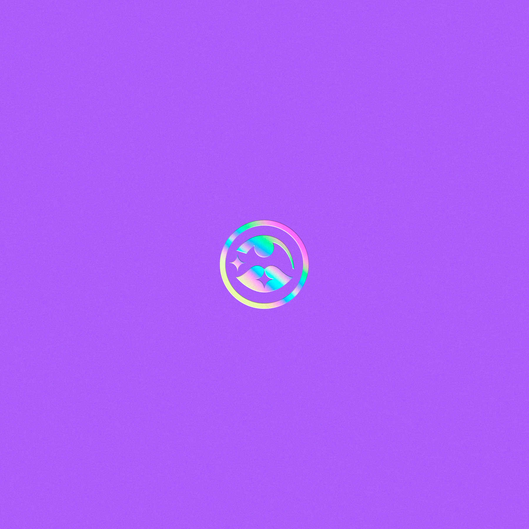
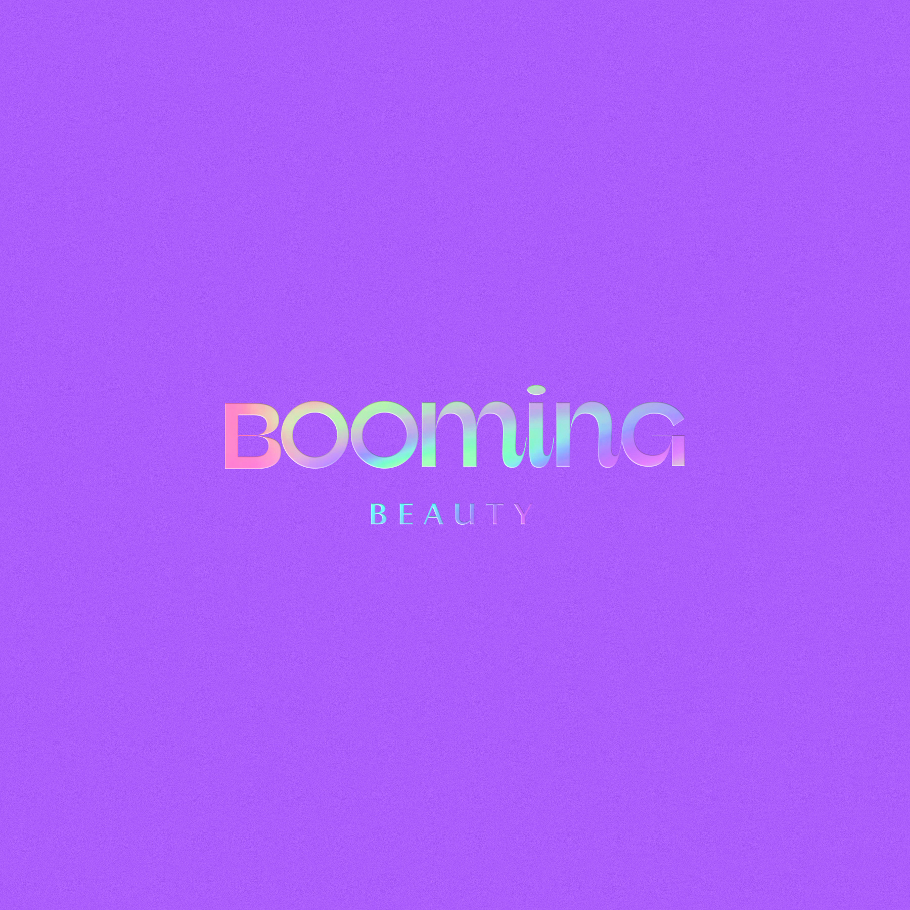
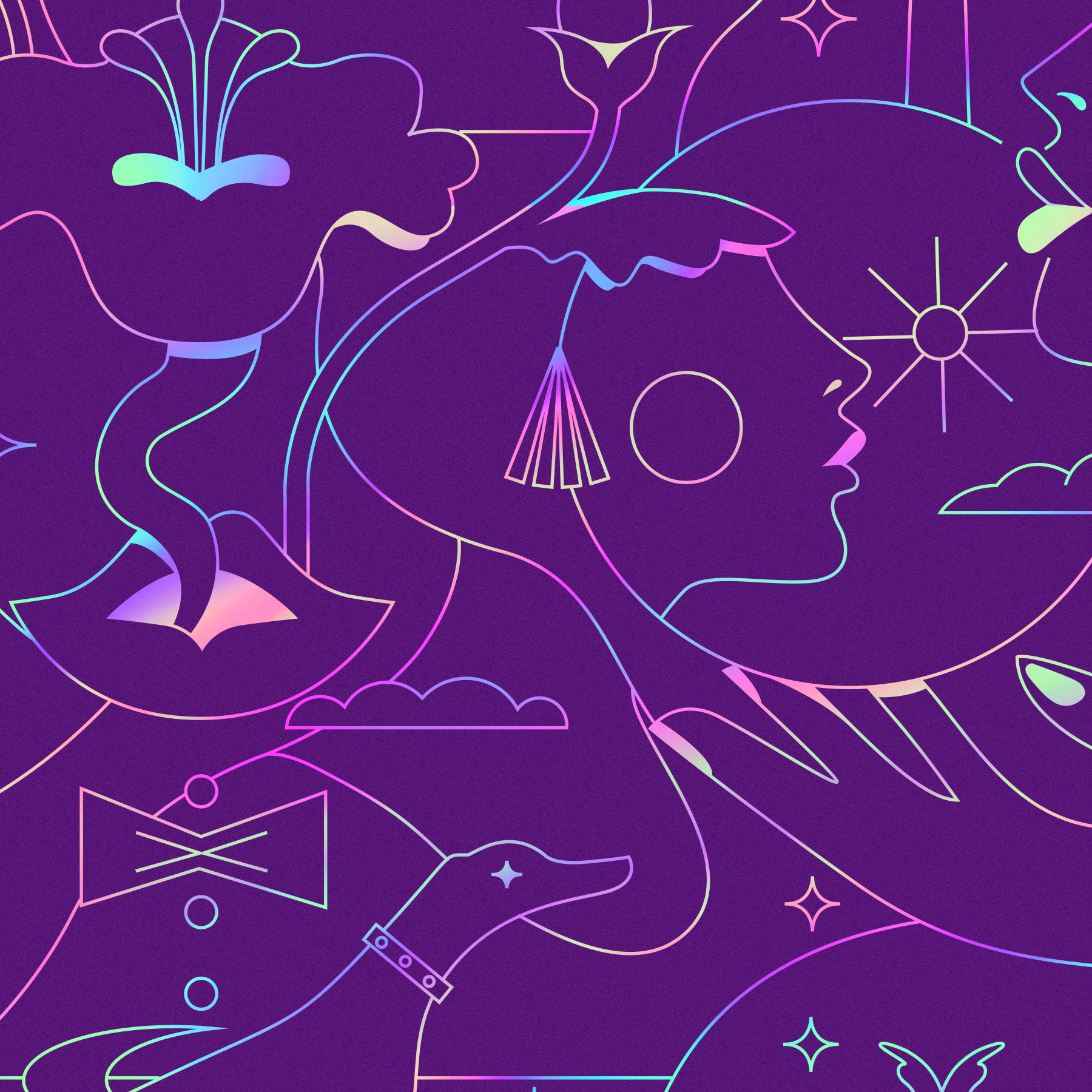
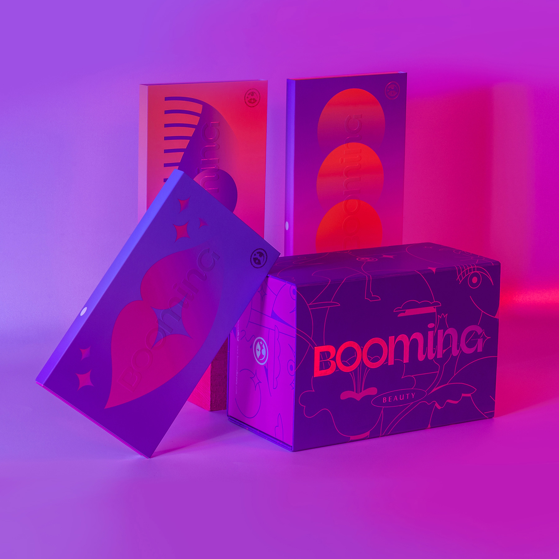
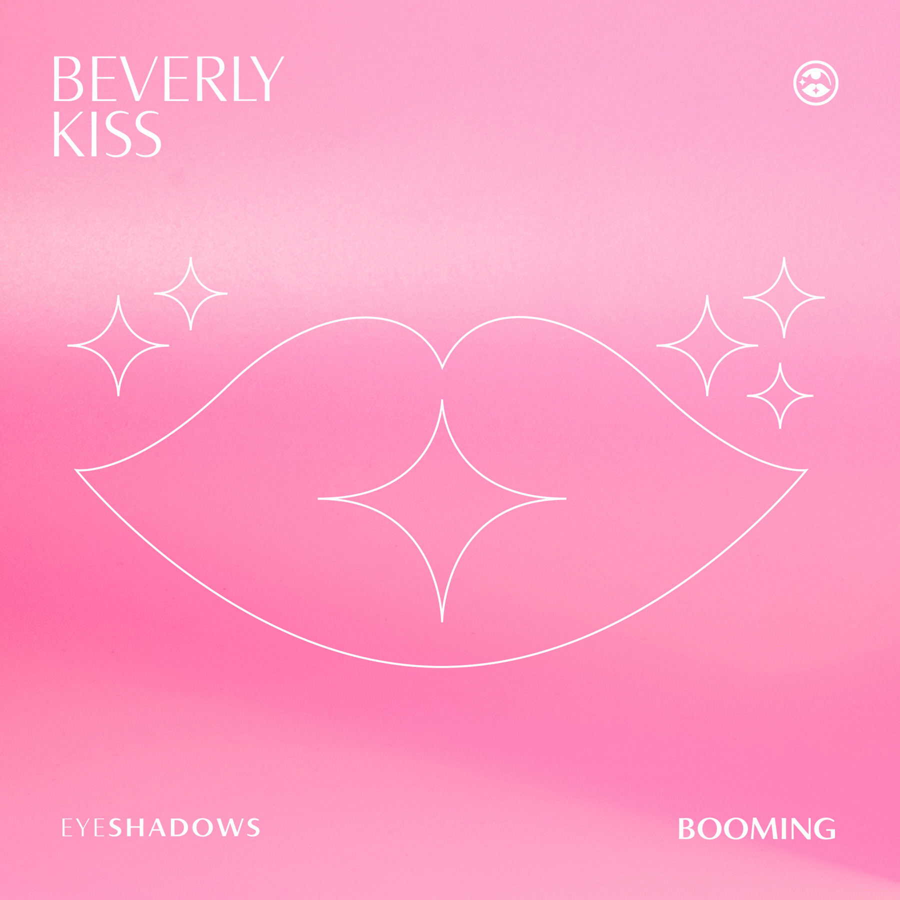
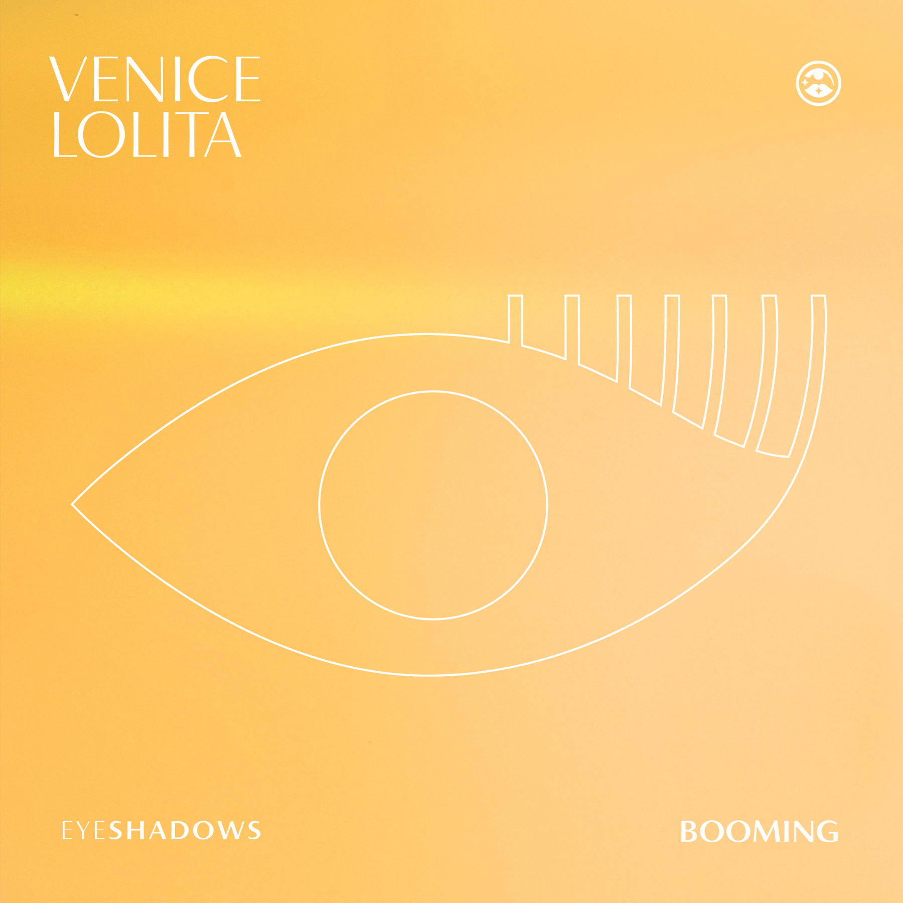
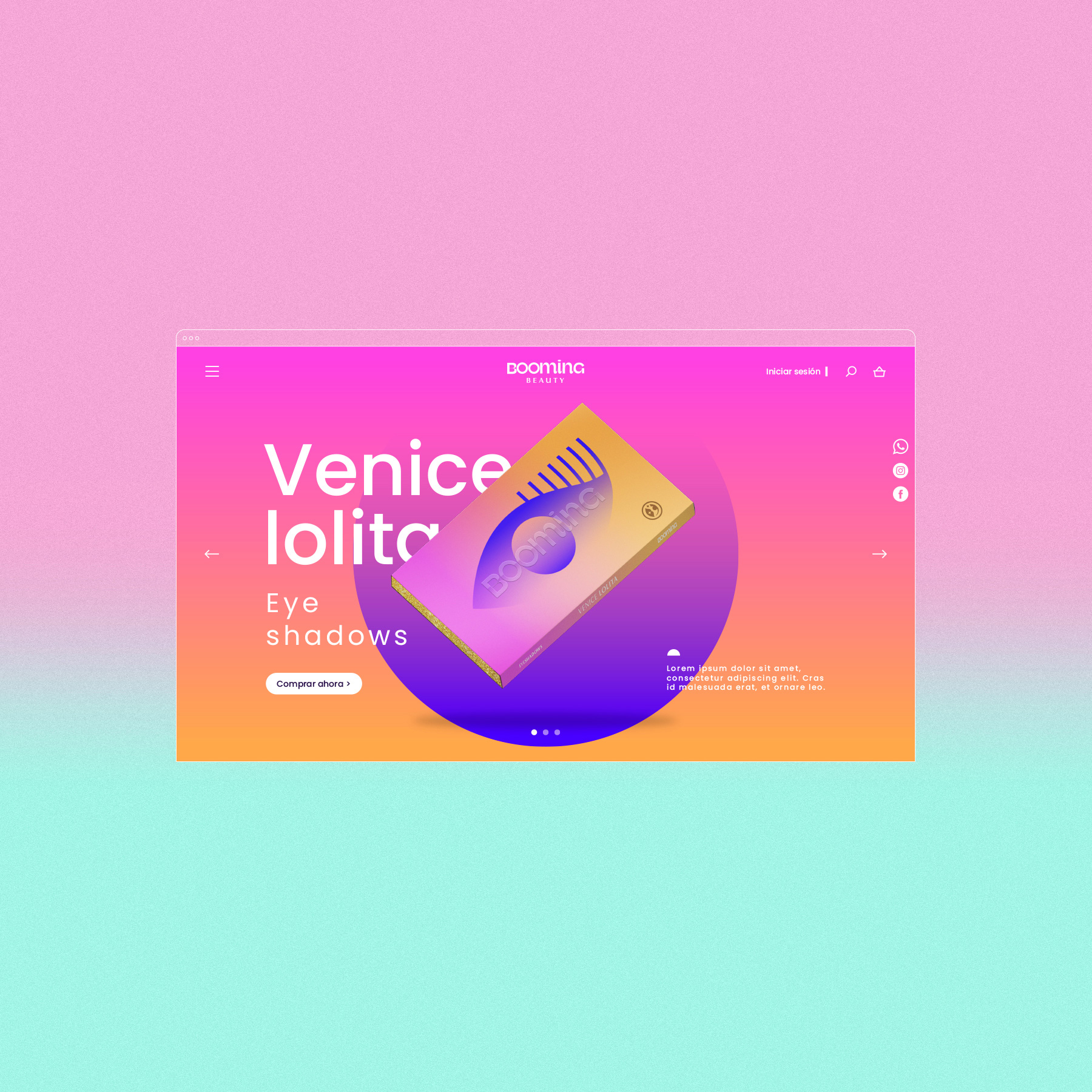
Our approach: During the brand strategy phase, we found out that the brand had to be a total experience, looking after every detail from the website to the unboxing. Once we defined the brand’s main concept, “a dream come true,” it was now time for the identity process. We designed a visual system using foil and glitter finishes to delight the senses beyond visual textures and typography. Booming is a dream come true made of color, basic shapes, and eye-catching plus fine details.
CREDIT
- Agency/Creative: Invade Design
- Article Title: Brand Identity, Packaging Design and Web Design for New Beauty and Makeup Brand Booming
- Organisation/Entity: Agency, Published Commercial Design
- Project Type: Identity
- Agency/Creative Country: Colombia
- Market Region: South America
- Project Deliverables: Brand Design, Brand Experience, Brand Guidelines, Brand Identity, Brand Strategy, Brand World, Branding, Graphic Design, Identity System, Illustration, Packaging Design, Photography, Product Naming, Research, Tone of Voice
- Industry: Fashion
- Keywords: Branding, makeup, LA, brush, sunset, gradient, illustration, logotype, packaging


