Sweety & Co. – All Nuts
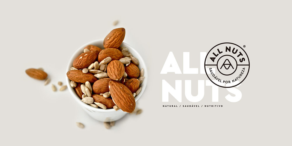
“Contemporary, All Nuts talks to people in the present days. They are rethinking their food, but with the rush life they have, there’s no time to make their own food. That’s where All Nuts comes in, with the practicality and certainty that by adding a nut a day to their food, people will be taking care of their own health and living better.
The Challenge
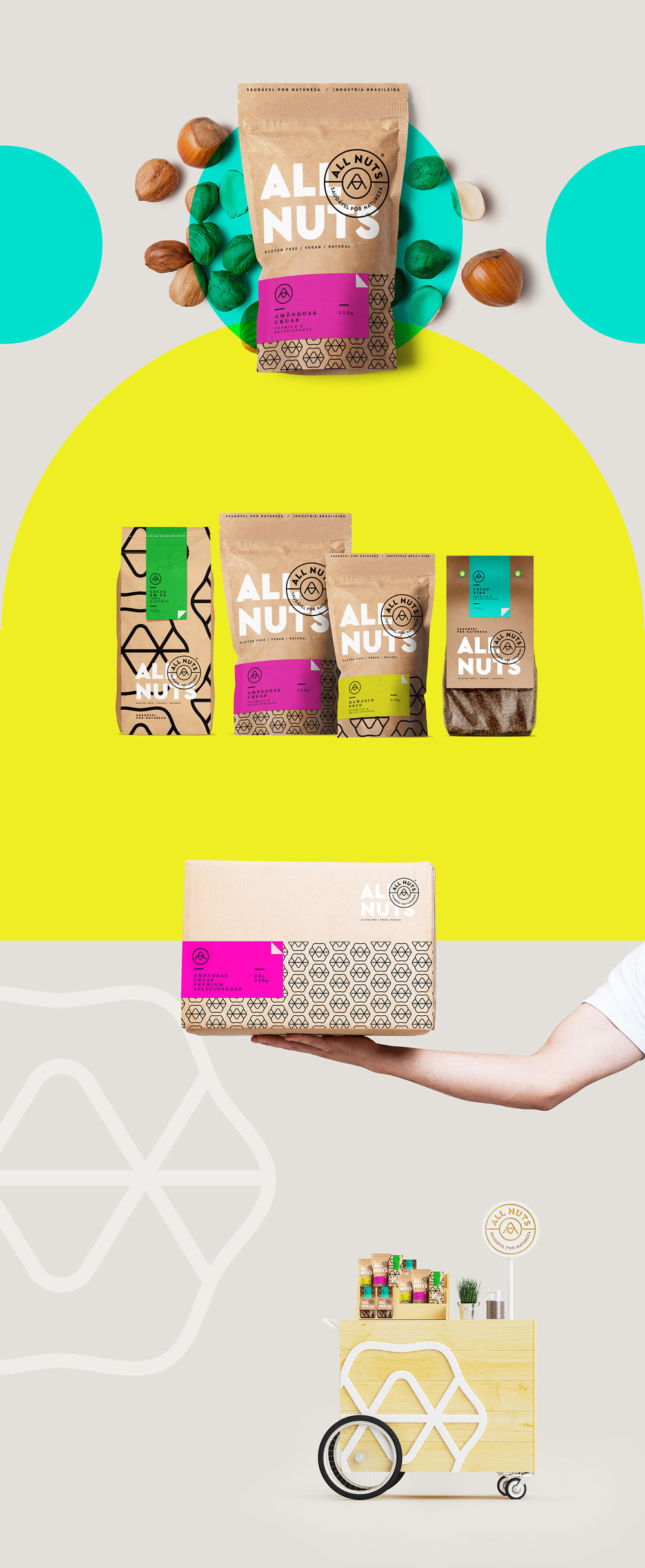
All Nuts has a varied product line with several packaging proposals. The idea was to bring to the daily life of people who wants to take care of themselves, a modern packaging, that delights them and also has a unique strong identity from the three pillars of the brand: Healthy, Natural and Brazilian.
The Solution
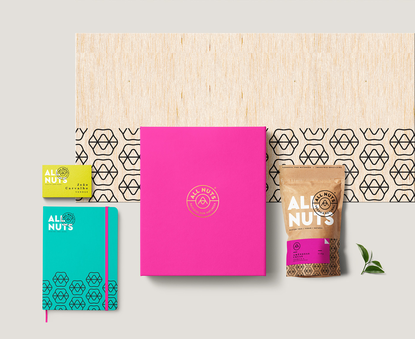
For the brand identity and packaging, we bet on a monogram that becomes a pattern (mesh with several applications) and we also used the overlap of the stickers to differentiate the product. Simple and easy solution with low coast. The result is a family with movement, due to the diverse proportions of pattern and bright attractive color.”


“Thinking about creating a badge that intersects the word NUT and the letter A (from All Nuts), we created a monogram that doubles as the reduced form for the brand. O result is a strong and independent element that reinforces the brand as necessary.”

CREDIT
- Agency/Creative: Sweety & Co.
- Article Title: Brand Identity, Packaging Design and a we Monogram that Becomes a Pattern for Nuts
- Project Type: Packaging
- Agency/Creative Country: Brazil
- Format: Pouch
- Substrate: Pulp Paper


