


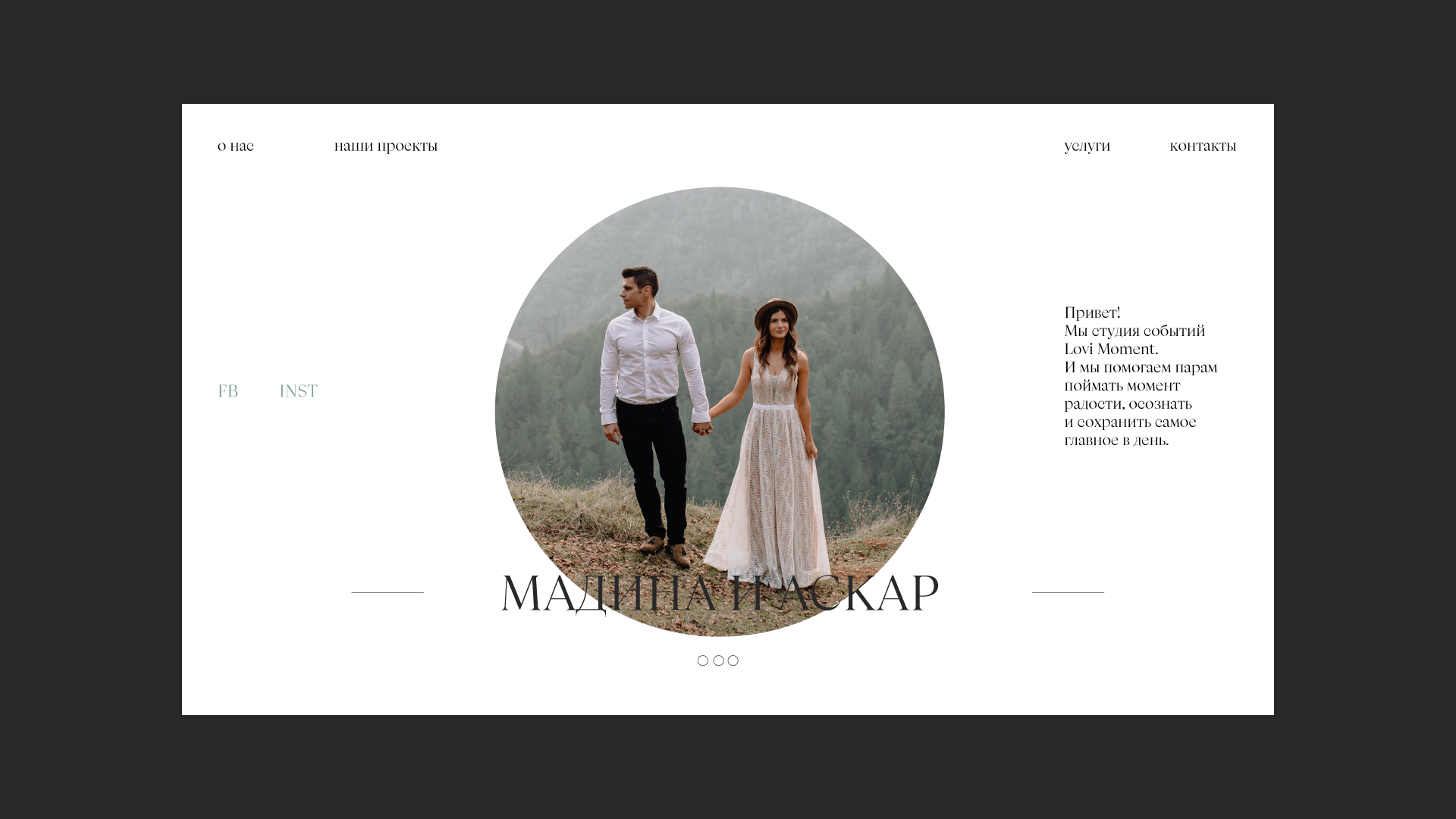
Development of identity for the wedding agency “Seize the Moment”. The founders of the agency highly value awareness and harmony not only in work, but also in life, they see their clients as sincere and free from stereotypes. It is important for them to give the newlyweds only positive emotions, freeing them from all the daily troubles of the wedding organization. Be in the moment and enjoy each other not only on the wedding day, but also in preparation for it.
Every day there are more and more wedding agencies in russia, the market is actively developing, looking and oriented to the west. The luxury niche is still very small, there are many medium-sized agencies, but they do not stand out from each other, do not have full-fledged branding.
This brand can be presented in the image of a girl, cheerful and light, but at the same time very harmonious, bright, intelligent and conscious. She is cheerful, loves to share joy, writes thanks in the morning, and meditates in the evening. Constantly developing in different areas, curious, at the same time organized and creative, will find a way out of any situation.
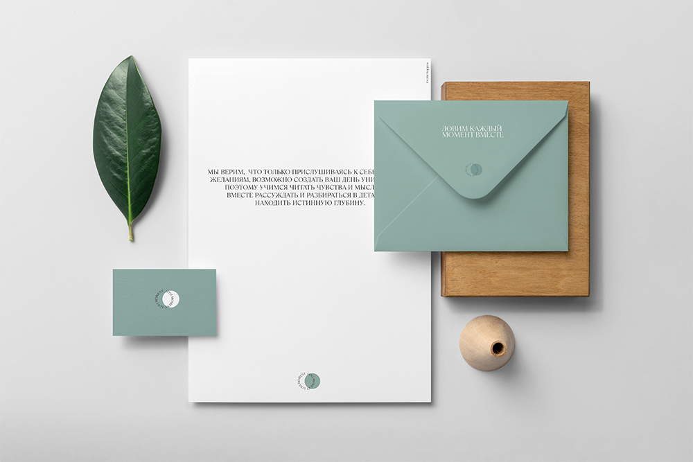
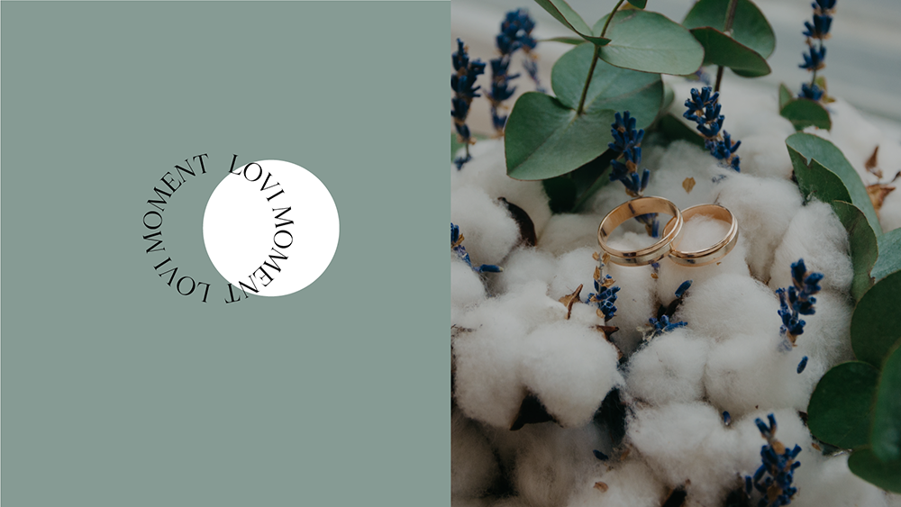
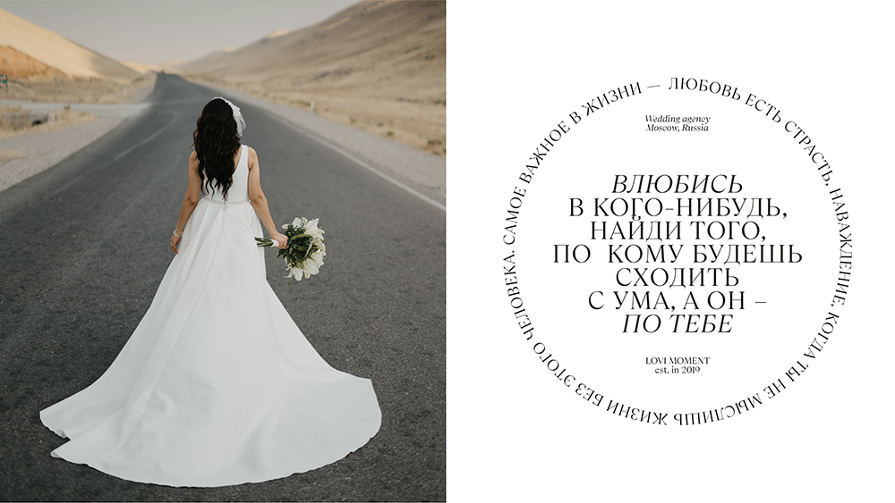
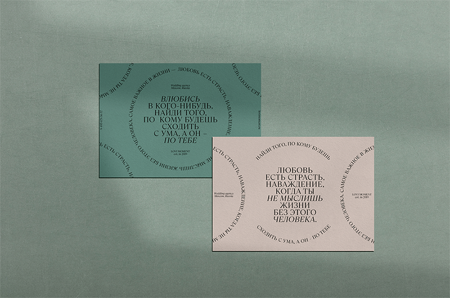
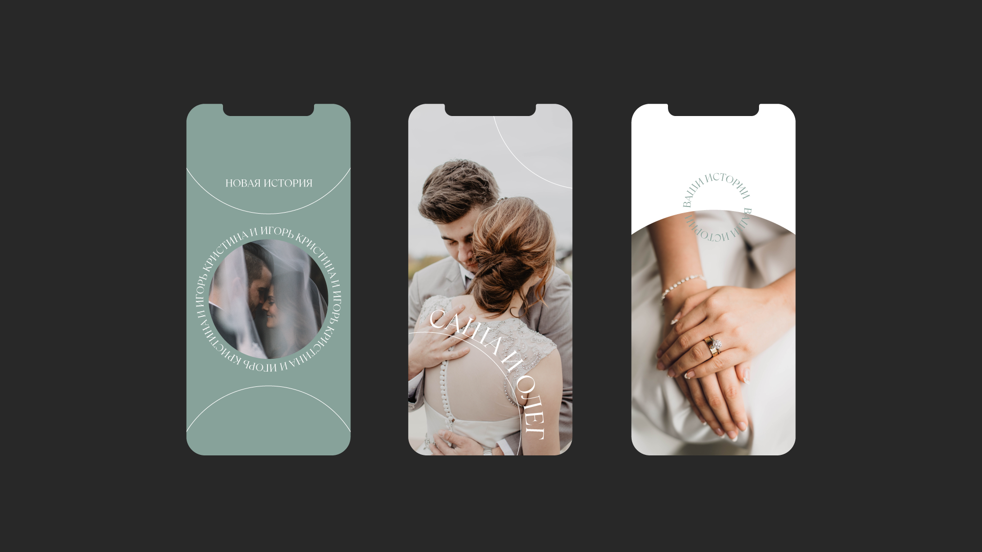
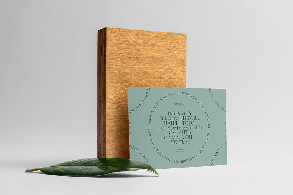
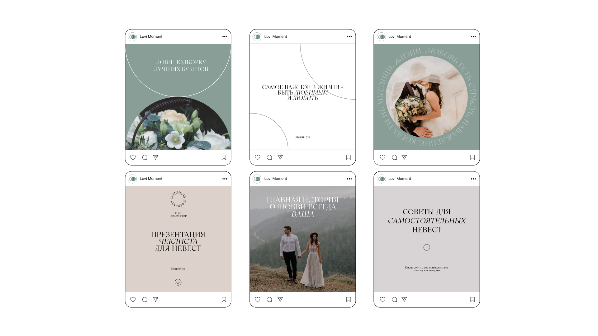
It was necessary to completely package the brand – from the development of souvenirs to the design of social networks and a website. The identity is built on harmony, lightness and a sense of awareness. To emphasize this, the style uses a circle as a symbol of unity and serenity. At the same time, two circles mean the main attribute of the newlyweds – wedding rings. In the logo, the name of the agency also repeats the shape of a circle, overlapping each other.
The intersection of the circles reflects the unity of the partners. Light green is associated exclusively with freshness, harmony and fully conveys the overall feeling of the brand. The typography is bold, large, capitalized, and gives texture to all materials. At the same time, accents tone down with italics. Typography is a powerful brand tool when creating compositions. For example, like a logo, it can repeat rounded shapes, fold on a sheet in a complex manner.
CREDIT
- Agency/Creative: Victoria Lamina
- Article Title: Brand Identity of Wedding Agency Designed by Victoria Lamina
- Organisation/Entity: Freelance, Non Published Concept Design
- Project Type: Identity
- Agency/Creative Country: Russia
- Market Region: Europe
- Project Deliverables: Brand Identity, Brand Refinement, Branding, Research, Tone of Voice
- Industry: Fashion
- Keywords: Wedding, agency, newlyweds, identity, serif, harmony, Cyrillic typography


