


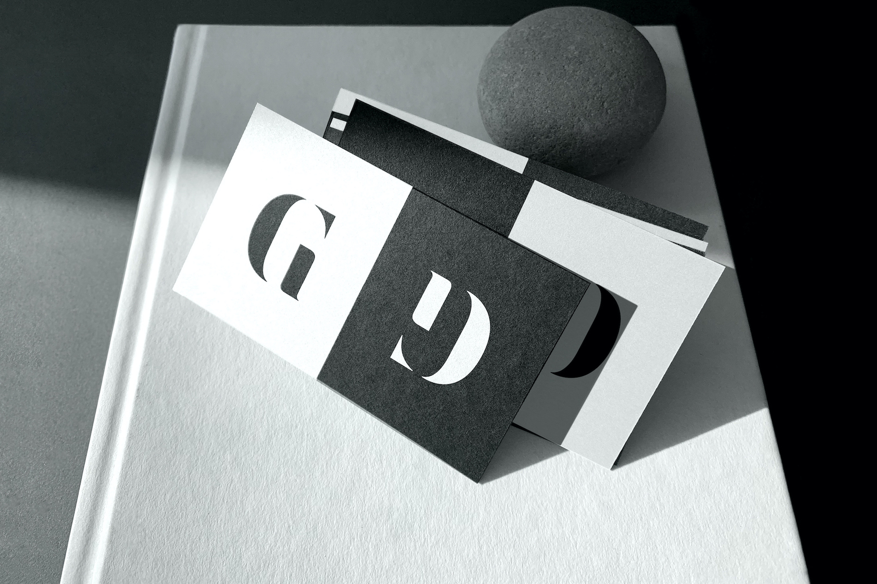
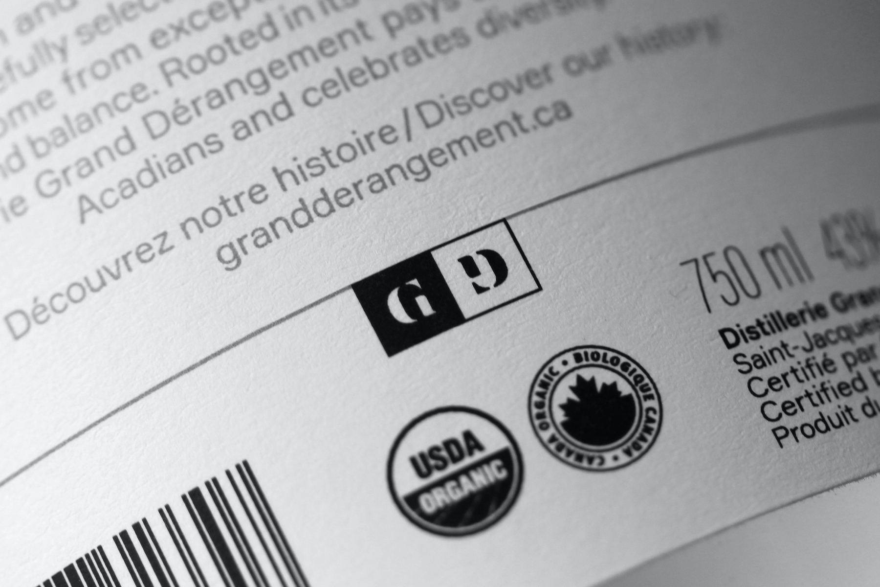
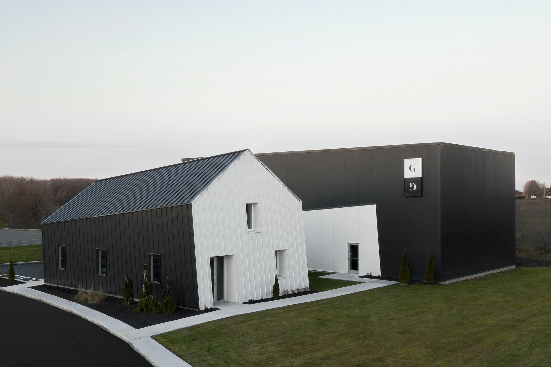
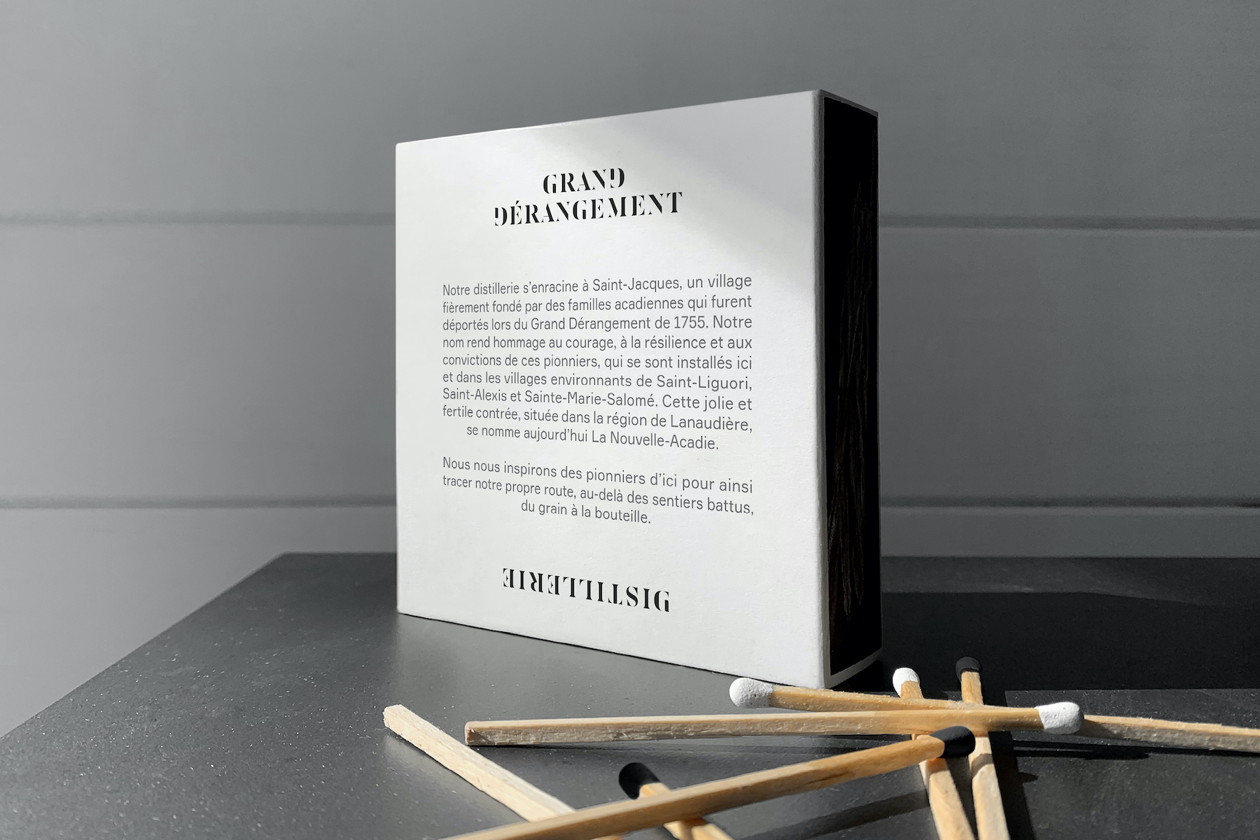
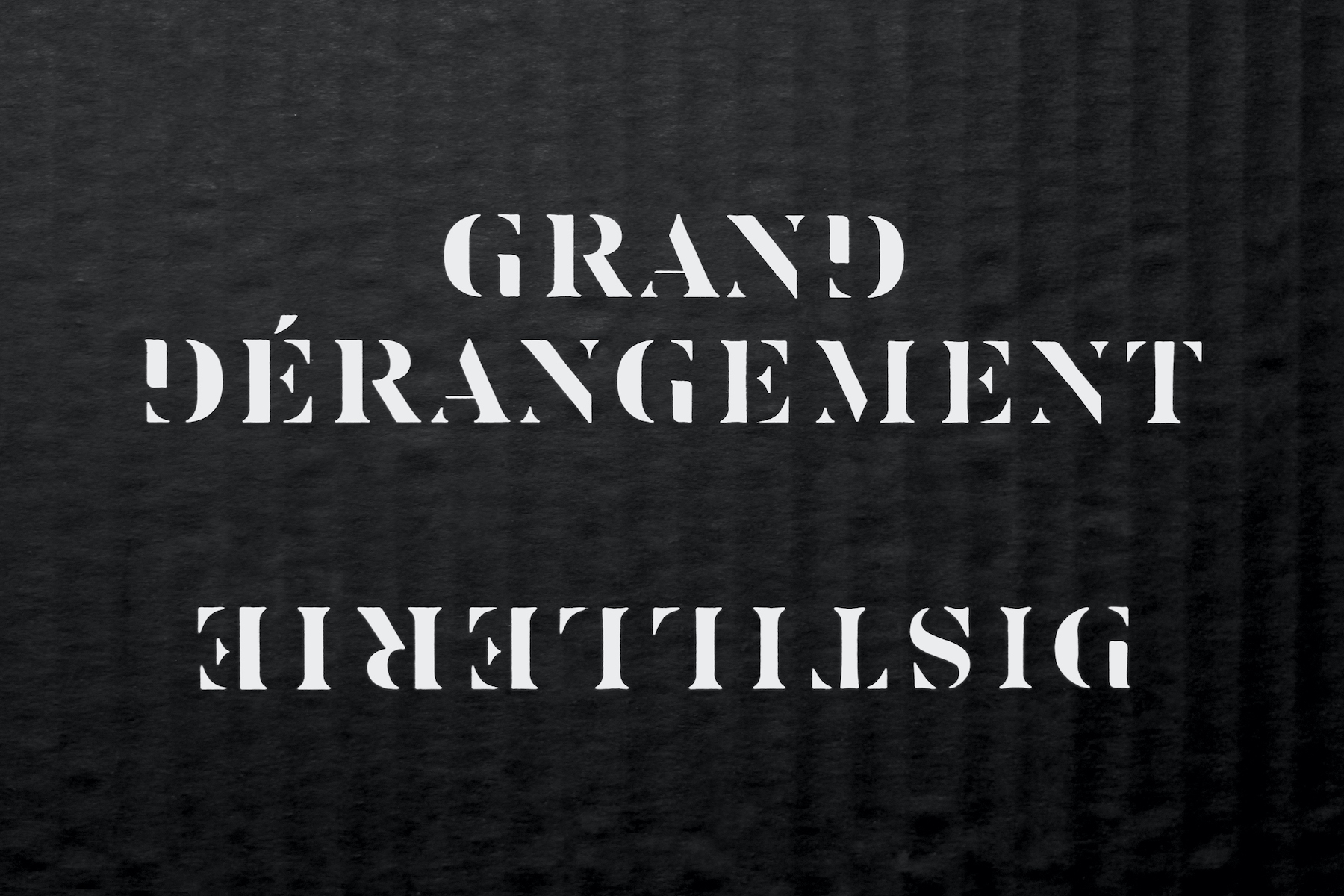
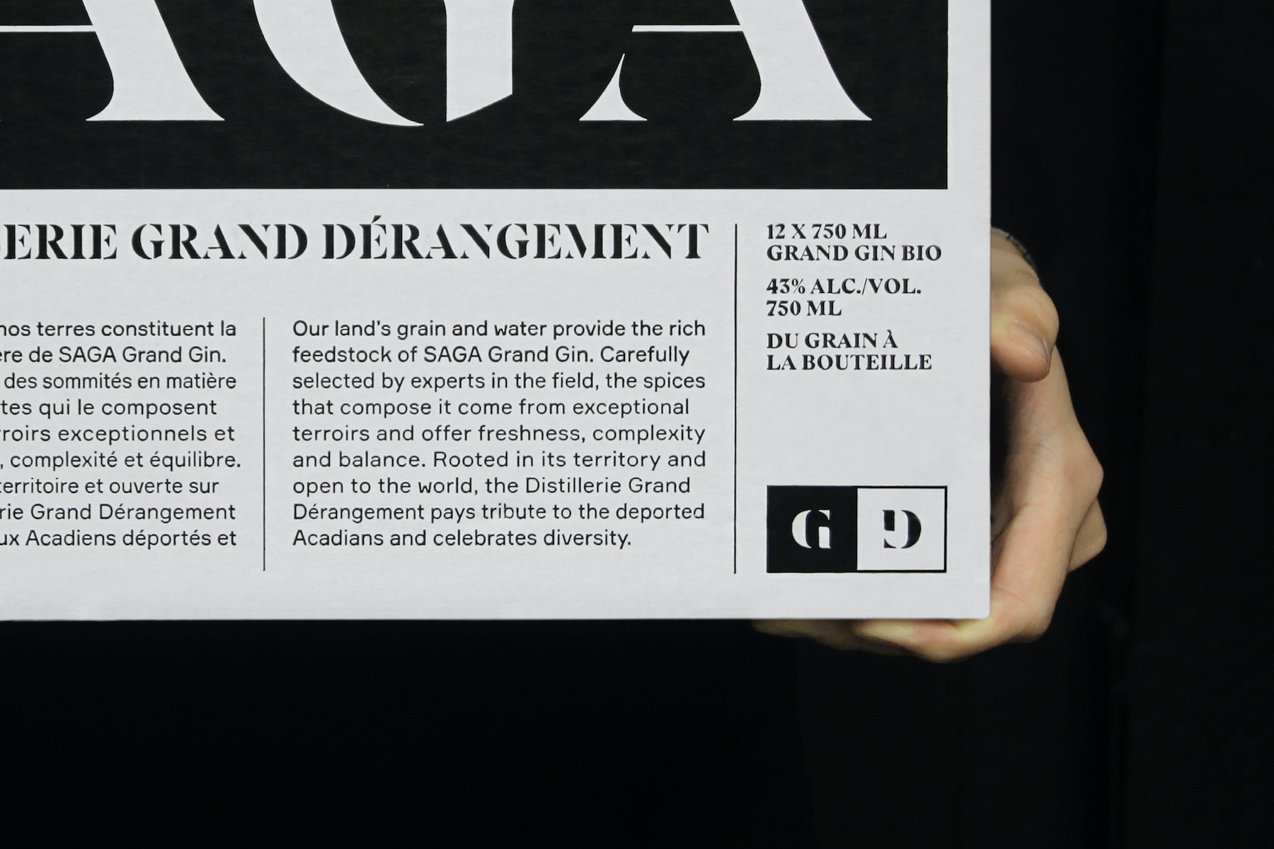
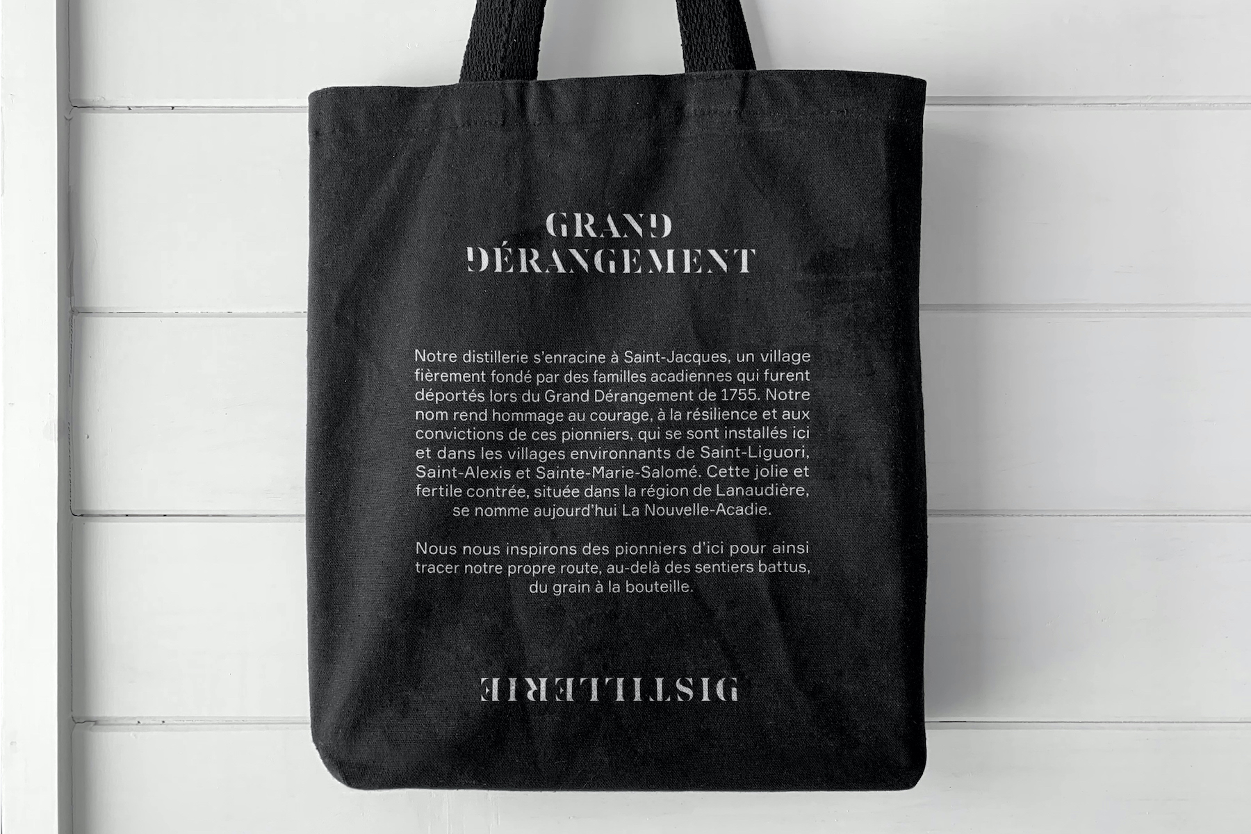
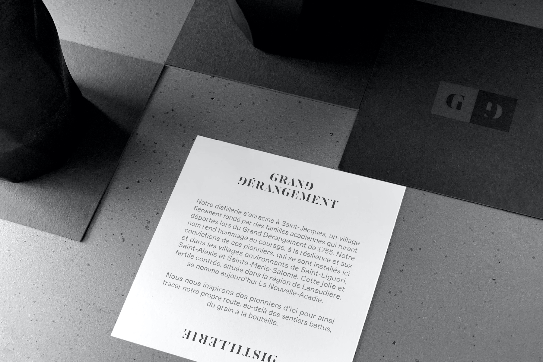
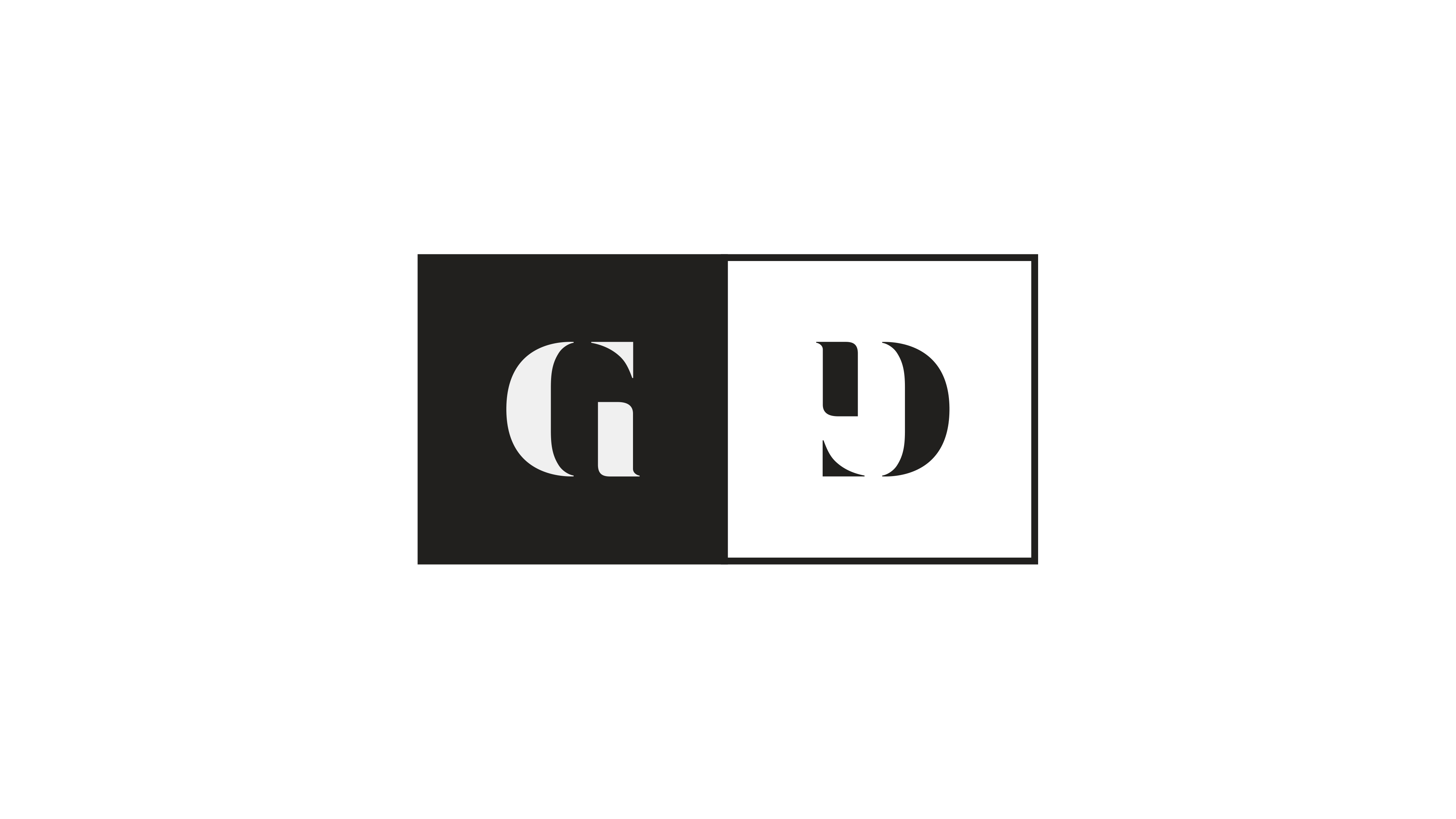
The Distillerie Grand Dérangement is a new distillery from Lanaudière in Quebec that aims to only produce and sell organic spirits. Many distilleries were created in the last years in Quebec, which explains the high competition and the need for this project to be unique and have a strong graphic impact. They asked Paprika to create an identity for their distillery that would reflect the deep history behind their name. The Grand Dérangement refers to the deportation of the Acadian people of Canada by the British Government that started in 1755. The town where the distillery is established was founded by Acadians hence the homage. The creative process started with historical research on the matter in order to better understand the main characteristics of the Acadian people and its history. After our research, we were deeply inspired by the resilience and strength of the Acadian people and we knew that we wanted it to be reflected in our work. The G and the D being the same letter turned on its other side is meant to represent this unity even through the toughest upheavals. Furthermore, as the logo will be on the spirits bottle caps, consumer will always be able to see the G and the D regardless of the angle from which they are seeing the logo. This is also useful for signage as the logo is printed on many glass doors and windows. Regardless of which side of the glass you are on, you can always read the G and the D. The duality of the black and the white also holds a deeper meaning. Effectively, it represents the great victories and setbacks that the Acadian people had to face in their hard-fought quest for a better life. Paprika also had the mandate to create some corporate products for the staff and regular clients of the distillery. We designed t-shirts, match boxes, coasters, tote bags, stationery, and signage to complement the distillery’s new image. Finally, the architecture of the distillery was simultaneously being developed by the Architect firm Aedifica which led to both the identity of the brand and the architecture of the facilities being truly harmonious and complementing each other.

CREDIT
- Agency/Creative: Paprika
- Article Title: Brand Identity of the Distillerie Grand Dérangement by Paprika
- Organisation/Entity: Agency, Published Commercial Design
- Project Type: Identity
- Agency/Creative Country: Canada
- Market Region: North America
- Project Deliverables: Brand Architecture, Brand Creation, Brand Experience, Brand Identity, Branding, Graphic Design, Identity System, Research
- Industry: Food/Beverage
- Keywords: Branding, Brand Identity, Graphic Design, Distillery, Spirits


