OPEN – TNX Brand Identity
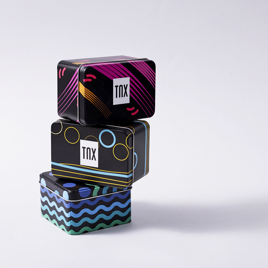
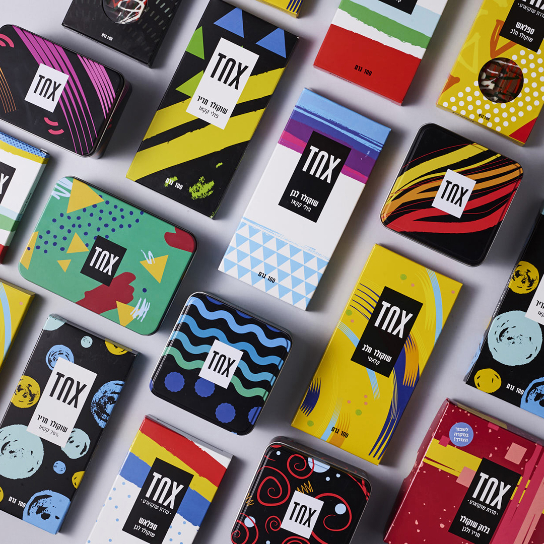
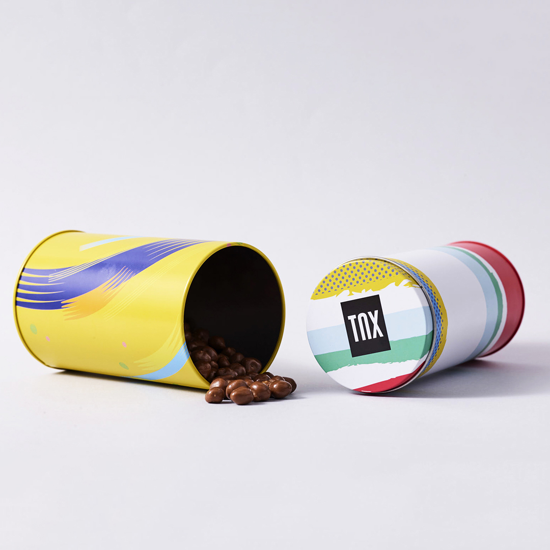
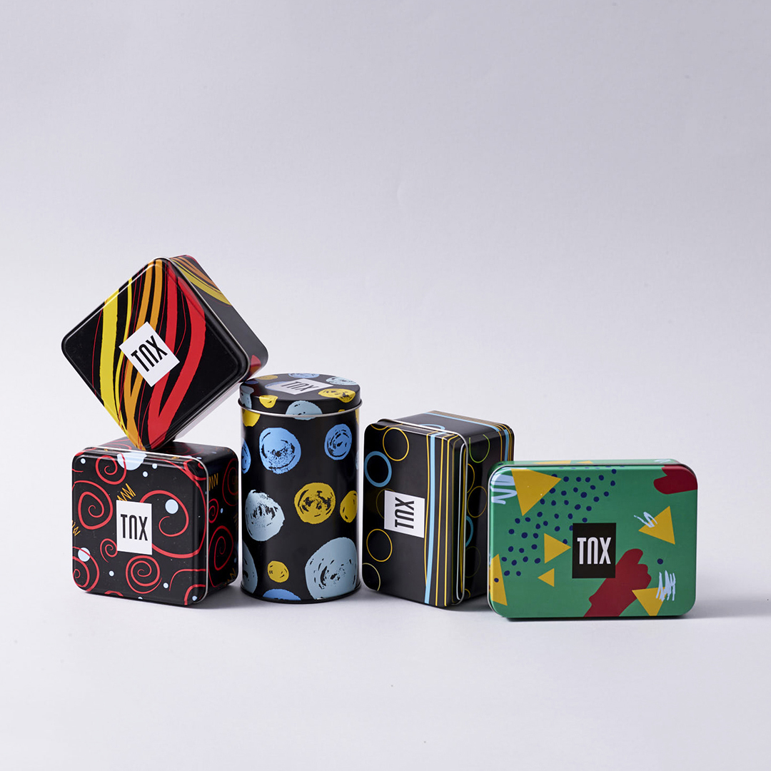
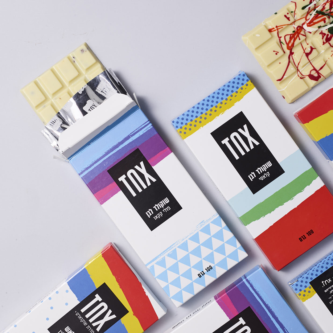
This is the story of an artizinal gifting company (non-profit) whose products are produced and sold by the mentally challenged.Often times, this community is put to work behind the scenes, backstage. A non-profit organisation was created in order to change this reality. This organization includes them in the whole process: from handcrafting, through packaging, and all the way to the point of sale.This unique, method has inspired a model of business and community integration in many countries around the world and was granted a prestigious award at the UN.As a result, they came to us asking to remove the charitable perception from this special brand and become more relevant.In order to provide them this new halo, we wanted to change the brand’s perception, being associated with charity to be associated with pride and craftsmanship.First, we chose to change the name. Our strategic team named it- TNX.It’s the old adage: To give is to receive.It’s tnx all around.During our work on the visual identity of TNX, due to the extraordinary characteristics of this organization, we decided to add another dimension to their creation by including the TNX community into the design process. We did that by OPENing our doors to TNX employees, inviting them to take part in the design itself. We asked them to paint whatever comes to mind when they think of giving back and saying ‘thank you’.We were left with these heartfelt drawings and tried to be inspired by them, find a way that they will guide us to the creative solution.We realized this is the solution; their drawings will be the design. We will just need to give them a little Oomph.Their colourful artwork turned into clean, surprising designs for the TNX’s packagings. We tried to pinpoint the unique energy in each drawing, and translate it into a graphic image.Every drawing was an inspiration, a muse, for the finished graphics.The energy of the drawings became the visual identity of the brand.On the back of each pack, you can find the name and picture of the original artist, and a personal “tnx” from them.We designed entirely new brand elements with fresh fonts, novel packaging and surprising colour schemes.Given the brand’s entire process is manufactured, packed and sold by the community, we realized that so should be the identity of the brand itself.
