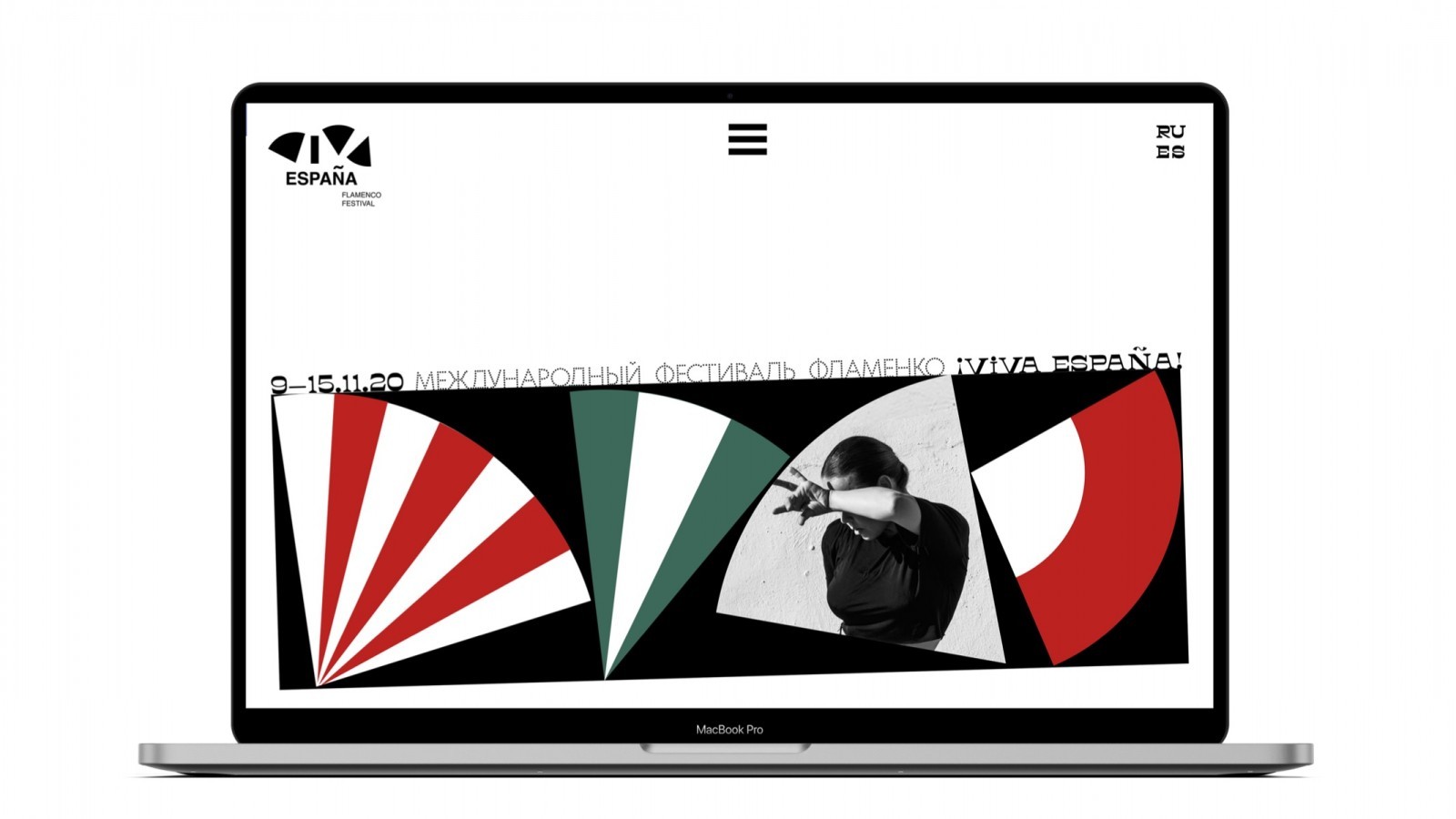
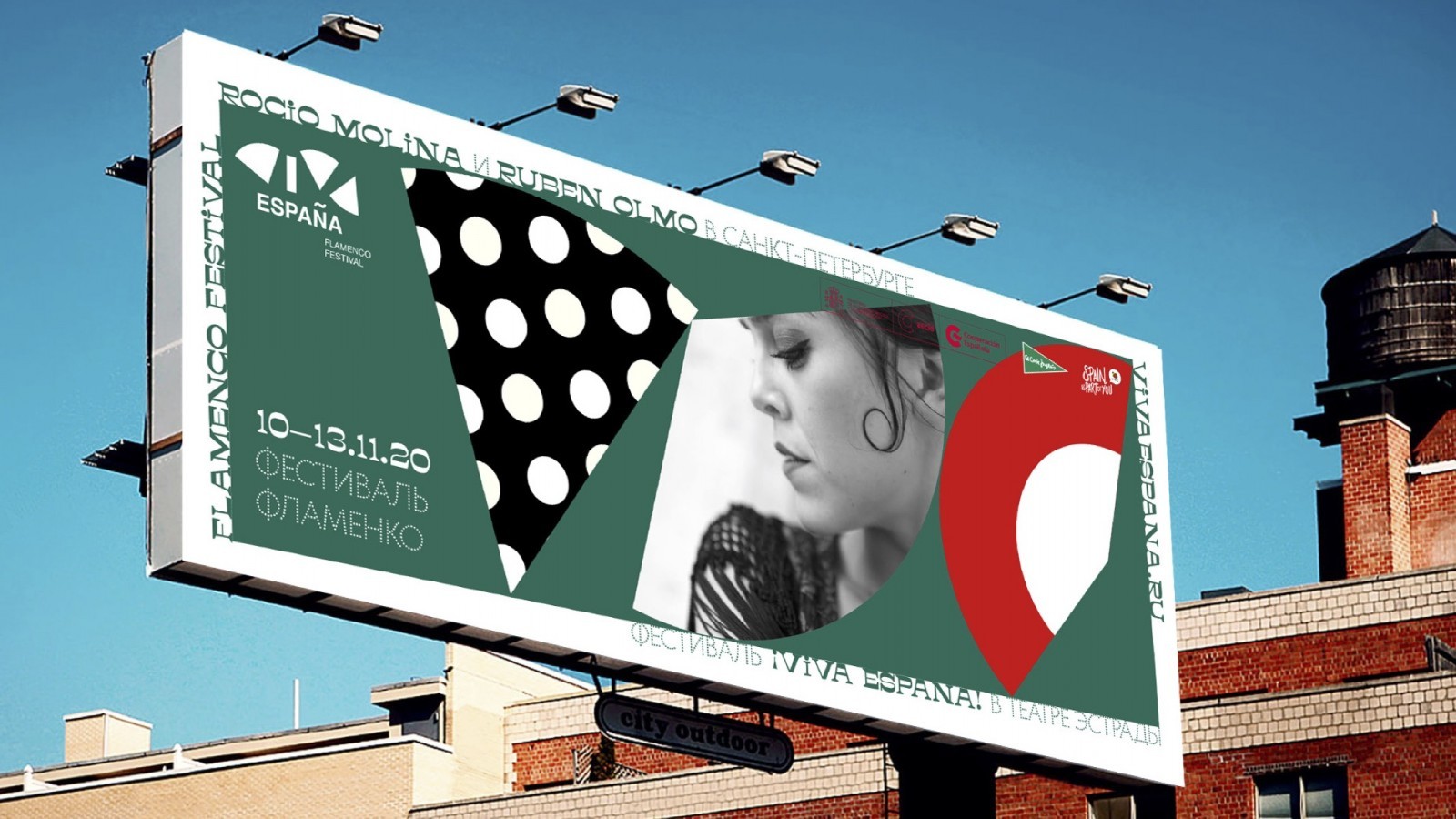
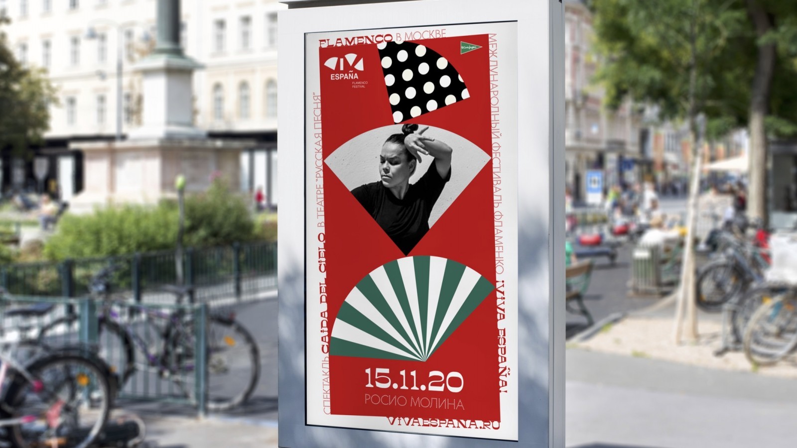
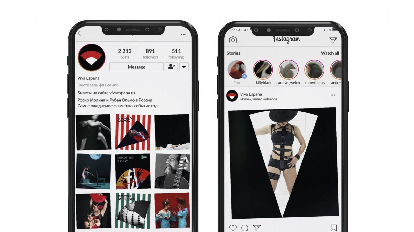
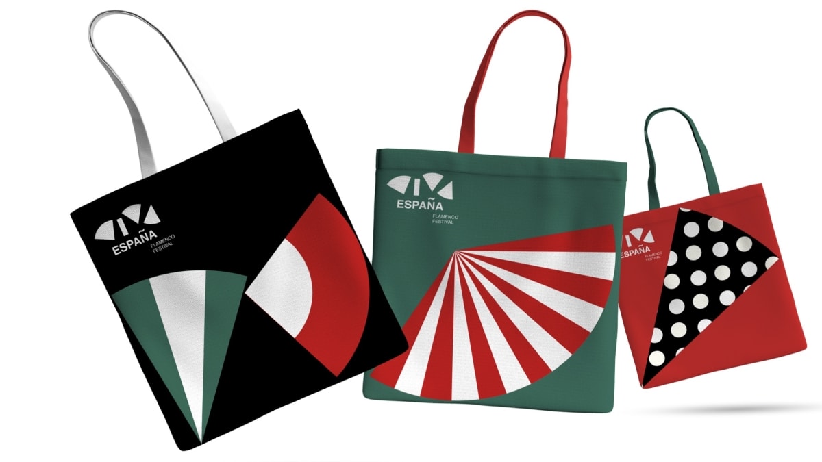
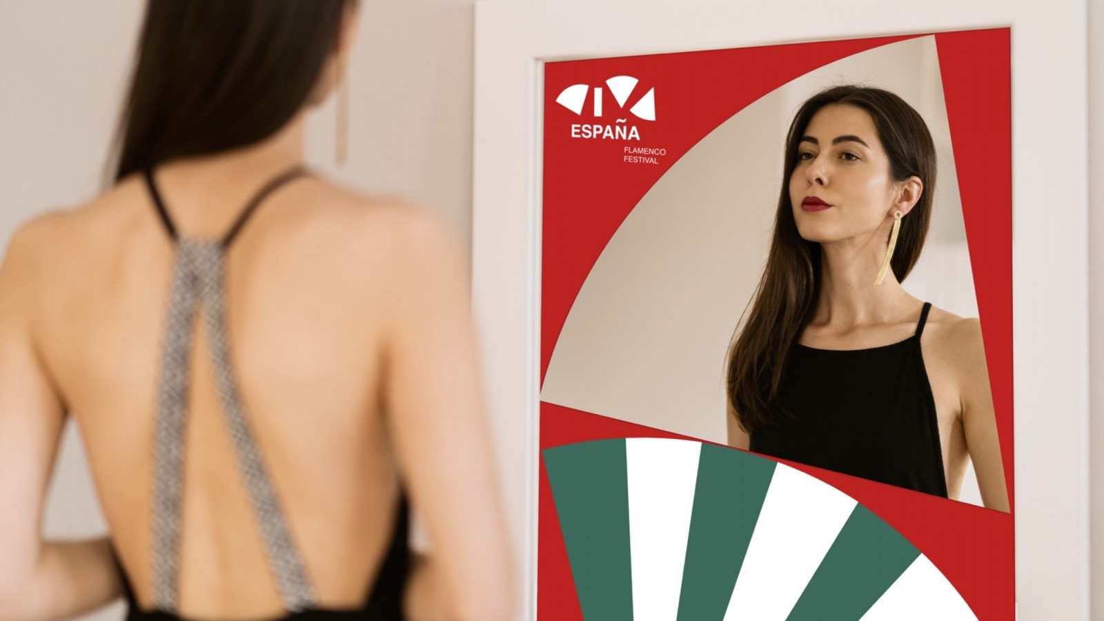
Refreshed brand identity for Russia’s leading flamenco festival ¡VIVA ESPAÑA! aimed to create a simple, bold, and easy to use the system. The new identity centers around multiple uses of a FAN form, a worldwide recognisable symbol of flamenco art, and patterns of traditional Spanish flamenco ‘fiestas’. The logo itself reflects the fan dance, famous Spanish ‘fan language’. All the letters become fans, open o closed. In contrast to the simplicity of geometric graphics and limited colors comes the sophisticated typography. Using two different accidental fonts supports the Festival program design: it always consists of two performances of two ‘stars’ representing two different styles of modern flamenco.
The core message of the new identity system is ‘modern tradition’. The target audience is young city hedonists who are extremely selective when it comes to choosing the events they attend. That’s why the new identity is loud, bright, and simple and supposed to capture your attention with being overloaded with information city environment at once.
CREDIT
- Agency/Creative: Kate Zakharova - British Higher School of Art and Design
- Article Title: Brand Identity For ¡VIVA ESPAÑA! Flamenco Festival
- Organisation/Entity: Conceptual Work - Identity - Brand Redesign
- Project Type: Identity
- Project Status: Published
- Industry: Entertainment
- Keywords: WBDS Student Design Awards 2020/21


