


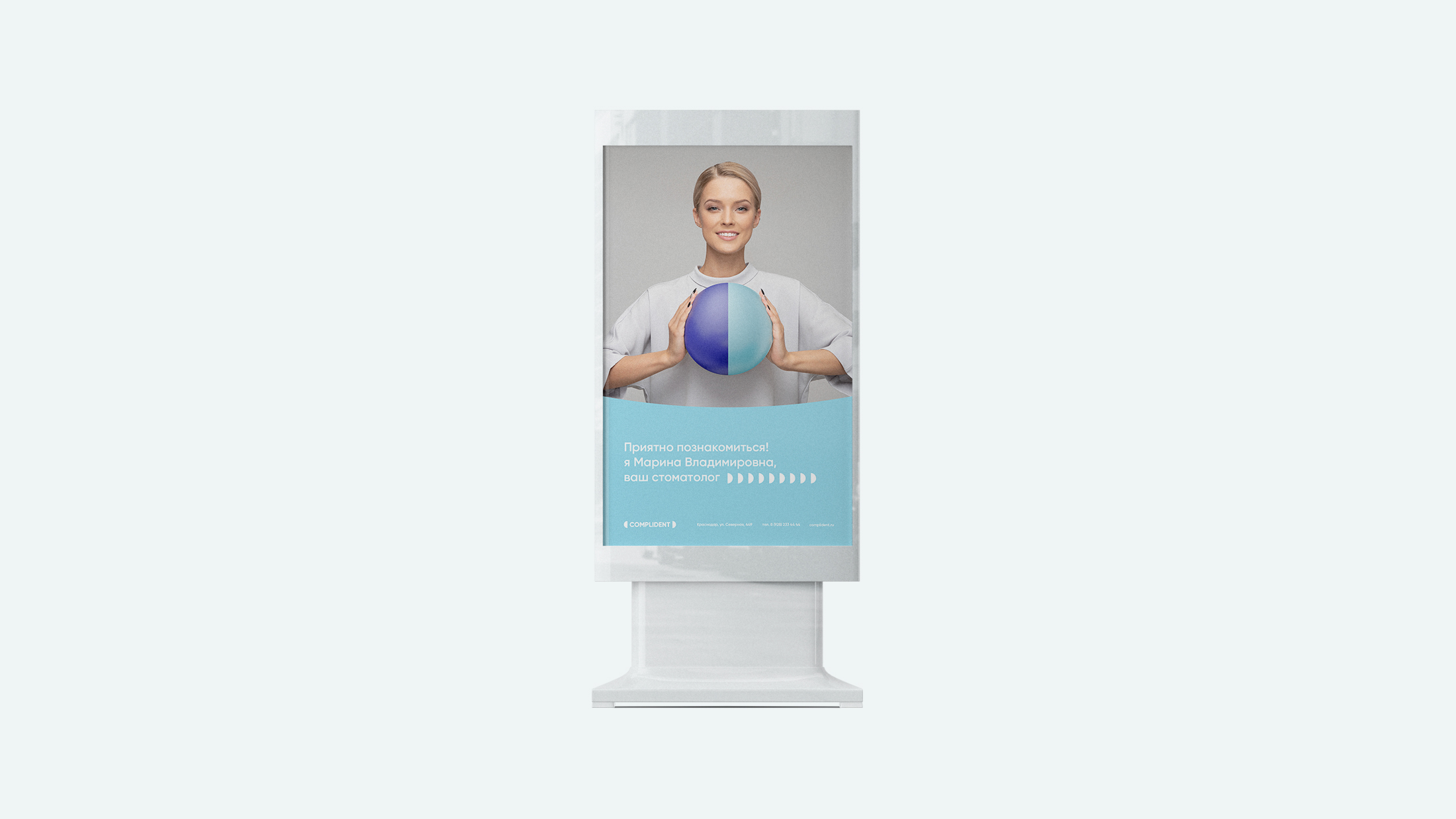
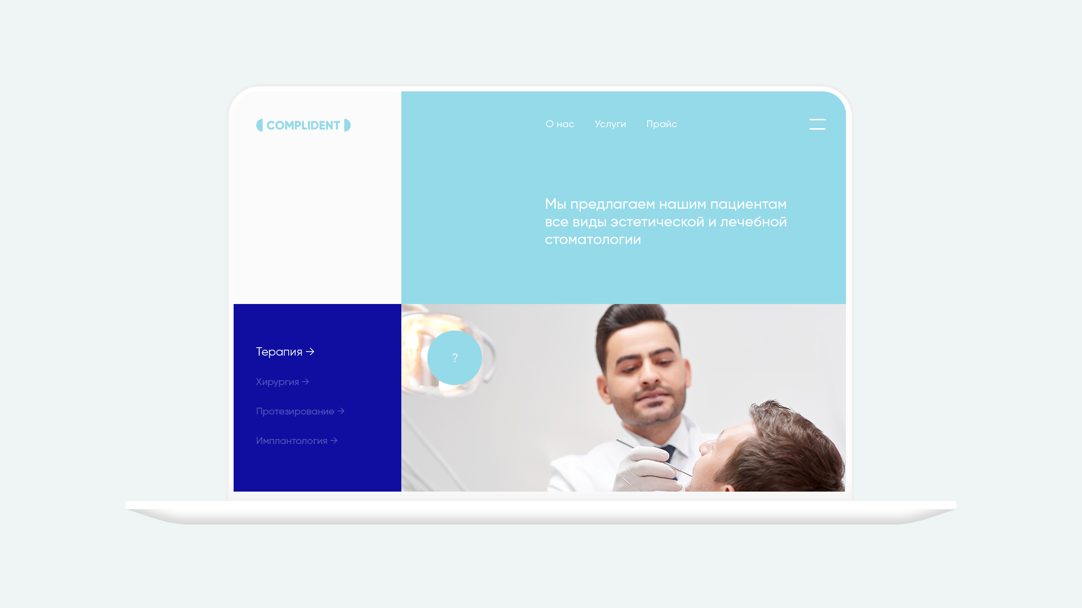
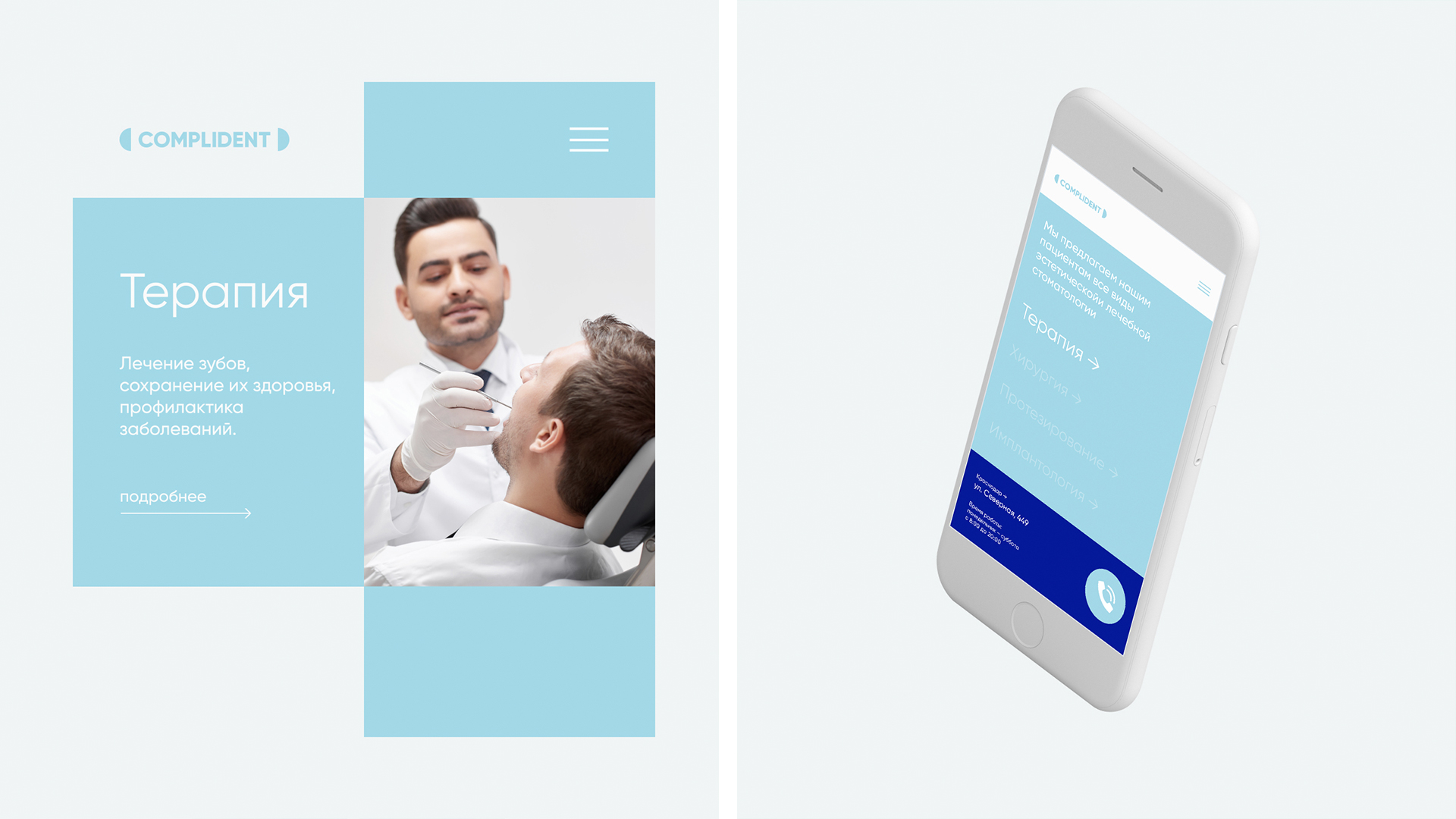
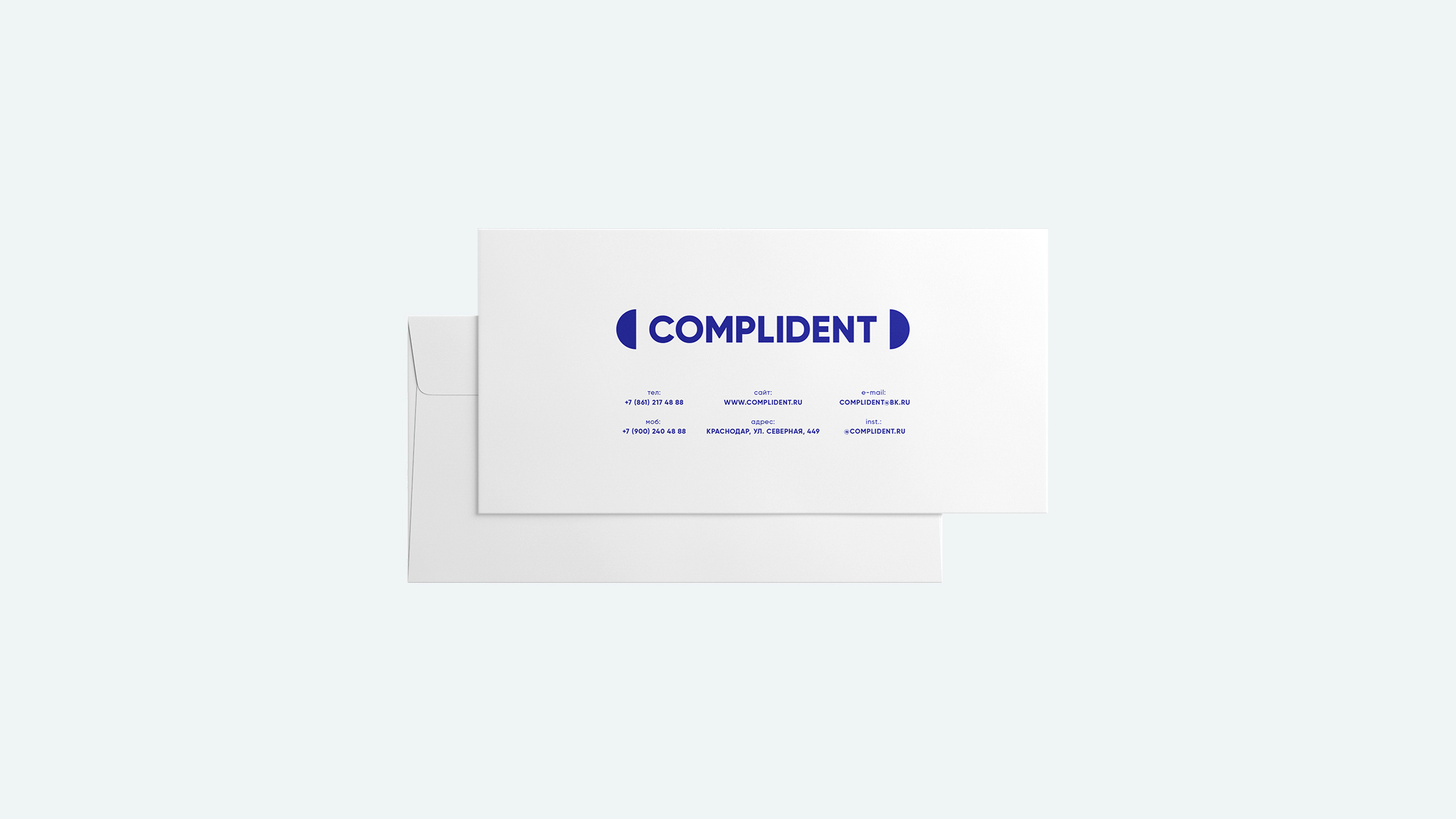
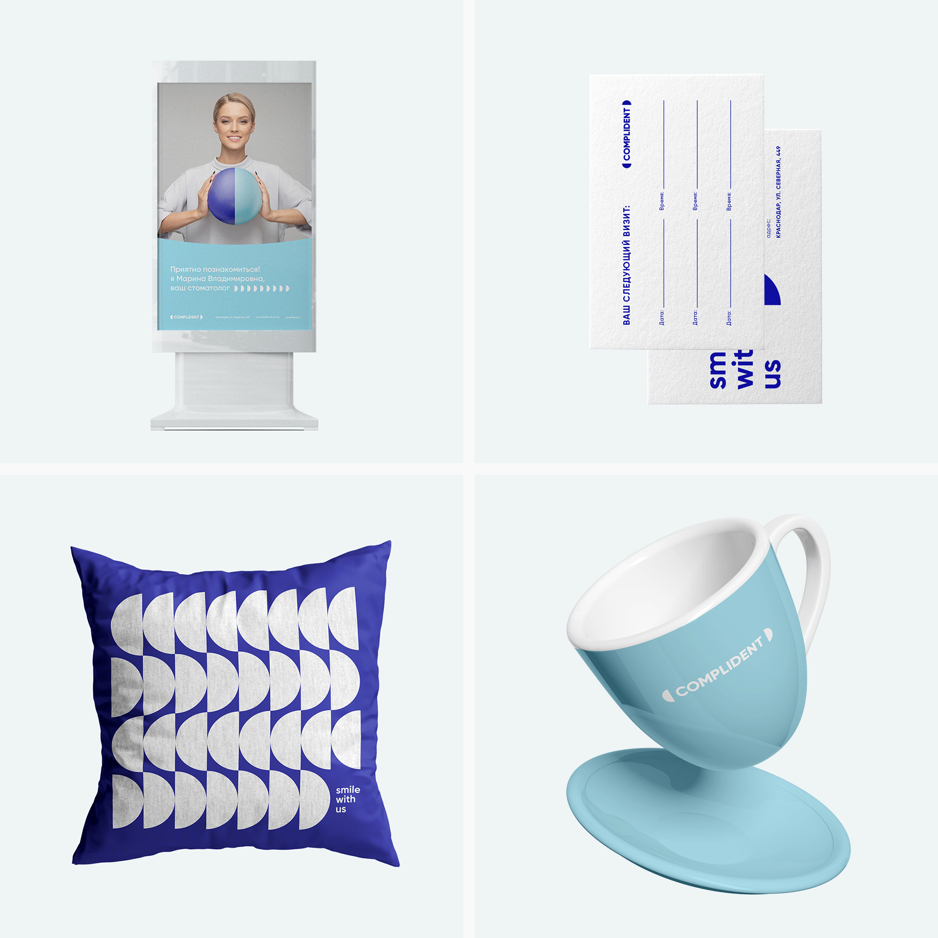
Dental clinic that provides services for the treatment and diagnosis of teeth. A multidisciplinary institution offers its customers a wide range of services and high quality service. The main mission of the clinic combines – helping a person, attention, responsiveness and care.
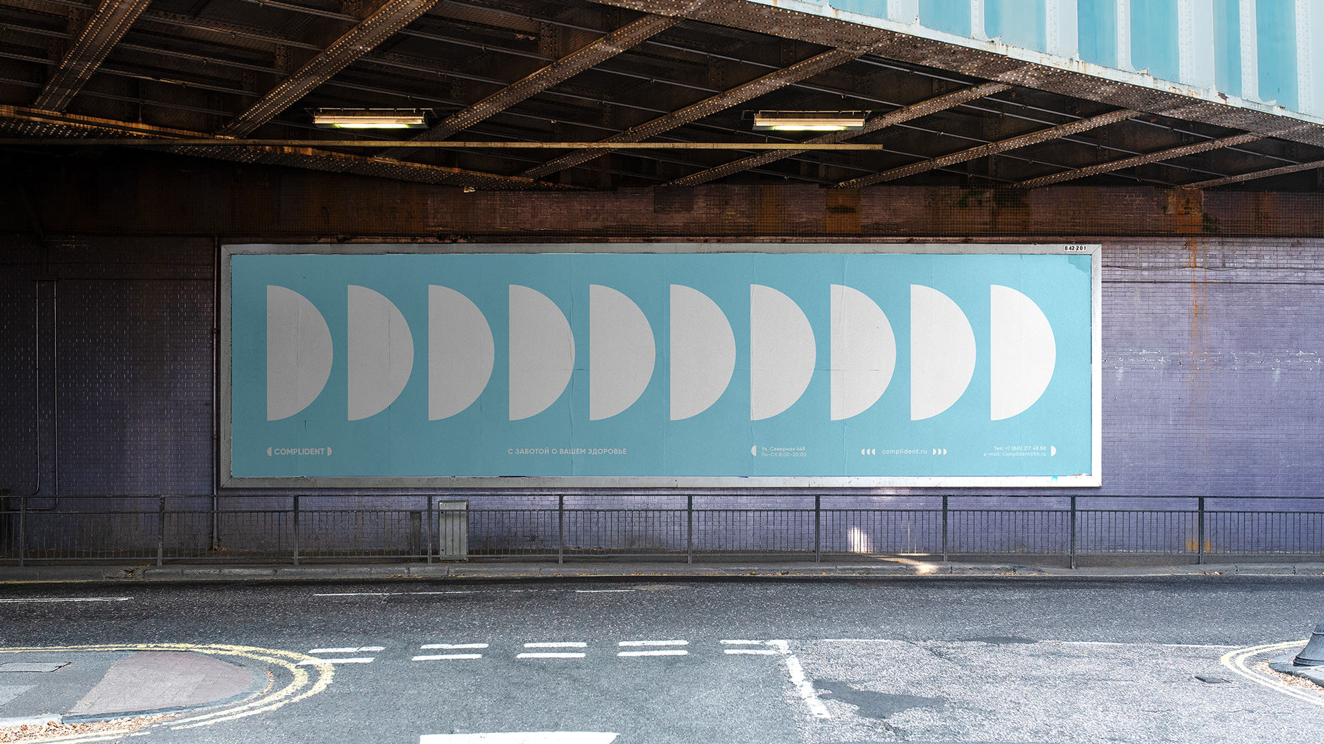
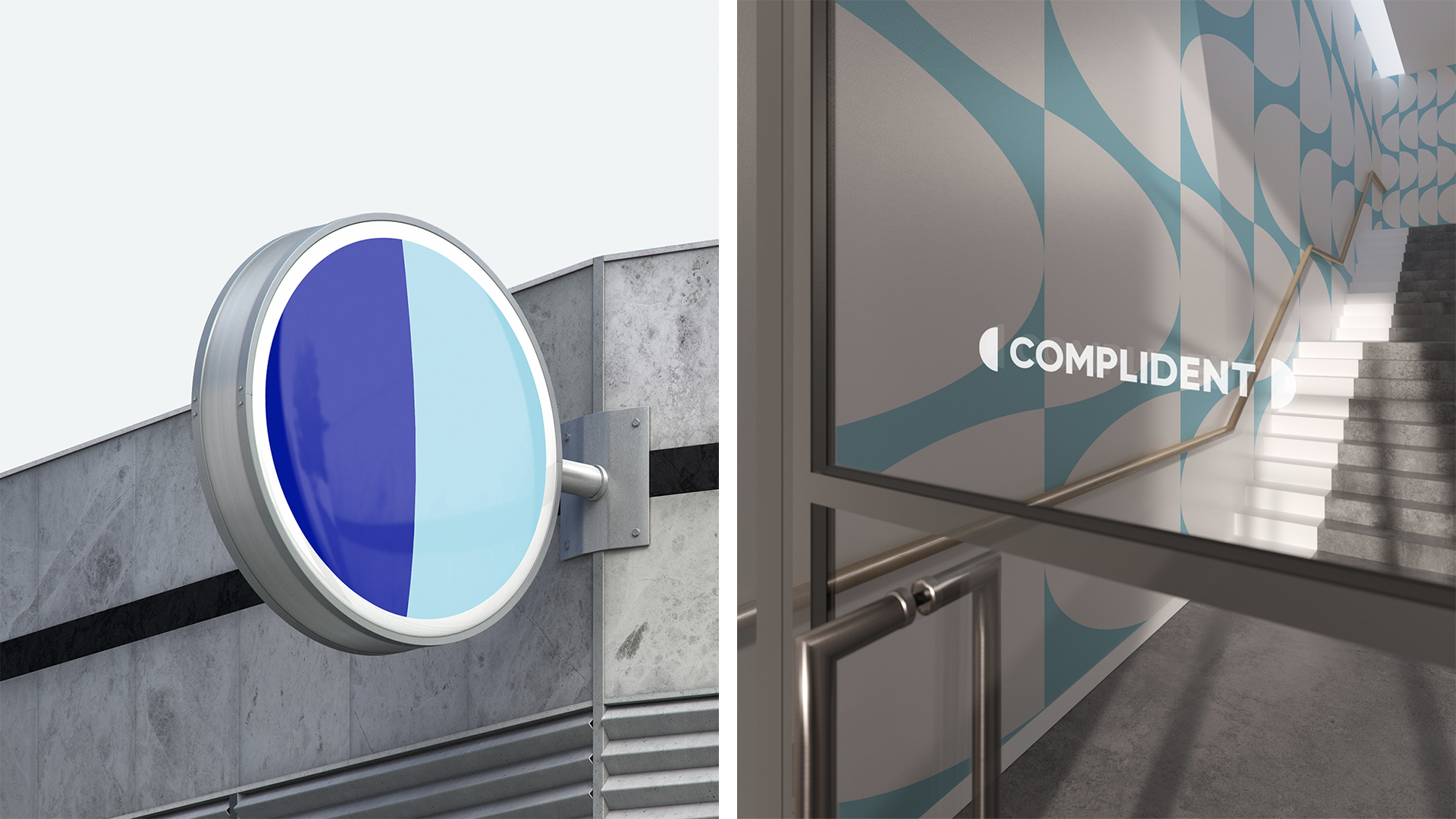
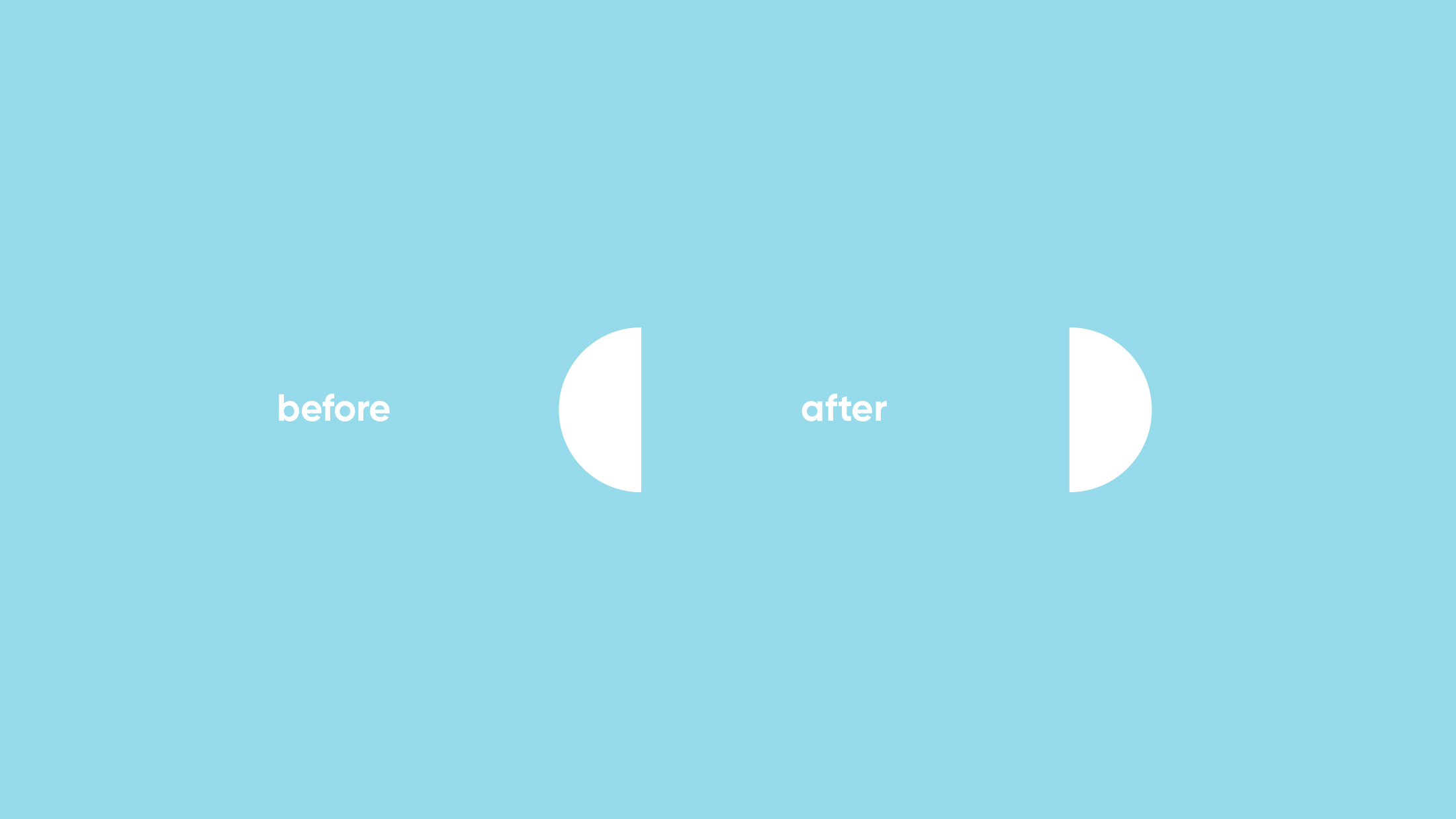
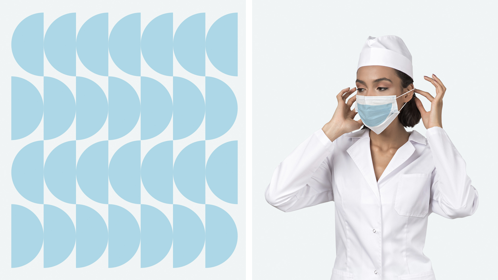
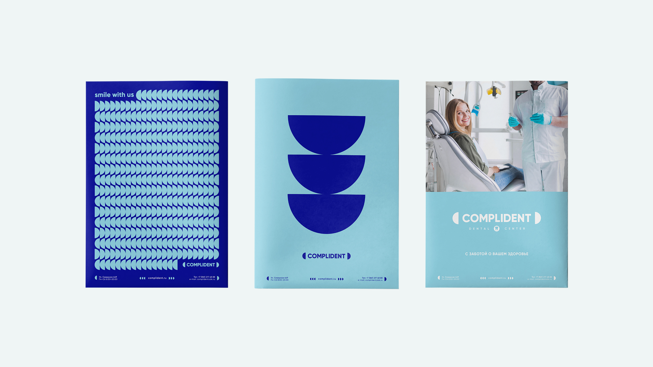
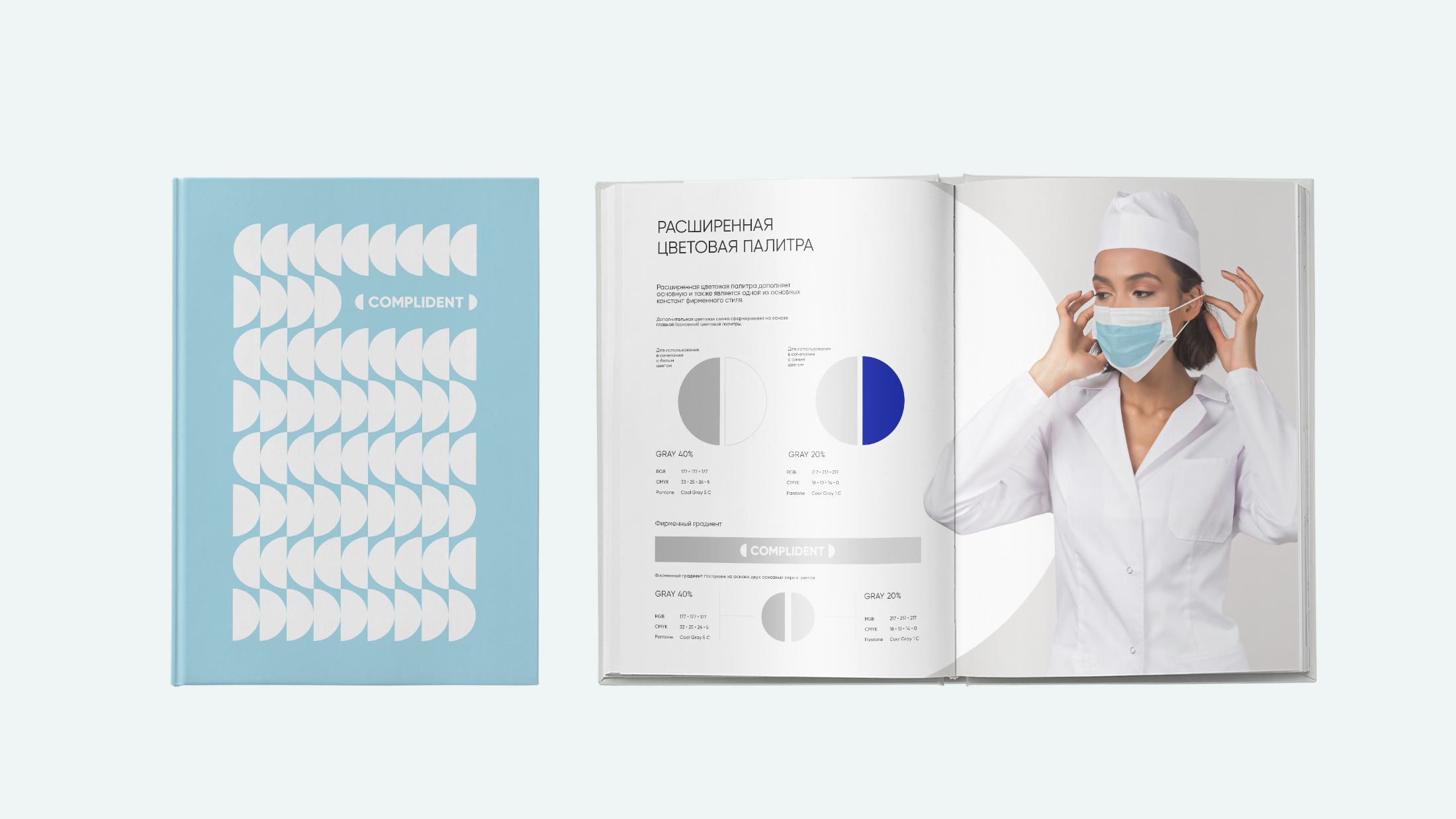
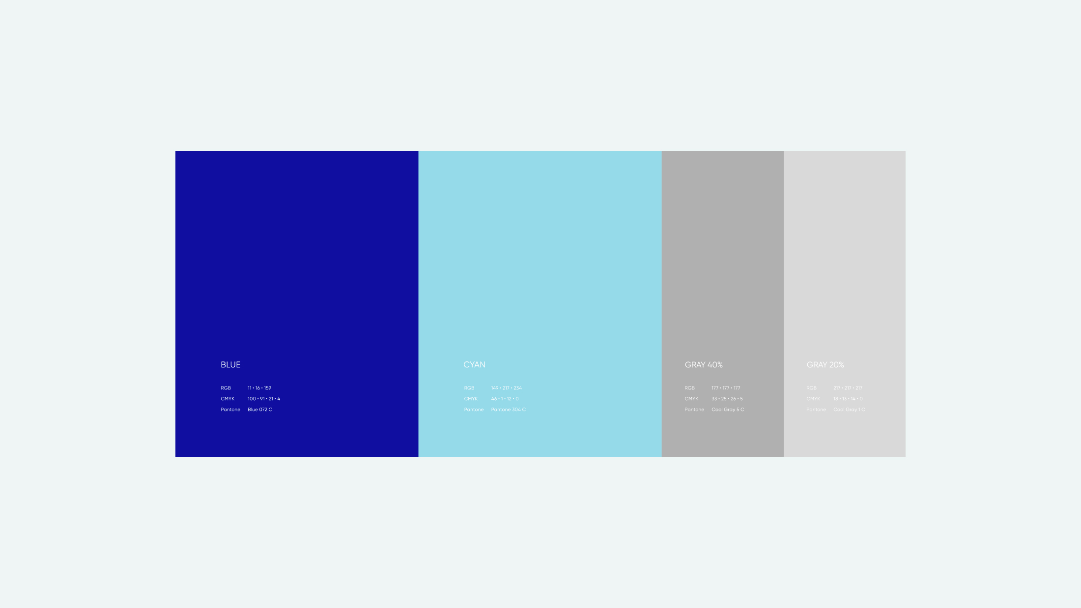
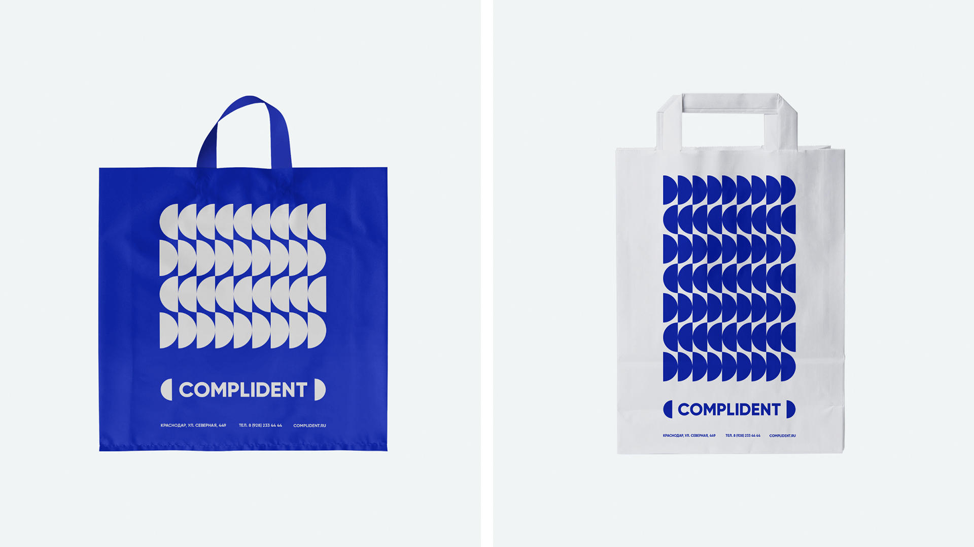
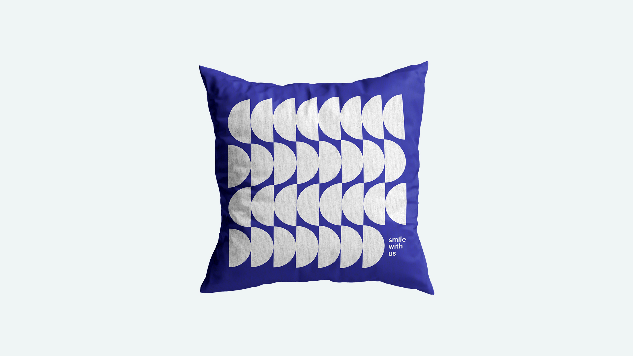
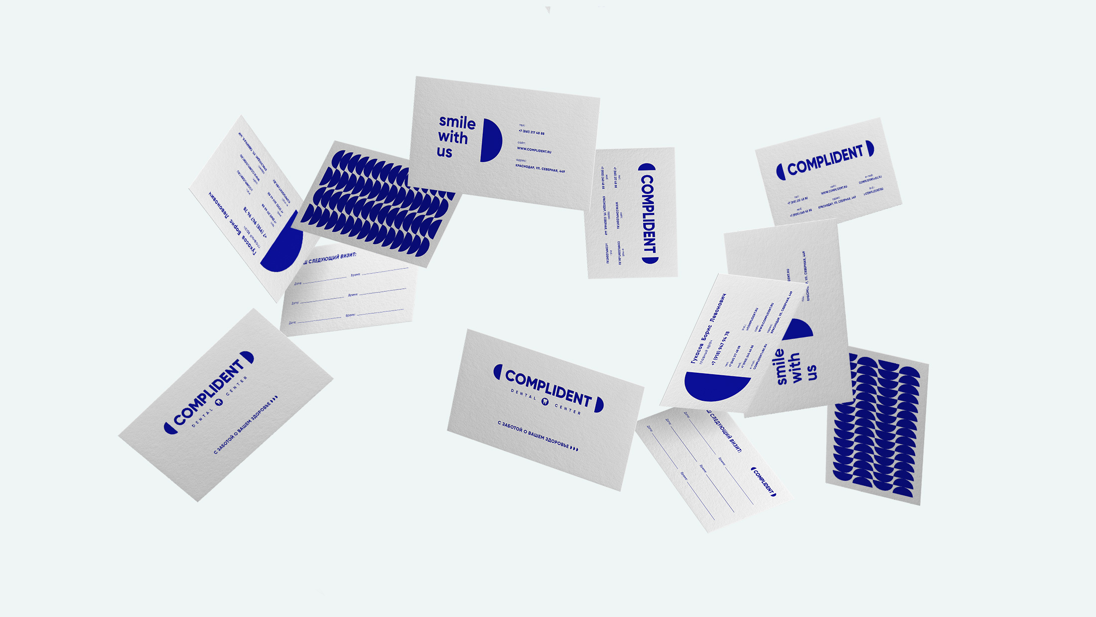
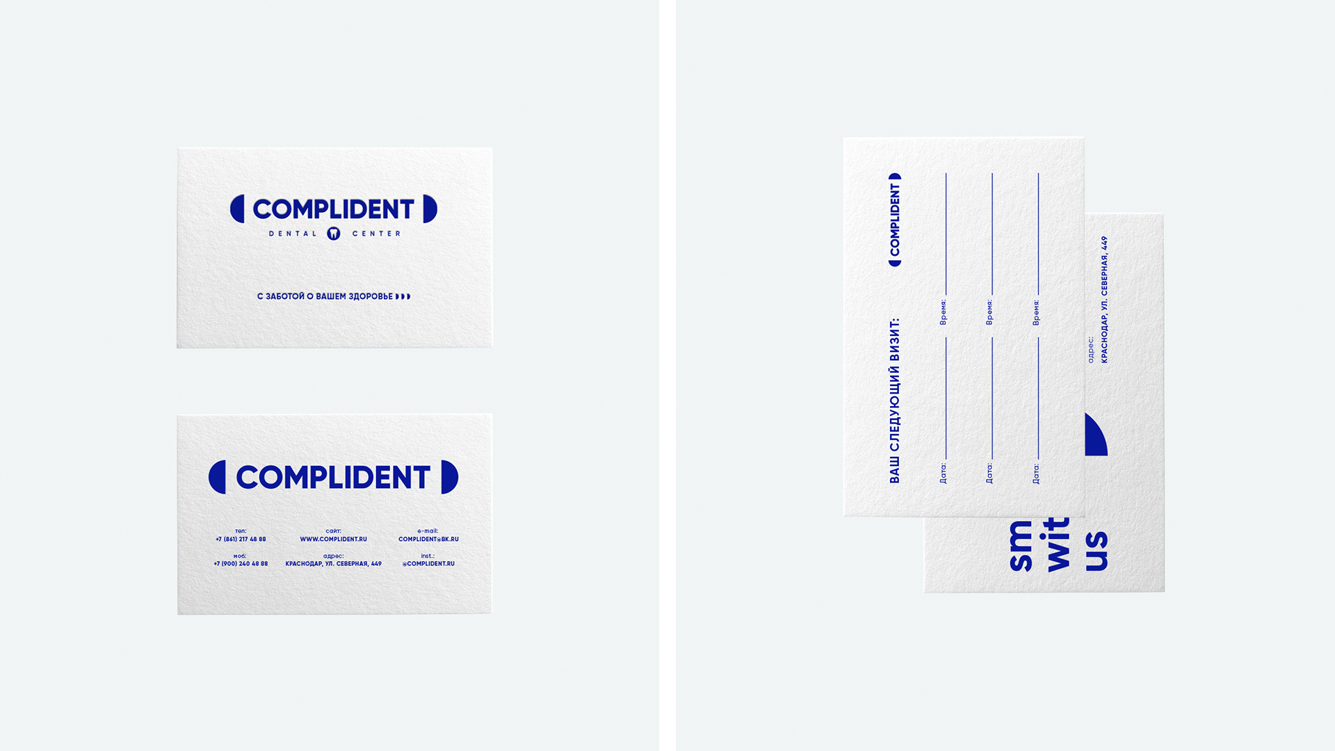
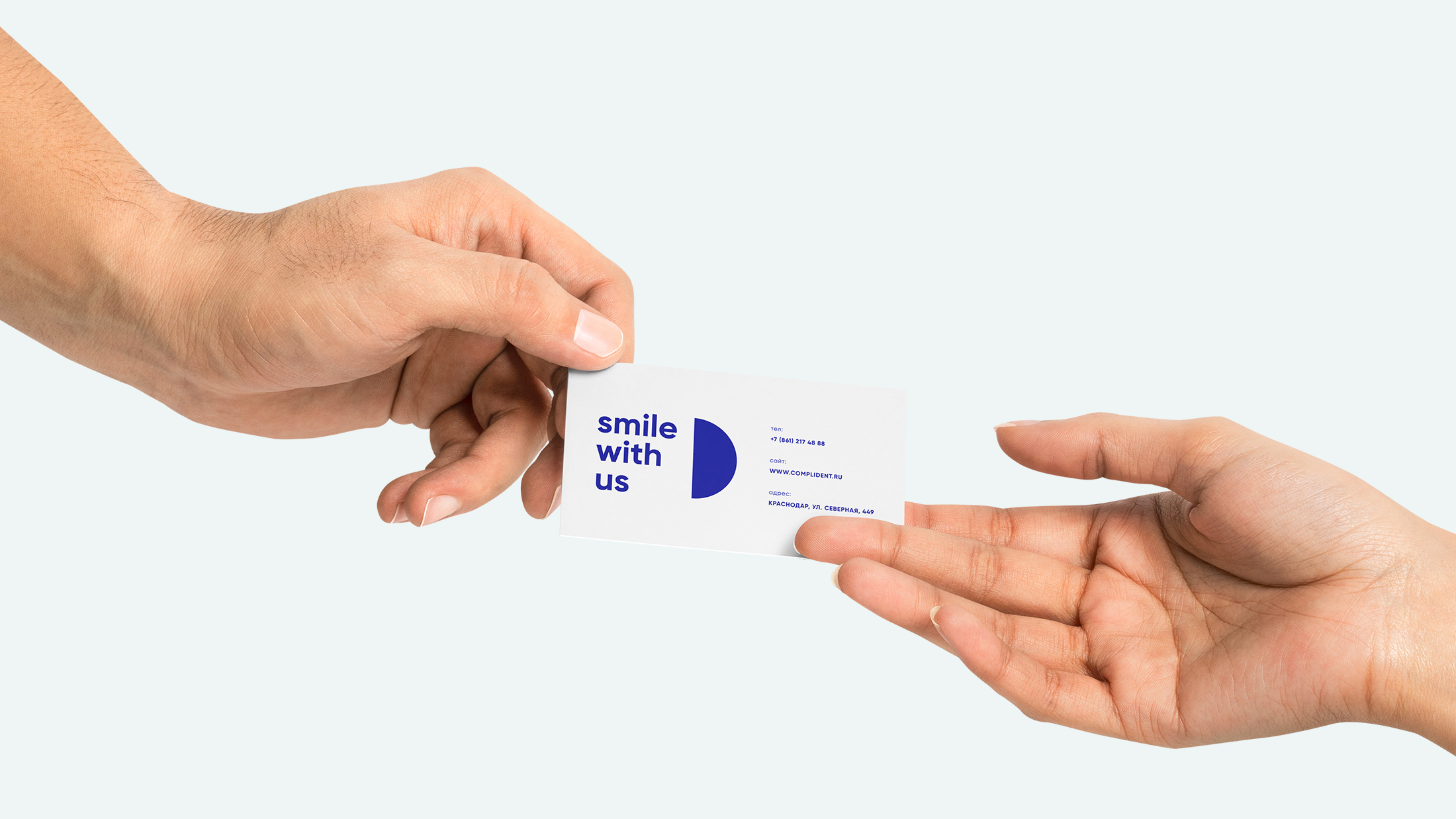
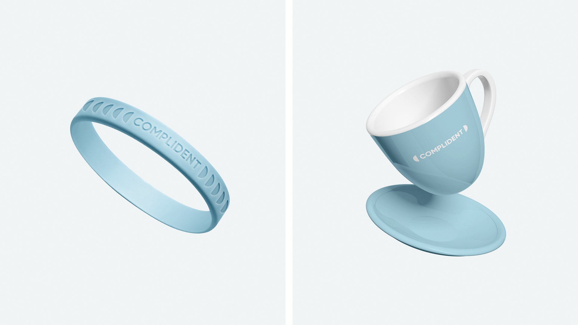
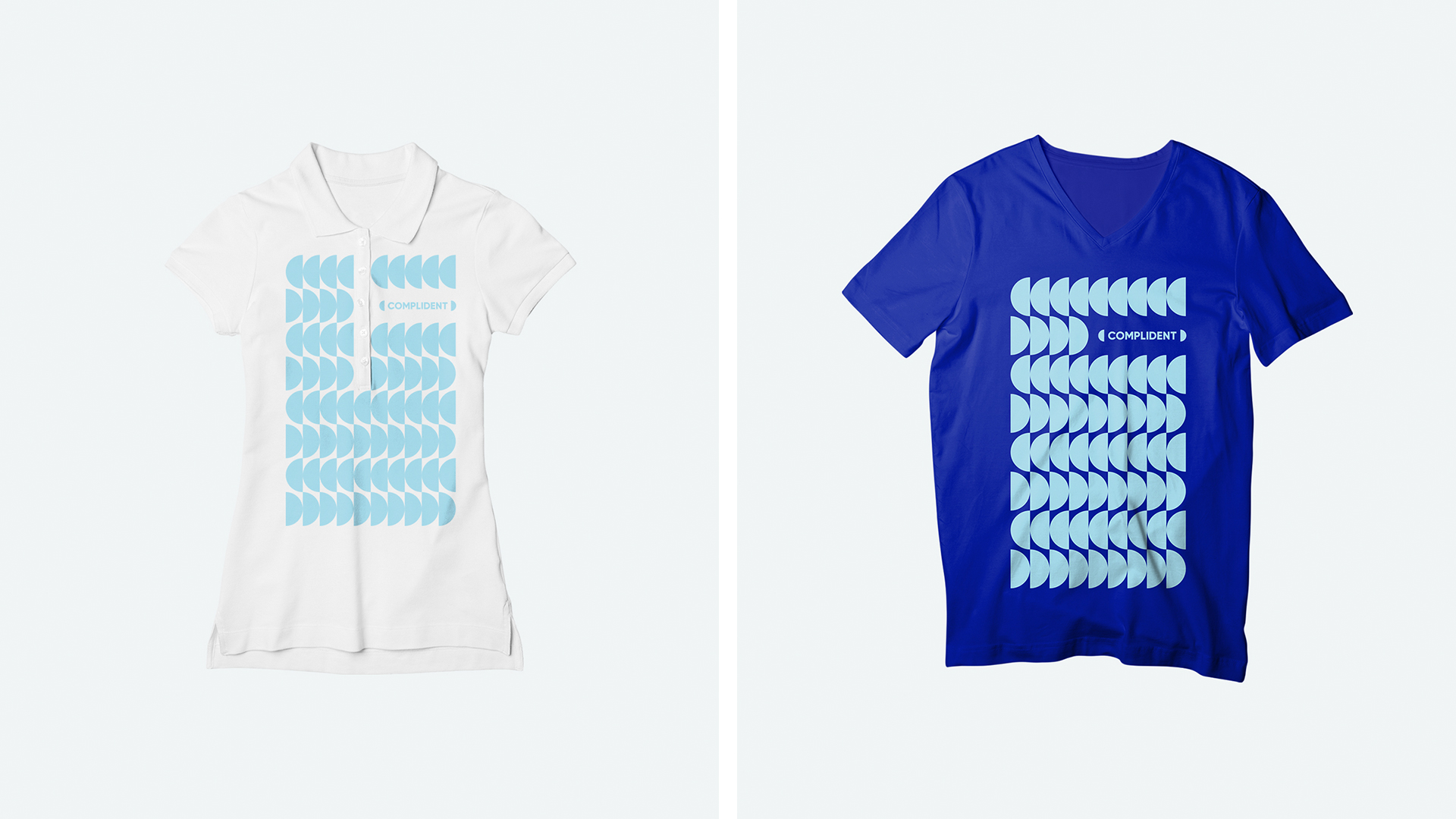
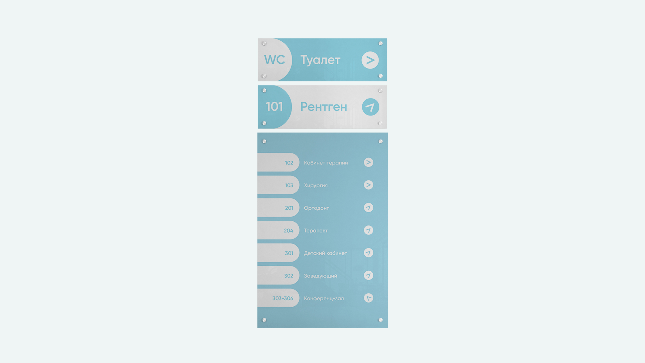
We began the development of the concept, based on the idea of integrity, a complete and wide range of services, and clinic competencies. Therefore, the main letters of the name “C” and “D” resemble a capsule, forming a holistic circle. They are also used as emoticons, which we all use in correspondence: “before treatment – upset, sad, and after – joyful, in a good mood.” The combination of colors conveys the main mood of the clinic: Blue professional, mint-turquoise – freshness, white – purity, gray – calm and non-congestion. The color scheme allows you to combine concepts such as treatment, care, attention, expertise, professionalism and scientificness.


CREDIT
- Agency/Creative: around
- Article Title: Brand Identity for the Krasnodar Dental Clinic
- Organisation/Entity: Agency, Published Commercial Design
- Project Type: Identity
- Agency/Creative Country: Russia
- Market Region: Europe
- Project Deliverables: Brand Design, Brand Guidelines, Brand Identity, Brand Naming, Branding, Graphic Design
- Industry: Health Care
- Keywords: Bleu, Clean, Clinic, Dent, Tooth, Medical.


