


Millz Karta is a fashion brand that produces leather goods and timeless garments. Their challenge was to create a transition from the average shop to the memorable brand in the minds of current and new consumers. Before the rebrand company’s main differentiator was quality and customer support. Which, at the moment, are not the key differentiators in the market but more the table stakes to run the business. So we needed to create the unique positioning behind the brand, find golden nuggets and translate them into a new visual language. Because of that, we focused on the brand strategy, identity and overall art direction.
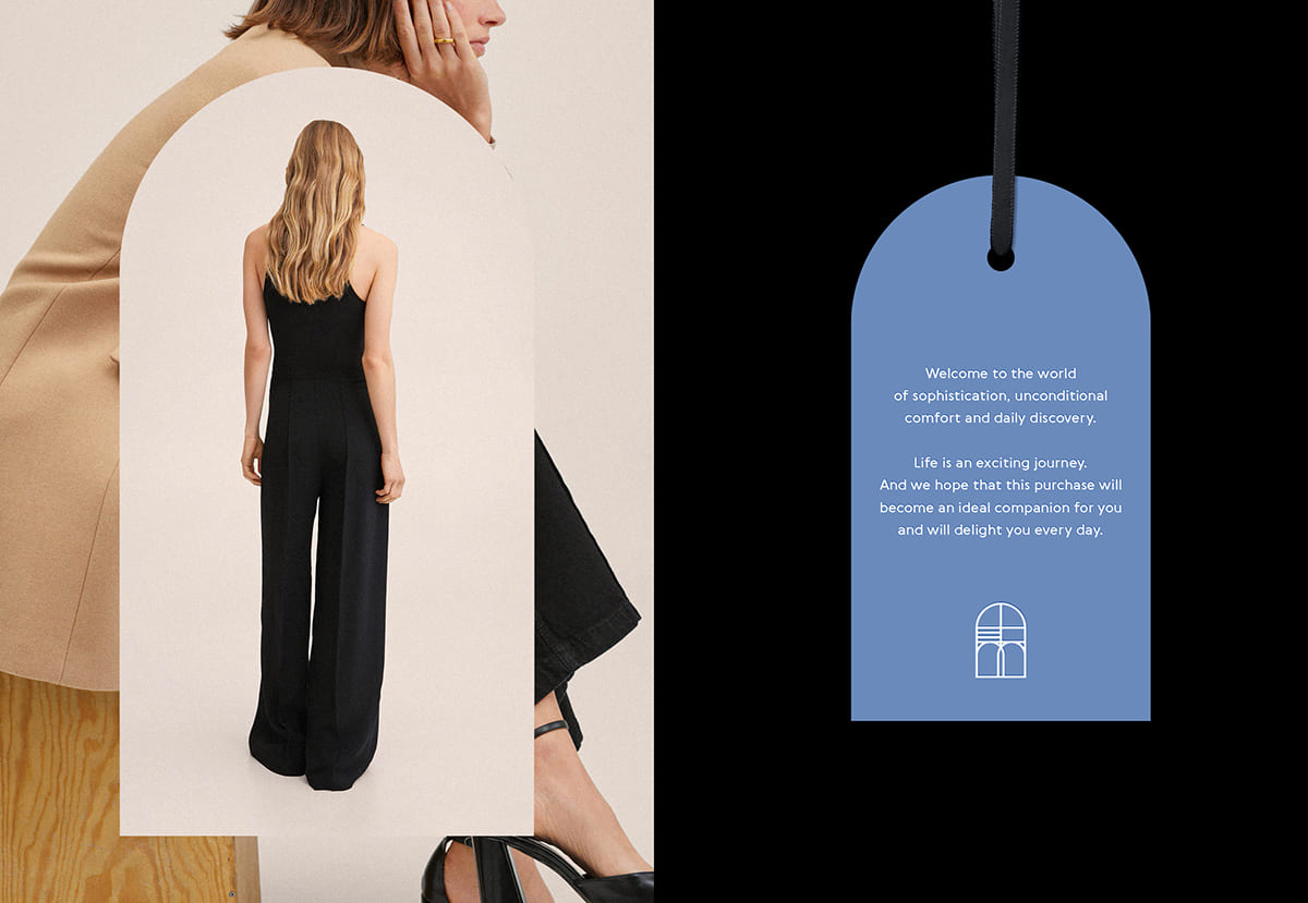
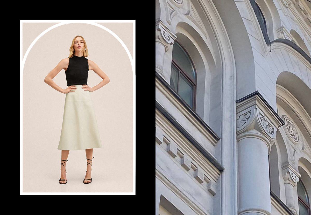
While running the strategy session with the owner, we discovered that Millz Karta needs to go away from the universal strict language of their garment presentation and move into translation of essential comfort, sophisticated look with the spirit of freedom. Because of that, we decided to position the brand as a personal guide/companion for a stylish lifestyle. Millz Karta opens the door to an elegant and comfortable life.
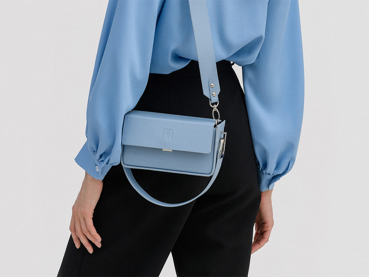
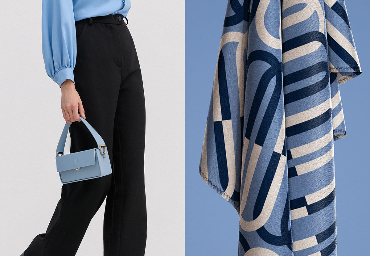
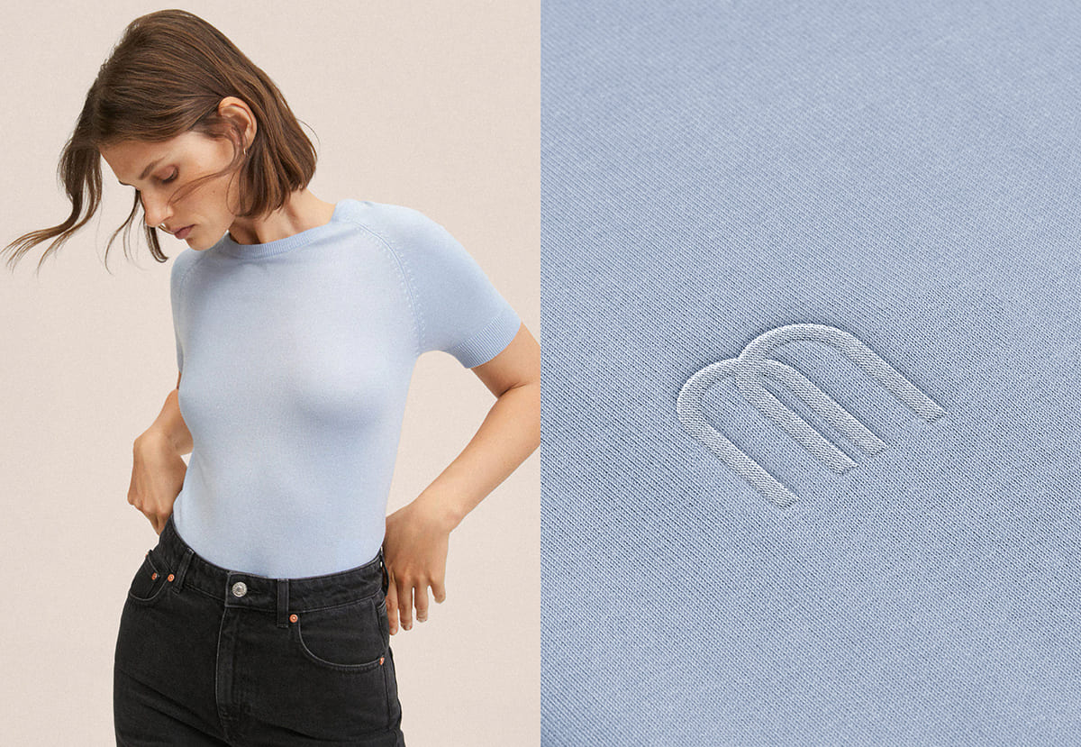
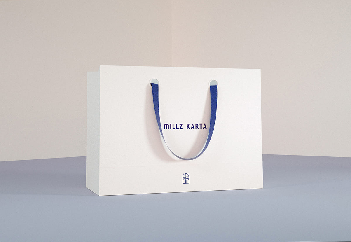
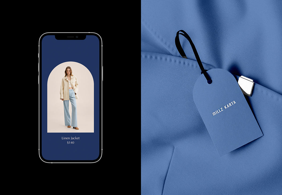
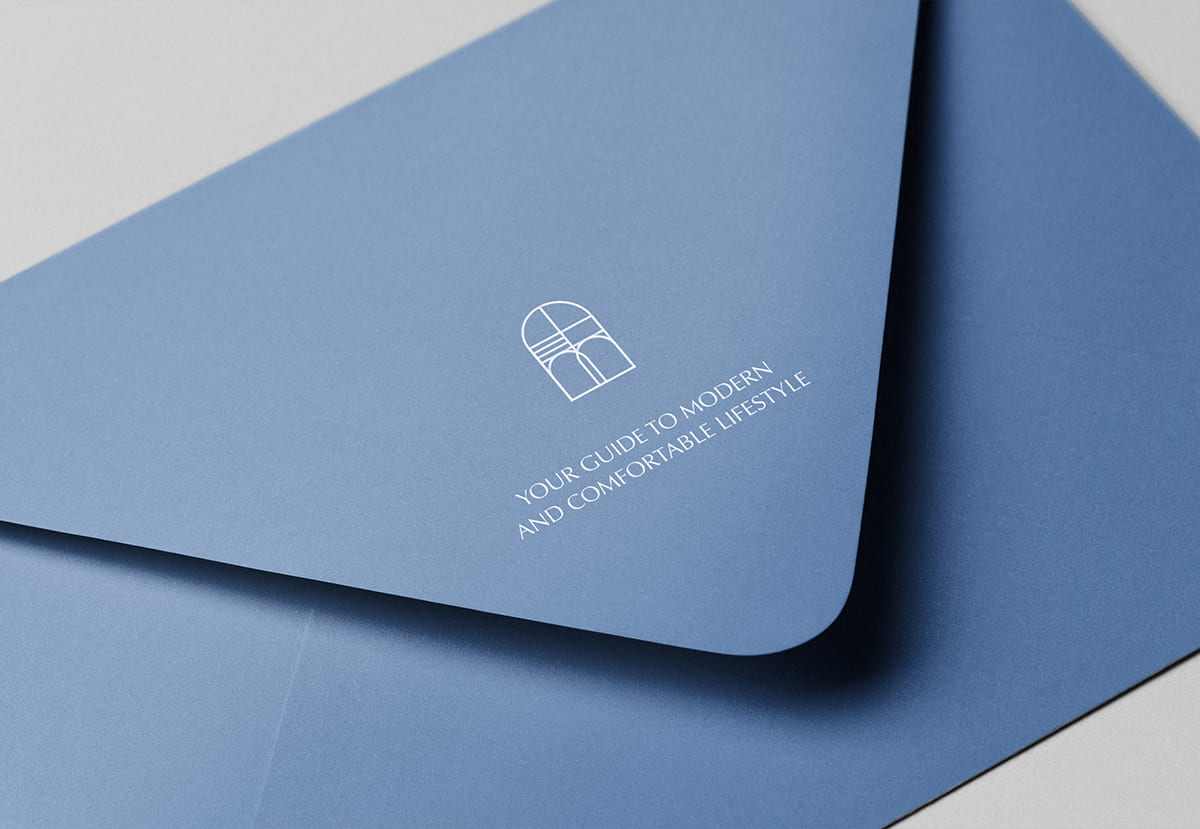
To distinguish the brand from others visually, we decided to choose a certain color scheme and go bold with it. Get away from the colors of competitors and reflect the main message: comfort and freedom. Shades of light and dark blue – colors of the sky paired with boundless light space reflecting confidence and freedom. The blue color also inspires trust, but the combination of its light and dark shade adds sophistication and premium. Light beige shades in printed materials, shop interior and photographs add tenderness and sophistication.
Signature graphics reflect the main product concept: Millz Karta allows you to create a multi-functional wardrobe, from a bag to weekend trousers or a casual tracksuit. We place emphasis on functionality, the ability to play, add and customize Millz Karta items to your wardrobe. This idea was expressed in the created graphic element, which embodies: the idea of multifunctionality, the metaphor of the arch / window / door / wardrobe. In the submark we hide the first letter of the brand, arch shape and bag handles which symbolizes continuing exploration of your wardrobe. Multifunctionality is reflected in the fact that created graphic elements can be transformed and create a complete system of brand identity.


CREDIT
- Agency/Creative: Anastasia Dunaeva
- Article Title: Brand Identity For The Fashion Brand Millz Karta
- Organisation/Entity: Freelance
- Project Type: Identity
- Project Status: Published
- Agency/Creative Country: Turkey
- Agency/Creative City: Istanbul
- Market Region: Europe
- Project Deliverables: Advertising Photography, Brand Creation, Editorial Design
- Industry: Fashion
- Keywords: fashion, minimalism, elegant, feminine
-
Credits:
Art Director: Anastasia Dunaeva


