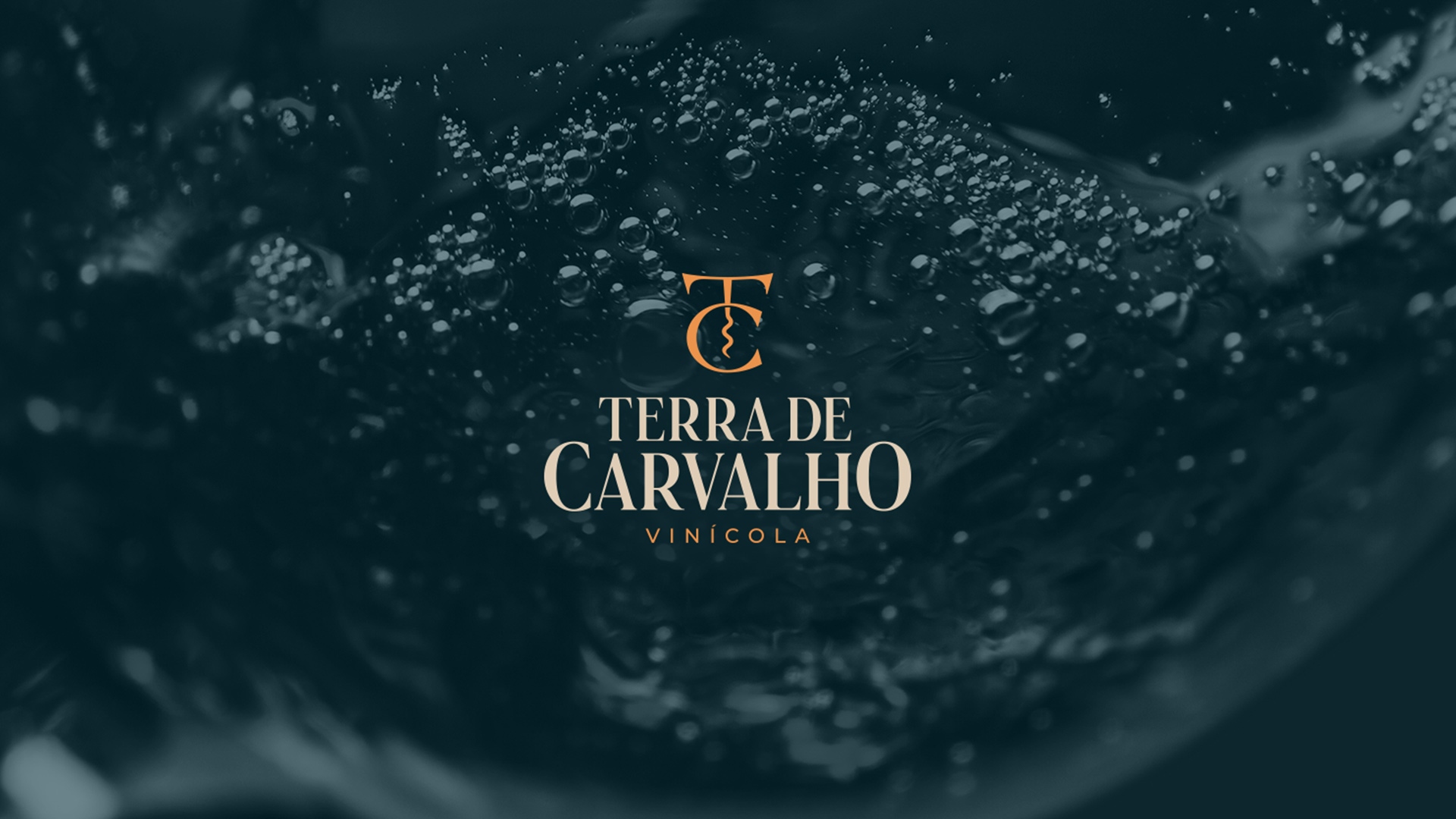
About the winery: Terra de Carvalho is a winery located in Jacutinga – Minas Gerais Brazil – specialized in fine wines production which uses double pruning method in grape harvest on winter. The double pruning method, also called inverted pruning, changes the plant’s natural cycle, changing the grape harvest period to winter. The technique consists of the first cutting of the vine’s branches in August to form branches and the second, in January or February, for production. With that, the vine begins to sprout in February, blooms in March and has its clusters beginning to form in April. This is the secret that allows the emergence of fine wines from in the region of the country where the Terra de Carvalho winery is located. Thus, the phases of growth, maturation and harvest, which would normally occur in the rainy season, in the spring and summer, start to happen in the dry season, in the autumn and in the winter. The inverted cycle provides ideal climate conditions for the production of ripe and healthy grapes for the production of fine wines.
The briefing: The company was searching for a refined visual identity that could present the values of the brand to the public that enjoy wine that are produced with the highest quality.
The idea: The initial idea was to separate the company’s initials (letters T and C) and try to create a shape by joining them with some element that was part of the brand’s universe, such as grapes, wine glass, cork, corkscrew, etc. After a search made looking for shapes, we realized that the best choice would be the corkscrew because it has a shape very similar to the capital letter “T”.
The refinement process: From that decision, a long process of drawing the symbol began, testing shapes, thickness, combinations and much refinement until we found the ideal symbol for the winery. After approval, the typographic design “Terra de Carvalho” started. The drawn typography adds a lot of personality.
The final result: The result is a modern and elegant brand for a very traditional segment. The client approved the project saying that the goal was achieved and was inspired by several applications of the brand.
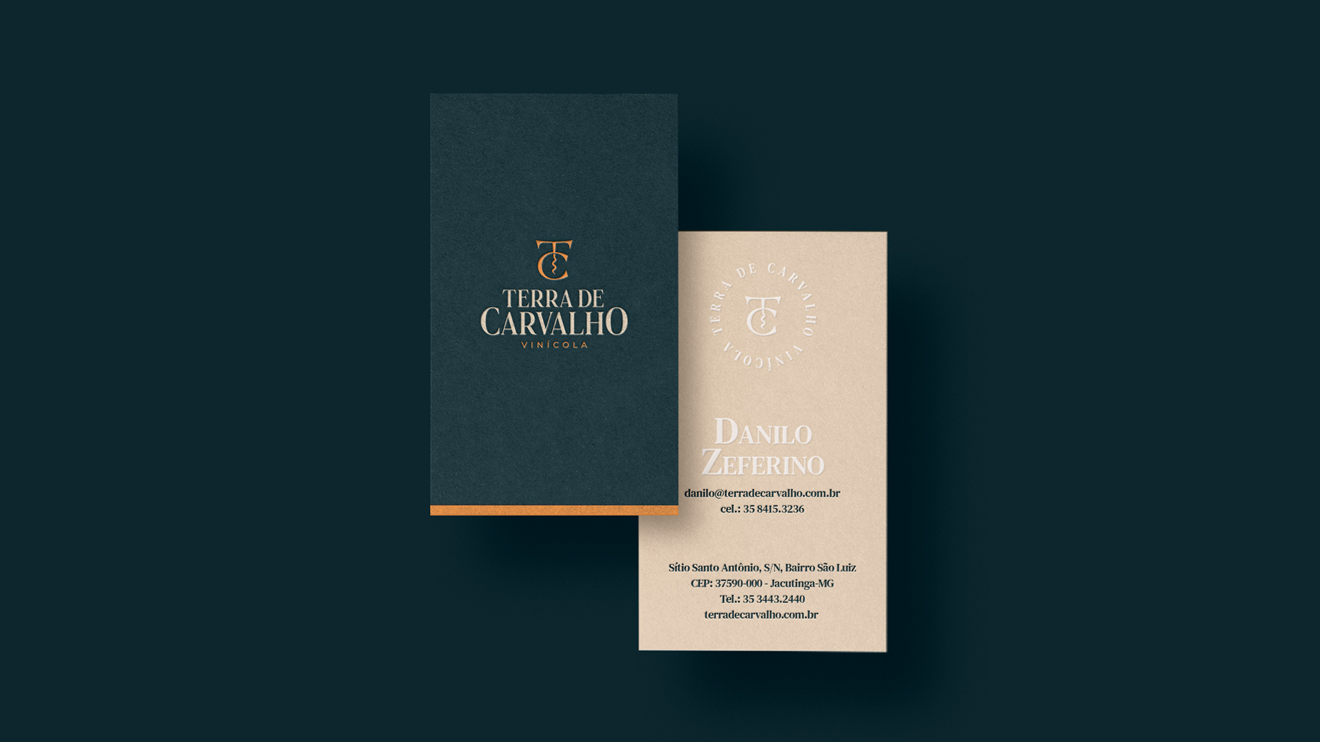
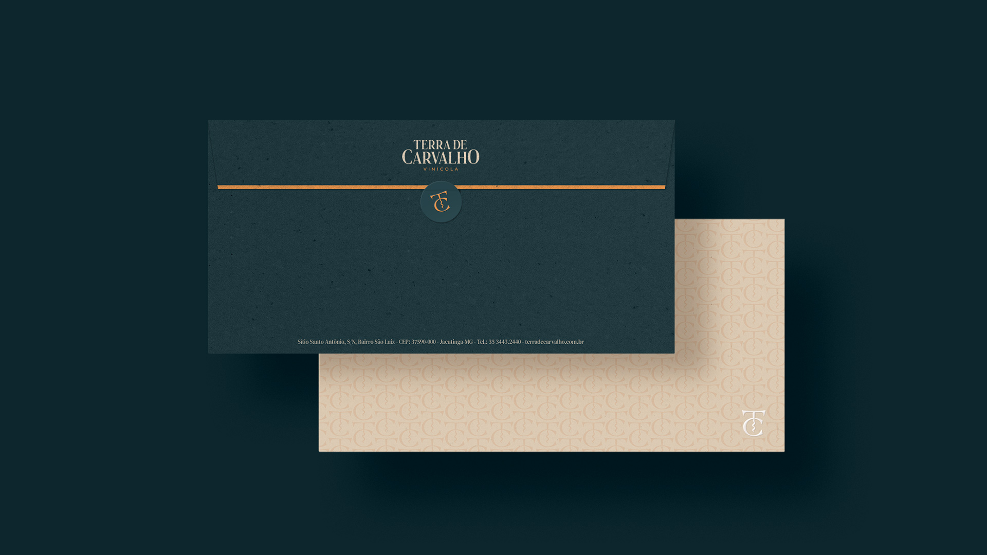
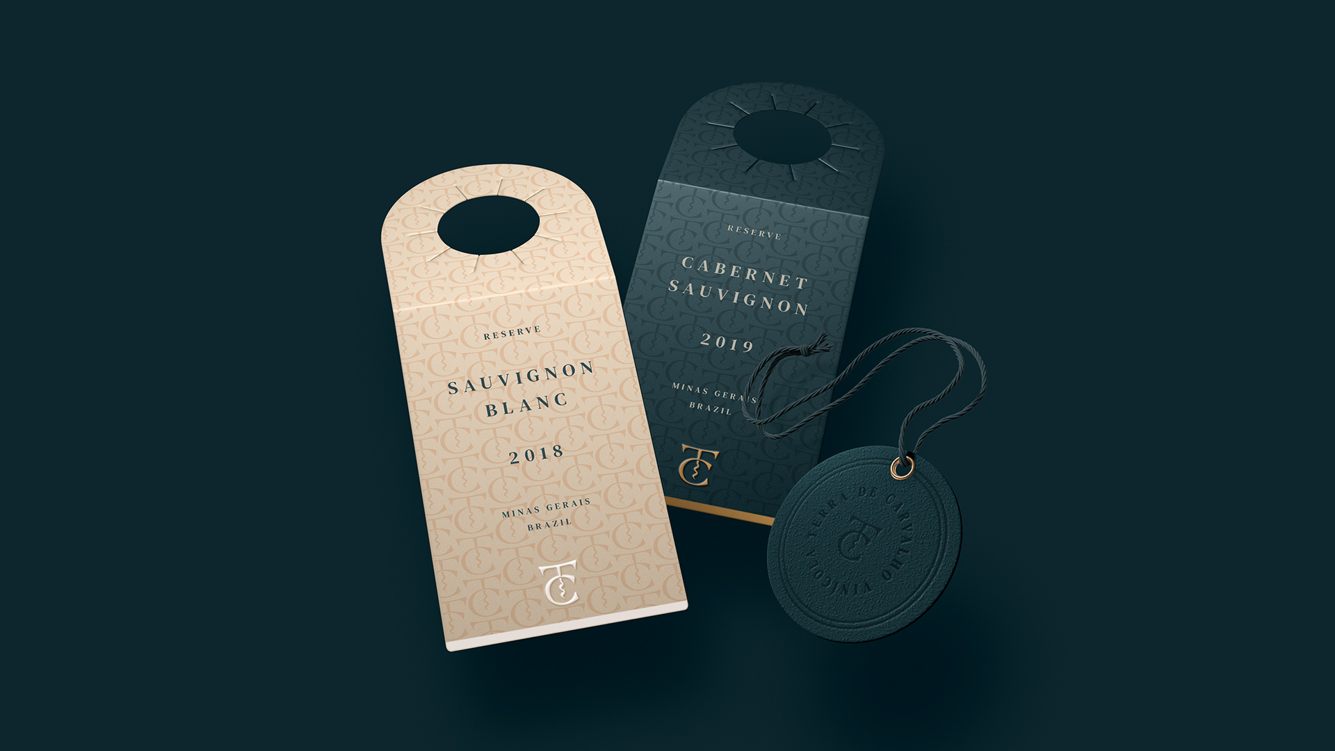
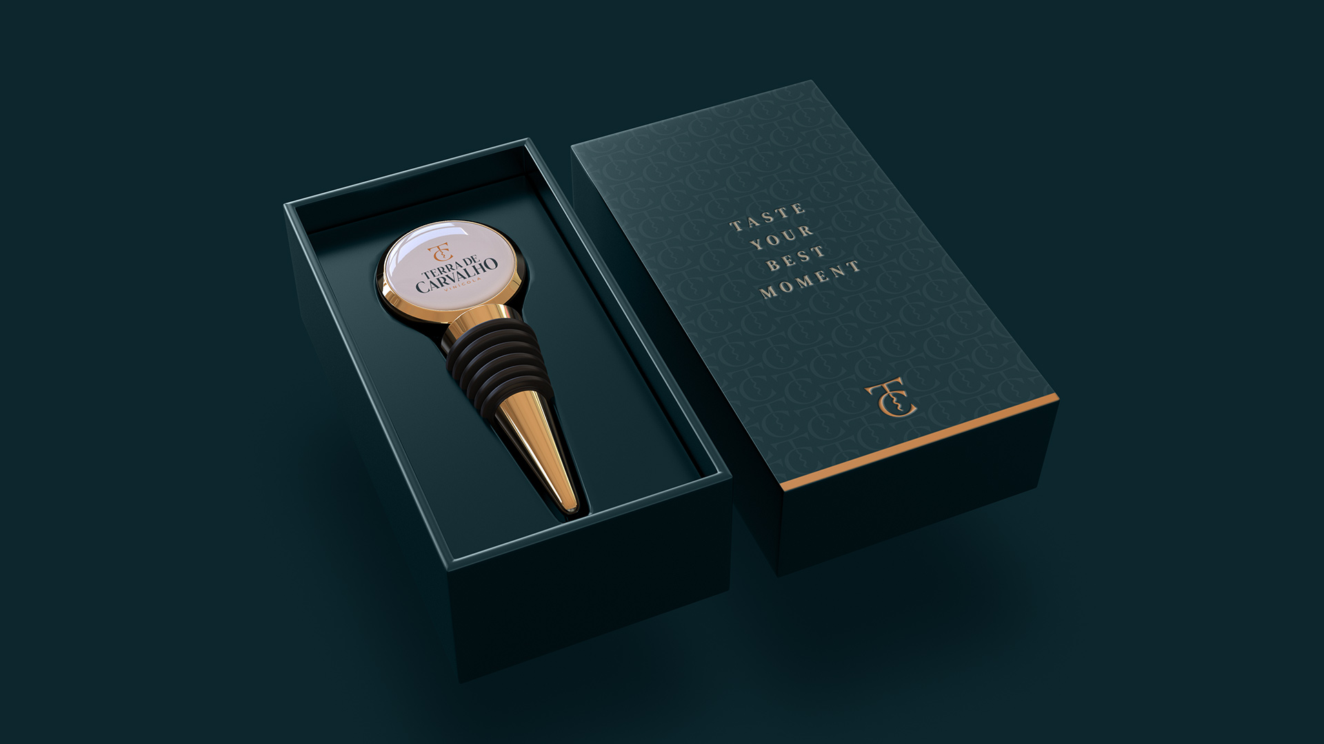
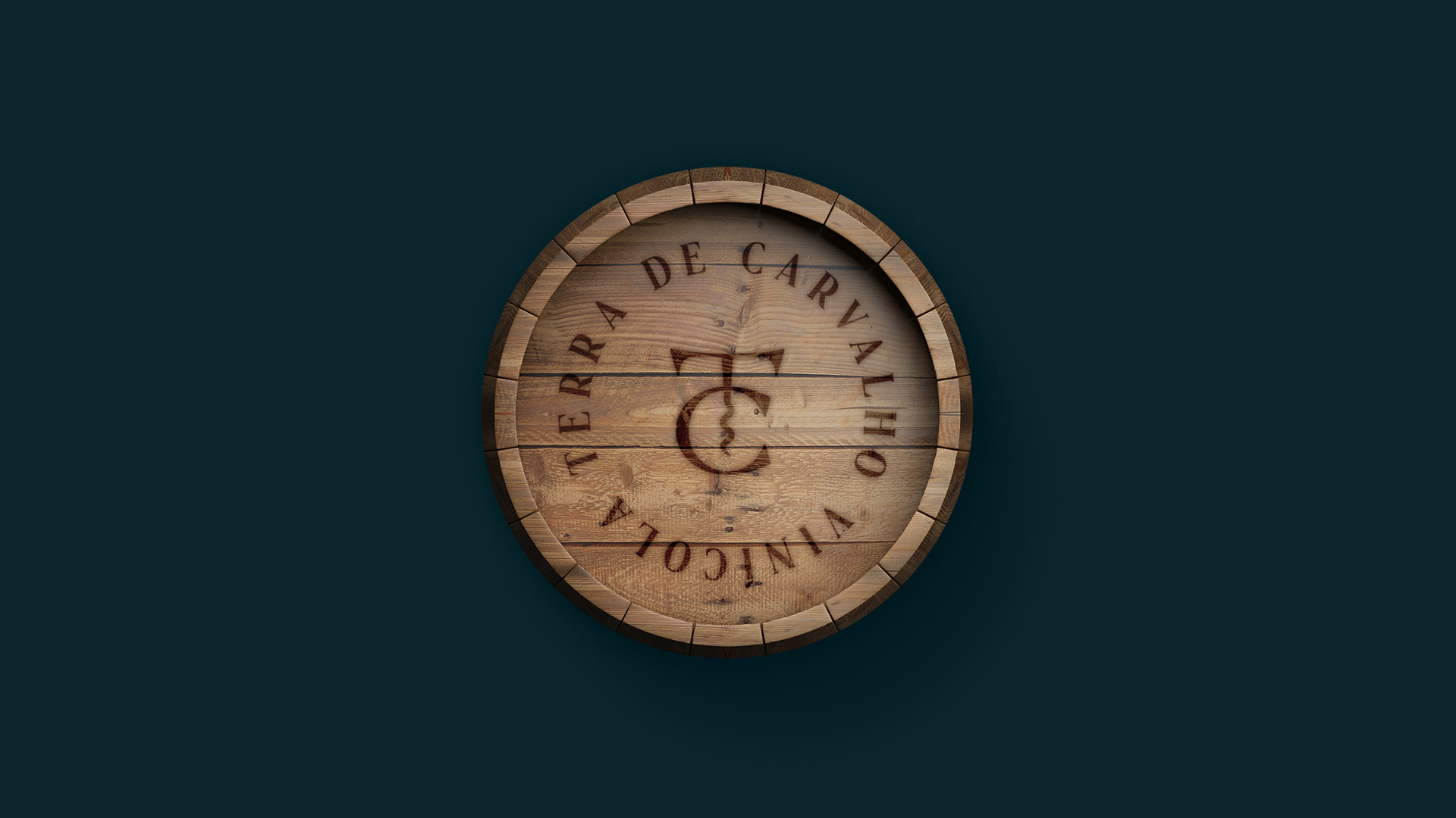
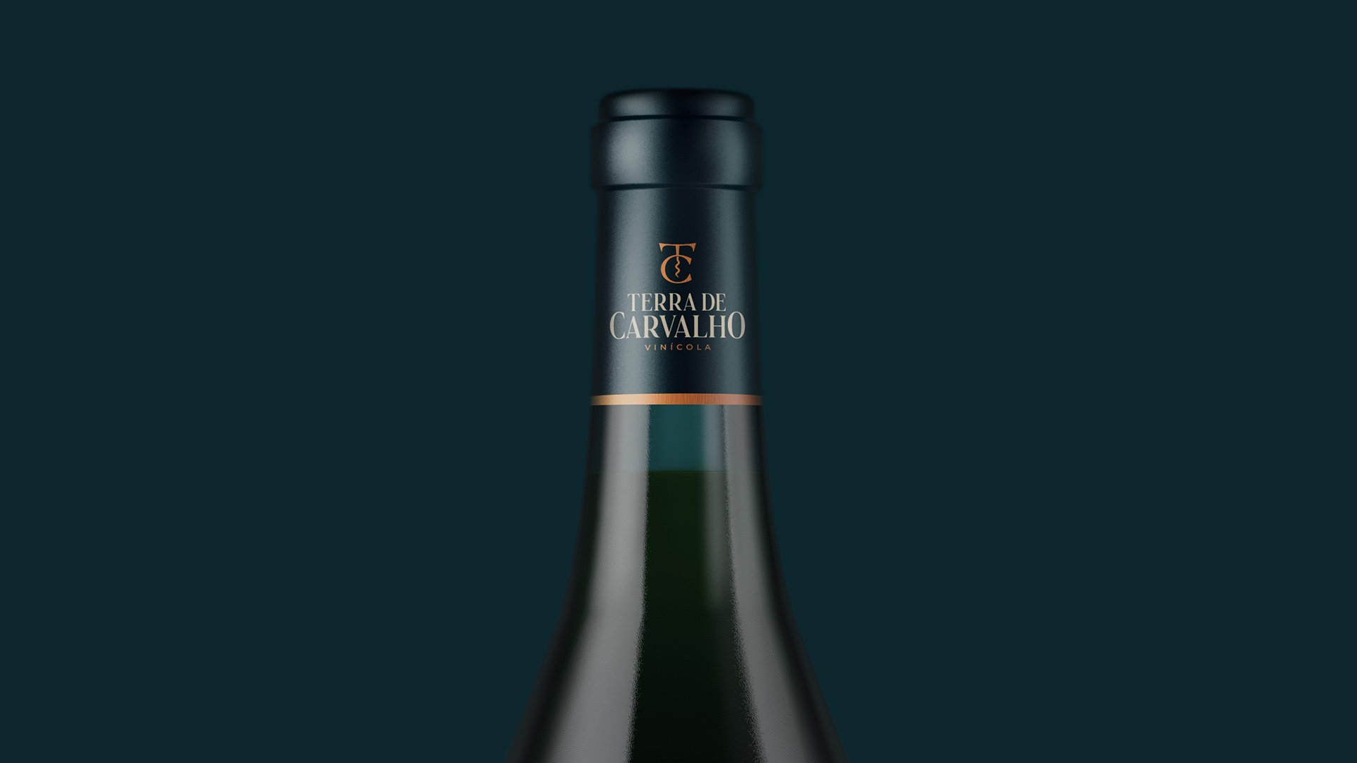
Brand applications: The brand will be applied in several places such as: winery facade, restaurant, stationery, wine packaging, menus, folders, gifts and gifts for customers, uniforms, social networks, website, among others.

CREDIT
- Agency/Creative: Lucas Coradi
- Article Title: Brand Identity for Terra de Carvalho Winery by Lucas Coradi
- Organisation/Entity: Freelance, Published Commercial Design
- Project Type: Identity
- Agency/Creative Country: Brazil
- Market Region: South America
- Project Deliverables: Brand Advertising, Brand Architecture, Brand Creation, Brand Guidelines, Brand Identity, Brand Refinement, Brand Strategy, Branding, Graphic Design, Identity System, Packaging Design, Tone of Voice
- Industry: Food/Beverage
- Keywords: brand, logo, winery, wine


