


Brand identity, strategies and packaging for a dark kitchen restaurant with asian-inspired dishes.
We create brands with purpose. Innovative brands that create trends with an effective communication, creative strategies and impactful designs.
We are a dark kitchen style restaurant with a menu based on fun and crazy Asian fusions. Our service is fast and simple, you can ask wherever you prefer.
We were born for everyone looking for something new to try. It doesn’t matter if you say konichiwa or hello, Takeshi has everything you are looking for to spend the moment with your family, friends or with that special person.
We bring the flavor! Our goal is to be the fastest and tastiest service you will find. Here, you will live an experience from the moment that you open your delivery.
Our main audience consists of young adults who are fans of Asian cuisine and dare to try new preparations; In addition, they look for brands that offer a complete experience for their group plans.
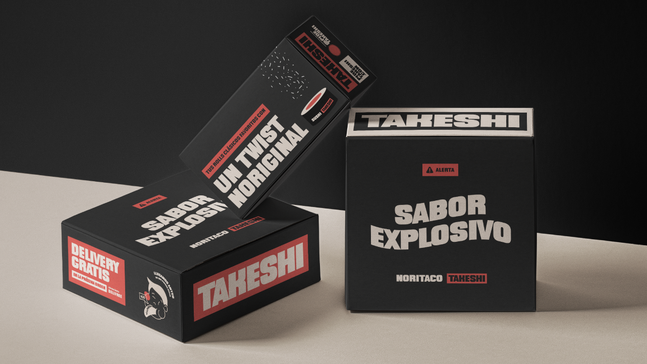
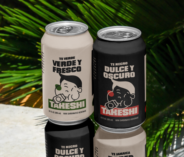
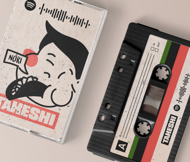
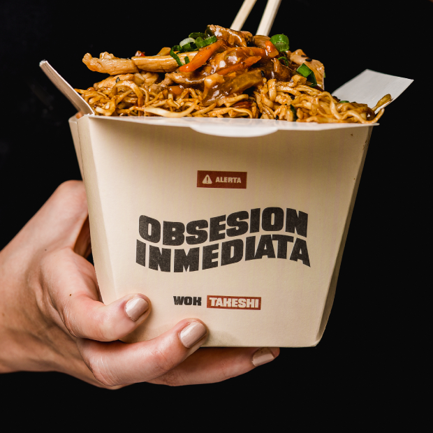
The branding is friendly, ingenious and ironically funny, especially with its packaging, which makes the arrival of each delivery feel exciting and unique. Takeshi’s identity uniquely combines illustrations and typographies with the colors that usually represent the world of asian cuisine, with a fun twist.
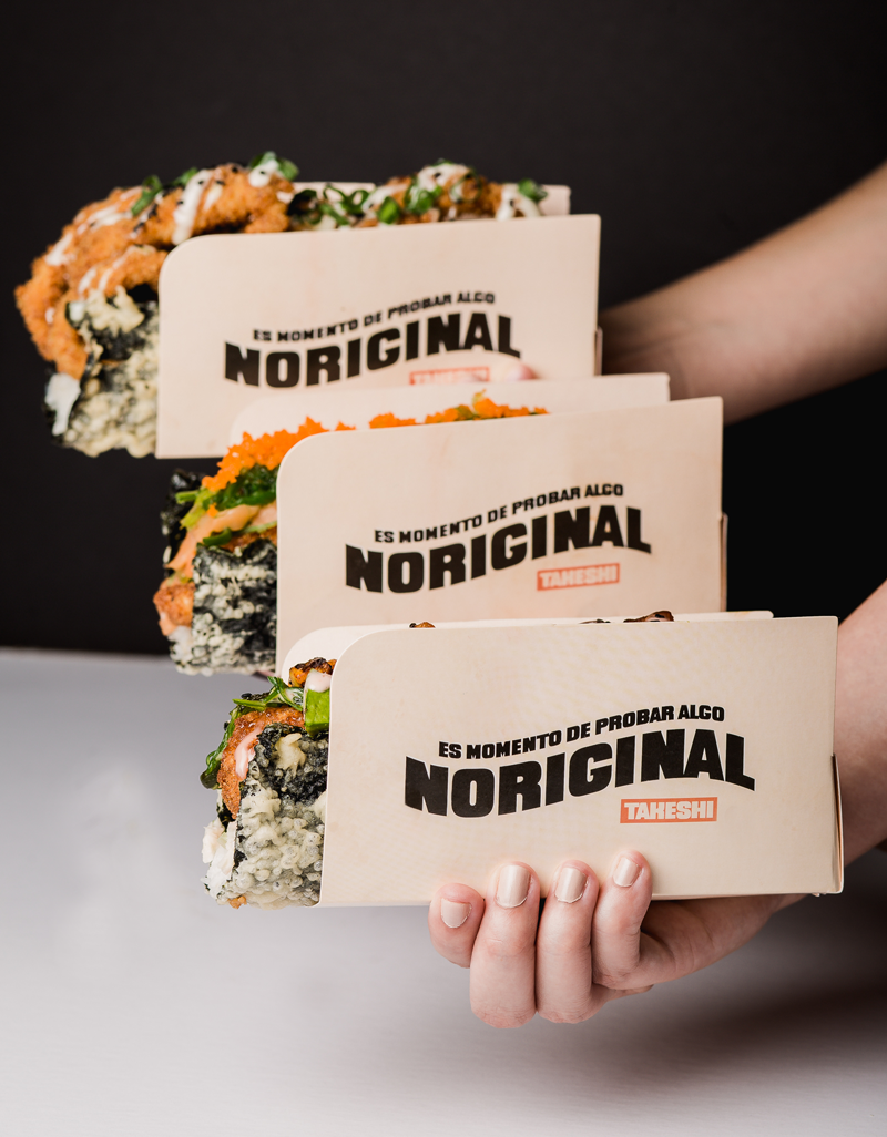
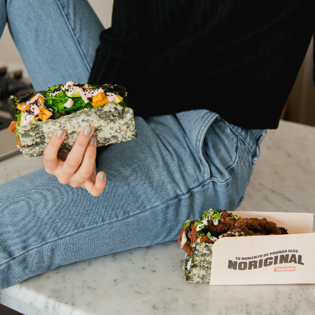
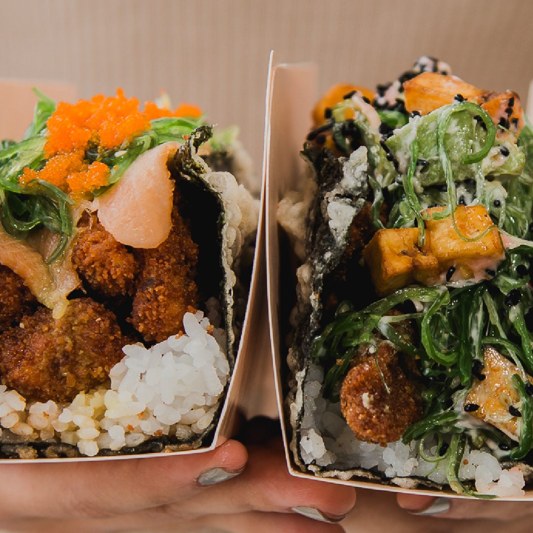
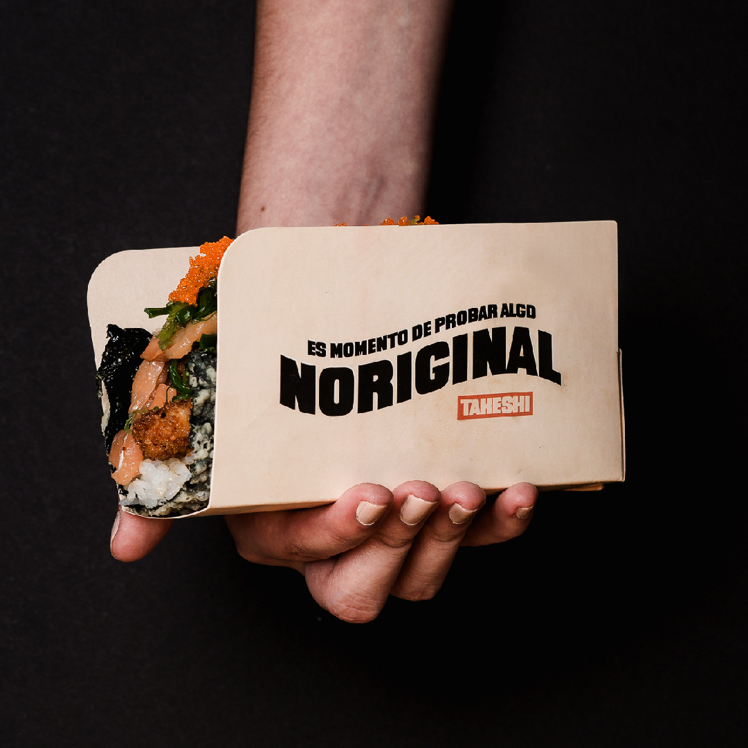
Taking into account our business model, the packaging in which the dishes arrives is the first physical contact with the brand that our customers will have; therefore, our packaging must be both iconic and functional, they should fill a need that customers do not yet know.
It is recommended to create packaging that allows directly access food and dressings to through attractive communicative messages.
Especially when we talk about the packaging of our Noritacos, who must facilitate the way in that our clients eat their preparations.
Given our business model, our delivery service should be the most functional and accessible possible; therefore, we suggest that Takeshi use all possible methods to make deliveries, with the aim of facilitating the service even more.


CREDIT
- Agency/Creative: The Brand Tag
- Article Title: Brand Identity for Takeshi Asian Restaurant by The Brand Tag
- Organisation/Entity: Agency, Published Commercial Design
- Project Type: Identity
- Project Status: Published
- Agency/Creative Country: Venezuela
- Market Region: South America
- Project Deliverables: Brand Advertising, Brand Architecture, Brand Creation, Brand Digital Design, Brand Experience, Brand Guidelines, Brand Identity, Brand Naming, Brand Strategy, Brand World, Branding, Graphic Design, Identity System, Illustration, Packaging Design, Photography, Product Naming, Research / Insight, Tone of Voice


