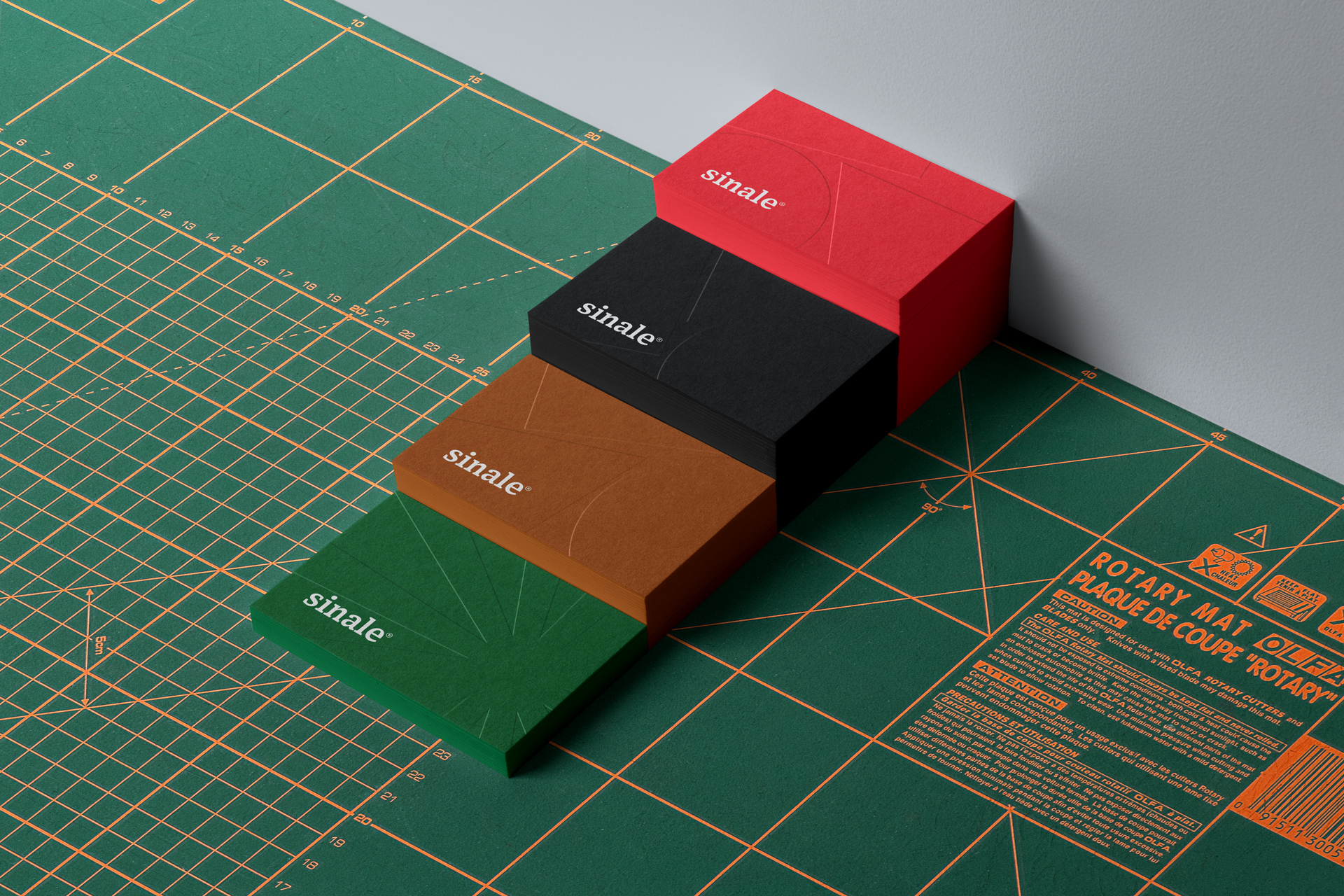
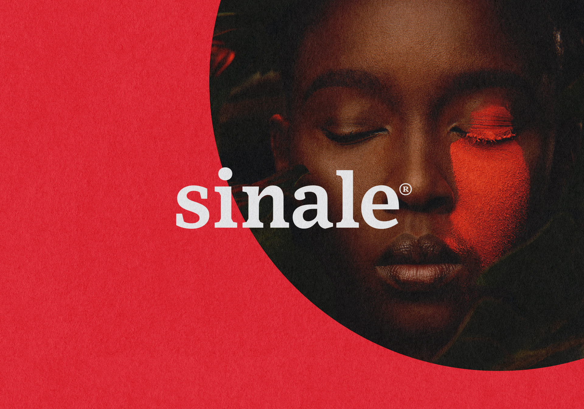
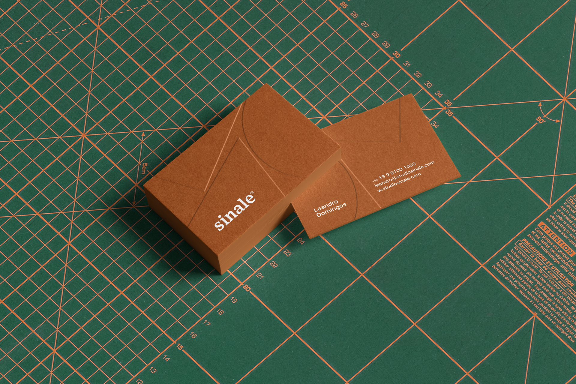
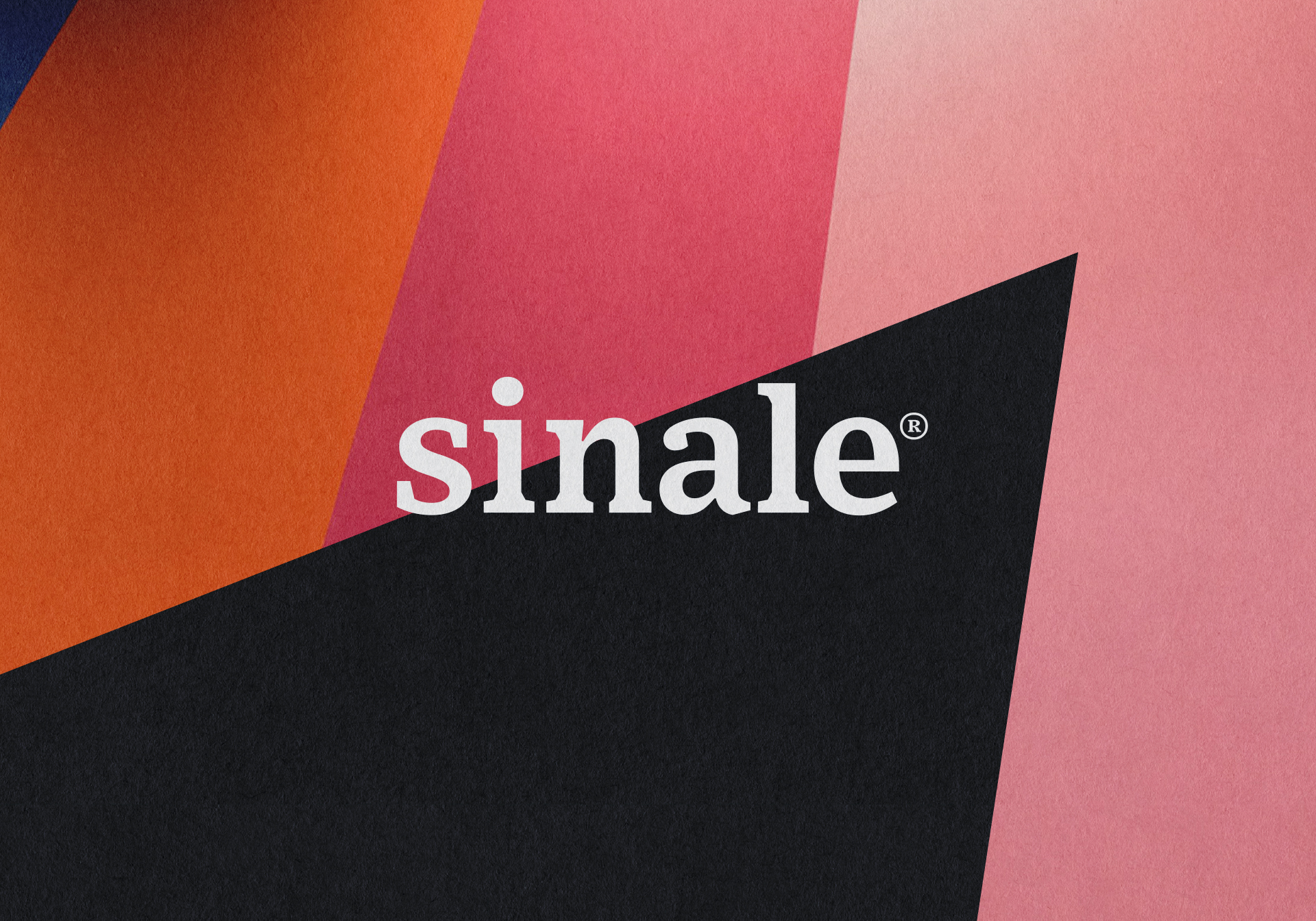
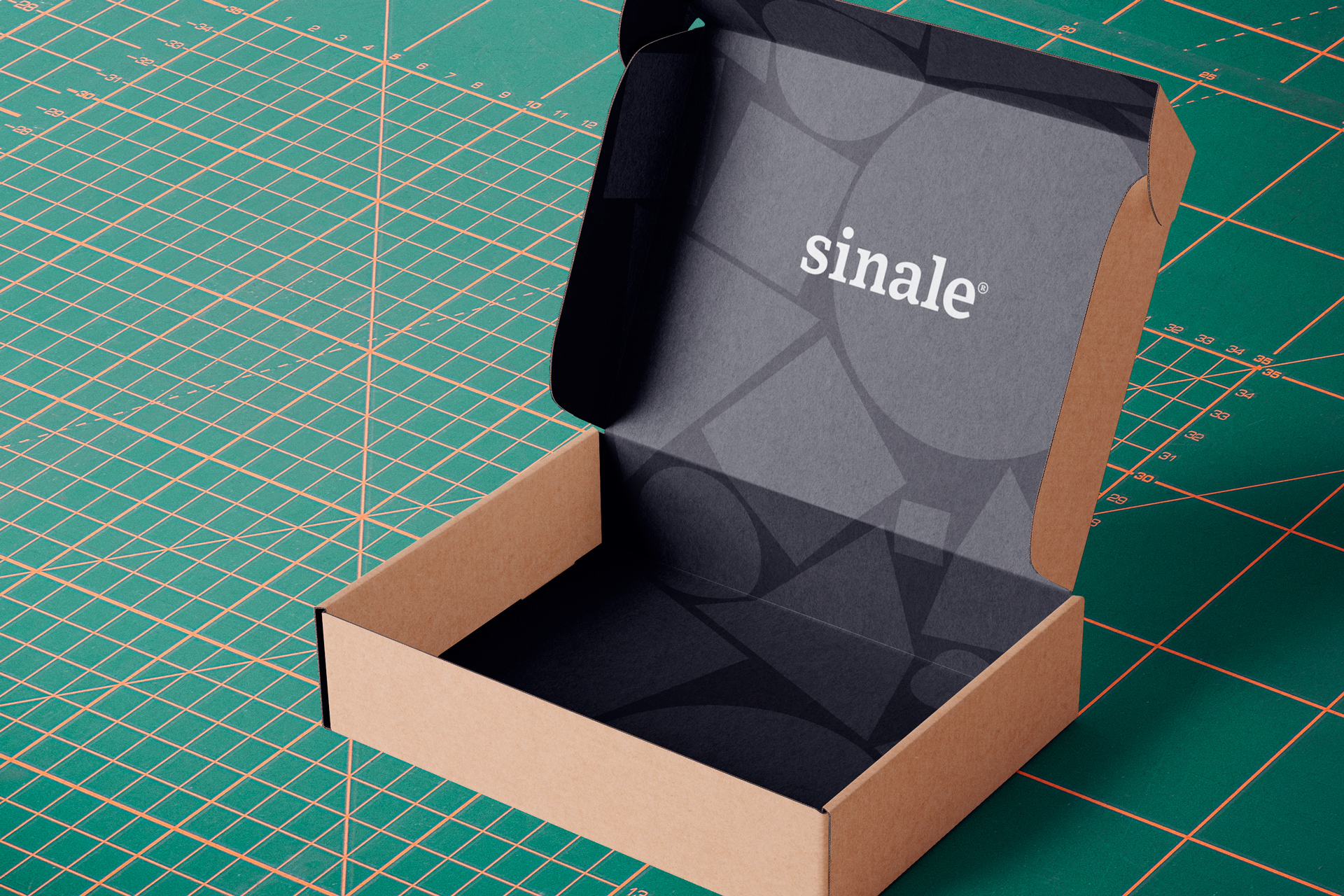
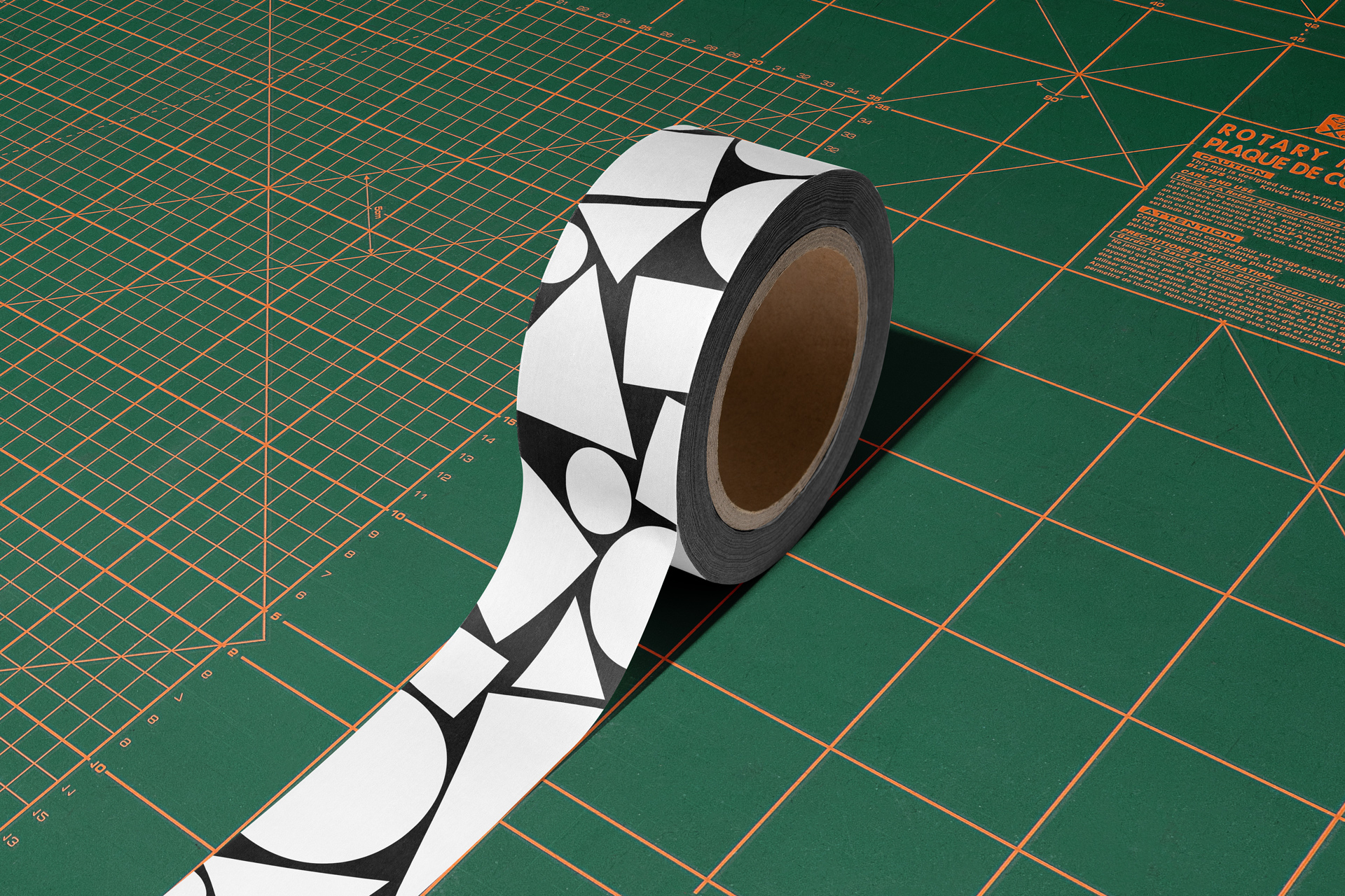
Sinale is a studio focused on Product Design, Wayfinding and Architecture. Its name comes from the Galician language which means sign. Sign in turn in semiotics uses visual signs with the intention of transmitting a message. The concept for identity is right there, using basic shapes, square, triangle and circle, together with images to always convey a different dynamic message.






CREDIT
- Agency/Creative: ADD Branding
- Article Title: Brand Identity for Sinale Studio by ADD Branding
- Organisation/Entity: Freelance, Published Commercial Design
- Project Type: Identity
- Agency/Creative Country: Brazil
- Market Region: South America
- Project Deliverables: Brand Identity, Brand Strategy, Graphic Design, Packaging Design
- Industry: Manufacturing
- Keywords: Architecture, color, illustration, shapes, square, visual signage
FEEDBACK
Relevance: Solution/idea in relation to brand, product or service
Implementation: Attention, detailing and finishing of final solution
Presentation: Text, visualisation and quality of the presentation


