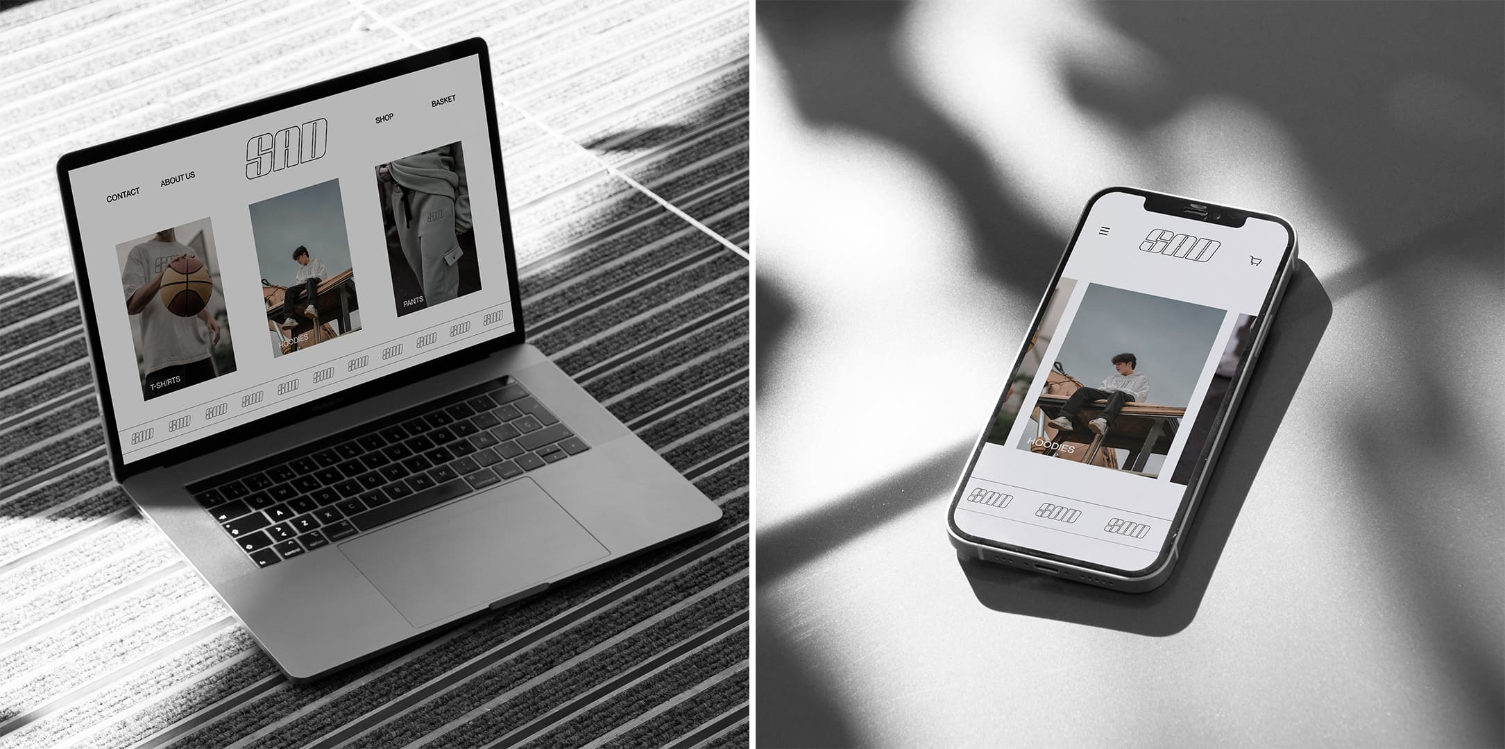
SAD no, it’s not about sadness, SAD stands for “attention to style”, a street style online clothing store in Uzbekistan, in the city of Tashkent. The target audience of the brand is young people, generation Z, so the logo was designed in the y2k style, which has become very popular among young people in recent years.
Although the logo and the corporate identity in general do not completely resemble the y2k style, because the y2k style has very bright, saturated colors, and the SAD uz corporate color is discreet, but still black and white color associated with street style.
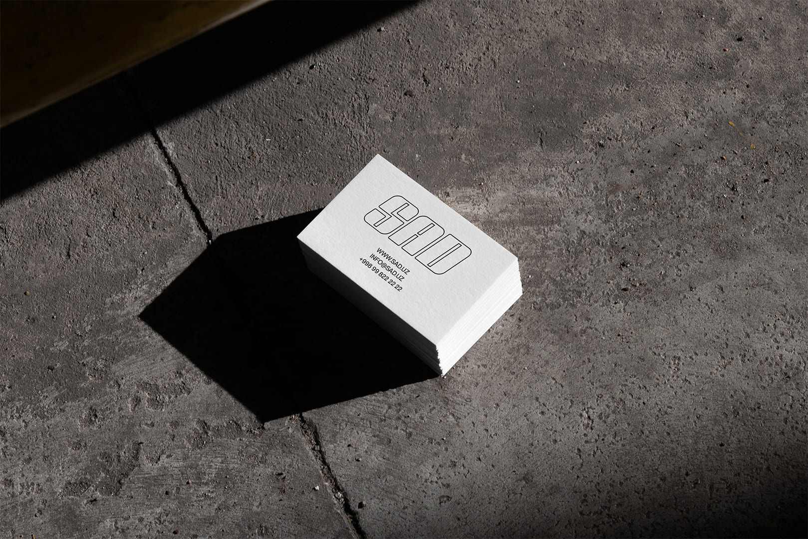
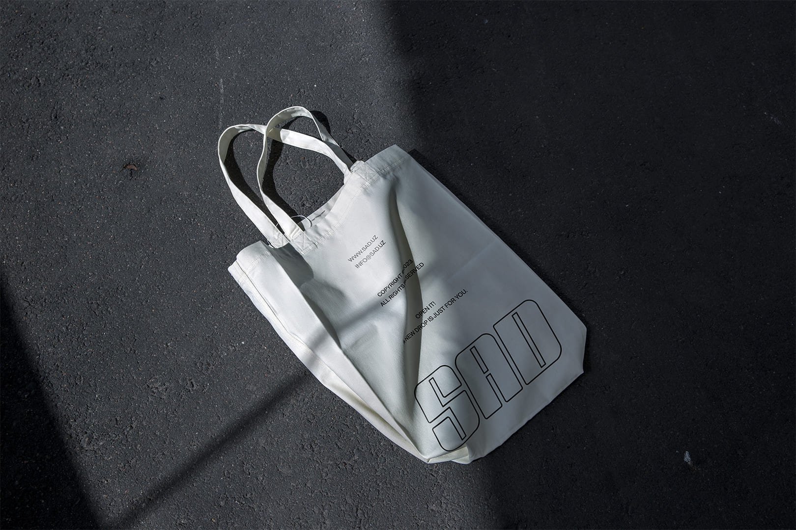
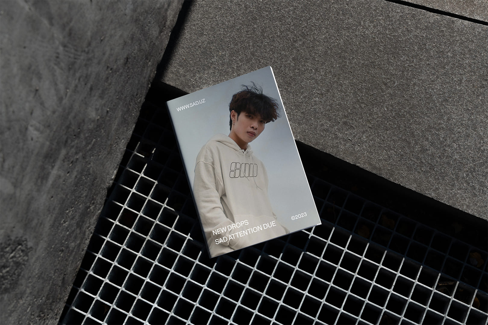
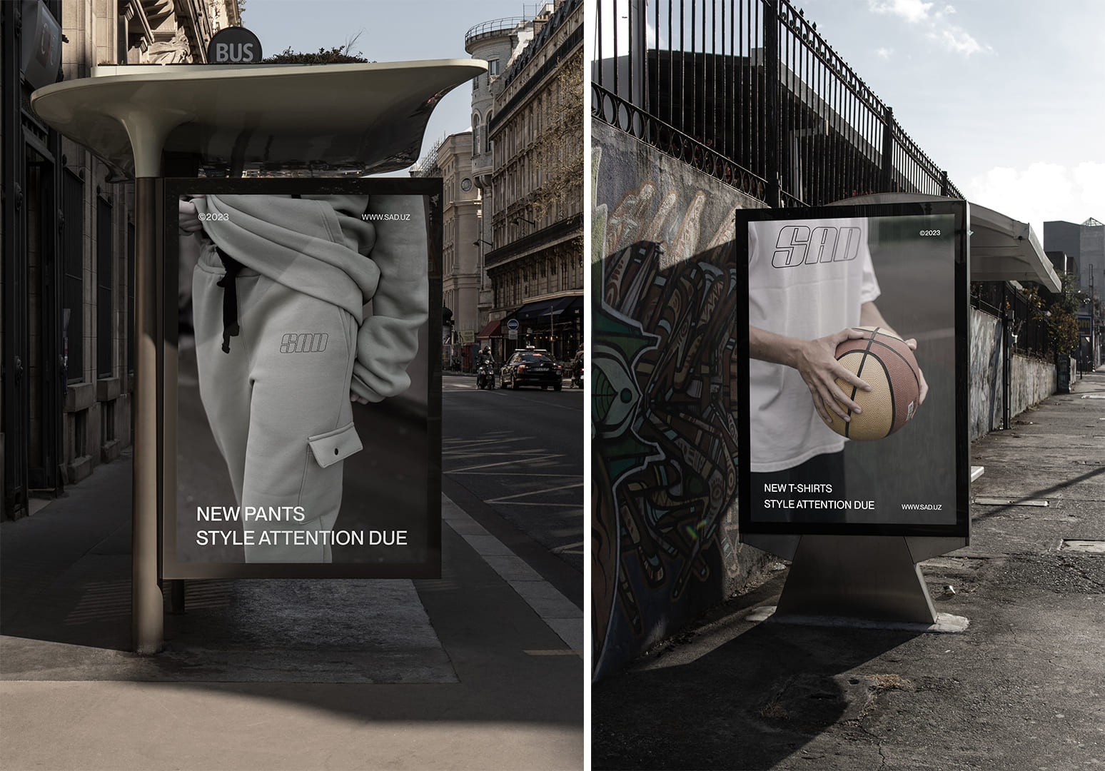
Since in the brand identity the main element is the logo, accordingly the logo is mainly placed in large sizes.
A neo-grotesque font was chosen as a corporate font, which is neutral and does not stand out too much, does not attract too much attention in the corporate style. Since the main thing in the SAD corporate identity is the logo.
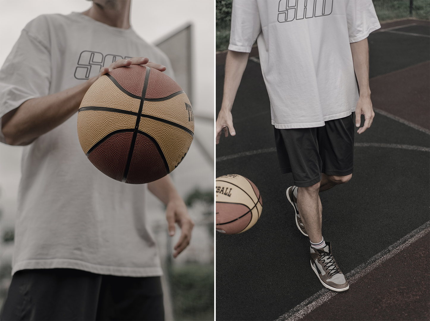
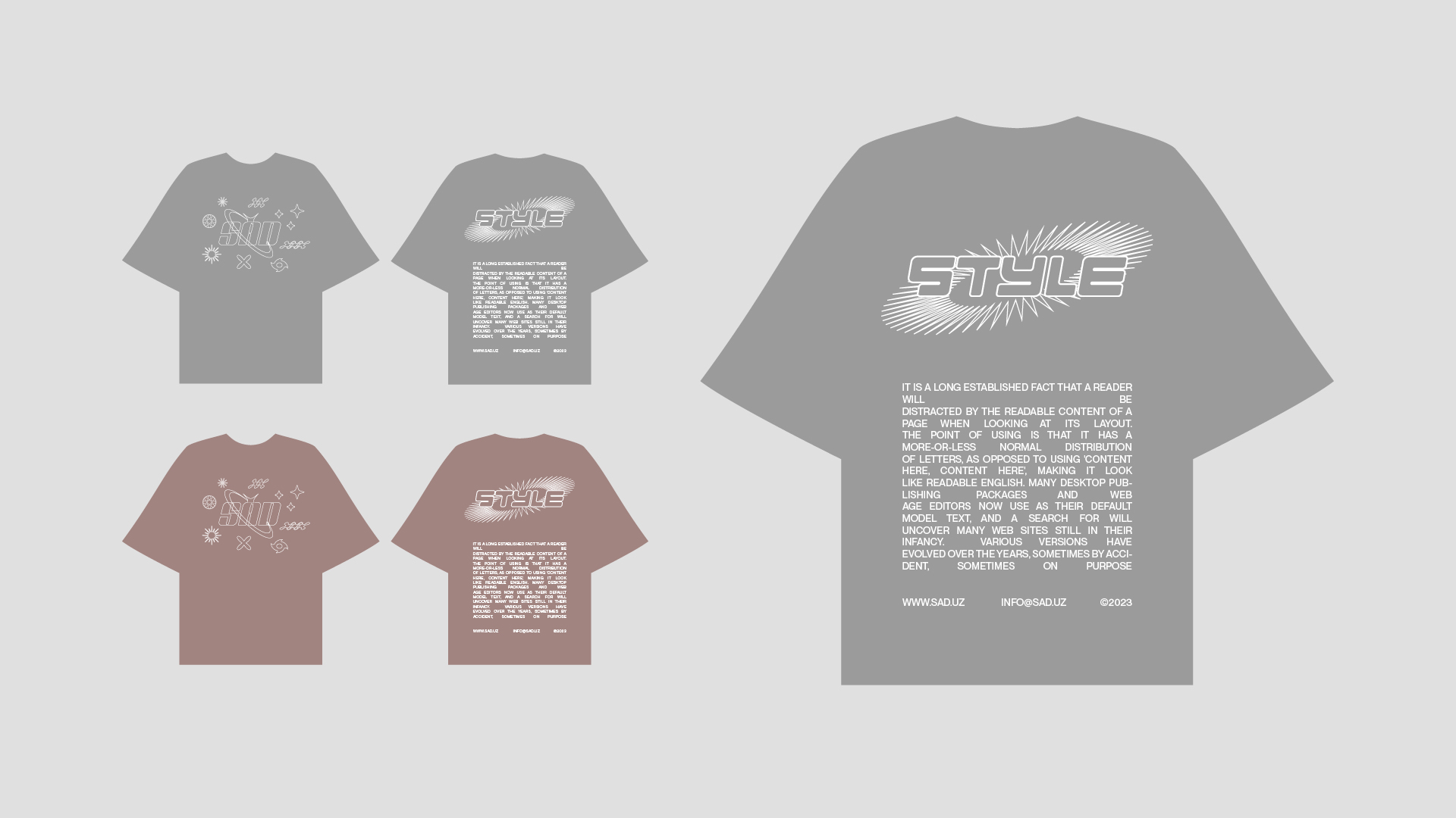
In order to sell a variety of products, SAD clothing may have prints consisting of a logo and icons in the y2k style. As an example, I myself tried to design a print and you can see it in vector t-shirts
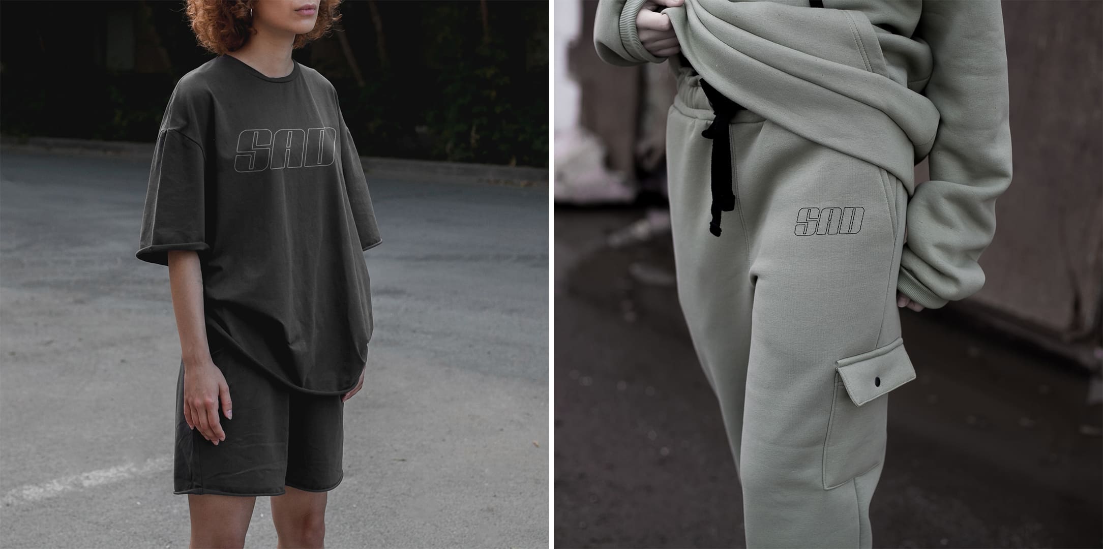
Also, corporate colors are not limited to black and white, streetwear can be made in different colors, but the colors are united by their common, unsaturated style.
The work is a concept, not a real order, but the brand for which the brand identity was developed exists.


CREDIT
- Agency/Creative: Fazliddin Ganiev
- Article Title: Brand Identity for SAD uz Streetwear Store in Tashkent
- Organisation/Entity: Freelance
- Project Type: Identity
- Project Status: Non Published
- Agency/Creative Country: Uzbekistan
- Agency/Creative City: Tashkent
- Market Region: Asia
- Project Deliverables: Brand Design, Brand Identity, Identity System, Logo Design
- Industry: Fashion
- Keywords: saduz identity logo
-
Credits:
Brand designer: Fazliddin Ganiev


