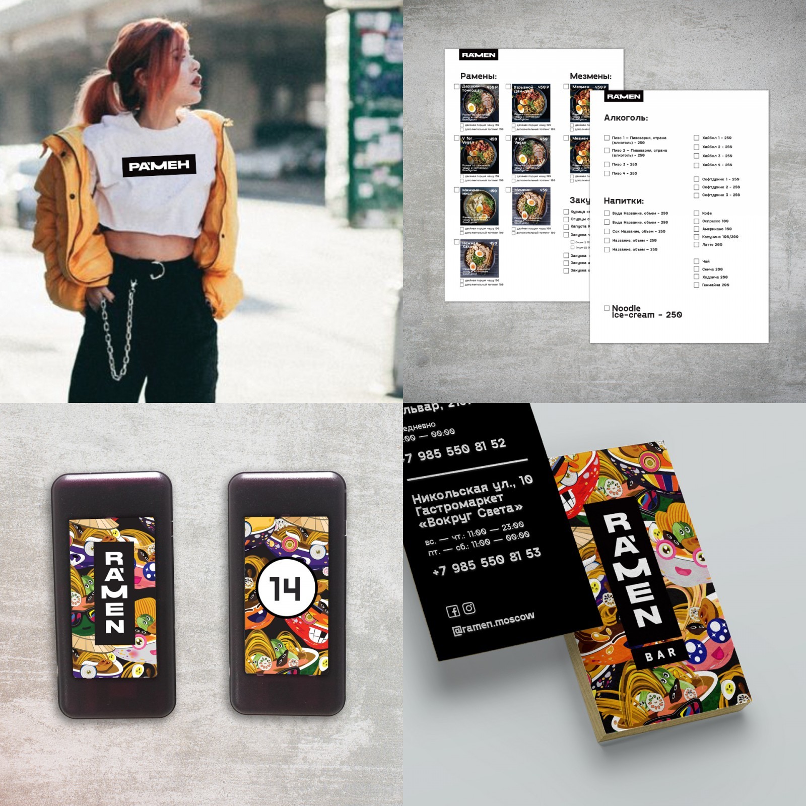
Task: The brand identity of the bar was supposed to convey its character: high quality product, fairly clean minimalistic interior, moderate democracy and all this without trying to portray authentic Japan. This strategy was supposed to distinguish RA’MEN from competitors that are often more traditional in character and communication and attract a core audience: young people 14-25 years old.
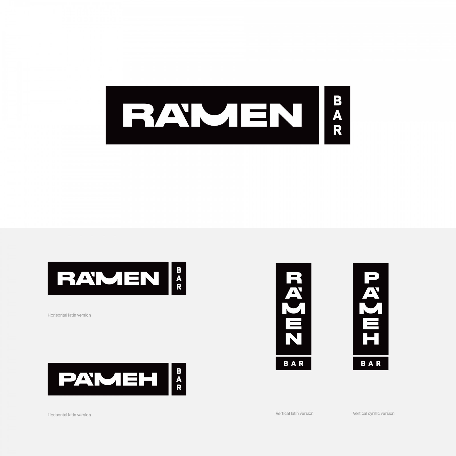
Ideas and Solutions: The logo is consciously solved with the help of a nuance intervention in the character of the original font, a specially drawn M is used, which has a reference to the shape of a bowl with a ramen and a nice hint of a smile and, to the right extent, refers to Japanese typography.This simple solution allows the logo to work in both Cyrillic and Latin.
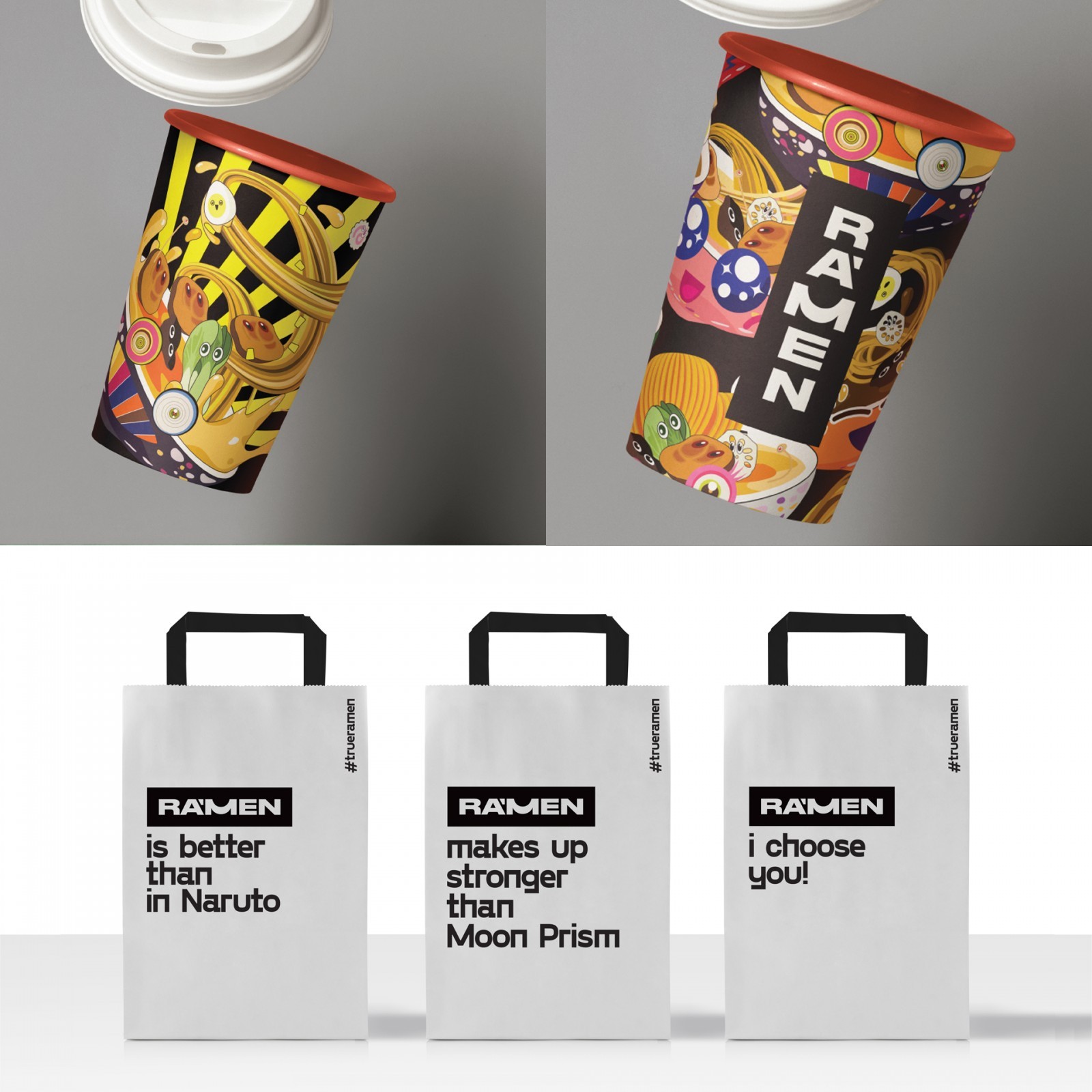
The design of the logo makes it easy to integrate the logo into the text set. Examples of such integration are branded paper bags with branded copyrights that refer to fragments of Japanese popular culture well known throughout the world.
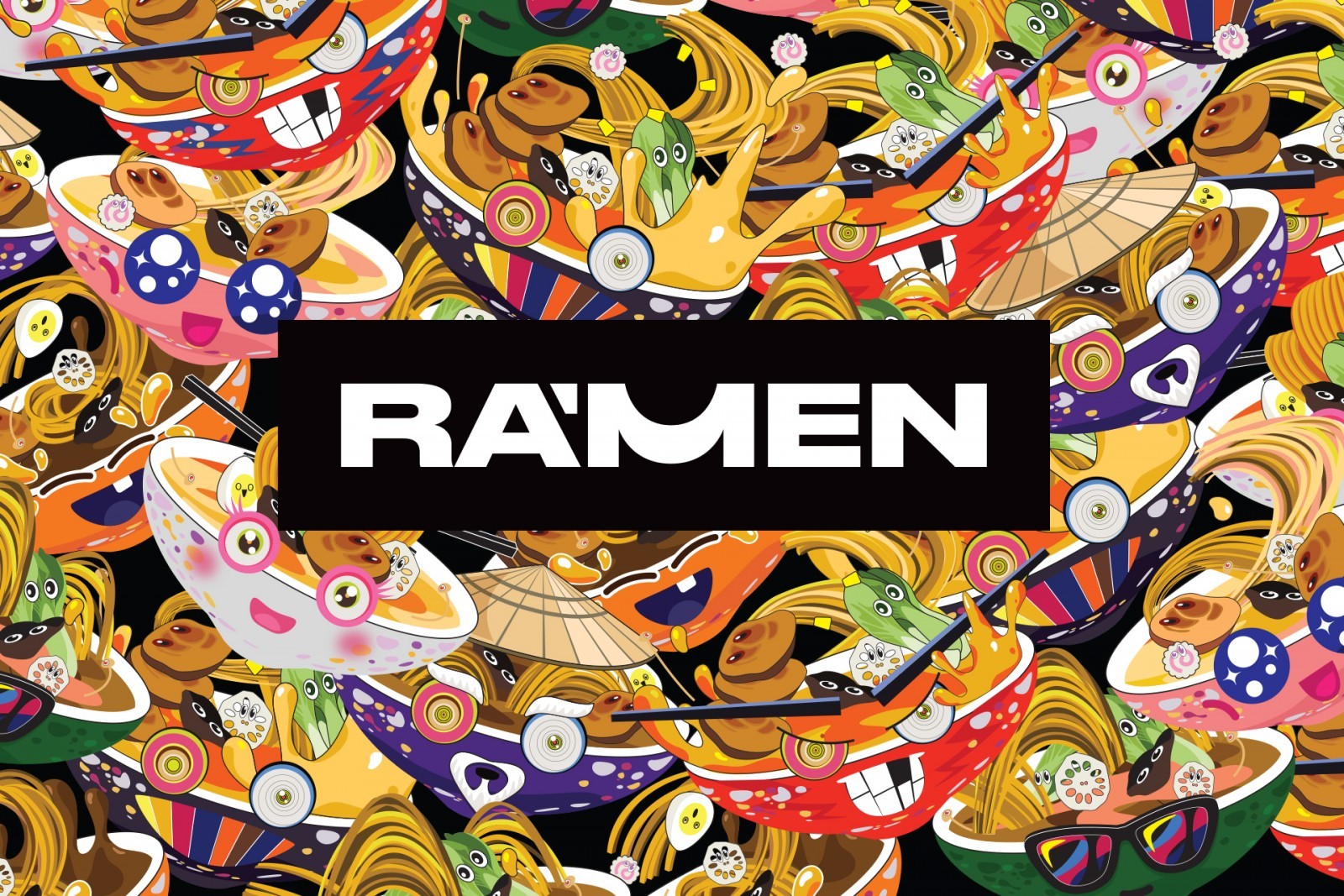
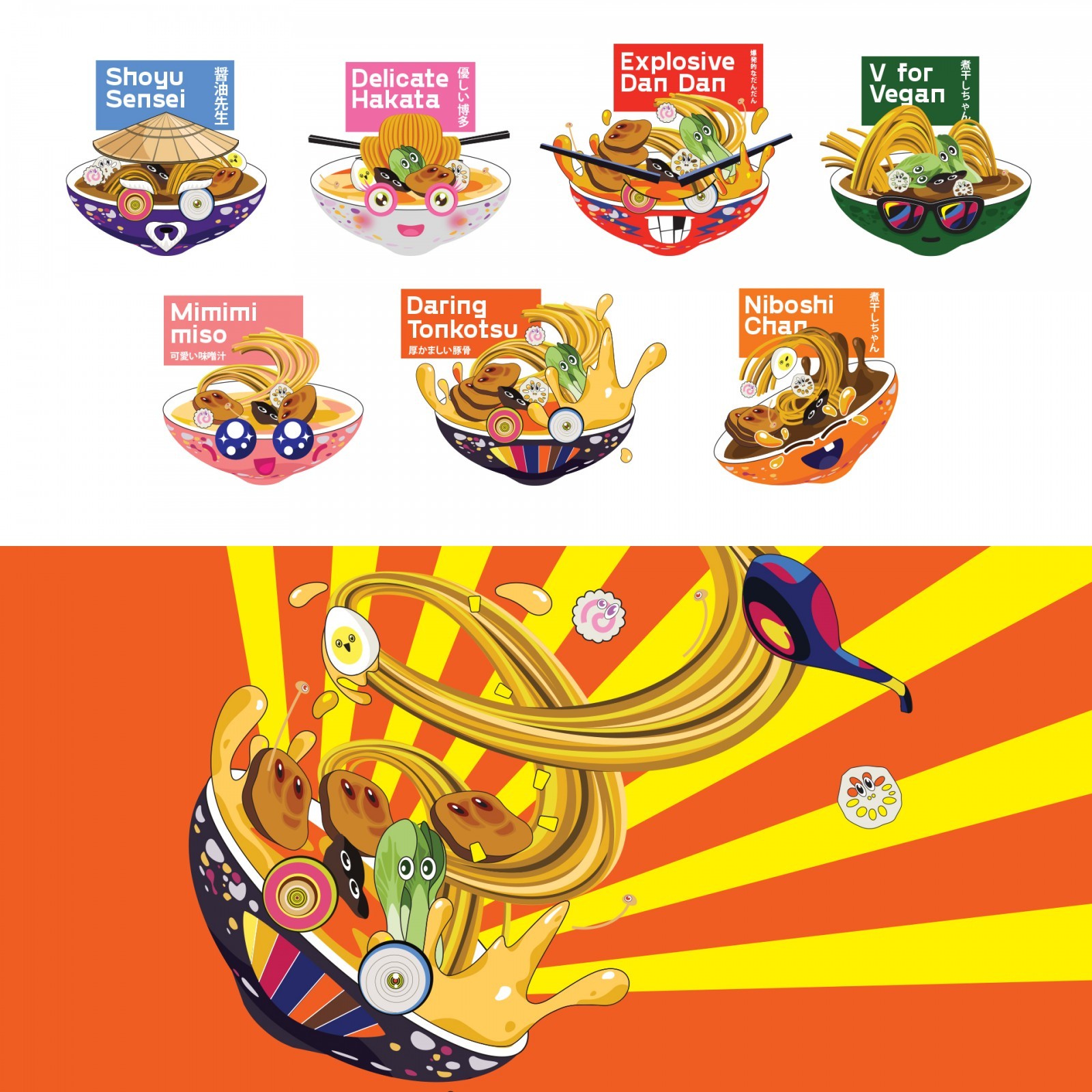
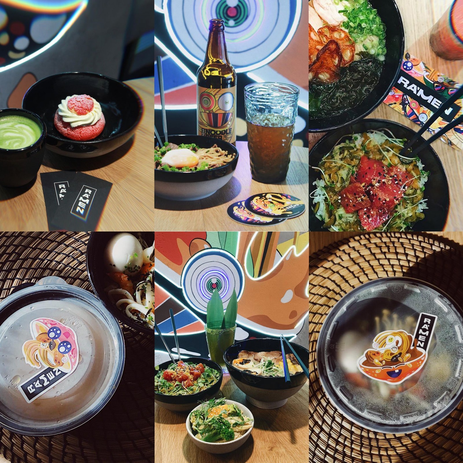
In order to maintain a discreet logo in communication, a system of bright corporate graphics has been developed. At the heart of the system is the decision of each ramen from the menu to come up with an individual memorable character that matches his taste and composition. Following the determination of the nature of the ramen, he came up with a name and developed a characteristic character. The graphics are inspired by Japanese pop art and particularly Takashi Murakami. Ramen characters are used both individually in different layouts and make up graphic filling formats.
CREDIT
- Agency/Creative: Vasiliy Khromov
- Article Title: Brand Identity for RA’MEN Bar by Vasiliy Khromov
- Organisation/Entity: Published Work - Identity - Brand Design Creation
- Project Status: Published
- Keywords: WBDS Creative Design Awards 2020/21


