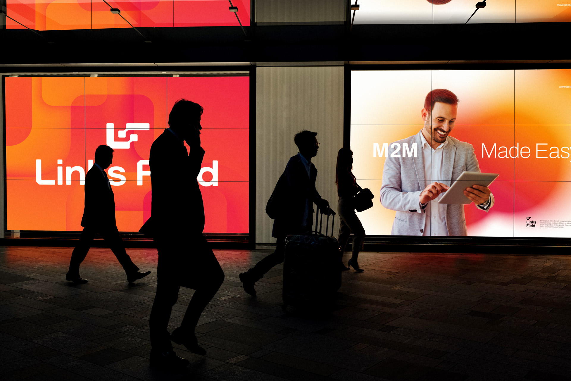
Links Field is a Chinese multinational with offices in more than 10 countries, and its purpose is to make using Internet of Things connectivity easier. The company focuses on the growing world of IoT, seeking to innovate the way “things” connect, facilitating the expansion of various markets, such as vehicle telemetry, industry 4.0, smart cities, among others.
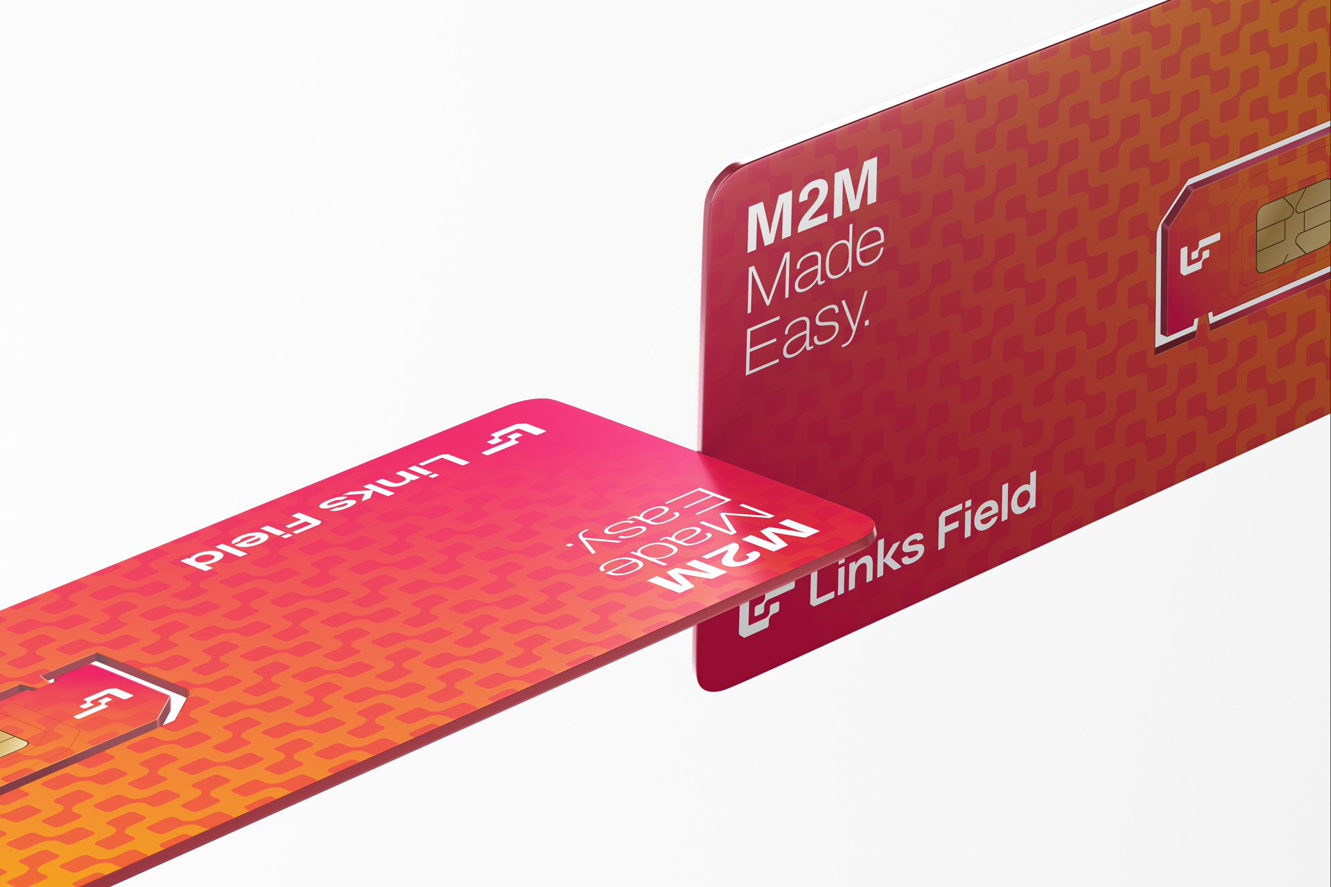
With this redesign, the company sought a brand that symbolized connectivity, with a unique, modern and lasting design, attributes that the old brand did not have. So, the first step was to think of graphic elements that somehow managed to convey the idea of connection. This thought should definitely be present graphically in the brand. In addition, we have the SIM Card as the main physical reference of the product that the company offers, and it would be challenging and interesting to also have this representation in the design of the brand.
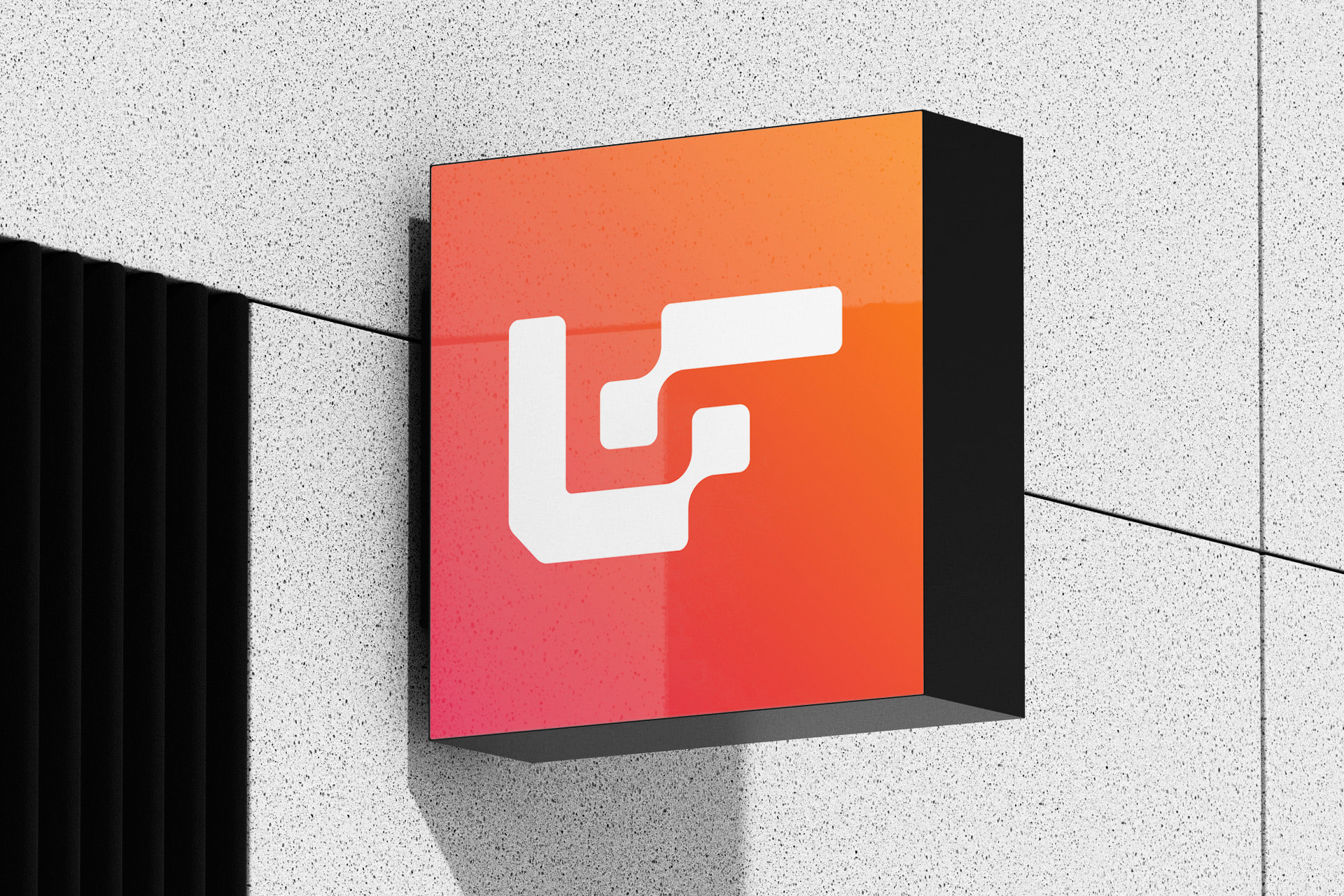
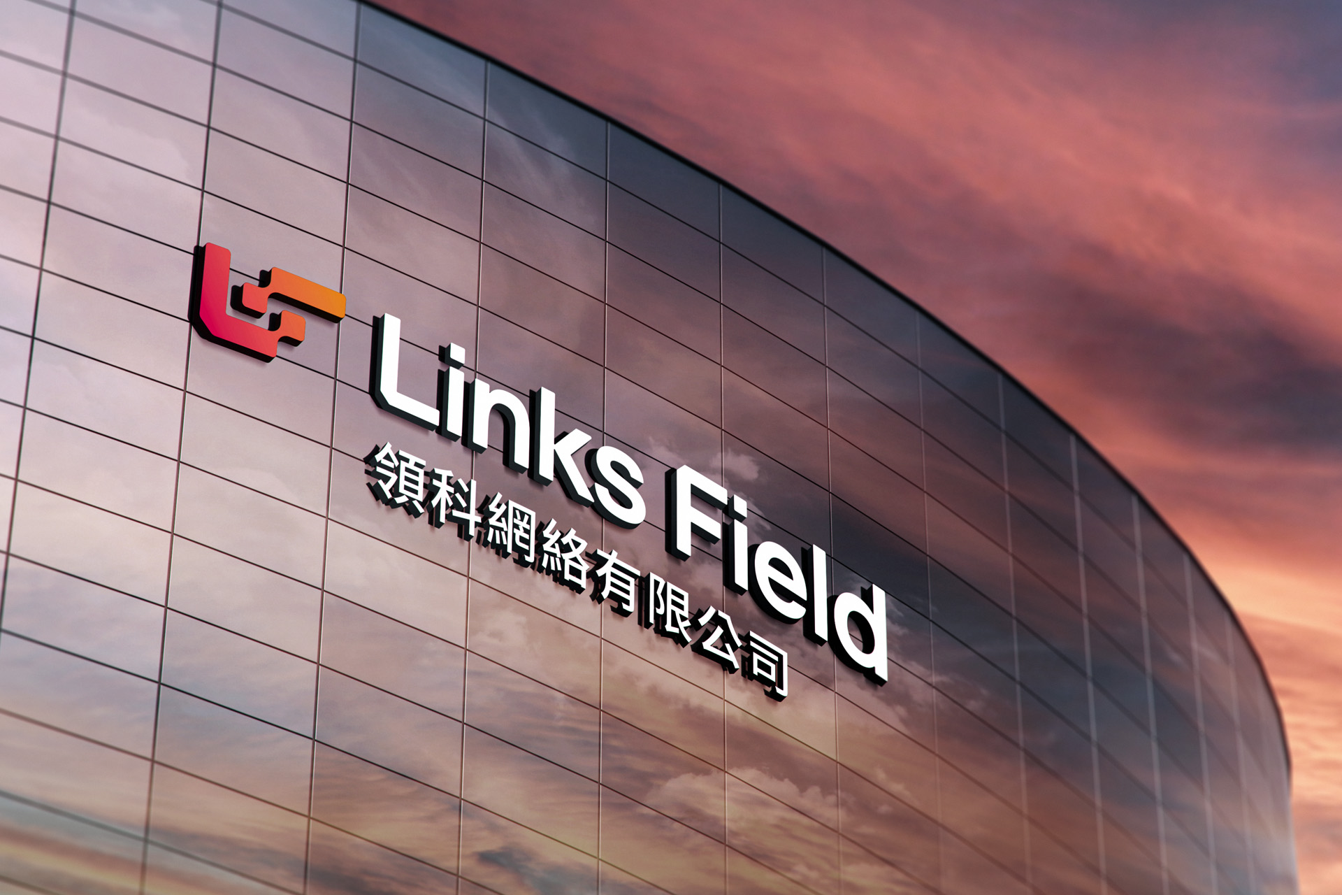
The solution was to create a symbol with the brand’s initials (LF) that would refer to connectivity (dots joining together) and also to the sim card (cut at 45 degrees). The typography was designed exclusively for the brand with cuts in the initials (sim card), rounded corners and the geometric letter K, bringing more personality to a sans serif that aims to be neutral and timeless. 3 typographic families were also defined to be used as support typography in the company’s institutional materials, one for English (and over 200 other languages), one for Simplified Chinese and another for Traditional Chinese.
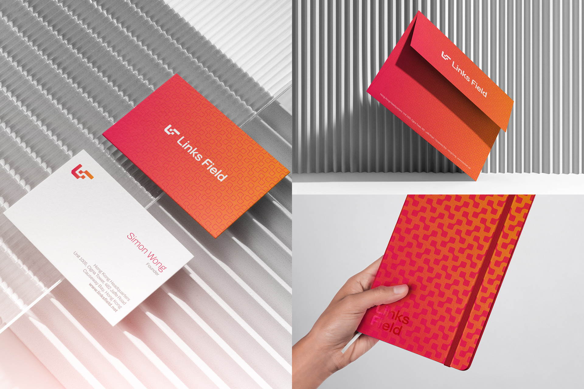
The brand’s colors, red and orange, were chosen to represent the colors present in the flag of China, and a way of using gradient colors with a predefined angle of 45 degrees was also defined. To complement the chromatic palette, there’s blue, white and gray colors also.
From the simplification of the symbol, a repeating graphic element was constructed that was used as a background in some institutional materials, such as business cards, envelopes and even the SIM Card.
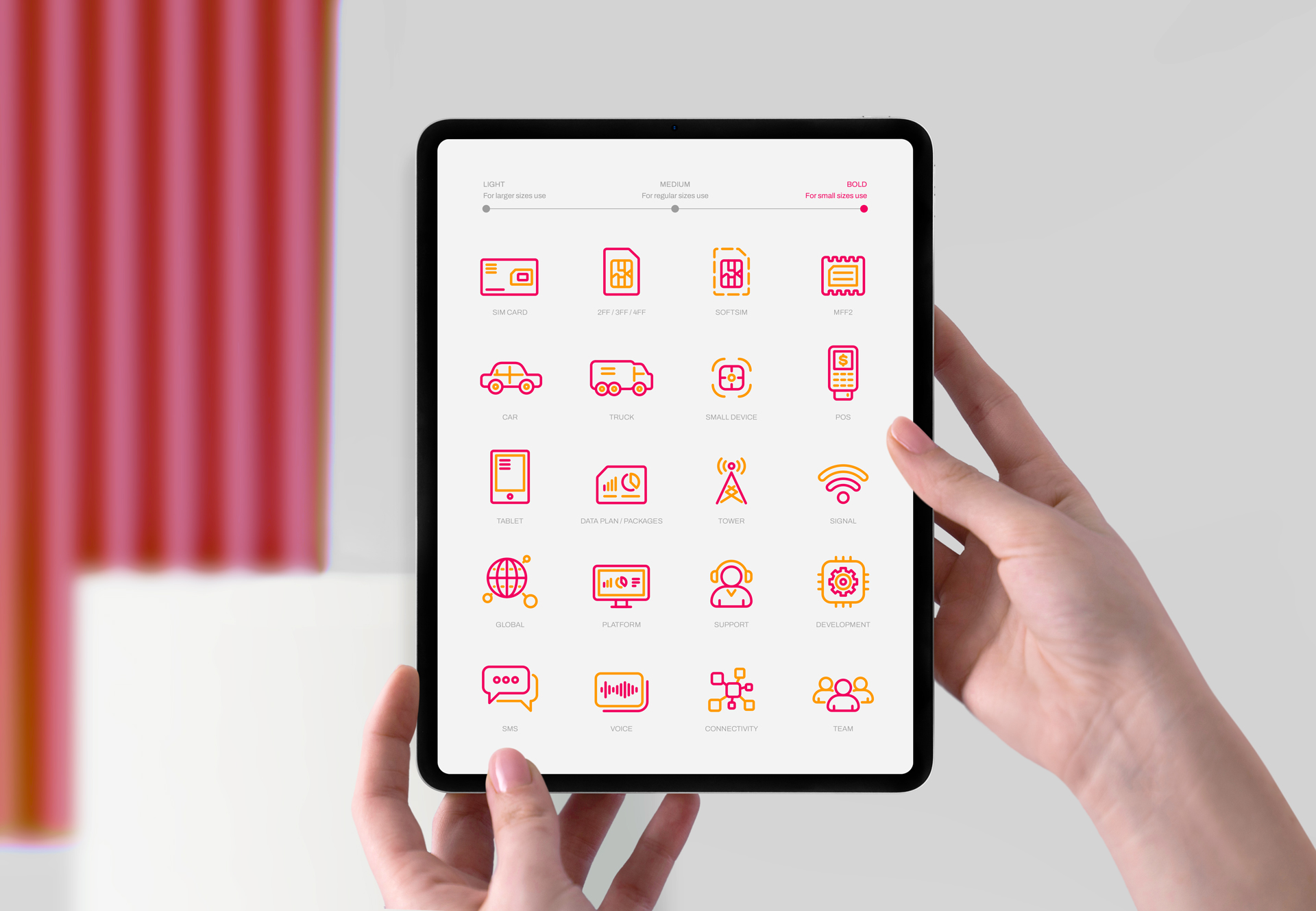
To make the construction of company presentations easier, a custom iconography family was created. There are 18 icons that represent different subjects of the company’s daily life and each one of them was created in Light format (for use in large size), Medium (for use in regular size) and Bold (for use in small size). A family of sub-brands was also created for the company’s products, which are: Flexi, Duo, Go, Go+, SoftSIM, Omni and One.
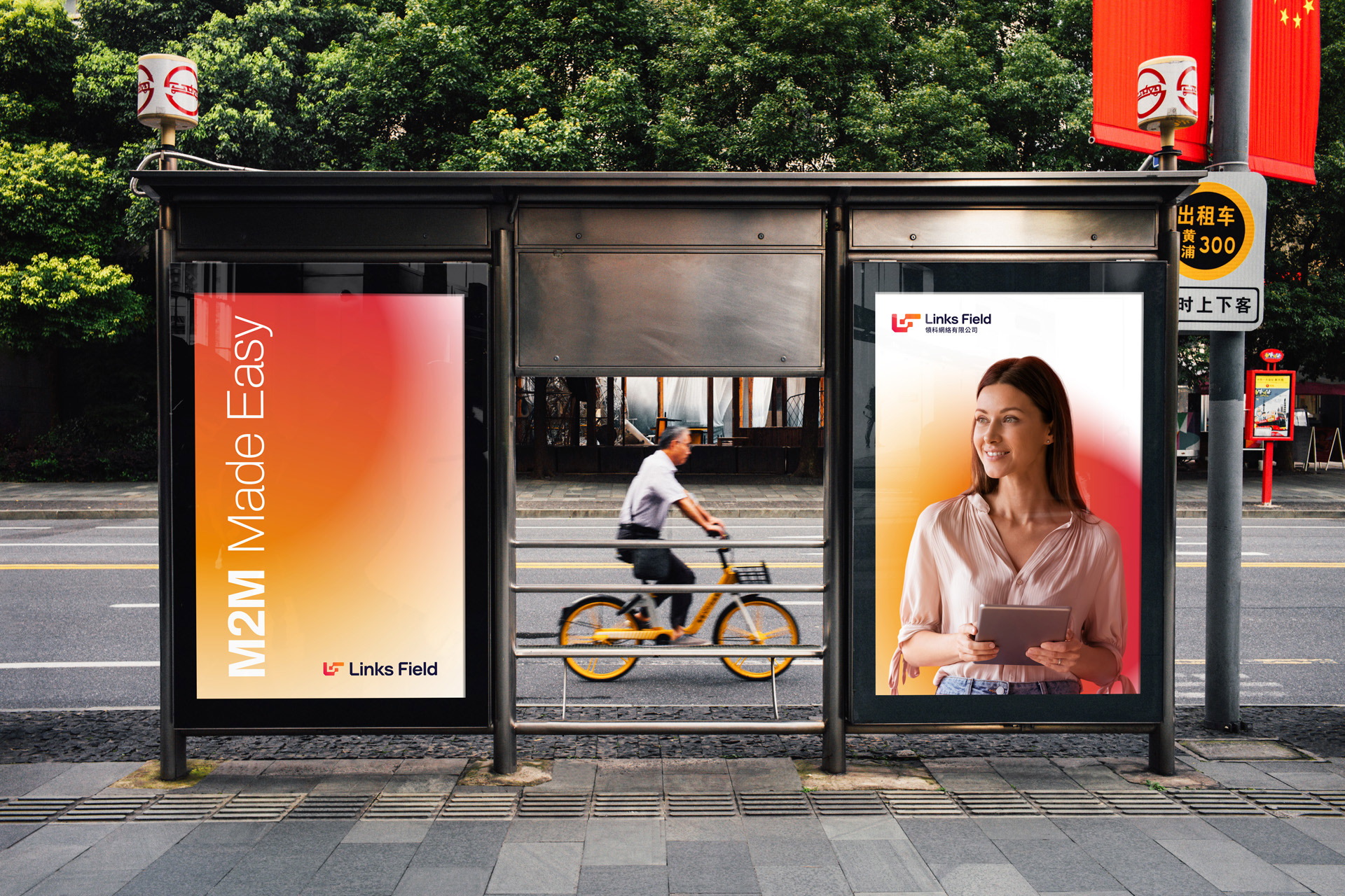
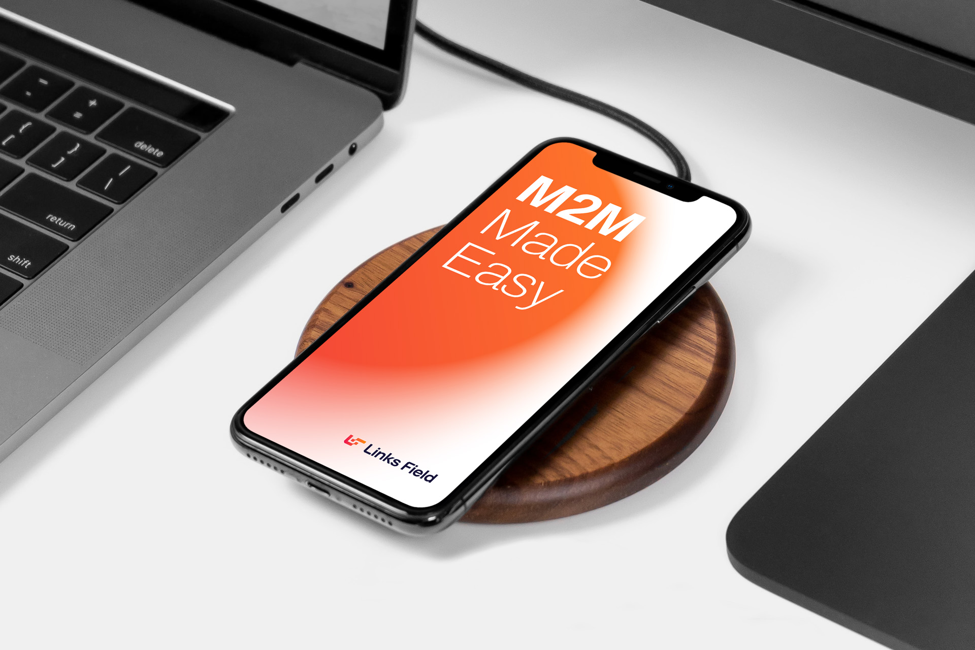
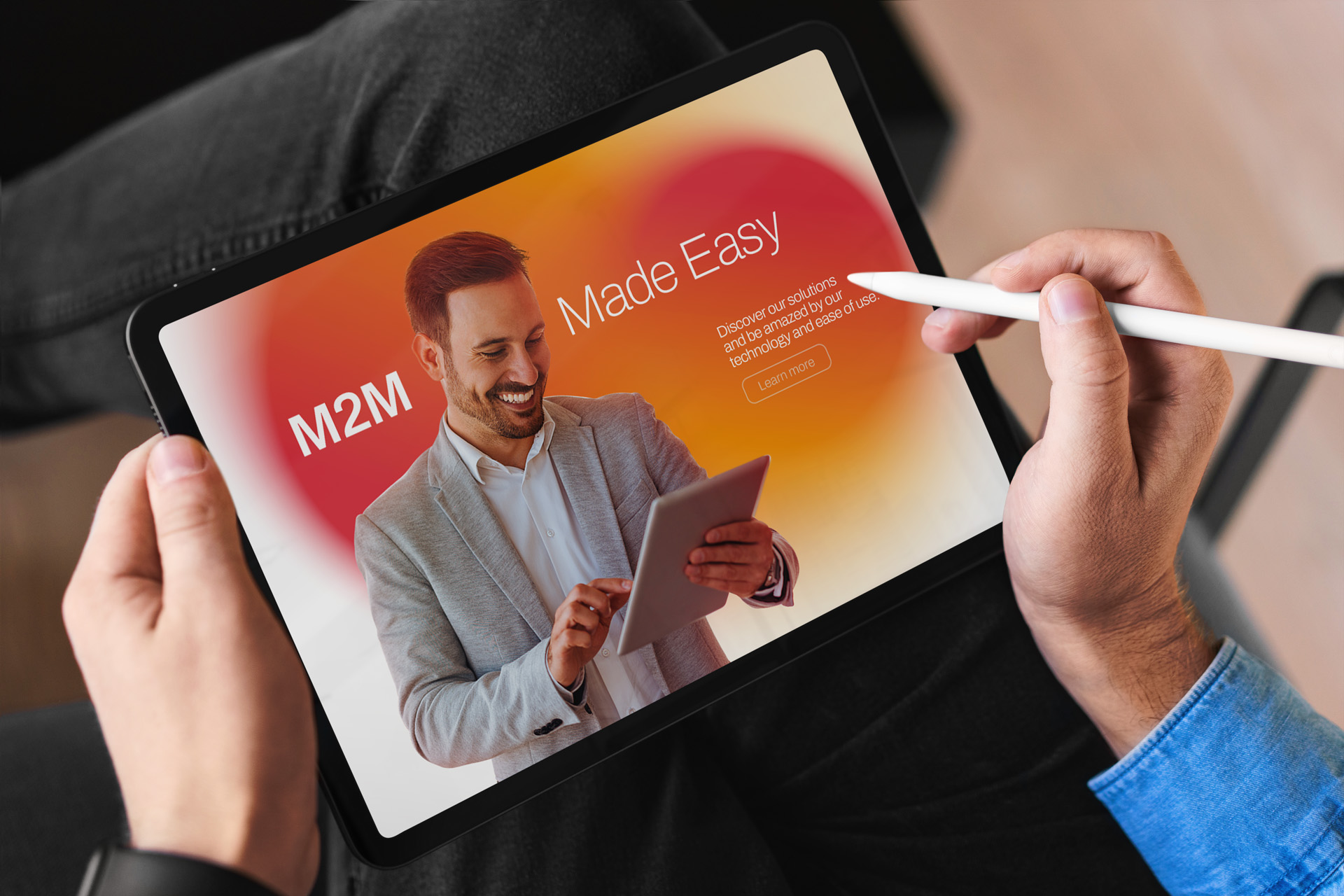
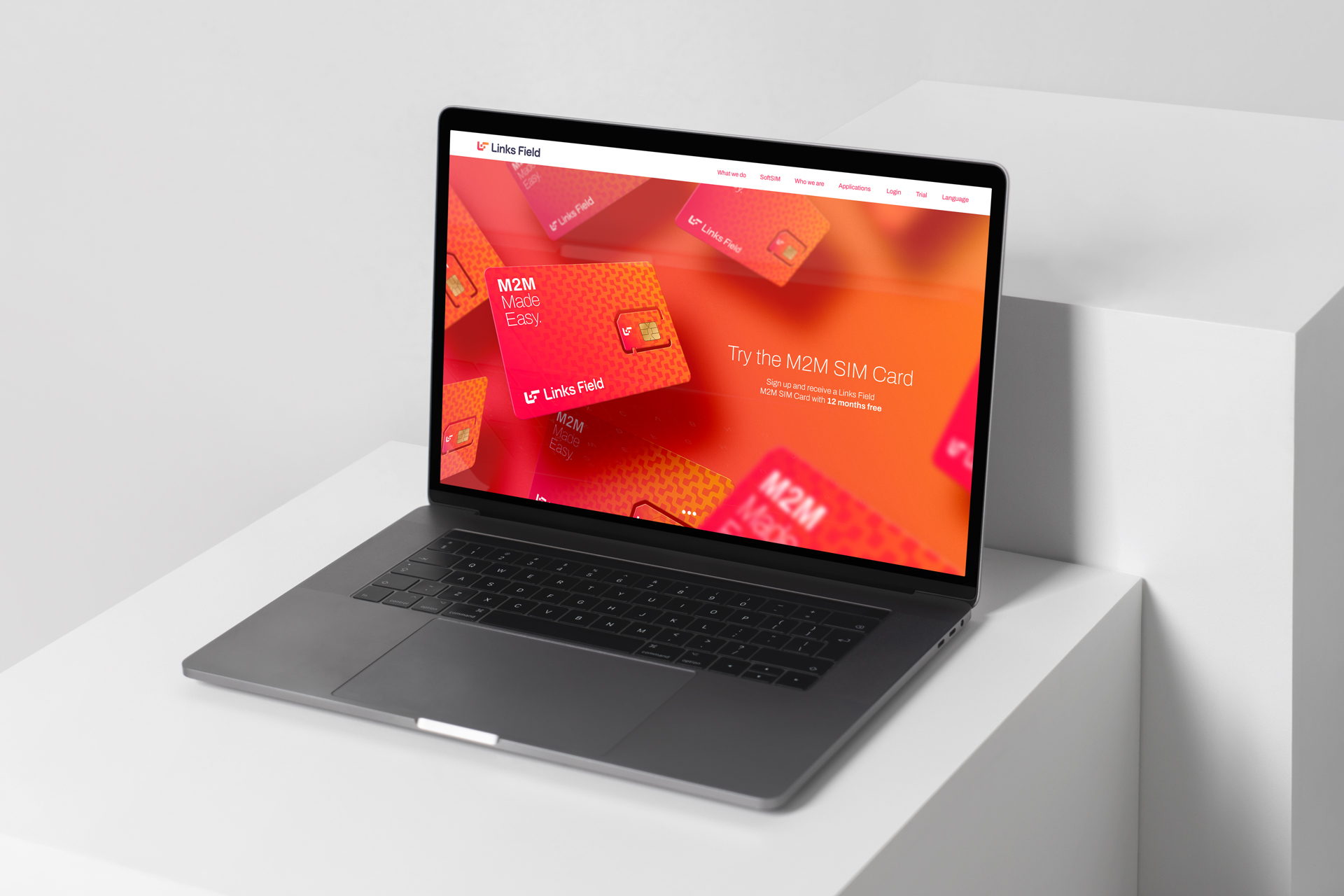
After building the entire identity, the new site layout was created, adapting this new visual language to an structure already used. Some promotional banners were created for the home of the website, and some layouts were derived from this material for ideas for physical applications, such as OOH.
Among the applications proposed for a new identity for the company, there are: complete stationery material, gifts, layout for presentations, website layout, campaign key visual, SIM Card layout and so on.
CREDIT
- Agency/Creative: Lucas Coradi
- Article Title: Brand Identity for Links Field Designed by Lucas Coradi
- Organisation/Entity: Freelance
- Project Type: Identity
- Project Status: Published
- Agency/Creative Country: Brazil
- Agency/Creative City: Campinas
- Market Region: Global
- Project Deliverables: Brand Creation, Brand Design, Brand Guidelines, Brand Identity, Brand Redesign, Branding, Graphic Design, Icon Design, Logo Design, Product Design, Rebranding, Type Design, Typography, Web Design
- Industry: Technology
- Keywords: china, chinese, connection, connectivity, innovation, internet of things, IoT, m2m, simcard, technology, logo, branding.
-
Credits:
Creative Director / Designer: Lucas Coradi
Presentation and Motion Graphics: Yago Ferreira
Motion Graphics: Gabriel Kazuo


