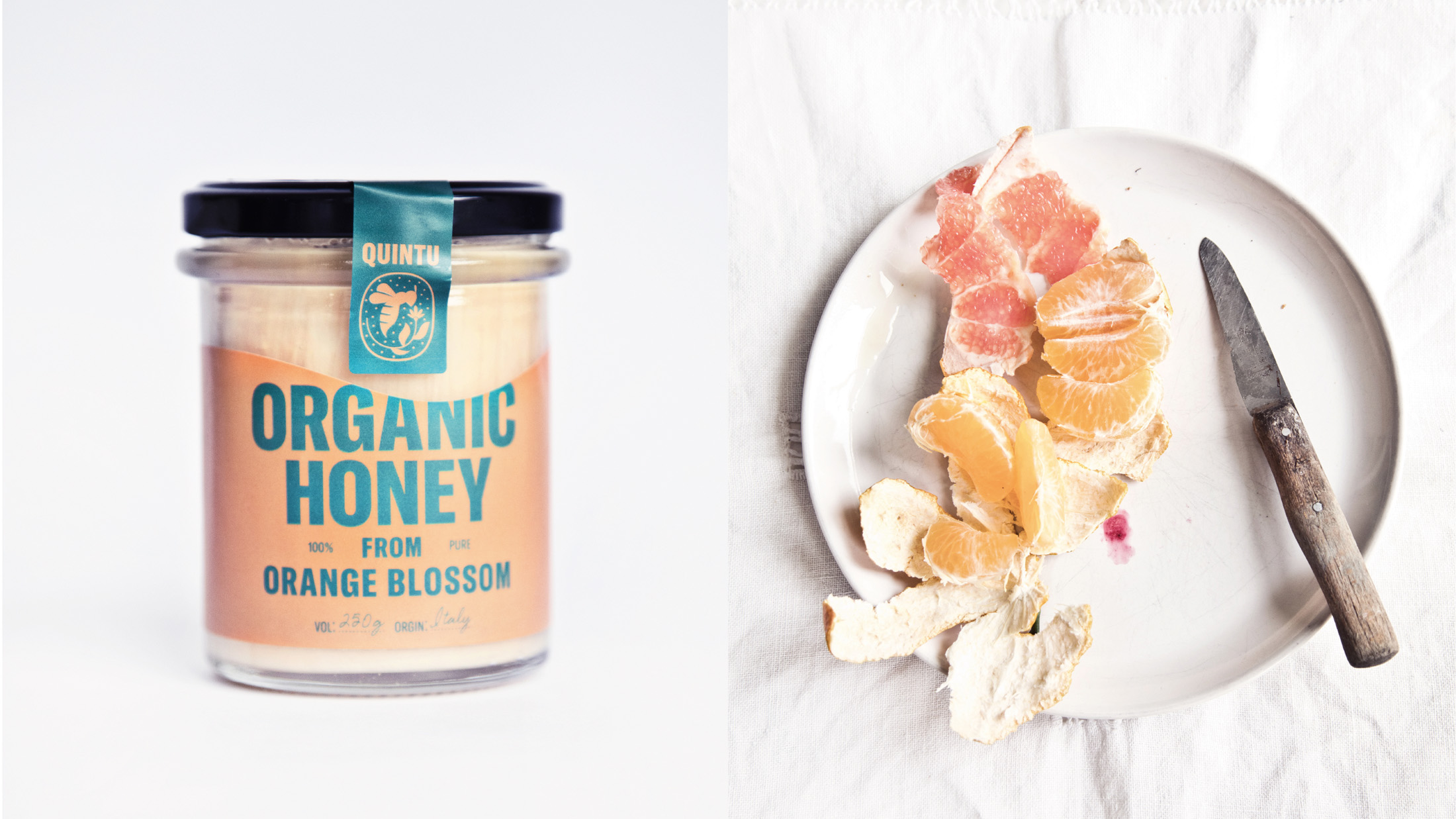
Honey. The creamy, golden and sweet spread on top of some toast. Great way to start the day. And it’s how the founder of Quintu, Jacques, prefers to start his mornings: with the golden spread of the buzzing critters. It all began when he first got a small and beautiful jar filled with delicious, pure, organic honey.
After searching high and low for similar honey, Jacques finally meet a collective of bio farmers with vast organic orchards. He learned he could actually help save bee populations by producing at the same time the tastiest of all honey. And so, Quintu was born.
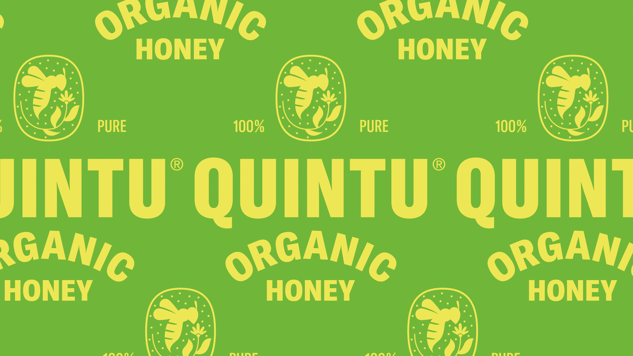
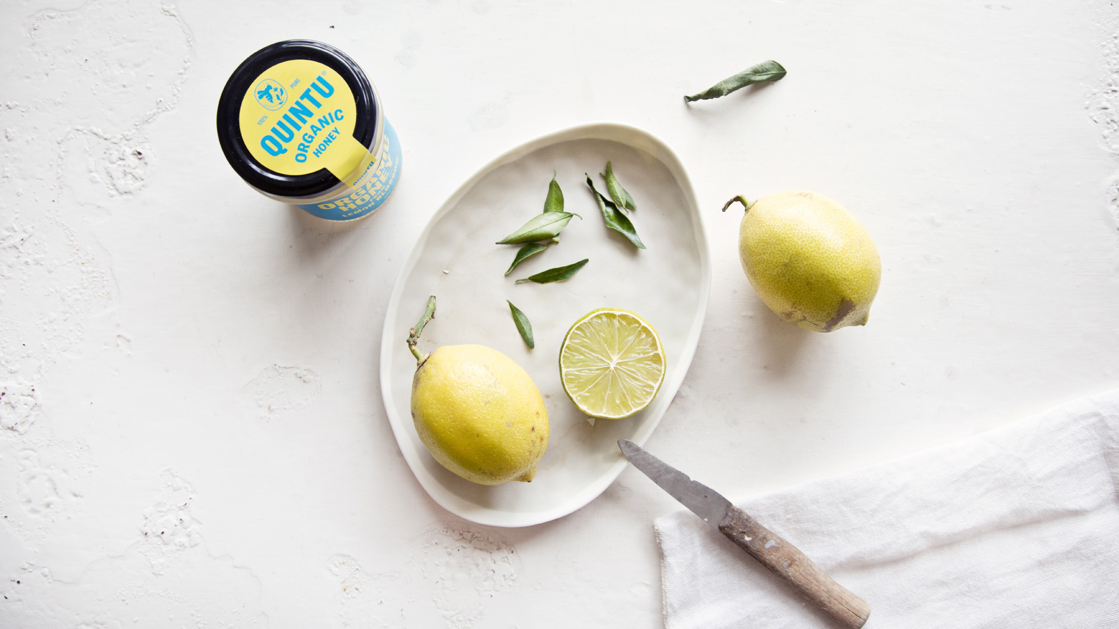
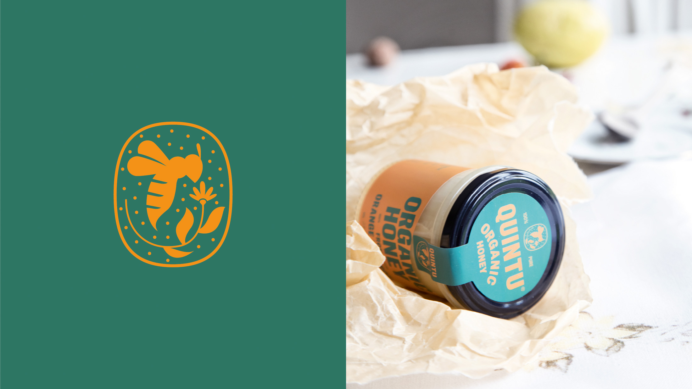
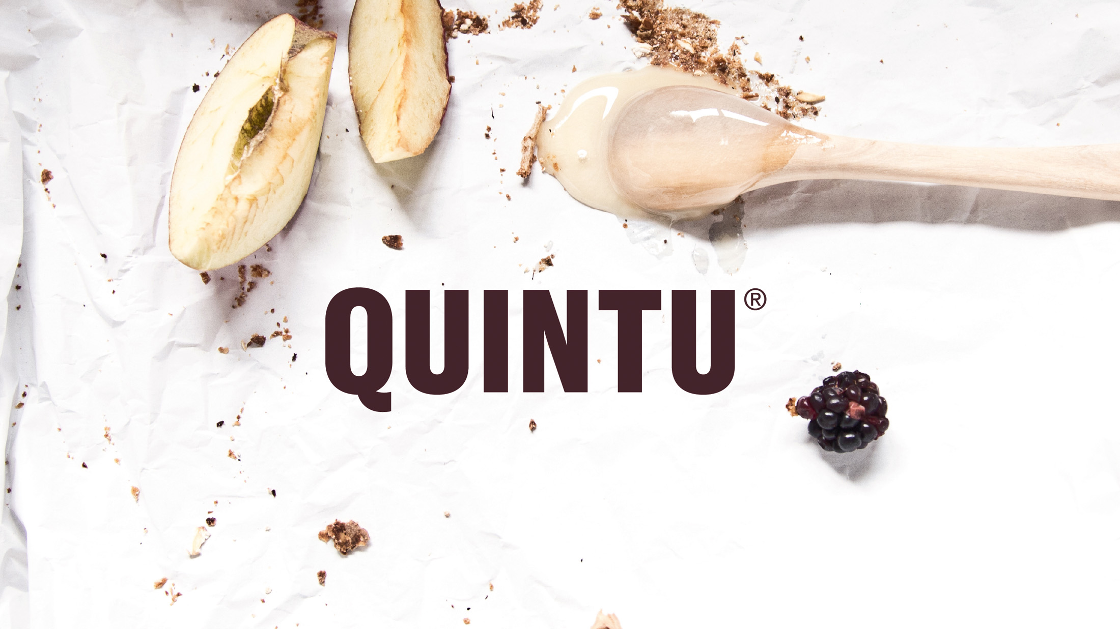
Creamy Communication: Quintu is all about craft and quality materials. It’s the ingredients that provide the delicate sweetness to your morning ritual. Stamp Works helped communicate the delicious product with a new brand identity, spanning logo, packaging design, illustration, and posters.
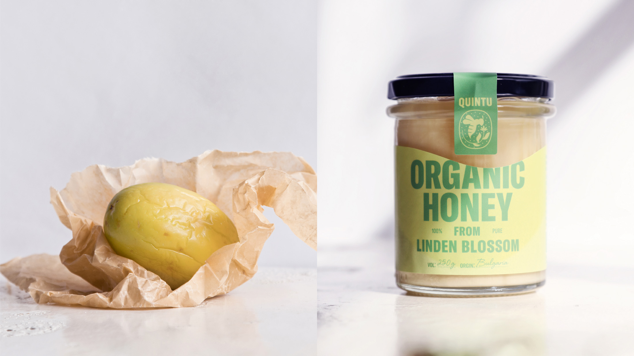
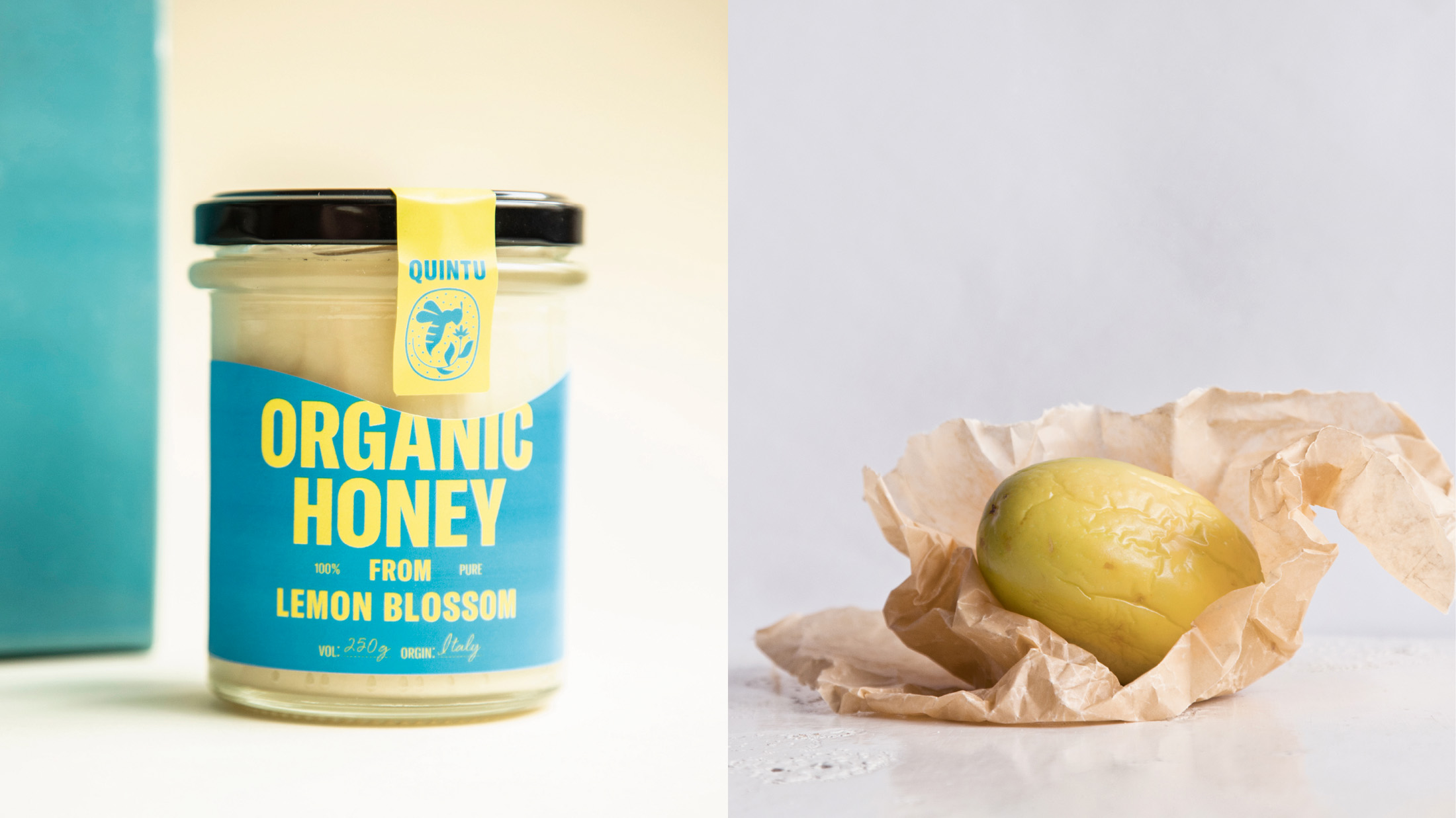
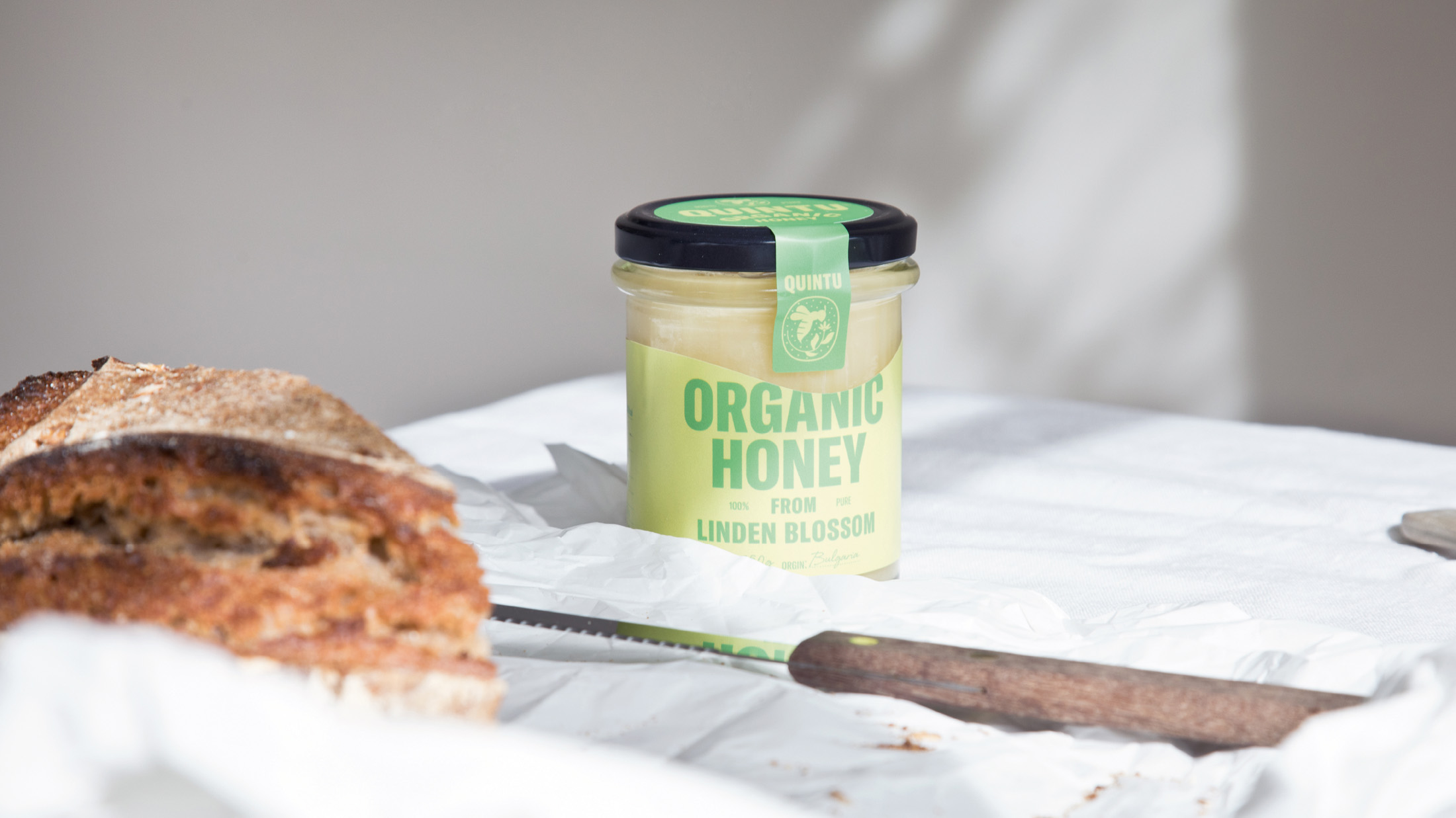
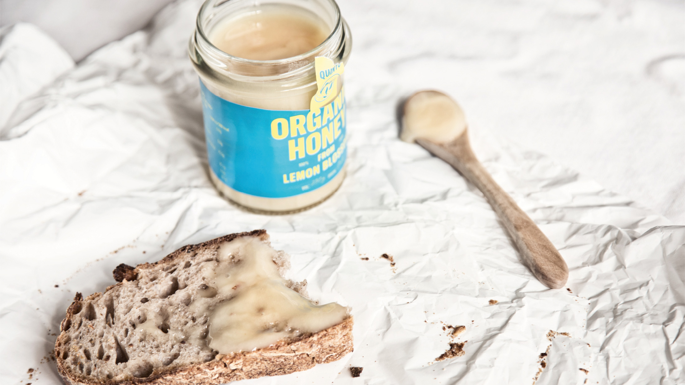
“The design reflects the craft but it doesn’t turn old school and outdated. The seal works like a quality mark and the label cut is a subtle way of telling about the creamy content.” – Jin Fujiwara, Designer and Founder of Stamp Works
Overall, the new Quintu brand design is a modern expression of quality and creaminess. The modern sans serif typeface is mixed with a classic layout that is easy to navigate on the shelves, as each of the three flavours also have their distinct colour.
CREDIT
- Agency/Creative: Stamp Works
- Article Title: Brand Identity for Honey Producer Quintu
- Organisation/Entity: Freelance
- Project Type: Identity
- Project Status: Published
- Agency/Creative Country: Sweden
- Agency/Creative City: Malmö
- Market Region: Europe
- Project Deliverables: Brand Identity, Illustration, Packaging Design, Poster Design
- Industry: Food/Beverage
- Keywords: honey, packaging design, organic honey,
-
Credits:
Senior Designer: Jin Fujiwara


