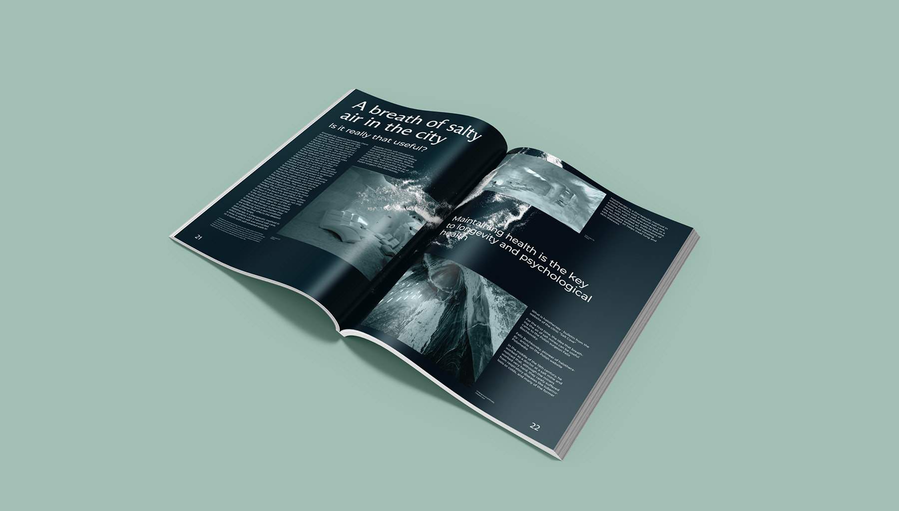
Halotherapy is an underestimated method of disease prevention. The microclimate of salt caves recreated there helps to improve the functioning of the lungs and nervous system, which was once relevant in connection with the epidemiological situation in the world. The benefits of halotherapy have been known for a long time. Even in ancient Greece and Rome, patients were sent to salt mines and noted a significant improvement in their well-being. Centuries later, this physiotherapeutic method of prevention and treatment has become extremely effective. Such a climate is created with the help of a halogen generator, where simple table salt is poured, which is blown by a strong air flow and as a result splits into aeroions, which, due to their lightness, easily enter the lungs and remain on the skin.
Despite the obvious benefits of therapy, nowadays it is not the most popular type of health improvement, as an atmosphere of pain has arisen around it, which often repels people.
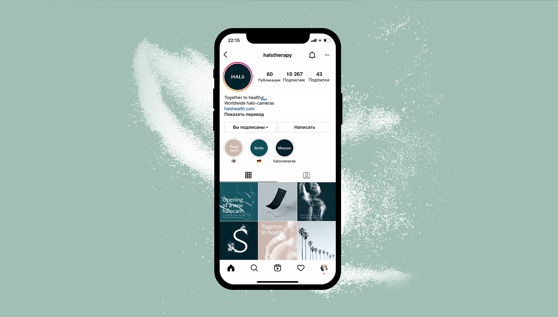
Identity is aimed at young people aged 20—35 who live in big cities and take care of their health. Such people would like to go to therapy, but they do not like the associations that have developed around her with serious illnesses. The company solves the problem of such people and creates a new image of halotherapy, which can be introduced into a person’s life as a pleasant routine.
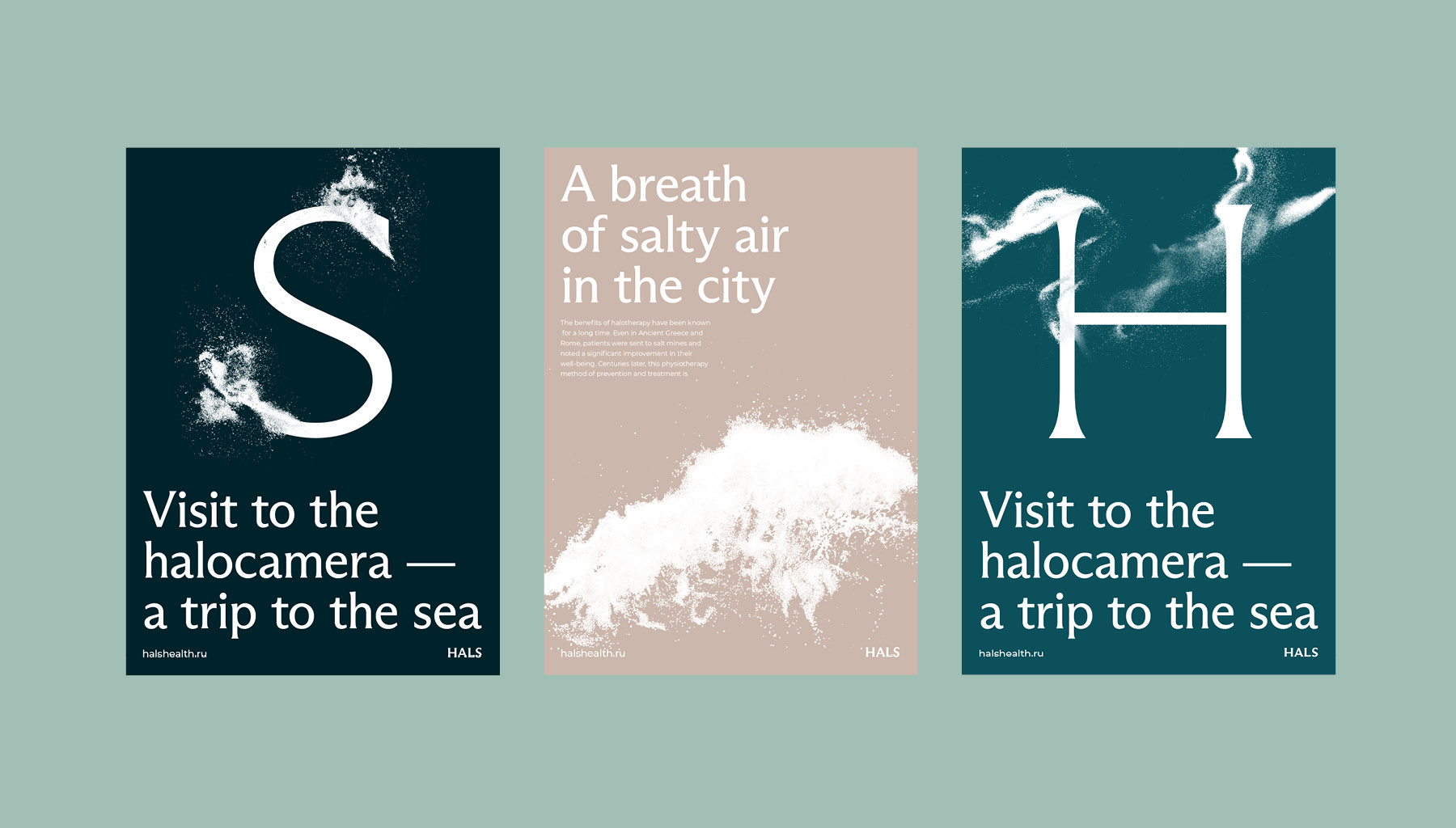
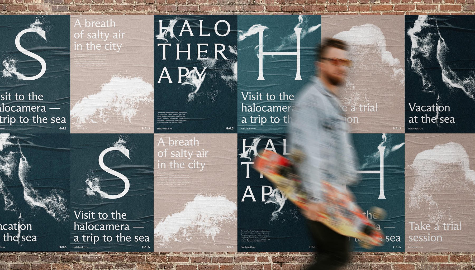
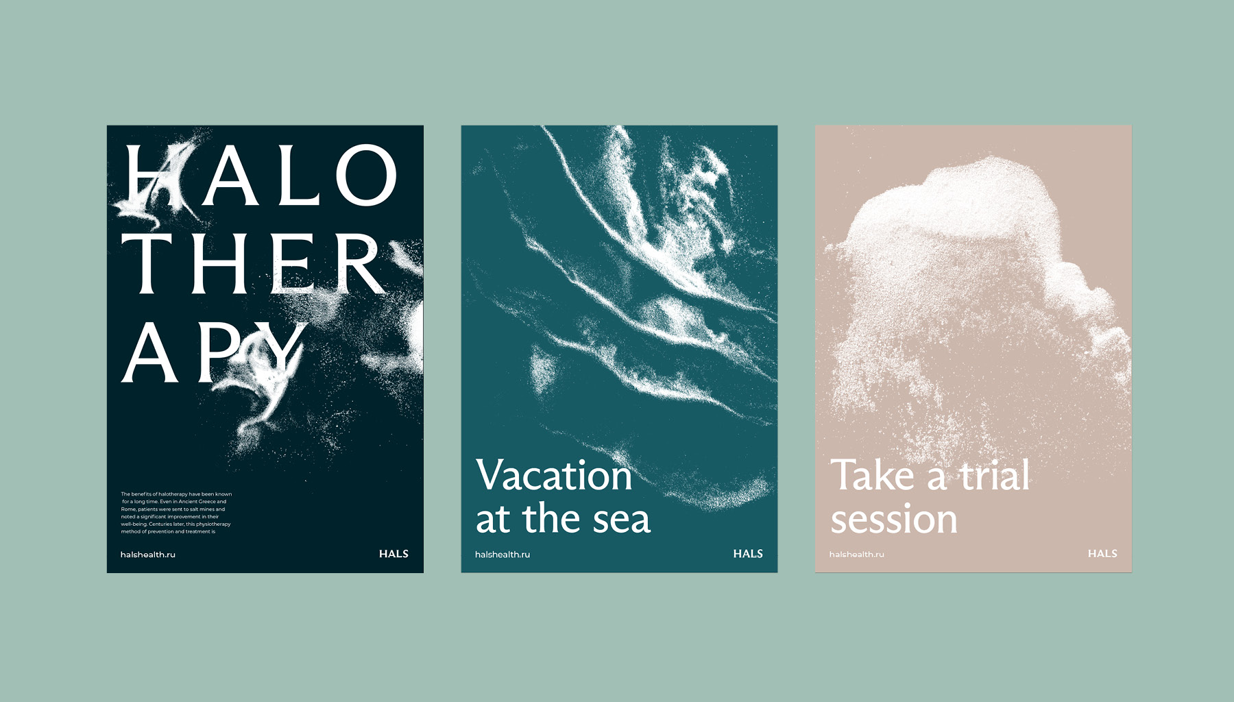
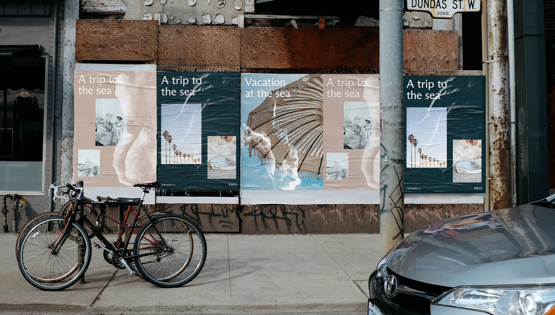
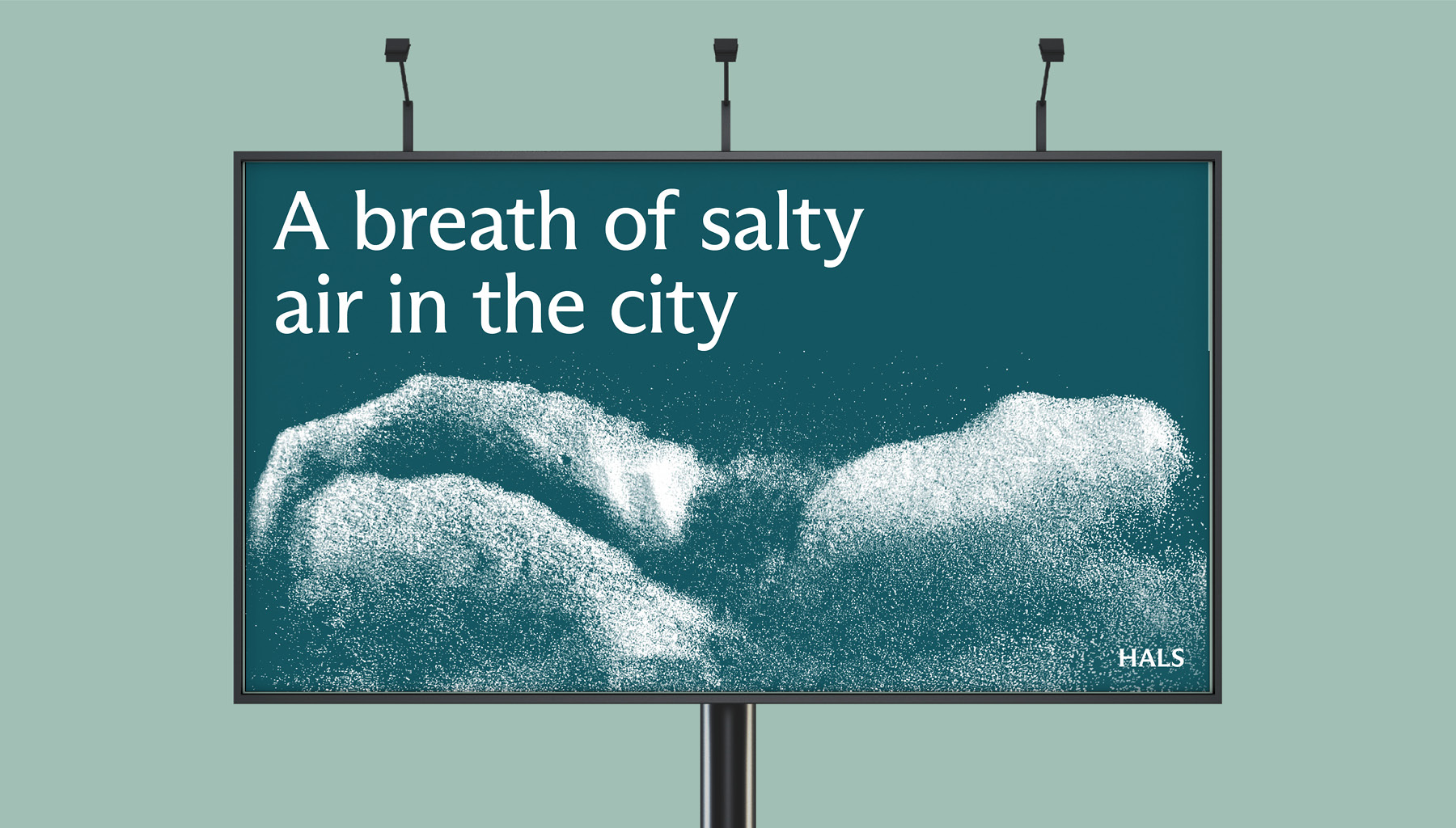
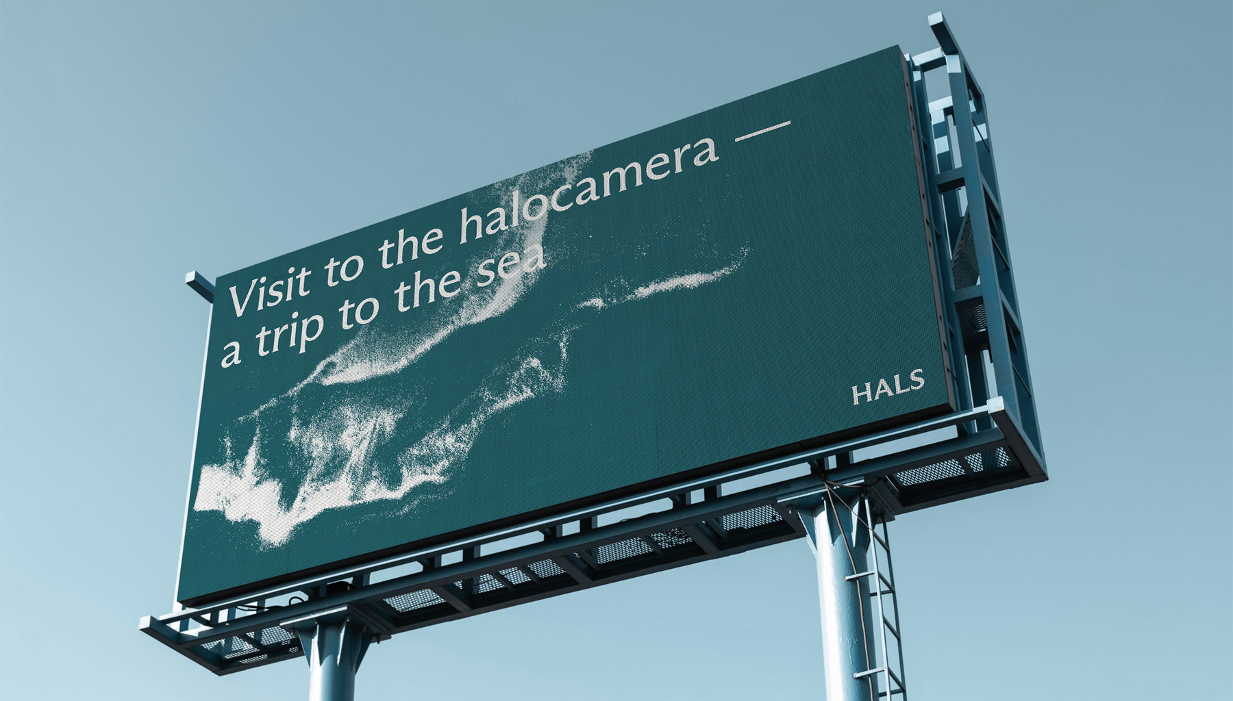
In identity, I got hooked on the idea that modern research shows that visiting halocams is equivalent to a trip to the sea. Therefore, the corporate identity is based on a metaphor with sea foam and waves — a visit to the HALS halocams turns into a mini trip to the sea. The visual embodiment of the idea is that the scattered salt becomes similar to sea waves, especially if the background is dominated by sea shades. So, the corporate identity turns into a system of well-recognized images with waves lined with salt.

CREDIT
- Agency/Creative: Alina Lomaeva
- Article Title: Brand identity for Halocam Network HALS by Student Alina Lomaeva
- Organisation/Entity: Student
- Project Type: Identity
- Project Status: Published
- Agency/Creative Country: Russia
- Agency/Creative City: Moscow
- Market Region: Europe
- Project Deliverables: Animation, Brand Identity, Branding, Graphic Design
- Industry: Health Care
- Keywords: Sea air
-
Credits:
curator: Evgeny Kashirin


