Grupo Dimelco was founded in 1992. Dedicated to the commercialization of equipment for the industry, such as: mining machinery, fuel dispensing equipment, inventory control systems for service stations, electric generators, compressed air compressors with cooling systems, forklifts and light construction equipment, all of these from world-renowned brands. It also provides specialized services in construction and electromechanical works, operating in Nicaragua and El Salvador.
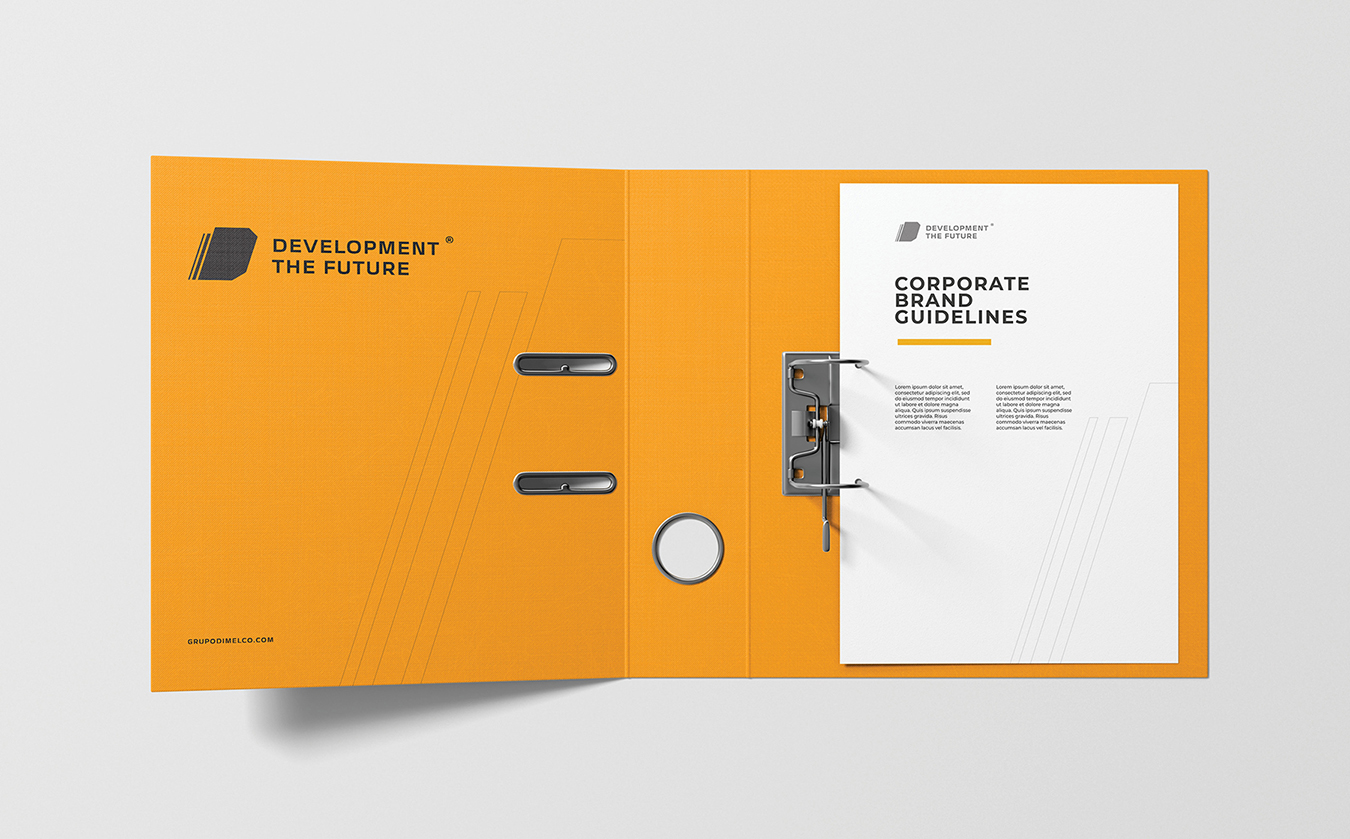
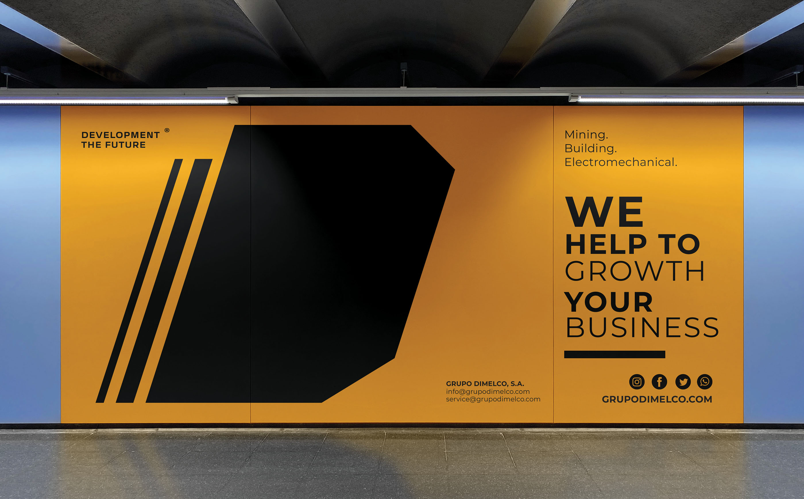
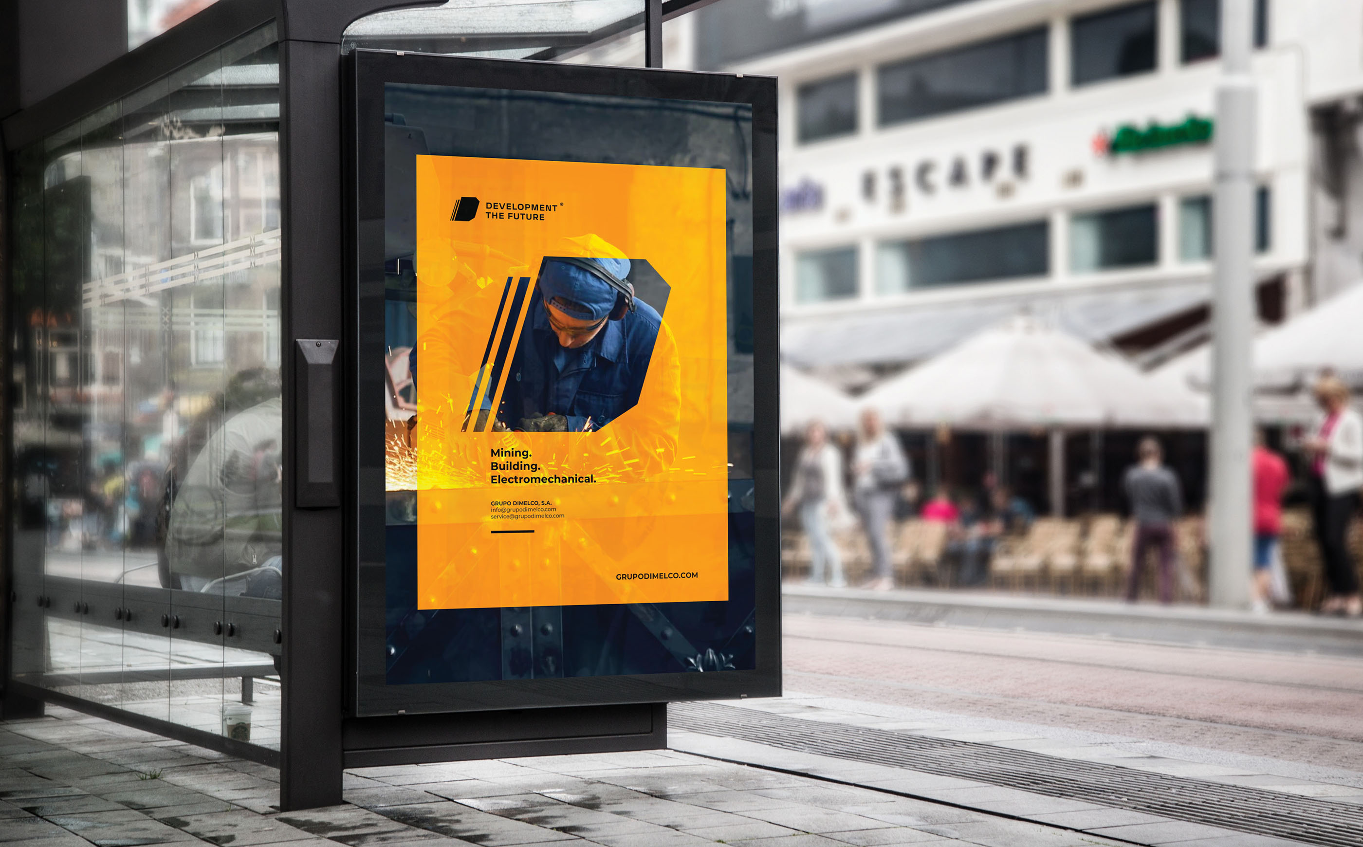
The project consisted of developing a brand with a great differentiator, so the challenge was great, since it was not only to develop a functional and adaptive logo, but also to generate an entire brand system and platform. From the development of the symbol to the large format, to maintain that cohesion and coherence that many brands lack today.
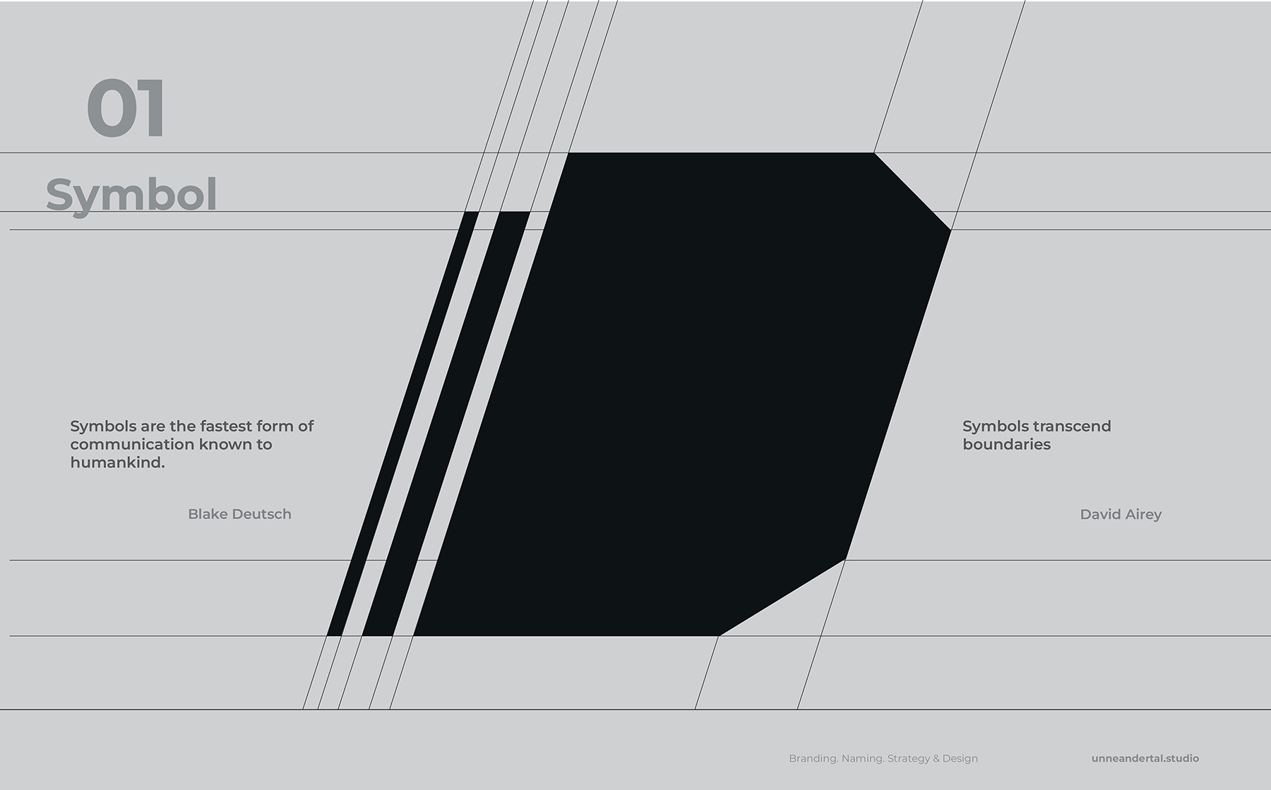
The brand was developed with a focus on the imposing and simple. A minimalist geometric symbology was sought that conveyed strength, simplicity and stability, in addition to the concept of a strong base, including a well-crafted structure that referred to the basic geometry, exploiting the shape of the letter D as a symbol that can be adapted to different platforms. the brand. The font used for the brand name was Eurostile Extended Black, with certain modifications in the spaces that denote stability and balance as part of the brand’s attributes. A slogan “Development of the future” was also incorporated to reinforce the positioning of the brand.
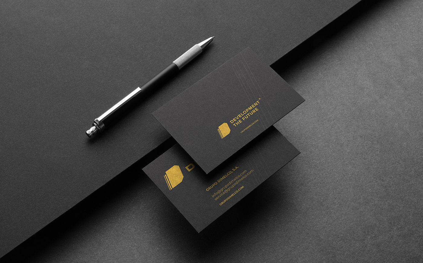
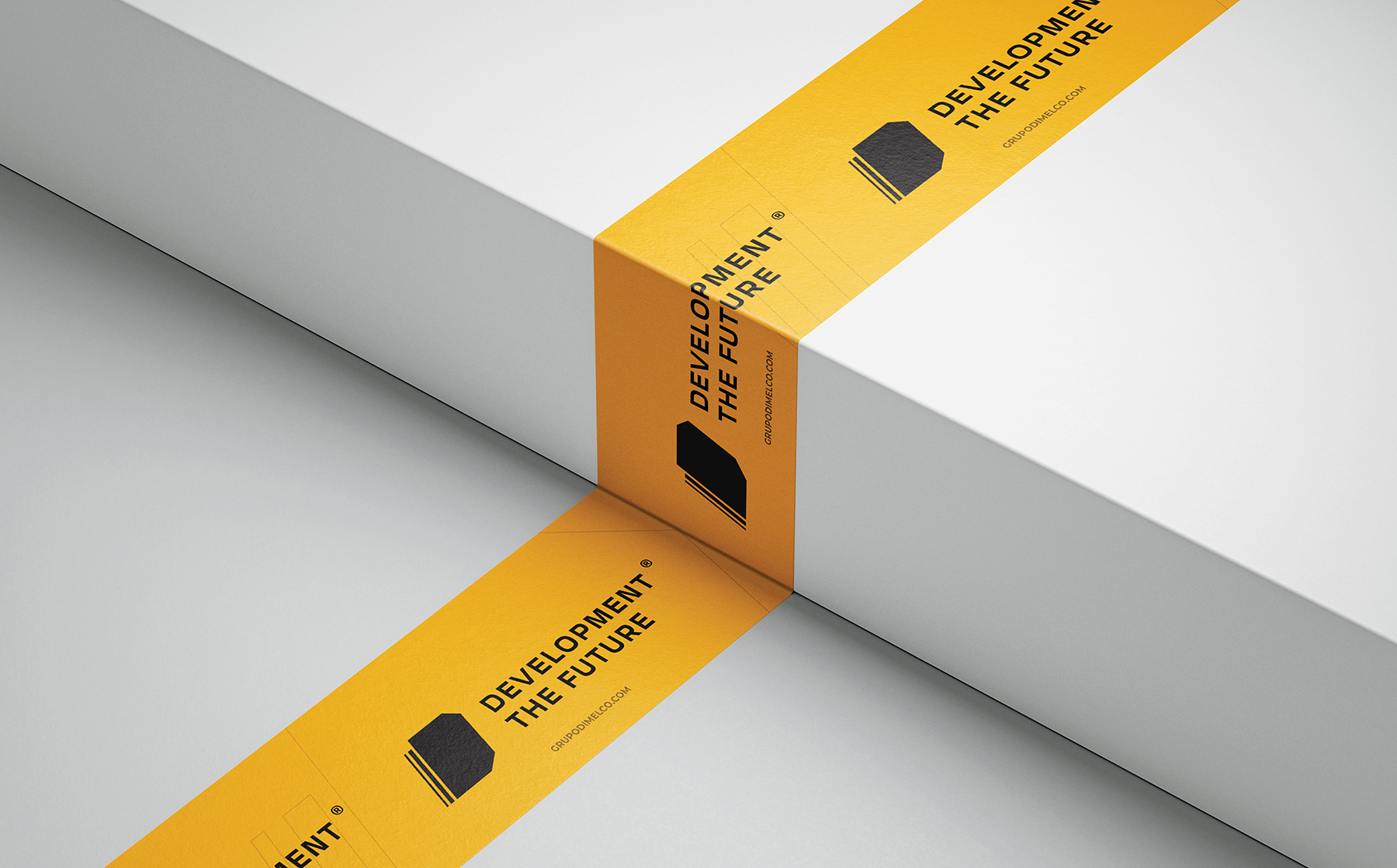
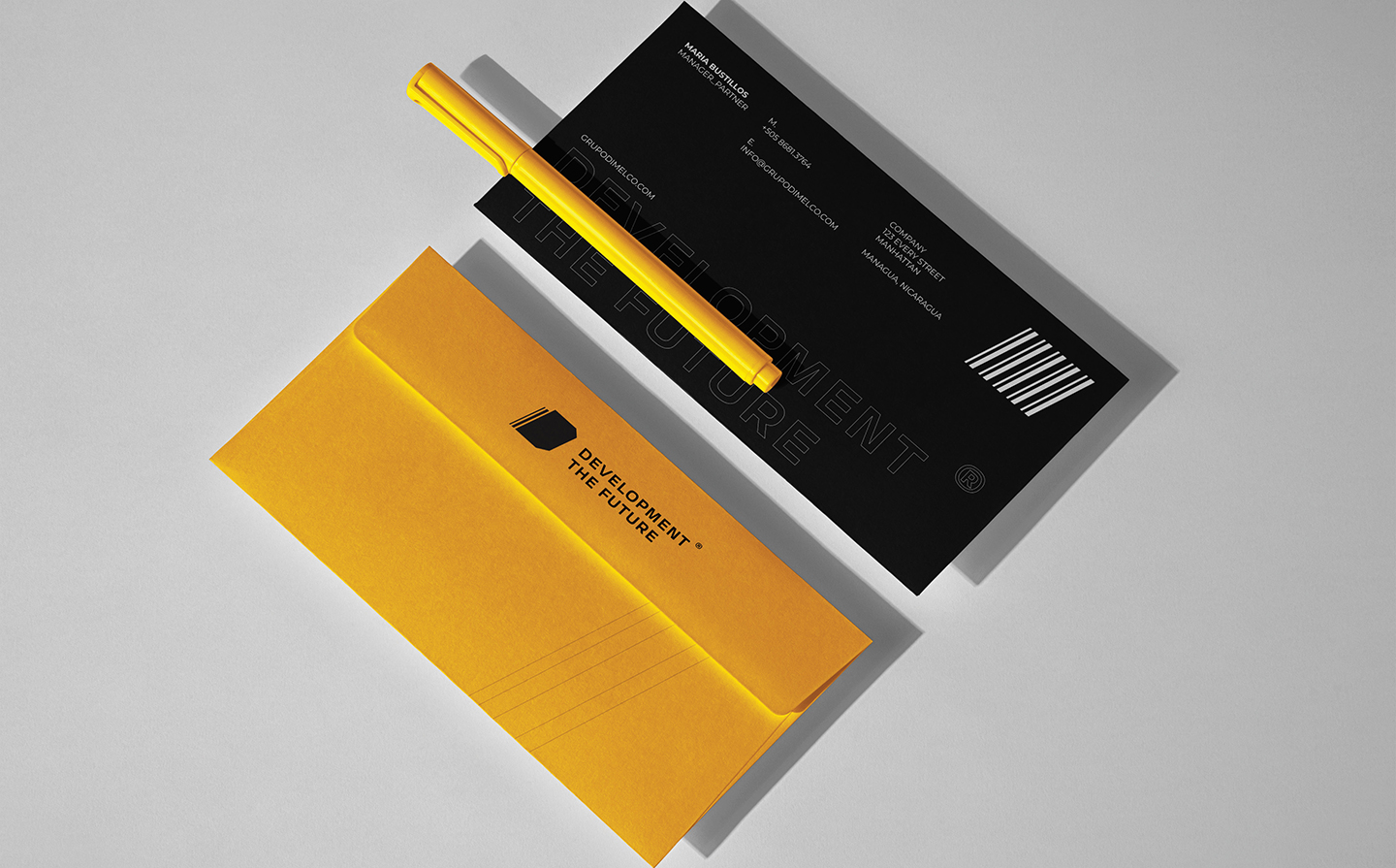
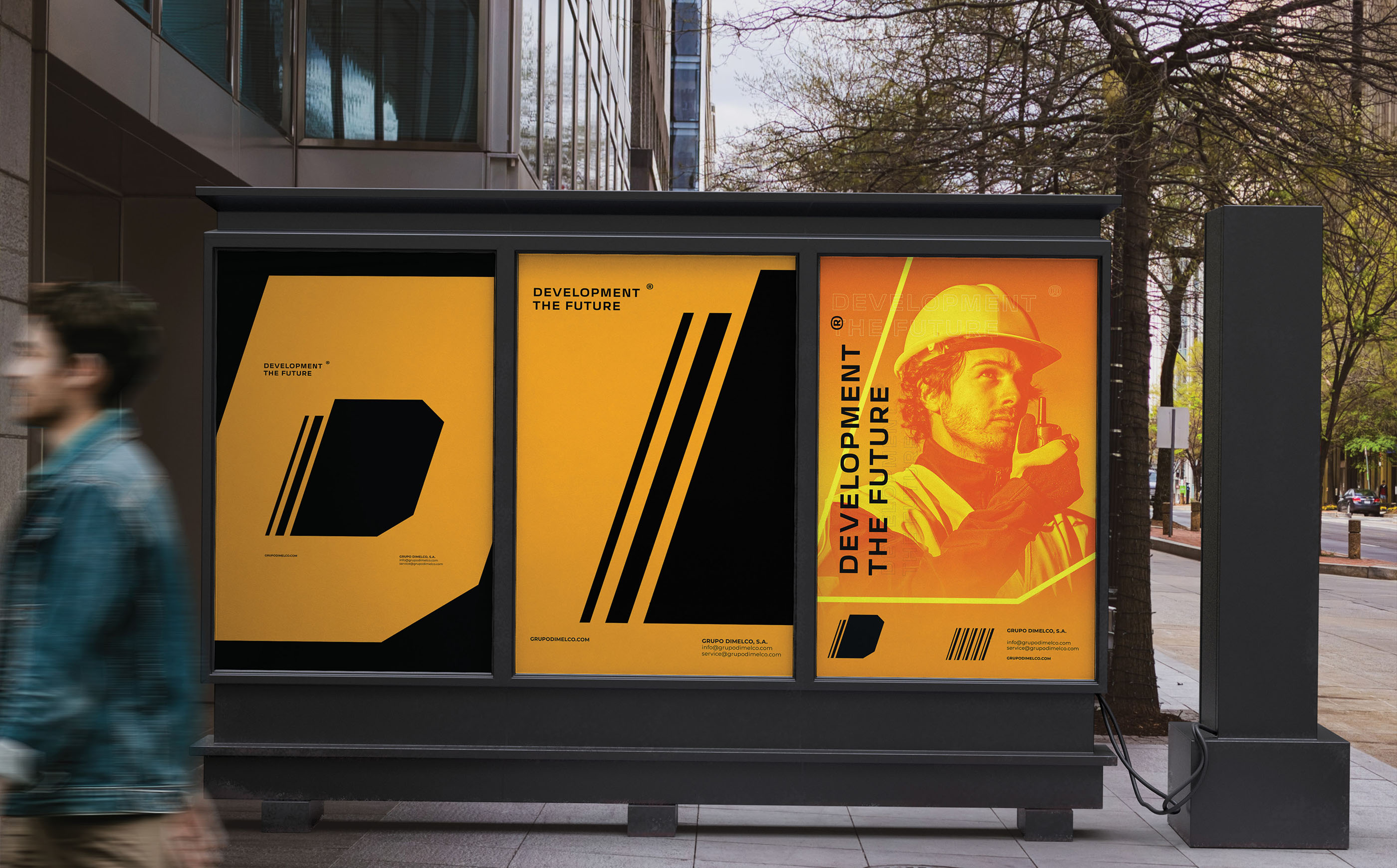
Several assets and patterns that accompany the brand were also created and can be seen in the applications of materials such as: labels, t-shirts, mugs, bags, helmets, among others. The simple geometric shapes in the communication pieces are main attributes for the brand.
The Dimelco Group brand seeks to create a differentiator compared to its competitors. The competition is great, but the brand always seeks to reinvent itself and stay current to conquer more and more space.
As a final result, we managed to develop a brand system according to the stated objectives: a simple, functional, modern and minimalist brand with a high degree of fixation and flexibility to be applied in any situation and on any platform where it will exist.
CREDIT
- Agency/Creative: unneandertal studio
- Article Title: Brand Identity for Grupo Dimelco, S.A. Development the Future
- Organisation/Entity: Freelance
- Project Type: Identity
- Project Status: Published
- Agency/Creative Country: Nicaragua
- Agency/Creative City: Managua
- Market Region: Global
- Project Deliverables: 2D Design, Advertising, Art Direction, Brand Architecture, Brand Design, Brand Guidelines, Brand Identity, Brand Redesign, Brand Strategy, Branding
- Industry: Construction
- Keywords: brand, brand identity, logo, Design, rebranding, art direction, creative, brand visual and tone
-
Credits:
Creative Director & Planner: Ernesto Pérez H.


