


Sweetness is the universal language of affection. And it is also an important part of life’s little pleasures.
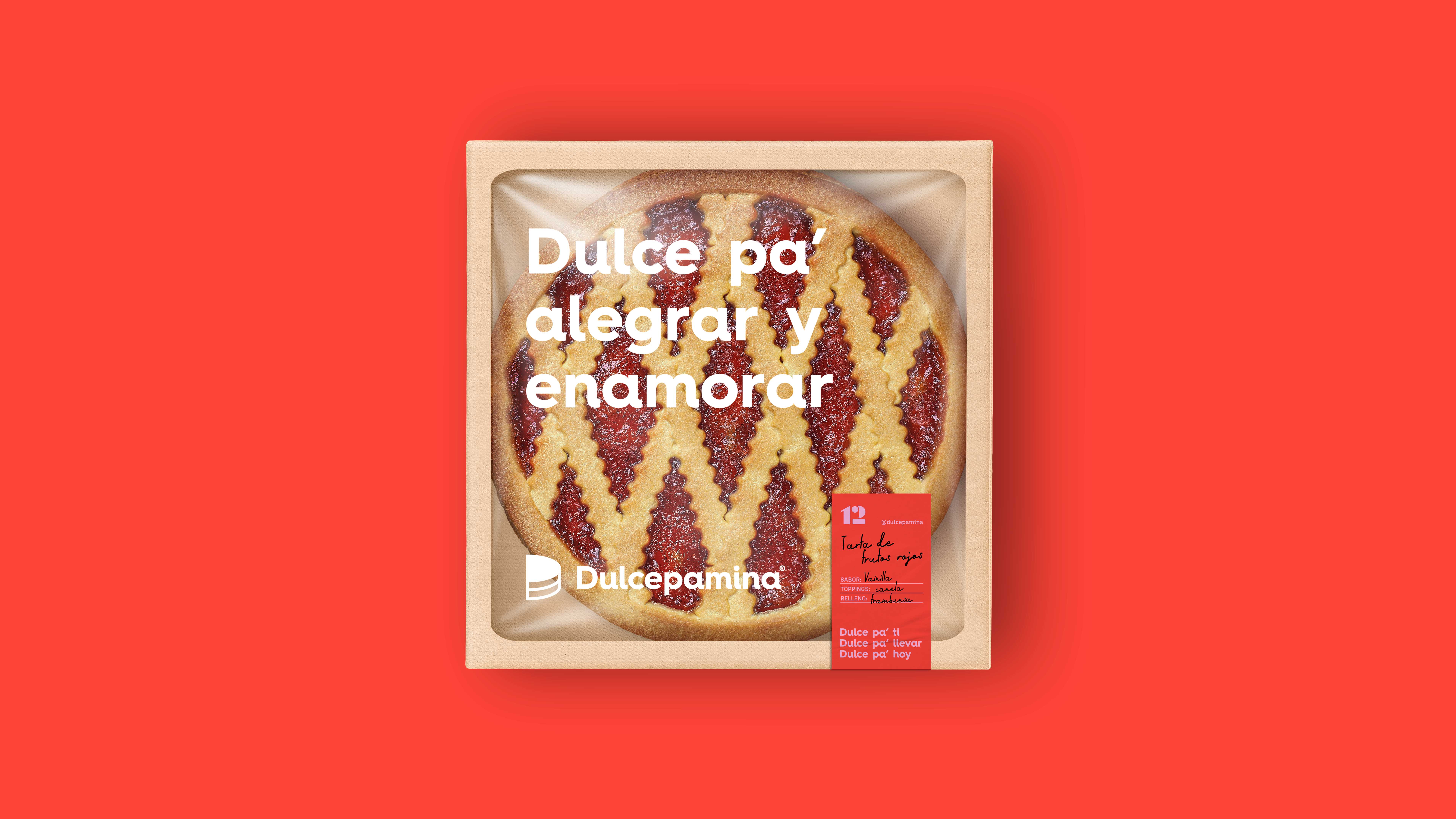
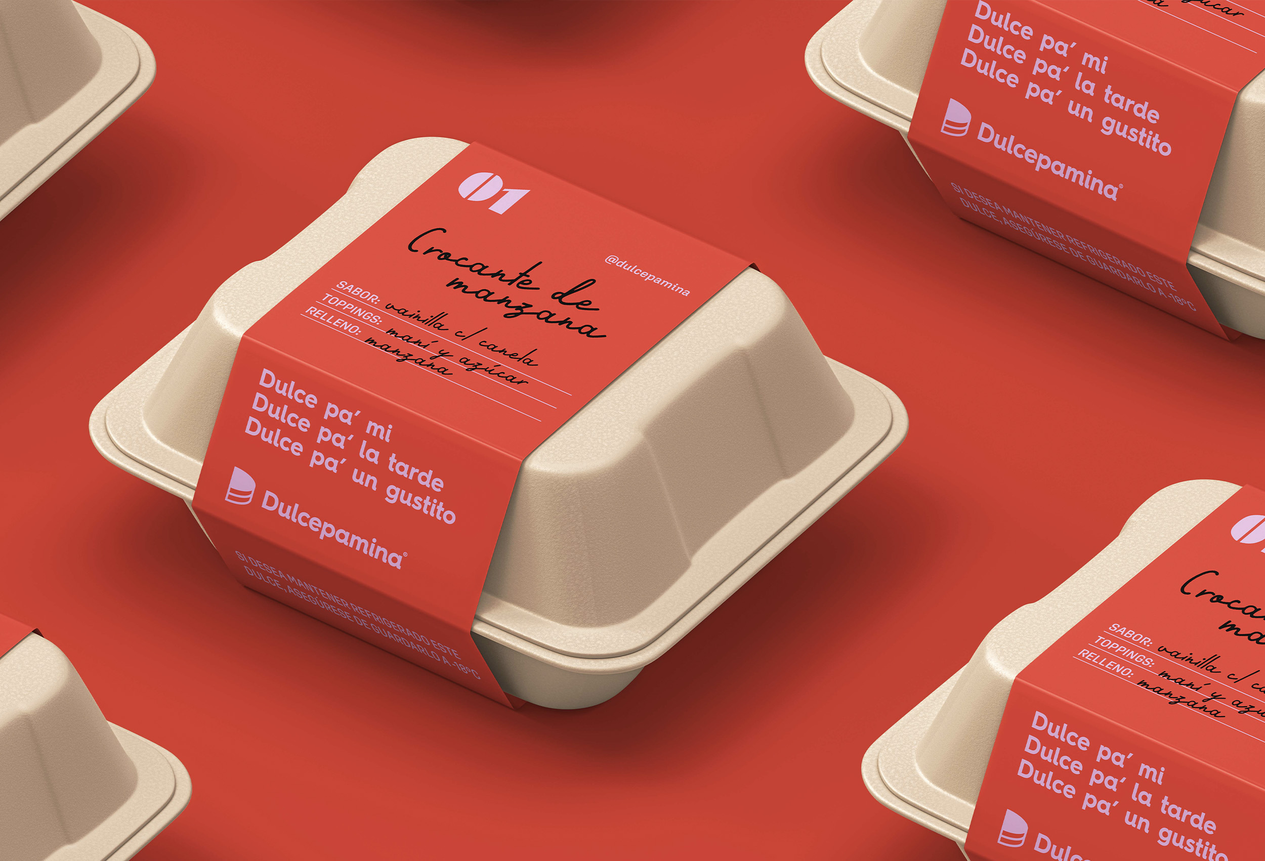
For Dulcepamina a versatile and intimate graphic system was designed at the communication level. The labels on the packages suggest that there may be a human part in them, writing down the name of the dessert, as well as the inputs that each sweet carries.
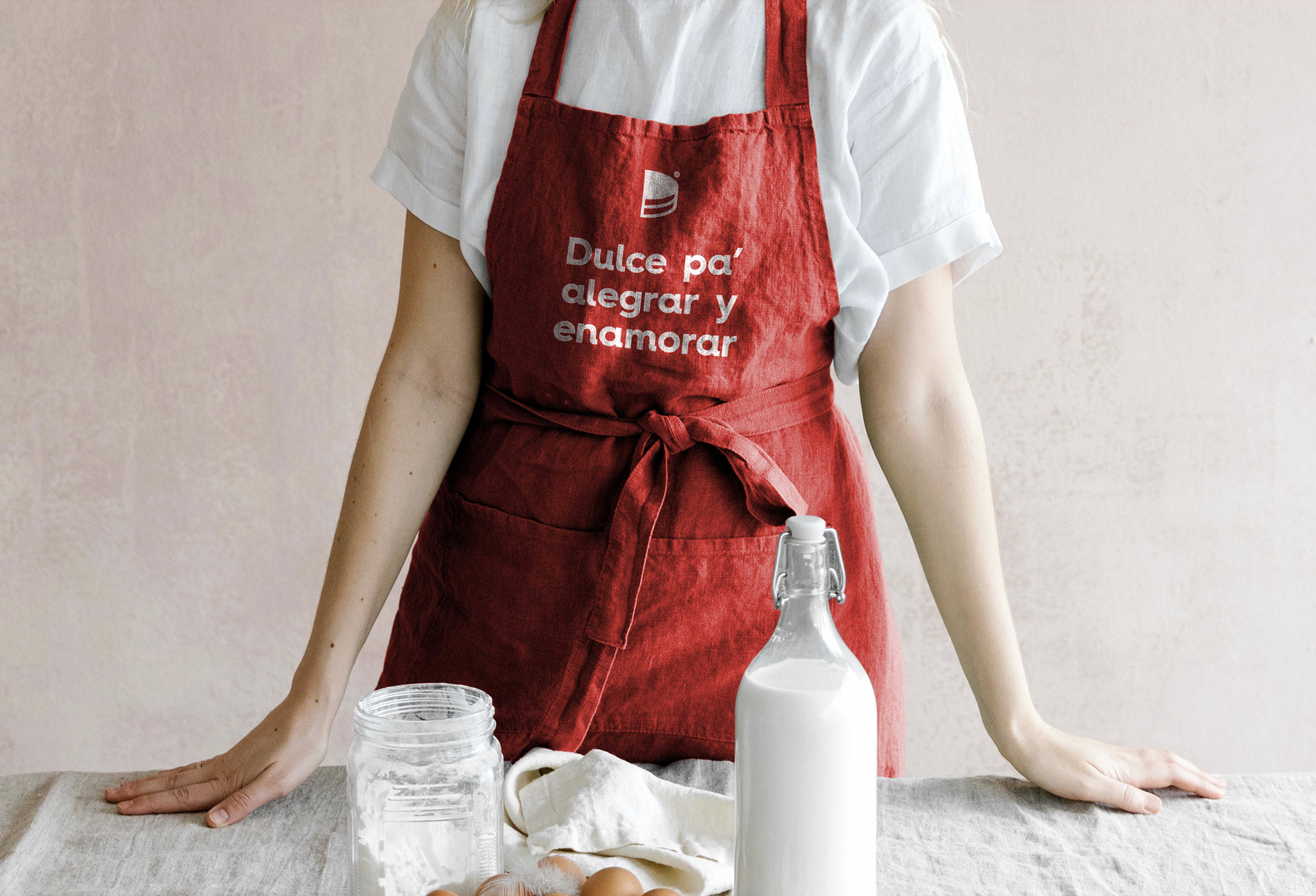
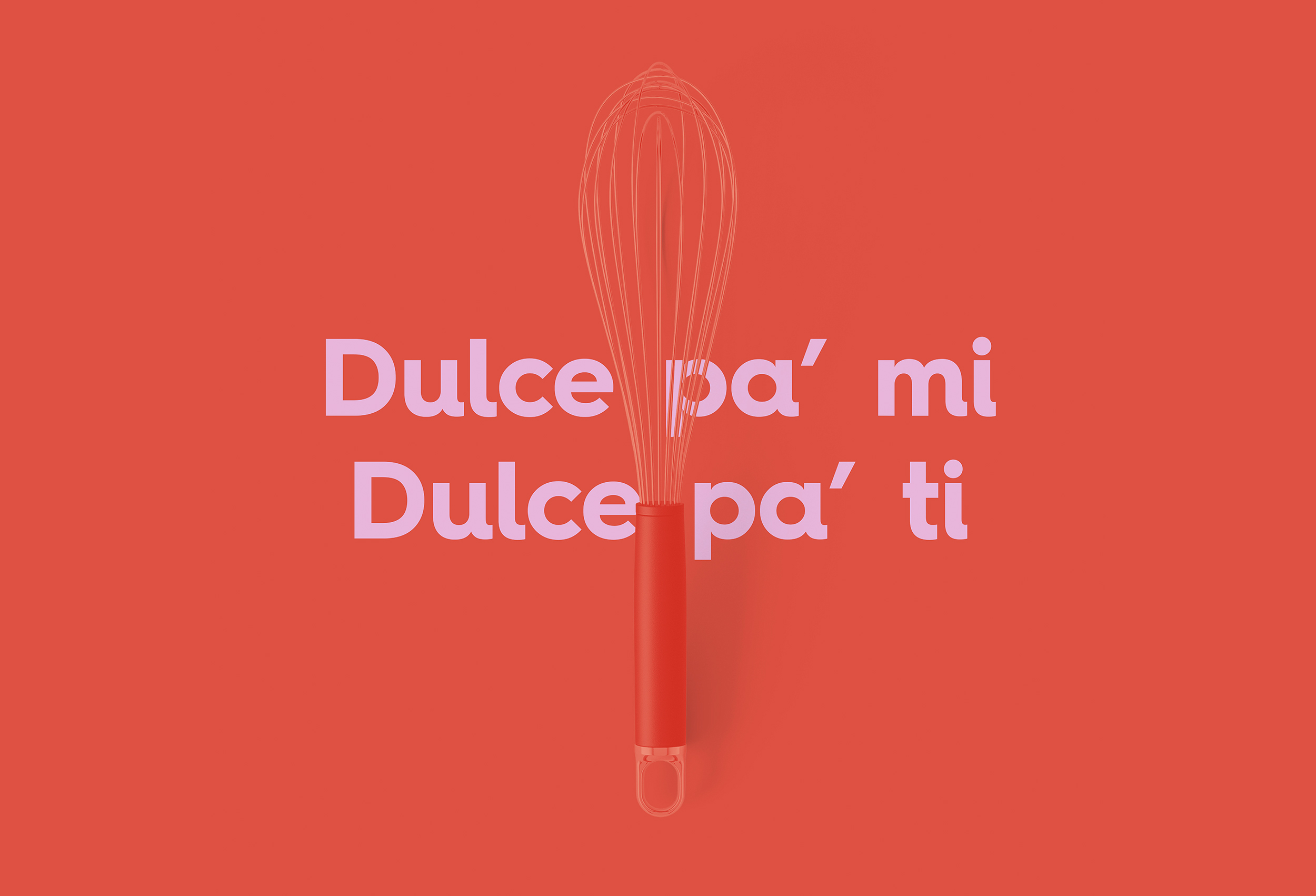
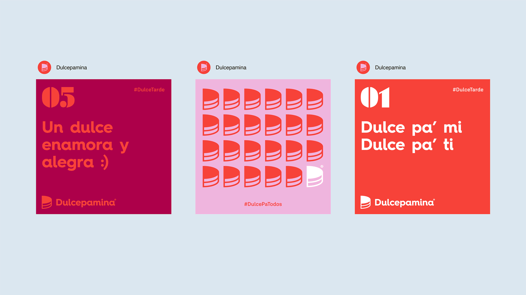
From the name Dulcepamina is derived the “Dulcepa” (which in Spanish would mean “Dulce pa'” ie, “Sweet for” in a colloquial way) to develop the verbal identity of the brand in phrases that turn the name into something memorable.
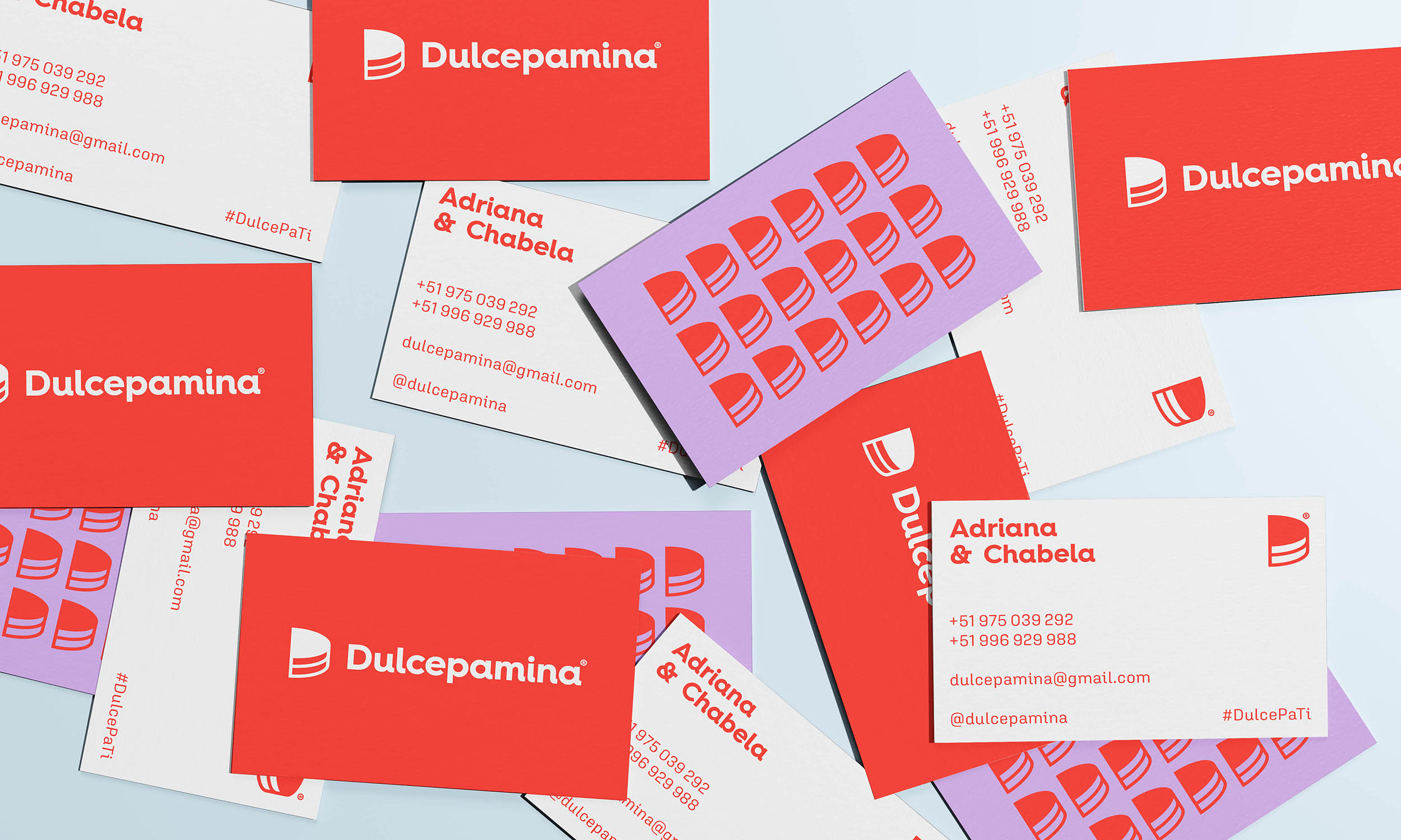
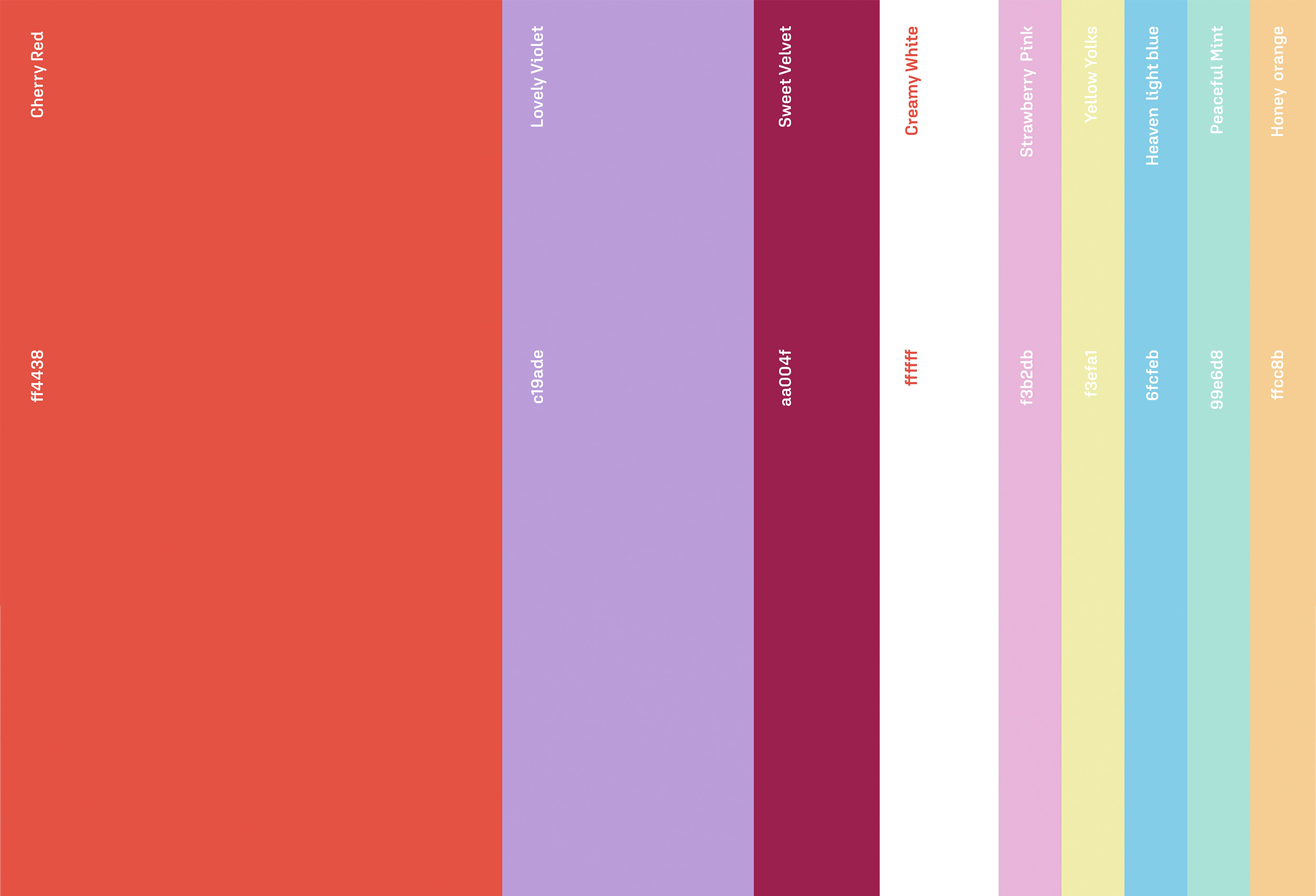
If we talk about the color palette, we highlight the red that par excellence has very positive and exquisite connotations in the pastry category. The red color we see in jams, we see it in strawberries and above all, we see it in an element so characteristic of the category: the cherry. Next to this color is a spectrum that goes from a violet to use as a dark shade and a harmony of pastel colors, which will help us to give a more cheerful and playful dynamic to the brand.
The symbol of the brand represents the feeling of sharing, imaginary cutting a cake in half, and that in turn, becomes the initial of the name Dulcepamina. Adriana and Chabela (brand representatives) They know very well that if there is a sweet for me there is a sweet for you.
Finally we have as a result a brand that works around affection in every sense of the word. From the family affection of the sisters Adriana and Chabela in preparing each of the desserts, through the affection of sharing symbolized in the isotype of the brand, to reach the whole look & feel at the level of color and typography to communicate in a consistent and coherent way a sweet and human brand.


CREDIT
- Agency/Creative: Kisho
- Article Title: Brand Identity for Dulcepamina by Kisho
- Organisation/Entity: Agency
- Project Type: Identity
- Project Status: Published
- Agency/Creative Country: Peru
- Agency/Creative City: Lima
- Market Region: South America
- Project Deliverables: Brand Identity
- Industry: Food/Beverage
- Keywords: Logo, Branding, Brand Identity, Packaging, Food, Desserts, Pastry, Kisho, Design, Peru
-
Credits:
Graphic Designer: Minoru Higa 'Kisho'


