


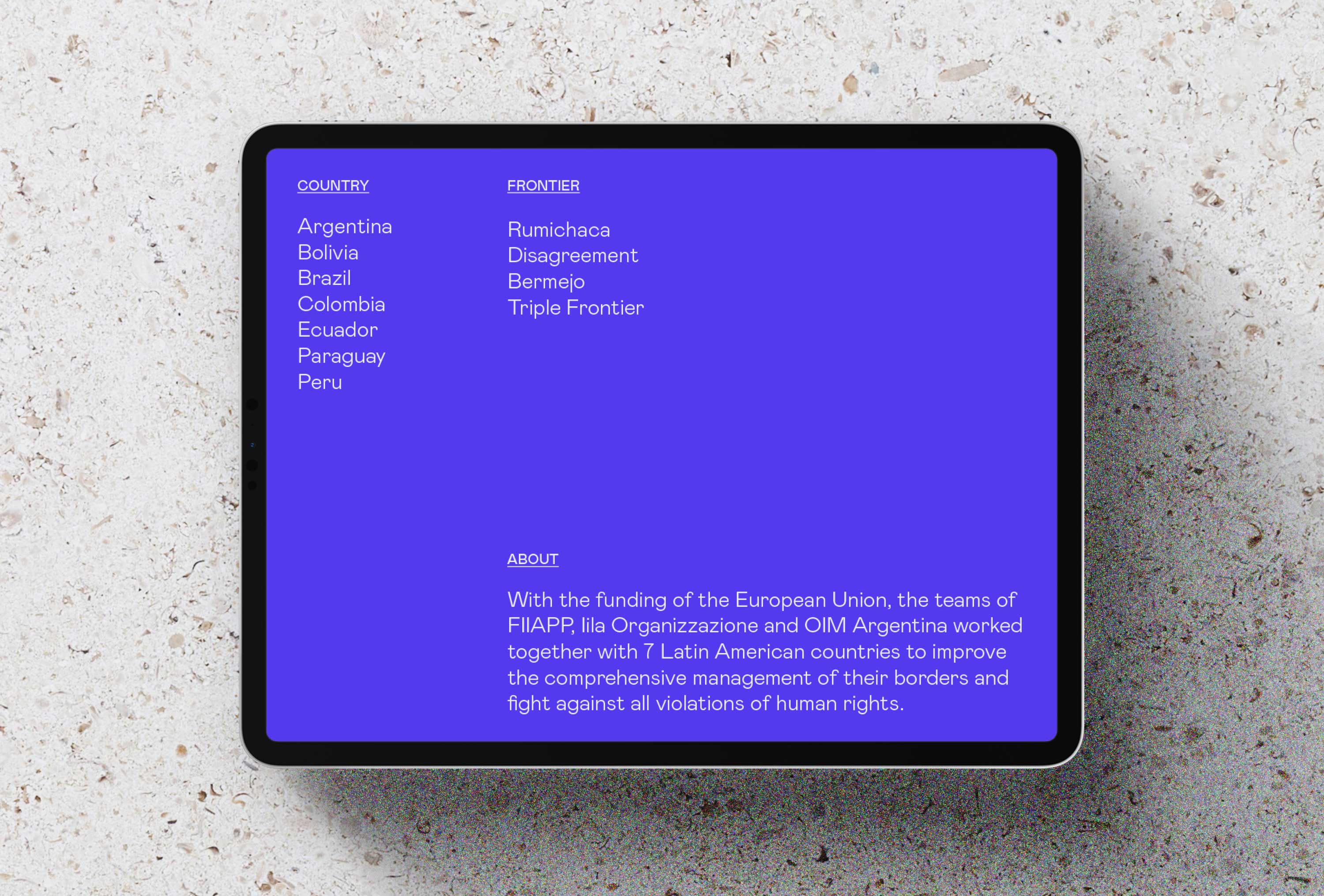
Eurofront is an international cooperation program of the European Commission, which aims to improve and strengthen border management in Latin America, increasing security, promoting cooperation between countries and supporting the fight against the illicit trafficking of migrants.
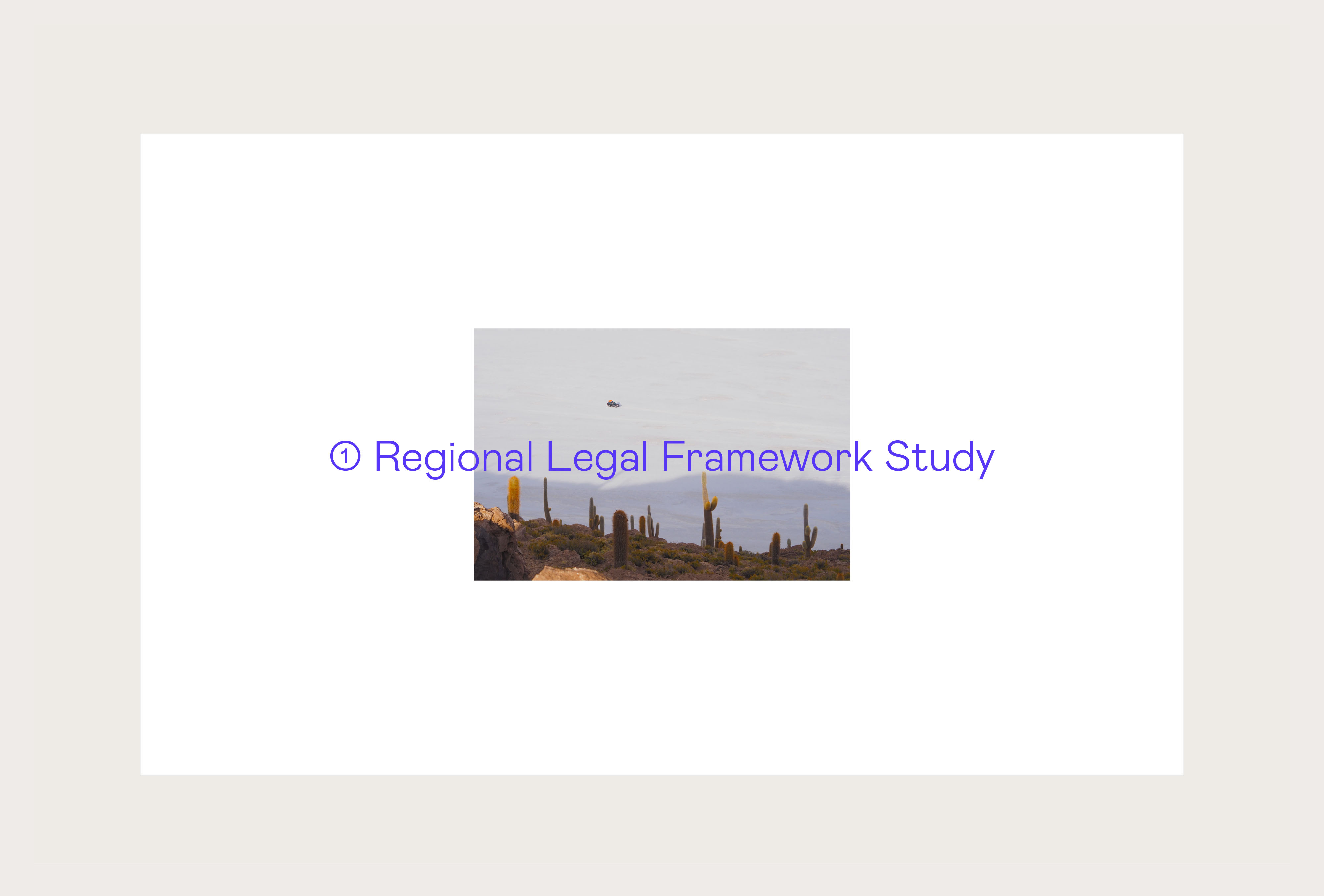
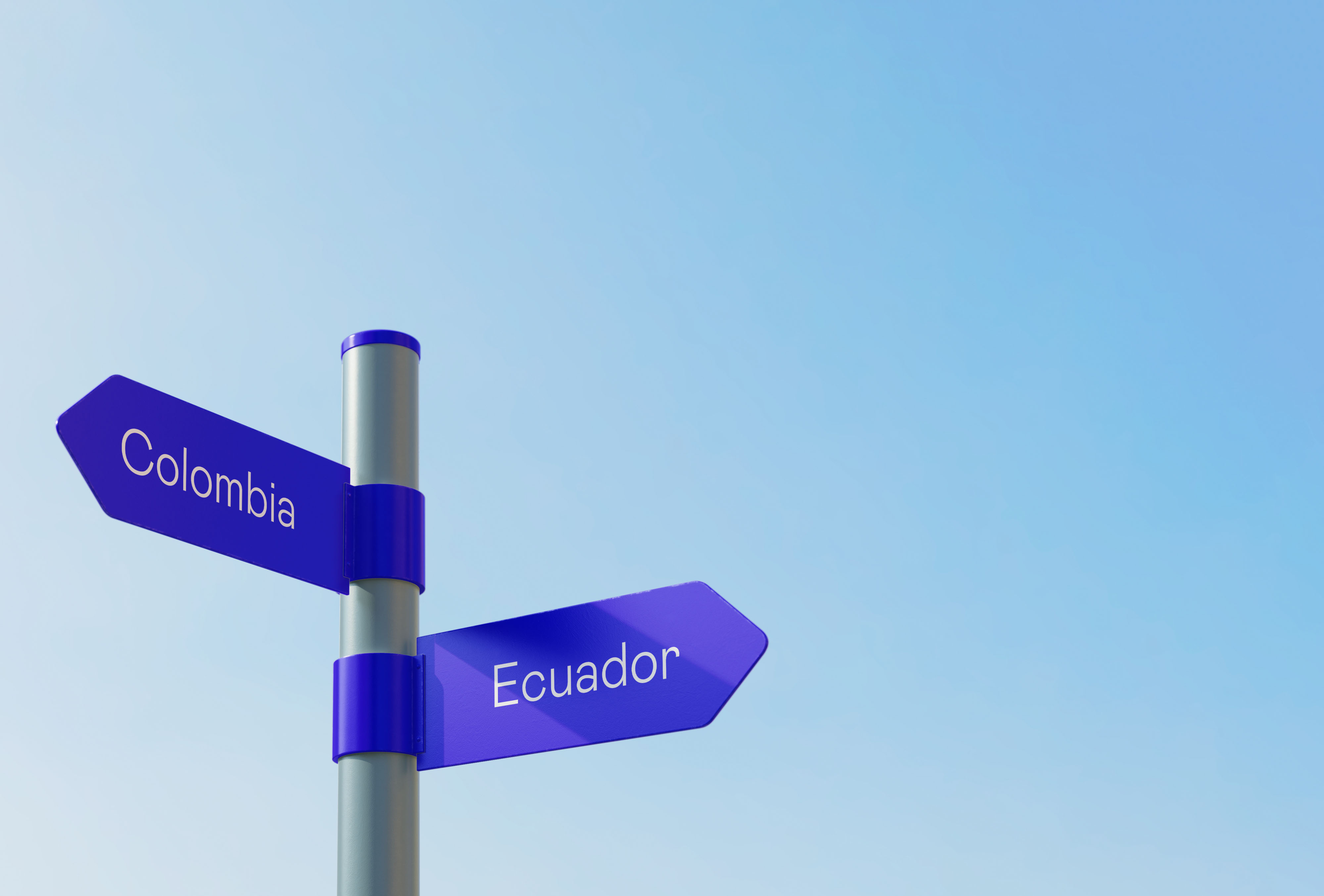
The program, which will be implemented in a group of 7 countries, seeks to export and integrate the best practices of the border management paradigm of the European Union to favor the economic and social development of the region. The goal is to make borders safe and agile places, and that they become points of union and cooperation between different communities and countries.
In addition to the European Commission, Eurofront is managed by different organizations such as IOM, FIIAPP or IILA, and has the collaboration of Frontex, the European Border and Coast Guard Agency.
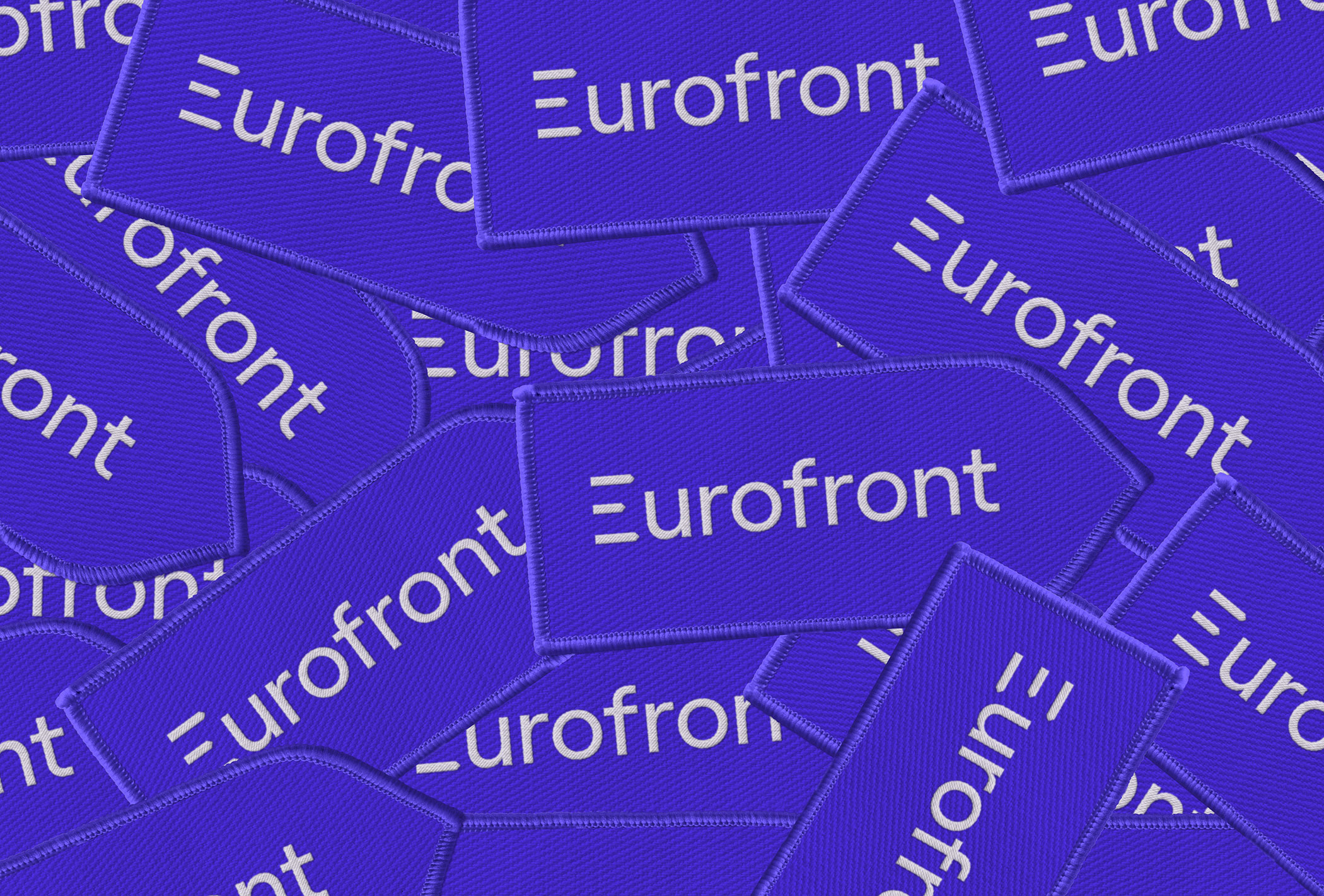
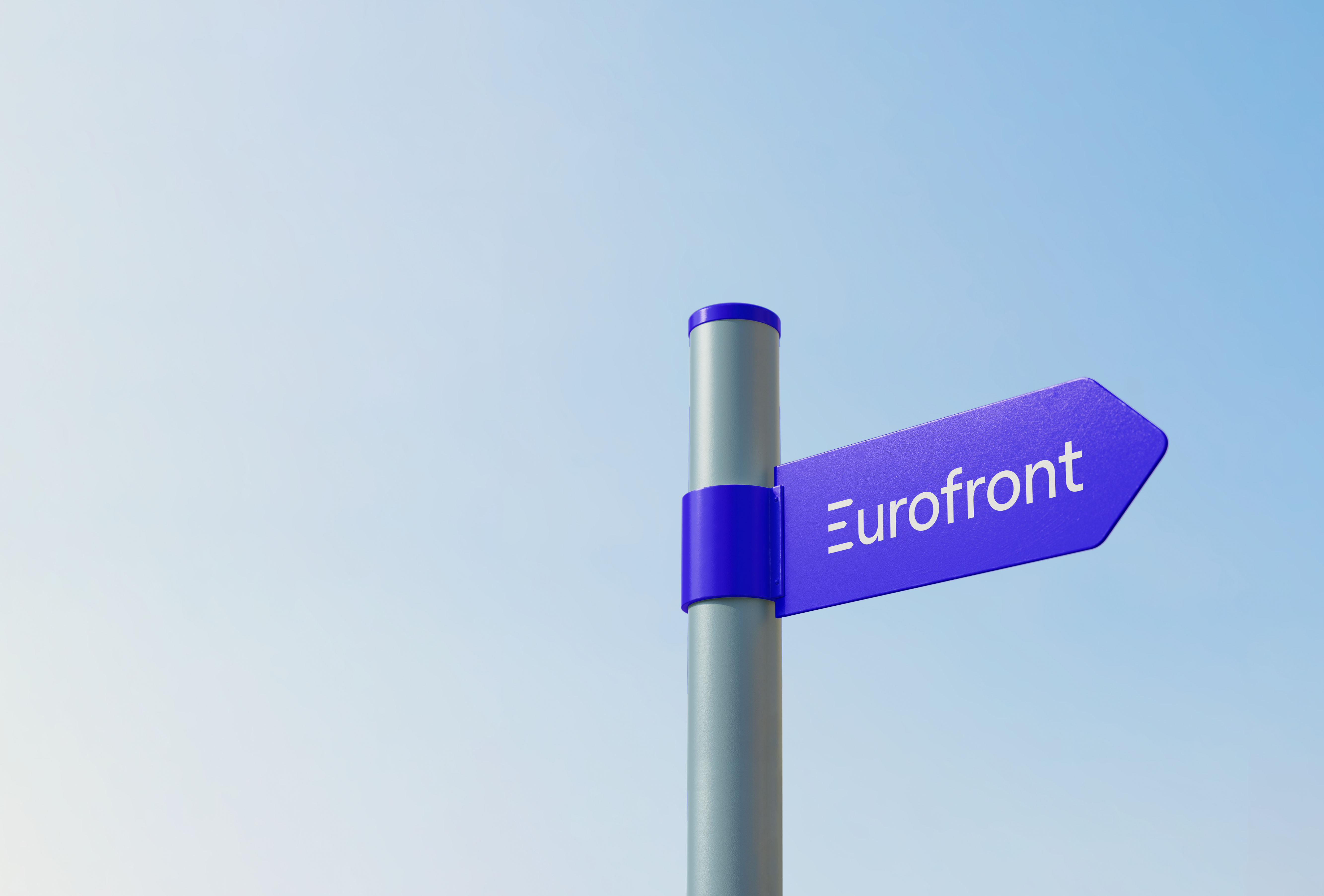
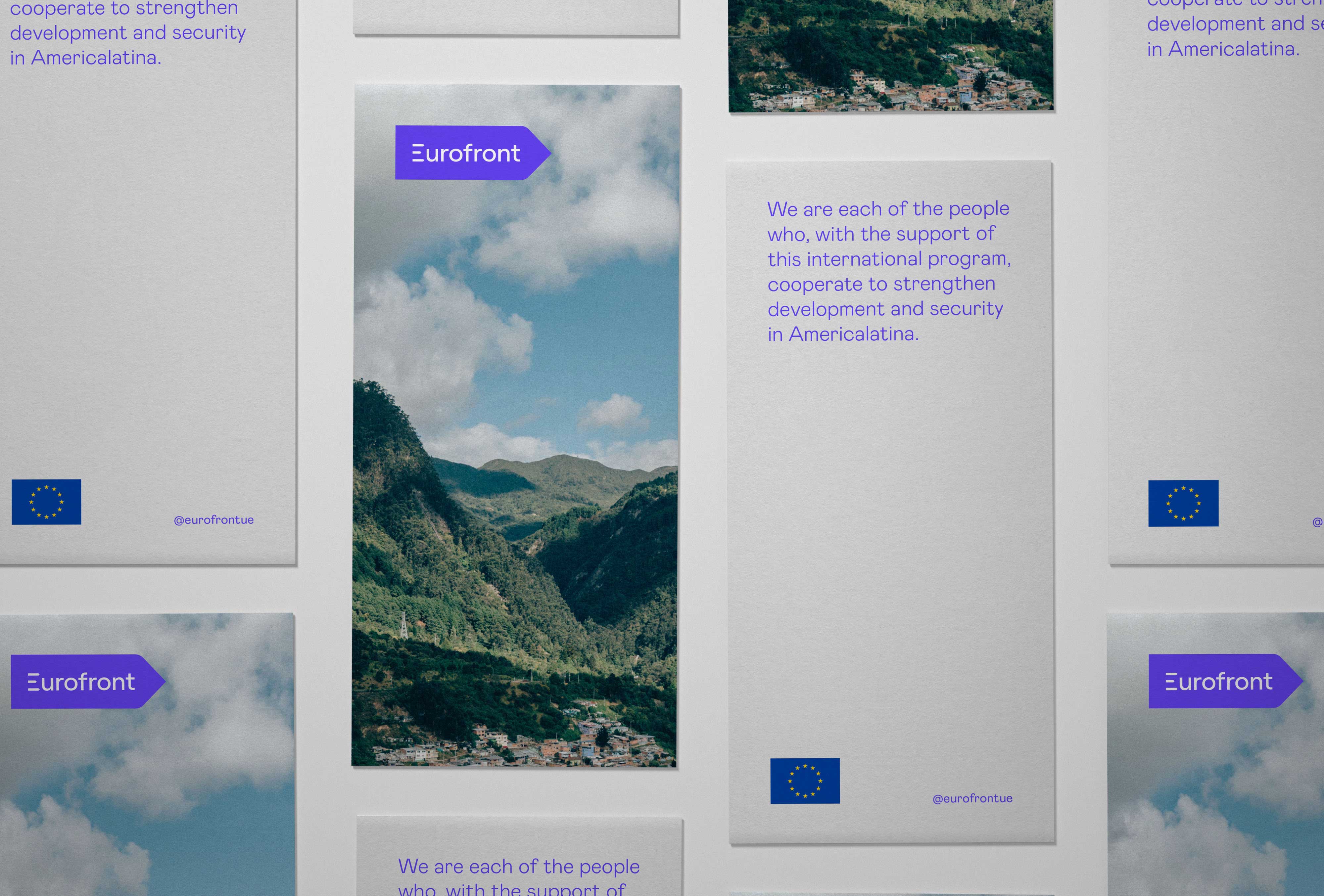
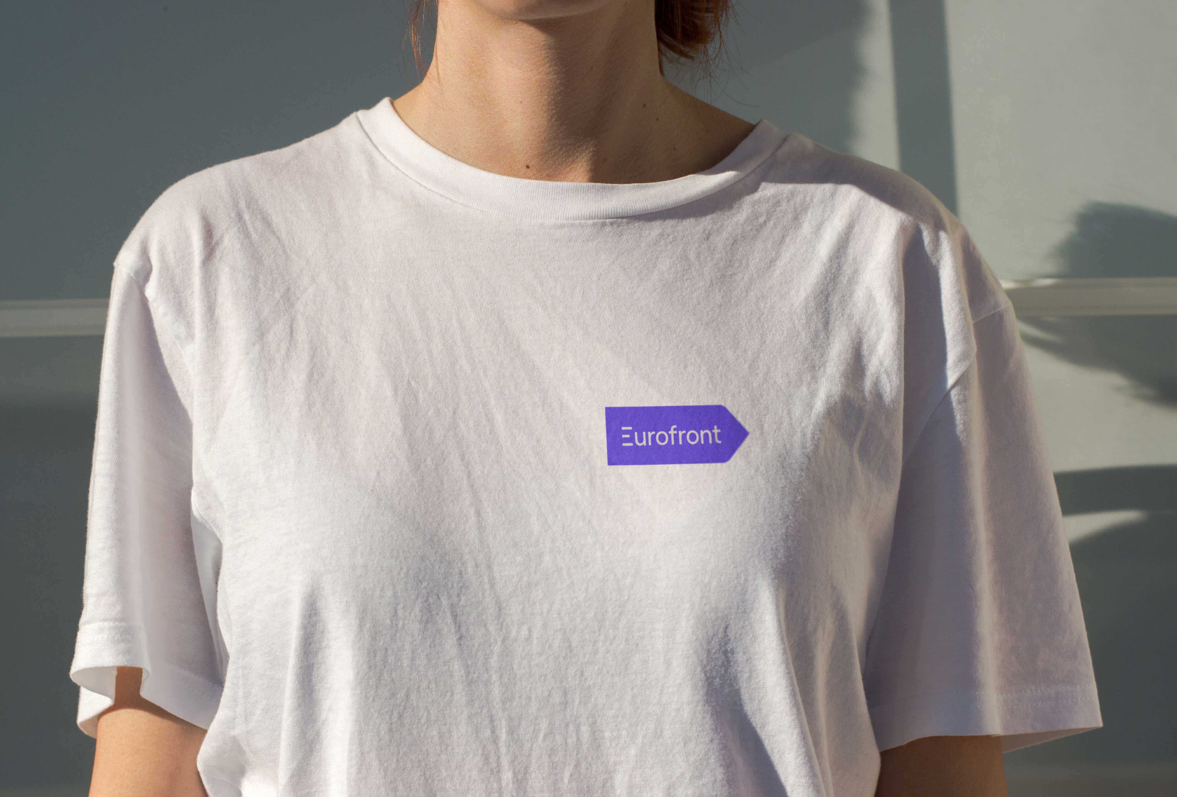
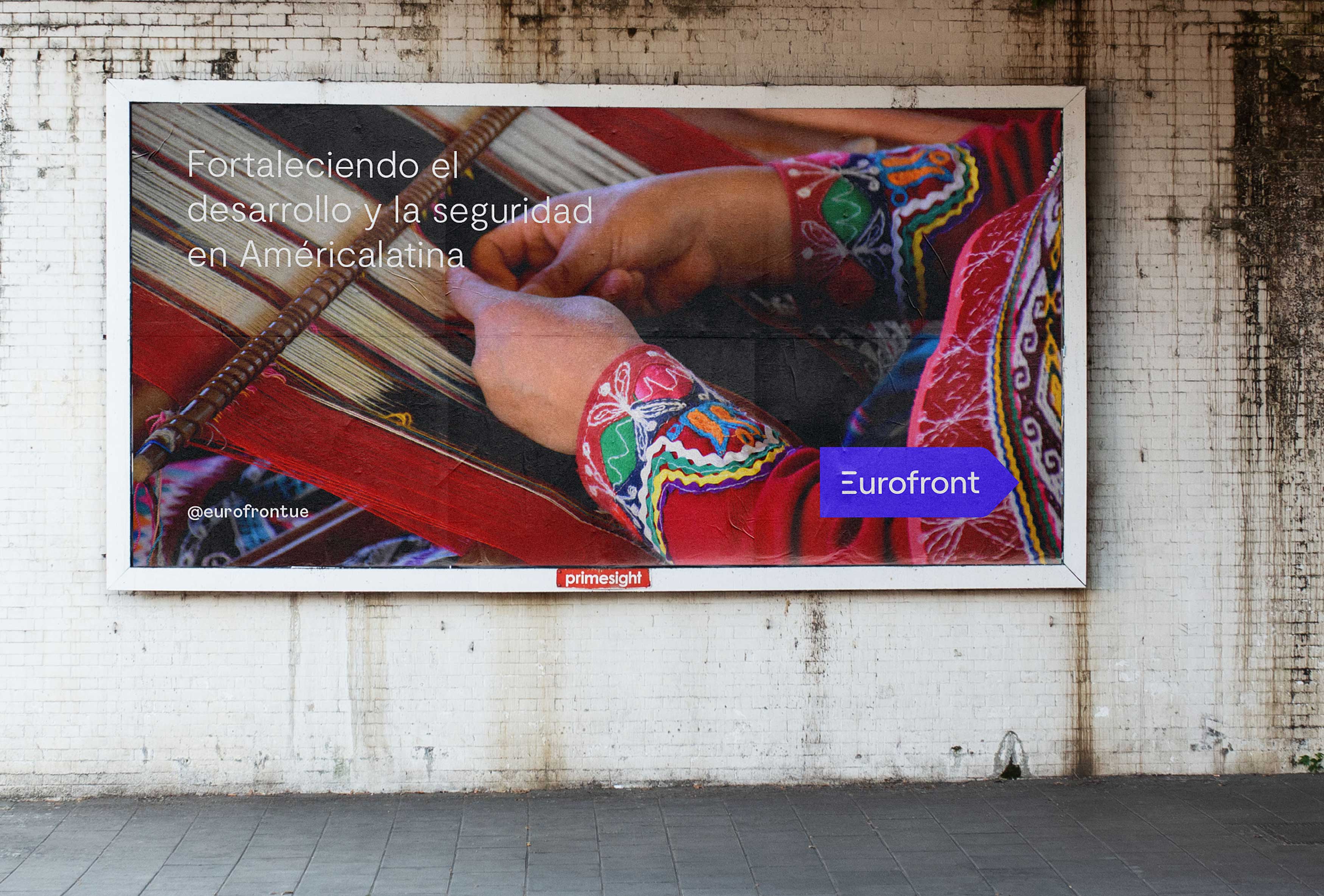
The brand is based on the concepts of mobility and growth, both essential values of the Eurofront program. The logo is inspired by the existing signage near the border crossings, in which the direction and distance of the different countries are indicated, to create a simple brand with a clear relationship with its context.
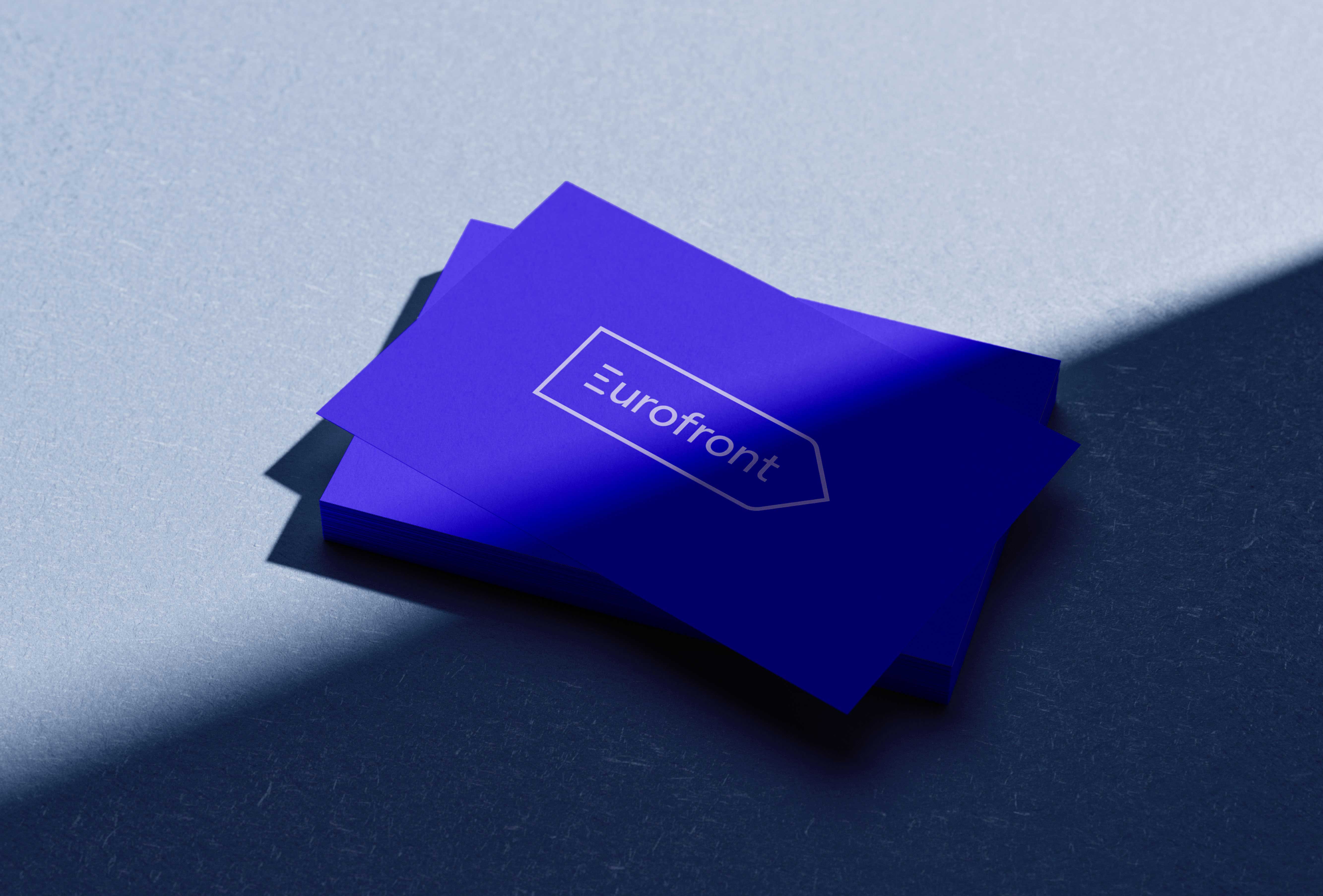
The word Eurofront is framed by an arrow pointing forward, as a way of representing the development objective that the program seeks to achieve in the beneficiary countries. In addition, the letter E has been modified by eliminating its stem, while the arms have been replaced by three arrows to generate a connection between the word and its container. For the construction of the logotype we have used a sans serif typeface, with geometric and friendly strokes, with a simple and modern look.
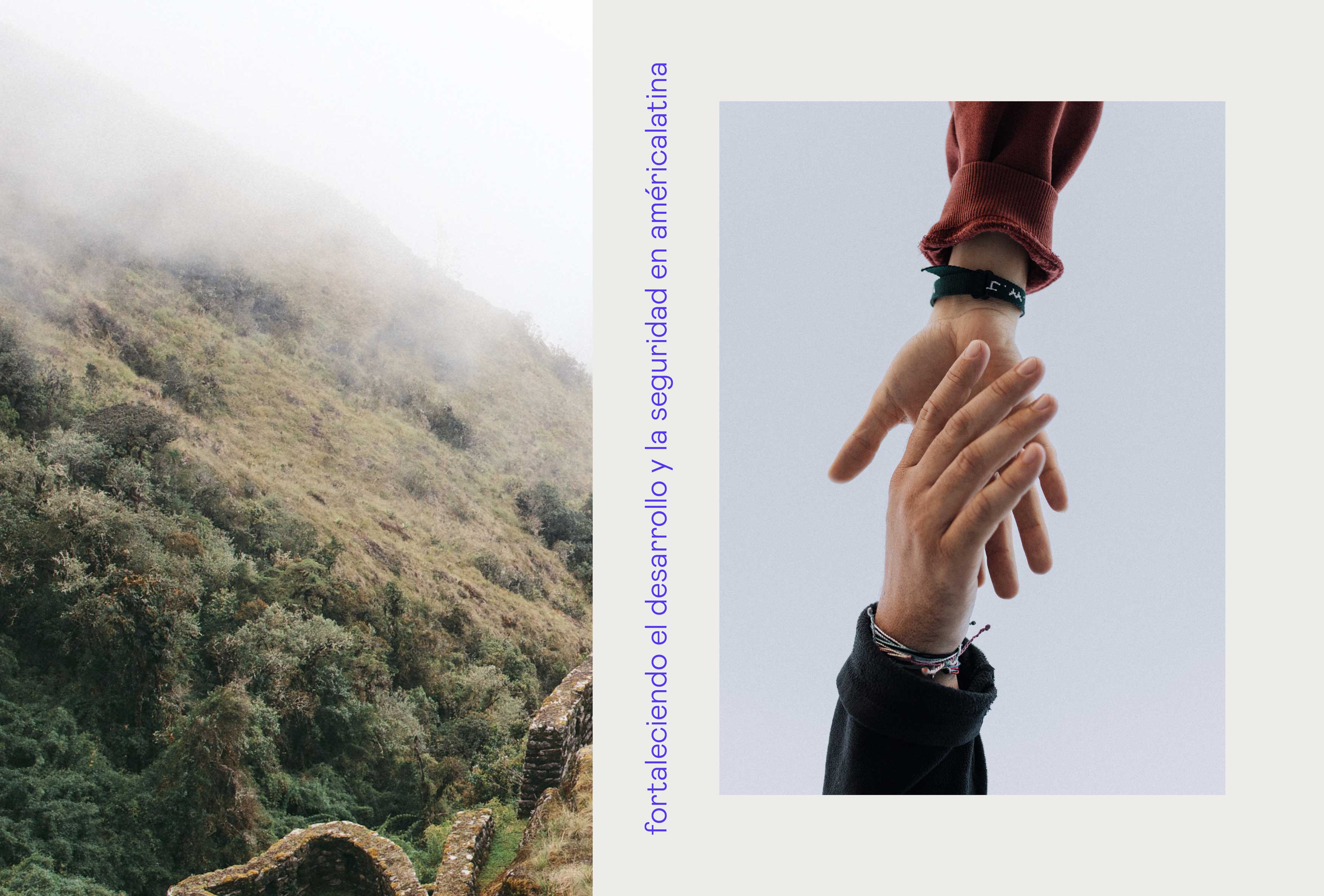
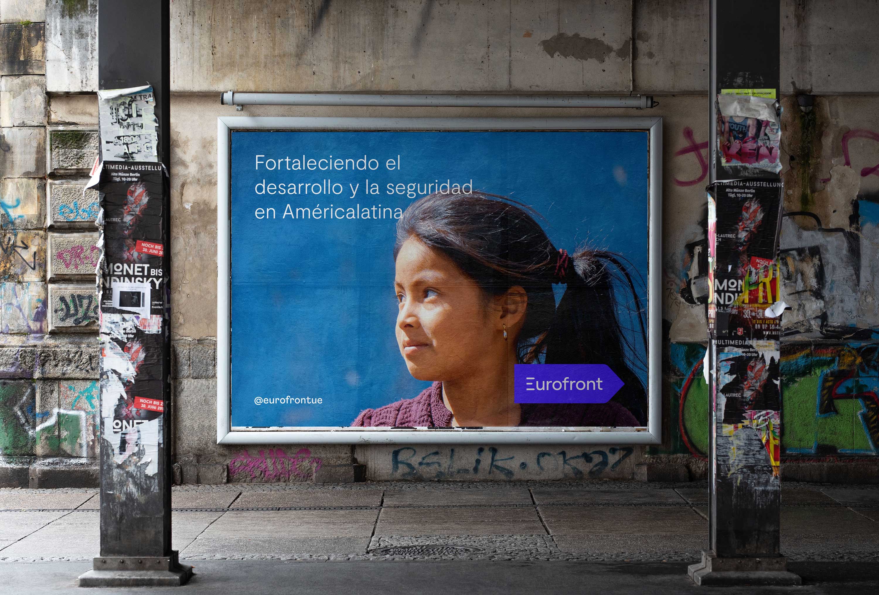
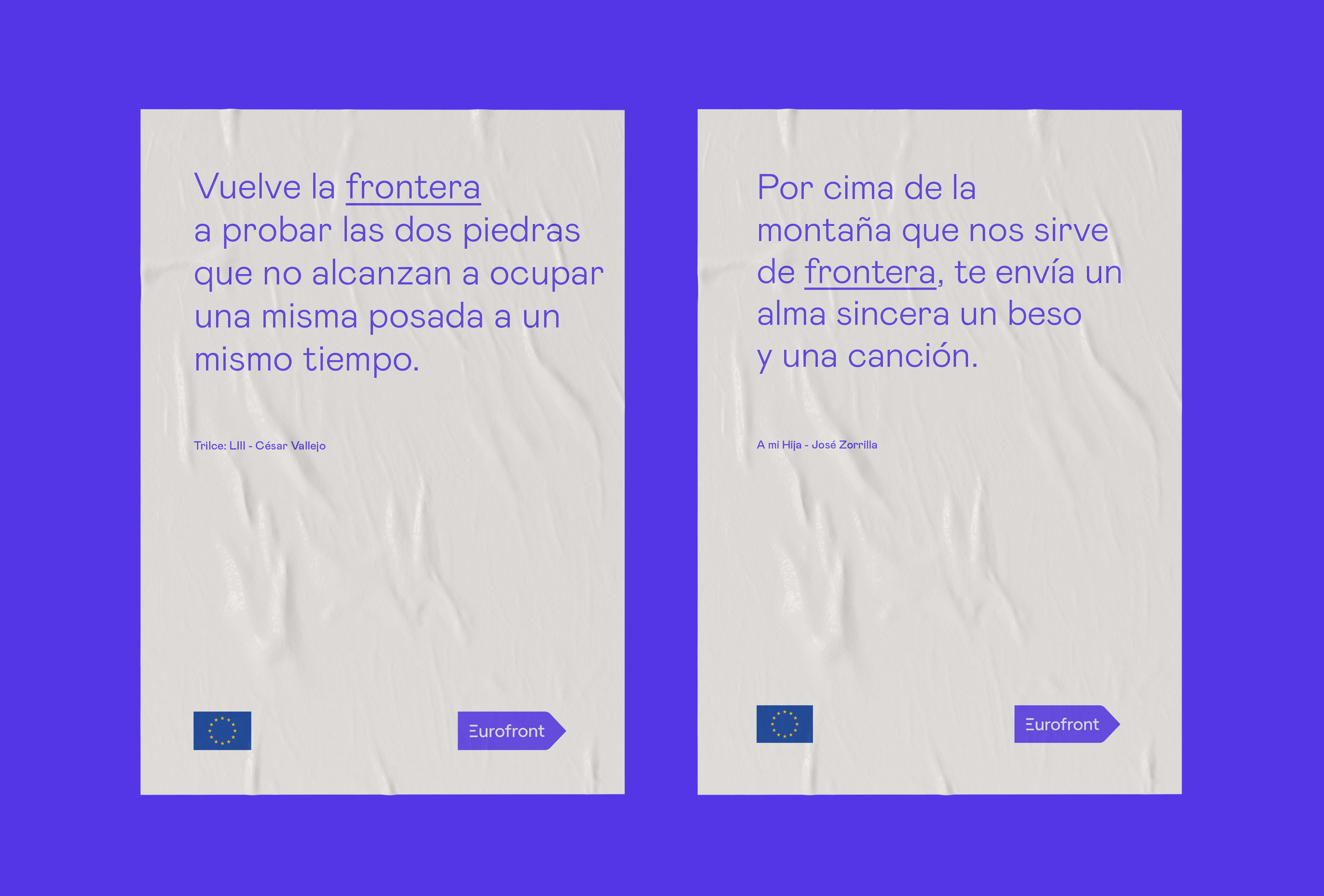
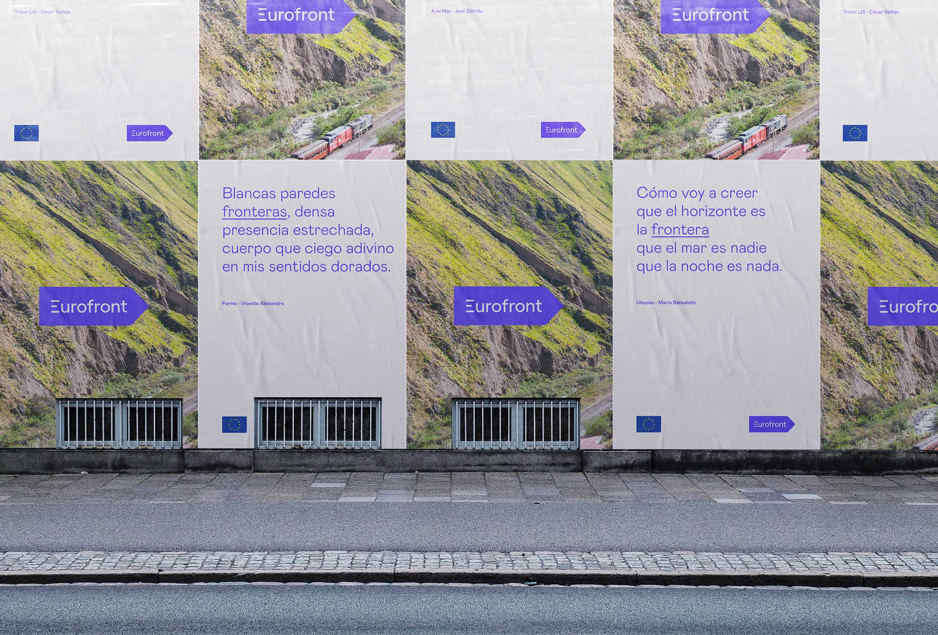
For the brand messages, we have used fragments of poems by different Iberoamerican authors to generate an emotional connection between the beneficiary countries and the program, and to highlight the link and the relationship between Europe and Latin America.
The main colour of the brand is blue, a hue associated with values such as peace, harmony, security or trust.
More Development, Less Borders


CREDIT
- Agency/Creative: fagerström
- Article Title: Brand Identity for Development Aid Program of the European Commission
- Organisation/Entity: Agency, Published Commercial Design
- Project Type: Identity
- Agency/Creative Country: Spain
- Market Region: Europe
- Project Deliverables: Brand Advertising, Brand Guidelines, Brand Identity, Brand Strategy, Branding, Graphic Design, Identity System, Tone of Voice
- Industry: Non-Profit
- Keywords: brandidentity, brand design, identity design, logo, brand, branding, corporate identity, logotype, graphic design, typography, logo design, visual identity, minimalism, graphic design, development aid, international cooperation, European Commission, Latam


