


I’m a passionate designer and multidisciplinary professional with a proven track record specializing in visual identity.
My vision is to explore how design can impact the world and how my work, beliefs and passions can bring about significant change for brands and people.
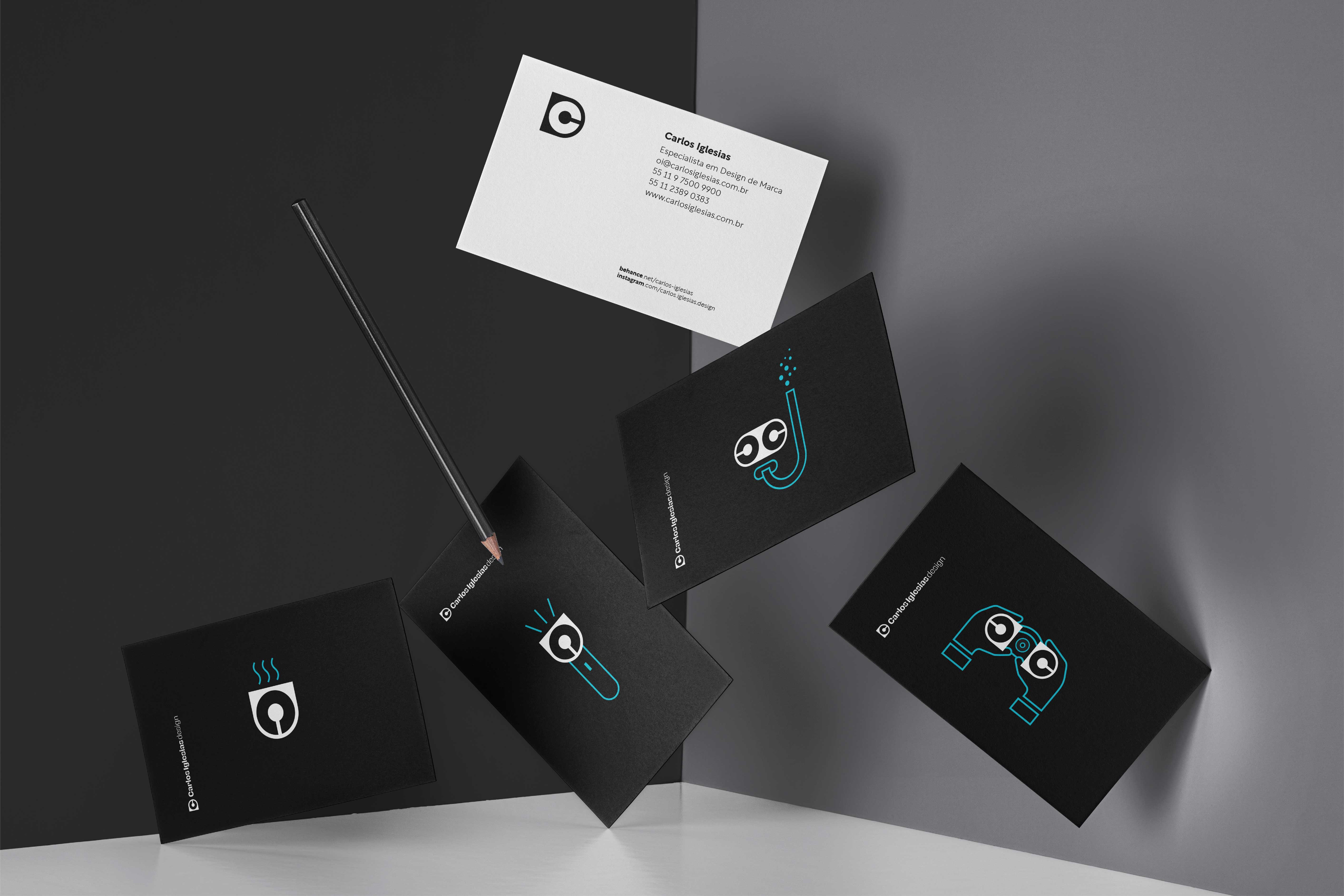
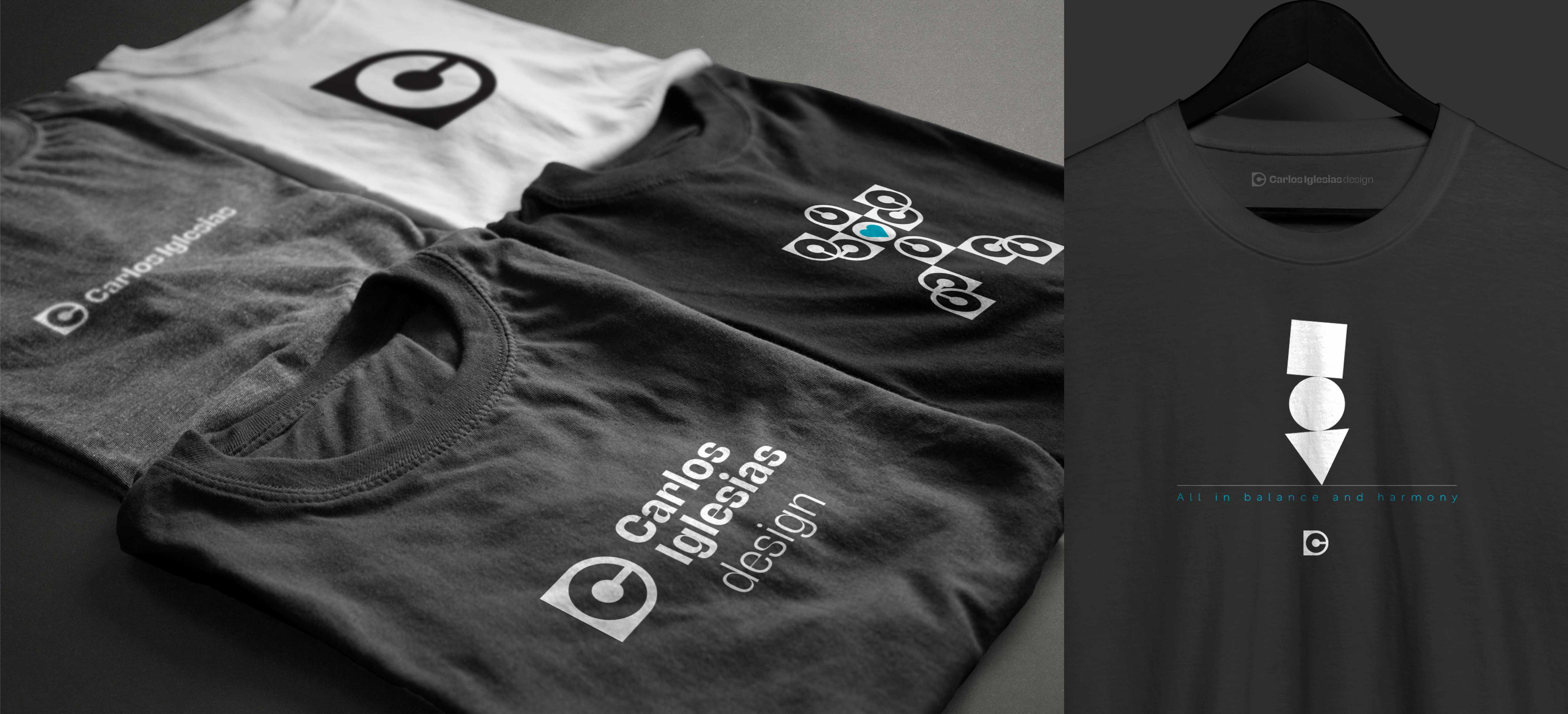
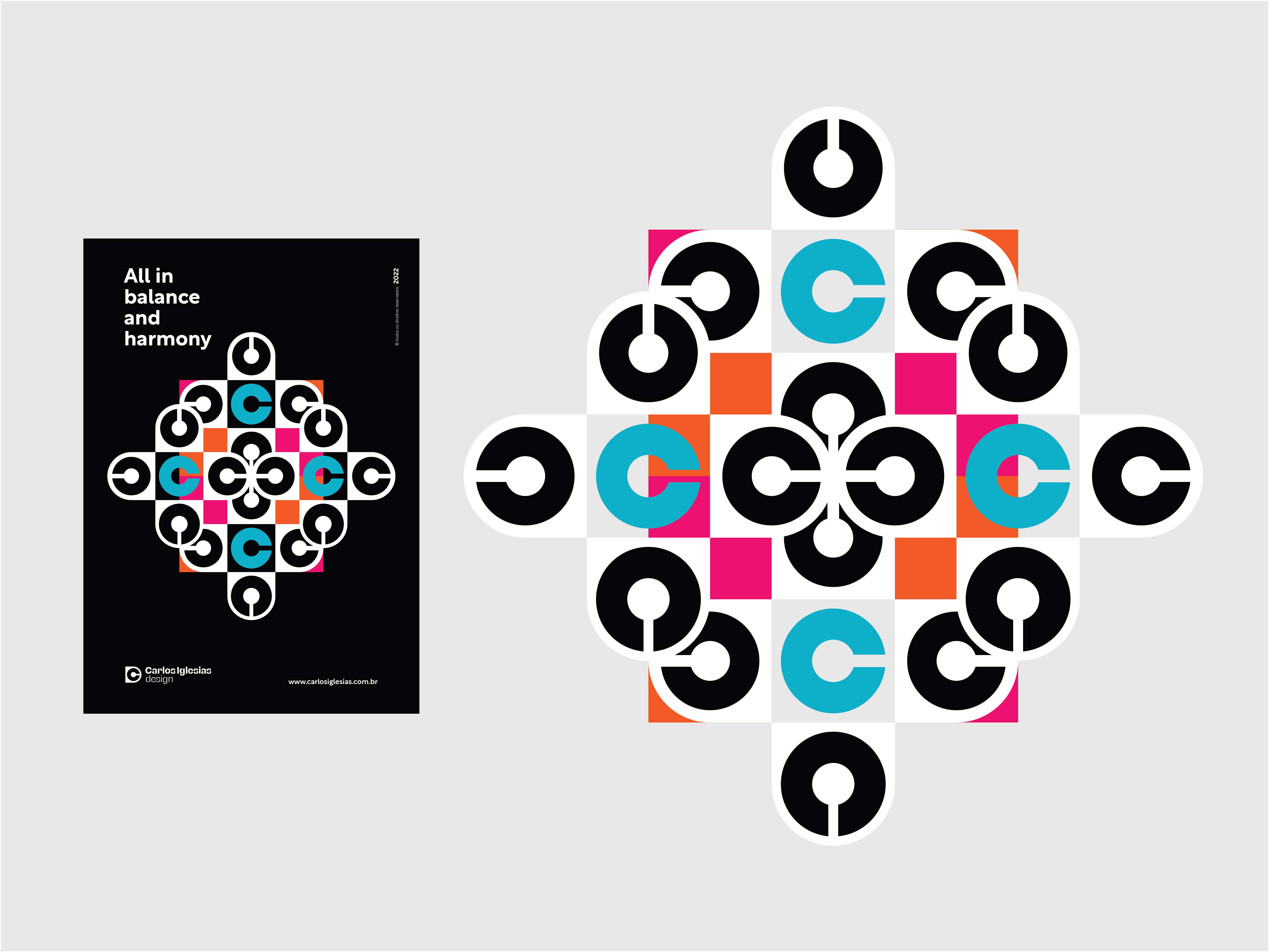
The symbol is derived from the composition of the initials of my name, C and I, added to the letter D (design). The use of simple shapes to represent the letters and the overlapping of these elements resulted in an impressive symbol and, at the same time, “clean”, balanced, harmonic and very easy to remember. The letters C and I inserted to the letter D represent my entire professional career dedicated solely and exclusively to design.
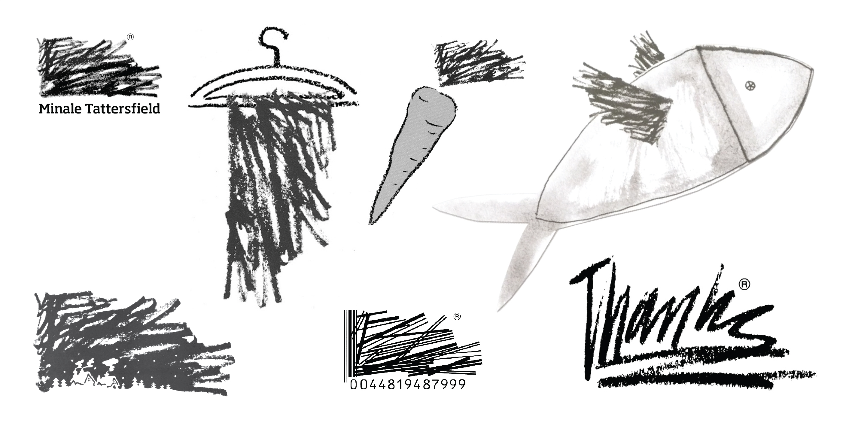
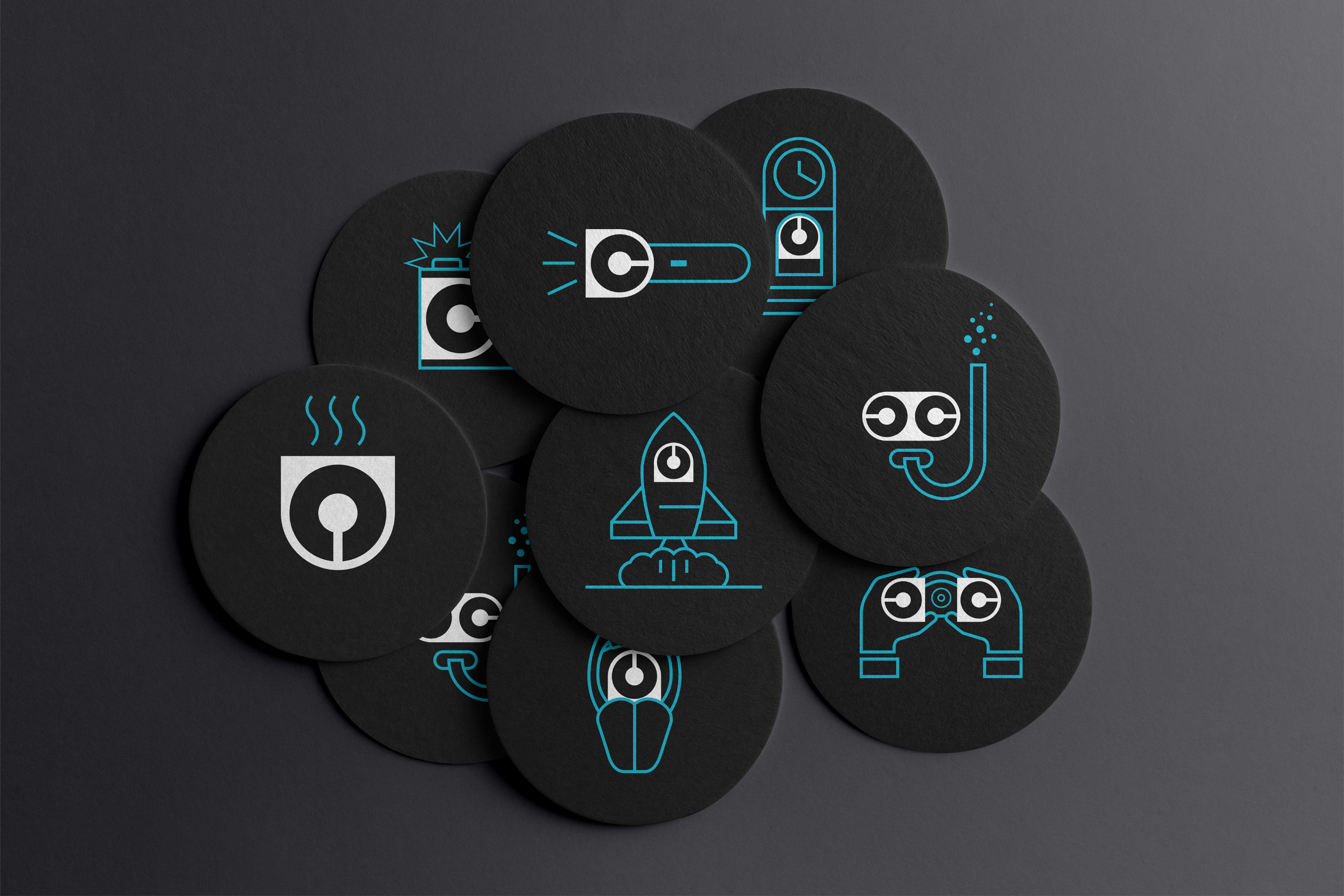
It was in the 90s that I met Minale Tattersfield, an English design agency founded in 1964 by Marcello Minale and Brian Tattersfield, winner of hundreds of international awards and known worldwide.“Rabisco”, a symbol created for the agency’s own identity, caught my attention. In addition to being a unique, expressive design with a lot of personality, the way it was used also stood out. Its apparently unregulated use was actually meticulously studied, and its constructive structure was rigorously maintained. It is important to remember that illustration software and personal computers did not yet exist. And so, inspired by this creative, irreverent and fun reference, I created a family of icons for the brand’s visual identity system, in which the symbol is used in different ways, opening up a range of possibilities and applications.
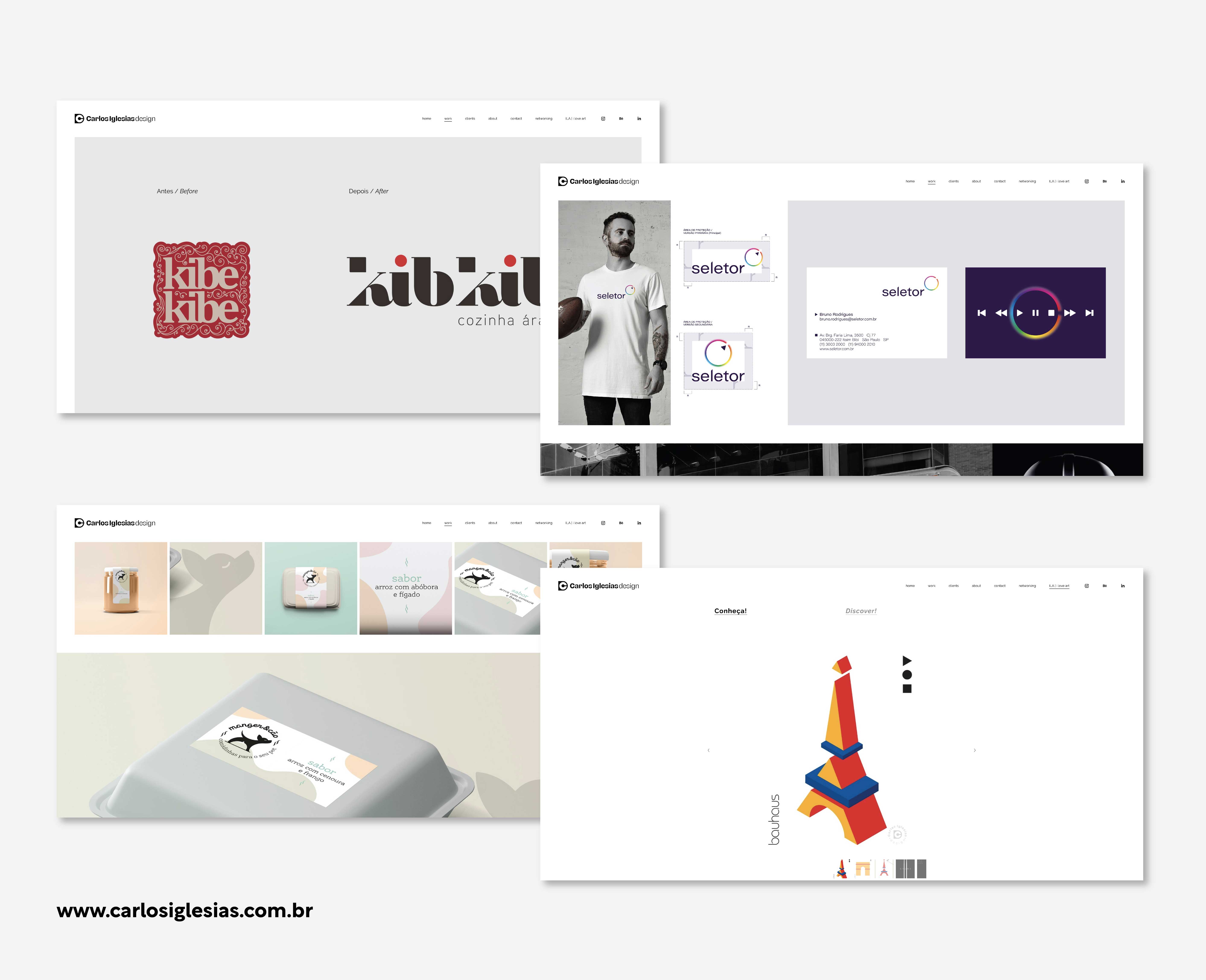
The Stravinsky font was chosen as the basis for the logo composition because it is modern, striking and, above all, because it presents a great contrast in its design. This variation of contrasts is also present in the brands I work for, which come from completely different origins, segments and sizes.
CREDIT
- Agency/Creative: Carlos Iglesias Design
- Article Title: Brand Identity for Carlos Iglesias Design
- Organisation/Entity: Agency
- Project Type: Identity
- Project Status: Published
- Agency/Creative Country: Brazil
- Agency/Creative City: São Paulo
- Market Region: South America
- Project Deliverables: Branding
- Industry: Retail
- Keywords: Design, Brand, Identity, Identity System, Logo, Brand Identity, Branding, Visual Identity, Logotype, Brand Design
-
Credits:
Creative: Carlos Iglesias


