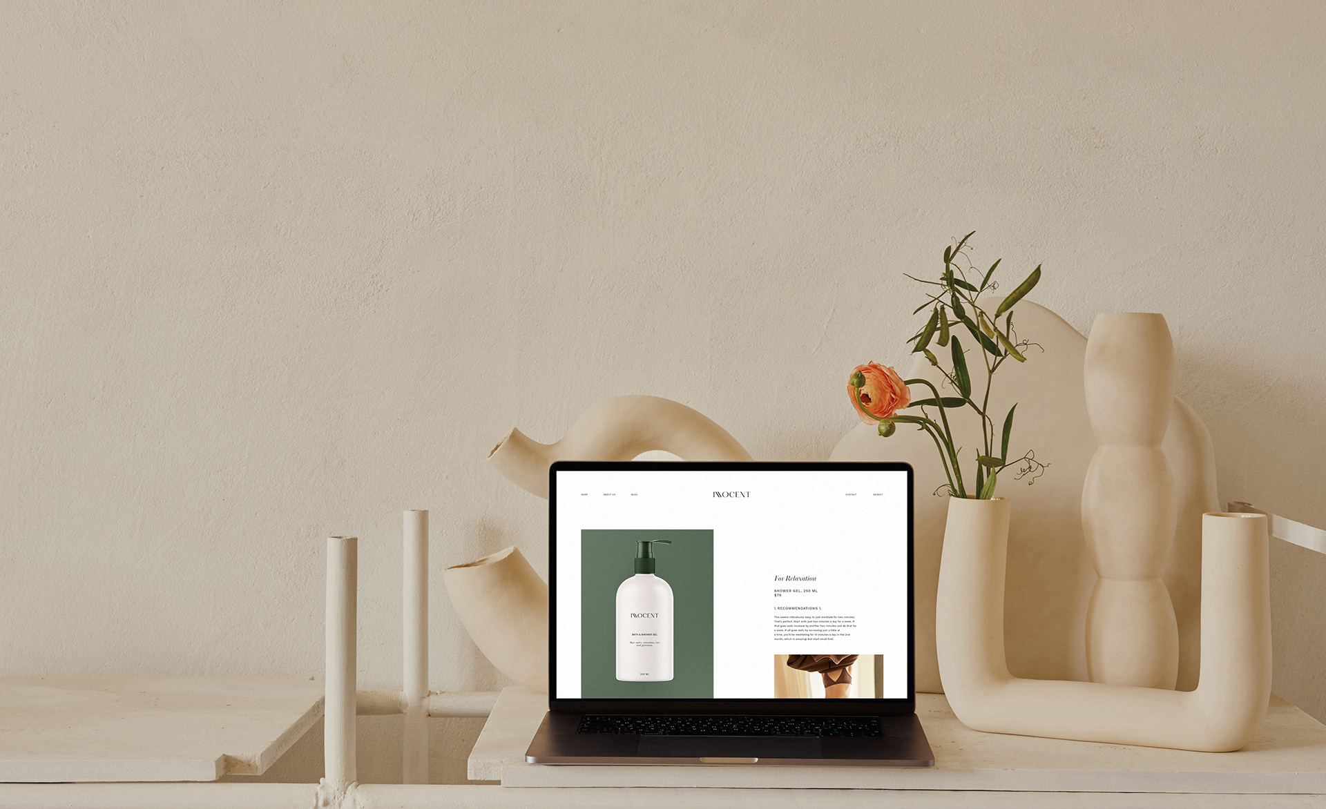
Innocent is a clean formulated minimalistic brand with a focus on body care. Their main goal was to translate calm, self-care vibes to their customers with the power of branding. We needed to create simple yet catchy positioning for a new line of bath products: shower gel, body lotion, and foot cream.
The Challenge: The whole brand’s mission is to provide people with clean formulated skincare products to improve the skin of everyday busy people. One of the biggest challenges was to stay connected to earth and science at the same time, focus on wellness and meditative practices. The identity system needed to speak the language of a calm and safe place, let people stop for a second, and take the time for themself. Therefore, we decided to put the emphasis on colors and typography to create the minimalistic, yet emotional look of the new brand.
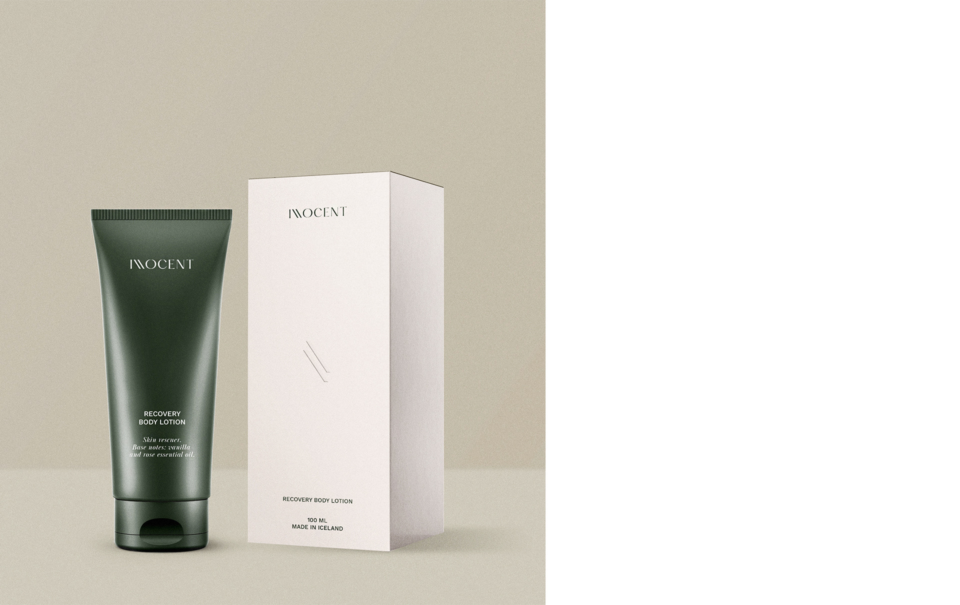
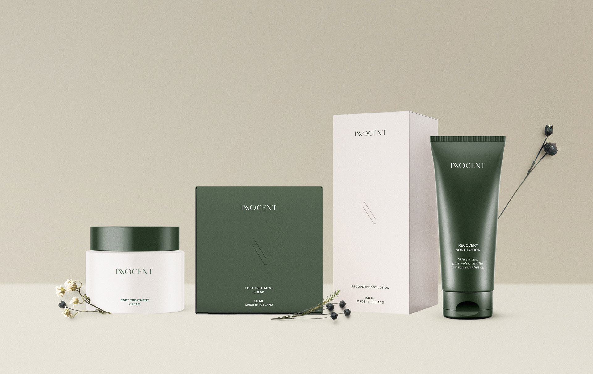
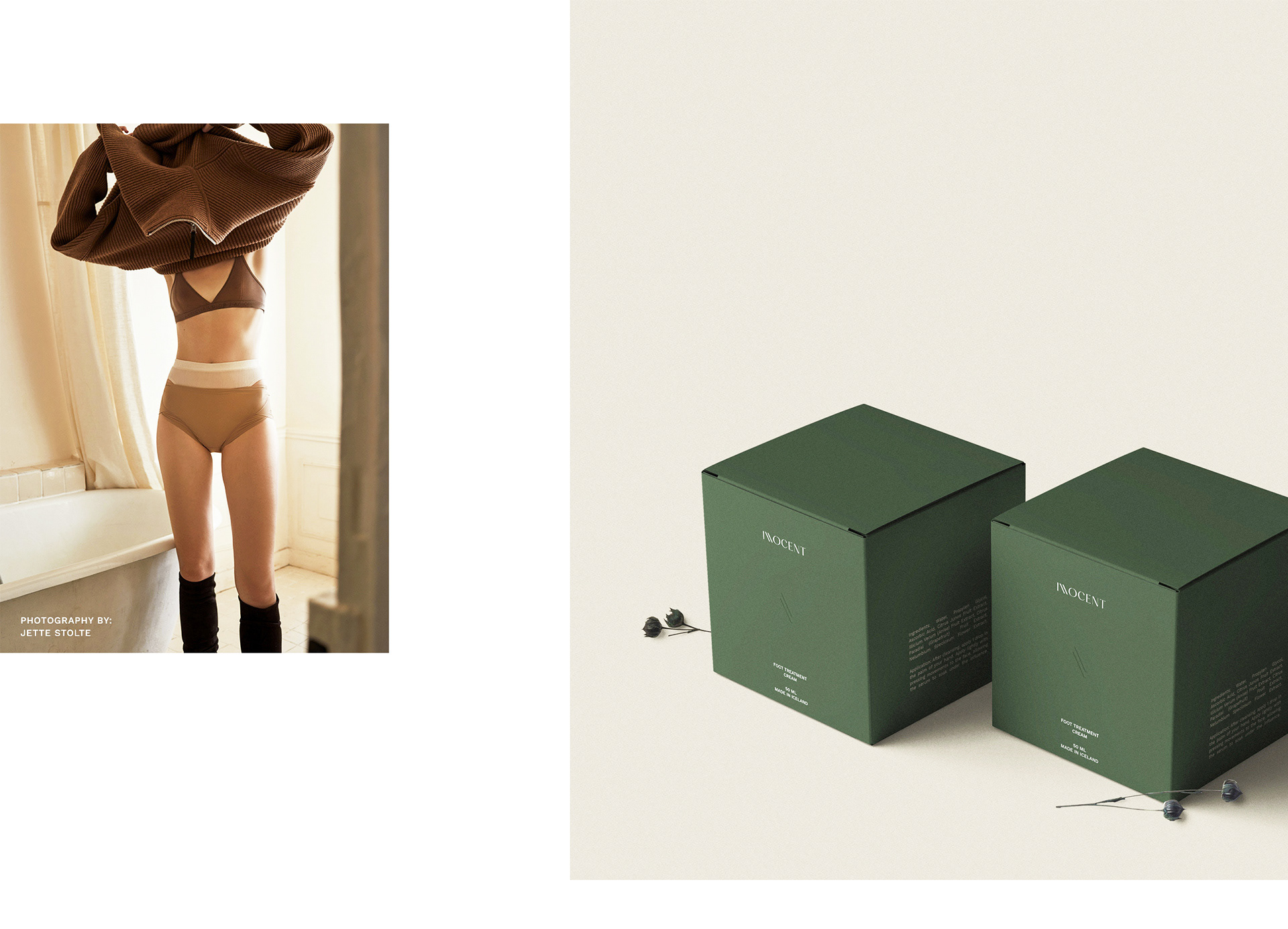
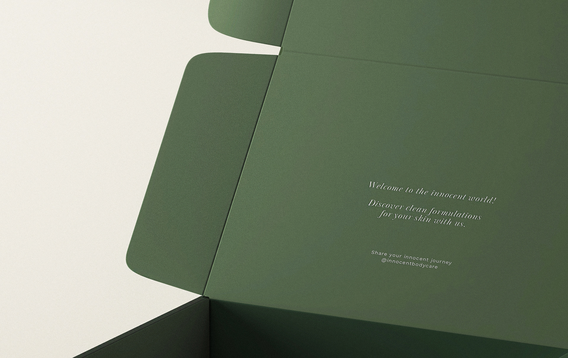
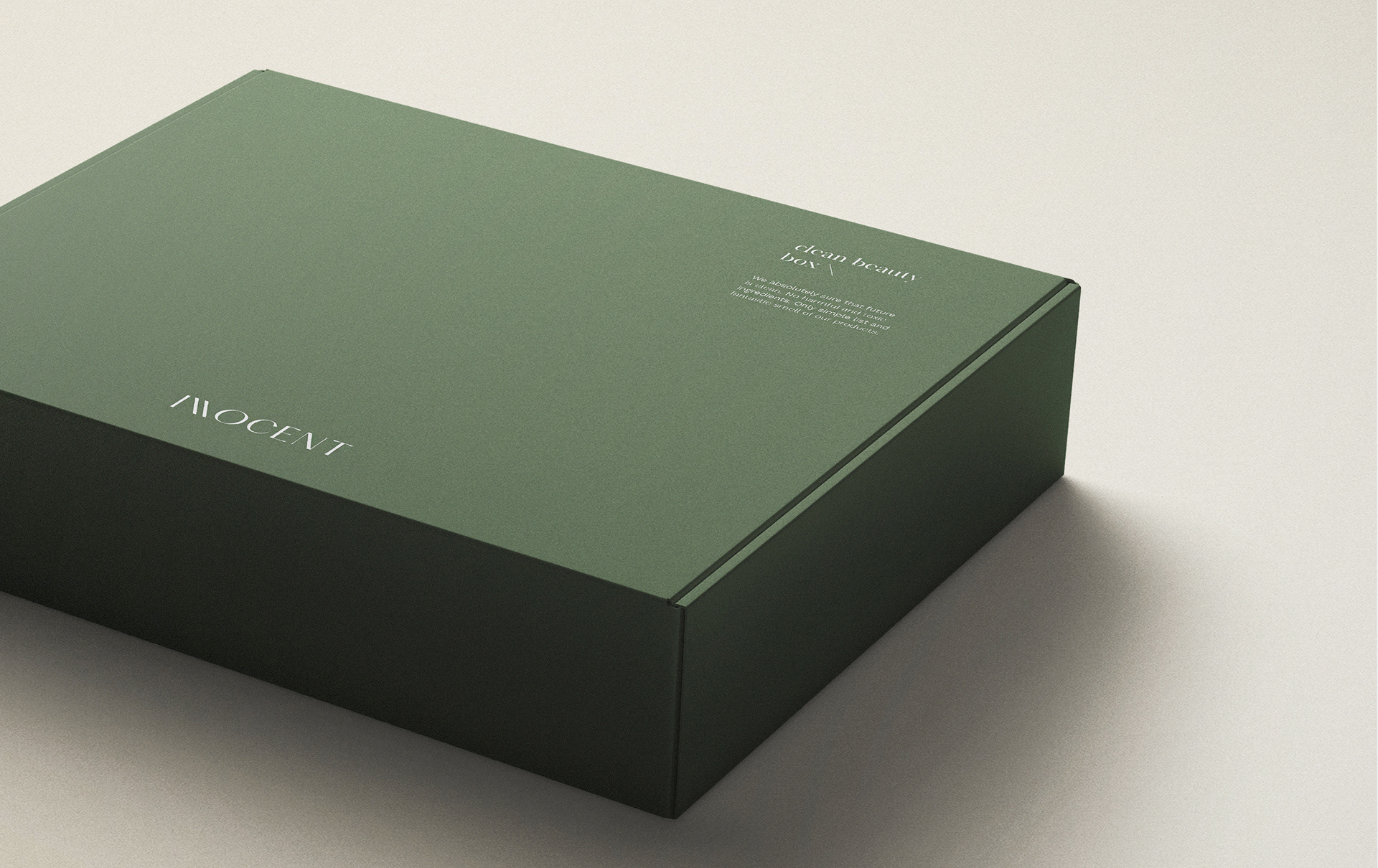
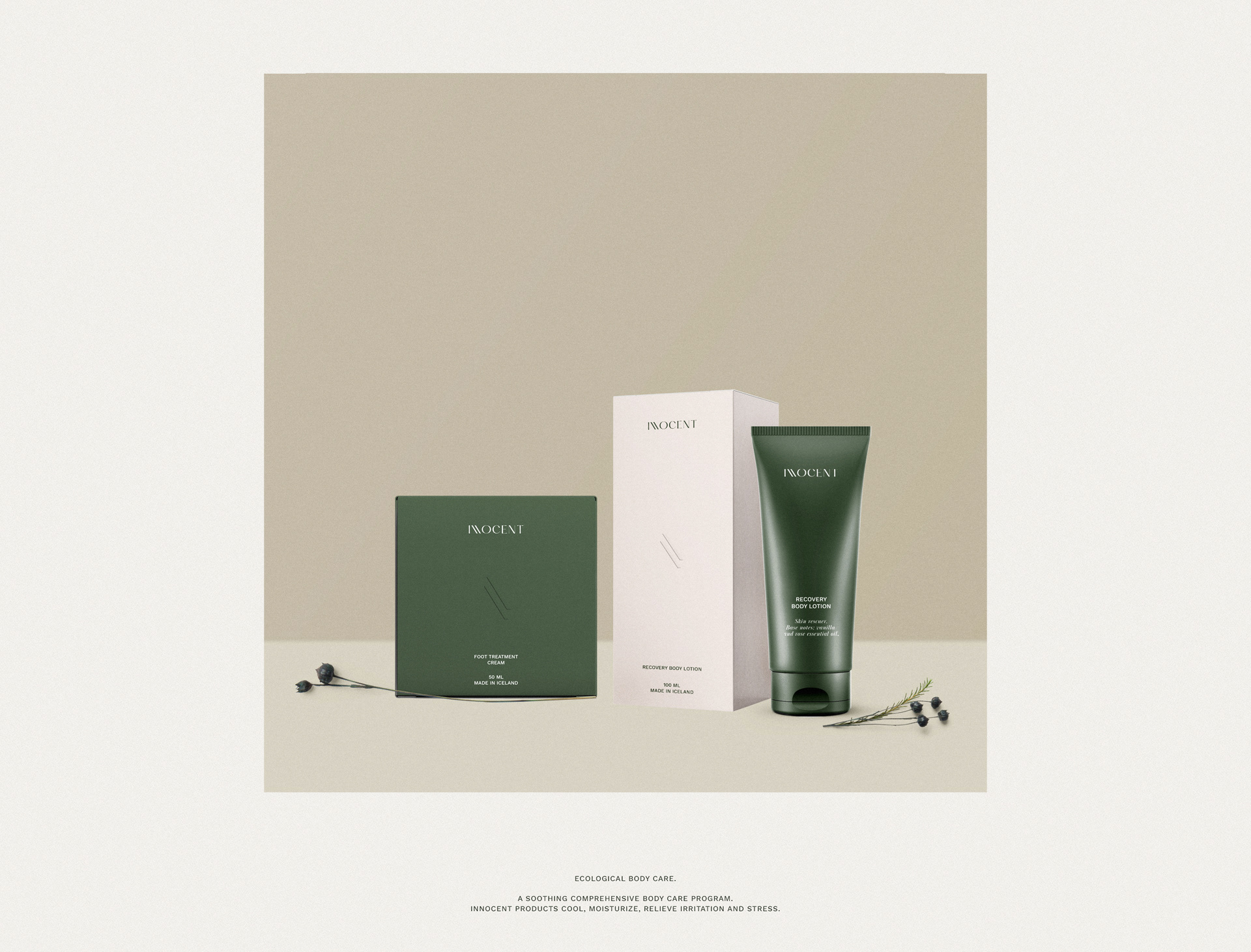
The Solution: We decided to create a minimalistic visual language that won’t distract customers from the main: time she dedicates to herself. Natural color palette with deep green, light beige, and white accents creates a modern and still so close to nature’s mood. The typography system consists of elegant italic serifs, which remind customers about nature and combined with a strong and bold sans serif typeface that creates a modern and scientific side of the brand. Brand main graphic element brought from the primary logotype and turned into submark. Two parallel lines turned at an angle showcase and translate the unity of inner and outer parts. The inner ones are the soul and mind, whilst the outer parts are the body and the whole life around us. Package design plays with sensations of the user and almost invisible design. The grainy texture of the box, a debossing technique for the logotype, and accents of color evoke the desire to focus on the most important what you have – yourself. Invite customers into the world of tactile senses to discover the products.
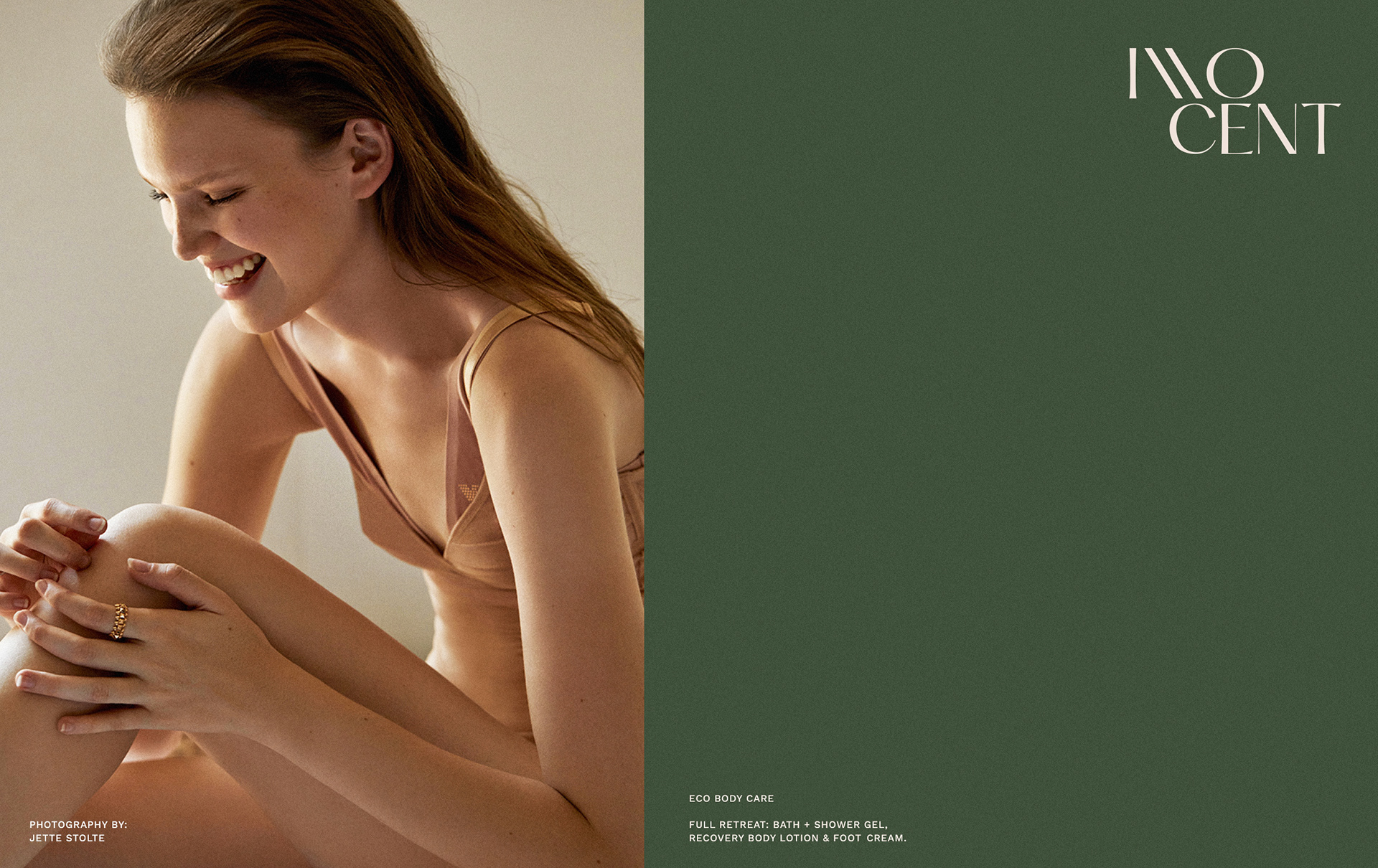
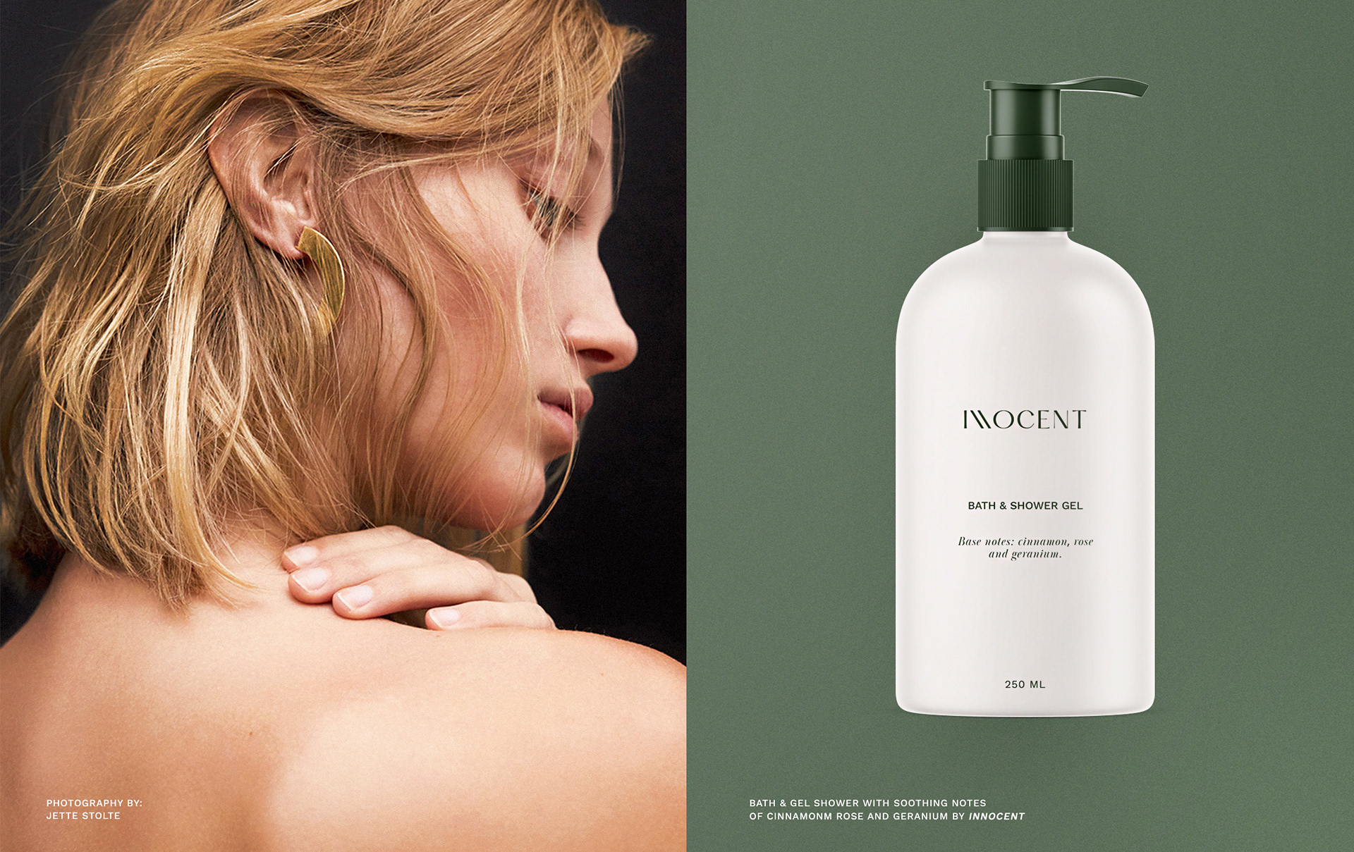
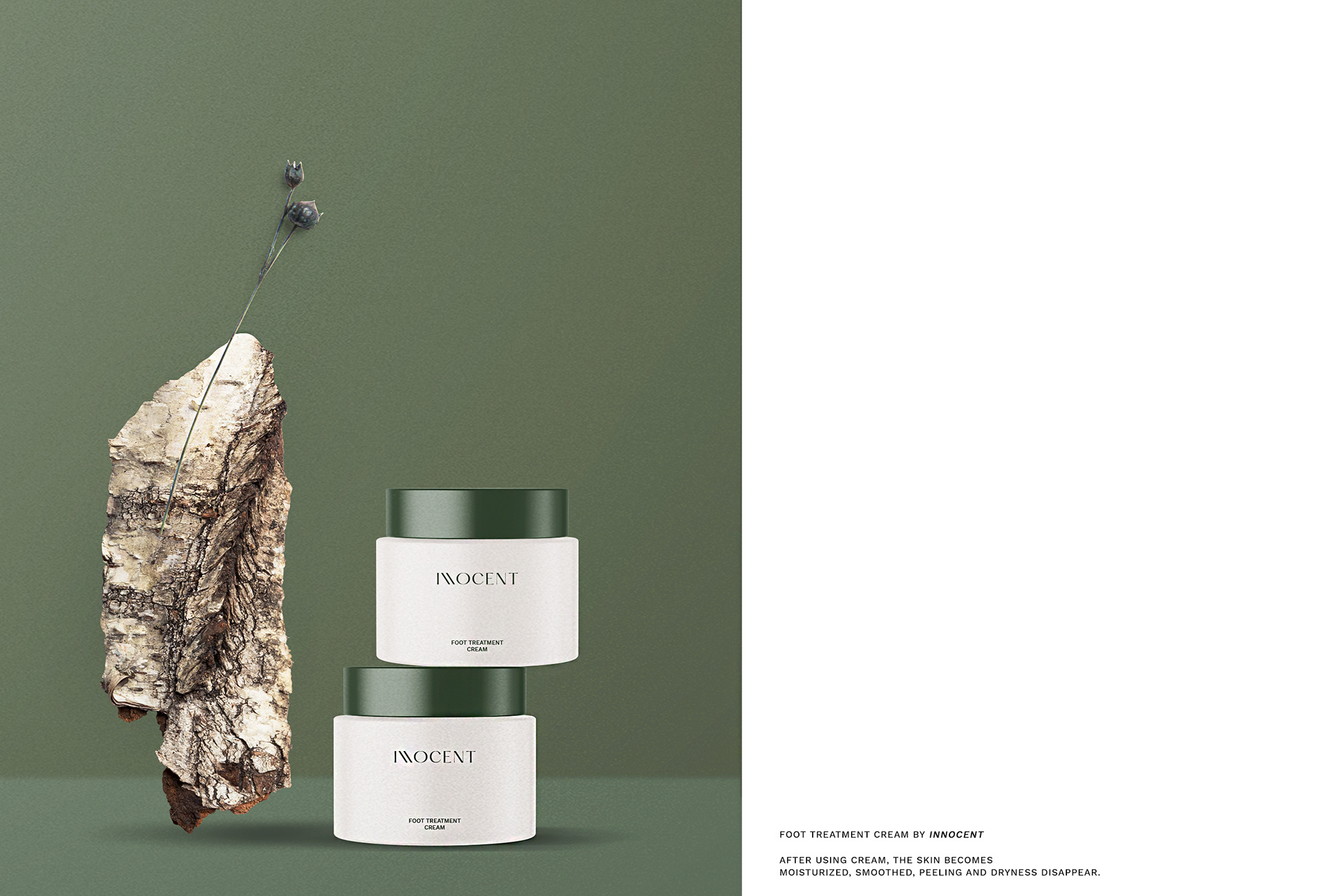
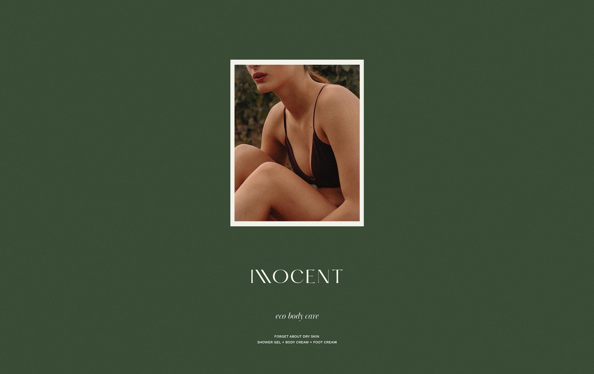
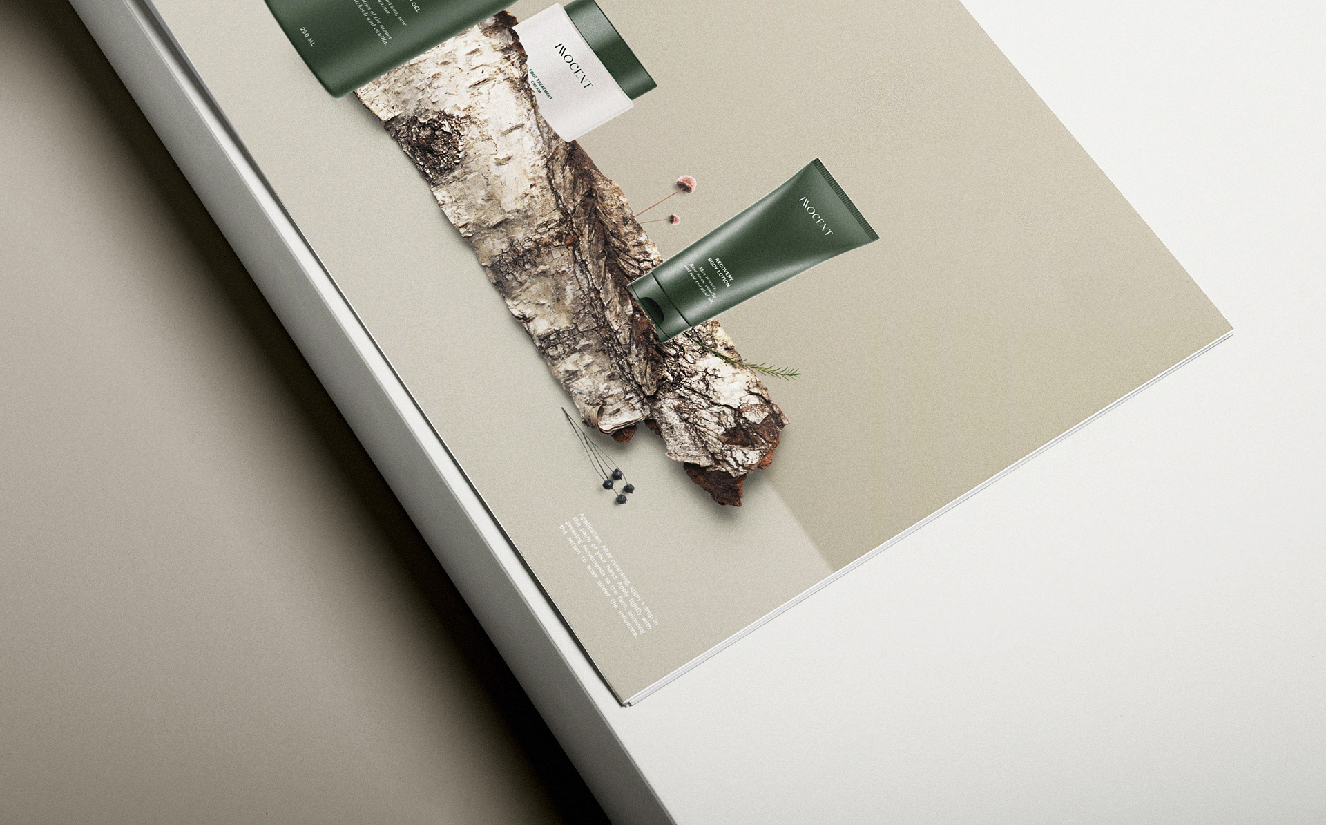
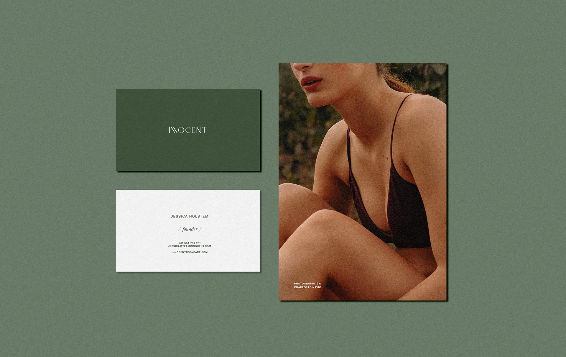
Brand’s photo art direction is based on natural, unfiltered photography with retro grainy effects and close-ups of the body. The whole visual language is down to earth. The brand uses still-life images that showcase natural textures combined with the products: wood, leaves, berries, and main ingredients from the products’ fragrances.
CREDIT
- Agency/Creative: Anastasia Dunaeva, Studio Stacie Co.
- Article Title: Brand Identity for Body Care Brand Innocent
- Organisation/Entity: Freelance, Published Commercial Design
- Project Type: Packaging
- Agency/Creative Country: Russia
- Market Region: Global
- Project Deliverables: Brand Experience, Brand Guidelines, Brand Identity, Brand Strategy, Branding, Graphic Design, Packaging Design, Research, Tone of Voice
- Format: Bottle, Box, Tube
- Substrate: Plastic


