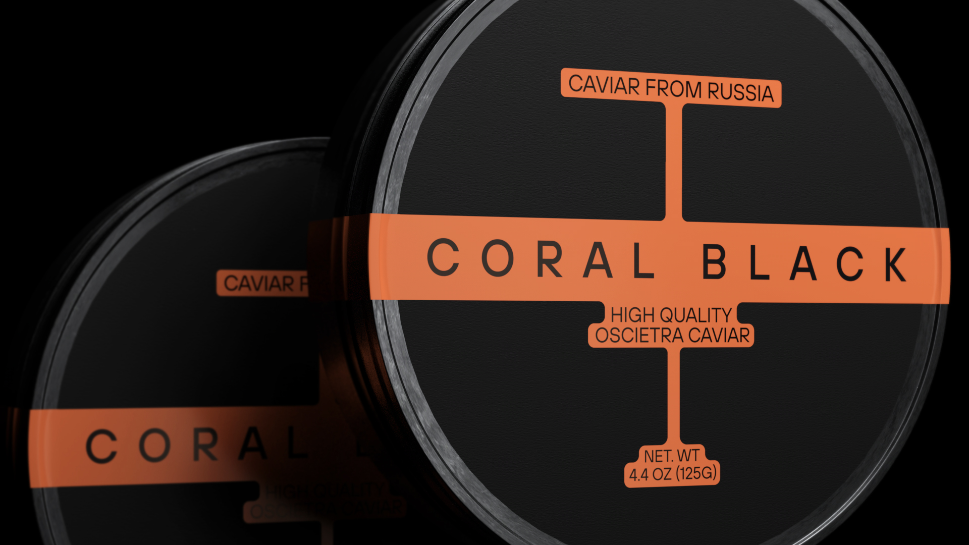
Coral Black is a manufacturer of the highest quality caviar. And it is not afraid to stand out.
At the first meeting with the client, we began our conversation with the fact that nowadays brands in related fields are mostly similar to each other. And why don’t we do it by our rules? With that in mind we got to work.
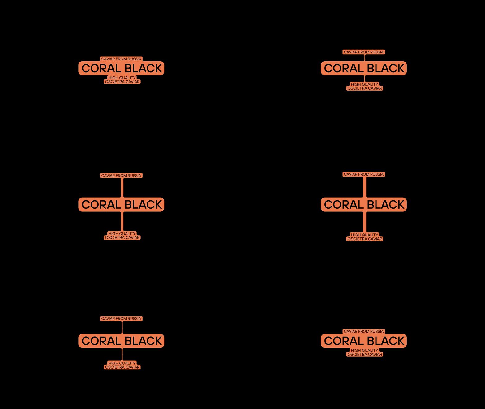
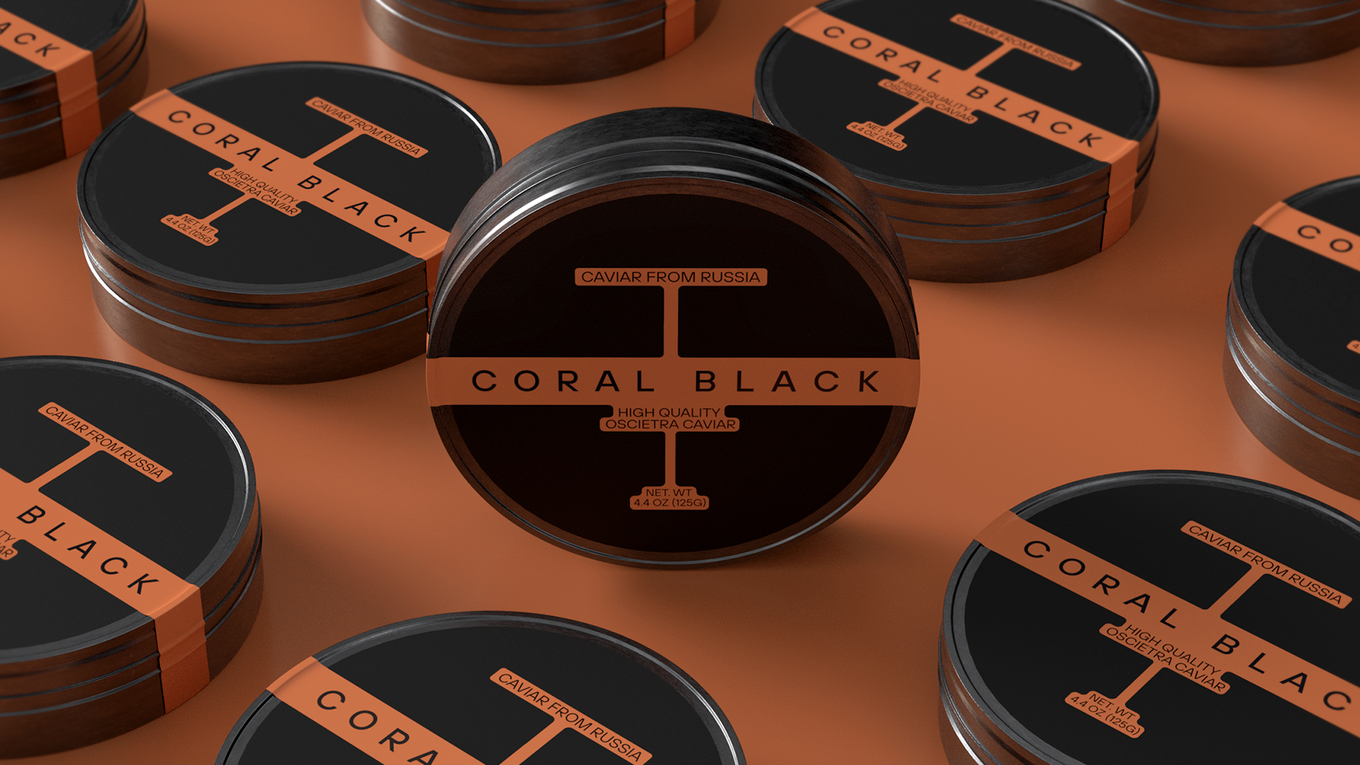
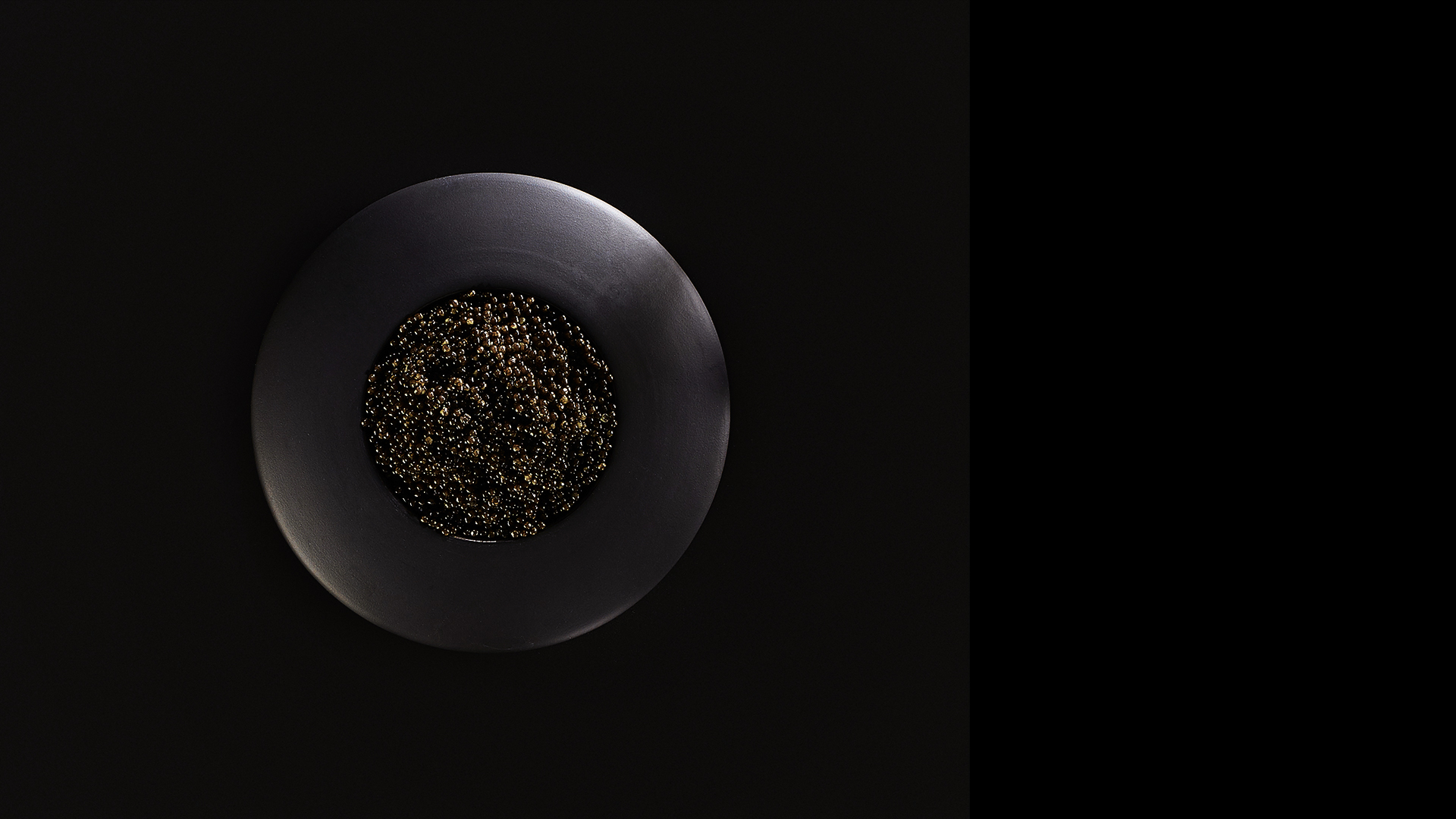
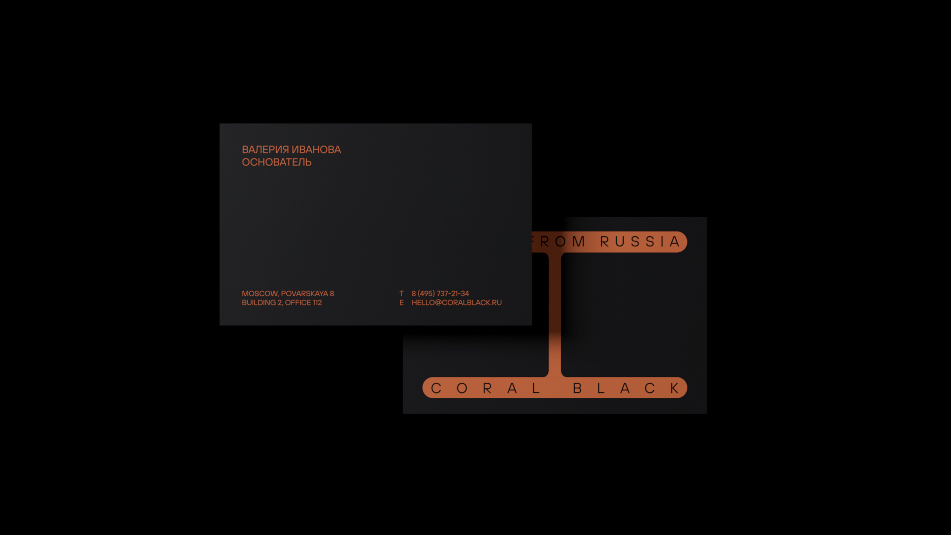
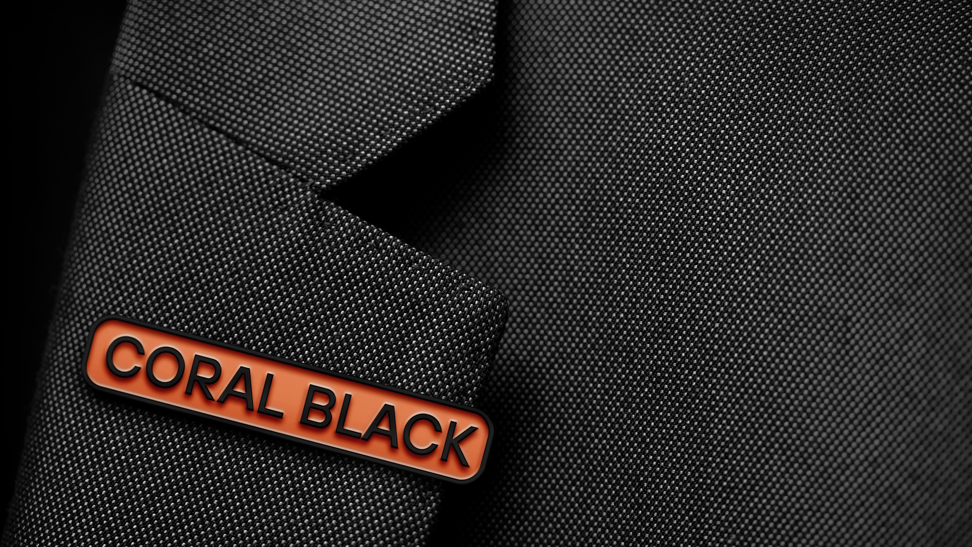
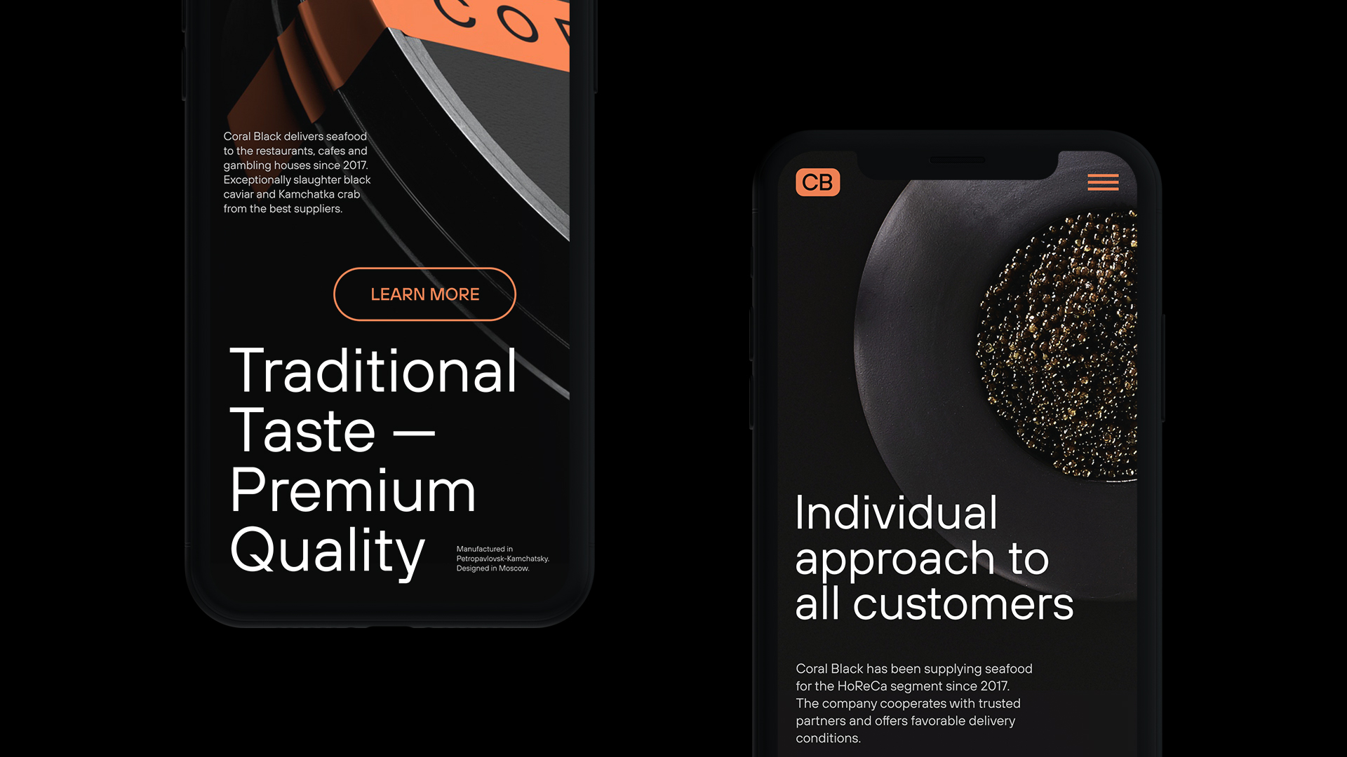
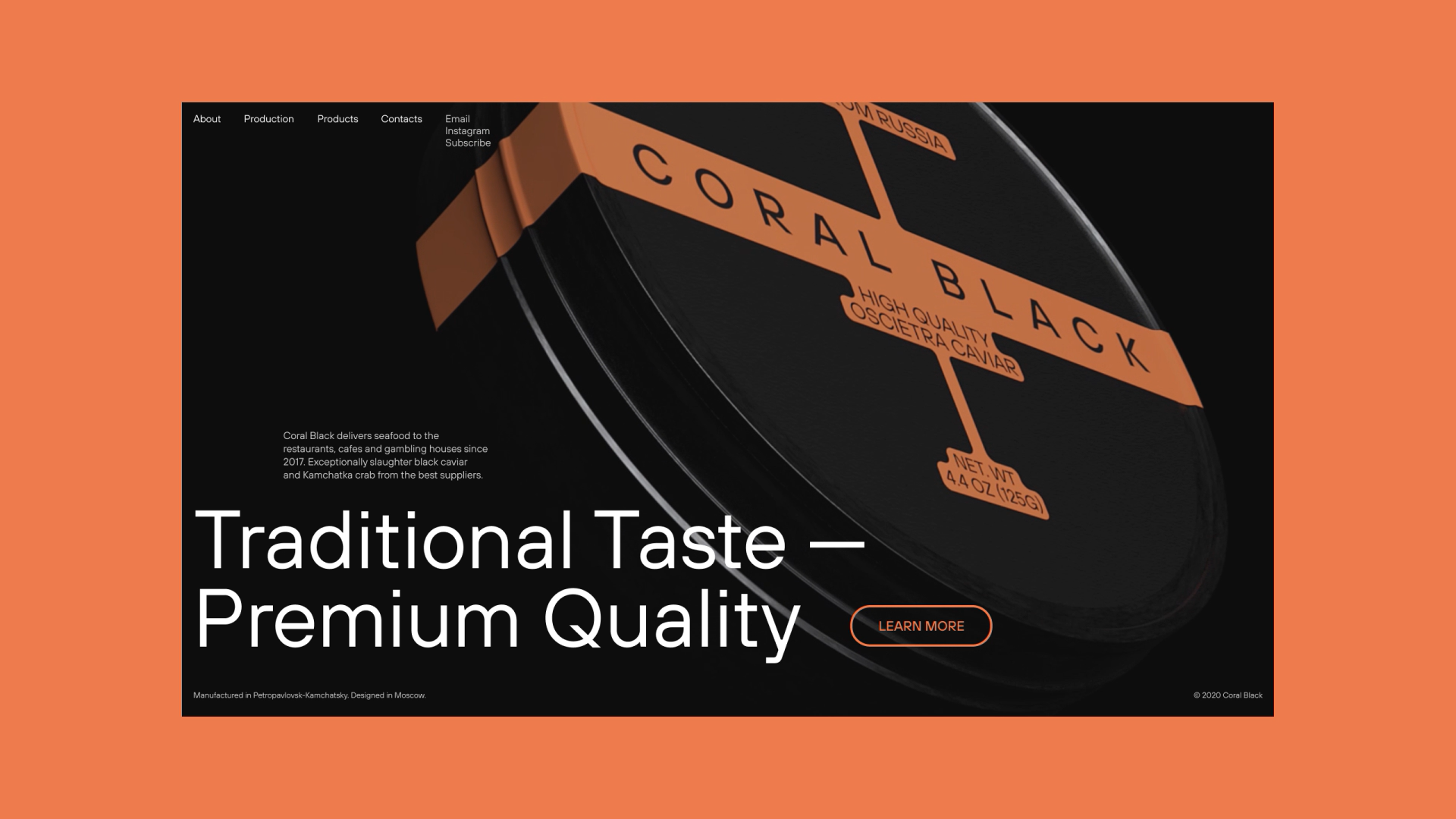
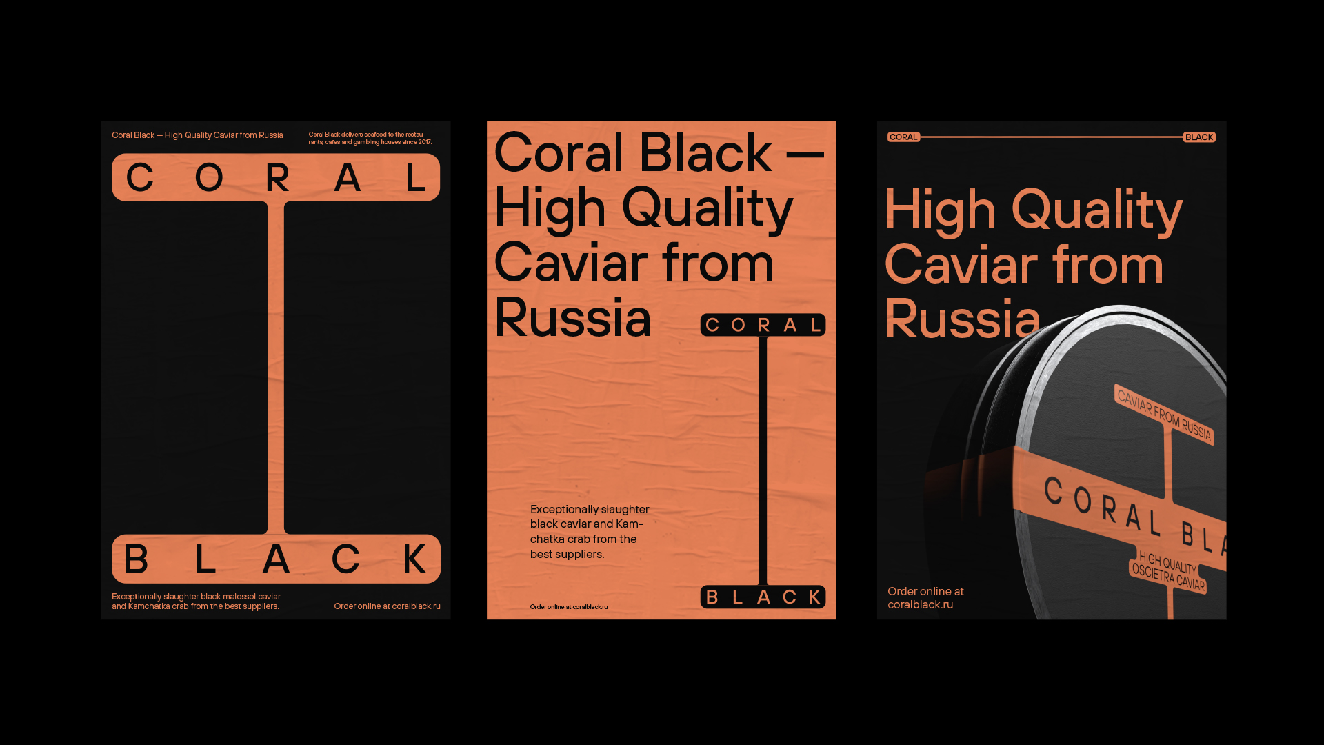
We developed naming that immediately tells about the origin of the company. Coral is associated with the sea; and black with its conciseness depicts the quality of the best. In brand identity, we emphasized the above mentioned and highlighted the specific qualities of the product: caviar forms clusters of different shapes. In visual identity it imitates various planes. A particular attention is paid to such details as the appearance of the package. Indeed, it has turned out as a black coral among mass caviar brands.

CREDIT
- Agency/Creative: FREE.creative
- Article Title: Brand Identity for a Caviar Manufacturer by FREE.creative
- Organisation/Entity: Agency, Non Published Concept Design
- Project Type: Identity
- Agency/Creative Country: Russia
- Market Region: Europe
- Project Deliverables: Brand Design, Brand Identity, Brand Naming, Branding, Identity System, Packaging Design, Research, Tone of Voice
- Industry: Food/Beverage
- Keywords: Identity, Packaging, Web design, Caviar, Russia


