


Development of the Brand Identity for Entre Linhas Advertising
In the process of creating the brand identity for Entre Linhas Advertising, we aimed to capture the essence of creativity, innovation, and commitment that define the company. A brand’s identity goes beyond colors and shapes; it should communicate values, mission, and the company’s personality in a clear and impactful way. For Entre Linhas, creativity is a central pillar, and our challenge was to translate this idea into solid visual elements.
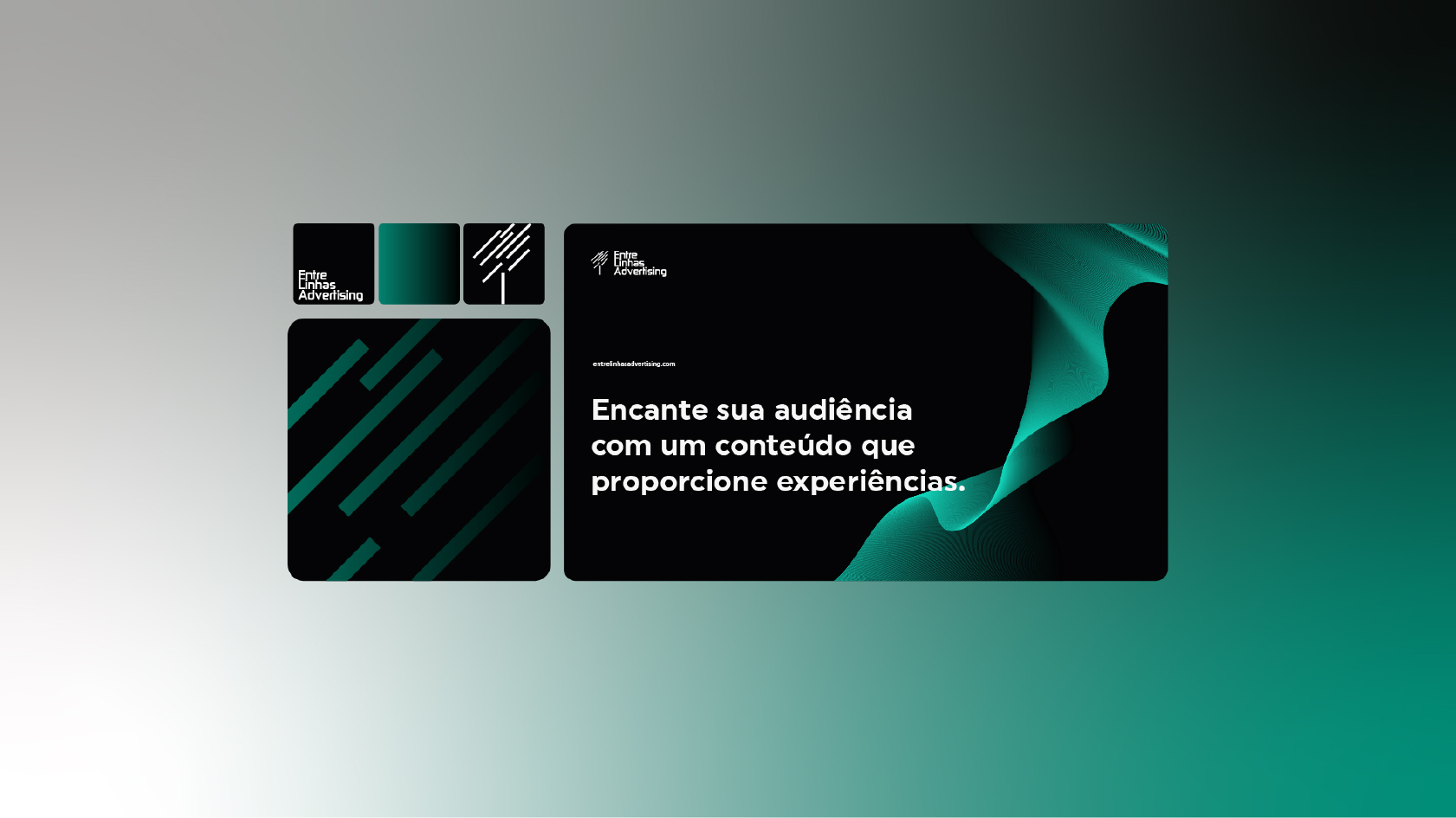
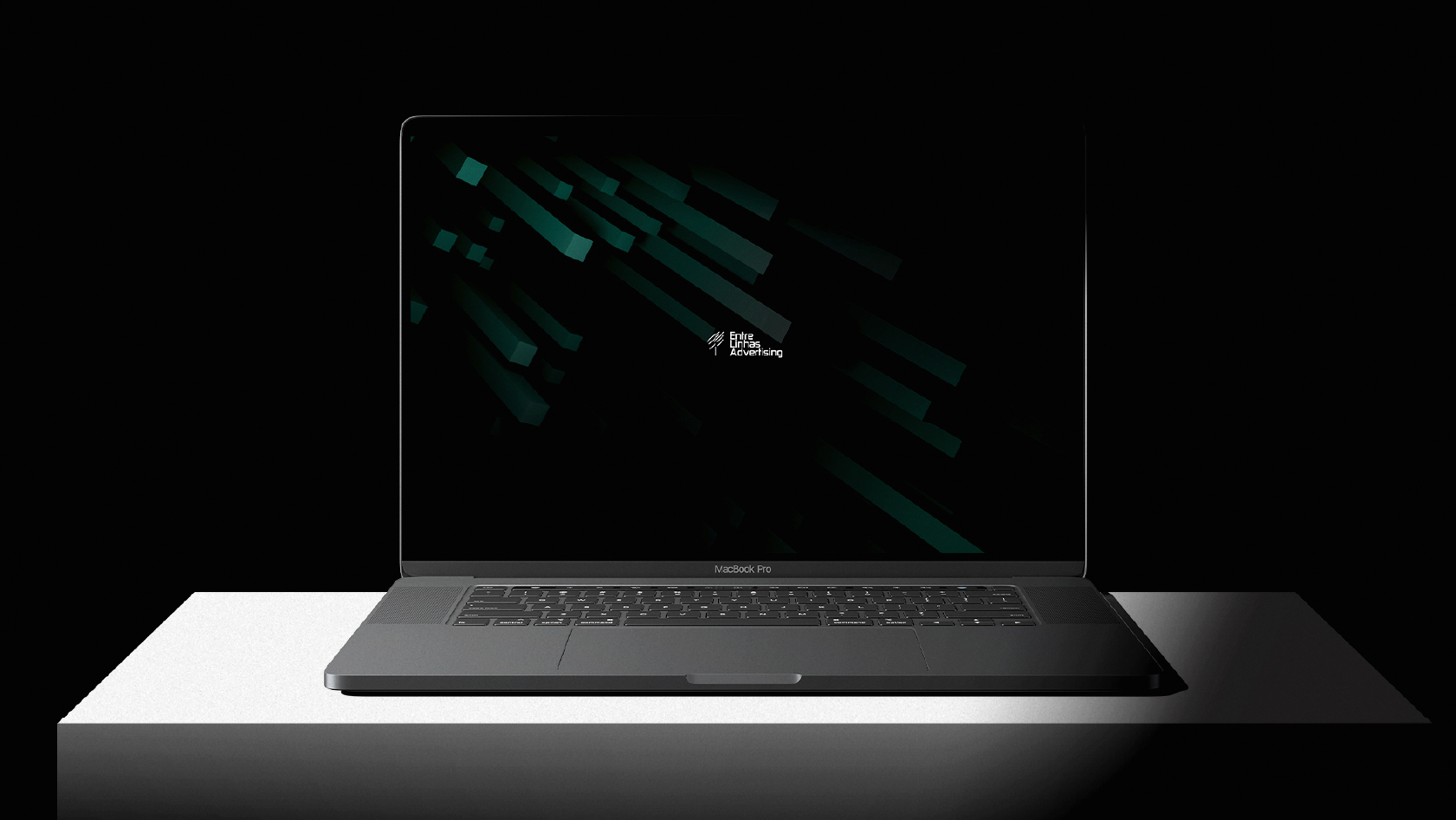
The choice of firm yet dynamic geometric shapes reflects the balance between the stability of a reliable brand and the flexibility of a company that is always open to innovation. Geometry communicates a message of organization and clarity, while the dynamism of the shapes suggests the fluidity necessary in an advertising environment, where ideas must constantly evolve to meet market demands.
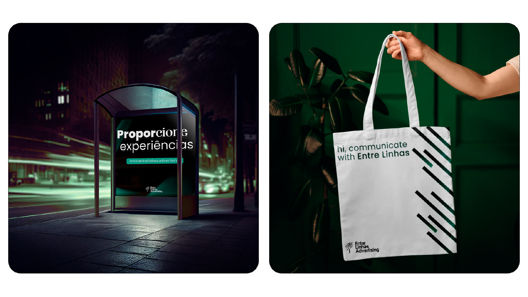
One of the most important elements of Entre Linhas’ visual identity is the symbolism of the tree, carefully chosen to represent the creativity and inspiration that drive the agency. The tree, with its diversity of shapes, textures, and colors, is a perfect metaphor for the creative process. Just as a tree grows, branches out, and adapts to its environment, creativity in the advertising world flourishes in various ways, bringing new and original ideas that connect with diverse audiences.
Each detail of the tree was designed to reflect this creative diversity. The roots, deep and firm, represent Entre Linhas’ commitment to quality and consistency in its work, while the branches stretching in multiple directions symbolize the diversity of ideas and approaches the agency offers its clients. The leaves, with their different shapes and tones, reinforce the idea of constant renewal and adaptation to market changes.
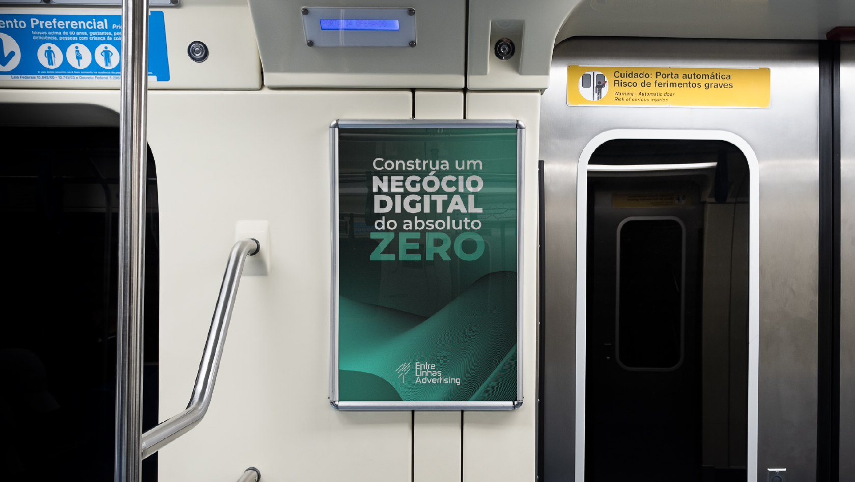
Finally, the color palette chosen for the brand complements this symbolism, with tones that evoke trust, energy, and a connection to nature. Each color was carefully selected to convey a specific message, reinforcing Entre Linhas’ unique identity in the advertising market.
Thus, the visual identity of Entre Linhas Advertising positions itself as a brand that balances innovation and tradition, always committed to offering creative solutions that generate positive impact for its clients.

CREDIT
- Agency/Creative: Hl Brands
- Article Title: Brand Identity Design for Entre Linhas Advertising
- Organisation/Entity: Freelance
- Project Type: Identity
- Project Status: Non Published
- Agency/Creative Country: Brazil
- Agency/Creative City: Aracju
- Market Region: South America
- Project Deliverables: Brand Design
- Industry: Telecoms
- Keywords: Advertising identity brand branding
-
Credits:
Designer: José Humberto Lima


